12 Tips for Better Instagram Photos

I joined this social media platform last summer, after hearing DP Ed Moore say in an interview that his Instagram feed helps him get work. I can’t say that’s happened for me yet, but an attractive Instagram feed can’t do any creative freelancer any harm. And for photographers and cinematographers, it’s a great way to practice our skills.

The tips below are primarily aimed at people who are using a phone camera to take their pictures, but many of them will apply to all types of photography.

The particular challenge with Instagram images is that they’re usually viewed on a phone screen; they’re small, so they have to be easy for the brain to decipher. That means reducing clutter, keeping things bold and simple.

Here are twelve tips for putting this philosophy into practice. The examples are all taken from my own feed, and were taken with an iPhone 5, almost always using the HDR (High Dynamic Range) mode to get the best tonal range.


1. choose your background carefully

The biggest challenge I find in taking snaps with my phone is the huge depth of field. This makes it critical to have a suitable, non-distracting background, because it can’t be thrown out of focus. In the pub photo below, I chose to shoot against the blank pillar rather than against the racks of drinks behind the bar, so that the beer and lens mug would stand out clearly. For the Lego photo, I moved the model away from a messy table covered in multi-coloured blocks to use a red-only tray as a background instead.


2. Find Frames within frames

The Instagram filters all have a frame option which can be activated to give your image a white border, or a fake 35mm negative surround, and so on. An improvement on this is to compose your image so that it has a built-in frame. (I discussed frames within frames in a number of my recent posts on composition.)


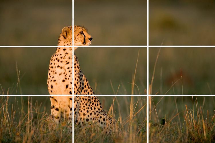
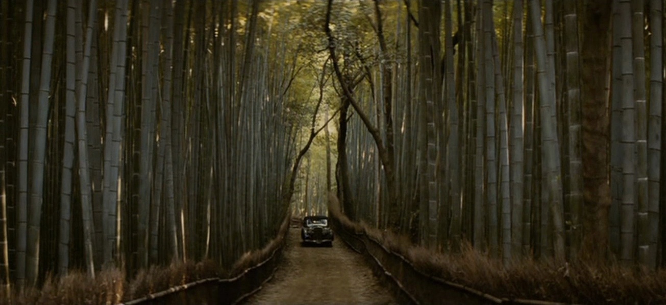
3. try symmetrical composition

To my eye, the square aspect ratio of Instagram is not wide enough for The Rule of Thirds to be useful in most cases. Instead, I find the most arresting compositions are central, symmetrical ones.


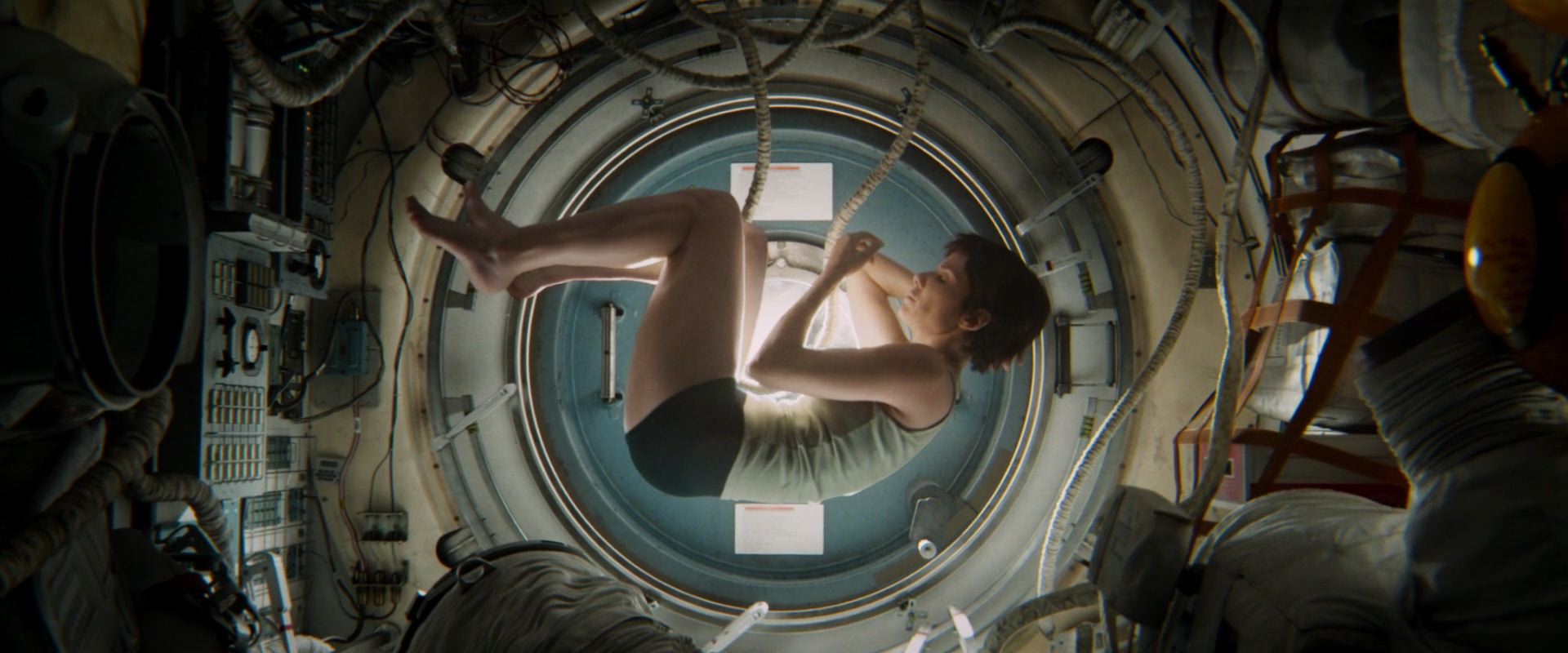
4. Consider Shooting flat on

In cinematography, an impression of depth is usually desirable, but in a little Instagram image I find that two-dimensionality can sometimes work better. Such photos take on a graphical quality, like icons, which I find really interesting. The key thing is that 2D pictures are easier for your brain to interpret when they’re small, or when they’re flashing past as you scroll.
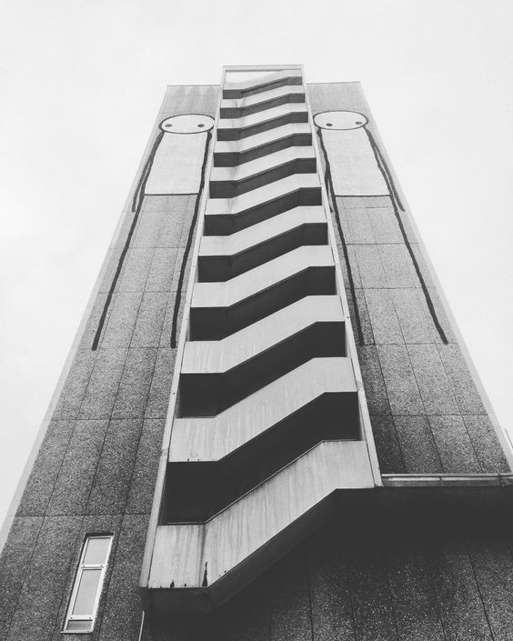
 

5. Look for shapes

Finding common shapes in a structure or natural environment can be a good way to make your photo catch the eye. In these examples I spotted an ‘S’ shape in the clouds and footpath, and an ‘A’ shape in the architecture.


6. Look for textures

Textures can add interest to your image. Remember the golden rule of avoiding clutter though. Often textures will look best if they’re very bold, like the branches of the tree against the misty sky here, or if they’re very close-up, like this cathedral door.


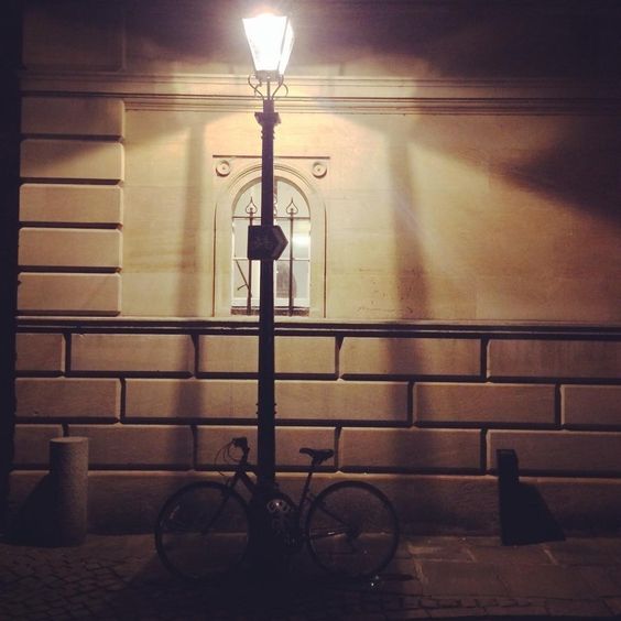
7. Shoot into the light

Most of you will not be lighting your Instagram pics artificially, so you need to be aware of the existing light falling on your subject. Often the strongest look is achieved by shooting towards the light. In certain situations this can create interesting silhouettes, but often there are enough reflective surfaces around to fill in the shadows so you can get the beauty of the backlight and still see the detail in your subject. You definitely need to be in HDR mode for this.


8. Look for interesting light

It’s also worth looking out for interesting light which may make a dull subject into something worth capturing. Nature provides interesting light every day at sunrise and sunset, so these are good times to keep an eye out for photo ops.


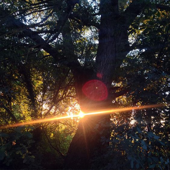
9. Use lens flare for interest

Photographers have been using lens flare to add an extra something to their pictures for decades, and certain science fiction movies have also been known to use (ahem) one or two. To avoid a flare being too overpowering, position your camera so as to hide part of the sun behind a foreground object. To get that anamorphic cinema look, wipe your finger vertically across your camera lens. The natural oils on your skin will cause a flare at 90° to the direction you wiped in. (Best not try this with that rented set of Master Primes though.)


10. Control your palette

Nothing gives an image a sense of unity and professionalism as quickly as a controlled colour palette. You can do this in-camera, like I did below by choosing the purple cushion to photograph the book on, or by adjusting the saturation and colour cast in the Photos app, as I did with the Canary Wharf image. For another example, see the Lego shot under point 3.


11. Wait for the right moment

Any good photographer knows that patience is a virtue. Waiting for pedestrians or vehicles to reach just the right spot in your composition before tapping the shutter can make the difference between a bold, eye-catching photo and a cluttered mess. In the below examples, I waited until the pedestrians (left) and the rowing boat and swans (right) were best placed against the background for contrast and composition before taking the shot.


12. Quality control

One final thing to consider: is the photo you’ve just taken worthy of your Instagram profile, or is it going to drag down the quality of your feed? If it’s not good, maybe you should keep it to yourself.

Check out my Instagram feed to see if you think I’ve broken this rule!

12 Tips for Better Instagram Photos

Composing a Shot-Reverse

Ah, the shot-reverse, that staple of film and television, that standard for dialogue scenes everywhere. Sooner or later, two characters are going to stand three feet apart, facing each other, and have a chat. (You know, like real people do all the time.) And the required coverage will be a wide or two-shot, followed by a pair of singles known as a shot-reverse.

The singles can be dirty (including the other character’s shoulder or back of head in the frame) or clean (not showing the other character). Except for tight close-ups, dirty singles – often called over-the-shoulder shots for obvious reasons – are most common, and it’s these that I’ll focus on in this post.


The Unwritten rules. Which I shall now write.

Conventional wisdom on shot-reverses says that the two shots should

  • be the same size,
  • use the same lens,
  • match the height of the respective eye-lines,
  • allow “looking space”, and
  • frame the two characters on opposite sides of the screen.

Here is a shot-reverse from Hugo (DP: Robert Richardson) which obeys all of these rules…

And here is a shot-reverse from Alien (DP: Derek Vanlint) which obeys none of them…

Ultimately, like all framing decisions, it’s subjective. Directors often have strong ideas about what they do and don’t like in shot-reverses. And no two DPs will agree exactly on the subject. And of course the actors will move around at least slightly during the scene, messing with any strict composition you’ve established.


Using the width of the frame

Traditional television, driven as it was by dialogue scenes usually covered in over-the-shoulder shots, was perfectly suited to the old 4:3 ratio. The subject and foreground characters neatly filled the frame.

But with today’s wider aspect ratios – particularly 2.39:1- we have a choice to make about how to use the extra horizontal space. If we want to place the characters on either side of the frame, we have to shift the camera out, away from the eyeline…

This has the disadvantage of showing some of the foreground character’s face, and starting to look a little like a two-shot. But it may be very effective symbolically if the characters have a strained or distant relationship in the story.

If you don’t like all that space between the characters, you can return the camera closer to the eyeline, keeping the subject on the “correct” side of frame, the side that gives them the most looking space

However, the foreground character cuts off the looking space, and the composition can end up looking unbalanced. It may feel like the subject is trapped, squashed into the side of frame by the foreground character. But again, this may be the effect you want to create.

You can frame the characters more centrally, or you can go to the other extreme, placing the foreground character enclosing the side of frame, cradling the rest of the composition…

This creates a nice sense of depth, making the screen resemble a window. The foreground character on the edge of frame continues the perspective of the physical frame itself (be it the plastic surround of a TV set, the curtains of a cinema or whatever) into the frame.

(I can’t understand why the cinema’s empty. This looks like an awesome movie.)

Here’s a similar composition from Die Hard (DP: Jan de Bont), where the perspective is continued even further into the image, to a statue in the deep background…


Oscar-winning shot-reverses

Looking through Evan Richards’ Cinematography Index at recent movies to bag the Best Cinematography Oscar, I saw a wide variety of styles in the shot-reverses. Here are just a few that stood out to me as interesting.

Here’s an example from The Revenant (DP: Emmanuel Lubezki) which uses the foreground character as a framing element on the right…

This next example from Inception (DP: Wally Pfister) has great perspective, helped by the line of the table, and the wineglass on the left which almost feels like a vanishing point for the eye-line…

This clean shot-reverse from Sicario (DP: Roger Deakins) is interesting because the camera height is not on the eye-line….

The men at the table are shot from just below their head height, giving them more power and permitting the inclusion of the great perspective lines of ceiling lights in the background. The characters are framed quite centrally, which is also true of this final example, from Memoirs of a Geisha (DP: Dion Beebe)…

In the first shot, the distant window on frame right anchors and balances the composition, while the lantern on frame left serves the same function in the second shot.


And now the conclusion

If there’s one single piece of advice to take from this somewhat disjointed post, it’s that it’s more important to frame a shot-reverse in a way that feels right aesthetically, for the characters, and for the story, than to follow any rules, because…

See also: Composing a Wide Shot and 2.39:1 Composition

Composing a Shot-Reverse

Book Review: “Magic Hour” by Jack Cardiff

If Roger Deakins is the greatest living cinematographer, Jack Cardiff must be the greatest one no longer with us. He is perhaps best known for his triptych of Technicolor collaborations with Powell & Pressburger – A Matter of Life and Death, Black Narcissus (which won Cardiff an Oscar and a Golden Globe) and The Red Shoes. But his career spanned a huge swathe of cinematic history, beginning in the days of the silent film and concluding in the age of action blockbusters like Rambo: First Blood Part II. Along the way he photographed many of the twentieth century’s most iconic movie stars: Humphrey Bogart, Sophia Loren, Errol Flynn, Marilyn Monroe, Laurence Olivier, Audrey Hepburn and Kirk Douglas, to name but a few.

Magic Hour is Cardiff’s autobiography, first published in 1996. (Yes, I’m reviewing this book 21 years late. Sorry.) From the beginning, his life was remarkable. His parents were travelling music hall performers, and he never stayed at the same school for long. But what he might have lacked in conventional education he more than made up for with a voracious appetite for literature and fine art.

One day, gazing at a roomful of paintings, I realized something starkly obvious that I’d never noticed before. Light! Now I gave all my attention to the way painters used light and also began the habit of analysing the light all around me: in rooms, buses, trains – everywhere. How light plays subtle tricks, bouncing off walls, how its various reflections and changed light sources can reveal much insight into the character of a face.

After a few movie appearances as a child actor, Cardiff found work as a camera assistant at Elstree, eventually rising to the rank of camera operator. One day, he and his fellow operators were interviewed to see who would go to America to learn all about the new Technicolor process. Cardiff cut short the technical questions and held forth on the great painters who inspired him. He was selected.

Cardiff (left) and his operator Geoffrey Unsworth with the comically huge Technicolor camera

The Technicolor camera was enormous and required precision maintenance, but Cardiff was to get stunning results from it.

Over the next quarter of a century, until the advent of single-film Eastmancolor, which tolled the death knell of the three-strip camera, I used this superb Rolls-Royce of a beauty all over the world in all kinds of dangerous situations: in steel foundries (inches away from molten ingots), in battleships in wartime seas, on top of erupting volcanoes, in burning deserts and steaming jungles, and diving on to the Colosseum in Rome in an old Italian bomber.

The above passage neatly sums up the kind of adventures Cardiff chronicles in Magic Hour. Anyone who’s ever worked on a film set will have a few ridiculous anecdotes to tell, and this man had a lifetime’s worth. For example, during World War II, Cardiff was tapped to lens a propaganda drama called Western Approaches. One scene required the sinking of a submarine, which was achieved without VFX of any kind, with the vessel doing a controlled dive to end up just short of total submersion. “My Technicolor camera was tied on to the extreme tip of the stern,” wrote Cardiff, “and I was operating it!”

Frame of Cardiff’s Oscar-winning work from “Black Narcissus” (1947, dir. Michael Powell & Emeric Pressburger)

After the war he came to the attention of director/producer team Michael Powell and Emeric Pressburger, leading to that famous triptych noted in my introduction, before going on to work with many other renowned filmmakers. His collaboration with Hitchcock, Under Capricorn, featured a memorable scene in which the four-foot-high Technicolor camera was required to track along the length of a dining table. This being impossible, the table was rigged to split apart as the camera advanced.

Now the camera moved forward, seemingly on an inevitable collision course, but at the last moment, each of the guests fell back on to a mattress clutching his section of the table with all the props stuck on it!

Magic Hour is beautifully and sincerely written, making you wish you could share a pint with the great man and hear even more of his beguiling tales of cinematic capers. Throughout the book, he provides unique insights into the off-screen lives of the Hollywood icons he worked alongside: his friendship with the “childlike, frightened Marilyn”; his unconsummated romance with Sophia Loren; his chat with Errol Flynn about the latter’s womanising, and many others.

Cardiff and Monroe on the set of “The Prince and the Showgirl” (1957)

We are also treated to fascinating glimpses into Cardiff’s creativity as a cinematographer. For example, when faced with an exterior close-up whose grey, cloudy background would not match earlier sunny wide shots, Cardiff shone an ungelled tungsten lamp on the talent and instructed the lab to correct for his skin tone. The lab duly added blue to the print, restoring the talent’s skin tone to normal and tinting the grey sky a perfect blue! Can you imagine performing such a risky experiment and not knowing until the following day whether it had succeeded or not? We digital DPs are truly spoilt.

Another example of Cardiff’s ingenuity was on 1956’s War and Peace, where he had to create a sunrise effect on a glass matte painting.

I placed a small lamp close beside my camera which was brightly reflected in the sheet of glass. [This had] pink and orange filters on it. Although a tiny lamp, its reflection in the glass looked exactly like a dawn sun on the horizon.

In the late fifities, Cardiff moved into directing, and the great critical and commercial success of his 1960 film Sons and Loverforms the denouement of Magic Hour. He later returned to DPing with such mainstream movies as Death on the Nile and Conan the Destroyer, a period of his life which Cardiff gives only a passing mention in the closing chapter. Perhaps he was less proud of the modern box office fodder than his earlier, arguably more artistic, work?

Cardiff in a shot from “Cameraman: The Life and Work of Jack Cardiff” (2010, dir. Craig McCall)

Cardiff died in 2009, the year before the release of the documentary feature Cameraman: The Life and Word of Jack Cardiff. Whether you choose to learn about Cardiff’s contributions to cinema from that excellent film or from the equally absorbing Magic Hour, learn you should. The word “legendary” is over-used, but Cardiff is more deserving of the adjective than most.

Book Review: “Magic Hour” by Jack Cardiff

Composing a Wide Shot

I have wanted to write a blog post about composition for ages, but I’ve procrastinated. Framing is such an instinctive and subjective thing; could I ever articulate how to do it? I’m still not sure, but at last I’m taking a deep breath and giving it a go. To help me, I’m using frame grabs from Best Cinematography Oscar-winning films of the last ten years or so, taken from the brilliant and handy website Cinematographer’s Index. Check it out and donate a few bucks if you can.


the rule of thirds

The Rule of Thirds is well known to most filmmakers. It suggests that you imagine the frame divided vertically and horizontally into thirds, then place the subject on one of the intersections of these lines.

However, composing images using The Rule of Thirds is like riding a bike using stabilisers. It’s something that you use before you’ve developed your own eye for composition.

Here are just a few examples of cinematography which completely ignore the rule, yet won Oscars. Guillermo Navarro puts his subject bang in the centre, in this scene from Pan’s Labyrinth

While Dion Beebe goes for an extreme off-set in Memoirs of a Geisha

In this scene from Life of Pi, Claudio Miranda places the two least important elements in the frame – the lifeboat and the sun – roughly on the thirds, but puts Pi himself right in the centre, and the distant ship off to the right…


ENclosing one SIDE

So, if we’re not using The Rule of Thirds, where do we start? I like to start with the edges of the frame, rather than some arbitrary points within in. I look for something to give me a reason to put the edge of the frame in a particular place.

As I touched on in my previous post, about Turner, it’s aesthetically pleasing to create a frame within a frame, but unless you’re shooting through a window you can’t always enclose the image on all four sides. Often the ground/horizon gives you a free framing along the bottom edge. So if you can frame just one more side, you’ve got an L-shaped frame (though the ‘L’ may be backwards) and you’re doing pretty well.

This is probably the most common compositional technique you’ll see in wide shots: a tree, wall or other vertical element enclosing the frame on one side. Pan’s Labyrinth again…

Here’s one from The Revenant (DP: Emmanuel Lubezki)…

It’s great when these enclosing elements are in the foreground, because they also serve to add depth to the image. But they can be in the background too, like the righthand skyscraper in this frame from Slumdog Millionaire (DP: Anthony Dod Mantle)…

Or in this one from Pan’s Labyrinth, where the mill wheel defines the height of the image as well as framing it on the left…

Sometimes, with flatter compositions, you can find an element on the same plane as the subject with which to frame the shot on one side, like the streetlamp on the left of this shot from Life of Pi. Note that the edge of the pond also provides strong framing along the bottom of the image…


ENCLOSING TWO SIDES

Placing enclosing elements on both sides of the frame, as well as being even more aesthetically pleasing than enclosing a single side, can suggest a situation from which the characters cannot escape. Consider these frames from, respectively, Inception (DP: Wally Pfister) and Road to Perdition (DP: Conrad Hall)…


Other frames within frames

In this shot from Hugo (DP: Robert Richardson), the architecture frames the image along the top and righthand side, while leaving it open in the bottom left, the direction towards which the subject is moving…

This shot from Life of Pi contains an interesting choice. The obvious – and far more dominant place – to put the subject would have been leaning against the foreground pillar on the right. Instead, Miranda makes the audience search for him in the frame…

Here, in Road to Perdition, the foreground character, the desk, the phone and the doorway all cradle and enclose the subject…


Pinning a corner

Sometimes it is impossible to enclose the image on any of its sides. In these cases I will at least try to pin a corner – to find an element that I can place just within a corner of the frame to anchor the composition. This frame from Hugo uses the lamp in the top right for this purpose…

Mantle uses the foreground tyre here in Slumdog Millionaire…

Navarro uses a chair in the bottom left of this Pan’s Labyrinth shot. Notice how the subject is placed on the imaginary line connecting the chair to the circular window in the background, which balances it out…

In this scene from Road to Perdition, Hall pins the top lefthand corner with the light fixture, then balances it beautifully with the shadows in the bottom right…

Indeed, the corner-pinning technique seems most effective when the diagonally opposite corner is opposite in other ways too – dark vs. light, close vs. far, warm vs. cold, etc.


Vanishing points

Vanishing points are a concept familiar to artists and technical drafters. You extend the image’s straight lines in perspective to the point where they vanish into the distance. Placing the subject of your image on a vanishing point will lead the viewer’s eyes right to them. Check out these examples from, respectively, Memoirs of a Geisha and Road to Perdition…

This shot from Slumdog Millionaire is a little more subtle, but follow the lines of the table and chair and you’ll end up right at the children…

And just to prove that rules are meant to be broken, here’s a Slumdog shot where the subjects are nowhere the vanishing point…


LEADING LINES

It’s not just vanishing points that provide satisfying spots to place your subject. Leading lines of any kind can draw the eye. In this shot from Inception, the vanishing point (the tip of the plane’s nose) would be somewhere in the extreme top-left corner of frame. Di Caprio isn’t on that vanishing point, but the rows of seats still lead our eyes to him…

In this shot from Sicario, Roger Deakins places both subjects over the corners of the house, where the buildings’ lines lead us to…

In The Revenant, this frame places the subjects at the point of the V formed by the sloping mounds…


Symmetry

I’ve touched on the concept of balance throughout this post, and I’ll probably need to write a whole other post to really get into it, but for now, here are some beautiful examples of the simplest way of giving a composition balance: symmetry…


So those are a few basic ways of approaching the composition of a wide shot. More composition posts to come, but meanwhile, you might like to check out my existing post on 2.39:1 composition.

Composing a Wide Shot