What colour is moonlight? In cinema, the answer is often blue, but what is the reality? Where does the idea of blue moonlight come from? And how has the colour of cinematic moonlight evolved over the decades?
The science bit
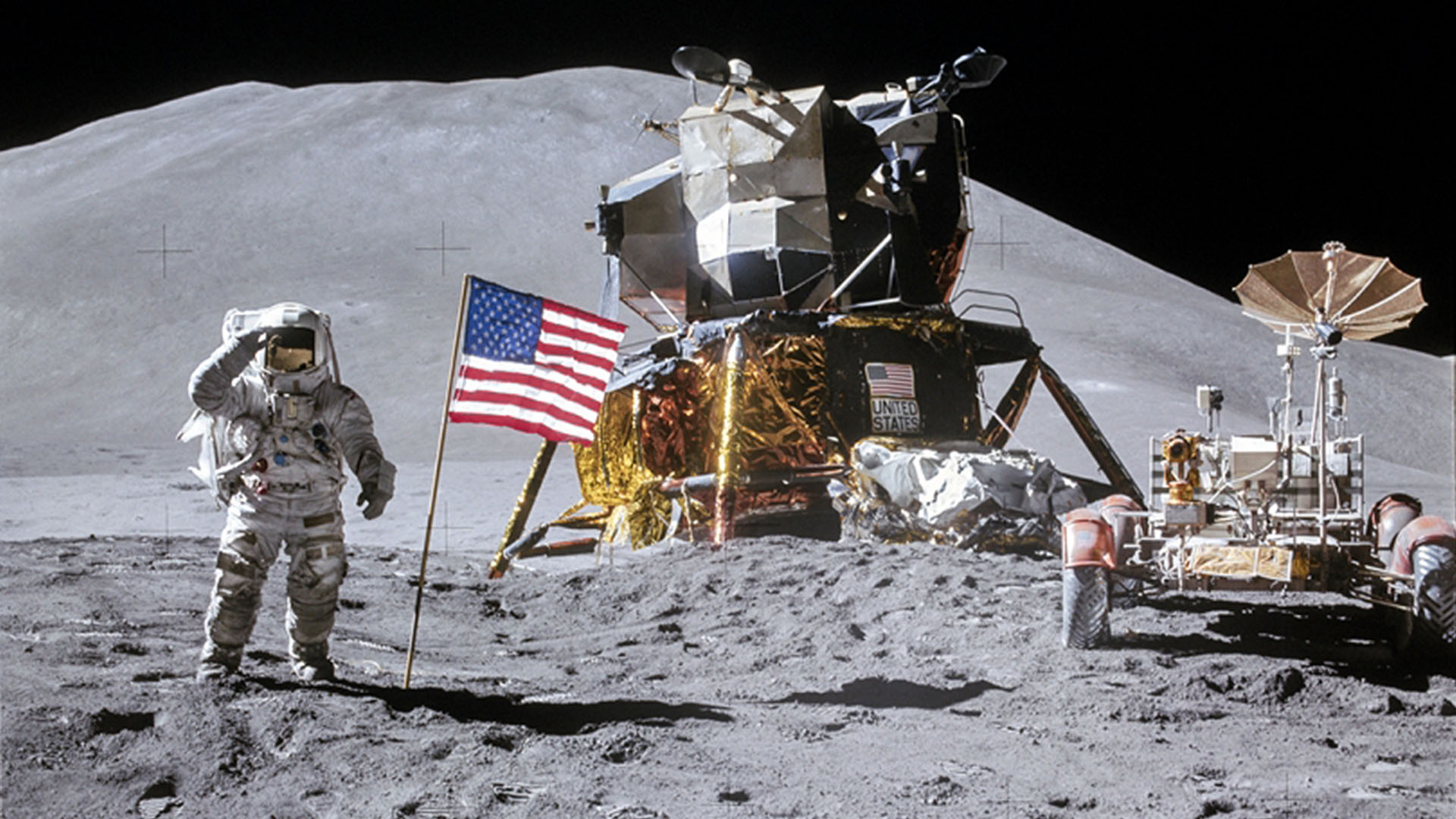
According to universetoday.com the lunar surface “is mostly oxygen, silicon, magnesium, iron, calcium and aluminium”. These elements give the moon its colour: grey, as seen best in photographs from the Apollo missions and images taken from space.
When viewed from Earth, Rayleigh scattering by the atmosphere removes the bluer wavelengths of light. This is most noticeable when the moon is low in the sky, when the large amount of atmosphere that the light has to travel through turns the lunar disc quite red, just as with the sun, while at its zenith the moon merely looks yellow.
Yellow is literally the opposite (or complement) of blue, so where on (or off) Earth did this idea of blue cinematic moonlight come from?
One explanation is that, in low light, our vision comes from our rods, the most numerous type of receptor in the human retina (see my article “How Colour Works” for more on this). These cells are more sensitive to blue than any other colour. This doesn’t actually mean that things look blue in moonlight exactly, just that objects which reflect blue light are more visible than those that don’t.
 In reality everything looks monochromatic under moonlight because there is only one type of rod, unlike the three types of cones (red, green and blue) which permit colour vision in brighter situations. I would personally describe moonlight as a fragile, silvery grey.
Blue moonlight on screen dates back to the early days of cinema, before colour cinematography was possible, but when enterprising producers were colour-tinting black-and-white films to get more bums on seats. The Complete Guide to Colour by Tom Fraser has this to say:
As an interesting example of the objectivity of colour, Western films were tinted blue to indicate nighttime, since our eyes detect mostly blue wavelengths in low light, but orange served the same function in films about the Far East, presumably in reference to the warm evening light there.
It’s entirely possible that that choice to tint night scenes blue has as much to do with our perception of blue as a cold colour as it does with the functioning of our rods. This perception in turn may come from the way our skin turns bluer when cold, due to reduced blood flow, and redder when hot. (We saw in my recent article on white balance that, when dealing with incandescence at least, bluer actually means hotter.)
Whatever the reason, by the time it became possible to shoot in colour, blue had lodged in the minds of filmmakers and moviegoers as a shorthand for night.
Examples
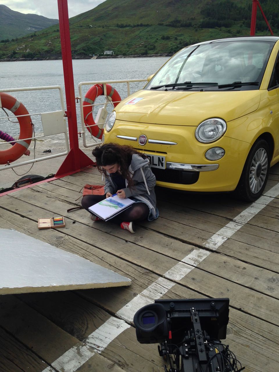
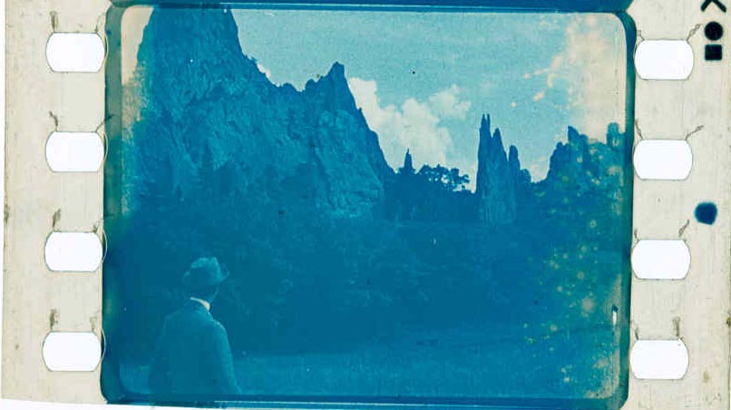
Early colour films often staged their night scenes during the day; DPs underexposed and fitted blue filters in their matte boxes to create the illusion. It is hard to say whether the blue filters were an honest effort to make the sunlight look like moonlight or simply a way of winking to the audience: “Remember those black-and-white films where blue tinting meant you were watching a night scene? Well, this is the same thing.”


Day-for-night fell out of fashion probably for a number of reasons: 1. audiences grew more savvy and demanded more realism; 2. lighting technology for large night exteriors improved; 3. day-for-night scenes looked extremely unconvincing when brightened up for TV broadcast. Nonetheless, it remains the only practical way to show an expansive seascape or landscape, such as the desert in Mad Max: Fury Road.

One of the big technological changes for night shooting was the availability of HMI lighting, developed by Osram in the late 1960s. With these efficient, daylight-balanced fixtures large areas could be lit with less power, and it was easy to render the light blue without gels by photographing on tungsten film stock.
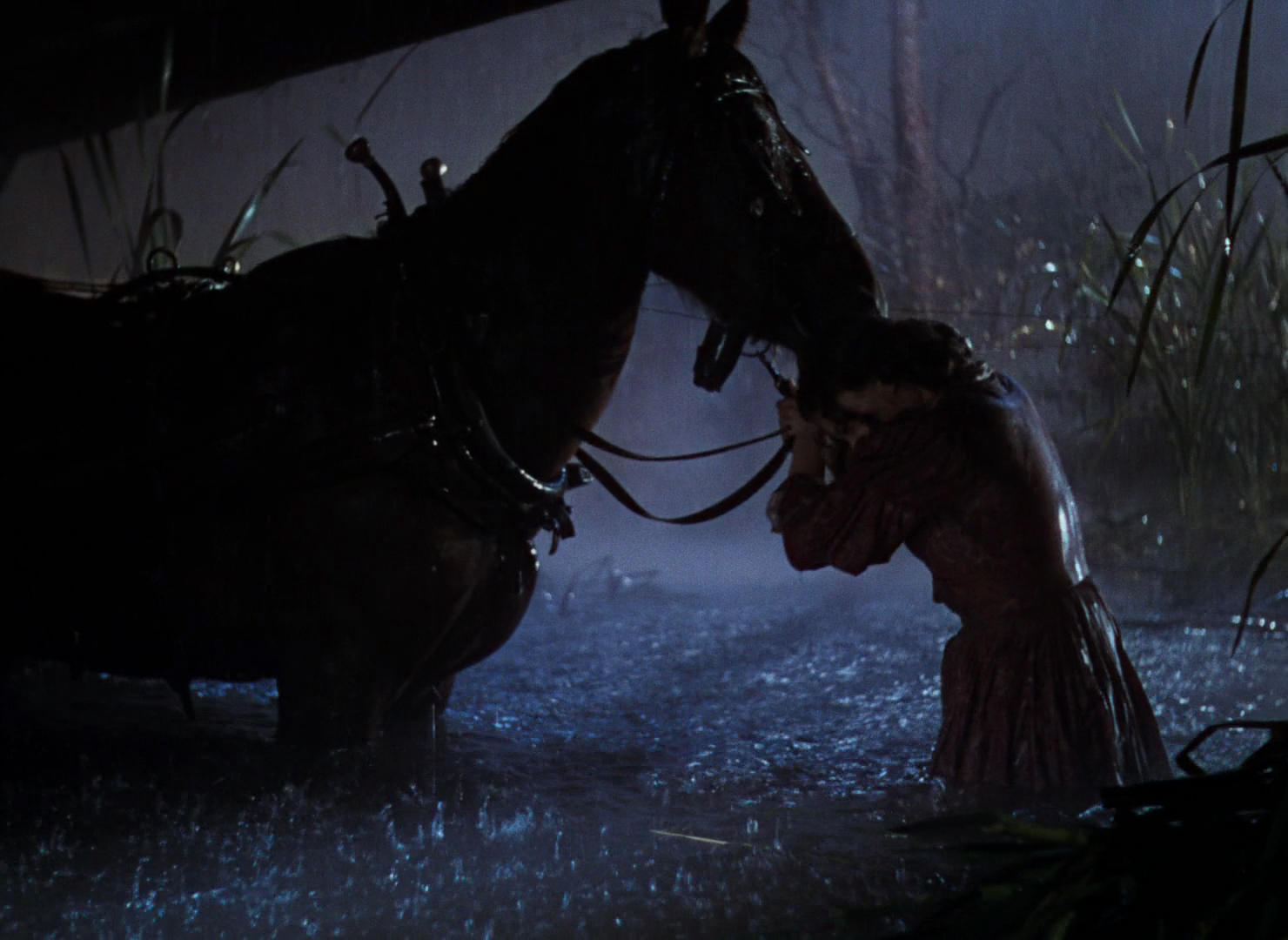
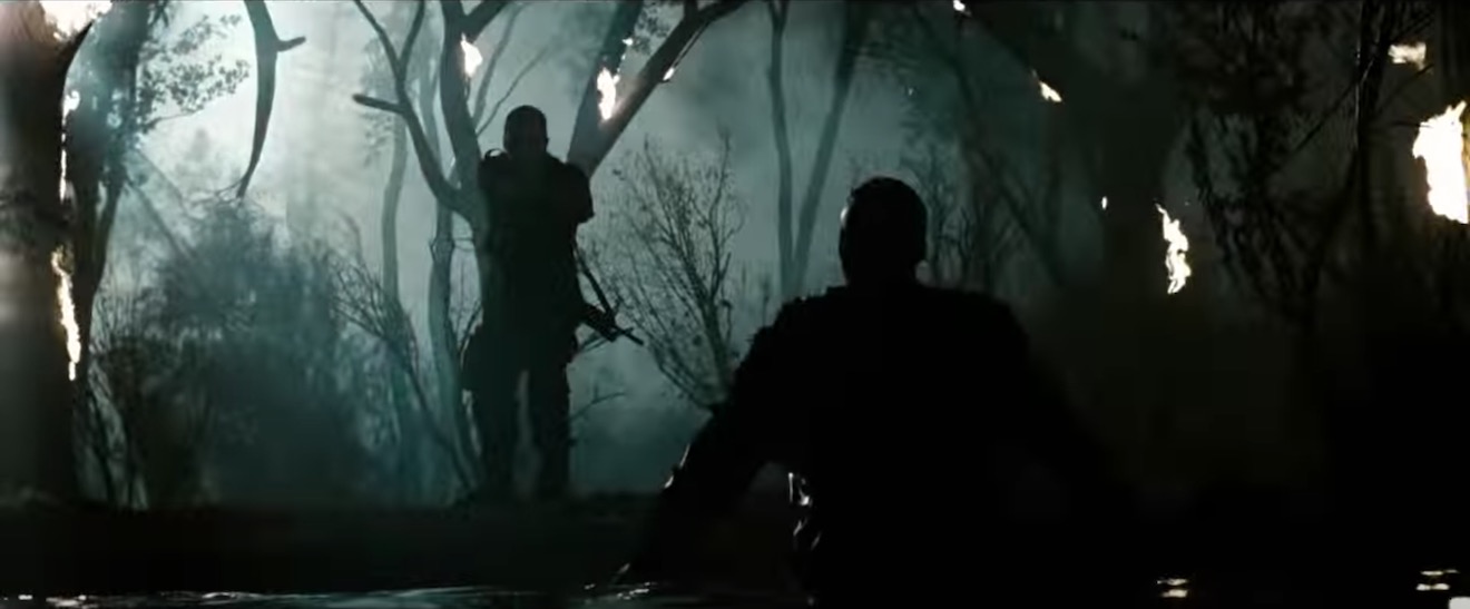
Cinematic moonlight reached a peak of blueness in the late 1980s and early ’90s, in keeping with the general fashion for saturated neon colours at that time. Filmmakers like Tony Scott, James Cameron and Jan de Bont went heavy on the candy-blue night scenes.


By the start of the 21st century bright blue moonlight was starting to feel a bit cheesy, and DPs were experimenting with other looks.
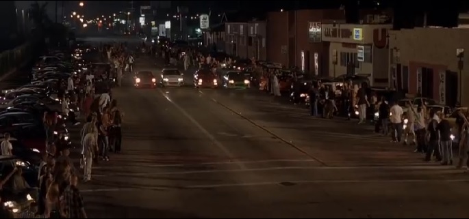

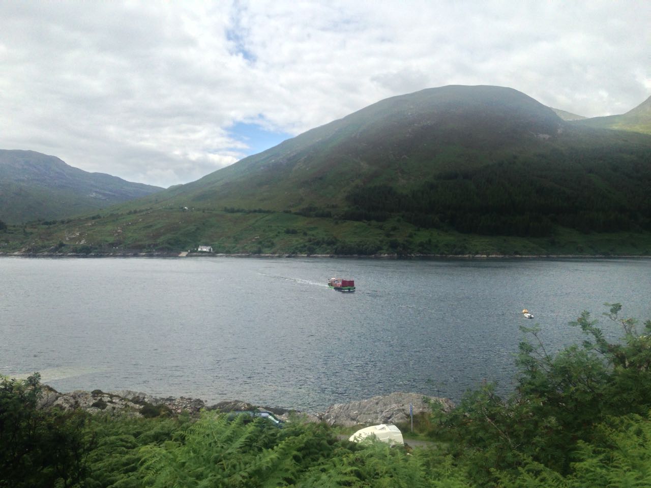
Speaking of the above ferry scene in War of the Worlds, Janusz Kaminski, ASC said:
I didn’t use blue for that night lighting. I wanted the night to feel more neutral. The ferryboat was practically illuminated with warm light and I didn’t want to create a big contrast between that light and a blue night look.
The invention of the digital intermediate (DI) process, and later the all-digital cinematography workflow, greatly expanded the possibilities for moonlight. It can now be desaturated to produce something much closer to the silvery grey of reality. Conversely, it can be pushed towards cyan or even green in order to fit an orange-and-teal scheme of colour contrast.
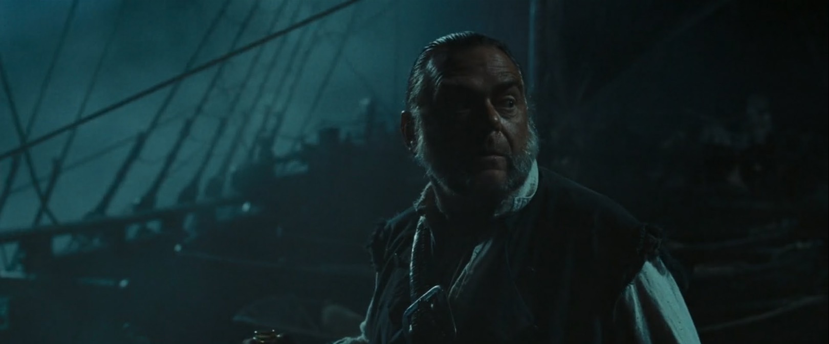
Darius Wolksi, ASC made this remark to American Cinematographer in 2007 about HMI moonlight on the Pirates of the Caribbean movies:
The colour temperature difference between the HMIs and the firelight is huge. If this were printed without a DI, the night would be candy blue and the faces would be red. [With a digital intermediate] I can take the blue out and turn it into more of a grey-green, and I can take the red out of the firelight and make it more yellow.

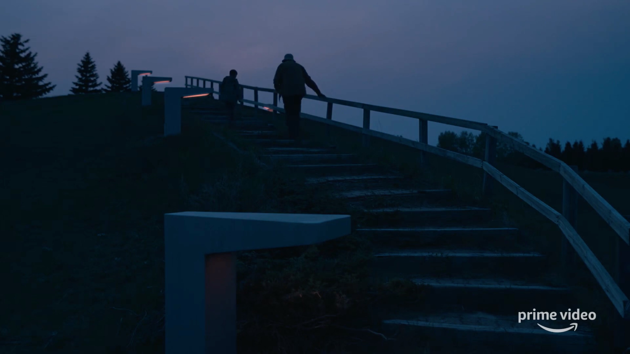
My favourite recent approach to moonlight was in the Amazon sci-fi series Tales from the Loop. Jeff Cronenweth, ASC decided to shoot all the show’s night scenes at blue hour, a decision motivated by the long dusks (up to 75 minutes) in Winnipeg, where the production was based, and the legal limits on how late the child actors could work.
The results are beautiful. Blue moonlight may be a cinematic myth, but Tales from the Loop is one of the few places where you can see real, naturally blue light in a night scene.
If you would like to learn how to light and shoot night scenes, why not take my online course, Cinematic Lighting? 2,300 students have enrolled to date, awarding it an average of 4.5 stars out of 5. Visit Udemy to sign up now.