 After fourteen nominations, celebrated cinematographer Roger Deakins, CBE, BSC, ASC finally won an Oscar last night, for his work on Denis Villeneuve’s Blade Runner 2049. Villeneuve’s sequel to Ridley Scott’s 1982 sci-fi noir is not a perfect film; its measured, thoughtful pace is not to everyone’s taste, and it has serious issues with women – all of the female characters being highly sexualised, callously slaughtered, or both – but the Best Cinematography Oscar was undoubtedly well deserved. Let’s take a look at the photographic style Deakins employed, and how it plays into the movie’s themes.
Blade Runner 2049 returns to the dystopian metropolis of Ridley Scott’s classic three decades later, introducing us to Ryan Gosling’s K. Like Harrison Ford’s Deckard before him, K is a titular Blade Runner, tasked with locating and “retiring” rogue replicants – artificial, bio-engineered people. He soon makes a discovery which could have huge implications both for himself and the already-strained relationship between humans and replicants. In his quest to uncover the truth, K must track down Deckard for some answers.
Villeneuve’s film meditates on deep questions of identity, creating a world in which you can never be sure who is or isn’t real – or even what truly constitutes being “real”. Deakins reinforces this existential uncertainty by reducing characters and locations to mere forms. Many scenes are shrouded in smog, mist, rain or snow, rendering humans and replicants alike as silhouettes.
K spends his first major scene seated in front of a window, the side-light bouncing off a nearby cabinet the only illumination on his face. Deakins’ greatest strength is his ability to adapt to whatever style each film requires, but if he has a recognisable signature it’s this courage to rely on a single source and let the rest of the frame go black.
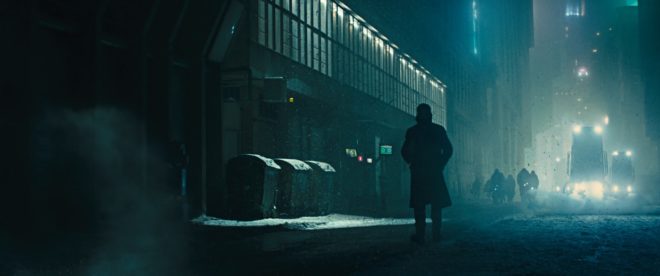
Whereas Scott and his DP Jordan Cronenweth portrayed LA mainly at night, ablaze with pinpoints of light, Villeneuve and Deakins introduce it in daylight, but a daylight so dim and smog-ridden that it reveals even less than those night scenes from 1982.
All this is not to say that the film is frustratingly dark, or that audiences will struggle to make out what is going on. Shooting crisply on Arri Alexas with Arri/Zeiss Master Primes, Deakins is a master of ensuring that you see what you need to see.
A number of the film’s sequences are colour-coded, delineating them as separate worlds. The city is mainly fluorescent blues and greens, visually reinforcing the sickly state of society, with the police department – an attempt at justice in an insane world – a neutral white.
The Brutalist headquarters of Jared Leto’s blind entrepreneur Wallace are rendered in gold, as though the corporation attempted a friendly yellow but was corrupted by greed. These scenes also employ rippling reflections from pools of water. Whereas the watery light in the Tyrell HQ of Scott’s Blade Runner was a random last-minute idea by the director, concerned that his scene lacked enough interest and production value, here the light is clearly motivated by architectural water features. Yet it is used symbolically too, and very effectively so, as it underscores one of Blade Runner 2049’s most powerful scenes. At a point in the story where more than one character is calling their memories into question, the ripples playing across the walls are as intangible and illusory as those recollections. “I know what’s real,” Deckard asserts to Wallace, but both the photography and Ford’s performance bely his words.

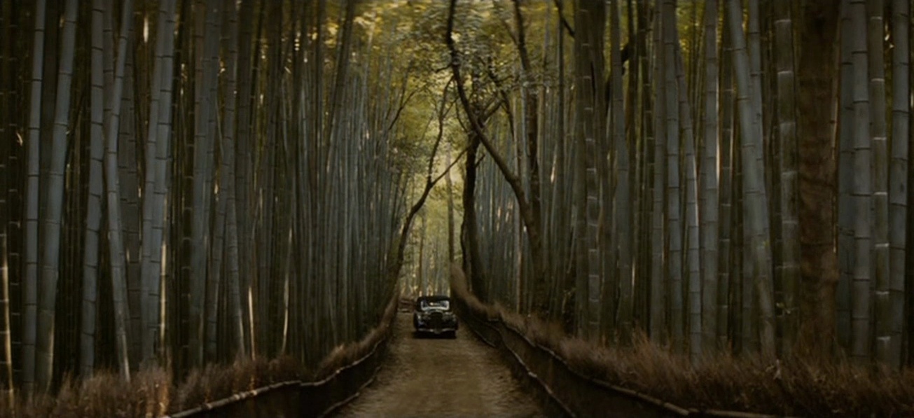
The most striking use of colour is the sequence in which K first tracks Deckard down, hiding out in a Las Vegas that’s been abandoned since the detonation of a dirty bomb. Inspired by photos of the Australian dust storm of 2009, Deakins bathed this lengthy sequence in soft, orangey-red – almost Martian – light. This permeating warmth, contrasting with the cold artificial light of LA, underlines the personal nature of K’s journey and the theme of birth which is threaded throughout the film.
Deakins has stated in interviews that he made no attempt to emulate Cronenweth’s style of lighting, but nonetheless this sequel feels well-matched to the original in many respects. This has a lot to do with the traditional camerawork, with most scenes covered in beautifully composed static shots, and movement accomplished where necessary with track and dolly.
The visual effects, which bagged the film’s second Oscar, also drew on techniques of the past; the above featurette shows a Canon 1DC tracking through a miniature landscape at 2:29. “Denis and I wanted to do as much as possible in-camera,” Deakins told Variety, “and we insisted when we had the actors, at least, all the foreground and mid-ground would be in-camera.” Giant LED screens were used to get authentic interactive lighting from the advertising holograms on the city streets.
One way in which the lighting of the two Blade Runner movies is undeniably similar is the use of moving light sources to suggest an exciting world continuing off camera. (The infamous lens flares of J.J. Abrahms’ Star Trek served the same purpose, illustrating Blade Runner’s powerful influence on the science fiction genre.) But whereas, in the original film, the roving searchlights pierce the locations sporadically and intrusively, the dynamic lights of Blade Runner 2049 continually remodel the actors’ faces. One moment a character is in mysterious backlight, the next in sinister side-light, and the next in revealing front-light – inviting the audience to reassess who these characters are at every turn.

This obfuscation and transience of identity and motivation permeates the whole film, and is its core visual theme. The 1982 Blade Runner was a deliberate melding of sci-fi and film noir, but to me the sequel does not feel like noir at all. Here there is little hard illumination, no binary division of light and dark. Instead there is insidious soft light, caressing the edge of a face here, throwing a silhouette there, painting everyone on a continuous (and continuously shifting) spectrum between reality and artificiality.
Blade Runner 2049 is a much deeper and more subtle film than its predecessor, and Deakins’ cinematography beautifully reflects this.