
Production designer Amy Nicholson is no stranger to period settings and low budgets. I spent all of last September in France lighting her impressive work, so when I came to crew up Amelia’s Letter, she was the only person I considered to create the script’s four distinct periods. I’ve asked her to share her experiences of the design process on this demanding short film.
I met Neil as a DOP on The First Musketeer, a rather intense but wonderful project. He instantly won my respect and acclaim with consistently superb lighting, a real appreciation for prop details and generally being a nice guy to work with. [Neil quietly slips Amy a tenner.] So when he approached me about designing Amelia’s Letter which he would be directing, I couldn’t help but say yes, despite a recent promise to myself not to take on any more freebies.

The script filled me with a mix of excitement and dread. On the one hand it was my dream job with four different time periods (including my favourite, 1930s) and a gothic style, but on the other hand the level of art required to do this project was massive.
The original budget set by the production wouldn’t cover the acquisition of the named props let alone any effective dressing. Luckily for me they listened to my cause and agreed to increase the figure to a point my most optimistic budget might stretch to. This was fantastic but of course still set me up on my biggest challenge ever!
I was part of early conversations and visits to locations, and with Neil agreed what could work best. This collaboration between a director and production designer is fantastic and really builds the strength and vision of a piece. The chosen location was a little semi derelict cottage at Newstead Abbey. The architecture was stunning and although the worn state and small size of the building would present big challenges, the opportunity to do whatever we wanted and really transform the main room for each time period was incredible.
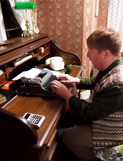
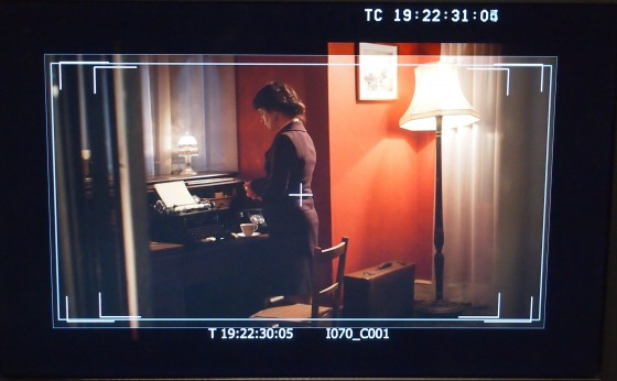
The main focus of the design and plot revolved around a period desk. Therefore it was important to get this piece right and plan all other design factors around this key item. I spent days searching for the right one, regularly sending images back and forth to Neil for an opinion. I wouldn’t normally bug a director in this way but the desk really had to support the action and shots effectively, so was crucial. I was pleased to learn that Neil was of the opinion that in this case the look of something was more important than the true accuracy of period, so this gave me a little flexibility. I eventually found the perfect piece, a 1909 roll top desk. The age and style was ever so slightly too modern but the detail and quality of wood far outweighed the five years of inaccuracy. Unfortunately the desk was 150 miles away and featured quite a bit of damage. So a road trip to collect the desk and some renovations by my dad ensued. Dad also constructed a bespoke locking drawer needed for the action. This proved a great deal of effort but worth it to get the right piece.
There were a few other items I had to buy, including a 1930s radio, but on the whole I was able to source everything else from my personal prop store and generally doing a bit of beg, steal and borrow from friends, family and the crew. I also befriended a local antique shop and was able to hire many dressing items really cheaply. Having many sources in this way really makes a budget stretch but always involves a lot of time spent collecting, sorting and returning.
Choosing paint colours should have been quite easy but the best colours are always the most expensive and with four colours required in just three days it took careful consideration. Neil and I agreed a pallet of colours which would look good on camera and distinguish each period. He requested that the colours get bolder throughout to suit the narrative, but on a practical front this also ensured only a single coat was needed on the walls, saving time and money. I bought patterned rollers to achieve an easy wallpaper effect for both 1903 and 1969. This was a new toy for me and proved a fantastic effect that I will certainly be using again.

On set I had a superb team to support with all the redressing. It was like 60-minute makeover each time we transformed to a new period and I was so impressed and grateful that all the crew got involved at some point to help us out. Once each transformation was complete the cast and crew consistently let out a genuine ‘wow’ making the art team feel very proud.
I was truly pleased with each of the sets and it was really special seeing them combined with some effective costume design by Sophie Black, impressive lighting by Alex Nevill and intense actor performances. I can’t wait to see the finished film, as I’m confident it will be something of beauty!
Visit Amy’s website at www.amynicholson.net.
For the latest updates on Amelia’s Letter, like the Facebook page. The film is produced by Sophia Ramcharan of Stella Vision Productions.