A couple of weeks ago I wrote a post on lead room, the amount of horizontal space the subject is given in front of them in the frame. Commonly the subject is placed to one side or the other, but there can be times when sitting that actor bang in the middle of the screen is most appropriate and effective. Here are some reasons you might want to do it.
1. To show immersion in the environment
When you surround a character with equal amounts of the background on both sides, you embed them into that background, creating a strong connection between them and their environment. This can be seen to great effect in the above frames from Road to Perdition and Butch Cassidy and the Sundance Kid (DP: Conrad Hall, ASC) and The Revenant (DP: Emmanuel Lubezki, ASC, AMC).
2. To create power
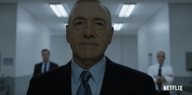
Central framing can give a subject tremendous power and dominance, particularly in combination with a low angle, as seen in the above examples from House of Cards (DP: David M. Dunlap) and Django Unchained (DP: Robert Richardson, ASC).
3. To suggest formality or rigidity
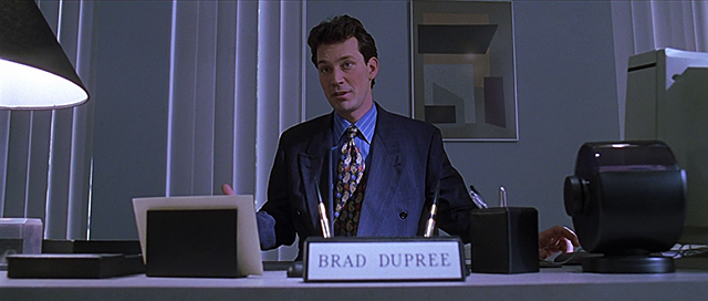
These scenes from American Beauty (DP: Conrad Hall, ASC) use central framing to emphasise the formality of Lester’s performance review, and the stilted, suffocating nature of his home life.
4. To create order
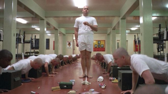
Kubrick used central framing with strong single-point perspective to create worlds of perfect order… so perfect that they would have to come crashing down sooner or later. The above examples are from Full Metal Jacket (DP: Douglas Milsome, BSC, ASC) and 2001: A Space Odyssey (DP: Geoffrey Unsworth, OBE, BSC).
This shot from The Matrix (DP: Bill Pope, ASC) also uses central framing to symbolise order, the calculatingly perfect order of the machines.
5. To suggest duality
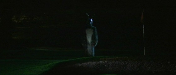
When you shoot a shot-reverse with both parties centred, the two characters appear to replace each other on screen every time you cut. This can suggest a strong connection between the characters, or a strong conflict as they battle for the same piece of screen. Donnie Darko (DP: Steven B. Poster, ASC, ICG) uses this technique to set up the antagonism of the rabbit, while also suggesting he’s a part of Donnie, a figment of his imagination.
6. For humour
Centre framing is of course a huge part of Wes Anderson’s style, as in The Life Aquatic with Steve Zissou and The Grand Budapest Hotel (DP: Robert Yeoman, ASC). But I don’t think it’s stylisation for stylisation’s sake; his movies all have the feeling of tall tales told by ageing relatives with the aid of a scrapbook full of dorky, posed photos. The symmetry helps create the dorkiness, and from thence – as Lee & Herring used to say – the humour arises. The same is true of this classic scene from Garden State (DP: Lawrence Sher, ASC).
7. For faster cutting
 Mad Max: Fury Road (DP: John Seale, ACS, ASC) was framed centrally in service of the editing. Director George Hill realised that if he put everyone in the same place in frame, the audience wouldn’t need to search the screen for the subject after every cut, allowing him to edit faster without making the action incomprehensible. See this post for more on the cinematography of Fury Road.
8. For impact
When used judiciously, central framing can have a big impact, giving a character their moment in the spotlight, putting them centre stage. It can underline a key character or story beat. The examples above are from Hugo (DP: Robert Richardson, ASC), Rogue One (DP: Greig Fraser, ACS, ASC) and American Beauty again.
9. To Break the fourth wall
And finally, if your subject is looking into the lens, addressing the audience, then central framing is the natural composition. It’s not the only composition though; often the subject will be framed to one side so we can see the action continuing in the background even as it is narrated to us. But if the shot is just about the narrator, often central framing will be the most effective, as in the above shots from Amélie (DP: Bruno Delbonnel, AFC, ASC) and A Series of Unfortunate Events (DP: Bernard Couture).


