5 Things Bob Ross Can Teach Us About Cinematography

I’m certainly glad you could join me today. It’s a fantastic day here and I hope it is wherever you’re at. Are you ready to read a fantastic little blog post? Good, then let’s get started.

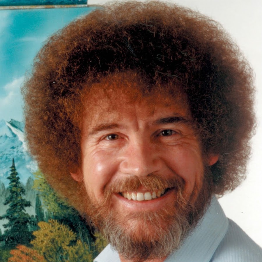
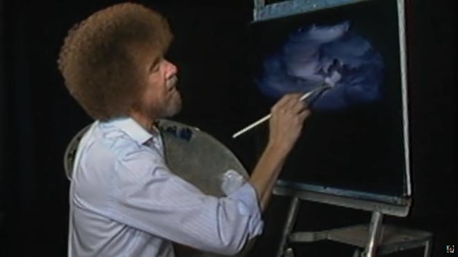
For twelve years, across 400 episodes, Bob Ross entertained all generations of Americans with his public access TV series, The Joy of Painting. Although he floated up to join the happy little clouds in 1995, in recent years YouTube and Twitch have brought his shows to a new audience, of which I am a humble member. Bob’s hypnotic, soft-spoken voice, his unfailingly positive attitude, and the magical effects of his wet-on-wet oil-painting technique make his series calming, comforting and captivating in equal measure.

Having watched every episode at least twice now, I’ve noticed several nuggets of Bob Ross wisdom that apply just as well to cinematography as they do to painting.


1. “The more plains you have in your painting, the more depth it has… and that’s what brings the happy buck.”

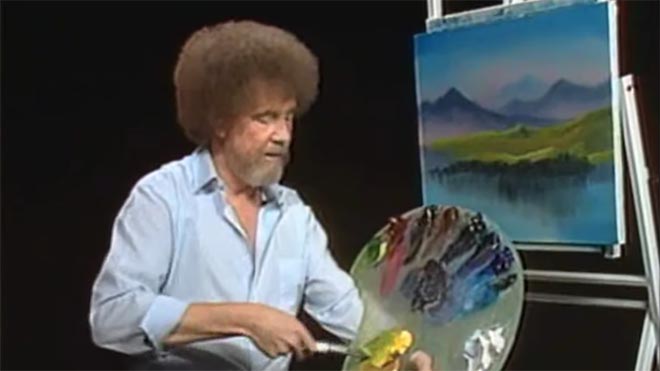
Bob always starts with the background of his scene and paints forward: first the sky with its happy little clouds; then often some almighty mountains; then the little footy hills; some trees way in the distance, barely more than scratches on the canvas; then perhaps a lake, its reflections springing forth impossibly from Bob’s brush; the near bank; and some detailed trees and bushes in the foreground, with a little path winding through them.

“Exile Incessant” (dir. James Reynolds)

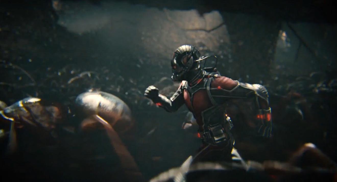
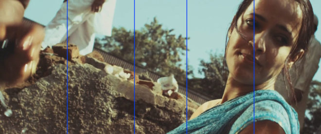
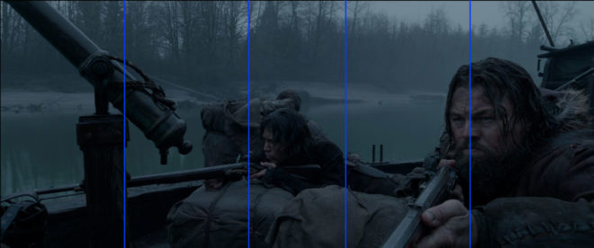
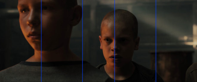
Just as with landscape painting, depth is tremendously important in cinematography. Creating a three-dimensional world with a monoscopic camera is a big part of a DP’s job, which starts with composition – shooting towards a window, for example, rather than a wall – and continues with lighting. Depth increases production value, which makes for a happy producer and a happy buck for you when you get hired again.


2. “As things get further away from you in a landscape, they get lighter in value.”

Regular Joy of Painting viewers soon notice that the more distant layers of Bob’s paintings use a lot more Titanium White than the closer ones. Bob frequently explains that each layer should be darker and more detailed than the one behind it, “and that’s what creates the illusion of depth”.

“The Gong Fu Connection” (dir. Ted Duran)

Distant objects seem lighter and less contrasty because of a phenomenon called aerial perspectivebasically atmospheric scattering of light. As a DP, you can simulate this by lighting deeper areas of your frame brightly, and keeping closer areas dark. This might be achieved by setting up a flag to provide negative fill to an object in the foreground, or by placing a battery-powered LED fixture at the end of a dark street. The technique works for night scenes and small interiors, just as well as daytime landscapes, even though aerial perspective would never occur there in real life. The viewer’s brain will subconsciously recognise the depth cue and appreciate the three-dimensionality of the set much more.


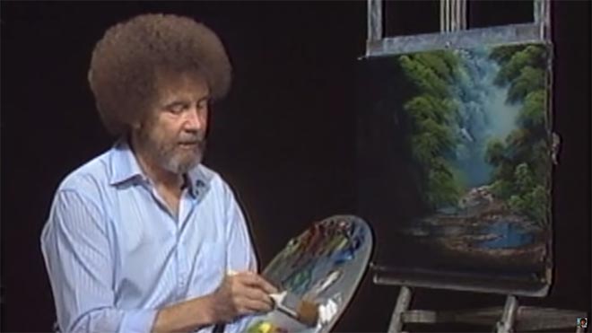
3. “Don’t kill the little misty area; that’s your separator.”

After completing each layer, particularly hills and mountains, Bob takes a clean, dry brush and taps gently along the bottom of it. This has a blurring and fading effect, giving the impression that the base of the layer is dissolving into mist. When he paints the next layer, he takes care to leave a little of this misty area showing behind it.

“Heretiks” (dir. Paul Hyett)

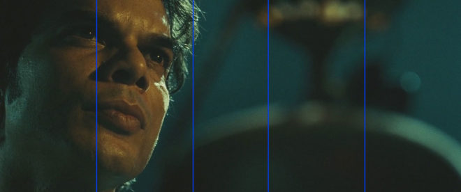
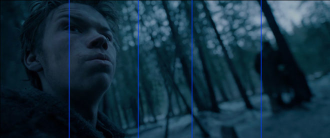
We DPs can add atmos (smoke) to a scene to create separation. Because there will be more atmos between the lens and a distant object than between the lens and a close object, it really aids the eye in identifying different plains. That makes the image both clearer and more aesthetically pleasing. Layers can also be separated with backlight, or a differentiation of tones or colours.


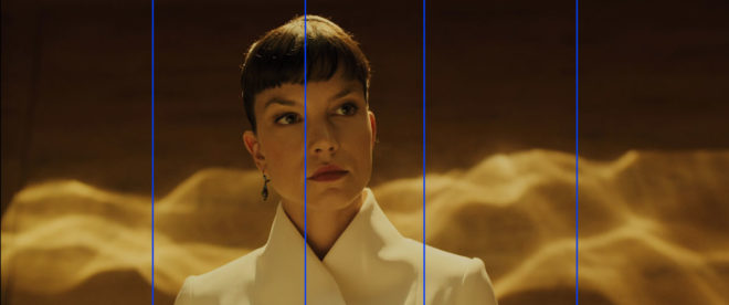
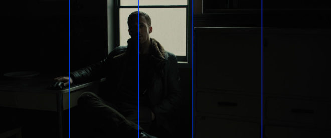
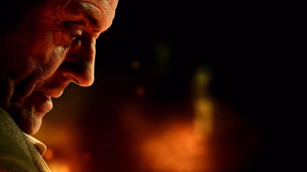
4. “You need the dark in order to show the light.”

Hinting at the tragedy in his own life, Bob often underlines the importance of playing dark tones against light ones. “It’s like in life. Gotta have a little sadness once in a while so you know when the good times come,” he wisely remarks, as he taps away at the canvas with his fan-brush, painting in the dark rear leaves of a tree. Then he moves onto the lighter foreground leaves, “but don’t kill your dark areas,” he cautions.

“Closer Each Day” promo (dir. Oliver Park)

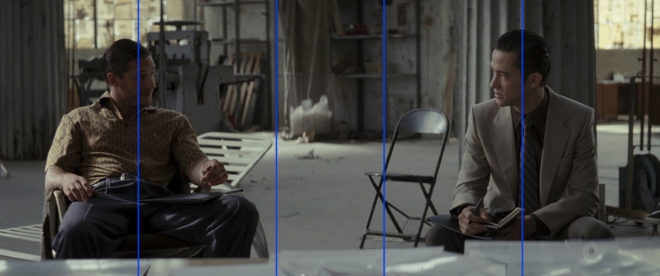
If there’s one thing that makes a cinematic image, it’s contrast. It can be very easy to over-light a scene, and it’s often a good idea to try turning a fixture or two off to see if the mood is improved. However bright or dark your scene is, where you don’t put light is just as important as where you do. Flagging a little natural light, blacking out a window, or removing the bubble from a practical can often add a nice bit of shape to the image.


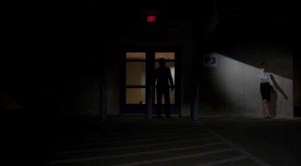
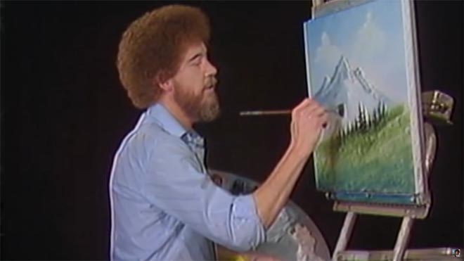
5. “Maybe… maybe… maybe… Let’s DROP in an almighty tree.”

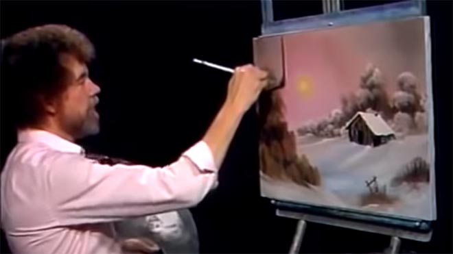
As the end of the episode approaches, and the painting seems complete, Bob has a habit of suddenly adding a big ol’ tree down one or both sides of the canvas. Since this covers up background layers that have been carefully constructed earlier in the show, Bob often gets letters complaining that he has spoilt a lovely painting. “Ruined!” is the knowing, light-hearted comment of the modern internet viewer.

“Synced” (dir. Devon Avery)

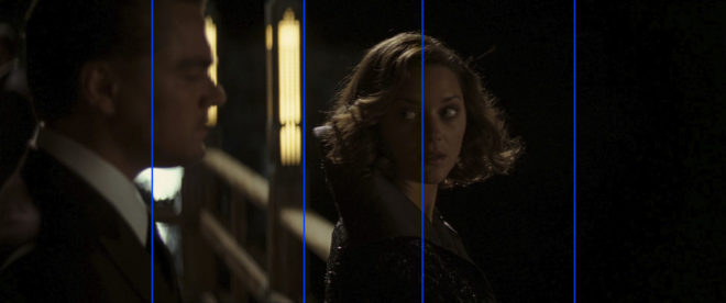
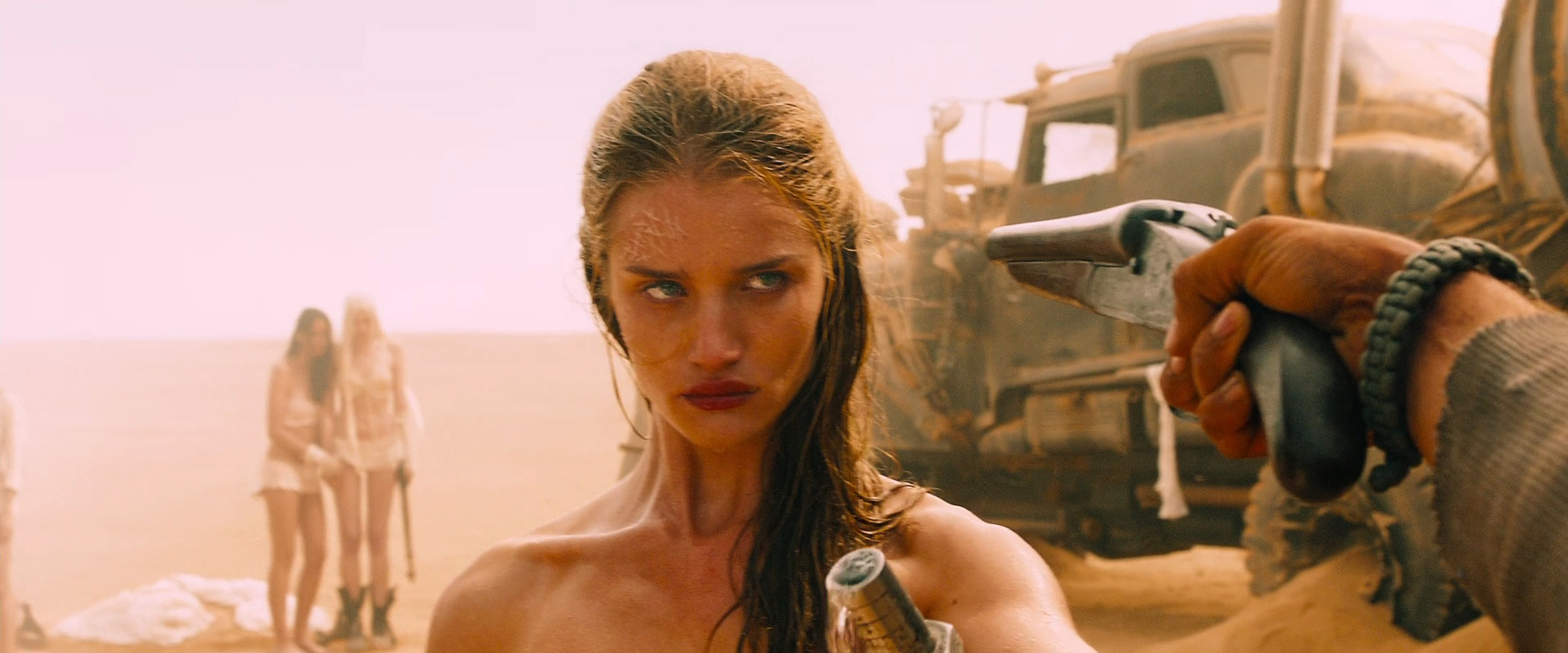
The function of these trees is to provide a foreground framing element which anchors the side of the image. I discussed this technique in my article on composing a wide shot. A solid, close object along the side or base of the frame makes the image much stronger. It gives a reason for the edge of the frame to be there rather than somewhere else. As DPs, we may not be able to just paint a tree in, but there’s often a fence, a pillar, a window frame, even a supporting artist that we can introduce to the foreground with a little tweaking of the camera position.

The ol’ clock on the wall tells me it’s time to go, so until next time: happy filming, and God bless, my friend.

If you’re keen to learn more about cinematography, don’t forget I have an in-depth course available on Udemy.

5 Things Bob Ross Can Teach Us About Cinematography

Where to Place Your Horizon

I once had an argument with a director about the composition of a wide shot. I wanted to put the horizon nearer the top of the frame than the bottom, and he felt that this was the wrong way around. In reality there is no right and wrong in composition, only a myriad of possibilities that are all valid and can all make your viewers feel different ways. In this article I will take a metaphorical ramble through these possibilities, and ponder their effects.

You would think that the most natural position for the horizon would be in the vertical centre of the frame. After all, in our day-to-day life, when we look straight ahead, this is where it appears to be.

In practice, a central horizon is not a popular choice. This article by Art Wolfe, for example, argues that it robs the image of dynamism, sending the eye straight to the horizon rather than letting it wander around the frame. The technique is also at odds with the Rule of Thirds, though as I’ve written before, that’s not a rule I place much stock in.

The talented photographer and vlogger Arian Vila, however, describes the merits of a central horizon when composing for a square aspect ratio. And this is an excellent reminder that the horizon does not exist in a vacuum; like anything else, it must be judged in the context of the aspect ratio and the other compositional elements of the frame.

For Leon Chambers’ Above the Clouds (out now on Amazon Prime and other platforms!), I placed the horizon centrally several times:

This was a deliberate echo of the painting “Above the Clouds” which appears in the film and provides the thematic backbone.

A year or two after shooting Clouds, I came across Photograms of the Year: 1949 in a charity shop. Amongst its pages I found another diptych, one created by the book designer rather than the two entirely separate photographers:

These two images, perfectly paired, demonstrate contrasting horizon placement. At Grey Dawn emphasises the sky by placing the horizon low in the frame, creating a sense of space. Meanwhile, Homeward Bound positions its horizon somewhere beyond the trees near the top of frame, drawing attention to the sand and the wheel ruts and indeed to the figures of the caravan itself, rather than to the destination or surroundings.

Horizon placement is closely tied to two other creative choices: headroom, which I dedicated a whole article to, and lens height, i.e. is this a low or a high angle? Even a GCSE media student can tell you that a low angle imbues power while a high angle implies vulnerability, but these are terms most applicable to closer shots. When we think of horizon placement we are probably concerned with big wides, where creating a mood for the scene or setting is more important than visualising a character’s power or lack thereof.

Breaking Bad is an example of a series that predominantly chooses low horizons to show off the big skies of its New Mexico locations. “[Showrunner] Vince [Gilligan] is a student of cinema and knows movies like the back of his hand,” says DP Michael Slovis, ASC. “It was always in his mind that this was a Western in the style of Sergio Leone and the Italian Neo-realists.”

Incidentally, there’s an amazing desert scene in the episode “Crawl Space” where a sunlit close-up cuts to a big wide. The wide holds as clouds roll over the sun. The action continues and the shot still holds, the line between sunlight and shade visible as it rolls away across the desert, until finally a new line slides under the camera and sun breaks over the actors once more. Only then are we permitted to see the scene up close again.

This creative choice, to set the character’s small concerns against the vast immutability of nature, comes from the same place as the choice to put the horizon low in frame.

Returning to Photograms of the Year: 1949, my eyes light upon another pair of contrasting images:

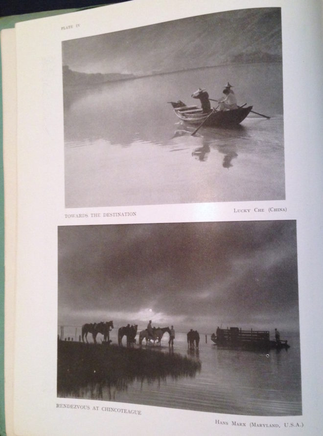
Despite its title, Towards the Destination shows us little of where the sailors are heading, by placing the horizon high in the frame and focusing on the water and the reflections therein. Rendezvous at Chincoteague, by placing its horizon low in the frame, radiates a feeling of isolation that is in contrast to the meeting of the title.

As we consider the figures in these photographs I am forced to concede that the argument I alluded to in the introduction may have been less about the position of the horizon and more about the position of the actor. I think the director felt that it was unnatural for an person to appear in the top half of the frame rather than the bottom half.

I can see his point. The vision of our naked eyes is definitely framed along the bottom by the ground, while the top remains open and unlimited – outdoors, at least. So if a person is standing on the ground, we naturally expect them to appear low down in an image.

But this – like nose room, the Rule of Thirds, the 180° Rule, short-key lighting, so many things in cinematography – is merely a guideline. There are times when it just isn’t helpful, when it can lead to wasted opportunities.

Here is a shot of mine from The Gong Fu Connection (dir. Ted Duran) where the horizon and the cast are placed in the upper half of frame:

Would it really have been better to frame them lower, losing out on the reflections and the foreround rushes, and gaining just empty sky? I think not. This composition was especially important to me, because the film’s titular connection is all about man and the natural world. By showing the water and greenery, we root the characters in it. A composition with more sky might have made them seem dwarfed by nature, lost in it.

This article has been something of a stream of consciousness, but the point I’m trying to make is this: always consider the content and meaning of your shot; reflecting those in your composition is infinitely more important than adhering to any guidelines.

If you enjoyed this, you may be interested in some of my other articles on composition:

Where to Place Your Horizon

Aspect Ratio and the Marvel Cinematic Universe

I used to be a casual follower of superhero films, until I was inducted into the Marvel Cinematic Universe via a movie marathon. Despite different directors for each instalment, the MCU has a fairly consistent look and feel, so I was a little surprised when we got to The Avengers to note that it differs visually in one significant way from all of its predecessors. Whereas the five previous films (and indeed most of the subsequent ones) were in the 2.39:1 aspect ratio, The Avengers was presented in the taller 1.85:1 ratio.

This initially struck me as counterintuitive. 2.39:1 was introduced in the 1950s to tempt watchers of the new-fangled TV back into the cinemas, and ever since then it has been associated with the biggest, most epic, most cinematic of movies. It seems like the natural choice for a superhero franchise, so it’s no surprise that the MCU adopted this ratio for most of its instalments. But if wider images mean a more epic movie, then surely The Avengers, the climax of Phase One and the coming-together of a whole team of superheroes, should be, if anything, even wider than its 2.39:1 predecessors?

“The Avengers” (2012, DP: Seamus McGarvey, BSC, ASC)

I’m certainly not the first person to be nonplussed by the choice. A quick google later on threw up plenty of forums where fans complained that The Avengers was “not cinematic enough” because of its aspect ratio. Some linked the choice of ratio to director Joss Whedon’s TV background, claiming he was more comfortable with that shape of frame.

The real reason for Whedon’s decision became clear as the action ramped up into the third act. The battle of New York is not a two-dimensional conflict; Thor and Iron Man are flying around, the Hulk climbs up buildings, the Chitauri ships float above the streets, and Stark Tower plays a key part in the action. The extra frame height of 1.85 was essential to tell that story.

“I wanted to feel the space around us, and use wider lenses,” said Whedon. “That’s why I went 1.85 instead of wider. In IMAX, I wanted it to fill your eyeball completely.”

“Ant-Man” (2015, DP: Russell Carpenter, ASC)

Continuing the movie marathon, the MCU does not return to 1.85 until Ant-Man, and director Peyton Reed initially encountered resistance from the studio when he advocated this ratio. “It’s a big conversation because it affects production design. It affects everything. And it felt to me… that shrinking was a vertical act and it was going to serve the movie even more. And I had to make a case for the fact that it was still going to be epic.”

I wonder if the days of wider aspect ratios being perceived as more epic are numbered. IMAX sequences are becoming more and more common in blockbusters, including the Marvel films. Digital IMAX has an aspect ratio of 1.90:1, very similar to the 1.85 which is so often perceived as the small-scale, poor man’s ratio. (To confuse matters, the 1.90 sequences are often cropped to 2.39 for ordinary cinemas and home entertainment release.) An epic feel is very much what the IMAX brand is selling, so the traditional perception is being turned on its head. Both Avengers: Infinity War and the recent Endgame were shot entirely in Imax 1.90:1, and are sure to be the very definition of epic for a while to come.

Things seem to be going the same way over in the DC universe too. On the social media platform Vevo, director Zak Snyder had this to say about Batman v. Superman and Justice League: “I had so much fun shooting the IMAX sections of my movie (BvS) [that I] sort of fell in love with that giant less rectangular aspect ratio and so that’s why I shot JL 1:85”.

Image size may have something to do with this shifting trend. After all, a larger image is surely more epic than a smaller one. In theory, 2.39 should result in the largest image, with curtains or masks at the sides of a cinema screen opening up for these widescreen presentations. In practice though, many smaller multiplex auditoria mask the top and bottom of their screens for 2.39, making for a smaller overall image than 1.85, just like when you watch 2.39 content at home on your TV or monitor (which is 1.78:1). My local multiplex recently converted its largest auditorium to IMAX, which involved no change to the width of the screen, but an increase in height.

Add to this the fact that 2.39 overtook 1.85 as the most common aspect ratio for top-grossing films over a decade ago, and it’s small wonder that filmmakers seeking to make their work stand out from the crowd are turning to taller frames.

“Avengers: Infinity War” (2018, DP: Trent Opaloch)

However the trend of aspect ratios ends up going, it’s important to remember that there’s no wrong or right. I’ve done jobs where directors have told me, “It’s a movie, it’s got to be 2.39,” or, “It’s a series, it’s got to be 1.78,” but there is always a choice. Are your sets tall or wide? Are your lead characters similar or dissimilar in height? Are landscapes or body language most important to this story? It’s factors like these that should really determine the best ratio for your movie, just as Whedon and Reed both realised.

See also:

Aspect Ratio and the Marvel Cinematic Universe

Is the Rule of Thirds Right for 2.39:1?

The Rule of Thirds is the most well-known guide for framing an image. Simply imagine the frame divided into equal horizontal and vertical thirds – or don’t even bother imagining, just turn on your camera’s built-in overlay – and place your subject on one of those lines to get a pleasantly composed picture every time. Some filmmakers believe in the Rule so much that they refuse to even consider any other type of composition.

The Rule of Thirds in action on “The Aviator” (2004, DP: Robert Richardson, ASC), winner of the 2005 Best Cinematography Oscar

As I’ve previously written, I find the Rule of Thirds grossly overrated. In particular, when composing for a widescreen aspect ratio like Scope (CinemaScope, i.e.. 2.39:1), the Rule often doesn’t work for me at all.

In this post I’m going to look at an alternative compositional technique, but first let’s step back and find out where the Rule of Thirds actually comes from and why it’s so popular.


Origins of the Rule of Thirds

The first known appearance of the term “Rule of Thirds” is in a 1797 treatise Remarks on Rural Scenery by the English painter John Thomas Smith. It seems he read too much into a simple statement by fellow artist Sir Joshua Reynolds to the effect that, if a picture has two clear areas of differing brightness, one should be bigger than the other. Hardly a robust and auspicious start for a rule that dominates the teaching and discussion of composition today.

I suspect that the Rule has gained strength over the last two centuries from the fact that it encourages novice painters, designers and photographers to overcome their natural tendency to frame everything centrally. Another factor in the Rule’s ubiquity is undoubtedly its similarity to a much older and more reasoned rule: the Golden Ratio.


The Golden Ratio and the Phi Grid

A mathematical concept that’s been around since the time of the ancient Greeks, the Golden Ratio is approximately 1.6:1. It’s a special ratio because if you add the two numbers together, 1.6+1, you get 2.6, and 2.6:1.6 turns out to be, when boiled down, the same ratio you started with, 1.6:1.

Wikipedia puts it this way:

Two quantities are in the Golden Ratio if their ratio is the same as the ratio of their sum to the larger of the two quantities.

It’s difficult to get your head around, I know!

The Golden Ratio is found in nature, in the spiral leaves of some plants for example, and even in certain crystals at the atomic level. There is a long history of artists believing that using the Ratio produces a more aesthetically pleasing image.

The Golden Ratio is most simply applied to composition in the form of a Phi Grid, which resembles a Rule of Thirds grid, but in different proportions, namely 1.6:1:1.6 rather than 1:1:1.

Andrew Lesnie, ACS, ASC applies the Phi Grid – though not necessarily deliberately – to “The Lord of the Rings: The Two Towers”

The Rule of Thirds and the Phi Grid both feel quite limiting in Scope because out of all that horizontal space you’ve only got two vertical lines to place your subject on. There is another technique though, one which provides more options.


The Squares within the rectangle

In his book The Mind of the Photographer, Michael Freeman writes about a composition guideline which dates back to the Middle Ages. You imagine two squares, the same height as the frame, and aligned with either side of the frame, then place your subject on the centre or inner edge of one of these squares.

Applied to a Scope frame it looks like this:

We can simplify it down to this:

When I first read about this technique, it really chimed with me. I’ve long believed that a “Rule of Fifths” would be a more effective guide for Scope composition than the Rule of Thirds, and the above diagram isn’t far away from fifths.

Below I’ve overlaid this grid on a few shots from Scope movies that won Best Cinematography Oscars: There Will Be Blood (DP: Robert Elswit, ASC), Slumdog Millionaire (Anthony Dod Mantle, DFF, ASC, BSC), Inception (Wally Pfister, ASC), The Revenant (Emmanuel Lubezki, ASC, AMC) and Blade Runner 2049 (Roger Deakins, CBE, ASC, BSC).

Let me provide a disclaimer first, though. You could draw any grid you wanted and find some shots from movies that matched it. The purpose of this article is not to convince you to ditch the Rule of Thirds and start following this “rule of squares within a rectangle” instead. (For a start, that name is never going to catch on.) This “rule” chimes with me because it’s similar to the way that I was already instinctively composing, but if it doesn’t work for you then don’t use it. Develop your own eye. It’s a creative medium, so compose creatively, not like a robot programmed with simple rules.

I’ll leave you with this quote from the great photographer Ansel Adams:

The so-called rules of photographic composition are, in my opinion, invalid, irrelevant and immaterial.

See also:

And if you want to read a thorough debunking of the Rule of Thirds, check out this article on Pro Video Coalition.

Is the Rule of Thirds Right for 2.39:1?

#ShotOfTheWeek: 2017 Round-up

At the end of last summer I started a regular #ShotOfTheWeek on my Twitter feed. It’s very simple: each week I post a frame grab (or sometimes a GIF if I can find one) of a great shot from a film or series I’ve been watching. Sometimes these are new productions, just out, and sometimes they’re older pieces which I’m revisiting or viewing for the first time.

For those of you who aren’t among the Twitterati, here is a round-up of last year’s Shots of the Week. On the other hand, if you are a Twitterist, why not post your own inspirational frame grabs, using the hashtag #ShotOfTheWeek?


Powerful Close-ups

Cinema is arguably at its most potent  when showing us the tiny nuances of emotion that only a big close-up can provide.

“Anne with an E” DP: Bobby Shore

This example from the moving Netflix series Anne with an E makes the most of Anne’s freckled face and puts us right in her headspace… literally. Shots like this were captured with a 27mm Primo, as opposed to the vintage Panavision glass used for other coverage. For more on the cinematography of Anne with an E, check out the Varicam section in my report from Camerimage 2017.

“Black Narcissus” DP: Jack Cardiff

I love the shadows in this shot by legendary DP Jack Cardiff; they almost suggest a crucifix or prison bars. Either would be appropriate for this story of a nun sent to a remote Indian palace to establish a school and hospital. The low-angle eye-light adds to the unsettling feel.

“The Crown” DP: Stuart Howell

The key promotional art for The Crown is an edge-lit profile shot of the Queen, evoking the regal image on stamps and coins. Here DP Stuart Howell has paid homage to the artwork, channelling the same connotations of a figurehead carrying a country on her shoulders.

“American Gods” DP: Aaron Morton

What can I say? I’m a sucker for a good profile shot. The hellish colours here are perfect given what the erstwhile Lovejoy has just done. (I won’t give you any spoilers, but let’s just say it doesn’t involve cheeky antiques dealing.)


Symbolism

“The Handmaid’s Tale” DP: Colin Watkinson

This was the shot that inspired me to start #ShotOfTheWeek. The Handmaid’s Tale is set in a Christian fundamentalist society, so evoking classical religious paintings with the angel-wing-like headboard and the muted, brown colour scheme was a clever move.

“The Ipcress File” DP: Otto Heller

This classic spy thriller has a lot of unusual compositions with domineering foreground objects. Here the cross and circle shapes of the light-shade suggest the crosshairs of a gun, while the bulb tastefully obscures the actual bullet wound.

“Mr Robot” DP: Tod Campbell

This one is almost too on-the-nose to be called symbolism. Only a drama as quirky as Mr Robot could get away with this kind of (literal) signposting, but I love how bold it is. The rigid geometric lines and excessive headroom used throughout the series are also in evidence here, reflecting how we’re seeing everything from Elliot’s mentally ill point of view.


Negative Space

“Mission: Impossible – Rogue Nation” DP: Robert Elswit

A forgettable film, but a shot with much to admire. The dark back of the bench creates negative space in the composition, reducing the already-wide Scope frame to a ratio of about 4:1, echoing the short, wide shape of the House of Commons. On the lighting front, negative fill has been employed to render both that bench and the cast very dark, almost silhouettes, imparting a lot of depth to an otherwise flat image.

“Stranger Things” DP: Tim Ives

Again, negative space here creates a geometrical frame within a frame. What I particularly liked was the placement of the bulb above the sheriff’s head, rather than on the right of frame, which would have produced a more balanced but much less interesting shot.

“Better Call Saul” DP: Arthur Albert

Every time Better Call Saul returned to this location I scanned the background of each angle, trying to figure out what on earth could be motivating the bold slash of light on the right of this image. It remains a mystery! The show is full of uncompromisingly dark images with crisp, pure blacks, but perhaps none so overtly noirish as this one.


Intersecting Lines

“Metropolis” DPs: Karl Freund, Günther Rittau & Walter Ruttmann

All credit to Otto Hunte, the production designer on this 1920s sci-fi classic, as every line in this set leads us to the figure of Maria, fittingly for a character who has captured the imaginations of the dystopian underclass. The cinematographers have helped by framing her centrally and making her the brightest part of the image.

“Jardin d’hiver” DP: Darius Khondji

Jardin d’hiver was sponsored by CW Sonderoptic to promote their new large-format Leica Thalia glass (see my Camerimage post for more info). I have to admit that most of the film’s imagery did nothing for me, but this shot of bold, contrasty lines softened by the milkiness of the foreground window has a graphical quality I find very appealing.

“Little Miss Sunshine” DP: Tim Suhrstedt

This is a shot of two halves: the upper half busy, confused and oppressive, the lower half reassuringly simple with its one-point perspective. It was only after filming wrapped on Above the Clouds that I realised just how much this shot and others like it in Little Miss Sunshine had influenced my cinematography of Leon Chambers’ comedy road movie. (Check out the second still on the Above the Clouds page and you’ll see what I mean!)


Iconic Reveals

“The 39 Steps” (1935) DP: Bernard Knowles

Richard Hannay and the audience both discover the cause of Annabella’s distress simultaneously, in a reveal that’s shocking and also funny! The chiaroscuro of the lighting beautifully highlights the bright knife against the deep shadows of the background.

“Terminator 2: Judgment Day” DP: Adam Greenberg

These two gifs are both parts of the same shot, which cranes up from the shockingly unexpected crushing of the skull to reveal the endoskeleton puppet in mid-shot as a perfectly timed explosion goes off in the background. As well as being a remarkable technical achievement, the arts and sciences of cinematography, practical effects and animatronics all working in harmony, it’s a great piece of visual storytelling.


And finally…

“A Ghost Story” DP: Andrew Droz Palermo

A Ghost Story didn’t get a very wide release, and won’t be to everyone’s taste. A lyrical meditation on the nature of time, its slow pace becomes glacial during a grief-filled, ten-minute pie-eating scene containing only one cut. There is plenty of time to consider the composition, and I loved how casually the ghost is placed within the frame, with the top of his head even cut off. (I later discovered he was composited in, to reduce the chances of anything spoiling the ultra-long, ultra-emotional take.) The lines of the cupboards lead our eyes always back to Rooney Mara, the painterly splash of light on the wall (which I believe was natural) throwing her profile into relief. When she starts to cry, it takes a while to spot the tears, but somehow that makes it all the more powerful.

It’s interesting to note that no fewer than four aspect ratios are represented by all these Shots of the Week: from the traditional Academy ratio of 4:3, through the standard 16:9, to the Netflix-favoured 2:1 and of course 2.39:1 Cinemascope. It’s an exciting time to be working in cinematography, when we have so many choices open to us to create the most fitting images for any given story. Here’s to many more inspiring #ShotOfTheWeek images in 2018. Follow me on Twitter to see them first!

#ShotOfTheWeek: 2017 Round-up

8 Ways “Barry Lyndon” Emulates Paintings

Stanley Kubrick’s 1975 period epic Barry Lyndon, although indifferently received upon its original release, is considered a masterpiece by many today. This is largely due to its painterly photography with strong, precisely composed frames that leave the viewer feeling more like they’ve wandered through an art gallery than watched a movie. Today I’m going to look at eight methods that Kubrick and his team used to create this feel. It’s an excellent example of how a director with a strong vision can use the many aspects of filmmaking to realise that vision.


1. Storytelling

The American Cinematographer article on Barry Lyndon notes that “Kubrick has taken a basically talky novel and magically transformed it into an intensely visual film.” You have only to look at a series of frame-grabs from the movie to see just how much of the story is contained in the images. Just like a painter, Kubrick reveals a wealth of narrative within a single frame. The shot above, for example, while recalling the landscapes of artists like Constable in its background and composition, also clearly tells the story of a courtship threatened by a third party with violent designs.


2. Design

Kubrick was keen for Lyndon to feature the type of rich fabrics which are often seen in 18th century art. He referred costume designer Milena Canonero to various painters of the period. “Stanley wanted beautiful materials,” she recalls in the documentary Stanley Kubrick: A Life in Pictures, “because as he quite rightly said, that’s why in those paintings they gave that wonderful light.”


3. Aspect ratio

There was much confusion and controversy surrounding Kubrick’s intended ratio for Lyndon. The negative was apparently hard-masked to 1.6:1, with the result that VHS and DVDs used this ratio, while the images were vertically cropped to 1.78:1 for the later Blu-ray release. However, the discovery in 2011 of a letter from Kubrick to cinema projectionists finally proved that 1.66:1 was the ratio he wanted audiences to see the film in.

1.66:1 was a standard ratio in parts of Europe, but unusual in the UK and USA. It’s not far off the golden ratio (1.6180:1) – a mathematically significant ratio which some artists believe to be aesthetically pleasing. There is evidence that Kubrick was not a fan of wide aspect ratios in general, perhaps because of his background as a photographer, but it can be no coincidence that Lyndon distances itself from the cinematic ratios of 1.85 and 2.39, and instead takes a shape closer to that of a typical painting.

(Most of the images in this post come from Evan Richards’ Cinematographers Index, and he in turn grabbed them from the 1.78:1 Blu-ray. The image above is in 1.66:1 but shows the 1.78:1 crop-lines.)


4. Composition

“The actual compositions of our setups were very authentic to the drawings of the period,” says DP John Alcott, BSC in his interview with American Cinematographer. Perhaps the film’s most obvious compositional nod to classical art is the large amount of headroom seen in the wide shots. As this article by Art Adams explains, the concept of placing the subject’s head at the top of the frame is fairly new in the history of image creation. Plenty of traditional art includes lots of headroom, and Lyndon does the same.


5. Camera movement

There is little camera movement in Barry Lyndon, but there are 36 zoom shots. Unlike a physical dolly move, in which the parallax effect causes different planes of the image to shrink or enlarge at differing rates, a zoom merely magnifies or reduces the whole image as a single element. This of course only serves to enhance the impression of a two-dimensional piece of art. In fact, the zooms resemble nothing so much as the rostrum camera moves a documentary filmmaker might make across a painting – what today we’d call a Ken Burns effect.

It’s interesting to note that, although Barry Lyndon is famous for its fast lenses – the f/0.7 Zeiss Planar primes – the movie also used a very slow lens, a custom-built T9 24-480mm zoom. From various accounts, other zooms used seem to include a Cooke T3.1 20-100mm and possibly a 25-250mm of some description. Of course, none of the zoom lenses were anywhere near fast enough for the candlelit scenes, so in those instances the filmmakers were forced to use a Planar and pull back physically on a dolly.


6. Lighting

“In preparation for Barry Lyndon we studied the lighting effects achieved in the paintings of the Dutch masters,” Alcott says. “In most instances we were trying to create the feeling of natural light within the houses, mostly stately homes, that we used as shooting locations.”  The DP closely observed how natural light would come in through the windows and emulate that using diffused mini-brutes outside. This made it possible to shoot long days during the British winter when natural light was in short supply. Last week I covered in detail the technical innovations which allowed Alcott and Kubrick to shoot night scenes with just genuine candlelight, as 18th century painters would have seen and depicted them.


7. Contrast

Film stock in the seventies was quite contrasty, so Alcott employed a few methods to adjust his images to a tonal range more in keeping with 18th century paintings. He used a Tiffen No. 3 Low Contrast Filter at all times, with an additional brown net for the wedding scene “where I wanted to control the highlights on the faces a bit more,” he explains. He also used graduated ND filters (as in the above frame) both outdoors and indoors, if one side of the room was too bright. Most interestingly, he even went so far as to cover white fireplaces and doorways with fine black nets – not on the lens but on the objects themselves.


8. Blocking

The blocking in Barry Lyndon is often static. While this is certainly a creative decision by Kubrick, again recalling painted canvases and their frozen figures, it was also technically necessary in the candlelit scenes. Whenever the f/0.7 lenses were in use, the cast were apparently instructed to move as little as possible, to prevent them going out of focus. As one YouTube commenter points out, the stillness imposed by these lenses mirrors the stillness required of a painter’s model.

8 Ways “Barry Lyndon” Emulates Paintings

9 Uses for Central Framing

A couple of weeks ago I wrote a post on lead room, the amount of horizontal space the subject is given in front of them in the frame. Commonly the subject is placed to one side or the other, but there can be times when sitting that actor bang in the middle of the screen is most appropriate and effective. Here are some reasons you might want to do it.


1. To show immersion in the environment

When you surround a character with equal amounts of the background on both sides, you embed them into that background, creating a strong connection between them and their environment. This can be seen to great effect in the above frames from Road to Perdition and Butch Cassidy and the Sundance Kid (DP: Conrad Hall, ASC) and The Revenant (DP: Emmanuel Lubezki, ASC, AMC).


2. To create power

Central framing can give a subject tremendous power and dominance, particularly in combination with a low angle, as seen in the above examples from House of Cards (DP: David M. Dunlap) and Django Unchained (DP: Robert Richardson, ASC).


3. To suggest formality or rigidity

These scenes from American Beauty (DP: Conrad Hall, ASC) use central framing to emphasise the formality of Lester’s performance review, and the stilted, suffocating nature of his home life.


4. To create order

Kubrick used central framing with strong single-point perspective to create worlds of perfect order… so perfect that they would have to come crashing down sooner or later. The above examples are from Full Metal Jacket (DP: Douglas Milsome, BSC, ASC) and 2001: A Space Odyssey (DP: Geoffrey Unsworth, OBE, BSC).

This shot from The Matrix (DP: Bill Pope, ASC) also uses central framing to symbolise order, the calculatingly perfect order of the machines.


5. To suggest duality

When you shoot a shot-reverse with both parties centred, the two characters appear to replace each other on screen every time you cut. This can suggest a strong connection between the characters, or a strong conflict as they battle for the same piece of screen. Donnie Darko (DP: Steven B. Poster, ASC, ICG) uses this technique to set up the antagonism of the rabbit, while also suggesting he’s a part of Donnie, a figment of his imagination.


6. For humour

Centre framing is of course a huge part of Wes Anderson’s style, as in The Life Aquatic with Steve Zissou and The Grand Budapest Hotel (DP: Robert Yeoman, ASC). But I don’t think it’s stylisation for stylisation’s sake; his movies all have the feeling of tall tales told by ageing relatives with the aid of a scrapbook full of dorky, posed photos. The symmetry helps create the dorkiness, and from thence – as Lee & Herring used to say – the humour arises. The same is true of this classic scene from Garden State (DP: Lawrence Sher, ASC).


7. For faster cutting

Mad Max: Fury Road (DP: John Seale, ACS, ASC) was framed centrally in service of the editing. Director George Hill realised that if he put everyone in the same place in frame, the audience wouldn’t need to search the screen for the subject after every cut, allowing him to edit faster without making the action incomprehensible. See this post for more on the cinematography of Fury Road.


8. For impact

When used judiciously, central framing can have a big impact, giving a character their moment in the spotlight, putting them centre stage. It can underline a key character or story beat. The examples above are from Hugo (DP: Robert Richardson, ASC), Rogue One (DP: Greig Fraser, ACS, ASC) and American Beauty again.


9. To Break the fourth wall

And finally, if your subject is looking into the lens, addressing the audience, then central framing is the natural composition. It’s not the only composition though; often the subject will be framed to one side so we can see the action continuing in the background even as it is narrated to us. But if the shot is just about the narrator, often central framing will be the most effective, as in the above shots from Amélie (DP: Bruno Delbonnel, AFC, ASC) and A Series of Unfortunate Events (DP: Bernard Couture).

9 Uses for Central Framing

The 2:1 Aspect Ratio

Last autumn I wrote a post about aspect ratio, covering the three main ratios in use today: 16:9, 1.85:1 and 2.39:1. The post briefly mentioned a few non-standard ratios, including 2:1. Since then, I’ve noticed this ratio popping up all over the place. Could it be on its way to becoming a standard?

Today I’ll give you a little background on this ratio, followed by a gallery of frame grabs from 2:1 productions. The aim is simply to raise awareness of this new(ish) tool in the aspect ratio toolkit. As ever, it’s up to the director and DP to decide whether their particular project is right for this, or any other, ratio. However, I would caution low-budget filmmakers against picking what is still not a common ratio without considering that smaller distribution companies may crop your work to a more standard ratio either because of convenience or negligence.

Woody Allen and Vittorio Storaro shooting Café Society

Vittorio Storaro, ASC, AIC – the highly-regarded cinematographer of Last Tango in Paris and Apocalypse Now amongst many others – began championing the 2:1 ratio around the turn of the millennium. It was one of the most complicated times in the history of aspect ratios. The horror of pan-and-scan (butchering a movie to fit its 1.85:1 or 2.39:1 ratio into 4:3 without bars) was starting to recede with the introduction of DVD, which was in fact still 4:3 but could contain squeezed 16:9 content. Widescreen television sets were starting to build in popularity, but some programmes and films were being broadcast in the middle-ground ratio of 14:9 so as not to offend the majority of viewers who still had 4:3 sets. And Storaro recognised that HD would soon supplant celluloid as the primary capture and exhibition method for cinema, likely bringing with it fresh aspect ratio nightmares.

Storaro proposed “Univisium”, a 2:1 aspect ratio that fell between the two cinema standards of 1.85:1 and 2.39:1. It was a compromise, designed to make everyone’s life easier, to produce images that would need only minor letterboxing no matter where or how they were screened. However, the industry did not share his vision, and until recently 2:1 productions were relatively rare, most of them lensed by Storaro himself, such as Frank Herbert’s Dune, Exorcist: The Beginning and Storaro’s first digital picture, Café Society.

John Schwartzman shooting Jurassic World

Perhaps the biggest 2:1 movie to date is Jurassic World. DP John Schwartzman, ASC wanted to shoot anamorphic 2.39:1, while Steven Spielberg, exec producing, advocated 1.85:1 (like his original Jurassic Park) to provide more height for the dinosaurs. 2:1 was arrived at, again, as a compromise.

And compromise is likely what has driven the recent explosion in 2:1 material – not in the cinema, but online. Recent shows produced in this ratio include The Crown, A Series of Unfortunate Events, Stranger Things and House of Cards on Netflix, and Transparent on Amazon. I expect the producers of these series were looking to give their audience a more cinematic experience without putting off those who dislike big black bars on their screen, not unlike the reasoning behind the 14:9 broadcasts in the noughties.

2:1 may be a ratio born out of compromise, but then so was 16:9 (invented by SMPTE in the early eighties as a halfway house between 2.35:1 and  4:3). It certainly doesn’t mean that shooting in 2:1 isn’t a valid creative choice. Perhaps its most interesting attribute is its lack of baggage; 16:9 is sometimes seen as “the TV ratio” and 2.39:1 as “the big movie ratio”, but 2:1 has no such associations. One day perhaps it may be thought of as “the streaming ratio”, but for now it is simply something other.

Anyway, enough of the history and theory. Here are some examples of the cinematography that can be achieved in 2:1.


Cafe Society

DP: Vittorio Storaro, ASC, AIC


Jurassic World

DP: John Schwartzman, ASC


House of Cards

Season 5 DP: David M. Dunlap


Stranger Things

Season 1 DP: Tim Ives


The Crown

Season 1 DPs: Adriano Goldman, ASC, ABC & Ole Bratt Birkeland


Broadchurch

Season 3 DP: Carlos Catalan


A Series of Unfortunate Events

Season 1 DP: Bernard Couture

The 2:1 Aspect Ratio

Lead Room, Nose Room or Looking Space

Like headroom, last week’s topic, lead room is one of the first concepts we are introduced to when we begin learning camera operation. And like headroom, it’s a rule that’s made to be broken. If a character is looking screen-left, certainly it’s most common to place them on the right of frame – giving them lead room (a.k.a. nose room or looking space) on the left, but that is not the only option. In certain situations it’s more appropriate, or simply more aesthetically pleasing, to place them on the left, or in the centre. And although The Rule of Thirds suggests how far to the left or right they will commonly be placed (a third, or two-thirds of the way across the frame) it is, again, far from the only option.

Below I’ve compiled a spectrum of lead room: a series of examples showing the whole range of horizontal positions within a frame where a subject could be placed. (Note: I’ve flopped some of the images to maintain the screen direction.) All of these examples are from 1.78:1 or 1.85:1 productions, but of course with the 2.39:1 Cinemascope format there is an even greater range of options. On the righthand side, to aid comparison, I’ve placed different crops of the same photo (by Richard Unger).

No composition is fixed in motion picture production. Actors move around, miss their marks; it’s difficult for a DP to be precise about where the subject appears in the shot, so reading a particular intention into an individual frame is dangerous. But if, within a film, there is a trend of characters, or a specific character, being placed in one particular part of the frame, then it’s fair to assume that the filmmakers were deliberately trying to create a particular effect.

With that in mind, the thoughts below are not intended to analyse why that specific shot in that specific production was composed the way it was, but rather to consider in general terms what meanings and emotions that kind of composition might convey.


“Carol” (DP: Edward Lachman)

This is the maximum lead room you can give an actor in 1.85:1 without cutting off part of their head (which you may want to do in certain extreme circumstances, but that’s a subject for another post). This is someone backed into a corner, isolated. They have full cognisance of their situation – they can see it all in front of them. What you choose to place on the other side of frame is very important with an extreme composition like this. Negative space, as in the above example, creates an unbalanced frame, suggesting someone in a precarious situation, whereas another person or object would appear to dominate the subject.


“Atonement” (DP: Seamus McGarvey)

This is widely considered to be the ideal framing, with the subject placed according to The Rule of Thirds. Assuming that Keira is looking at another actor here, and that that actor’s single is framed with him in the left half of frame, the brain can comfortably merge the two shots into one, creating – subconsciously – a split-screen like a phone conversation in an old sitcom. The shot-reverse will be pleasingly balanced, and no tension will be created – at least not by the lead room.


“Fargo” (DP: Roger Deakins)

On more than one occasion I’ve tried to frame a shot like this, only to be told by the director that the subject is “too close to the centre”, it’s “wrong” and the subject must be placed on a third. What I should have done is shown them this frame, said, “If it’s good enough for Roger Deakins….” and then coughed in a way that sounded suspiciously like “thirteen Oscar nominations”. What’s interesting about this composition is the visual tension it creates when edited with the reverse. If the other actor is similarly close to the centre, their images start to overlap, almost like they’re duking it out, and if the other actor is placed further from the centre, they will seem trapped by their interlocutor. Or maybe composing the shot this way sometimes just allows for the best range of movement from the actor and the most pleasing frame.


“Lost in Translation” (DP: Lance Acord)

Placing someone in the centre of frame can be very powerful. It suggests someone in control, balanced, dominant. Now of course, that is not at all an accurate description of Bill Murray’s character in Lost in Translation. But notice that big, bright practical light so close to his head; it completely unbalances the composition. This just goes to show that the subject’s   position relative to background elements can be of equal or greater importance to their position within the frame. I aim to do a whole post about centre-framing in the near future.


“Hugo” (DP: Robert Richardson)

Although short-sided, the boy still has some lead room, in fact an amount of lead room that would be perfectly normal in a 4:3 composition. Personally, I would be comfortable with this composition for purely aesthetic reasons, but it could also be used to create some visual tension, suggesting things unknown behind the subject, waiting to creep up on them figuratively or literally. It could also suggest the character is weak, particularly if intercut with another character who is more traditionally framed.


“Les Miserables” (DP: Danny Cohen)

Now we are into territory that many will find uncomfortable. A character short-sided like this may seem unbalanced, lost, trapped, wrong-footed or isolated. Or they might simply be deep in thought;  you can easily imagine another character entering in the background of the above frame, breaking Crowe’s reverie, restoring the compositional balance and turning it into a deep two-shot.


“Mr. Robot” (DP: Tod Campbell)

Imagine someone walking into a room and standing right up against the wall, facing it. You would think them strange, disturbed. You might wonder if they were looking at something imaginary. This is the effect created by extreme short-siding. It also serves to make the subject look completely alone, even though they might be speaking to someone just inches in front of them. Mr. Robot is the only place I’ve ever seen composition this unusual, though I’m sure there are other examples out there.


Next time you watch a film or a TV show, pay attention to the lead room. You may be surprised to find that non-standard compositions are employed more often than you thought.

Thanks again to evanrichards.com, where I found most of the frame grabs.

Lead Room, Nose Room or Looking Space

Headroom

One of the first things that amateur photographers and cinematographers are taught is  “correct” headroom. Don’t put people’s heads in the middle of the frame, we’re told, but at the top. Rules are made to be broken though, and here are three examples of beautiful cinematography which do just that.


Broadchurch

“A town wrapped in secrets” is the tag-line of this critically-acclaimed ITV detective serial. In classic murder mystery fashion, every character is hiding something, causing suspicion to rest on each of them for a little while until the the person hiding the right secret is found.

David Tennant’s DI Alec Hardy complains of the small coastal town’s “endless sky”, an observation which could equally apply to the cinematography, framing the action as it often does with expansive headroom. While this may be partly an attempt to emphasise the isolation of the titular town, where people are small in the face of nature, its primary effect is to evoke the secrecy so integral to the storyline. Just as the police – and viewers – are figuratively misdirected by the suspects’ lies, so the camera is literally misdirected. The message from Matt Gray, BSC’s cinematography is: look at the beautiful sky and the paintings high up on the wall, because if you look too hard at what’s in front of you, you’ll see that the surface perfection of the bucket-and-spade idyll is built on foundations of sand.


Utopia

This stylish, stunningly-photographed thriller ran for two seasons on Channel 4 in 2013 and 2014. It featured a group of disparate characters following clues in a cult graphic novel to uncover a chilling conspiracy. It was the first TV show I’d ever seen in 2.39:1, it had a garish, digitally-manipulated palette, and its composition broke all the rules.

Amongst Utopia‘s visual hallmarks was the use of plentiful headroom. Characters were frequently crushed into the lower half of the frame, a symbol of the powerful conspiracy looming over them. The overall look crafted by director Marc Munden and DP Ole Bratt Birkeland placed the viewer completely outside of the comfort zone of TV’s visual conventions, into a world where you couldn’t trust or rely on anything. (The Amazon series Mr. Robot uses similar techniques for similar reasons.)

Both seasons of Utopia can be viewed free at channel4.com


IDA

The makers of the Oscar-winning Polish indie feature Ida also chose an unusual aspect ratio; 4:3 had not been commonly used in features for decades. It was director Pawel Pawlikowski who wanted to try framing his subjects low down within the boxy ratio, leaving lots of headroom.

DP Lukasz Zal, PSC embraced the idea. “We saw that [the odd framing] created the feeling of loss, isolation and that it wasn’t just a strange mannerism but it conveyed so much more,” he told The LA Times.

Many interpretations have been placed on the meaning of the extra headroom in this tale of a young novitiate nun who comes to question her lifestyle. Most commonly it is seen as implying heaven above and therefore the nuns’ thoughts of the divine. To me it also conveys a sense of helplessness, of free will being overcome by larger forces above and around Ida.

Read this post on the ASC website for more on the cinematography of Ida.

If you want to delve deeper into the topic of headroom, I highly recommend this article by Art Adams: A Short History of Headroom, and How to Use It.

I’ll leave you with Pawel Pawlikowski’s thoughts on the ambiguity of his framing in Ida

Some audiences have said the sky was crushing them. When you do something that’s formally strong, it elicits all kinds of responses. When you make these decisions, they’re kind of intuitive. You don’t intellectualize what it means; it feels right.

Headroom