Is the Rule of Thirds Right for 2.39:1?

The Rule of Thirds is the most well-known guide for framing an image. Simply imagine the frame divided into equal horizontal and vertical thirds – or don’t even bother imagining, just turn on your camera’s built-in overlay – and place your subject on one of those lines to get a pleasantly composed picture every time. Some filmmakers believe in the Rule so much that they refuse to even consider any other type of composition.

The Rule of Thirds in action on “The Aviator” (2004, DP: Robert Richardson, ASC), winner of the 2005 Best Cinematography Oscar

As I’ve previously written, I find the Rule of Thirds grossly overrated. In particular, when composing for a widescreen aspect ratio like Scope (CinemaScope, i.e.. 2.39:1), the Rule often doesn’t work for me at all.

In this post I’m going to look at an alternative compositional technique, but first let’s step back and find out where the Rule of Thirds actually comes from and why it’s so popular.


Origins of the Rule of Thirds

The first known appearance of the term “Rule of Thirds” is in a 1797 treatise Remarks on Rural Scenery by the English painter John Thomas Smith. It seems he read too much into a simple statement by fellow artist Sir Joshua Reynolds to the effect that, if a picture has two clear areas of differing brightness, one should be bigger than the other. Hardly a robust and auspicious start for a rule that dominates the teaching and discussion of composition today.

I suspect that the Rule has gained strength over the last two centuries from the fact that it encourages novice painters, designers and photographers to overcome their natural tendency to frame everything centrally. Another factor in the Rule’s ubiquity is undoubtedly its similarity to a much older and more reasoned rule: the Golden Ratio.


The Golden Ratio and the Phi Grid

A mathematical concept that’s been around since the time of the ancient Greeks, the Golden Ratio is approximately 1.6:1. It’s a special ratio because if you add the two numbers together, 1.6+1, you get 2.6, and 2.6:1.6 turns out to be, when boiled down, the same ratio you started with, 1.6:1.

Wikipedia puts it this way:

Two quantities are in the Golden Ratio if their ratio is the same as the ratio of their sum to the larger of the two quantities.

It’s difficult to get your head around, I know!

The Golden Ratio is found in nature, in the spiral leaves of some plants for example, and even in certain crystals at the atomic level. There is a long history of artists believing that using the Ratio produces a more aesthetically pleasing image.

The Golden Ratio is most simply applied to composition in the form of a Phi Grid, which resembles a Rule of Thirds grid, but in different proportions, namely 1.6:1:1.6 rather than 1:1:1.

Andrew Lesnie, ACS, ASC applies the Phi Grid – though not necessarily deliberately – to “The Lord of the Rings: The Two Towers”

The Rule of Thirds and the Phi Grid both feel quite limiting in Scope because out of all that horizontal space you’ve only got two vertical lines to place your subject on. There is another technique though, one which provides more options.


The Squares within the rectangle

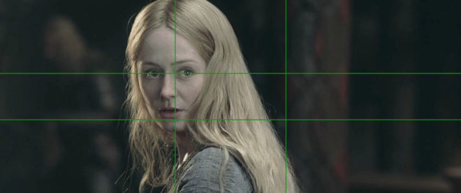
In his book The Mind of the Photographer, Michael Freeman writes about a composition guideline which dates back to the Middle Ages. You imagine two squares, the same height as the frame, and aligned with either side of the frame, then place your subject on the centre or inner edge of one of these squares.

Applied to a Scope frame it looks like this:

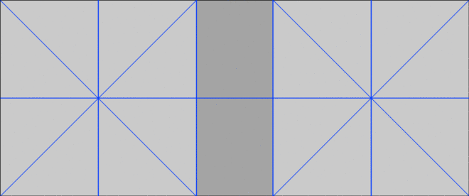
We can simplify it down to this:

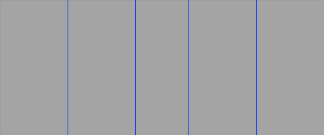
When I first read about this technique, it really chimed with me. I’ve long believed that a “Rule of Fifths” would be a more effective guide for Scope composition than the Rule of Thirds, and the above diagram isn’t far away from fifths.

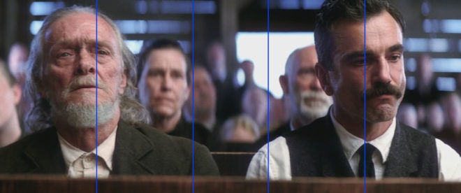
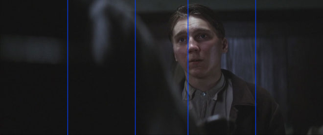
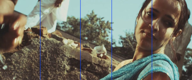
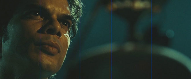
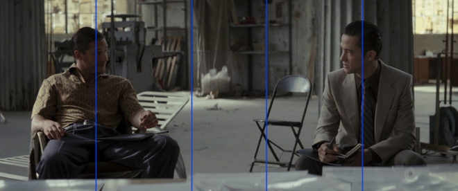
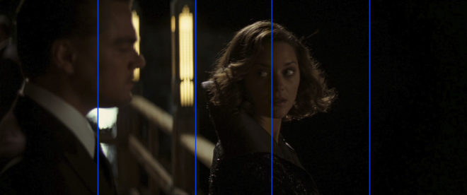
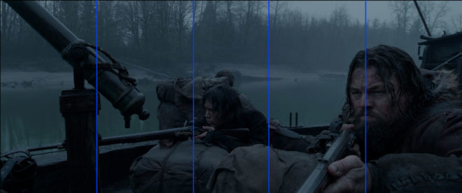
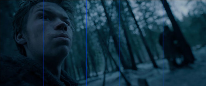
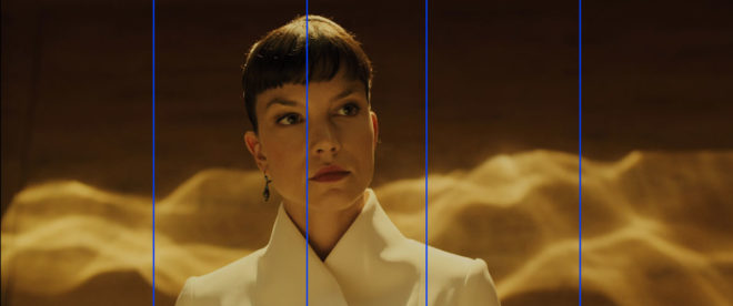
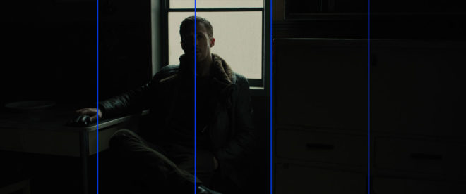
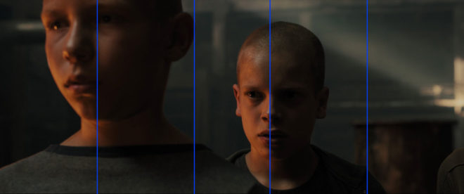
Below I’ve overlaid this grid on a few shots from Scope movies that won Best Cinematography Oscars: There Will Be Blood (DP: Robert Elswit, ASC), Slumdog Millionaire (Anthony Dod Mantle, DFF, ASC, BSC), Inception (Wally Pfister, ASC), The Revenant (Emmanuel Lubezki, ASC, AMC) and Blade Runner 2049 (Roger Deakins, CBE, ASC, BSC).

Let me provide a disclaimer first, though. You could draw any grid you wanted and find some shots from movies that matched it. The purpose of this article is not to convince you to ditch the Rule of Thirds and start following this “rule of squares within a rectangle” instead. (For a start, that name is never going to catch on.) This “rule” chimes with me because it’s similar to the way that I was already instinctively composing, but if it doesn’t work for you then don’t use it. Develop your own eye. It’s a creative medium, so compose creatively, not like a robot programmed with simple rules.

I’ll leave you with this quote from the great photographer Ansel Adams:

The so-called rules of photographic composition are, in my opinion, invalid, irrelevant and immaterial.

See also:

And if you want to read a thorough debunking of the Rule of Thirds, check out this article on Pro Video Coalition.

Is the Rule of Thirds Right for 2.39:1?

Colour Schemes

Last week I looked at the science of colour: what it is, how our eyes see it, and how cameras see and process it. Now I’m going to look at colour theory – that is, schemes of mixing colours to produce aesthetically pleasing results.


The Colour wheel

The first colour wheel was drawn by Sir Isaac Newton in 1704, and it’s a precursor of the CIE diagram we met last week. It’s a method of arranging hues so that useful relationships between them – like primaries and secondaries, and the schemes we’ll cover below – can be understood. As we know from last week, colour is in reality a linear spectrum which we humans perceive by deducing it from the amounts of light triggering our red, green and blue cones, but certain quirks of our visual system make a wheel in many ways a more useful arrangement of the colours than a linear spectrum.

One of these quirks is that our long (red) cones, although having peak sensitivity to red light, have a smaller peak in sensitivity at the opposite (violet) end of the spectrum. This may be what causes our perception of colour to “wrap around”.

Another quirk is in the way that colour information is encoded in the retina before being piped along the optic nerve to the brain. Rather than producing red, green and blue signals, the retina compares the levels of red to green, and of blue to yellow (the sum of red and green cones), and sends these colour opponency channels along with a luminance channel to the brain.

You can test these opposites yourself by staring at a solid block of one of the colours for around 30 seconds and then looking at something white. The white will initially take on the opposing colour, so if you stared at red then you will see green.

Hering’s colour wheels

19th century physiologist Ewald Hering was the first to theorise about this colour opponency, and he designed his own colour wheel to match it, having red/green on the vertical axis and blue/yellow on the horizontal.

RGB colour wheel

Today we are more familiar with the RGB colour wheel, which spaces red, green and blue equally around the circle. But both wheels – the first dealing with colour perception in the eye-brain system, and the second dealing with colour representation on an RGB screen – are relevant to cinematography.

On both wheels, colours directly opposite each other are considered to cancel each other out. (In RGB they make white when combined.) These pairs are known as complementary colours.


Complementary

A complementary scheme provides maximum colour contrast, each of the two hues making the other more vibrant. Take “The Snail” by modernist French artist Henri Matisse, which you can currently see at the Tate Modern; Matisse placed complementary colours next to each other to make them all pop.

“The Snail” by Henri Matisse (1953)

In cinematography, a single pair of complementary colours is often used, for example the yellows and blues of Aliens‘ power loader scene:

“Aliens” DP: Adrian Biddle, BSC

Or this scene from Life on Mars which I covered on my YouTube show Lighting I Like:

I frequently use a blue/orange colour scheme, because it’s the natural result of mixing tungsten with cool daylight or “moonlight”.

“The First Musketeer”, DP: Neil Oseman

And then of course there’s the orange-and-teal grading so common in Hollywood:

“Hot Tub Time Machine” DP: Jack N. Green, ASC

Amélie uses a less common complementary pairing of red and green:

“Amélie” DP: Bruno Belbonnel, AFC, ASC


Analogous

An analogous colour scheme uses hues adjacent to each other on the wheel. It lacks the punch and vibrancy of a complementary scheme, instead having a harmonious, unifying effect. In the examples below it seems to enhance the single-mindedness of the characters. Sometimes filmmakers push analogous colours to the extreme of using literally just one hue, at which point it is technically monochrome.

“The Matrix” DP: Bill Pope, ASC
“Terminator 2: Judgment Day” DP: Adam Greenberg, ASC
“The Double” DP: Erik Alexander Wilson
“Total Recall” (1990) DP: Jost Vacano, ASC, BVK


There are other colour schemes, such as triadic, but complementary and analogous colours are by far the most common in cinematography. In a future post I’ll look at the psychological effects of individual colours and how they can be used to enhance the themes and emotions of a film.

SaveSave

Colour Schemes

The Inverse Square Law

If you’ve ever read or been taught about lighting, you’ve probably heard of the Inverse Square Law. It states that light fades in proportion to the square of the distance from the source. But lately I started to wonder if this really applies in all situations. Join me as I attempt to get to the bottom of this…


Knowing the law

The seed of this post was sown almost a year ago, when I read Herbert McKay’s 1947 book The Tricks of Light and Colour, which described the Inverse Square Law in terms of light spreading out. (Check out my post about The Tricks of Light and Colour here.)

But before we go into that, let’s get the Law straight in our minds. What, precisely, does it say? Another excellent book, Gerald Millerson’s Lighting for Television and Film, defines it thusly:

With increased distance, the light emitted from a given point source will fall rapidly, as it spreads over a progressively larger area. This fall-off in light level is inversely proportional to the distance square, i.e. 1/d². Thus, doubling the lamp distance would reduce the light to ¼.

The operative word, for our purposes, is “spreads”.

If you’d asked me a couple of years ago what causes the Inverse Square Law, I probably would have mumbled something about light naturally losing energy as it travels. But that is hogwash of the highest order. Assuming the light doesn’t strike any objects to absorb it, there is nothing to reduce its energy. (Air does scatter – and presumably absorb – a very small amount of light, hence atmospheric haze, but this amount will never be significant on the scale a cinematographer deals with.)

In fact, as the Millerson quote above makes clear, the Inverse Square Law is a result of how light spreads out from its source. It’s purely geometry. In this diagram you can see how fewer and fewer rays strike the ‘A’ square as it gets further and further away from the source ‘S’:

Illustration by Borb, CC BY-SA 3.0

Each light ray (dodgy term, I know, but sufficient for our purposes) retains the same level of energy, and there are the same number of them overall, it’s just that there are fewer of them passing through any given area.

So far, so good.


Taking the Law into my own hands

During season two of my YouTube series Lighting I Like, I discussed Dedo’s Panibeam 70 HMI. This fixture produces collimated light, light of which all the waves are travelling in parallel. It occurred to me that this must prevent them spreading out, and therefore render the Inverse Square Law void.

This in turn got me thinking about more common fixtures – par cans, for example.


Par lamps are so named for the Parabolic Aluminised Reflectors they contain. These collect the light radiated from the rear and sides of the filament and reflect it as parallel rays. So to my mind, although light radiated from the very front of the filament must still spread and obey the Inverse Square Law, that which bounces off the reflector should theoretically never diminish. You can imagine that the ‘A’ square in our first diagram would have the same number of light rays passing through it every time if they are travelling in parallel.

Similarly, fresnel lenses are designed to divert the spreading light waves into a parallel pattern:

Even simple open-face fixtures have a reflector which can be moved back and forth using the flood/spot control, affecting both the spread and the intensity of the light. Hopefully by now you can see why these two things are related. More spread = more divergence of light rays = more fall-off. Less spread = less divergence of light rays = more throw.

So, I wondered, am I right? Do these focused sources disobey the Inverse Square Law?


Breaking the law

To find the answer, I waded through a number of fora.

Firstly, and crucially, everyone agrees that the Law describes light radiated from a point source, so any source which isn’t infinitely small will technically not be governed by the Law. In practice, says the general consensus, the results predicted by the Law hold true for most sources, unless they are quite large or very close to the subject.

If you are using a softbox, a Kinoflo or a trace frame at short range though, the Inverse Square Law will not apply.

The above photometric data for a Filmgear LED Flo-box indeed shows a slower fall-off than the Law predicts. (Based on the 1m intensity, the Law predicts the 2m and 3m intensities as 970÷2²=243 lux and 970÷3²=108 lux respectively.)

A Flickr forum contributor called Severin Sadjina puts it like this:

In general, the light will fall off as 1/d² if the size of the light source is negligible compared to the distance d to the light source. If, on the other hand, the light source is significantly larger than the distance d to the light source, the light will fall off as 1/d – in other words: slower than the Inverse Square Law predicts.

Another contributor, Ftir, claims that a large source will start to follow the Law above distances equal to about five times the largest side of the source, so a 4ft Kinoflo would obey the Law very closely after about 20ft. This claim is confirmed by Wikipedia, citing A. Ryer’s The Light Measurement Handbook.

But what about those pesky parallel light beams from the pars and fresnels?

Every forum had a lot of disagreement on this. Most people agree that parallel light rays don’t really exist in real life. They will always diverge or converge, slightly, and therefore the Law applies. However, many claim that it doesn’t apply in quite the same way.

Diagram from a tutorial PDF on light-measurement.com showing a virtual point source behind the bulb of a torch.

A fresnel, according to John E. Clark on Cinematography.com, can still be treated as a point source, but that point source is actually located somewhere behind the lamp-head! It’s a virtual point source. (Light radiating from a distant point source has approximately parallel rays with consequently negligible fall-off, e.g. sunlight.) So if this virtual source is 10m behind the fixture, then moving the lamp from 1m from the subject to 2m is not doubling the distance (and therefore not quartering the intensity). In fact it is multiplying the distance by 1.09 (12÷11=1.09), so the light would only drop to 84% of its former intensity (1÷1.09²=0.84).

I tried to confirm this using the Arri Photometrics App, but the data it gives for Arri’s fresnel fixtures conforms perfectly with an ordinary point source under the Law, leaving me somewhat confused. However, I did find some data for LED fresnels that broke the Law, for example the Lumi Studio 300:

As you can see, at full flood (bottom graphic) the Law is obeyed as expected; the 8m intensity of 2,500 lux is a quarter of the 4m intensity of 10,000 lux. But when spotted (top graphic) it falls off more rapidly. Again, very confusing, as I was expecting it to fall off less rapidly if the rays are diverging but close to parallel.

A more rapid fall-off suggests a virtual point source somewhere in front of the lamp-head. This was mentioned in several places on the fora as well. The light is converging, so the intensity increases as you move further from the fixture, reaching a maximum at the focal point, then diverging again from that point as per the Inverse Square Law. In fact, reverse-engineering the above data using the Law tells me – if my maths is correct – that the focal point is 1.93m in front of the fixture. Or, to put it another way, spotting this fixture is equivalent to moving it almost 2m closer to the subject. However, this doesn’t seem to tally with the beam spread data in the above graphics. More confusion!

I decided to look up ETC’s Source Four photometrics, since these units contain an ellipsoidal reflector which should focus the light (and therefore create a virtual point source) in front of themselves. However, the data shows no deviation from the Law and no evidence of a virtual point source displaced from the actual source.


I fought the law and the law won

I fear this investigation has left me more confused than when I started! Clearly there are factors at work here beyond what I’ve considered.

However, I’ve learnt that the Inverse Square Law is a useful means of estimating light fall-off for most lighting fixtures – even those that really seem like they should act differently! If you double the distance from lamp to subject, you’re usually going to quarter the intensity, or near as damn it. And that rule of thumb is all we cinematographers need 99% of the time. If in doubt, refer to photometrics data like that linked above.

And if anyone out there can shed any light (haha) on the confusion, I’d be very happy to hear from you!

The Inverse Square Law

9 Fun Photic Facts from a 70-year-old Book

Shortly before Christmas, while browsing the secondhand books in the corner of an obscure Herefordshire garden centre, I came across a small blue hardback called The Tricks of Light and Colour by Herbert McKay. Published in 1947, the book covered almost every aspect of light you could think of, from the inverse square law to camouflage and optical illusions. What self-respecting bibliophile cinematographer could pass that up?

Here are some quite-interesting things about light which the book describes…


1. SPHERES ARE THE KEY to understandING the inverse square law.

Any cinematographer worth their salt will know that doubling a subject’s distance from a lamp will quarter their brightness; tripling their distance will cut their brightness to a ninth; and so on.  This, of course, is the inverse square law. If you struggle to visualise this law and why it works the way it does, The Tricks of Light and Colour offers a good explanation.

[Think] of light being radiated from… a mere point. Light and heat are radiated in straight lines and in all directions [from this point]. At a distance of one foot from the glowing centre the whole quantity of light and heat is spread out over the surface of a sphere with a radius of one foot. At a distance of two feet from the centre it is spread over the surface of a sphere of radius two feet. Now to find an area we multiply two lengths; in the case of a sphere both lengths are the radius of the sphere. As both lengths are doubled the area is four times as great… We have the same amounts of light and heat spread over a sphere four times as great, and so the illumination and heating effect are reduced to a quarter as great.


2. MIRAGES ARE DUE TO Total internal reflection.

This is one of the things I dimly remember being taught in school, which this book has considerably refreshed me on. When light travels from one transparent substance to another, less dense, transparent substance, it bends towards the surface. This is called refraction, and it’s the reason that, for example, streams look shallower than they really are, when viewed from the bank. If the first substance is very dense, or the light ray is approaching the surface at a glancing angle, the ray might not escape at all, instead bouncing back down. This is called total internal reflection, and it’s the science behind mirages.

The heated sand heats the air above it, and so we get an inversion of the density gradient: low density along the heated surface, higher density in the cooler air above. Light rays are turned down, and then up, so that the scorched and weary traveller sees an image of the sky, and the images looks like a pool of cool water on the face of the desert.


3. Pinhole images pop up in unexpected places.

Most of us have made a pinhole camera at some point in our childhood, creating an upside-down image on a tissue paper screen by admitting light rays through a tiny opening. Make the opening bigger and the image becomes a blur, unless you have a lens to focus the light, as in a “proper” camera or indeed our eyes. But the pinhole imaging effect can occur naturally too. I’ve sometimes lain in bed in the morning, watching images of passing traffic or flapping laundry on a line projected onto my bedroom ceiling through the little gap where the curtains meet at the top. McKay describes another example:

One of the prettiest examples of the effect may be seen under trees when the sun shines brightly. The ground beneath a tree may be dappled with circles of light, some of them quite bright… When we look up through the leaves towards the sun we may see the origin of the circles of light. We can see points of light where the sun shines through small gaps between the leaves. Each of these gaps acts in the same way as a pinhole: it lets through rays from the sun which produce an image of the sun on the ground below.


4. The sun isn’t a point source.

“Shadows are exciting,” McKay enthuses as he opens chapter VI. They certainly are to a cinematographer. And this cinematographer was excited to learn something about the sun and its shadow which is really quite obvious, but I had never considered before.

Look at the shadow of a wall. Near the base, where the shadow begins, the edge of the shadow is straight and sharp… Farther out, the edge of the shadow gets more and more fuzzy… The reason lies of course in the great sun itself. The sun is not a mere point of light, but a globe of considerable angular width.

The accompanying illustration shows how you would see all, part or none of the sun if you stood in a slightly different position relative to the hypothetical wall. The area where none of the sun is visible is of course in full shadow (umbra), and the area where the sun is partially visible is the fuzzy penumbra (the “almost shadow”).


5. Gravity bends LIGHT.

Einstein hypothesised that gravity could bend light rays, and observations during solar eclipses proved him right. Stars near to the eclipsed sun were seen to be slightly out of place, due to the huge gravitational attraction of the sun.

The effect is very small; it is too small to be observed when the rays pass a comparatively small body like the moon. We need a body like the sun, at whose surface gravity is 160 or 170 times as great as at the surface of the moon, to give an observable deviation…. The amount of shift depends on the apparent nearness of a star to the sun, that is, the closeness with which the rays of light from the star graze the sun. The effect of gravity fades out rapidly, according to the inverse square law, so that it is only near the sun that the effects can be observed.


6. Light helped us discover helium.

Sodium street-lamps are not the most pleasant of sources, because hot sodium vapour emits light in only two wave-lengths, rather than a continuous spectrum. Interestingly, cooler sodium vapour absorbs the same two wave-lengths. The same is true of other elements: they  emit certain wave-lengths when very hot, and absorb the same wave-lengths when less hot. This little bit of science led to a major discovery.

The sun is an extremely hot body surrounded by an atmosphere of less highly heated vapours. White light from the sun’s surfaces passes through these heated vapours before it reaches us; many wave-lengths are absorbed by the sun’s atmosphere, and there is a dark line in the spectrum for each wave-length that has been absorbed. The thrilling thing is that these dark lines tell us which elements are present in the sun’s atmosphere. It turned out that the lines in the sun’s spectrum represented elements already known on the earth, except for one small group of lines which were ascribed to a hitherto undetected element. This element was called helium (from helios, the sun).


7. Moonlight is slightly too dim for colours.

Our retinas are populated by two different types of photoreceptors: rods and cones. Rods are much more sensitive than cones, and enable us to see in very dim light once they’ve had some time to adjust. But rods cannot see colours. This is why our vision is almost monochrome in dark conditions, even under the light of a full moon… though only just…

The light of the full moon is just about the threshold, as we say, of colour vision; a little lighter and we should see colours.


8. MAGIC HOUR can be longer than an hour.

We cinematographers often think of magic “hour” as being much shorter than an hour. When prepping for a dusk-for-night scene on The Little Mermaid, I used my light meter to measure the length of shootable twilight. The result was 20 minutes; after that, the light was too dim for our Alexas at 800 ISO and our Cooke S4 glass at T2. But how long after sunset is it until there is literally no light left from the sun, regardless of how sensitive your camera is? McKay has this to say…

Twilight is partly explained as an effect of diffusion. When the sun is below the horizon it still illuminates particles of dust and moisture in the air. Some of the scattered light is thrown down to the earth’s surface… Twilight ends when the sun is 17° or 18° below the horizon. At the equator [for example] the sun sinks vertically at the equinoxes, 15° per hour; so it sinks 17° in 1 hour 8 minutes.


9. Why isn’t Green a primary colour in paint?

And finally, the answer to something that bugged me during my childhood. When I was a small child, daubing crude paintings of stick figures under cheerful suns, I was taught that the primary colours are red, blue and yellow. Later I learnt that the true primary colours, the additive colours of light, are red, blue and green. So why is it that green, a colour that cannot be created by mixing two other colours of light, can be created by mixing blue and yellow paints?

When white light falls on a blue pigment, the pigment absorbs reds and yellows; it reflects blue and also some green. A yellow pigment absorbs blue and violet; it reflects yellow, and also some red and green which are the colours nearest to it in the spectrum. When the two pigments are mixed it may be seen that all the colours are absorbed by one or other of the components except green.


If you’re interested in picking up a copy of The Tricks of Light and Colour yourself, there is one on Amazon at the time of writing, but it will set you back £35. Note that Herbert McKay is not to be confused with Herbert C. McKay, an American author who was writing books about stereoscopic photography at around the same time.

9 Fun Photic Facts from a 70-year-old Book