What Makes a Good Shot?

It’s a very difficult question to answer, but let’s look at a few major things a cinematographer considers each time they set up their camera.


Tonal Range
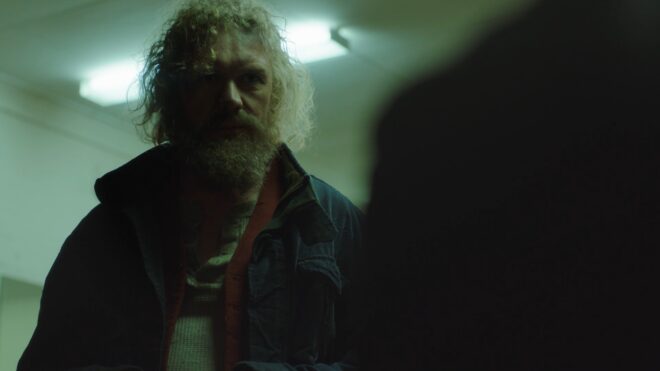
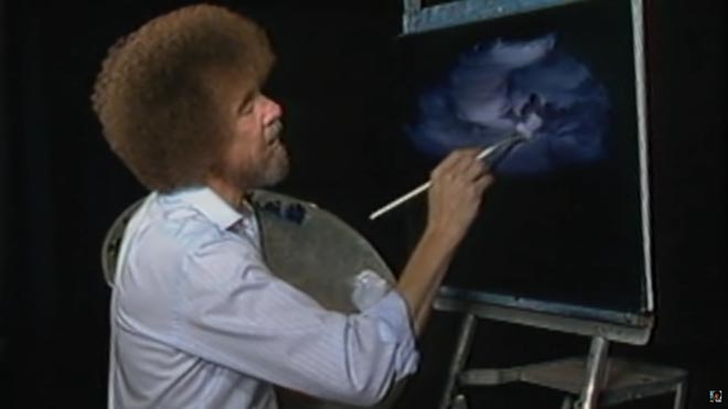
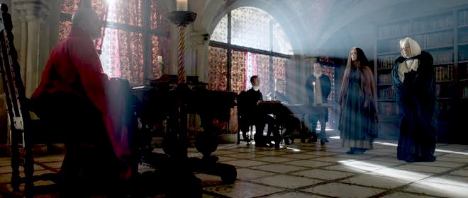
“Above the Clouds” (2020, dir: Leon Chambers, DP: Neil Oseman)

TV sets and other moving-image devices, especially if they are non-HDR, cannot display as wide a dynamic range as most scenes have in real life. So it is often seen as desirable to make the most of what contrast a screen can reproduce by including at least one area of the blackest black and one of the whitest white, with a good distribution of all the tones in between.

Contrast makes an image richer and also easier for the viewer’s brain to interpret, but as with all of these rules, it is perfectly possible to break it with excellent results. For example, you may want to keep a scene in a prison entirely in the shadows, so that when the prisoner escapes into the daylight the viewer will feel the impact of the highlights. Tonal distribution has a big impact on mood, and thought should be given to what mood a DP wants to convey. 


Colour Schemes

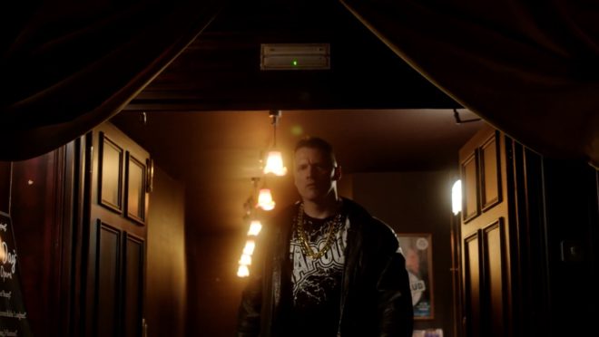
“Alder” (2019, dir: Vanda Ladeira, DP: Neil Oseman)

Since Isaac Newton invented the colour wheel in 1704, artists have devised several colour schemes which can evoke different feelings, the most common in cinematography being complementary and analogous.

A complementary colour scheme uses two hues on opposite sides of the wheel for maximum colour contrast, punch and vibrancy. Think Ripley’s yellow power loader against the blue lighting of Aliens, or the infamous teal-and-orange grading of Michael Bay’s films.

An analogous colour scheme uses hues adjacent to each other on the wheel for a harmonious or oppressive effect. Think the greens of The Matrix, or the reds of Mars in Paul Verhoeven’s Total Recall.

There’s more on colour schemes in this post.


Composition
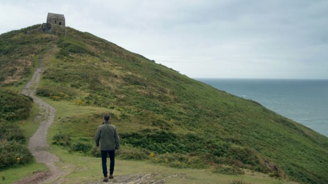
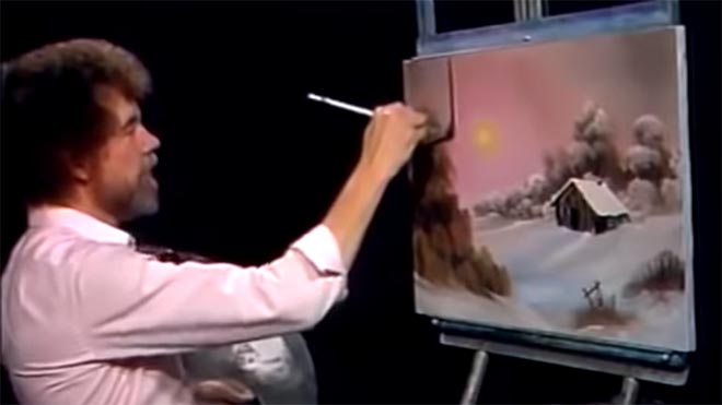
“Perplexed Music” (2018, dir: Mark McGann, DP: Neil Oseman)

“The so-called rules of photographic composition are, in my opinion, invalid, irrelevant and immaterial,” said the great American photographer Ansel Adams. I might not go that far, but they can certainly be overrated.

The Rule of Thirds, for example, is intended to produce a balanced image, but what if you don’t want a balanced image? Placing a character in an unusual part of the frame, as is frequently done in Amazon’s Mr. Robot, can be powerfully unsettling and say much about the character’s status and mindset. Breaking rules for the sake of breaking rules may not be wise, but breaking them in a single shot to make the viewer sit up and take notice, or breaking them subtly but consistently throughout a film to subconsciously cue the audience into a theme or character trait, is a good use of cinematic technique.

As for camera moves, some believe that they should always be motivated. Some like them to be expressive. Some simply like to keep dollying the camera back and forth to add energy to a scene. As long as the movement helps to immerse rather than distract the viewer, it is serving its purpose.


Depth
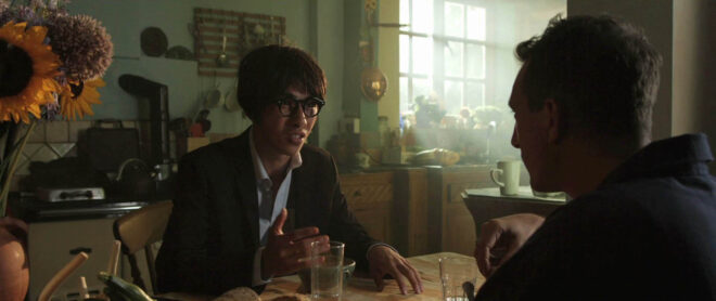
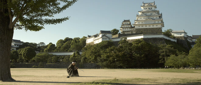
“The Gong Fu Connection” (2016, dir. Ted Duran, DP: Neil Oseman)

As film and TV are usually monoscopic media, cinematographers often aim to compensate by enhancing other types of depth cues. Commonly this is through lighting – using backlight to cut a layer out from the background, using colour to separate layers, or alternating light and dark layers. Haze and camera movement can also be used to create a greater sense of depth, as can lens choice, be it a wide lens which exaggerates perspective, or a long lens that throws backgrounds out of focus.

The result is not just impact but clarity, ensuring the viewer is not distracted from the story trying to figure out what they’re seeing. Again though, you may sometimes want just the opposite, to disorientate the viewer or make them work to find the important element in the frame.

This post has some good examples of depth cues.


Production Value
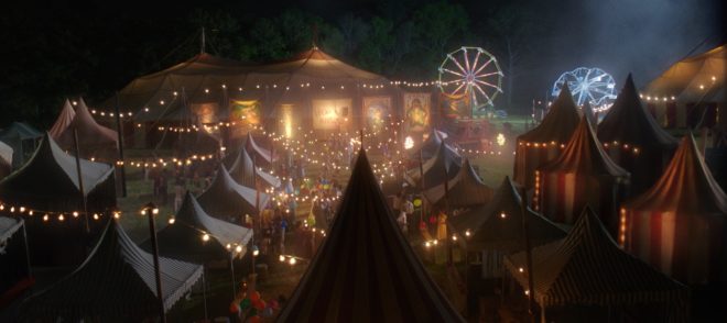
“The Little Mermaid” (2018, dir: Blake Harris, DP: Neil Oseman)

A DP has the responsibility of capturing on film or digital media the work of every other department on the production (except sound!). If the costumers have spent weeks sewing beads onto a period dress, a cross-light to bring out the texture is the least the DP can do. If the make-up department are struggling to hide the joins in a prosthetic, softening or dimming the lighting will help. If a huge set has been built or an expensive location hired, showing it off in at least one wide shot is probably advisable.


Story and Character

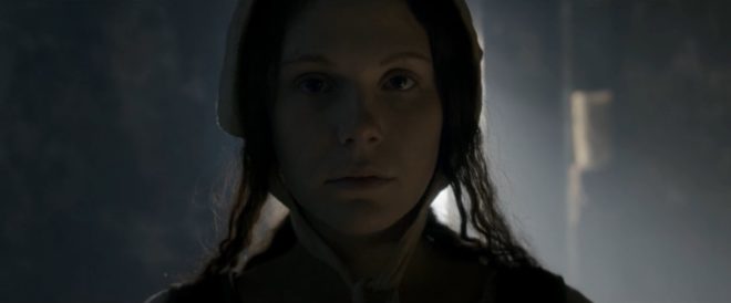
“Ren: The Girl with the Mark” (2016, dir: Kate Madison, DP: Neil Oseman)

As I’ve hinted throughout, the most important thing is that every aspect of the shot is working towards telling the story, revealing or enhancing character, and conveying the right overall mood. This might be by keeping everything quiet and conventional to let the performances shine through, or it might be through crazy framing, crunchy contrast and dramatic movements. The possibilities are endless.

What Makes a Good Shot?

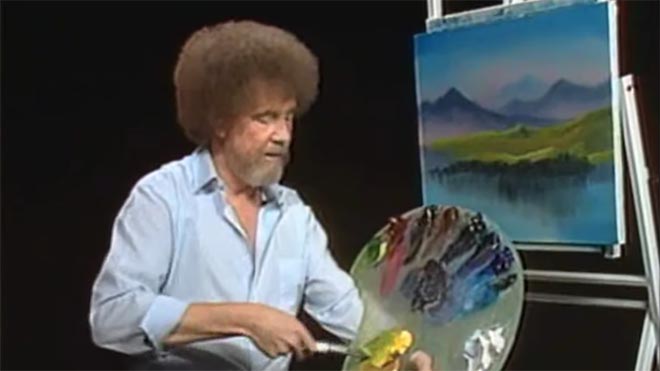
5 Things Bob Ross Can Teach Us About Cinematography

I’m certainly glad you could join me today. It’s a fantastic day here and I hope it is wherever you’re at. Are you ready to read a fantastic little blog post? Good, then let’s get started.

For twelve years, across 400 episodes, Bob Ross entertained all generations of Americans with his public access TV series, The Joy of Painting. Although he floated up to join the happy little clouds in 1995, in recent years YouTube and Twitch have brought his shows to a new audience, of which I am a humble member. Bob’s hypnotic, soft-spoken voice, his unfailingly positive attitude, and the magical effects of his wet-on-wet oil-painting technique make his series calming, comforting and captivating in equal measure.

Having watched every episode at least twice now, I’ve noticed several nuggets of Bob Ross wisdom that apply just as well to cinematography as they do to painting.


1. “The more plains you have in your painting, the more depth it has… and that’s what brings the happy buck.”

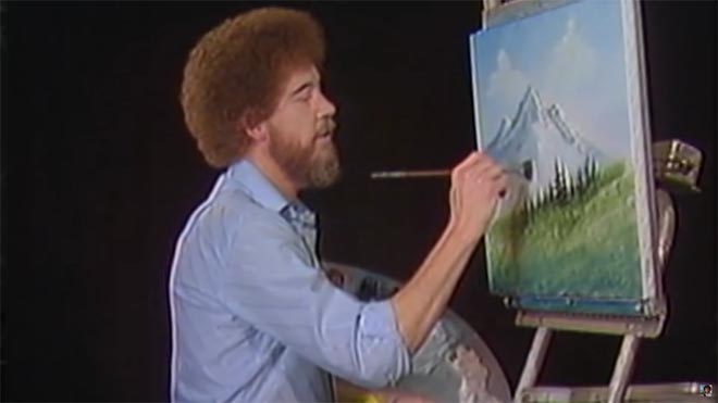
Bob always starts with the background of his scene and paints forward: first the sky with its happy little clouds; then often some almighty mountains; then the little footy hills; some trees way in the distance, barely more than scratches on the canvas; then perhaps a lake, its reflections springing forth impossibly from Bob’s brush; the near bank; and some detailed trees and bushes in the foreground, with a little path winding through them.

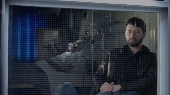
“Exile Incessant” (dir. James Reynolds)

Just as with landscape painting, depth is tremendously important in cinematography. Creating a three-dimensional world with a monoscopic camera is a big part of a DP’s job, which starts with composition – shooting towards a window, for example, rather than a wall – and continues with lighting. Depth increases production value, which makes for a happy producer and a happy buck for you when you get hired again.


2. “As things get further away from you in a landscape, they get lighter in value.”

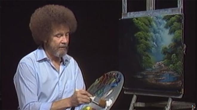
Regular Joy of Painting viewers soon notice that the more distant layers of Bob’s paintings use a lot more Titanium White than the closer ones. Bob frequently explains that each layer should be darker and more detailed than the one behind it, “and that’s what creates the illusion of depth”.

“The Gong Fu Connection” (dir. Ted Duran)

Distant objects seem lighter and less contrasty because of a phenomenon called aerial perspectivebasically atmospheric scattering of light. As a DP, you can simulate this by lighting deeper areas of your frame brightly, and keeping closer areas dark. This might be achieved by setting up a flag to provide negative fill to an object in the foreground, or by placing a battery-powered LED fixture at the end of a dark street. The technique works for night scenes and small interiors, just as well as daytime landscapes, even though aerial perspective would never occur there in real life. The viewer’s brain will subconsciously recognise the depth cue and appreciate the three-dimensionality of the set much more.


3. “Don’t kill the little misty area; that’s your separator.”

After completing each layer, particularly hills and mountains, Bob takes a clean, dry brush and taps gently along the bottom of it. This has a blurring and fading effect, giving the impression that the base of the layer is dissolving into mist. When he paints the next layer, he takes care to leave a little of this misty area showing behind it.

“Heretiks” (dir. Paul Hyett)

We DPs can add atmos (smoke) to a scene to create separation. Because there will be more atmos between the lens and a distant object than between the lens and a close object, it really aids the eye in identifying different plains. That makes the image both clearer and more aesthetically pleasing. Layers can also be separated with backlight, or a differentiation of tones or colours.


4. “You need the dark in order to show the light.”

Hinting at the tragedy in his own life, Bob often underlines the importance of playing dark tones against light ones. “It’s like in life. Gotta have a little sadness once in a while so you know when the good times come,” he wisely remarks, as he taps away at the canvas with his fan-brush, painting in the dark rear leaves of a tree. Then he moves onto the lighter foreground leaves, “but don’t kill your dark areas,” he cautions.

“Closer Each Day” promo (dir. Oliver Park)

If there’s one thing that makes a cinematic image, it’s contrast. It can be very easy to over-light a scene, and it’s often a good idea to try turning a fixture or two off to see if the mood is improved. However bright or dark your scene is, where you don’t put light is just as important as where you do. Flagging a little natural light, blacking out a window, or removing the bubble from a practical can often add a nice bit of shape to the image.


5. “Maybe… maybe… maybe… Let’s DROP in an almighty tree.”

As the end of the episode approaches, and the painting seems complete, Bob has a habit of suddenly adding a big ol’ tree down one or both sides of the canvas. Since this covers up background layers that have been carefully constructed earlier in the show, Bob often gets letters complaining that he has spoilt a lovely painting. “Ruined!” is the knowing, light-hearted comment of the modern internet viewer.

“Synced” (dir. Devon Avery)

The function of these trees is to provide a foreground framing element which anchors the side of the image. I discussed this technique in my article on composing a wide shot. A solid, close object along the side or base of the frame makes the image much stronger. It gives a reason for the edge of the frame to be there rather than somewhere else. As DPs, we may not be able to just paint a tree in, but there’s often a fence, a pillar, a window frame, even a supporting artist that we can introduce to the foreground with a little tweaking of the camera position.

The ol’ clock on the wall tells me it’s time to go, so until next time: happy filming, and God bless, my friend.

If you’re keen to learn more about cinematography, don’t forget I have an in-depth course available on Udemy.

5 Things Bob Ross Can Teach Us About Cinematography

The Science of Smoke

Smoke, haze, atmos, whatever you want to call it, anyone who knows me knows that I’m a big fan. But how does it work and what is the purpose of smoking up a set?


Aerial perspective

At the most basic level, smoke simulates a natural phenomenon called aerial perspective. If you look at – for example – a range of mountains receding into the distance, the further mountains will appear bluer, lighter, less contrasty and less colour-saturated than the nearer mountains.

An example of aerial perspective

This effect is due to light being scattered by particles naturally suspended in the air, and by molecules of the air itself. It is described by the scary-looking Rayleigh Equation:

We don’t need to get into what all the variables stand for, but there are a couple of things worth noting:

  • The symbol on the far right represents the angle between the incident light and the scattered light. In practice this means that the more you shoot into the sun – the more the air you’re photographing is backlit – the more scattering there will be. Place the sun behind your camera and scattering will be minimal.
  • Lamda (the sort of upside-down y next to the x) is the wavelength of the light, so the shorter the wavelength, the more scattering. This is why things look bluer with distance: blue light has a shorter wavelength and so is scattered more. It’s also why shooting through an ultraviolet filter reduces the appearance of aerial perspective/atmospheric haze.


How smoke works

An Artem smoke gun

Foggers, hazers and smoke machines simulate aerial perspective by adding suspended particles to the air. These particles start off as smoke fluid (a.k.a. “fog juice”) which is made of mineral oil, or of a combination of water and glycol/glycerin.

In a smoke machine or gas-powered smoke gun (like the Artem), smoke fluid is pushed into a heat exchanger which vaporises it. When the vapour makes contact with the colder air, it condenses to form fog.

A hazer uses compression rather than heat to vaporise the fluid, meaning you don’t have to wait for the machine to heat up. The particles are smaller, making for a more subtle and longer-lasting effect.

As a general rule, you should use only hazers for interior cinematography, unless there is a story reason for smoke to be present in the scene. Outdoors, however, hazers are ineffective. An Artem or two will work well for smaller exterior scenes; for larger ones, a Tube of Death is the best solution. This is a long, plastic inflatable tube with regularly-spaced holes, with a fan and a smoke machine (usually electric) at the end. It ensures that smoke is distributed fairly evenly over a large area.

A Tube of Death in action on the set of “The Little Mermaid”


The effects of smoke

Just like aerial perspective, smoke/haze separates the background from the foreground, as the background has more smoke between it and the camera. The background becomes brighter, less contrasty, less saturated and (depending on the type of smoke) bluer, making the foreground stand out against it.

Since smoke also obeys the Rayleigh Equation, it shows up best when it’s backlit, a bit when it’s side-lit and barely at all when front-lit.

Here are some of the other things that smoke achieves:

  • It diffuses the image, particularly things further away from camera.
  • It lowers contrast.
  • It brightens the image.
  • It lifts the shadows by scattering light into them.
  • If it’s sufficiently thick, and particularly if it’s smoke rather than haze, it adds movement and texture to the image, which helps to make sets look less fake.
  • It volumises the light, showing up clear shafts of hard light and diffuse pools of soft light. (For more on this, read 5 Tips for Perfect Shafts of Light.)
  • Backlit smoke in front of a person or an object will obscure them, concealing identity.
Heavy smoke (from an Artem) pops Lyanna (Dita Tantang) out of the background in “Ren: The Girl with the Mark” (dir. Kate Madison).
Backlit smoke through a roof of branches creates magical shafts of light in “Ren: The Girl with the Mark”.
The final day/sunset look. From each side an orange-gelled and a pink-gelled par can light the backdrop. A 2K tungsten fresnel provides backlight, while a 650W fresnel with a cucoloris provides dappled light on the tree and tarsier. An LED panel off right supplies fill, and a second panel is inside the cave with a turquoise gel.
The colour-washed infinity cove in the background of this music promo for Lewis Watson’s “Droplets” (dir. Tom Walsh) is softened and disguised by smoke.
Haze gives the LED panels their glowing appearance in this video for “X, Y & Z Rays” (dir. Tom Walsh) by Revenge of Calculon.
This torch beam in “Above the Clouds” (dir. Leon Chambers) shows up so well because the set is heavily fogged.
Smoke backlit by an HMI creates the blue background glow against which the heroes of “The First Musketeer” (dir. Harriet Sams) stand out.
Haze creates the shafts of light from HMIs outside the windows, and adds to the gothic feel of “Heretiks” (dir. Paul Hyett).
The Science of Smoke

5 Principles of Cinematography We Can Learn from Turner

Yesterday I took a trip to The Tate Britain to see what I could learn about light and composition from the world of traditional art. My background is more technical than fine art, so this world is quite new to me. Within quarter of an hour of arriving, I had fallen in love with the work of JMW Turner. The way this man captured the natural moods of light and weather is breathtaking.

Here are five of Turner’s techniques for creating beautiful images which we can apply to cinematography.


1. Negative space

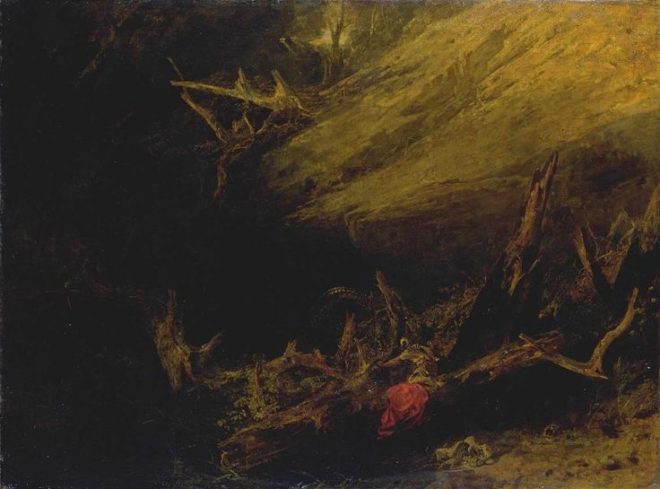
One of the most powerful things you can do with an area of the frame is to let it go black. A great example is Bill Pope’s work on The Matrix. But 200 years before that, Turner was embracing the darkness, emphasising those areas in the light, and allowing the viewer’s imagination to fill in the gaps.

“Jason” (1802) – That dragon is lurking in the shadows like a dodgy monster costume in a B-movie.
“Sketch of a Bank, with Gipsies” (1809) – The titular gypsies are barely visible in the black shadows, betrayed only by the smoke from their fire.


2. Layering

Any artist creating a 2D image strives to give the impression of depth and dimensionality. There are a number of techniques that can be used to achieve this, but one which Turner uses repeatedly is layering. See how the paintings below delineate foreground (light), midground (dark) and background (light again). The midgrounds sink into shadow, becoming negative space, reinforcing the link and relationship between the foregrounds and backgrounds. At the same time, the foreground figures stand out clearly and eye-catchingly against the shade behind them.

“The Tenth Plague of Egypt” (1802)
“The Goddess of Discord Choosing the Apple of Contention in the Garden of the Hesperides” (1806) – This painting contains five layers: light-dark-light-dark-light, highlighting the two groups of people and the monster in the distance.


3. Framing

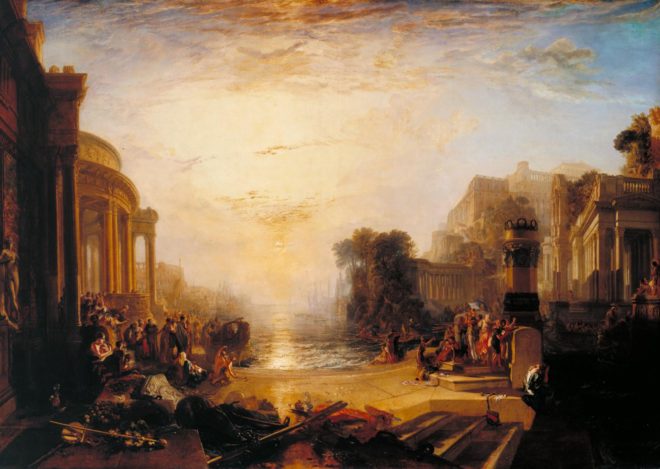
Although most images we see are framed, be it by a gilt picture frame or by the black edges of a phone screen, there is something aesthetically pleasing about adding a second frame within the image itself. An extreme example would be shooting through a window, framing the image on all four sides, but more commonly we frame two or three sides of the image. Turner frequently does this using trees, buildings and shadowy ground.

“The Decline of the Carthaginian Empire” (1817) – A backwards-‘J’-shaped frame is created by the dark foreground: the wall on the left, the shadowed floor across the bottom, and the dark space in the lower right. To balance the shorter part of the ‘J’ on the righthand side, the sun and its reflection (the focal point of the image) are placed left of centre.
“England: Richmond Hill, on the Prince Regent’s Birthday” (1819) – The dark ground and dark tree to the right create a backwards-L-shaped frame which appears to cradle the rest of the image like a waiter cradling plates in the crook of his elbow.


4. Dynamic Composition

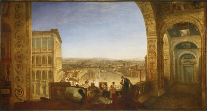
The composition of the two paintings below fascinates me. Both seem to be two images in one: a deep view of a settlement on the left, and a tapering tunnel perspective on the right. As I studied them, I found my eyes “panning” from one side to the other. As cinematographers, we can use actual camera movement to create a dynamic shot, but we should not forget Turner’s lesson here, that there can also be dynamism in static frames.

“Rome, from the Vatican. Raffaelle, Accompanied by La Fornarina, Preparing his Pictures for the Decoration of the Loggia” (1820)
“Palestrina – Composition” (1828)


5. Colour Contrast

Apart from stunningly demonstrating Turner’s power to create mood and atmosphere (a core skill for any DP), the two paintings below are great examples of warm/cool colour contrast. The yellows, oranges and reds of fire and sunset are juxtaposed with the blues of the sky. The result is pictures that really “pop”, arresting the viewer’s attention. A modern cinematographer can readily achieve a similar effect by playing natural daylight, and daylight sources like HMIs and Kinos, against practicals and other tungsten sources.

“Peace – Burial at Sea” (1842) – Contrast in both hue and luminance make this a powerfully evocative painting.
“War. The Exile and the Rock Limpet” (1842) – Note how Napoleon’s blue uniform causes him to stand out against the oranges of the sky, whilst the unimportant, red-garbed soldier behind him is allowed to blend into the background.

 
See also: my trip to the National Portrait Gallery.

5 Principles of Cinematography We Can Learn from Turner