#ShotOfTheWeek: 2017 Round-up

At the end of last summer I started a regular #ShotOfTheWeek on my Twitter feed. It’s very simple: each week I post a frame grab (or sometimes a GIF if I can find one) of a great shot from a film or series I’ve been watching. Sometimes these are new productions, just out, and sometimes they’re older pieces which I’m revisiting or viewing for the first time.

For those of you who aren’t among the Twitterati, here is a round-up of last year’s Shots of the Week. On the other hand, if you are a Twitterist, why not post your own inspirational frame grabs, using the hashtag #ShotOfTheWeek?
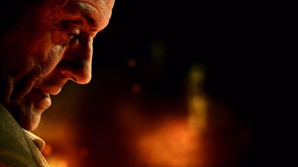
 

Powerful Close-ups

Cinema is arguably at its most potent  when showing us the tiny nuances of emotion that only a big close-up can provide.

“Anne with an E” DP: Bobby Shore

This example from the moving Netflix series Anne with an E makes the most of Anne’s freckled face and puts us right in her headspace… literally. Shots like this were captured with a 27mm Primo, as opposed to the vintage Panavision glass used for other coverage. For more on the cinematography of Anne with an E, check out the Varicam section in my report from Camerimage 2017.

“Black Narcissus” DP: Jack Cardiff

I love the shadows in this shot by legendary DP Jack Cardiff; they almost suggest a crucifix or prison bars. Either would be appropriate for this story of a nun sent to a remote Indian palace to establish a school and hospital. The low-angle eye-light adds to the unsettling feel.

“The Crown” DP: Stuart Howell

The key promotional art for The Crown is an edge-lit profile shot of the Queen, evoking the regal image on stamps and coins. Here DP Stuart Howell has paid homage to the artwork, channelling the same connotations of a figurehead carrying a country on her shoulders.

“American Gods” DP: Aaron Morton

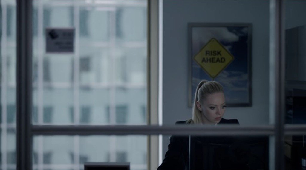
What can I say? I’m a sucker for a good profile shot. The hellish colours here are perfect given what the erstwhile Lovejoy has just done. (I won’t give you any spoilers, but let’s just say it doesn’t involve cheeky antiques dealing.)


Symbolism

“The Handmaid’s Tale” DP: Colin Watkinson

This was the shot that inspired me to start #ShotOfTheWeek. The Handmaid’s Tale is set in a Christian fundamentalist society, so evoking classical religious paintings with the angel-wing-like headboard and the muted, brown colour scheme was a clever move.

“The Ipcress File” DP: Otto Heller

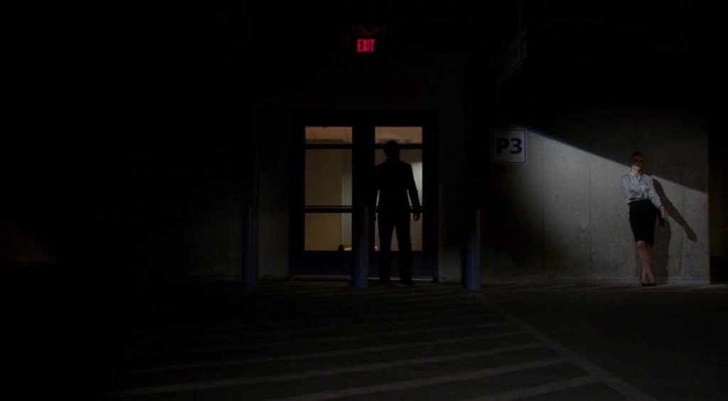
This classic spy thriller has a lot of unusual compositions with domineering foreground objects. Here the cross and circle shapes of the light-shade suggest the crosshairs of a gun, while the bulb tastefully obscures the actual bullet wound.

“Mr Robot” DP: Tod Campbell

This one is almost too on-the-nose to be called symbolism. Only a drama as quirky as Mr Robot could get away with this kind of (literal) signposting, but I love how bold it is. The rigid geometric lines and excessive headroom used throughout the series are also in evidence here, reflecting how we’re seeing everything from Elliot’s mentally ill point of view.
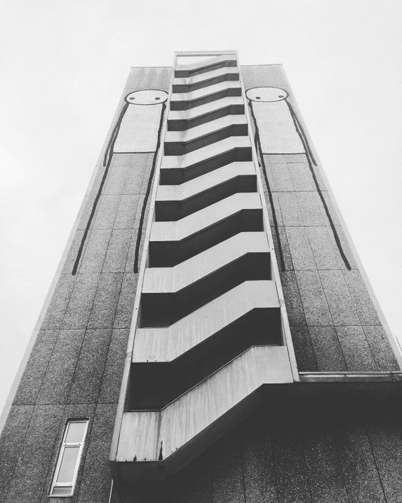
 

Negative Space

“Mission: Impossible – Rogue Nation” DP: Robert Elswit

A forgettable film, but a shot with much to admire. The dark back of the bench creates negative space in the composition, reducing the already-wide Scope frame to a ratio of about 4:1, echoing the short, wide shape of the House of Commons. On the lighting front, negative fill has been employed to render both that bench and the cast very dark, almost silhouettes, imparting a lot of depth to an otherwise flat image.

“Stranger Things” DP: Tim Ives

Again, negative space here creates a geometrical frame within a frame. What I particularly liked was the placement of the bulb above the sheriff’s head, rather than on the right of frame, which would have produced a more balanced but much less interesting shot.

“Better Call Saul” DP: Arthur Albert

Every time Better Call Saul returned to this location I scanned the background of each angle, trying to figure out what on earth could be motivating the bold slash of light on the right of this image. It remains a mystery! The show is full of uncompromisingly dark images with crisp, pure blacks, but perhaps none so overtly noirish as this one.


Intersecting Lines

“Metropolis” DPs: Karl Freund, Günther Rittau & Walter Ruttmann

All credit to Otto Hunte, the production designer on this 1920s sci-fi classic, as every line in this set leads us to the figure of Maria, fittingly for a character who has captured the imaginations of the dystopian underclass. The cinematographers have helped by framing her centrally and making her the brightest part of the image.

“Jardin d’hiver” DP: Darius Khondji

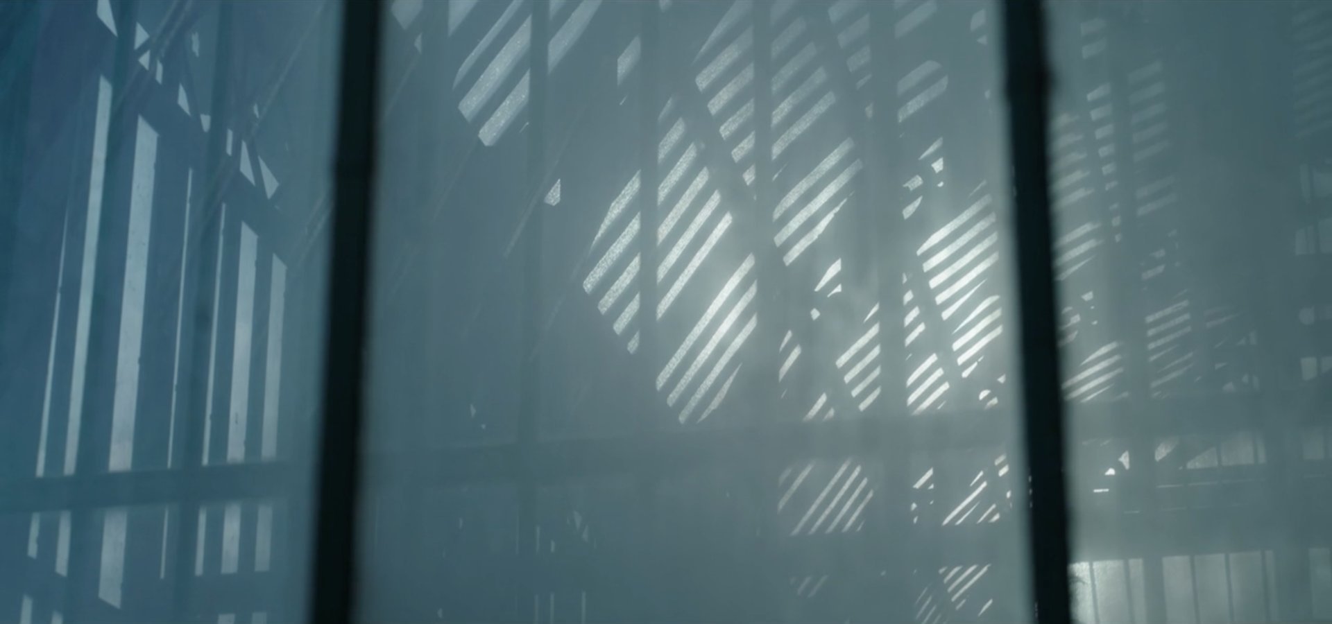
Jardin d’hiver was sponsored by CW Sonderoptic to promote their new large-format Leica Thalia glass (see my Camerimage post for more info). I have to admit that most of the film’s imagery did nothing for me, but this shot of bold, contrasty lines softened by the milkiness of the foreground window has a graphical quality I find very appealing.

“Little Miss Sunshine” DP: Tim Suhrstedt

This is a shot of two halves: the upper half busy, confused and oppressive, the lower half reassuringly simple with its one-point perspective. It was only after filming wrapped on Above the Clouds that I realised just how much this shot and others like it in Little Miss Sunshine had influenced my cinematography of Leon Chambers’ comedy road movie. (Check out the second still on the Above the Clouds page and you’ll see what I mean!)


Iconic Reveals

“The 39 Steps” (1935) DP: Bernard Knowles

Richard Hannay and the audience both discover the cause of Annabella’s distress simultaneously, in a reveal that’s shocking and also funny! The chiaroscuro of the lighting beautifully highlights the bright knife against the deep shadows of the background.

“Terminator 2: Judgment Day” DP: Adam Greenberg

These two gifs are both parts of the same shot, which cranes up from the shockingly unexpected crushing of the skull to reveal the endoskeleton puppet in mid-shot as a perfectly timed explosion goes off in the background. As well as being a remarkable technical achievement, the arts and sciences of cinematography, practical effects and animatronics all working in harmony, it’s a great piece of visual storytelling.


And finally…

“A Ghost Story” DP: Andrew Droz Palermo

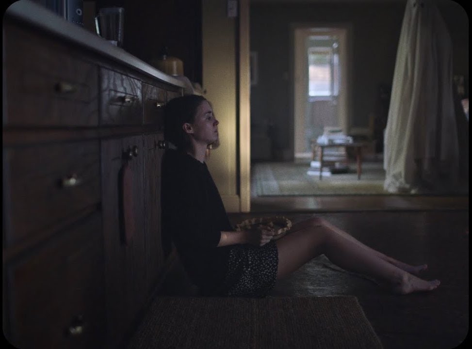
A Ghost Story didn’t get a very wide release, and won’t be to everyone’s taste. A lyrical meditation on the nature of time, its slow pace becomes glacial during a grief-filled, ten-minute pie-eating scene containing only one cut. There is plenty of time to consider the composition, and I loved how casually the ghost is placed within the frame, with the top of his head even cut off. (I later discovered he was composited in, to reduce the chances of anything spoiling the ultra-long, ultra-emotional take.) The lines of the cupboards lead our eyes always back to Rooney Mara, the painterly splash of light on the wall (which I believe was natural) throwing her profile into relief. When she starts to cry, it takes a while to spot the tears, but somehow that makes it all the more powerful.

It’s interesting to note that no fewer than four aspect ratios are represented by all these Shots of the Week: from the traditional Academy ratio of 4:3, through the standard 16:9, to the Netflix-favoured 2:1 and of course 2.39:1 Cinemascope. It’s an exciting time to be working in cinematography, when we have so many choices open to us to create the most fitting images for any given story. Here’s to many more inspiring #ShotOfTheWeek images in 2018. Follow me on Twitter to see them first!

#ShotOfTheWeek: 2017 Round-up

12 Tips for Better Instagram Photos

I joined this social media platform last summer, after hearing DP Ed Moore say in an interview that his Instagram feed helps him get work. I can’t say that’s happened for me yet, but an attractive Instagram feed can’t do any creative freelancer any harm. And for photographers and cinematographers, it’s a great way to practice our skills.

The tips below are primarily aimed at people who are using a phone camera to take their pictures, but many of them will apply to all types of photography.

The particular challenge with Instagram images is that they’re usually viewed on a phone screen; they’re small, so they have to be easy for the brain to decipher. That means reducing clutter, keeping things bold and simple.

Here are twelve tips for putting this philosophy into practice. The examples are all taken from my own feed, and were taken with an iPhone 5, almost always using the HDR (High Dynamic Range) mode to get the best tonal range.


1. choose your background carefully

The biggest challenge I find in taking snaps with my phone is the huge depth of field. This makes it critical to have a suitable, non-distracting background, because it can’t be thrown out of focus. In the pub photo below, I chose to shoot against the blank pillar rather than against the racks of drinks behind the bar, so that the beer and lens mug would stand out clearly. For the Lego photo, I moved the model away from a messy table covered in multi-coloured blocks to use a red-only tray as a background instead.


2. Find Frames within frames

The Instagram filters all have a frame option which can be activated to give your image a white border, or a fake 35mm negative surround, and so on. An improvement on this is to compose your image so that it has a built-in frame. (I discussed frames within frames in a number of my recent posts on composition.)


3. try symmetrical composition

To my eye, the square aspect ratio of Instagram is not wide enough for The Rule of Thirds to be useful in most cases. Instead, I find the most arresting compositions are central, symmetrical ones.


4. Consider Shooting flat on

In cinematography, an impression of depth is usually desirable, but in a little Instagram image I find that two-dimensionality can sometimes work better. Such photos take on a graphical quality, like icons, which I find really interesting. The key thing is that 2D pictures are easier for your brain to interpret when they’re small, or when they’re flashing past as you scroll.


5. Look for shapes

Finding common shapes in a structure or natural environment can be a good way to make your photo catch the eye. In these examples I spotted an ‘S’ shape in the clouds and footpath, and an ‘A’ shape in the architecture.


6. Look for textures

Textures can add interest to your image. Remember the golden rule of avoiding clutter though. Often textures will look best if they’re very bold, like the branches of the tree against the misty sky here, or if they’re very close-up, like this cathedral door.


7. Shoot into the light

Most of you will not be lighting your Instagram pics artificially, so you need to be aware of the existing light falling on your subject. Often the strongest look is achieved by shooting towards the light. In certain situations this can create interesting silhouettes, but often there are enough reflective surfaces around to fill in the shadows so you can get the beauty of the backlight and still see the detail in your subject. You definitely need to be in HDR mode for this.


8. Look for interesting light

It’s also worth looking out for interesting light which may make a dull subject into something worth capturing. Nature provides interesting light every day at sunrise and sunset, so these are good times to keep an eye out for photo ops.


9. Use lens flare for interest

Photographers have been using lens flare to add an extra something to their pictures for decades, and certain science fiction movies have also been known to use (ahem) one or two. To avoid a flare being too overpowering, position your camera so as to hide part of the sun behind a foreground object. To get that anamorphic cinema look, wipe your finger vertically across your camera lens. The natural oils on your skin will cause a flare at 90° to the direction you wiped in. (Best not try this with that rented set of Master Primes though.)


10. Control your palette

Nothing gives an image a sense of unity and professionalism as quickly as a controlled colour palette. You can do this in-camera, like I did below by choosing the purple cushion to photograph the book on, or by adjusting the saturation and colour cast in the Photos app, as I did with the Canary Wharf image. For another example, see the Lego shot under point 3.


11. Wait for the right moment

Any good photographer knows that patience is a virtue. Waiting for pedestrians or vehicles to reach just the right spot in your composition before tapping the shutter can make the difference between a bold, eye-catching photo and a cluttered mess. In the below examples, I waited until the pedestrians (left) and the rowing boat and swans (right) were best placed against the background for contrast and composition before taking the shot.


12. Quality control

One final thing to consider: is the photo you’ve just taken worthy of your Instagram profile, or is it going to drag down the quality of your feed? If it’s not good, maybe you should keep it to yourself.

Check out my Instagram feed to see if you think I’ve broken this rule!

12 Tips for Better Instagram Photos

The First Musketeer: Join the Thunderclap

10947237_703907393062608_5512442058382461441_n

In September 2013 I was lucky enough to serve as the director of photography on The First Musketeer, an action-adventure web series based on the famous novels of Alexandre Dumas. Telling the story of how Athos, Porthos and Aramis first meet and become the heroes we know and love, the show was shot in castles and chateaus in the Lot and Dordogne regions of southern France.

On Monday June 1st, at 8pm BST, the series will be released free on YouTube at www.youtube.com/TheFirstMusketeerWeb

A web series, more than any other medium, lives and dies by its viewing figures. You can help the show succeed and go forward into future seasons by sharing that link or better still by joining our Thunderclap campaign. Thunderclap is a service which automatically posts a one-off message to your Facebook, Twitter and/or Tumblr accounts at a prearranged time, so at 8pm on June 1st a huge number of people will all hear about The First Musketeer simultaneously. Follow this link to join the Thunderclap.

The other exciting news is that both The First Musketeer and Ren will be part of the New British Web Series panel at London ComicCon tomorrow, Friday May 22nd. I’ll be joining actress Jessica Preddy on the panel to represent The First Musketeer. I hope to see some of you there!

The First Musketeer: Join the Thunderclap