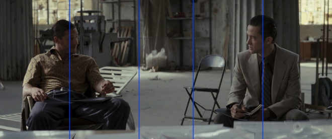
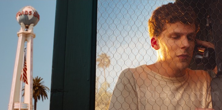
Film industry jargon isn’t shy of national references. A Dutch angle is a canted shot. To Spanish a piece of kit is to get rid of it (a corruption of “it’s banished”). To German a light – I think – is to lie the stand horizontal, attach the head, then raise the whole thing vertical. Or maybe that’s Italianing. I forget. But what is a French over?
It’s a type of over-the-shoulder shot. It requires the two characters to be bodily facing in the same direction, like on a bench or in the front seats of a car. If the camera shoots from behind their bodies, it’s a French over. Here are a few examples.
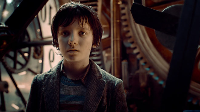
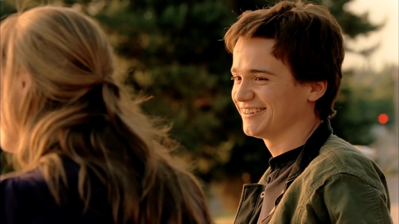
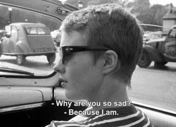
“Norman” (2010, DP: Darren Genet)A commercial shot by Patrick O’Sullivan“À bout de souffle” (1960, DP: Raoul Coutard)
A French over feels a little more conspiratorial or voyeuristic than a standard over. It gives the viewer a sense that they’re privy to a confidential conversation.
It works well for bench scenes because benches often have nice vistas in front of them which you can keep in the background of your close-ups, and you don’t have to cross the line to do a wide shot behind the bench showcasing the whole view.
“Mission: Impossible – Rogue Nation” (2015, DP: Robert Elswit, ASC)
It’s far easier to shoot French overs in a car because the operator can simply sit on the back seat rather than trying to jam the camera onto the dashboard.
French overs allow the editor more flexibility too. A typical problem of covering dialogue scenes where characters are facing the same way is that you can often clearly see the foreground character’s mouth, which locks the editor in to maintaining lip-sync every time they cut. In a French over you only see the back of the foreground character’s head so this problem is eliminated.
They’re not to everyone’s taste though. You certainly see less of the actors’ faces than in a standard over, and if the cast are not going to turn to look at each other very often their emotions could easily end up unreadable. If that’s not the effect you want, standard overs would be a better choice.
I hope you have all enjoyed Die Hard as a traditional staple of your Yuletide festivities. Every time I see it I am in awe of, among other things, the composition by DP Jan de Bont, ASC and camera operators Michael Ferris, Michael Scott and M. Todd Henry. Let’s have a look at some of the beautifully framed images and see what some of the hallmarks are.
Low Angles
“From up here it doesn’t look like you’re in charge of jack shit.”
So many low angles in Die Hard, some motivated by the blocking but many simply to make the characters seem larger than life.
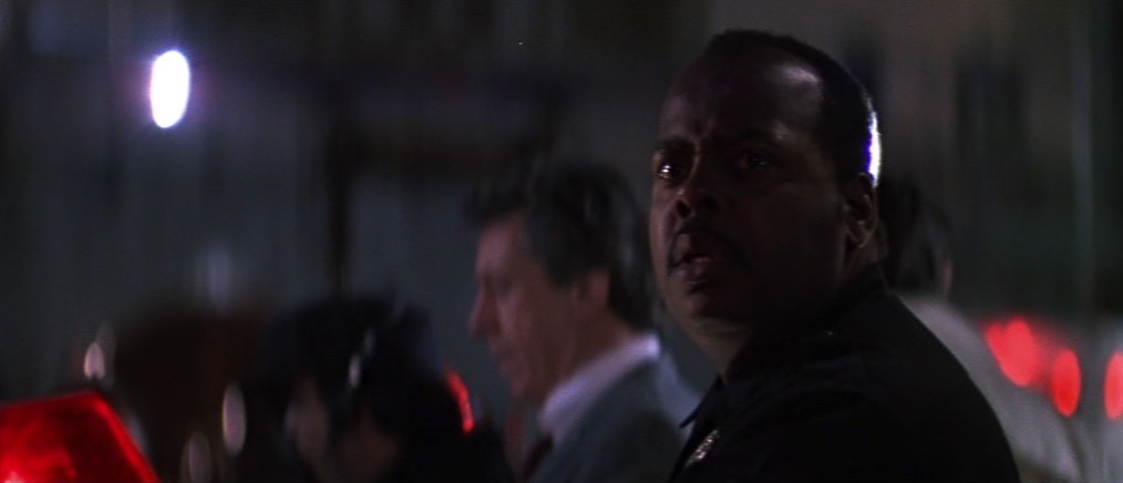
No Rule of Thirds
“There are rules for policemen.” / “Yeah. That’s what my captain keeps telling me.”
De Bont uses the full width of the 2.39:1anamorphic frame to creatively place his subjects, rarely obeying the Rule of Thirds and often squeezing characters right into one side of the frame.
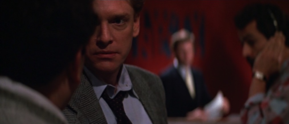
Short-siding
“Now I know what a TV dinner feels like.”
Short-siding means placing a character close to the side of the frame which they’re looking towards, and this happens quite often in the film as well.
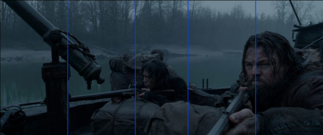
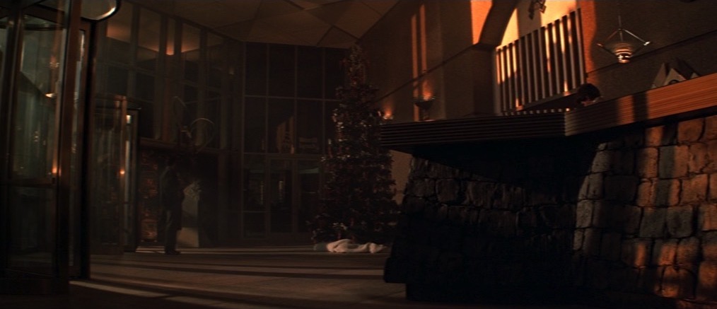
Deep Raking Shots
“Welcome to the party, pal.”
The filmmakers love to have a row of characters ranging from near to far. Even in over-the-shoulder shots, de Bont frequently adds an extra element in the background, continuing the depth procession begun by the foreground shoulder and mid-ground actor.
Dutch Angles
“You oughta be on fucking TV with that accent.”
Jan de Bont is from the Netherlands, so every shot… But I’m talking specifically about the canted shots which underscore the deception of the scene where Alan Rickman’s Hans Gruber pretends to be a hostage (with a highly convincing English-German-American accent) and the subsequent shoot-out in the computer room.
There are also a lot of great camera moves in Die Hard, but that’s a post for another Christmas. Happy new year and yippie-ki-yay, motherfuckers!
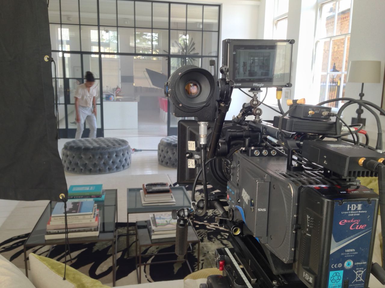
Shooting on one camera, getting the lighting and framing perfect for just one angle at a time, used to be a hallmark of quality in film and television. Nowadays many drama DPs are expected to achieve comparable quality while photographing two or more angles simultaneously, with all the attendant problems of framing out booms, lights and other cameras.
So what is the best way to tackle multi-camera shooting? Let’s consider a few approaches.
Photo: Brooks Patrick Allen
1. Two sizes
The most straightforward use of a B camera is to put it close to the A camera and point it in the same direction, just with a different lens. One disadvantage is that you’re sacrificing the ability to massage the lighting for the closer shot, perhaps bringing in a bounce board or diffusion frame that would flatter the actor a little more, but which would encroach on the wider frame.
Another limitation is that the talent’s eye-line will necessarily be further off axis on one of the shots. Typically this will be the wider camera, perhaps on a mid-shot including the shoulder of the foreground actor, while the other camera is tighter in terms of both framing and eye-line, lensing a close-up through the gap between the shoulder and the first camera.
The sound department must also be considered, especially if one camera is very wide and another is tight. Can the boom get close enough to capture the kind of close-miked audio required for the tight shot without entering the wide frame?
Some TV series are solving this problem by routinely painting out the boom in the wider shots. This is usually easy enough in a lock-off, but camera movement will complicate things. It’s an approach that needs to be signed off by all the major players beforehand, otherwise you’re going to get some panicked calls from a producer viewing the dailies.
2. Cross-shooting
This means filming a shot-reverse simultaneously: over character A’s shoulder onto character B, and over character B’s shoulder onto character A. This approach is an editor’s delight because there is no danger that the performance energies will be different when they cut from one person to the other, nor that arm or head positions will throw up continuity errors.
Keeping the cameras out of each other’s frames is of course an issue, one usually handled by backing them off and choosing tighter lenses. (Long lenses are an unavoidable side effect of multi-camera cinematography.) Two booms are required, and keeping their shadows out is four times as difficult.
Lighting can take twice as long too, since you now have two cast members who need to look their best, and you need to maintain mood, shape and contrast in the light in both directions simultaneously. Softer and toppier light is usually called for.
The performances in certain types of scene – comedy with a degree of improvisation, for example – really benefit from cross-shooting, but it’s by far the most technically challenging approach.
3. Inserts
Grabbing inserts, like close-ups of people’s hands dealing with props, is a quick and simple way of getting some use out of a second camera. Lighting on such shots is often not so critical, they don’t need to be close-miked, and it’s no hassle to shoot them at the same time as a two-shot or single.
There is a limit to how many inserts a scene needs though, so sooner or later you’ll have to find something else to do with the camera before the producer starts wondering what they’re paying all that extra money for.
4. Splinter unit
The idea of sending B camera off to get something completely separate from what A camera is doing can often appeal. This is fine for GVs (general views), establishing shots of the outside of buildings, cutaways of sunsets and so on, but anything much more complicated is really getting into the realm of a second unit.
Does the set or location in front of camera need to be dressed? Then someone from the art department needs to be present. Is it a pick-up of an actor? Well, then you’re talking about hair, make-up, costume, continuity, sound…
Photo: Brooks Patrick Allen
With the extra problems that a second camera throws up, it’s a fallacy to think it will always speed up your shoot; the opposite can easily happen. An experienced crew and a clear plan worked out by the director, DP, operators and gaffer is definitely required. However, when it’s done well, it’s a great way to increase your coverage and give your editor more options.
I once had an argument with a director about the composition of a wide shot. I wanted to put the horizon nearer the top of the frame than the bottom, and he felt that this was the wrong way around. In reality there is no right and wrong in composition, only a myriad of possibilities that are all valid and can all make your viewers feel different ways. In this article I will take a metaphorical ramble through these possibilities, and ponder their effects.
You would think that the most natural position for the horizon would be in the vertical centre of the frame. After all, in our day-to-day life, when we look straight ahead, this is where it appears to be.
In practice, a central horizon is not a popular choice. This article by Art Wolfe, for example, argues that it robs the image of dynamism, sending the eye straight to the horizon rather than letting it wander around the frame. The technique is also at odds with the Rule of Thirds, though as I’ve written before, that’s not a rule I place much stock in.
The talented photographer and vlogger Arian Vila, however, describes the merits of a central horizon when composing for a square aspect ratio. And this is an excellent reminder that the horizon does not exist in a vacuum; like anything else, it must be judged in the context of the aspect ratio and the other compositional elements of the frame.
This was a deliberate echo of the painting “Above the Clouds” which appears in the film and provides the thematic backbone.
A year or two after shooting Clouds, I came across Photograms of the Year: 1949 in a charity shop. Amongst its pages I found another diptych, one created by the book designer rather than the two entirely separate photographers:
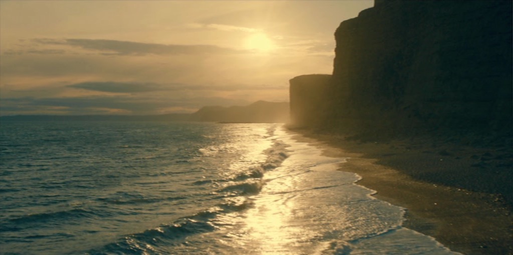
These two images, perfectly paired, demonstrate contrasting horizon placement. At Grey Dawn emphasises the sky by placing the horizon low in the frame, creating a sense of space. Meanwhile, Homeward Bound positions its horizon somewhere beyond the trees near the top of frame, drawing attention to the sand and the wheel ruts and indeed to the figures of the caravan itself, rather than to the destination or surroundings.
Horizon placement is closely tied to two other creative choices: headroom, which I dedicated a whole article to, and lens height, i.e. is this a low or a high angle? Even a GCSE media student can tell you that a low angle imbues power while a high angle implies vulnerability, but these are terms most applicable to closer shots. When we think of horizon placement we are probably concerned with big wides, where creating a mood for the scene or setting is more important than visualising a character’s power or lack thereof.
Breaking Bad is an example of a series that predominantly chooses low horizons to show off the big skies of its New Mexico locations. “[Showrunner] Vince [Gilligan] is a student of cinema and knows movies like the back of his hand,” says DP Michael Slovis, ASC. “It was always in his mind that this was a Western in the style of Sergio Leone and the Italian Neo-realists.”
Incidentally, there’s an amazing desert scene in the episode “Crawl Space” where a sunlit close-up cuts to a big wide. The wide holds as clouds roll over the sun. The action continues and the shot still holds, the line between sunlight and shade visible as it rolls away across the desert, until finally a new line slides under the camera and sun breaks over the actors once more. Only then are we permitted to see the scene up close again.
This creative choice, to set the character’s small concerns against the vast immutability of nature, comes from the same place as the choice to put the horizon low in frame.
Returning to Photograms of the Year: 1949, my eyes light upon another pair of contrasting images:
Despite its title, Towards the Destination shows us little of where the sailors are heading, by placing the horizon high in the frame and focusing on the water and the reflections therein. Rendezvous at Chincoteague, by placing its horizon low in the frame, radiates a feeling of isolation that is in contrast to the meeting of the title.
As we consider the figures in these photographs I am forced to concede that the argument I alluded to in the introduction may have been less about the position of the horizon and more about the position of the actor. I think the director felt that it was unnatural for an person to appear in the top half of the frame rather than the bottom half.
I can see his point. The vision of our naked eyes is definitely framed along the bottom by the ground, while the top remains open and unlimited – outdoors, at least. So if a person is standing on the ground, we naturally expect them to appear low down in an image.
Here is a shot of mine from The Gong Fu Connection (dir. Ted Duran) where the horizon and the cast are placed in the upper half of frame:
Would it really have been better to frame them lower, losing out on the reflections and the foreround rushes, and gaining just empty sky? I think not. This composition was especially important to me, because the film’s titular connection is all about man and the natural world. By showing the water and greenery, we root the characters in it. A composition with more sky might have made them seem dwarfed by nature, lost in it.
This article has been something of a stream of consciousness, but the point I’m trying to make is this: always consider the content and meaning of your shot; reflecting those in your composition is infinitely more important than adhering to any guidelines.
If you enjoyed this, you may be interested in some of my other articles on composition:
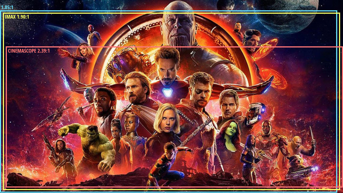
I used to be a casual follower of superhero films, until I was inducted into the Marvel Cinematic Universe via a movie marathon. Despite different directors for each instalment, the MCU has a fairly consistent look and feel, so I was a little surprised when we got to The Avengers to note that it differs visually in one significant way from all of its predecessors. Whereas the five previous films (and indeed most of the subsequent ones) were in the 2.39:1 aspect ratio, The Avengers was presented in the taller 1.85:1 ratio.
This initially struck me as counterintuitive. 2.39:1 was introduced in the 1950s to tempt watchers of the new-fangled TV back into the cinemas, and ever since then it has been associated with the biggest, most epic, most cinematic of movies. It seems like the natural choice for a superhero franchise, so it’s no surprise that the MCU adopted this ratio for most of its instalments. But if wider images mean a more epic movie, then surely The Avengers, the climax of Phase One and the coming-together of a whole team of superheroes, should be, if anything, even wider than its 2.39:1 predecessors?
“The Avengers” (2012, DP: Seamus McGarvey, BSC, ASC)
I’m certainly not the first person to be nonplussed by the choice. A quick google later on threw up plenty of forums where fans complained that The Avengers was “not cinematic enough” because of its aspect ratio. Some linked the choice of ratio to director Joss Whedon’s TV background, claiming he was more comfortable with that shape of frame.
The real reason for Whedon’s decision became clear as the action ramped up into the third act. The battle of New York is not a two-dimensional conflict; Thor and Iron Man are flying around, the Hulk climbs up buildings, the Chitauri ships float above the streets, and Stark Tower plays a key part in the action. The extra frame height of 1.85 was essential to tell that story.
“I wanted to feel the space around us, and use wider lenses,” said Whedon. “That’s why I went 1.85 instead of wider. In IMAX, I wanted it to fill your eyeball completely.”
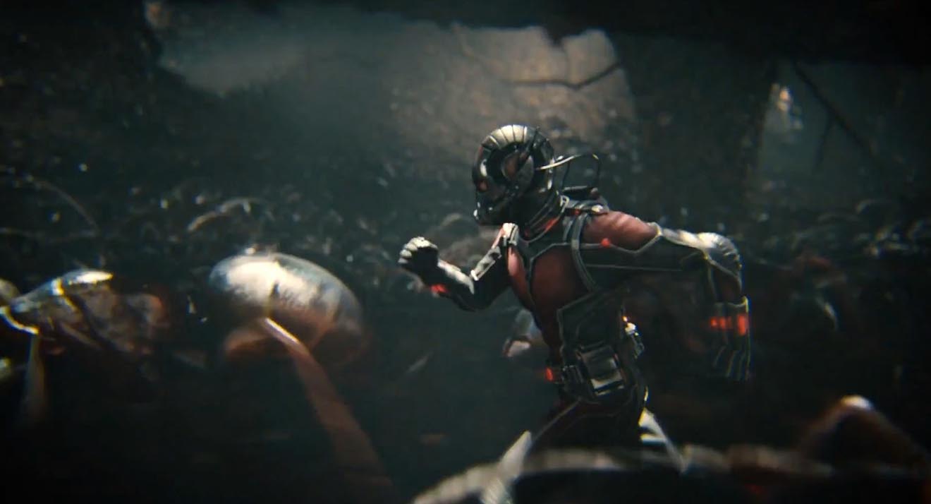
“Ant-Man” (2015, DP: Russell Carpenter, ASC)
Continuing the movie marathon, the MCU does not return to 1.85 until Ant-Man, and director Peyton Reed initially encountered resistance from the studio when he advocated this ratio. “It’s a big conversation because it affects production design. It affects everything. And it felt to me… that shrinking was a vertical act and it was going to serve the movie even more. And I had to make a case for the fact that it was still going to be epic.”
I wonder if the days of wider aspect ratios being perceived as more epic are numbered. IMAX sequences are becoming more and more common in blockbusters, including the Marvel films. Digital IMAX has an aspect ratio of 1.90:1, very similar to the 1.85 which is so often perceived as the small-scale, poor man’s ratio. (To confuse matters, the 1.90 sequences are often cropped to 2.39 for ordinary cinemas and home entertainment release.) An epic feel is very much what the IMAX brand is selling, so the traditional perception is being turned on its head. Both Avengers: Infinity War and the recent Endgame were shot entirely in Imax 1.90:1, and are sure to be the very definition of epic for a while to come.
Things seem to be going the same way over in the DC universe too. On the social media platform Vevo, director Zak Snyder had this to say about Batman v. Superman and Justice League: “I had so much fun shooting the IMAX sections of my movie (BvS) [that I] sort of fell in love with that giant less rectangular aspect ratio and so that’s why I shot JL 1:85”.
Image size may have something to do with this shifting trend. After all, a larger image is surely more epic than a smaller one. In theory, 2.39 should result in the largest image, with curtains or masks at the sides of a cinema screen opening up for these widescreen presentations. In practice though, many smaller multiplex auditoria mask the top and bottom of their screens for 2.39, making for a smaller overall image than 1.85, just like when you watch 2.39 content at home on your TV or monitor (which is 1.78:1). My local multiplex recently converted its largest auditorium to IMAX, which involved no change to the width of the screen, but an increase in height.
Add to this the fact that 2.39 overtook 1.85 as the most common aspect ratio for top-grossing films over a decade ago, and it’s small wonder that filmmakers seeking to make their work stand out from the crowd are turning to taller frames.
However the trend of aspect ratios ends up going, it’s important to remember that there’s no wrong or right. I’ve done jobs where directors have told me, “It’s a movie, it’s got to be 2.39,” or, “It’s a series, it’s got to be 1.78,” but there is always a choice. Are your sets tall or wide? Are your lead characters similar or dissimilar in height? Are landscapes or body language most important to this story? It’s factors like these that should really determine the best ratio for your movie, just as Whedon and Reed both realised.
The Rule of Thirds is the most well-known guide for framing an image. Simply imagine the frame divided into equal horizontal and vertical thirds – or don’t even bother imagining, just turn on your camera’s built-in overlay – and place your subject on one of those lines to get a pleasantly composed picture every time. Some filmmakers believe in the Rule so much that they refuse to even consider any other type of composition.
The Rule of Thirds in action on “The Aviator” (2004, DP: Robert Richardson, ASC), winner of the 2005 Best Cinematography Oscar
As I’ve previously written, I find the Rule of Thirds grossly overrated. In particular, when composing for a widescreen aspect ratio like Scope (CinemaScope, i.e.. 2.39:1), the Rule often doesn’t work for me at all.
In this post I’m going to look at an alternative compositional technique, but first let’s step back and find out where the Rule of Thirds actually comes from and why it’s so popular.
Origins of the Rule of Thirds
The first known appearance of the term “Rule of Thirds” is in a 1797 treatise Remarks on Rural Scenery by the English painter John Thomas Smith. It seems he read too much into a simple statement by fellow artist Sir Joshua Reynolds to the effect that, if a picture has two clear areas of differing brightness, one should be bigger than the other. Hardly a robust and auspicious start for a rule that dominates the teaching and discussion of composition today.
I suspect that the Rule has gained strength over the last two centuries from the fact that it encourages novice painters, designers and photographers to overcome their natural tendency to frame everything centrally. Another factor in the Rule’s ubiquity is undoubtedly its similarity to a much older and more reasoned rule: the Golden Ratio.
The Golden Ratio and the Phi Grid
A mathematical concept that’s been around since the time of the ancient Greeks, the Golden Ratio is approximately 1.6:1. It’s a special ratio because if you add the two numbers together, 1.6+1, you get 2.6, and 2.6:1.6 turns out to be, when boiled down, the same ratio you started with, 1.6:1.
Two quantities are in the Golden Ratio if their ratio is the same as the ratio of their sum to the larger of the two quantities.
It’s difficult to get your head around, I know!
The Golden Ratio is found in nature, in the spiral leaves of some plants for example, and even in certain crystals at the atomic level. There is a long history of artists believing that using the Ratio produces a more aesthetically pleasing image.
The Golden Ratio is most simply applied to composition in the form of a Phi Grid, which resembles a Rule of Thirds grid, but in different proportions, namely 1.6:1:1.6 rather than 1:1:1.
Andrew Lesnie, ACS, ASC applies the Phi Grid – though not necessarily deliberately – to “The Lord of the Rings: The Two Towers”
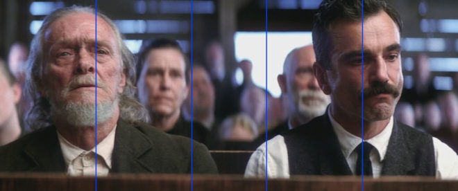
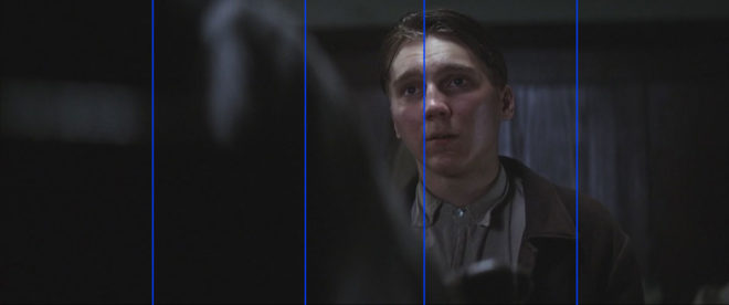
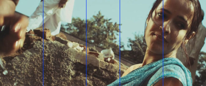
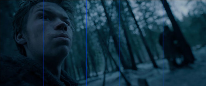
The Rule of Thirds and the Phi Grid both feel quite limiting in Scope because out of all that horizontal space you’ve only got two vertical lines to place your subject on. There is another technique though, one which provides more options.
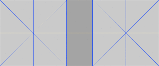
The Squares within the rectangle
In his book The Mind of the Photographer, Michael Freeman writes about a composition guideline which dates back to the Middle Ages. You imagine two squares, the same height as the frame, and aligned with either side of the frame, then place your subject on the centre or inner edge of one of these squares.
Applied to a Scope frame it looks like this:
We can simplify it down to this:
When I first read about this technique, it really chimed with me. I’ve long believed that a “Rule of Fifths” would be a more effective guide for Scope composition than the Rule of Thirds, and the above diagram isn’t far away from fifths.
Below I’ve overlaid this grid on a few shots from Scope movies that won Best Cinematography Oscars: There Will Be Blood (DP: Robert Elswit, ASC), Slumdog Millionaire (Anthony Dod Mantle, DFF, ASC, BSC), Inception (Wally Pfister, ASC), The Revenant (Emmanuel Lubezki, ASC, AMC) and Blade Runner 2049 (Roger Deakins, CBE, ASC, BSC).
Let me provide a disclaimer first, though. You could draw any grid you wanted and find some shots from movies that matched it. The purpose of this article is not to convince you to ditch the Rule of Thirds and start following this “rule of squares within a rectangle” instead. (For a start, that name is never going to catch on.) This “rule” chimes with me because it’s similar to the way that I was already instinctively composing, but if it doesn’t work for you then don’t use it. Develop your own eye. It’s a creative medium, so compose creatively, not like a robot programmed with simple rules.
I’ll leave you with this quote from the great photographer Ansel Adams:
The so-called rules of photographic composition are, in my opinion, invalid, irrelevant and immaterial.
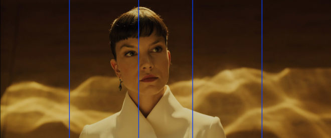
This summer I shot Exit Eve, a short film from director Charlie Parham dealing with the exhausting and demeaning life of an au pair. We took the unusual decision to shoot it in 4:3, a ratio all but obsolete, but one which felt right for this particular story. Before I look at some of the ratio’s strengths and challenges, let’s remind ourselves of the history behind it.
History
William Kennedy Dickson
The 4:3 motion picture aspect ratio, a.k.a. 1.33:1, was created about 120 years ago by William Kennedy Dickson. This Thomas Edison employee was developing a forerunner to the movie projector, and decided that an image height of four perforations on 35mm film gave the ideal shape. In 1909 the ratio was declared the official standard for all US films by the Motion Picture Patent Company.
When the talkies arrived two decades later, room needed to be made on the film prints for the optical soundtrack. The Academy of Motion Pictures Arts and Sciences responded by determining a new, very slightly wider ratio of 1.37:1, known fittingly enough as the Academy Ratio. It’s so similar to 4:3 that I’m going to lump them together from hereon in.
When television was invented it naturally adopted the same 4:3 ratio as the big screen. The popularity of TV led to falling cinema attendance in the 1950s, to which the Hollywood studios responded with a range of enticing gimmicks including widescreen aspect ratios. Widescreen stuck, and for the next generation 1.85:1 and 2.39:1 were the ratios of cinema, while the narrower 4:3 was the ratio of TV.
By the time I entered the industry in the late 1990s, 4:3 was much maligned by filmmakers. It seemed boxy and restrictive compared with widescreen, and reminded those of us in the guerrilla world that we didn’t have the budgets and equipment of the Hollywood studios. Meanwhile, the wide compositions of big movies were butchered by pan-and-scan, the practice of cropping during the telecine process to fit the image onto a 4:3 TV without letterboxing. 4:3 was ruining our favourite movies, we felt.
Then, in the 21st century, 16:9 television became the norm, and the 4:3 aspect ratio quietly disappeared, unmourned…. Or did it?
Contemporary Cinema
Although they are firmly in a minority, a number of filmmakers have experimented with 4:3 or Academy Ratio in recent years. Some, like Andrea Arnold and the late Éric Rohmer, rarely shot anything else.
Arnold wanted a combination of intimacy and claustrophobia for her Bafta-winning 2009 drama Fish Tank. She carried the ratio over to her next film, an adaptation of Wuthering Heights, despite the prevalence of big landscapes which would have prompted most directors to choose 2.39:1. The Academy Ratio focuses the viewer’s attention much more on the characters and their inner worlds.
“Fish Tank” – DP: Robbie Ryan, BSC
Mark Kermode has this to say about the 1.37:1 work of Arnold and her DP Robbie Ryan: “What’s wonderful about it is the way [Ryan] uses that squarer format not to make the picture seem compressed but to make it seem taller, to make it seem larger, to make it seem oddly more expansive.”
Meek’s Cutoff (2010), a modern western by Kelly Reichardt, recalls the early Academy classics of the genre. As with Wuthering Heights, characters are placed in the landscape without being dominated by it, while the height of the frame produces bigger skies and an airier feel.
“Meek’s Cutoff” – DP: Chris Blauvelt
Pawel Pawlikowski’s 2013 Oscar-winner Ida deliberately goes against the grain, shooting not only in 4:3 but in black and white as well. It’s the perfect format to convey the timeless, spartan existence of the titular Ida and her fellow nuns. The tall frame allows for copious headroom, inspiring thoughts of Heaven and God, beneath which the mortal characters seem small.
The 2017 animated feature Loving Vincent, meanwhile, adopted 4:3 because it was closer to the shape of Van Gogh’s paintings.
David Lowery, director of last year’s A Ghost Story, wanted to trap his deceased title character in the boxy ratio. “It gave me a good opportunity to really hammer home the circumstances this ghost finds himself trapped in, and to dig into and break down the claustrophobia of his life within these four walls… And it was also a way to tap into some degree of nostalgia, because it feels old-fashioned when you see a movie in a square aspect ratio.”
4:3’s nostalgia factor has allowed it to be used very effectively for flashbacks, such as those in the recent Channel 4/Netflix series The End of the F***ing World. Wes Anderson delineated the three time periods of The Grand Budapest Hotel (2014) with different aspect ratios, using 1.37:1 for scenes set in 1932, the very same year in which that ratio was standardised by the Academy.
“Exit Eve”
Nostalgia, intimacy, claustrophobia, isolation – these are just some of the feelings which cinema’s original aspect ratio can evoke. For Charlie and I on Exit Eve, it was the sense of being trapped which made the ratio really fit our story.
I’m also a great believer in choosing a ratio that fits the shape of your primary location, and the converted schoolhouse which we were shooting in had very high ceilings. 4:3 allowed us to show the oppressive scale of these rooms, while giving the eponymous Eve little horizontal freedom to move around it. One additional practical consideration was that, when lensing a party scene, the narrower ratio made it easier to fill the frame with supporting artists!
It wasn’t hard to get used to framing in 4:3 again. A lot of Exit Eve was handheld, making for fluid compositions. There were a couple of tripod set-ups where I couldn’t help thinking that the extra width of 1.85:1 would be useful, but for the most part 4:3 worked well.
We were shooting on an Alexa Plus with a 16:9 sensor, meaning we were cropping the image at the sides, whereas ideally we would have hired a 4:3 model to use the full width of the sensor and a larger proportion of our lenses’ image circles. This would have allowed us to get slightly wider frames in some of the location’s smaller rooms.
Our sound department had to adapt a little. The boom op was used to being able to get in just above the actors’ heads, but with the generous headroom I was often giving, she had to re-learn her instincts.
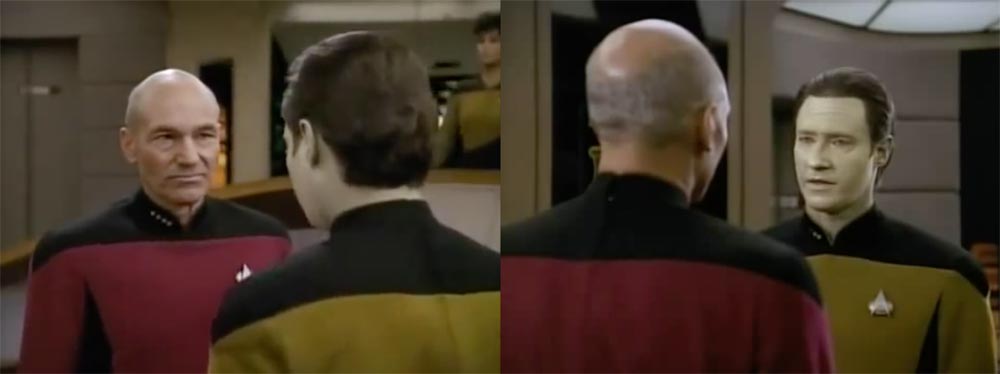
Classic 4:3 overs in “Star Trek: The Next Generation”
I had forgotten how well dialogue scenes are suited to 4:3. With wider ratios, over-the-shoulder shots can sometimes be tricky; you can end up with a lot of space between the foreground shoulder and the other actor, and the eye-line ends up way off camera. 4:3 perfectly fits a face, along with that ideal L-shape of the foreground shoulder and side of head, while keeping the eye-line tight to camera.
Not every project is right for 4:3, far from it. But I believe that the ratio has served its sentence in the wilderness for its pan-and-scan crimes against cinema, and should now be returned to the fold as a valid and expressive option for filmmakers.
A couple of weeks ago I wrote a post on lead room, the amount of horizontal space the subject is given in front of them in the frame. Commonly the subject is placed to one side or the other, but there can be times when sitting that actor bang in the middle of the screen is most appropriate and effective. Here are some reasons you might want to do it.
1. To show immersion in the environment
When you surround a character with equal amounts of the background on both sides, you embed them into that background, creating a strong connection between them and their environment. This can be seen to great effect in the above frames from Road to Perdition and Butch Cassidy and the Sundance Kid (DP: Conrad Hall, ASC) and The Revenant (DP: Emmanuel Lubezki, ASC, AMC).
2. To create power
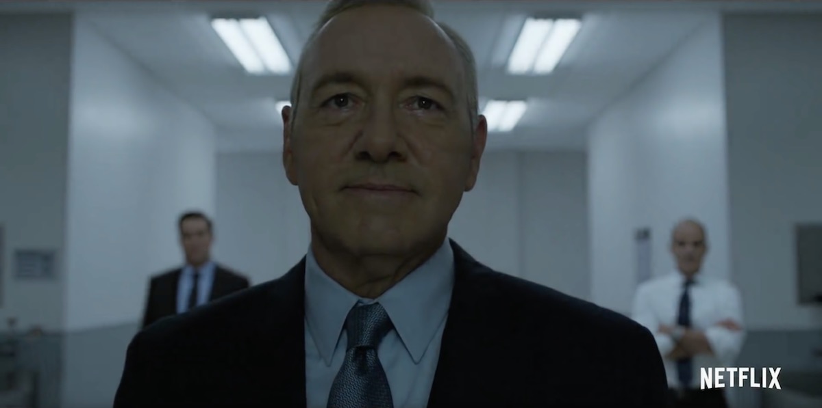
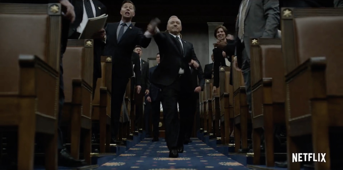
Central framing can give a subject tremendous power and dominance, particularly in combination with a low angle, as seen in the above examples from House of Cards (DP: David M. Dunlap) and Django Unchained (DP: Robert Richardson, ASC).
3. To suggest formality or rigidity
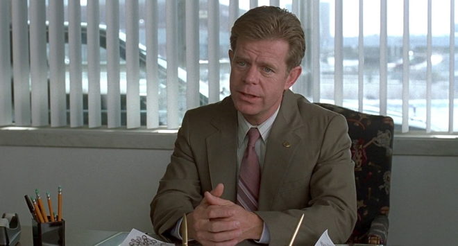
These scenes from American Beauty (DP: Conrad Hall, ASC) use central framing to emphasise the formality of Lester’s performance review, and the stilted, suffocating nature of his home life.
4. To create order
Kubrick used central framing with strong single-point perspective to create worlds of perfect order… so perfect that they would have to come crashing down sooner or later. The above examples are from Full Metal Jacket (DP: Douglas Milsome, BSC, ASC) and 2001: A Space Odyssey (DP: Geoffrey Unsworth, OBE, BSC).
This shot from The Matrix (DP: Bill Pope, ASC) also uses central framing to symbolise order, the calculatingly perfect order of the machines.
5. To suggest duality
When you shoot a shot-reverse with both parties centred, the two characters appear to replace each other on screen every time you cut. This can suggest a strong connection between the characters, or a strong conflict as they battle for the same piece of screen. Donnie Darko (DP: Steven B. Poster, ASC, ICG) uses this technique to set up the antagonism of the rabbit, while also suggesting he’s a part of Donnie, a figment of his imagination.
6. For humour
Centre framing is of course a huge part of Wes Anderson’s style, as in The Life Aquatic with Steve Zissou and The Grand Budapest Hotel (DP: Robert Yeoman, ASC). But I don’t think it’s stylisation for stylisation’s sake; his movies all have the feeling of tall tales told by ageing relatives with the aid of a scrapbook full of dorky, posed photos. The symmetry helps create the dorkiness, and from thence – as Lee & Herring used to say – the humour arises. The same is true of this classic scene from Garden State (DP: Lawrence Sher, ASC).
7. For faster cutting
Mad Max: Fury Road (DP: John Seale, ACS, ASC) was framed centrally in service of the editing. Director George Hill realised that if he put everyone in the same place in frame, the audience wouldn’t need to search the screen for the subject after every cut, allowing him to edit faster without making the action incomprehensible. See this post for more on the cinematography of Fury Road.
8. For impact
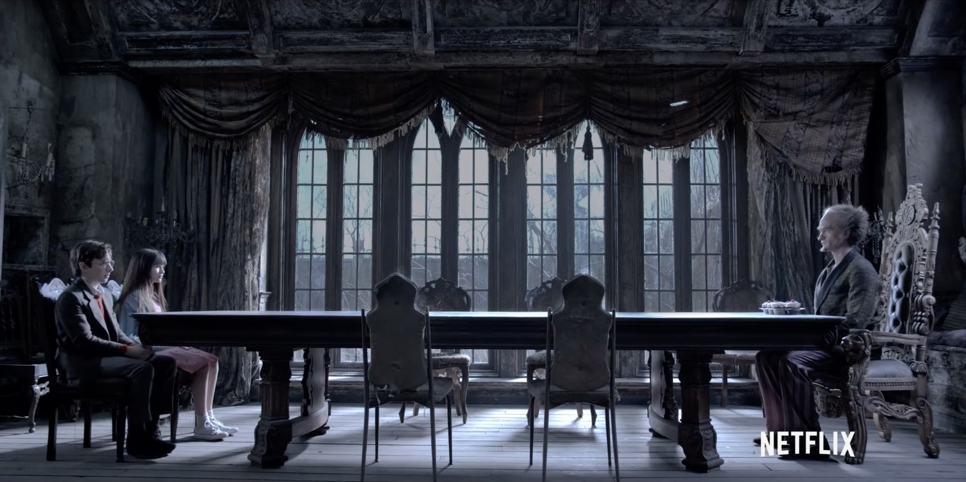
When used judiciously, central framing can have a big impact, giving a character their moment in the spotlight, putting them centre stage. It can underline a key character or story beat. The examples above are from Hugo (DP: Robert Richardson, ASC), Rogue One (DP: Greig Fraser, ACS, ASC) and American Beauty again.
9. To Break the fourth wall
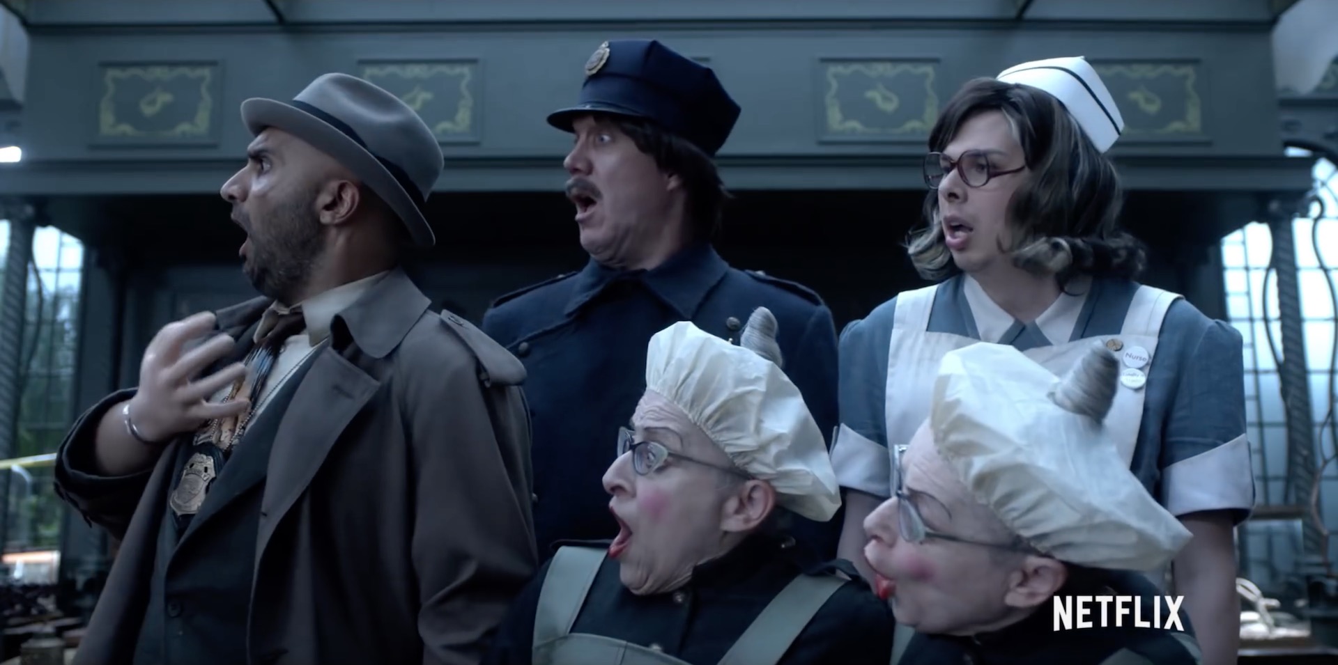
And finally, if your subject is looking into the lens, addressing the audience, then central framing is the natural composition. It’s not the only composition though; often the subject will be framed to one side so we can see the action continuing in the background even as it is narrated to us. But if the shot is just about the narrator, often central framing will be the most effective, as in the above shots from Amélie (DP: Bruno Delbonnel, AFC, ASC) and A Series of Unfortunate Events (DP: Bernard Couture).
Last autumn I wrote a post about aspect ratio, covering the three main ratios in use today: 16:9, 1.85:1 and 2.39:1. The post briefly mentioned a few non-standard ratios, including 2:1. Since then, I’ve noticed this ratio popping up all over the place. Could it be on its way to becoming a standard?
Today I’ll give you a little background on this ratio, followed by a gallery of frame grabs from 2:1 productions. The aim is simply to raise awareness of this new(ish) tool in the aspect ratio toolkit. As ever, it’s up to the director and DP to decide whether their particular project is right for this, or any other, ratio. However, I would caution low-budget filmmakers against picking what is still not a common ratio without considering that smaller distribution companies may crop your work to a more standard ratio either because of convenience or negligence.
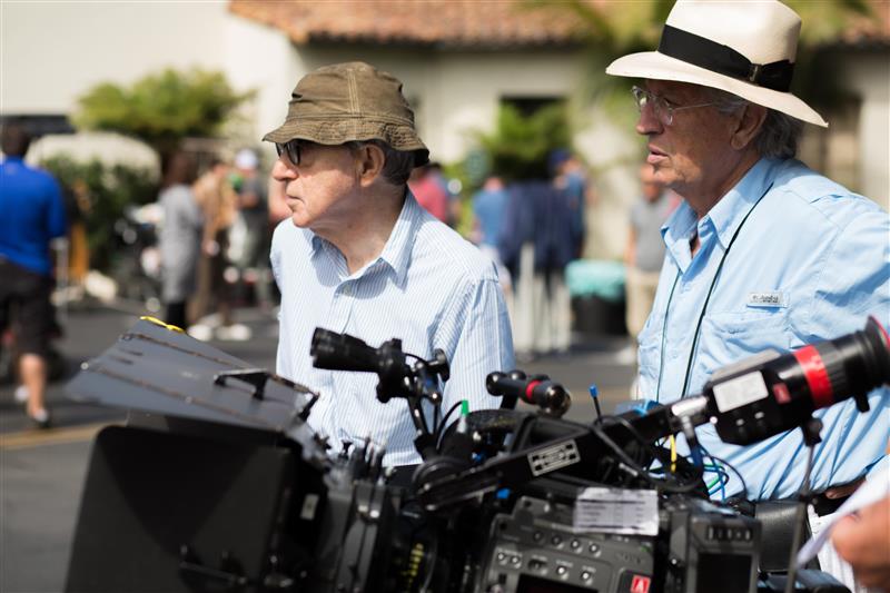
Woody Allen and Vittorio Storaro shooting Café Society
Vittorio Storaro, ASC, AIC – the highly-regarded cinematographer of Last Tango in Paris and Apocalypse Now amongst many others – began championing the 2:1 ratio around the turn of the millennium. It was one of the most complicated times in the history of aspect ratios. The horror of pan-and-scan (butchering a movie to fit its 1.85:1 or 2.39:1 ratio into 4:3 without bars) was starting to recede with the introduction of DVD, which was in fact still 4:3 but could contain squeezed 16:9 content. Widescreen television sets were starting to build in popularity, but some programmes and films were being broadcast in the middle-ground ratio of 14:9 so as not to offend the majority of viewers who still had 4:3 sets. And Storaro recognised that HD would soon supplant celluloid as the primary capture and exhibition method for cinema, likely bringing with it fresh aspect ratio nightmares.
Storaro proposed “Univisium”, a 2:1 aspect ratio that fell between the two cinema standards of 1.85:1 and 2.39:1. It was a compromise, designed to make everyone’s life easier, to produce images that would need only minor letterboxing no matter where or how they were screened. However, the industry did not share his vision, and until recently 2:1 productions were relatively rare, most of them lensed by Storaro himself, such as Frank Herbert’s Dune,Exorcist: The Beginning and Storaro’s first digital picture, Café Society.
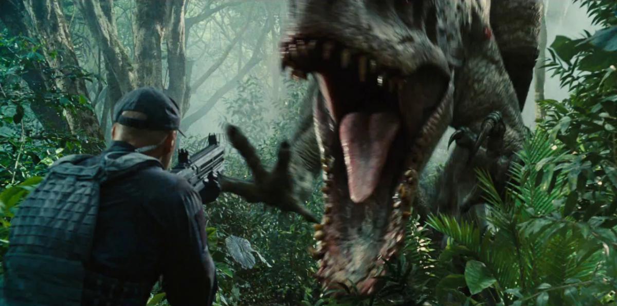
John Schwartzman shooting Jurassic World
Perhaps the biggest 2:1 movie to date is Jurassic World. DP John Schwartzman, ASC wanted to shoot anamorphic 2.39:1, while Steven Spielberg, exec producing, advocated 1.85:1 (like his original Jurassic Park) to provide more height for the dinosaurs. 2:1 was arrived at, again, as a compromise.
And compromise is likely what has driven the recent explosion in 2:1 material – not in the cinema, but online. Recent shows produced in this ratio include The Crown, A Series of Unfortunate Events, Stranger Things and House of Cards on Netflix, and Transparent on Amazon. I expect the producers of these series were looking to give their audience a more cinematic experience without putting off those who dislike big black bars on their screen, not unlike the reasoning behind the 14:9 broadcasts in the noughties.
2:1 may be a ratio born out of compromise, but then so was 16:9 (invented by SMPTE in the early eighties as a halfway house between 2.35:1 and 4:3). It certainly doesn’t mean that shooting in 2:1 isn’t a valid creative choice. Perhaps its most interesting attribute is its lack of baggage; 16:9 is sometimes seen as “the TV ratio” and 2.39:1 as “the big movie ratio”, but 2:1 has no such associations. One day perhaps it may be thought of as “the streaming ratio”, but for now it is simply something other.
Anyway, enough of the history and theory. Here are some examples of the cinematography that can be achieved in 2:1.
Cafe Society
DP: Vittorio Storaro, ASC, AIC
Jurassic World
DP: John Schwartzman, ASC
House of Cards
Season 5 DP: David M. Dunlap
Stranger Things
Season 1 DP: Tim Ives
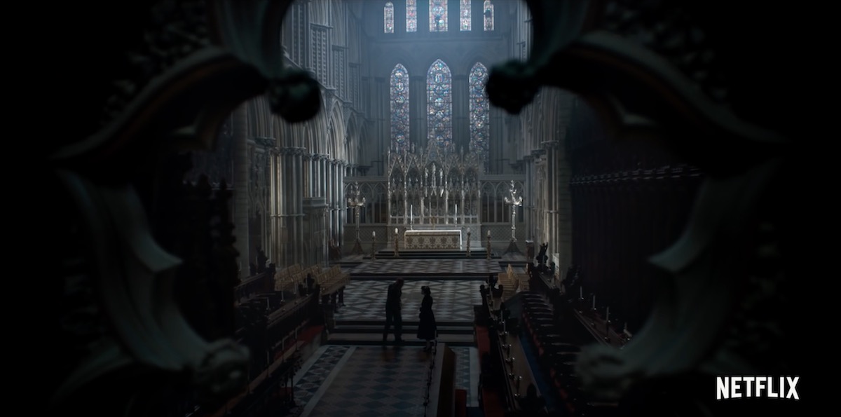
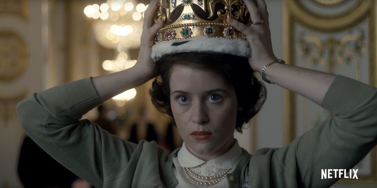
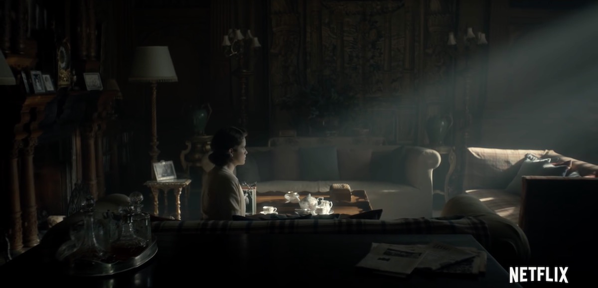
The Crown
Season 1 DPs: Adriano Goldman, ASC, ABC & Ole Bratt Birkeland
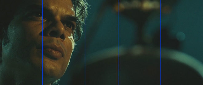
Like headroom, last week’s topic, lead room is one of the first concepts we are introduced to when we begin learning camera operation. And like headroom, it’s a rule that’s made to be broken. If a character is looking screen-left, certainly it’s most common to place them on the right of frame – giving them lead room (a.k.a. nose room or looking space) on the left, but that is not the only option. In certain situations it’s more appropriate, or simply more aesthetically pleasing, to place them on the left, or in the centre. And although The Rule of Thirds suggests how far to the left or right they will commonly be placed (a third, or two-thirds of the way across the frame) it is, again, far from the only option.
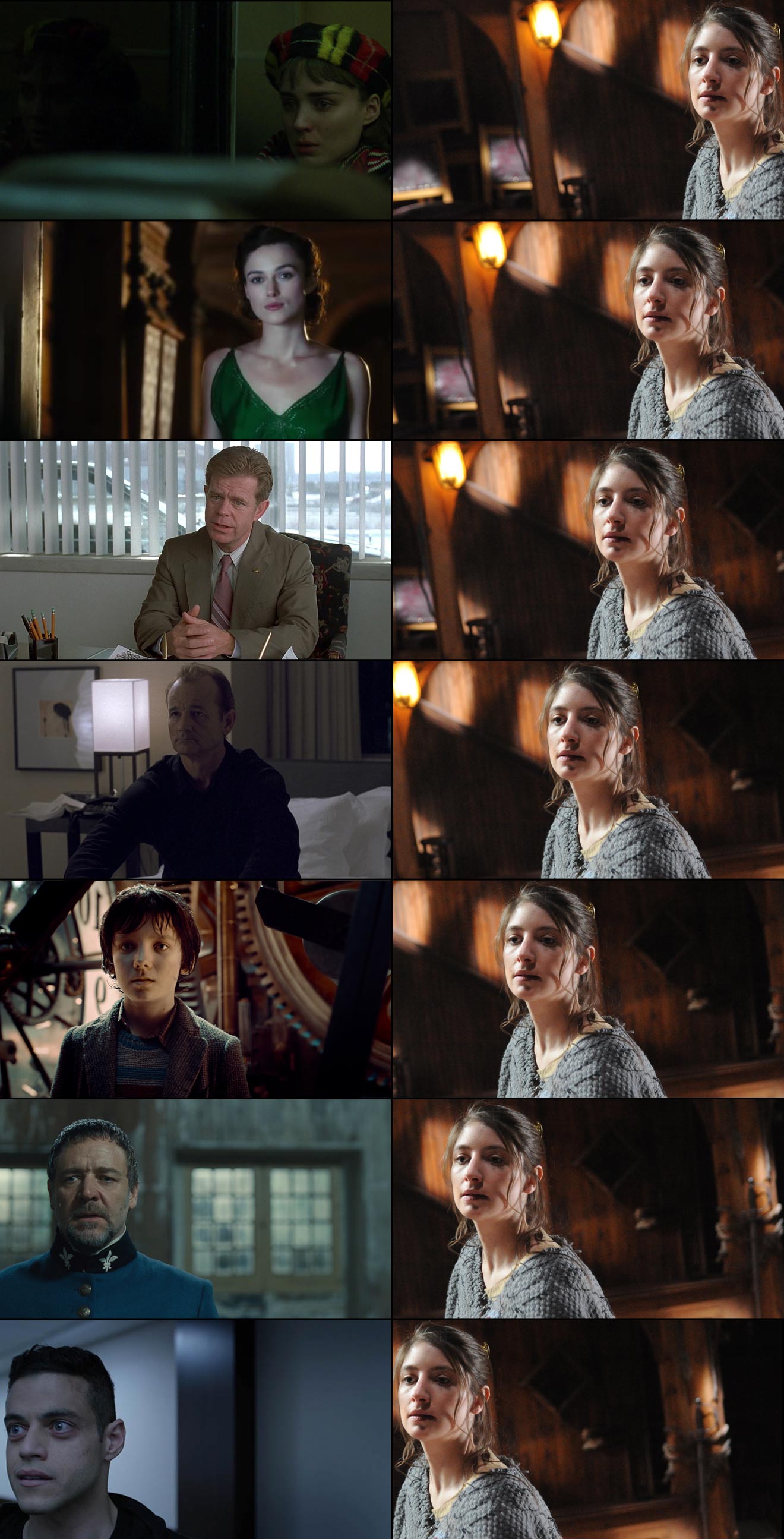
Below I’ve compiled a spectrum of lead room: a series of examples showing the whole range of horizontal positions within a frame where a subject could be placed. (Note: I’ve flopped some of the images to maintain the screen direction.) All of these examples are from 1.78:1 or 1.85:1 productions, but of course with the 2.39:1 Cinemascope format there is an even greater range of options. On the righthand side, to aid comparison, I’ve placed different crops of the same photo (by Richard Unger).
No composition is fixed in motion picture production. Actors move around, miss their marks; it’s difficult for a DP to be precise about where the subject appears in the shot, so reading a particular intention into an individual frame is dangerous. But if, within a film, there is a trend of characters, or a specific character, being placed in one particular part of the frame, then it’s fair to assume that the filmmakers were deliberately trying to create a particular effect.
With that in mind, the thoughts below are not intended to analyse why that specific shot in that specific production was composed the way it was, but rather to consider in general terms what meanings and emotions that kind of composition might convey.
“Carol” (DP: Edward Lachman)
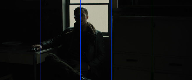
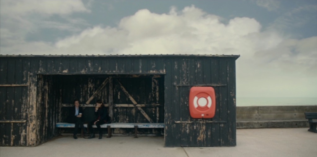
This is the maximum lead room you can give an actor in 1.85:1 without cutting off part of their head (which you may want to do in certain extreme circumstances, but that’s a subject for another post). This is someone backed into a corner, isolated. They have full cognisance of their situation – they can see it all in front of them. What you choose to place on the other side of frame is very important with an extreme composition like this. Negative space, as in the above example, creates an unbalanced frame, suggesting someone in a precarious situation, whereas another person or object would appear to dominate the subject.
“Atonement” (DP: Seamus McGarvey)
This is widely considered to be the ideal framing, with the subject placed according to The Rule of Thirds. Assuming that Keira is looking at another actor here, and that that actor’s single is framed with him in the left half of frame, the brain can comfortably merge the two shots into one, creating – subconsciously – a split-screen like a phone conversation in an old sitcom. The shot-reverse will be pleasingly balanced, and no tension will be created – at least not by the lead room.
“Fargo” (DP: Roger Deakins)
On more than one occasion I’ve tried to frame a shot like this, only to be told by the director that the subject is “too close to the centre”, it’s “wrong” and the subject must be placed on a third. What I should have done is shown them this frame, said, “If it’s good enough for Roger Deakins….” and then coughed in a way that sounded suspiciously like “thirteen Oscar nominations”. What’s interesting about this composition is the visual tension it creates when edited with the reverse. If the other actor is similarly close to the centre, their images start to overlap, almost like they’re duking it out, and if the other actor is placed further from the centre, they will seem trapped by their interlocutor. Or maybe composing the shot this way sometimes just allows for the best range of movement from the actor and the most pleasing frame.
“Lost in Translation” (DP: Lance Acord)
Placing someone in the centre of frame can be very powerful. It suggests someone in control, balanced, dominant. Now of course, that is not at all an accurate description of Bill Murray’s character in Lost in Translation. But notice that big, bright practical light so close to his head; it completely unbalances the composition. This just goes to show that the subject’s position relative to background elements can be of equal or greater importance to their position within the frame. I aim to do a whole post about centre-framing in the near future.
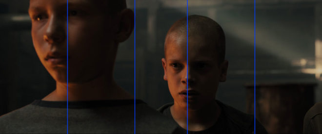
“Hugo” (DP: Robert Richardson)
Although short-sided, the boy still has some lead room, in fact an amount of lead room that would be perfectly normal in a 4:3 composition. Personally, I would be comfortable with this composition for purely aesthetic reasons, but it could also be used to create some visual tension, suggesting things unknown behind the subject, waiting to creep up on them figuratively or literally. It could also suggest the character is weak, particularly if intercut with another character who is more traditionally framed.
“Les Miserables” (DP: Danny Cohen)
Now we are into territory that many will find uncomfortable. A character short-sided like this may seem unbalanced, lost, trapped, wrong-footed or isolated. Or they might simply be deep in thought; you can easily imagine another character entering in the background of the above frame, breaking Crowe’s reverie, restoring the compositional balance and turning it into a deep two-shot.
“Mr. Robot” (DP: Tod Campbell)
Imagine someone walking into a room and standing right up against the wall, facing it. You would think them strange, disturbed. You might wonder if they were looking at something imaginary. This is the effect created by extreme short-siding. It also serves to make the subject look completely alone, even though they might be speaking to someone just inches in front of them. Mr. Robot is the only place I’ve ever seen composition this unusual, though I’m sure there are other examples out there.
Next time you watch a film or a TV show, pay attention to the lead room. You may be surprised to find that non-standard compositions are employed more often than you thought.
Thanks again to evanrichards.com, where I found most of the frame grabs.


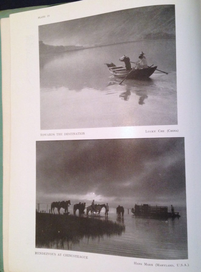 Despite its title, Towards the Destination shows us little of where the sailors are heading, by placing the horizon high in the frame and focusing on the water and the reflections therein. Rendezvous at Chincoteague, by placing its horizon low in the frame, radiates a feeling of isolation that is in contrast to the meeting of the title.