Headroom

One of the first things that amateur photographers and cinematographers are taught is  “correct” headroom. Don’t put people’s heads in the middle of the frame, we’re told, but at the top. Rules are made to be broken though, and here are three examples of beautiful cinematography which do just that.


Broadchurch

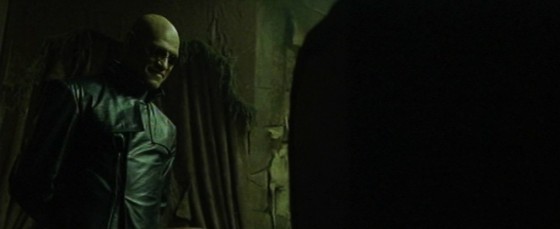
“A town wrapped in secrets” is the tag-line of this critically-acclaimed ITV detective serial. In classic murder mystery fashion, every character is hiding something, causing suspicion to rest on each of them for a little while until the the person hiding the right secret is found.

David Tennant’s DI Alec Hardy complains of the small coastal town’s “endless sky”, an observation which could equally apply to the cinematography, framing the action as it often does with expansive headroom. While this may be partly an attempt to emphasise the isolation of the titular town, where people are small in the face of nature, its primary effect is to evoke the secrecy so integral to the storyline. Just as the police – and viewers – are figuratively misdirected by the suspects’ lies, so the camera is literally misdirected. The message from Matt Gray, BSC’s cinematography is: look at the beautiful sky and the paintings high up on the wall, because if you look too hard at what’s in front of you, you’ll see that the surface perfection of the bucket-and-spade idyll is built on foundations of sand.
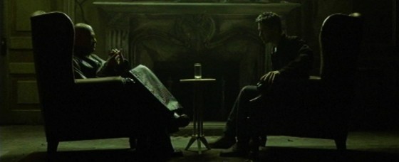
 

Utopia

This stylish, stunningly-photographed thriller ran for two seasons on Channel 4 in 2013 and 2014. It featured a group of disparate characters following clues in a cult graphic novel to uncover a chilling conspiracy. It was the first TV show I’d ever seen in 2.39:1, it had a garish, digitally-manipulated palette, and its composition broke all the rules.

Amongst Utopia‘s visual hallmarks was the use of plentiful headroom. Characters were frequently crushed into the lower half of the frame, a symbol of the powerful conspiracy looming over them. The overall look crafted by director Marc Munden and DP Ole Bratt Birkeland placed the viewer completely outside of the comfort zone of TV’s visual conventions, into a world where you couldn’t trust or rely on anything. (The Amazon series Mr. Robot uses similar techniques for similar reasons.)

Both seasons of Utopia can be viewed free at channel4.com


IDA

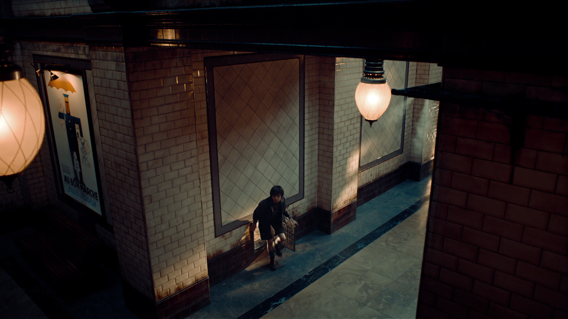
The makers of the Oscar-winning Polish indie feature Ida also chose an unusual aspect ratio; 4:3 had not been commonly used in features for decades. It was director Pawel Pawlikowski who wanted to try framing his subjects low down within the boxy ratio, leaving lots of headroom.

DP Lukasz Zal, PSC embraced the idea. “We saw that [the odd framing] created the feeling of loss, isolation and that it wasn’t just a strange mannerism but it conveyed so much more,” he told The LA Times.

Many interpretations have been placed on the meaning of the extra headroom in this tale of a young novitiate nun who comes to question her lifestyle. Most commonly it is seen as implying heaven above and therefore the nuns’ thoughts of the divine. To me it also conveys a sense of helplessness, of free will being overcome by larger forces above and around Ida.

Read this post on the ASC website for more on the cinematography of Ida.

If you want to delve deeper into the topic of headroom, I highly recommend this article by Art Adams: A Short History of Headroom, and How to Use It.

I’ll leave you with Pawel Pawlikowski’s thoughts on the ambiguity of his framing in Ida

Some audiences have said the sky was crushing them. When you do something that’s formally strong, it elicits all kinds of responses. When you make these decisions, they’re kind of intuitive. You don’t intellectualize what it means; it feels right.

Headroom

Composing a Shot-Reverse

Ah, the shot-reverse, that staple of film and television, that standard for dialogue scenes everywhere. Sooner or later, two characters are going to stand three feet apart, facing each other, and have a chat. (You know, like real people do all the time.) And the required coverage will be a wide or two-shot, followed by a pair of singles known as a shot-reverse.

The singles can be dirty (including the other character’s shoulder or back of head in the frame) or clean (not showing the other character). Except for tight close-ups, dirty singles – often called over-the-shoulder shots for obvious reasons – are most common, and it’s these that I’ll focus on in this post.


The Unwritten rules. Which I shall now write.

Conventional wisdom on shot-reverses says that the two shots should

  • be the same size,
  • use the same lens,
  • match the height of the respective eye-lines,
  • allow “looking space”, and
  • frame the two characters on opposite sides of the screen.

Here is a shot-reverse from Hugo (DP: Robert Richardson) which obeys all of these rules…

And here is a shot-reverse from Alien (DP: Derek Vanlint) which obeys none of them…

Ultimately, like all framing decisions, it’s subjective. Directors often have strong ideas about what they do and don’t like in shot-reverses. And no two DPs will agree exactly on the subject. And of course the actors will move around at least slightly during the scene, messing with any strict composition you’ve established.


Using the width of the frame

Traditional television, driven as it was by dialogue scenes usually covered in over-the-shoulder shots, was perfectly suited to the old 4:3 ratio. The subject and foreground characters neatly filled the frame.

But with today’s wider aspect ratios – particularly 2.39:1- we have a choice to make about how to use the extra horizontal space. If we want to place the characters on either side of the frame, we have to shift the camera out, away from the eyeline…

This has the disadvantage of showing some of the foreground character’s face, and starting to look a little like a two-shot. But it may be very effective symbolically if the characters have a strained or distant relationship in the story.

If you don’t like all that space between the characters, you can return the camera closer to the eyeline, keeping the subject on the “correct” side of frame, the side that gives them the most looking space

However, the foreground character cuts off the looking space, and the composition can end up looking unbalanced. It may feel like the subject is trapped, squashed into the side of frame by the foreground character. But again, this may be the effect you want to create.

You can frame the characters more centrally, or you can go to the other extreme, placing the foreground character enclosing the side of frame, cradling the rest of the composition…

This creates a nice sense of depth, making the screen resemble a window. The foreground character on the edge of frame continues the perspective of the physical frame itself (be it the plastic surround of a TV set, the curtains of a cinema or whatever) into the frame.

(I can’t understand why the cinema’s empty. This looks like an awesome movie.)

Here’s a similar composition from Die Hard (DP: Jan de Bont), where the perspective is continued even further into the image, to a statue in the deep background…


Oscar-winning shot-reverses

Looking through Evan Richards’ Cinematography Index at recent movies to bag the Best Cinematography Oscar, I saw a wide variety of styles in the shot-reverses. Here are just a few that stood out to me as interesting.

Here’s an example from The Revenant (DP: Emmanuel Lubezki) which uses the foreground character as a framing element on the right…

This next example from Inception (DP: Wally Pfister) has great perspective, helped by the line of the table, and the wineglass on the left which almost feels like a vanishing point for the eye-line…

This clean shot-reverse from Sicario (DP: Roger Deakins) is interesting because the camera height is not on the eye-line….

The men at the table are shot from just below their head height, giving them more power and permitting the inclusion of the great perspective lines of ceiling lights in the background. The characters are framed quite centrally, which is also true of this final example, from Memoirs of a Geisha (DP: Dion Beebe)…

In the first shot, the distant window on frame right anchors and balances the composition, while the lantern on frame left serves the same function in the second shot.


And now the conclusion

If there’s one single piece of advice to take from this somewhat disjointed post, it’s that it’s more important to frame a shot-reverse in a way that feels right aesthetically, for the characters, and for the story, than to follow any rules, because…

See also: Composing a Wide Shot and 2.39:1 Composition

Composing a Shot-Reverse

Composing a Wide Shot

I have wanted to write a blog post about composition for ages, but I’ve procrastinated. Framing is such an instinctive and subjective thing; could I ever articulate how to do it? I’m still not sure, but at last I’m taking a deep breath and giving it a go. To help me, I’m using frame grabs from Best Cinematography Oscar-winning films of the last ten years or so, taken from the brilliant and handy website Cinematographer’s Index. Check it out and donate a few bucks if you can.


the rule of thirds

The Rule of Thirds is well known to most filmmakers. It suggests that you imagine the frame divided vertically and horizontally into thirds, then place the subject on one of the intersections of these lines.

However, composing images using The Rule of Thirds is like riding a bike using stabilisers. It’s something that you use before you’ve developed your own eye for composition.

Here are just a few examples of cinematography which completely ignore the rule, yet won Oscars. Guillermo Navarro puts his subject bang in the centre, in this scene from Pan’s Labyrinth

While Dion Beebe goes for an extreme off-set in Memoirs of a Geisha

In this scene from Life of Pi, Claudio Miranda places the two least important elements in the frame – the lifeboat and the sun – roughly on the thirds, but puts Pi himself right in the centre, and the distant ship off to the right…


ENclosing one SIDE

So, if we’re not using The Rule of Thirds, where do we start? I like to start with the edges of the frame, rather than some arbitrary points within in. I look for something to give me a reason to put the edge of the frame in a particular place.

As I touched on in my previous post, about Turner, it’s aesthetically pleasing to create a frame within a frame, but unless you’re shooting through a window you can’t always enclose the image on all four sides. Often the ground/horizon gives you a free framing along the bottom edge. So if you can frame just one more side, you’ve got an L-shaped frame (though the ‘L’ may be backwards) and you’re doing pretty well.

This is probably the most common compositional technique you’ll see in wide shots: a tree, wall or other vertical element enclosing the frame on one side. Pan’s Labyrinth again…

Here’s one from The Revenant (DP: Emmanuel Lubezki)…

It’s great when these enclosing elements are in the foreground, because they also serve to add depth to the image. But they can be in the background too, like the righthand skyscraper in this frame from Slumdog Millionaire (DP: Anthony Dod Mantle)…

Or in this one from Pan’s Labyrinth, where the mill wheel defines the height of the image as well as framing it on the left…

Sometimes, with flatter compositions, you can find an element on the same plane as the subject with which to frame the shot on one side, like the streetlamp on the left of this shot from Life of Pi. Note that the edge of the pond also provides strong framing along the bottom of the image…


ENCLOSING TWO SIDES

Placing enclosing elements on both sides of the frame, as well as being even more aesthetically pleasing than enclosing a single side, can suggest a situation from which the characters cannot escape. Consider these frames from, respectively, Inception (DP: Wally Pfister) and Road to Perdition (DP: Conrad Hall)…


Other frames within frames

In this shot from Hugo (DP: Robert Richardson), the architecture frames the image along the top and righthand side, while leaving it open in the bottom left, the direction towards which the subject is moving…

This shot from Life of Pi contains an interesting choice. The obvious – and far more dominant place – to put the subject would have been leaning against the foreground pillar on the right. Instead, Miranda makes the audience search for him in the frame…

Here, in Road to Perdition, the foreground character, the desk, the phone and the doorway all cradle and enclose the subject…


Pinning a corner

Sometimes it is impossible to enclose the image on any of its sides. In these cases I will at least try to pin a corner – to find an element that I can place just within a corner of the frame to anchor the composition. This frame from Hugo uses the lamp in the top right for this purpose…

Mantle uses the foreground tyre here in Slumdog Millionaire…

Navarro uses a chair in the bottom left of this Pan’s Labyrinth shot. Notice how the subject is placed on the imaginary line connecting the chair to the circular window in the background, which balances it out…

In this scene from Road to Perdition, Hall pins the top lefthand corner with the light fixture, then balances it beautifully with the shadows in the bottom right…

Indeed, the corner-pinning technique seems most effective when the diagonally opposite corner is opposite in other ways too – dark vs. light, close vs. far, warm vs. cold, etc.


Vanishing points

Vanishing points are a concept familiar to artists and technical drafters. You extend the image’s straight lines in perspective to the point where they vanish into the distance. Placing the subject of your image on a vanishing point will lead the viewer’s eyes right to them. Check out these examples from, respectively, Memoirs of a Geisha and Road to Perdition…

This shot from Slumdog Millionaire is a little more subtle, but follow the lines of the table and chair and you’ll end up right at the children…

And just to prove that rules are meant to be broken, here’s a Slumdog shot where the subjects are nowhere the vanishing point…


LEADING LINES

It’s not just vanishing points that provide satisfying spots to place your subject. Leading lines of any kind can draw the eye. In this shot from Inception, the vanishing point (the tip of the plane’s nose) would be somewhere in the extreme top-left corner of frame. Di Caprio isn’t on that vanishing point, but the rows of seats still lead our eyes to him…

In this shot from Sicario, Roger Deakins places both subjects over the corners of the house, where the buildings’ lines lead us to…

In The Revenant, this frame places the subjects at the point of the V formed by the sloping mounds…


Symmetry

I’ve touched on the concept of balance throughout this post, and I’ll probably need to write a whole other post to really get into it, but for now, here are some beautiful examples of the simplest way of giving a composition balance: symmetry…


So those are a few basic ways of approaching the composition of a wide shot. More composition posts to come, but meanwhile, you might like to check out my existing post on 2.39:1 composition.

Composing a Wide Shot

Aspect Ratio

Aspect ratio is a large and potentially confusing subject, but the good news is that there are only a few things you need to know to get by 99% of the time. Today I’ll go over those things, and show you where to look if you want to cover that last 1%.

Put simply, aspect ratio is the ratio of an image’s width to its height. For example, a 1.85:1 image is 1.85 times as wide as it is high.

Caption: the three main aspect ratios, plus 4:3 for reference. 4:3 is, more or less, the ratio most movies were shot in until the 1950s and all TV was shot in until the late 1990s.

The diagram above shows four aspect ratios. 4:3 is, more or less, the ratio most movies were shot in until the 1950s and all TV was shot in until the late 1990s, but today it’s virtually obsolete. So let’s look at the other three…

  • 16:9 – This is the standard ratio for TV, DVD (sort of), Blu-ray, YouTube and other video sharing and VOD platforms. It is sometimes written as 1.77:1 or 1.78:1. Almost all digital cameras shoot natively in this ratio. In the TV industry, this ratio was often called widescreen to distinguish it from 4:3.
  • 1.85:1 – One of two standard ratios for digital cinema projection. It is very similar to 16:9, but slightly wider. In practice, 1.85:1 movies may be shot and framed for 16:9, and delivered in 16:9 for TV, DVD and so on, but cropped very slightly at the top and bottom to achieve the 1.85:1 ratio for cinema projection.
  • 2.39:1 – A.k.a. Cinemascope (“Scope” for short) or widescreen (in the film industry), this is the other standard ratio for cinema projection. It is achieved either by cropping a 16:9 frame or by using anamorphic lenses to squeeze the image horizontally. Note that many cameras offer 2.35:1 framing guides rather than 2.39:1, but the difference is negligible, and these two designations are used pretty much interchangeably, as well as 2.40:1. On TV, VOD and so on, 2.39:1 movies are generally letterboxed to fit the ratio onto the 16:9 screen.
A 2.39:1 image letterboxed to 16:9, from The Gong Fu Connection (dir. Ted Duran)
A 2.39:1 image letterboxed to 16:9, from an action-comedy feature I shot called The Gong Fu Connection (dir. Ted Duran)


This graph by Stephen Follows shows how 2.39:1 movies have become more common in recent years, with around 70% of the 100 top grossing Hollywood films produced in this ratio.
This graph by Stephen Follows shows how Scope movies have become more common in the last two decades, with around 70% of the 100 top grossing Hollywood films produced in the 2.35:1 / 2.39:1  ratio. I suspect that a survey of lower grossing films would show a higher proportion of 1.85:1 material.

There is a temptation to choose 2.39:1 because it looks more “cinematic“, but it’s important to think carefully before selecting your aspect ratio. Here are some reasons to consider:

Some advantages of 2.39:1

  • Better for landscapes
  • More composition options with group shots and over-the-shoulder shots in terms of horizontal placement and separation of the two characters
  • Better for wide sets, or sets lacking height

(See also my article on 2:39:1 composition.)

Ren: The Girl with the Mark (2.35:1)
The 2.39:1 aspect ratio helps me to frame out the unfinished roofs of the buildings behind the title character in Ren: The Girl with the Mark (dir. Kate Madison).

Some advantages of 1.85:1 or 16:9

  • Shows more body language in singles
  • Better for shots containing characters of very different heights – e.g. two-shot of an adult and a child
  • Better for tall or narrow sets, and car interiors
The 16:9 aspect ratio allows me to show the nice, oak beam ceiling and the raised stage in this shot from The First Musketeer (dir. Harriet Sams).

Although your project will almost certainly be delivered in one of the three ratios listed above, it is of course possible to frame and mask your footage to any aspect ratio you can imagine. This should always be cleared with the producer though, because sales agents may reject films not presented in a standard ratio.

Some recent films using non-standard ratios are:

  • The Hateful Eight – 2.76:1 – Tarantino’s latest was lensed in Ultra Panavision 70, an obsolete, super-wide 70mm celluloid format. But unless you were lucky enough to catch one of the much-publicised roadshow screenings, or you own the Blu-ray, you probably saw it cropped to 2.39:1.
  • Jurassic World – 2:1 – The filmmakers felt that 1.85:1 was too TV, but 2.39:1 lacked enough height for the dinosaurs, so they used a halfway house. In practice, the movie was delivered to cinemas in 1.85:1 with letterboxing at the top and bottom to achieve the 2:1 ratio. I have a whole post about 2:1 here.
  • Ida – 4:3 – Set in a convent, this film symbolises its nuns’ and novices’ thoughts of God and heaven above by using this tall aspect ratio and framing with lots of head room. I have a whole post about 4:3 here.
aspect_ratios
The Grand Budapest Hotel

A surprising number of films use multiple aspect ratios, which we often don’t even notice on a conscious level. Here are just a few examples:

  • The Grand Budapest Hotel – Wes Anderson differentiated the three time periods featured in the story by giving each a different aspect ratio: 1.375:1 (“Academy” ratio, similar to 4:3) for the 1930s, 2.35:1 for the 1960s and 1.85:1 for the more contemporary bookends.
  • The Dark Knight – Parts of this film, such as the opening bank robbery and aerial city footage, were shot in Imax at 1.44:1, while the rest is in 2.35:1.
  • Scott Pilgrim vs. the World – To recall the comic book format of this film’s source material, the aspect ratio changes on a shot-by-shot basis during the fight scenes.

The aspect ratio of a film is agreed by the director, the DP and sometimes the producer, in preproduction. However, it is very easy for a director, producer, editor or colourist to alter the aspect ratio in postproduction. This is far from ideal, and since it changes the composition of every image in the movie, the DP should always be consulted and should ideally work with the post team to ensure that he or she retains authorship of the frame. After all, his or her name is on the film as director of photography.

Regrettably, this doesn’t always happen. I did a short last year which I agreed with the director and producer we would shoot in 4:3, but to my dismay when I saw the finished film it had been reformatted to 2.39:1, a drastically different ratio. To minimise the chances of this happening to you, make sure in preproduction that your director and producer fully understand the consequences of the selected ratio, and make your best effort to attend the grading so you can at least see if any re-framing has occurred before it’s too late.

If you want to know more about aspect ratio, here are a couple of videos you might find useful. The first is a guide I made a few years ago to shooting on celluloid, and it covers (at timecode 2:00) the aspect ratios native to the various gauges of film.

The second is a comprehensive history of aspect ratios in film and TV from Filmmaker IQ.

Aspect Ratio

Classic Single Developing Shot in Back to the Future: Part II

“What the hell’s going on, Doc? Where are we? When are we?”

“We’re descending towards Hill Valley, California, on Wednesday, October 21st, 2015.”

“2015? You mean we’re in the future?”

Yep, we’re all in the future now.

The Back to the Future trilogy are the films that made me want to be a filmmaker, and 30 years has not dulled their appeal one bit. In a moment I’ll give a single example of the brilliance with which Robert Zemeckis directed the trilogy, but first a reminder…

If you’re in the Cambridge area, you can see Back to the Future along with my short film Stop/Eject at the Arts Picturehouse next Monday, Oct 26th, 9pm. You need to book in advance here.

If you can’t make it, I’m pleased to announce that Stop/Eject will be released free on YouTube on November 1st.

Stop-Eject release poster RGBAnyway, back to Back to the Future. Robert Zemeckis is a major proponent of the Single Developing Shot – master shots that use blocking and camera movement to form multiple framings within a single take. Halfway through BTTF: Part II comes a brilliant example of this technique. Doc has found Marty at his father’s graveside, the pair having returned from 2015 to a nightmarish alternate 1985. In an exposition-heavy scene, Doc explains how history has been altered and what they must do to put it right.

It could have been very dull if covered from a lot of separate angles (and not acted by geniuses). Instead Zemeckis combines many of the necessary angles into a single fluid take, cutting only when absolutely necessary to inserts, reverses and a wide. Here are the main framings the shot moves through.

It starts on a CU of the newspaper…

Screen Shot 2015-10-19 at 21.30.42

…then pulls out to a 2-shot…Screen Shot 2015-10-19 at 21.31.22

…which becomes a deep 2 as Doc walks away…Screen Shot 2015-10-19 at 21.31.47

…before pushing in to Doc at the blackboard…Screen Shot 2015-10-19 at 21.32.07

…and panning with him to the DeLorean…Screen Shot 2015-10-19 at 21.32.25

…then pulls back out to include Marty again…Screen Shot 2015-10-19 at 21.32.41

…rests briefly on another 2-shot…Screen Shot 2015-10-19 at 21.32.46

…then becomes a deep 2 once more as Doc moves away…Screen Shot 2015-10-19 at 21.32.55

…then a flat 2 again…Screen Shot 2015-10-19 at 21.33.16

…then a deep 2 again…Screen Shot 2015-10-19 at 21.33.33

…then pushes in to a tighter 2 as Marty realises it’s all his fault…Screen Shot 2015-10-19 at 21.33.40

…then it becomes an over-the-shoulder as Marty turns to Doc at the DeLorean…Screen Shot 2015-10-19 at 21.33.49

…then a 50/50 as they face each other…Screen Shot 2015-10-19 at 21.33.59

…then it tracks back to the blackboard…Screen Shot 2015-10-19 at 21.34.03

…and tracks in further to emphasise the reveal of the second newspaper…Screen Shot 2015-10-19 at 21.34.16

…then dollies back with Marty as he takes it into the foreground…Screen Shot 2015-10-19 at 21.34.26

…then dollies into a tight 2 to end.Screen Shot 2015-10-19 at 21.34.41I wonder how many takes they did of this, and how many different takes are used in the edit. Just after the reveal of the second paper there’s a cut to Einstein the dog, and when we come back to the developing shot the framing is slightly different, suggesting the dog shot is there to allow a splicing of takes more than anything else. All the other cuts in the scene are strongly motivated though, and seem to be there for narrative reasons rather than take-hopping.

Given the shortness of the lens – not more than a 35mm, I reckon – it’s likely that Michael J. Fox had to deliberately move out of the camera’s way at certain points, and the table seen in the opening frame may have been slid out by grips early on in the take to facilitate camera movement. I’d love to see some behind-the-scenes footage from this day on set, but none seems to exist.

So there you have it, one small example of the inventiveness which makes these films so enduring. Now stop reading this and get back to your trilogy marathon!

Classic Single Developing Shot in Back to the Future: Part II

How to Make Chase Scenes Look Fast

Sarah on the roof rackThere are many ways to shoot a chase scene, but not all of them will give a sense of speed. Today I’m going to look at the chases in a couple of my old films and see what we can learn from them about enhancing the impression of speed.

First of all, here is the car chase from my silly 2002 action movie, The Beacon. (You may notice I’ve tried to increase the sense of speed through extremely fast editing, with only limited success.)

I think the least successful part of that chase, in terms of conveying speed, is the section between 0:20 and 0:45. Why? Because the cars are driving along open road with little except the occasional telegraph pole passing close to them. Parallax is incredibly important when shooting action – the concept that objects closer to the camera seem to move faster than those further away. So the hills and fields in the background seem to move quite slowly, even though the cars were going at a fair old lick. If there had been bushes or poles in the foreground, zipping past close to camera all the time, the side-on tracking shots would have been much more effective.

The Blackmagic, mounted on the dashboard with an old Hama suction mount, some cardboard, some gaffer tape, a wing and prayer
My Blackmagic, mounted for a driving shot in The Gong Fu Connection last year

The shots where the camera was mounted to the outside of the car look better, because we are close to the surface of the road, which therefore appears to zip by very quickly. Similarly, when the cars enter the narrow, wooded lane at 0:50, there is a great sense of speed because the passing greenery is only a foot or two from the car.

From around 1:20, as the cars cross an open field again, I took a different approach. I shot the vehicles on a very long lens, handheld, panning with them. Because panning – especially on a long lens – is a two-dimensional movement, it completely eliminates parallax. Everything that passes in the background moves at the same speed, determined entirely by the speed of the pan, which is in turn determined by the speed of the person or vehicle you’re panning to follow.

I applied some of these lessons to the foot chase in Soul Searcher, beginning at 1:08:30. Note the use of long lens pans, and tracking through narrow aisles for maximum parallax.

Speed is all relative, so it’s important to cut every now and then to a shot where your camera isn’t moving, giving the maximum relative velocity to your chaser and chasee as they zip past. Actually that’s not the maximum relative velocity; in the Soul Searcher chase you may have noticed  the odd  shot where someone runs towards camera as the camera simultaneously moves towards them.

So, in summary, here are my tips to satisfy your need for speed:

  1. Set the chase in narrow aisles, alleys, country lanes or roads with lots of streetlamps and telegraph poles, to maximise parallax.
  2. For side-on tracking shots, have plenty of foreground.
  3. When mounting a camera on a vehicle, get it as close as safely possible to the road or passing obstacles.
  4. Long lens pans give a great impression of speed, regardless of the setting.
  5. Let the characters pass a static camera occasionally, or counter-track towards them to increase their relative velocity.
  6. And one extra tip: if possible, have small patches of light and shade for the characters or vehicles to pass in and out of; this will further increase the impression of speed.

Want to know more about how The Beacon’s car chase was shot? Read this retrospective blog post.

Need your car chase to end with a crash? Here’s how I staged the car crash in The Beacon.

Want more tips for shooting in a moving car? Here’s how I did it last summer on The Gong Fu Connection.

How to Make Chase Scenes Look Fast

2.39:1 Composition

In the days of 4:3 cameras, many filmmakers chose to mask off their viewfinders and shoot in 16:9 widescreen. Now that 16:9 is ubiquitous, those of us wanting something more cinematic turn to the glorious 2.39:1, a.k.a. Scope. Choose your aspect ratio carefully though, not just because it “looks cooler”. 2.39 works well if you have lots of landscapes, lots of extras or a wide set. It’s not so great if one of your main sets is a tall, narrow booth, as I found out the hard way on Stop/Eject.

I love composing for the 2.39 ratio. You have so much flexibility on where to put your subject in the frame. The rule of thirds is obsolete here. You can put someone almost anywhere in the 2.39 frame and have it look good. They can be short-sided (placed on the “wrong” side of frame) but still have looking space. They can be just off centre, or they can be squeezed right to the edge. And if it’s a two-shot or a dirty single, you can illustrate the closeness of the characters’ relationship by choosing the distance between them in the frame – anywhere from overlapping (a couple madly in love?) to facing each other across the full width of the widescreen frame (enemies with no common ground?).

Here are some of my favourite examples of 2.39 composition. First up, The Matrix, lensed by Bill Bope. Look at how he uses black space to create a stark minimalism. One of the most powerful things you can do with all that horizontal space is to not use half of it!

Matrix-black1

Matrix-door

Matrix-Morpheus

In this close-up (below), Morpheus starts off conventionally framed on the left, but leans forward at a key point, crossing the width of the frame to become short-sided, as pictured. It really makes it feel like he’s getting in your face.

Matrix-Morpheus-shortside

Symmetrical shots become more powerful in 2.39. These ones really help reinforce the rigid, computer-generated nature of the matrix.

Matrix-chairs-symmetry

Matrix-agents-symmetry

In Donnie Darko (DP: Steven Poster), formal composition (framing characters centrally) is used as a stylistic device in the dream sequences. Again, a powerful symmetry in this wide format.

Donnie1 Donnie2

I love the composition of this shot from Armaggedon (DP: John Schwartzman). He’s on the “wrong” side of frame and he’s barely off centre, but somehow it works beautifully. It almost looks like he’s surging forwards with the flag, rather than seeming dominated by it, like he would if he was on the right of frame.

Armageddon

Jan de Bont’s cinematography in Die Hard is a masterclass in 2.39 composition. Check out the depth in these raking shots.

DieHard-Bonnie

DieHard-mirror

Below, De Bont uses the doorway as a symmetrical frame for the composition, which gives Willis license to be anywhere within it.

DieHard-CU-shortside

Here’s an interesting lesson in shooting over-the-shoulders in 2.39. Put the foreground actor on the edge of frame and you’ll find it very hard to keep a sense of depth if you put the background actor over on the other side of frame. You need them nearer so the perspective can continue off into the other side of frame, perhaps with other characters (or a statue, in this case) in the deep background or just the set.

DieHard-overshoulder

Here’s a nice bit of short-siding, balanced out by the car.

DieHard-shortside-ext

And finally, I utterly adore this shot/reverse from Alien (DP: Derek Vanlint). If ever a director tells you that shot/reverses have to match, show them this scene. Every rule in the book is broken. He’s shot from a low angle, she’s shot from head height. He’s in a mid, she’s in an MCU. His single is dirty, hers is clean. He’s on the left of frame, and so’s she! But isn’t it gorgeous? Both characters are given power through composition, but in different ways. His power comes from the low angle of the camera. Hers comes from her being placed towards the closer end of the horizontal lines in the set. If she’d been placed on the tapering end, on the right of frame, she would have no power in this scene at all, compositionally. I can’t say whether it’s intentional, but the fact that this compositional power – equal but different – matches the power the characters have in the dialogue and performance, is just exquisite.

Alien-HurtAlien-Weaver

What are your favourite 2.39 movies, and how do they use the frame to help tell the story?

2.39:1 Composition

Int. Car – Moving

Hama suction mount
Hama suction mount

Inside a moving car – an everyday setting, but amongst the more challenging ones for a film crew. You can tackle it with greenscreen, or with front projection, or with Poor Man’s Process. Or you can do it for real.

On The Gong Fu Connection we did it for real. If you’re going to attempt this you’ll need three things:

  1. A very wide lens, if you want to get both the driver and the front passenger in frame. I used the wide end of a Tokina 11-16mm zoom, kindly lent to us by DIT Rob McKenzie.
  2. An LED panel to ensure the cast are sufficiently illuminated when the vehicle passes through dark areas.
  3. Some kind of suction mount.

I still had a Hama car mount I’d bought back in 2000 to do car chases like this with my Canon XM1.

I can’t believe I used to rely entirely on that mount to hold the camera, with no safety rope. I’d never do that now.

Of course, this mount wouldn’t support the weight of the Blackmagic. It was just to provide an extra anchor point. Most of the camera’s weight was actually rested on the dashboard, as you can see below. Cardboard and gaffer tape were used to secure it firmly, and the V-lock battery was placed in the open glove box underneath.

The Blackmagic, mounted on the dashboard with an old Hama suction mount, some cardboard, some gaffer tape, a wing and prayer

We ruled out mounting the camera on the bonnet partly for safety and partly because windscreen reflections can be a real nightmare. But we did mount the LED panel on the bonnet, or rather in the gap between the back end of the bonnet and the windscreen, nestled on the wipers. Its yoke rested against the windscreen, maintaining the panel at the right angle. Bungee cords and gaffer tape held it firmly and a bin bag protected it from the spitting rain.

Under the black bag is an LED panel to keep some consistency to the light on the actors as the car moves.

Baldur, the character in the front passenger seat, was supposed to have a laptop on his lap. Since it was out of frame, I gave him another LED panel instead to represent the light coming from the screen. With hindsight I wish I’d gelled it cooler, but never mind. I gaffer-taped over the brightness and colour temperature dials on the back of the panel to stop them getting accidentally knocked out of position.

Exposing for these shots is tricky, particularly when you’re driving on country lanes where a dark, tree-lined avenue can suddenly give way to a bright, open field. If you turn up the LED panels too bright, the dark sections look fake, but if you don’t turn them up bright enough then the dark sections look too dark. I made a guess and it turned out to be pretty bang on.

When we shot, only the three actors and the sound recordist were able to be in the car. Before it drove off, I started the camera rolling and Colin popped in with the slate. Then it was all down to the actors. They did a series of takes and came back to show us the results. Everyone was happy, and that was that.

Support The Gong Fu Connection at www.indiegogo.com/projects/the-gong-fu-connection

Int. Car – Moving

Camerawork and Character

Character isn't something that's only revealed in front of the lens
Character isn’t something that’s only revealed in front of the lens

Actors, costume designers, make-up artists and set dressers all work hard to enhance character through their work. Often cinematography is not considered part of this process, but there’s no reason it shouldn’t be.

Here are some examples of how I’ve used cinematography to enhance character:

  • In Soul Searcher, protagonist Joe has an unrequited love for waitress Heather. Whenever they talk to each other, her CUs are shot on sticks, while his CUs are shot handheld, reflecting his nervousness.
  • There is a similar situation in Someone Else’s Shoes, written and directed by Nick Fogg. We decided to use wide lenses for the man’s CUs, putting the audience right there with him, and long lenses for the woman’s CUs, suggesting she is being observed and loved from afar. You can watch Someone Else’s Shoes below.
  • I won’t reveal the name of this film, because it’s still in post and I don’t want to spoil the plot, but a project I worked on last year featured certain characters who were real and others who were imaginary or supernatural. I decided to give the unreal characters perfect haloes of backlight wherever they went, and make their faces flawless by surrounding them with reflectors.
  • In Ted Duran’s The Gong Fu Connection, which we start shooting next week, the theme of connecting with people is very important. Characters who have this connection will be shot in two-shots and dirty singles, while characters who don’t will be shot in clean singles or isolated in frame.
  • For Coffin Grabber, director Claire Alberie devised a visual grammer whereby the film’s young protagonist would be shot at his eye level with an engaing handheld camera, while adults would be shot in locked-off, isolating wides.

How could you use cinematography to reveal and enhance character in your films?

Camerawork and Character

Writing a Shot List

Some of my rough storyboards for Stop/Eject

How does a filmmaker decide what angles to shoot from? Speaking for myself, it’s a hard process to analyse, as many of the decisions are made without much conscious thought. Often I just sit down and imagine the scene playing out in my head. Since childhood I’ve been pretending to be a camera – closing one eye and moving my head to mimick a crane shot, for example, as I pushed my Lego car along – so in imagining the scene I automatically create shots and edits in my head. Then it’s just a case of writing them down, or sketching them as storyboards. I suspect that some of the time – perhaps a lot of the time – I’m subconciously recalling similar scenes in other films I’ve seen and copying their shots.

Sometimes it does require more thought to choose between a number of options. It’s about picking the angle, the lens, the movement that has the right feel for that moment of the story. “If I push in on a short lens, it will feel more dramatic and intimate, but maybe a cool, detached look would be better, using a long lens and remaining static… What do I want the audience to feel?”

Throughout my career, I’ve always shot-listed or storyboarded in a linear fashion – “I’ll be on this shot, then I’ll cut to this one, then this one, then back to the first one, then to the second one which has now dollied in closer, etc….” It made perfect sense to me, because that’s how the film would ultimately appear to the viewer. Knowing the order in which angles would be seen, I could choose to transition between two angles with a camera move, rather than a cut. I could be sure that I wasn’t wasting time on set shooting extraneous material.

But of course, this linear approach to shot planning lacked flexibility. If the action changed on set when blocking it with the actors, I often struggled to integrate this into my plans. And if I needed to change the sequence in the edit, it was often challenging to make the shots work in a different order, because I hadn’t covered the whole scene from a particular angle, or I’d built in a camera move which was now redundant.

Storyboards by Luis Gayol for The Dark Side of the Earh

Other directors plan their shots more in terms of coverage. They might do this via a floorplan showing the camera positions. They’re making sure that, across the sum total of their camera angles, all of the action can be seen clearly and with the appropriate tightness or wideness of framing. They’ve not decided where each angle will be used, only that these are angles they will probably need somewhere in the edit. They’re giving themselves options.

I used to think of giving yourself options as a weakness in a director. Surely you should know now what you want, rather than figuring it out in post? But as I’ve come to realise, particularly in my experience of working with a separate editor for the first time on Stop/Eject, until you’re away from the baggage of the shoot and you’re actually putting the stuff together, you simply can’t know for sure what the best way to edit it is going to be. You can’t predict every nuance of a performance in preproduction, you can’t predict exactly where the pace may flag and need tightening, and you can’t predict which shots or pieces of action will be unsuccessful due to problems on the day with the execution.

So in writing the shot list for A Cautionary Tale last week, I’ve tried to lean much more towards the coverage style of planning. Inevitably the result is a halfway house, or more optimistically perhaps a hybrid, between the linear and coverage styles. I look forward to seeing what impact this has on the editing process.

Continuing this theme, in my next blog post I’ll break down how I chose the shots for a sequence in Stop/Eject, and look at how those decisions ramified in production and post.

Writing a Shot List