Planning Camera Angles and Lighting

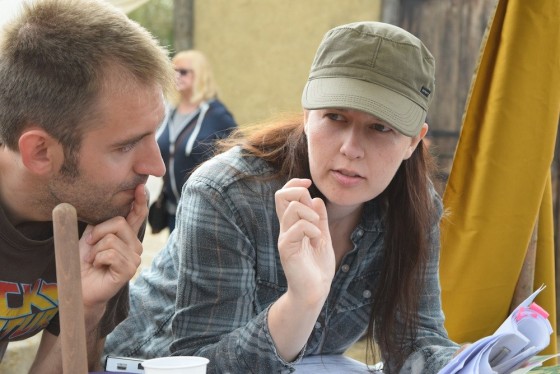
Discussing shots with director Kate Madison on the set of “Ren: The Girl with the Mark”. Photo: Michael Hudson

A thorough plan for shots and lighting can save lots of time on set, but no battle plan survives contact with the enemy. To what extent should a DP prepare?

How much camera angles are planned – and by whom – varies tremendously in my experience. Some directors will prepare a complete shot-list or storyboard and send it to the DP for feedback; others will keep it close to their chest until the time of shooting. Some don’t do one at all, either preferring to improvise on the day in collaboration with the DP, or occasionally asking the DP to plan all the shots alone.

A shot-list can be hard to interpret by itself, particularly if there’s a lot of camera movement. Overhead blocking diagrams, perhaps done in Shot Designer or a general graphics app, make things a lot clearer. Storyboards are very useful too, be they beautifully and time-consumingly drawn, or hastily scribbled thumbnails.
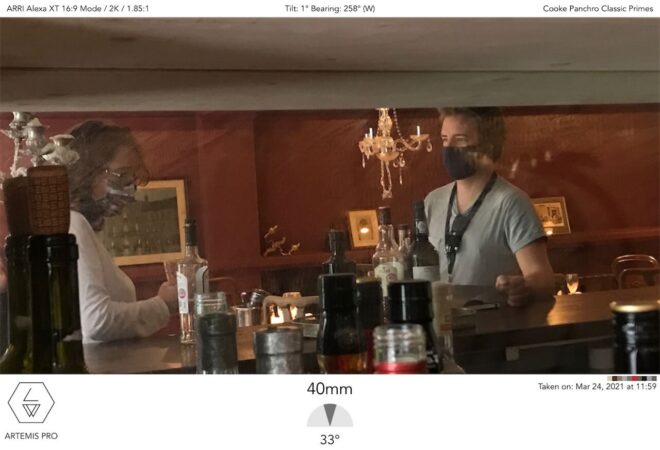
An Artemis shot from “Hamlet” using stand-ins

On a feature I shot last year, we were afforded the luxury of extensive rehearsals with the cast on location. I spent the time snapping photos with Artemis Pro, the viewfinder app, and ultimately output PDF storyboards of every scene; the 1st AD distributed these with the call-sheets every morning. That level of preparedness is rare unless complex stunts or VFX are involved, but it’s incredibly useful for all the departments. The art department in particular were able to see at a glance what they did and didn’t need to dress.
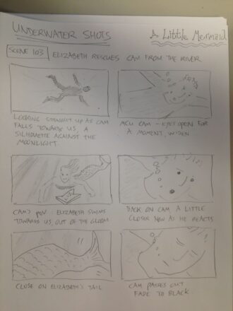
One of my unused storyboards from “The Little Mermaid”

Beware though: being prepared can kill spontaneity if you’re not careful. Years ago I directed a film that had a scene supposedly set at the top of a football stadium’s lighting tower; we were going to cheat it on a platform just a few feet high, and I storyboarded it accordingly. When we changed the location to a walkway in a brewery – genuinely 20ft off the ground – I stuck to the storyboards and ended up without any shots that showcased the height of the setting.

If the various departments have prepared based on your storyboards, not keeping to them can make you unpopular. So storyboards are a double-edged sword, and expectations should be carefully managed regarding how closely they will be adhered to.

The amount of planning that the DP puts into lighting will vary greatly with budget. On a micro-budget film – or a daytime soap like Doctors – you may not see the location until the day you shoot there. But on a high-end production shooting in a large soundstage you may have to agree a detailed lighting plot with the gaffer and pre-rigging crew days or weeks in advance.

Having enough crew to pre-rig upcoming scenes is one of the first things you benefit from as a DP moving up the ladder of budgets. Communicating to the gaffer what you want to achieve then becomes very important, so that when you walk onto the set with the rest of the cast and crew the broad strokes of the lighting are ready to go, and just need tweaking once the blocking has been done.
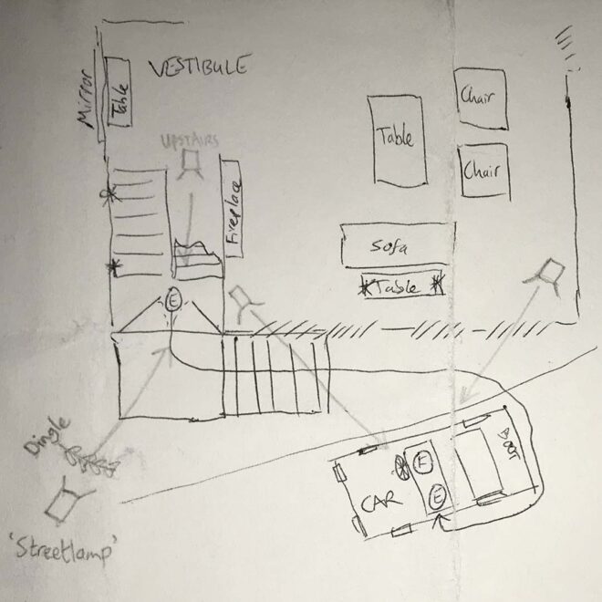
My lighting plan for a night exterior scene in “Exit Eve”

Blocking is usually the biggest barrier to preparedness. Most films have no rehearsals before the shoot begins, so you can never quite know where the actors will feel it is best to stand until they arrive on set on the day. So a lighting plan must be more about lighting the space than anything else, just trying to make sure there are sources in roughly the right places to cover any likely actor positions suggested by the script, director or layout of the set.

Whether a detailed lighting plan needs to be drawn up or not depends on the size and complexity of the set-up, but also how confident you feel that the gaffer understands exactly what you want. I often find that a few recces and conversations along with some brief written notes are enough, but the more money that’s being spent, the more crucial it is to leave no room for misunderstandings.

Again, Shot Designer is a popular solution for creating lighting plans, but some DPs use less specialised apps like Notability, and there’s nothing wrong with good old pencil and paper.

Overall, the best approach is to have a good plan, but to keep your eyes and mind open to better ideas on the day.

For more about apps that DPs can use to help them prep and shoot, see my article “Tools of the Trade” on britishcinematographer.co.uk.

Planning Camera Angles and Lighting

A Cautionary Tale: Recce #2

Left to right: Tom Walsh (1st AD), Sophia Ramcharan (producer), Benjamin Maier (DP), Amy Nicholson (production designer) and Steve Deery (writer)

Following our positive recce of Newstead Abbey last month, we returned there yesterday, this time with new crew members Benjamin Maier (director of photography), Tom Walsh (first assistant director) and designer Amy Nicholson’s assistants Anya and Charlotte. It was an opportunity for Ben to assess the power, lighting, lens and grip requirements, for Tom to consider the logistics of working in the place, and for the art department to take measurements.

Amy and her team are sinking their teeth into the project. Initial ideas of a single feature wall which would be re-wallpapered for each of the film’s four time periods have expanded into full-blown redecoration of the room. This will create a whole different mood and palette for each period and really up the production values.

After leaving the gatekeeper’s cottage, we drove up to the lake to show Ben where the waterside scenes would take place. His immediate observation, which had escaped me on the previous recce because I was wearing my director’s hat, was that it was in the worst possible orientation to the sun: the actors would be flatly lit. We walked around the lake to a cool Victorian folly that looked like part of a miniature castle. Here the light would strike from a better angle, and indeed it was a better location in every respect except for one. I can’t tell you what that one is because it would give away the ending of the film.

Sophia and Steve on the folly overlooking the lake

This recce was my first chance to use Artemis, a virtual director’s viewfinder app which I recently purchased. At £20.99 it’s very pricey, but where it scores over other, cheaper viewfinder apps is in its vast array of cameras you can choose from. You don’t have to worry about calculating crop factors; you simply select your camera from the menu, along with the lenses you have available, and Artemis shows you the field of view you’ll get with each one. On the wide end it’s limited by the iPad camera’s lens length, which in terms of a Super-35mm sensor at 16:9 is equivalent in height to a 22mm lens and in width to about 25mm, but you can purchase an optional wide angle lens adaptor to get around this. I have yet to use the app’s more advanced features, but it’s certainly cheaper than a real director’s viewfinder, and much more convenient than carting a DSLR and lenses around, which is what I did on the first recce.

The cottage exterior seen from amongst the trees opposite, through the Artemis director's viewfinder app
The cottage exterior seen from amongst the trees opposite, through the Artemis director’s viewfinder app

In other areas of preproduction, I’ve had initial Skype chats with the two lead actors, which led to some suggestions for little additions to the script, and I’ve been continuing to watch genre films for inspiration, taking in The Silence of the Lambs, The Woman in Black (2012) and The Innocents lately.

A Cautionary Tale: Recce #2

Stop/Eject: Script to Screen

Following my personal observations on the shot planning process the other day, here’s a look at that process in action and a record of some of the thoughts that go through my head as a director when I’m choosing camera angles.

Everything begins with the script, and here is the extract for the Stop/Eject sequence I’m going to break down:

14. INT. ALCOVE/EXT. RIVER GARDENS – DAY – INTERCUT
KATE stands behind the alcove’s curtain with an armful of tapes.
She pushes one into the recorder – “JULY 16th 2007, 5-6:30pm” - 
and hits PLAY. Warm summer sunshine steals in through the crack
in the curtain. She pulls it back to reveal the river, sunlight
dancing and sparkling in the water of the weir.
COPY-KATE cycles through the gardens on a creaky old bicycle
with a custom paint job and various doodads hanging off,
oblivious to her other self and the alcove stood in the middle
of a Victorian bandstand.
Copy-Kate spots a strange figure on the riverbank, wearing
closed-back headphones and waving a big, fluffy microphone at
the running water.  She looks ahead – she’s about to run over
TWO YOUNG GIRLS.  She grips the brakes tightly and the bike
screeches to a stop with a noise like a small army of warring
cats.  She catches her breath as the older girl scowls and drags
her sister away.

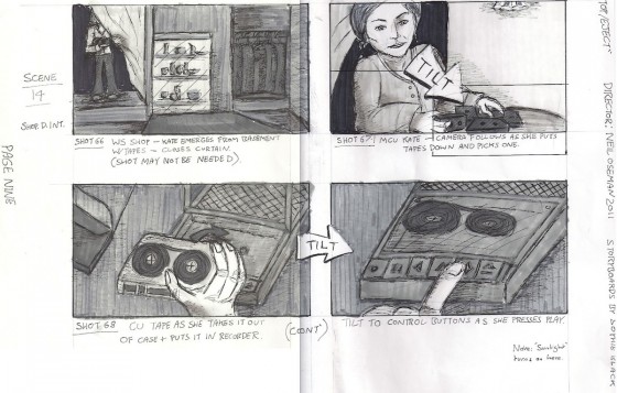
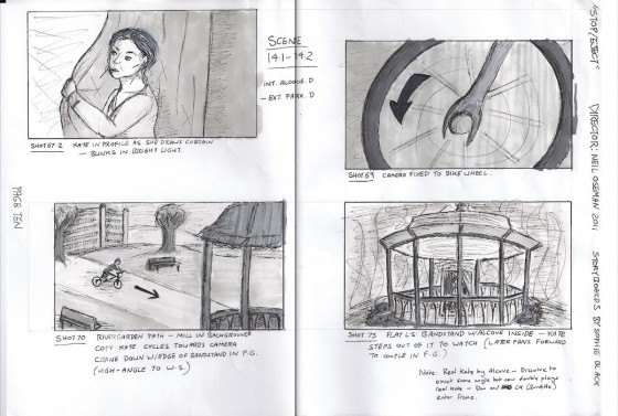
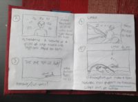
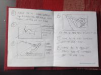
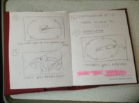
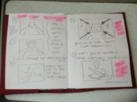
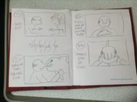
Sophie drew the following storyboards for this sequence, based on my rough sketches:

I don’t like starting scenes with establishing shots; I prefer to reveal them gradually. So when I conceived the first shot (top left) – setting up Kate in the alcove in the shop – I suspected I would probably end up cutting it, and sure enough I never even filmed it. The audience would know by now where the tape recorder alcove was, I figured.

The next shot (top right) follows Kate as she puts down the stack of tapes. This is fairly basic visual storytelling. The audience already knows that the tapes contain recordings of Kate’s life. When we see her come in with an armful of cassettes, we anticipate her nostalgia trip.

As this was the first time Kate was to travel back in time more than a few hours, I felt it important to show the action of the tape going into the recorder in close-up (bottom), to ensure the audience understood the connection between the tapes, the machine and the time travelling.

storyboards_scan10

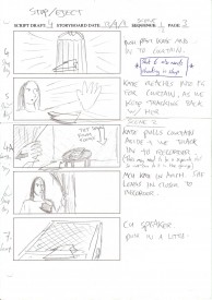
We then return (top left) to the previous angle, following Kate as she stands back up and opens the curtain. One of my regrets with Stop/Eject was that I never shot over Kate’s shoulder as she looked out of the alcove. I can only think this is because I was trying to avoid doing “the obvious thing”. In this scene I chose instead to tease what she’s seeing, revealing first the sunlight on her face, and then (top right) an abstract close-up of a spinning bike wheel, part of the visual theme of circles I had smart-arsedly developed for the film. My thinking was that time travel was a big and unbelievable concept for Kate to take in, so it needed to be broken to her (and therefore us) gradually.

Finally the scene is revealed (bottom left) in a high wide shot to establish the geography, which then cranes down to draw us into the action. On the day, there was a bush in the foreground, which began to obscure the action as we craned down, so we decided to crane up instead, rising up over the bush to reveal the action.

Next it was necessary to show the place of Kate and the alcove in the geography. I wanted to echo the formality and symmetry of the bandstand’s architecture by framing it flat-on, dead centre (bottom right).

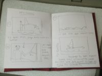
storyboards_scan11Then Copy-Kate sees Dan, her future husband, for the very first time. I wanted to show an immediate connection using an over-the-shoulder shot-reverse. Since Copy-Kate was on a moving bike, this meant panning with her for her angle (top) and then tracking with her for Dan’s angle (bottom) in order to keep her shoulder in frame. I left Dan’s shoulder out of Kate’s shot since he hasn’t seen her yet and so hasn’t made a connection.

The editing podcast below from summer 2012 explains the various iterations I went through with this sequence. (I later brought Miguel Ferros on board to re-edit the film, and his final version is far superior to all of my attempts.) You can see in the podcast some of the problems that my linear shot planning approach caused, notably my failure to cover the whole scene in the crane shot, and the restrictions which that placed on me in the edit.

Despite these minor quibbles, I’m very proud of Stop/Eject and its visual storytelling. It’s recently received a couple of glowing reviews on Unsung Films and The London Film Review, the latter praising its visuals, and both quite rightly lauding Georgina Sherrington’s brilliant lead performance.


Stop/Eject: Script to Screen

Writing a Shot List

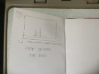
Some of my rough storyboards for Stop/Eject

How does a filmmaker decide what angles to shoot from? Speaking for myself, it’s a hard process to analyse, as many of the decisions are made without much conscious thought. Often I just sit down and imagine the scene playing out in my head. Since childhood I’ve been pretending to be a camera – closing one eye and moving my head to mimick a crane shot, for example, as I pushed my Lego car along – so in imagining the scene I automatically create shots and edits in my head. Then it’s just a case of writing them down, or sketching them as storyboards. I suspect that some of the time – perhaps a lot of the time – I’m subconciously recalling similar scenes in other films I’ve seen and copying their shots.

Sometimes it does require more thought to choose between a number of options. It’s about picking the angle, the lens, the movement that has the right feel for that moment of the story. “If I push in on a short lens, it will feel more dramatic and intimate, but maybe a cool, detached look would be better, using a long lens and remaining static… What do I want the audience to feel?”

Throughout my career, I’ve always shot-listed or storyboarded in a linear fashion – “I’ll be on this shot, then I’ll cut to this one, then this one, then back to the first one, then to the second one which has now dollied in closer, etc….” It made perfect sense to me, because that’s how the film would ultimately appear to the viewer. Knowing the order in which angles would be seen, I could choose to transition between two angles with a camera move, rather than a cut. I could be sure that I wasn’t wasting time on set shooting extraneous material.

But of course, this linear approach to shot planning lacked flexibility. If the action changed on set when blocking it with the actors, I often struggled to integrate this into my plans. And if I needed to change the sequence in the edit, it was often challenging to make the shots work in a different order, because I hadn’t covered the whole scene from a particular angle, or I’d built in a camera move which was now redundant.

Storyboards by Luis Gayol for The Dark Side of the Earh

Other directors plan their shots more in terms of coverage. They might do this via a floorplan showing the camera positions. They’re making sure that, across the sum total of their camera angles, all of the action can be seen clearly and with the appropriate tightness or wideness of framing. They’ve not decided where each angle will be used, only that these are angles they will probably need somewhere in the edit. They’re giving themselves options.

I used to think of giving yourself options as a weakness in a director. Surely you should know now what you want, rather than figuring it out in post? But as I’ve come to realise, particularly in my experience of working with a separate editor for the first time on Stop/Eject, until you’re away from the baggage of the shoot and you’re actually putting the stuff together, you simply can’t know for sure what the best way to edit it is going to be. You can’t predict every nuance of a performance in preproduction, you can’t predict exactly where the pace may flag and need tightening, and you can’t predict which shots or pieces of action will be unsuccessful due to problems on the day with the execution.

So in writing the shot list for A Cautionary Tale last week, I’ve tried to lean much more towards the coverage style of planning. Inevitably the result is a halfway house, or more optimistically perhaps a hybrid, between the linear and coverage styles. I look forward to seeing what impact this has on the editing process.

Continuing this theme, in my next blog post I’ll break down how I chose the shots for a sequence in Stop/Eject, and look at how those decisions ramified in production and post.

Writing a Shot List

Presenting Your Vision

Working on my Stop/Eject mood reel for FilmWorks last week got me thinking about the various methods with which a director can convey his vision for a film during the development process. Here are the ways I’ve used over the years, and the pros and cons of each.

The first ones are all static images, so they can be printed out and thus viewed without the need for any technology (no worries about whether the recipient will be able to open this particular file format) but are also small enough to be emailed. They’ll never grab someone’s attention as much as a moving image, but take less time to absorb and can produce an instant reaction.

If you have the skills or know someone who does, high quality CONCEPT ART can dazzle and excite. Choose dramatic moments and give the artist guidance on the colour palette and lighting you’re after.

The Dark Side of the Earth concept art by Ian Tomlinson
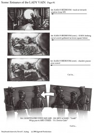
Storyboards for The Dark Side of the Earth by David Ayling

You wouldn’t get STORYBOARDS out at an initial pitch, but they’ll impress at a second or third meeting. They show you’ve thought carefully about the script and how you’re going to put it on screen. This is particularly valuable if you have complex action or FX sequences. Beware that if the person you’re pitching to thinks the script needs more work, they’ll see storyboards as jumping the gun. Get the script right first.

A MOOD BOARD is a scrapbook or montage of images from films and/or other artforms that represent the tone and style of your piece. Less skill is required to make one of these than concept art or storyboards, and although as a creative person you may balk at the implication that your film is unoriginal, execs will find it very useful to compare your project to previous ones. If you use images from a film that did poor box office, again expect tough questions about why your movie won’t fail too.

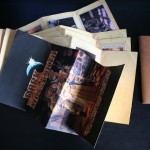
The Dark Side of the Leaflet, designed and executed by Ian Tomlinson

A variation on this is a BOOKLET which might contain some of the above, plus photos and biogs of attached or wish-list actors, a synopsis, a director’s statement and maybe even an outline budget. Ian Tomlinson, The Dark Side of the Earth’s incredibly talented production designer, came up with the period-style leaflets pictured at left to promote the project. In one of my Cannes video blogs you can see a bit of these leaflets. (Sadly they’re now all gone and they got quite time-consuming and expensive to produce.)

Now we’ll look at moving images. Nowadays these aren’t prohibitively expensive to produce, and can be distributed for next-to-nothing via the internet – but beware of techy problems on the other end. Even YouTube doesn’t always work. If the person you’re sending it to can’t open it, they’ll probably give up and move onto something else, perhaps without even telling you why. Frankly I reckon you’re always safer with a DVD. Playing it off a laptop, tablet computer or iPhone in a meeting is a bad idea. Execs are narrow-minded and will see your project as a cheap YouTube video rather than a big, cinematic venture. Plus the sound will be awful. In another of my Cannes vlogs I discussed the dilemma of whether it’s better to show your pilot with poor picture and sound or not at all.

A MOOD REEL or RIP REEL is a moving version of the mood board or scrapbook. Ripping all those DVDs and YouTube clips can be a technical nightmare, but if done well it can be very useful. Here’s one for a very different vision of The Hunger Games by director Kevin Tancharoen. The accompanying interview on Slashfilm.com is also well worth a read.

Beware that many of the above materials will start giving the recipient thoughts about the budget. If your materials make it look like your vision will be expensive, be prepared to answer tough questions about that.

TEASER TRAILERS can be very useful for raising crowd-funding, but my feeling is that they’re not great for attracting conventional financing. Unless you’re going to chuck a hell of a lot of money at it and get an experienced trailer editor to cut it, the danger that a teaser trailer will look amateur and backfire is significant. You’d be better off with a rip reel.

PILOTS can also backfire. You can’t shoot it on a DSLR with a few hundred quid, then screen it at your pitch meeting and say, “The film will look like this, only better.” You have to shoot it with the production values you want the full film to have. That’s why my pilot for The Dark Side of the Earth was shot on 35mm anamorphic, and why we insist that anyone wanting to view it attends a screening of the print, rather than watching a crappy little quicktime or even a DVD. When you’re in that darkened screening room with the 5.1 track rumbling away and the image looking jaw-droppingly beautiful, only then are you doing your film-to-be justice.

Consider making a stand-alone SHORT FILM instead. My greatest regret with the Dark Side pilot is that we didn’t do this; we just took a couple of scenes from the middle of the screenplay and added an introductory voiceover and concept art montage to explain the story so far. It’s far and away my best work, but no-one’s seen it! If only I could have entered it into film festivals. Even if that hadn’t helped get the feature funded, it would have been great exposure for me and perhaps could have led to another of my projects getting made.

Another thing I tried for Dark Side before making the pilot was PREVIZ. These are filmed or animated storyboards, normally created once a project is greenlit to help plan and budget for FX, but they may also have value as part of a pitch, particularly if you want to prove you’re on top of how the FX will be achieved. The Dark Sides previz was shot with action figures and cardboard models and I’d certainly never screen them in a pitch meeting; I did them mainly for my own benefit. If they’re for a pitch, get a good CG animator on the case.

Check out The Dark Side of the Earth: Previsualisation playlist on YouTube for more of these.

Finally, I once read about a filmmaker who created an AUDIO PITCH consisting of her own voice narrating the synopsis, mixed with music and sound effects. Whatever technology and skills you can access to best get your vision across, that’s what you’ve got to do. But remember, it has to be top quality or you’re just shooting yourself in the foot.

What methods have you used to get your vision across?

Presenting Your Vision

Wheels Within Wheels

One of the great things about DSLRs is that, being so small, you can put them in all kinds of unusual places and, being so light, you can rig them to things with relatively little hassle. Stop/Eject is not the sort of film where we’ll being doing a lot of this (unlike Act of Valor, which I strongly suggest you check out), but there is one shot that needs a custom rig…

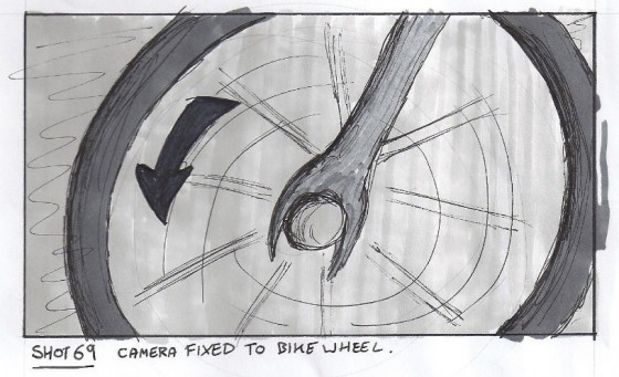
Shot 69, as drawn by Sophie Black

In this shot, the camera needs to be attached to the bike in some way so it moves with it, maintaining the same framing on the wheel throughout. This is part of the film’s visual theme of circles, which I discussed earlier this year on the blog.

Rigged for the rear wheel

If the shoot had gone ahead last October as originally planned, this shot would probably have got dropped or replaced with a similar but less effective version achieved by simply steadicamming along next to the bike. But one great advantage of a shoot being postponed is the opportunity to prepare so much better.

To that end, Colin and I borrowed his mum’s bike this morning to test the shot. Under the pressure of a low budget filming schedule, you can’t mess around trying to figure out a rig like this. You have to work it out in advance.

My plan was to use a C-stand arm and a cheap tripod to get the camera in the right place. First of all we tried clamping the arm to the frame of the bike, but it was too thick. So then we clamped it to the pedal (which meant roping or clamping the pedal to another part of the bike so it wouldn’t turn). The bottom of the tripod was clamped in turn to this arm. The handy thing about using a tripod, of course, is that you have a pan-and-tilt head for easy adjustments and a quick-release plate too.

Rear wheel shot
Rear wheel shot

Initially we filmed the rear wheel, but then I realised filming the front wheel would allow us to get a wider frame, since the pedals (which had to be framed out because the arm was clamped to one of them) were further away from the front wheel.

The rig worked out really well. We had to use a lens with an image stabiliser, and when we shoot it for real we’ll put someone on the bike to weigh it down and reduce the bumps further. I’d imagined we’d have to use a second clamp and bungee cords to keep the camera in place, but the sturdiness of the C-stand arm and the low weight of the camera made this unnecessary.

Yeah, we got a bit of the pedal in shot, not to mention Col’s feet. But those things are easily fixed.

Just before I sign off, I have to give you a link to Tony Hill Films, a site I came across while researching bike rigs. He’s built a number of unique and fascinating camera rigs which you can see in action on the site: http://www.tonyhillfilms.com/rigs

Front wheel rig
Front wheel rig
Wheels Within Wheels

My Density Has Popped Me to You

"I am your density."
“I am your density.”

At the risk of sounding like a Media Studies teacher, I’d like to talk a bit about the themes of Stop/Eject. Warning: this post contains spoilers.

I see themes as a way of making a film seem tighter and more cohesive. Let’s say you have a scene where a character is reading a book. As a writer, you ask yourself what book he should be reading. Firstly you’ll probably consider the plot: is it important to the storyline what book he’s reading? If not then you’ll consider the character (which you should always do anyway of course): what kind of book would this character be reading? This will doubtless narrow down the field but ideally you should now think about the themes. Can he be reading a book which somehow reflects the themes? For example, if the film has an environmental theme, could he be reading Watership Down?

I used to see putting themes into a film as giving myself extra work, but it actually makes it easier to reach decisions because it narrows down your options. And anyone who knows me knows I need all the help I can get with making decisions.

Okay, onto Stop/Eject. The first draft script had no themes at all that I was aware of. When I had to give my characters something to do while talking I chose things at random and kept them pretty generic. But the thing about themes is they’re always there – you just have to find them and tease them out.

Tape recorder
Tape recorder

I chose a tape recorder as the vehicle for time travel in the film simply because it seemed like a cool idea. And I chose “hit by a car while trying to get mobile reception” for Dan’s demise just because I’m a grumpy old luddite who hates mobiles and I’ll take any chance I can get to portray them in a negative light. But then someone pointed out the link between these two things: audio.

So I chose to develop sound as a theme in subsequent drafts. How do you develop a theme? Easy. You just bung in more references to it.

So Dan’s hitherto-unspecified job became Sound Designer. Which in turn transformed an unoriginal scene of Kate working late to Dan’s chagrin to a more unique and thematic one in which Dan’s loud editing of some dialogue in his living room studio sparks the conflict.

Co-writer Tommy Draper and I had been struggling to come up with a satisfying “meet cute” (Hollywood parlance for the key scene in a romcom where the couple first meet). Dan’s new job soon provided the answer as we came up with a nice sequence in which Kate first sees him hovering around the weir with a big fluffy microphone recording sound effects.

We even tweaked little things to enhance the theme. So instead of Kate being woken up one morning by a beam of sunlight coming through a crack in the curtains, it’s an alarm clock: sound again. And instead of the driver who runs Dan over being distracted by writing a text, it’s tuning the radio that takes his eyes off the road.

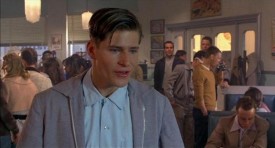
Stop/Eject‘s other theme is destiny, as Kate quickly discovers that although she can effectively travel back in time she can’t change anything. This came in handy when trying to write Dan’s proposal speech; at the risk of it being too “on the nose” I had him tell Kate that she’s his destiny. (It doesn’t hurt that a certain George McFly may have uttered similar words.)

Belper's horseshoe weir (photo: Sophie Black)
Belper’s horseshoe weir (photo: Sophie Black)

But the destiny theme is mainly developed visually. I picked the Derbyshire town of Belper to shoot in primarily for its aesthetic qualities, but as the script evolved I saw the thematic benefit of using Belper’s river wherever possible. A river flows continually, like time moving unstoppably forward… or like the tape in a cassette… which linked to another visual theme that had emerged: circles.

It was clear from early on that the film would feature many close-ups of the tape recorder, particularly the capstans (the bits that make the cassette spools go round). When storyboarding, I looked for places that I could echo this image to create a visual motif. The most obvious thing was to include a shot of a waterwheel in one of the river scenes. More subtly, I moved a scene to a bandstand so I could have Kate cycle around it. And when she microwaves a ready meal I conceived a shot looking straight down on it, inside the microwave, as it rotates. Aside from a visual continuity, hopefully these things will suggest the Circle of Life to viewers on some unconscious level – linking in to the destiny theme.

If you had told me in my A level Media Studies lessons, as Mr Clutterbuck paused Psycho for the twentieth time and pointed out some minor detail which I was convinced the director had not planned as deliberately as my teacher seemed to think he had, that I would one day put so much stock in cinematic themes I wouldn’t have believed you. But if you can take control of your film’s subtext I’m now convinced your audience will have a better time, even if they can’t put their finger on why.

If you’ve enjoyed this blog post and you’d like to see Stop/Eject get made, please contribute a few pennies at http://tinyurl.com/stopeject

My Density Has Popped Me to You

Stop/Eject Visuals

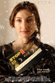
Poster concept 1
Poster concept 1

On Friday morning Satnam Rana, arts correspondent for BBC Midlands Today, came and shot an interview with me about Stop/Eject. Two interviews in fact – one for radio, which went out just before 6pm that evening on BBC Hereford & Worcester – and one for TV, which was meant to go out that evening too, but subsequently got bumped back to tonight’s (Monday’s) show. Look out for it at 6:30pm in the West Midlands or on Sky channel 979.

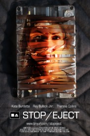
Poster concept 2
Poster concept 2

The report should go on their website as well, so hopefully in my next post I’ll be able to bring you a link to that and I’ll also explain how I managed to get myself on TV.

There have been some visual developments with Stop/Eject in the last few days. Sophie has taken some of my crude storyboards and fleshed them out, while I’ve been taking photographs of cassettes and mangled tape and trying out some new poster concepts. The wrapped tape one has garnered the most response so far, some loving it, some hating it, but I’m interested to hear what you think.


Stop/Eject Visuals