Is Modern Cinematography too Dark?

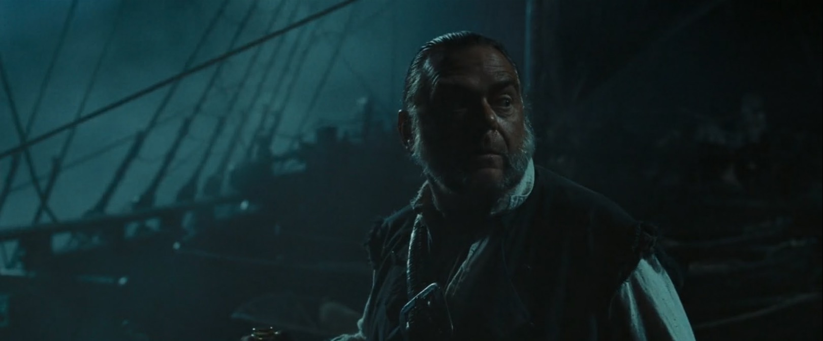
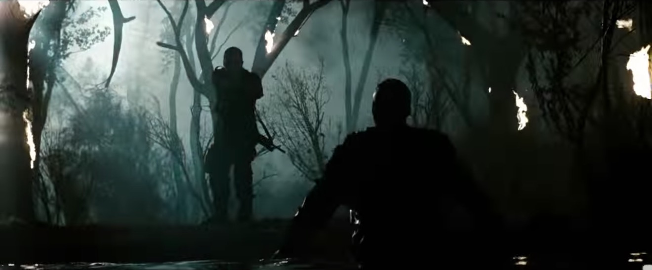
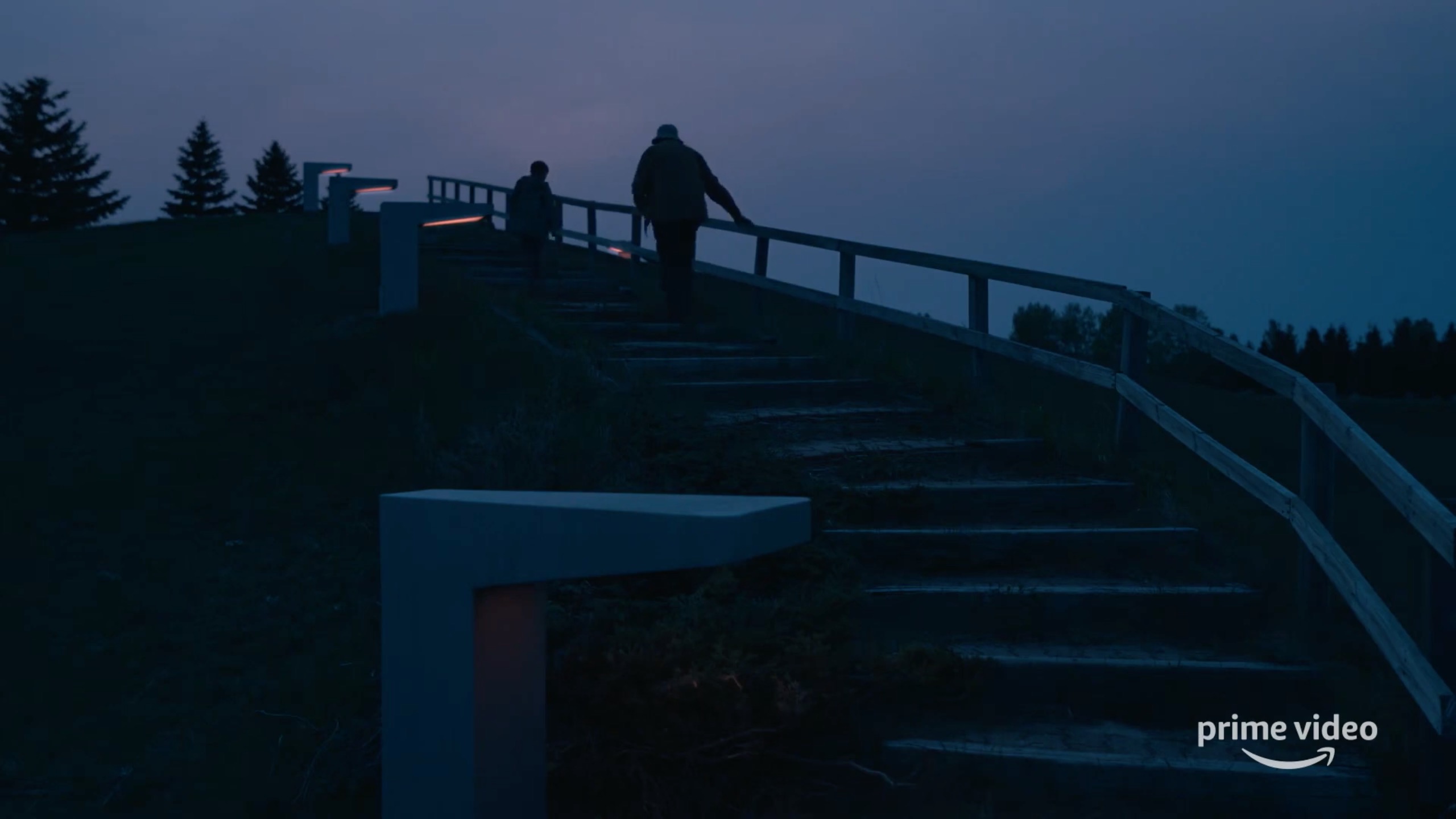
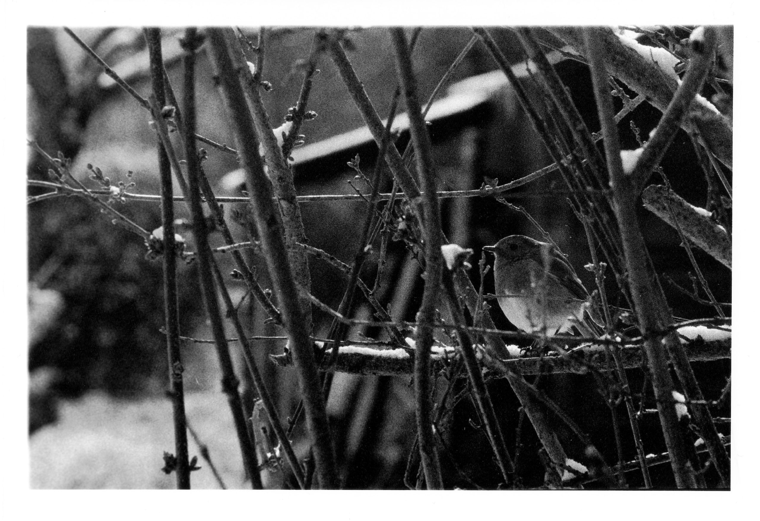
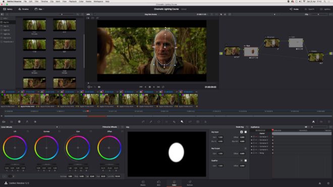
“Why are things so dimly lit today? Can barely see anything.” Such was a comment on a frame of my cinematography that I posted on Instagram last year. It was a night scene but far from the darkest image I’ve ever posted.

“The First Musketeer” (2015, DP: Neil Oseman)

I remembered the comment recently when double Oscar-winning cinematographer Janusz Kamiński said something similar in an interview with British Cinematographer. He lamented what he perceives as a loss of lighting skills that accompanied the transition from celluloid to digital filmmaking: “Now everyone shoots dark… Pictures are so murky you need to crank up the TV to see it… They just don’t know how to light.”

I think there’s a tremendous amount of talent in today’s world of digital cinematography, but the technology might have encouraged a trend towards darker images. With celluloid it was always better to err on the side of over-exposure, as highlights would fall off attractively but shadows could get lost in the grain. With digital it is more advisable to lean towards under-exposure, to avoid the harsh clipping of highlights.

We should also consider that modern digital cameras have more dynamic range than film, so there is less risk inherent in under-exposing a scene, especially as you can see on your histogram exactly what detail you’re retaining. But the same should be true of over-exposure too.

The demand from streaming platforms for HDR delivery also encourages DPs and colourists to play more with very dark (or very bright) images. Most viewers will still see the results in SDR, however, and some crucial information at the edges of the dynamic range could get lost in the transfer.

“Crimson Tide” (1995, DP: Dariusz Wolski, ASC)

The trend for darker images may have started even before the digital revolution though. “I think contemporary photography is going away from pretty pictures,” Dariusz Wolski told American Cinematographer in 1996, well over a decade before digital capture became the norm. “Something that is dark is really dark, and something that is bright is very bright. The idea is to stretch photography, to make it more extreme.”

Wolski may have been onto something there: a trend towards more naturalistic images. You have only to look at a film made in the first half of the 20th century to see that lighting has become much more realistic and less stylised since then. Darker doesn’t necessarily mean more realistic, but perhaps it has become a convenient trick to suggest realism, much like blue lighting is a convenient trick to suggest night that has very little basis in how things look in the real world.

The most noticeable increase in darker images has been in TV – traditionally bright and flat because of the inherently contrasty nature of the cathode ray tube and the many lights and reflections contaminating the screen in a typical living room. Flat-screens are less reflective, less contrasty and generally bigger – and a dimmer image is easier for the eye to interpret when it’s bigger.

Perhaps people are more likely to draw the curtains or turn off the lights if they’ve splashed out on a TV so large that it feels a bit like a cinema, but what about all the mobile devices we have today? I went through a phase of watching a lot of Netflix shows on an iPad Mini on trains, and I was forever trying to keep the daylight off the screen so that I could see what was going on. It was annoying, but it was my own fault for watching it in a form that the programme-makers couldn’t reasonably be expected to cater for.

A shot from “Games of Thrones: The Long Night” (2019, DP: Fabian Wagner, ASC, BSC) which has been brightened by disgruntled fans

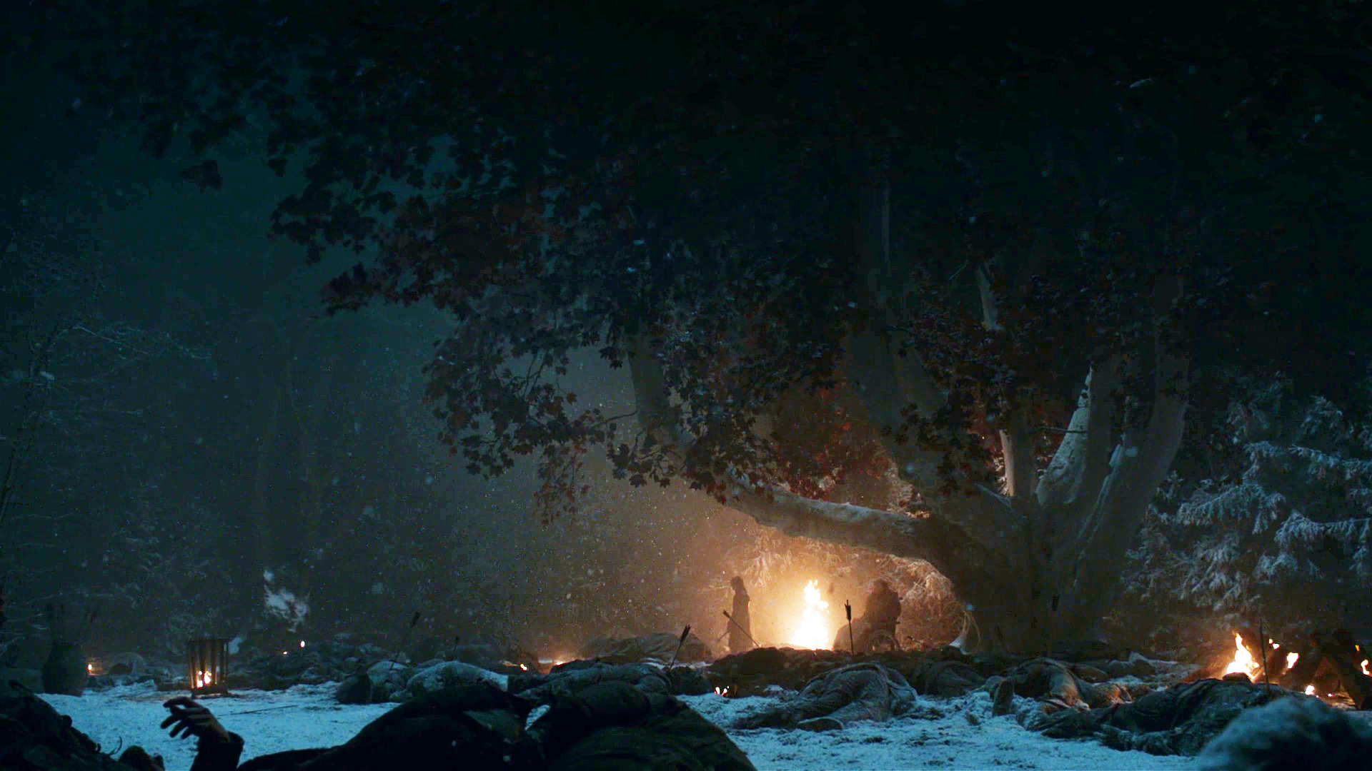
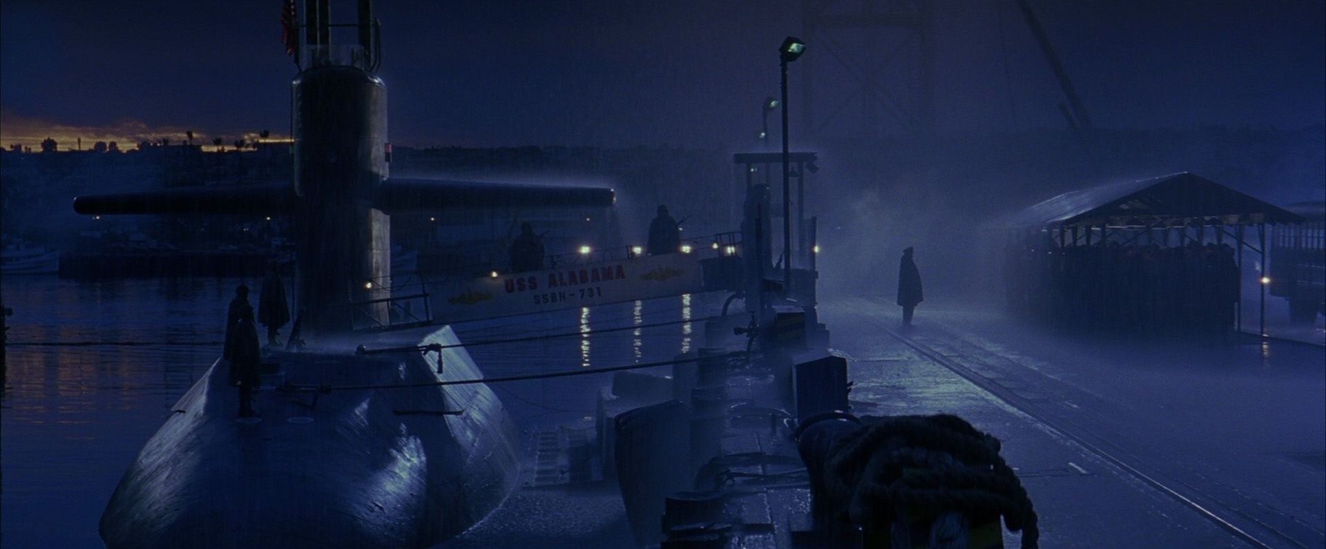
“A lot of people… watch it on small iPads, which in no way can do justice to a show like that anyway,” said DP Fabian Wagner in defence of the infamously dark Battle of Winterfell in Game of Thrones. I’ve never seen it, and I’m all for a DP’s right to shoot an image the way they see fit, but it sounds like he might have gone too far in this case. After all, surely any technique that distracts the audience or takes them out of the story has defeated its purpose.

So, the odd extreme case like this aside, is modern cinematography too dark? I think there is an over-reliance on moodiness sometimes, a bit like how early DSLR filmmakers were too reliant on a tiny depth of field. DPs today have so much choice in all aspects of crafting an image; it is a shame to discount the option of a bright frame, which can be just as expressive as a dark one.

But if a DP wants to choose darkness, that is up to them. Risks like Fabian Wagner took are an important part of any art-form. Without them, cinematography would go stale. And I for one would certainly not want that, the odd negative Instagram comment notwithstanding.

Is Modern Cinematography too Dark?

The Colour of Moonlight

What colour is moonlight? In cinema, the answer is often blue, but what is the reality? Where does the idea of blue moonlight come from? And how has the colour of cinematic moonlight evolved over the decades?


The science bit

According to universetoday.com the lunar surface “is mostly oxygen, silicon, magnesium, iron, calcium and aluminium”. These elements give the moon its colour: grey, as seen best in photographs from the Apollo missions and images taken from space.

When viewed from Earth, Rayleigh scattering by the atmosphere removes the bluer wavelengths of light. This is most noticeable when the moon is low in the sky, when the large amount of atmosphere that the light has to travel through turns the lunar disc quite red, just as with the sun, while at its zenith the moon merely looks yellow.

Yellow is literally the opposite (or complement) of blue, so where on (or off) Earth did this idea of blue cinematic moonlight come from?

One explanation is that, in low light, our vision comes from our rods, the most numerous type of receptor in the human retina (see my article “How Colour Works” for more on this). These cells are more sensitive to blue than any other colour. This doesn’t actually mean that things look blue in moonlight exactly, just that objects which reflect blue light are more visible than those that don’t.

In reality everything looks monochromatic under moonlight because there is only one type of rod, unlike the three types of cones (red, green and blue) which permit colour vision in brighter situations. I would personally describe moonlight as a fragile, silvery grey.

Blue moonlight on screen dates back to the early days of cinema, before colour cinematography was possible, but when enterprising producers were colour-tinting black-and-white films to get more bums on seats. The Complete Guide to Colour by Tom Fraser has this to say:

As an interesting example of the objectivity of colour, Western films were tinted blue to indicate nighttime, since our eyes detect mostly blue wavelengths in low light, but orange served the same function in films about the Far East, presumably in reference to the warm evening light there.

It’s entirely possible that that choice to tint night scenes blue has as much to do with our perception of blue as a cold colour as it does with the functioning of our rods. This perception in turn may come from the way our skin turns bluer when cold, due to reduced blood flow, and redder when hot. (We saw in my recent article on white balance that, when dealing with incandescence at least, bluer actually means hotter.)

Whatever the reason, by the time it became possible to shoot in colour, blue had lodged in the minds of filmmakers and moviegoers as a shorthand for night.


Examples

Early colour films often staged their night scenes during the day; DPs underexposed and fitted blue filters in their matte boxes to create the illusion. It is hard to say whether the blue filters were an honest effort to make the sunlight look like moonlight or simply a way of winking to the audience: “Remember those black-and-white films where blue tinting meant you were watching a night scene? Well, this is the same thing.”

This scene from “Ben Hur” (1959, DP: Robert Surtees, ASC) appears to be a matte painting combined with a heavily blue-tinted day-for-night shot.
A classic and convincing day-for-night scene from “Jaws” (1975, DP: Bill Butler, ASC)

Day-for-night fell out of fashion probably for a number of reasons: 1. audiences grew more savvy and demanded more realism; 2. lighting technology for large night exteriors improved; 3. day-for-night scenes looked extremely unconvincing when brightened up for TV broadcast. Nonetheless, it remains the only practical way to show an expansive seascape or landscape, such as the desert in Mad Max: Fury Road.

Blue moonlight on stage for “Gone with the Wind” (1939, DP: Ernest Haller)
Cold stage lighting matches the matte-painted mountains in “Black Narcissus” (1947, DP: Jack Cardiff, OBE)

One of the big technological changes for night shooting was the availability of HMI lighting, developed by Osram in the late 1960s. With these efficient, daylight-balanced fixtures large areas could be lit with less power, and it was easy to render the light blue without gels by photographing on tungsten film stock.

Cinematic moonlight reached a peak of blueness in the late 1980s and early ’90s, in keeping with the general fashion for saturated neon colours at that time. Filmmakers like Tony Scott, James Cameron and Jan de Bont went heavy on the candy-blue night scenes.

“Beverly Hills Cop II” (1987, DP: Jeffrey Kimball, ASC)
“Flatliners” (1990, DP: Jan de Bont, ASC)
“Terminator 2: Judgment Day” (1991, DP: Adam Greenberg, ASC) uses a lot of strong, blue light, partly to symbolise the cold inhumanity of the robots, and partly because it’s a hallmark of director James Cameron.

By the start of the 21st century bright blue moonlight was starting to feel a bit cheesy, and DPs were experimenting with other looks.

“The Fast and the Furious” (2001, DP: Ericson Core) has generally warm-coloured night scenes to reflect LA’s mild weather after dark, but often there is a cooler area of moonlight in the deep background.
“War of the Worlds” (2005, DP: Janusz Kaminski, ASC)

Speaking of the above ferry scene in War of the Worlds, Janusz Kaminski, ASC said:

I didn’t use blue for that night lighting. I wanted the night to feel more neutral. The ferryboat was practically illuminated with warm light and I didn’t want to create a big contrast between that light and a blue night look.

The invention of the digital intermediate (DI) process, and later the all-digital cinematography workflow, greatly expanded the possibilities for moonlight. It can now be desaturated to produce something much closer to the silvery grey of reality. Conversely, it can be pushed towards cyan or even green in order to fit an orange-and-teal scheme of colour contrast.

“Pirates of the Carribean: Dead Man’s Chest” (2006, DP: Darius Wolski, ASC)

Darius Wolksi, ASC made this remark to American Cinematographer in 2007 about HMI moonlight on the Pirates of the Caribbean movies:

The colour temperature difference between the HMIs and the firelight is huge. If this were printed without a DI, the night would be candy blue and the faces would be red. [With a digital intermediate] I can take the blue out and turn it into more of a grey-green, and I can take the red out of the firelight and make it more yellow.

Compare Shane Hurlbut, ASC’s moonlight here in “Terminator Salvation” (2009) to the “Terminator 2” shot earlier in the article.
The BBC series “The Musketeers” (2014-2016, pilot DP: Stephan Pehrsson) employed very green moonlight, presumably to get the maximum colour contrast with orange candles and other fire sources.

My favourite recent approach to moonlight was in the Amazon sci-fi series Tales from the Loop. Jeff Cronenweth, ASC decided to shoot all the show’s night scenes at blue hour, a decision motivated by the long dusks (up to 75 minutes) in Winnipeg, where the production was based, and the legal limits on how late the child actors could work.

The results are beautiful. Blue moonlight may be a cinematic myth, but Tales from the Loop is one of the few places where you can see real, naturally blue light in a night scene.

“Tales from the Loop” (2020, DP: Jeff Cronenweth, ASC)

If you would like to learn how to light and shoot night scenes, why not take my online course, Cinematic Lighting? 2,300 students have enrolled to date, awarding it an average of 4.5 stars out of 5. Visit Udemy to sign up now.

The Colour of Moonlight

Making an Analogue Print

This is the latest in my series about analogue photography. Previously, I’ve covered the science behind film capture, and how to develop your own black-and-white film. Now we’ll proceed to the next step: taking your negative and producing a print from it. Along the way we’ll discover the analogue origins of Photoshop’s dodge and burn tools.


Contact printing

35mm contact sheet

To briefly summarise my earlier posts, we’ve seen that photographic emulsion – with the exception of colour slide film – turns black when exposed to light, and remains transparent when not. This is how we end up with a negative, in which dark areas correspond to the highlights in the scene, and light areas correspond with the shadows.

The simplest way to make a positive print from a negative is contact-printing, so called because the negative is placed in direct contact with the photographic printing paper. This is typically done in a spring-loaded contact printing frame, the top of which is made of glass. You shine light through the glass, usually from an enlarger – see below – for a measured period of time, determined by trial and error. Where the negative is dark (highlights) the light can’t get through, and the photographic emulsion on the paper remains transparent, allowing the white paper base to show through. Where the negative is transparent (shadows) the light passes through, and the emulsion – once developed and fixed in the same way as the original film – turns black. Thus a positive image is produced.

Normally you would contact-print multiple strips of negative at the same time, perhaps an entire roll of film’s worth, if your paper is large enough to fit them all. Then you can examine them through a loupe to decide which ones are worth enlarging. You have probably seen contact sheets, complete with circled images, stars and arrows indicating which frames the photographer or picture editor likes, where they might crop it, and which areas need doctoring. In fact, contact sheets are so aesthetically pleasing that it’s not uncommon these days for graphic designers to create fake digital ones.

The correct exposure time for a contact print can be found by exposing the whole sheet for, say, ten seconds, then covering a third of it with a piece of card, exposing it for another ten seconds, then covering that same third plus another third and exposing it for ten seconds more. Once developed, you can decide which exposure you like best, or try another set of timings.

120 contact sheet


Making an enlargement

Contact prints are all well and good, but they’re always the same size as the camera negative, which usually isn’t big enough for a finished product, especially with 35mm. This is where an enlarger comes in.

An enlarger is essentially a projector mounted on a stand. You place the negative of your chosen image into a drawer called the negative carrier. Above this is a bulb, and below it is a lens. When the bulb is turned on, light shines through the negative, and the lens focuses the image (upside-down of course) onto the paper below. By adjusting the height of the enlarger’s stand, you can alter the size of the projected image.

Just like a camera lens, an enlarger’s lens has adjustable focus and aperture. You can scrutinise the projected image using a loupe; if you can see the grain of the film, you know that the image is sharply focused.

The aperture is marked in f-stops as you would expect, and just like when shooting, you can trade off the iris size against the exposure time. For example, a print exposed for 30 seconds at f/8 will have the same brightness as one exposed for 15 seconds at f/5.6. (Opening from f/8 to f/5.6 doubles the light, or increases exposure by one stop, while halving the time cuts the light back to its original value.)


Dodging and burning

As with contact-printing, the optimum exposure for an enlargement can be found by test-printing strips for different lengths of time. This brings us to dodging and burning, which are respectively methods of decreasing or increasing the exposure time of specific parts of the image.

Remember that the printing paper starts off bright white, and turns black with exposure, so to brighten part of the image you need to reduce its exposure. This can be achieved by placing anything opaque between the projector lens and the paper for part of the exposure time. Typically a circle of cardboard on a piece of wire is used; this is known as a dodger. That’s the “lollipop” you see in the Photoshop icon. It’s important to keep the dodger moving during the exposure, otherwise you’ll end up with a sharply-defined bright area (not to mention a visible line where the wire handle was) rather than something subtle.

I dodged the robin in this image, to help him stand out.

Let me just say that dodging is a joyful thing to do. It’s such a primitive-looking tool, but you feel like a child with a magic wand when you’re using it, and it can improve an image no end. It’s common practice today for digital colourists to power-window a face and increase its luminance to draw the eye to it; photographers have been doing this for decades and decades.

Burning is of couse the opposite of dodging, i.e. increasing the exposure time of part of the picture to make it darker. One common application is to bring back detail in a bright sky. To do this you would first of all expose the entire image in such a way that the land will look good. Then, before developing, you would use a piece of card to cover the land, and expose the sky for maybe five or ten seconds more. Again, you would keep the card in constant motion to blend the edges of the effect.

To burn a smaller area, you would cut a hole in a piece of card, or simply form your hands into a rough hole, as depicted in the Photoshop icon.


Requirements of a darkroom

The crucial thing which I haven’t yet mentioned is that all of the above needs to take place in near-darkness. Black-and-white photographic paper is less sensitive to the red end of the spectrum, so a dim red lamp known as a safe-light can be used to see what you’re doing. Anything brighter – even your phone’s screen – will fog your photographic paper as soon as you take it out of its lightproof box.

Once your print is exposed, you need to agitate it in a tray of diluted developer for a couple of minutes, then dip it in a tray of water, then place it in a tray of diluted fixer. Only then can you turn on the main lights, but you must still fix the image for five minutes, then leave it in running water for ten minutes before drying it. (This all assumes you’re using resin-coated paper.)

Because you need an enlarger, which is fairly bulky, and space for the trays of chemicals, and running water, all in a room that is one hundred per cent lightproof, printing is a difficult thing to do at home. Fortunately there are a number of darkrooms available for hire around the country, so why not search for a local one and give analogue printing a go?

Some enlargements from 35mm on 8×10″ paper


Making an Analogue Print

How Analogue Photography Can Make You a Better Cinematographer

With many of us looking for new hobbies to see us through the zombie apocalypse Covid-19 lockdown, analogue photography may be the perfect one for an out-of-work DP. While few of us may get to experience the magic and discipline of shooting motion picture film, stills film is accessible to all. With a range of stocks on the market, bargain second-hand cameras on eBay, seemingly no end of vintage glass, and even home starter kits for processing your own images, there’s nothing to stop you giving it a go.

Since taking them up again In 2018, I’ve found that 35mm and 120 photography have had a positive impact on my digital cinematography. Here are five ways in which I think celluloid photography can help you too sharpen your filmmaking skills.


1. Thinking before you click

When you only have 36 shots on your roll and that roll cost you money, you suddenly have a different attitude to clicking the shutter. Is this image worthy of a place amongst those 36? If you’re shooting medium or large-format then the effect is multiplied. In fact, given that we all carry phone cameras with us everywhere we go, there has to be a pretty compelling reason to lug an SLR or view camera around. That’s bound to raise your game, making you think longer and harder about composition and content, to make every frame of celluloid a minor work of art.


2. Judging exposure

I know a gaffer who can step outside and tell you what f-stop the light is, using only his naked eye. This is largely because he is a keen analogue photographer. You can expose film by relying on your camera’s built-in TTL (through the lens) meter, but since you can’t see the results until the film is processed, analogue photographers tend to use other methods as well, or instead, to ensure a well-exposed negative. Rules like “Sunny Sixteen” (on a sunny day, set the aperture to f/16 and the shutter speed reciprocal to match the ISO, e.g. 1/200th of a second at ISO 200) and the use of handheld incident meters make you more aware of the light levels around you. A DP with this experience can get their lighting right more quickly.


3. Pre-visualising results

We digital DPs can fall into the habit of not looking at things with our eyes, always going straight to the viewfinder or the monitor to judge how things look. Since the optical viewfinder of an analogue camera tells you little more than the framing, you tend to spend less time looking through the camera and more using your eye and your mind to visualise how the image will look. This is especially true when it comes to white balance, exposure and the distribution of tones across a finished print, none of which are revealed by an analogue viewfinder. Exercising your mind like this gives you better intuition and increases your ability to plan a shoot, through storyboarding, for example.


4. Grading

If you take your analogue ethic through to post production by processing and printing your own photographs, there is even more to learn. Although detailed manipulation of motion pictures in post is relatively new, people have been doctoring still photos pretty much since the birth of the medium in the mid-19th century. Discovering the low-tech origins of Photoshop’s dodge and burn tools to adjust highlights and shadows is a pure joy, like waving a magic wand over your prints. More importantly, although the printing process is quick, it’s not instantaneous like Resolve or Baselight, so you do need to look carefully at your print, visualise the changes you’d like to make, and then execute them. As a DP, this makes you more critical of your own work and as a colourist, it enables you to work more efficiently by quickly identifying how a shot can be improved.


5. Understanding

Finally, working with the medium which digital was designed to imitate gives you a better understanding of that imitation. It was only when I learnt about push- and pull-processing – varying the development time of a film to alter the brightness of the final image – that my understanding of digital ISO really clicked. Indeed, some argue that electronic cameras don’t really have ISO, that it’s just a simulation to help users from an analogue background to understand what’s going on. If all you’ve ever used is the simulation (digital), then you’re unlikely to grasp the concepts in the same way that you would if you’ve tried the original (analogue).

How Analogue Photography Can Make You a Better Cinematographer

Secondary Grades are Nothing New

Last week I posted an article I wrote a while back (originally for RedShark News), entitled “Why You Can’t Relight Footage in Post”. You may detect that this article comes from a slightly anti-colourist place. I have been, for most of my career, afraid of grading – afraid of colourists ruining my images, indignant that my amazing material should even need grading. Arrogance? Ego? Delusion? Perhaps, but I suspect all DPs have felt this way from time to time.

I think I have finally started to let go of this fear and to understand the symbiotic relationship betwixt DP and colourist. As I mentioned a couple of weeks ago, one of the things I’ve been doing to keep myself occupied during the Covid-19 lockdown is learning to grade. This is so that I can grade the dramatic scenes in my upcoming lighting course, but also an attempt to understand a colourist’s job better. The course I’m taking is this one by Matthew Falconer on Udemy. At 31 hours, it takes some serious commitment to complete, commitment I fear I lack. But I’ve got through enough to have learnt the ins and outs of Davinci Resolve, where to start when correcting an image, the techniques of primary and secondary grades, and how to use the scopes and waveforms. I would certainly recommend the course if you want to learn the craft.

As I worked my way through grading the supplied demo footage, I was struck by two similarities. Firstly, as I tracked an actor’s face and brightened it up, I felt like I was in the darkroom dodging a print. (Dodging involves blocking some of the light reaching a certain part of the image when making an enlargement from a film negative, resulting in a brighter patch.) Subtly lifting the brightness and contrast of your subject’s face can really help draw the viewer’s eye to the right part of the image, but digital colourists were hardly the first people to recognise this. Photographers have been dodging – and the opposite, burning – prints pretty much since the invention of the negative process almost 200 years ago.

The second similarity struck me when I was drawing a power curve around an actor’s shirt in order to adjust its colour separately from the rest of the image. I was reminded of this image from Painting with Light, John Alton’s seminal 1949 work on cinematography…


The chin scrim is a U-shaped scrim… used to cut the light off hot white collars worn with black dinner jackets.

It’s hard for a modern cinematographer to imagine blocking static enough for such a scrim to be useful, or indeed a schedule generous enough to permit the setting-up of such an esoteric tool. But this was how you did a power window in 1949: in camera.

Sometimes I’ve thought that modern grading, particularly secondaries (which target only specific areas of the image) are unnecessary; after all, we got through a century of cinema just fine without them. But in a world where DPs don’t have the time to set up chin scrims, and can’t possibly expect a spark to follow an actor around with one, adding one in post is a great solution. Our cameras might have more dynamic range than 1940s film stock, meaning that that white collar probably won’t blow out, but we certainly don’t want it distracting the eye in the final grade.

Like I said in my previous post, what digital grading does so well are adjustments of emphasis. This is not to belittle the process at all. Those adjustments of emphasis make a huge difference. And while the laws of physics mean that a scene can’t feasibly be relit in post, they also mean that a chin scrim can’t feasibly follow an actor around a set, and you can’t realistically brighten an actor’s face with a follow spot.

What I’m trying to say is, do what’s possible on set, and do what’s impossible in post. This is how lighting and grading work in harmony.

Secondary Grades are Nothing New

Why You Can’t Re-light Footage in Post

The concept of “re-lighting in post” is one that has enjoyed a popularity amongst some no-budget filmmakers, and which sometimes gets bandied around on much bigger sets as well. If there isn’t the time, the money or perhaps simply the will to light a scene well on the day, the flexibility of RAW recording and the power of modern grading software mean that the lighting can be completely changed in postproduction, so the idea goes.

I can understand why it’s attractive. Lighting equipment can be expensive, and setting it up and finessing it is one of the biggest consumers of time on any set. The time of a single wizard colourist can seem appealingly cost-effective – especially on an unpaid, no-budget production! – compared with the money pit that is a crew, cast, location, catering, etc, etc. Delaying the pain until a little further down the line can seem like a no-brainer.

There’s just one problem: re-lighting footage is fundamentally impossible. To even talk about “re-lighting” footage demonstrates a complete misunderstanding of what photographing a film actually is.

This video, captured at a trillion frames per second, shows the tranmission and reflection of light.

The word “photography” comes from Greek, meaning “drawing with light”. This is not just an excuse for pompous DPs to compare themselves with the great artists of the past as they “paint with light”; it is a concise explanation of what a camera does.

A camera can’t record a face. It can’t record a room, or a landscape, or an animal, or objects of any kind. The only thing a camera can record is light. All photographs and videos are patterns of light which the viewer’s brain reverse-engineers into a three-dimensional scene, just as our brains reverse-engineer the patterns of light on the retinae every moment of every day, to make sense of our surroundings.

The light from this object gets gradually brighter then gradually darker again – therefore it is a curved surface. There is light on the top of that nose but not on the underneath, so it must be sticking out. These oval surfaces are absorbing all the red and blue light and reflecting only green, so it must be plant life. Such are the deductions made continuously by the brain’s visual centre.

A compound lens for a prototype light-field camera by Adobe

To suggest that footage can be re-lit is to suggest that recorded light can somehow be separated from the underlying physical objects off which that light reflected. Now of course that is within the realms of today’s technology; you could analyse a filmed scene and build a virtual 3D model of it to match the footage. Then you could “re-light” this recreated scene, but it would be a hell of a lot of work and would, at best, occupy the Uncanny Valley.

Some day, perhaps some day quite soon, artificial intelligence will be clever enough to do this for us. Feed in a 2D video and the computer will analyse the parallax and light shading to build a moving 3D model to match it, allowing a complete change of lighting and indeed composition.

Volumetric capture is already a functioning technology, currently using a mix of infrared and visible-light cameras in an environment lit as flatly as possible for maximum information – like log footage pushed to its inevitable conclusion. By surrounding the subject with cameras, a moving 3D image results.

Sir David Attenborough getting his volume captured by Microsoft

Such rigs are a type of light-field imaging, a technology that reared its head a few years ago in the form of Lytro, with viral videos showing how depth of field and even camera angle (to a limited extent) could be altered with this seemingly magical system. But even Lytro was capturing light, albeit it in a way that allowed for much more digital manipulation.

Perhaps movies will eventually be captured with some kind of Radar-type technology, bouncing electromagnetic waves outside the visible spectrum off the sets and actors to build a moving 3D model. At that point the need for light will have been completely eliminated from the production process, and the job of the director of photography will be purely a postproduction one.

While I suspect most DPs would prefer to be on a physical set than hunched over a computer, we would certainly make the transition if that was the only way to retain meaningful authorship of the image. After all, most of us are already keen to attend grading sessions to ensure our vision survives postproduction.

The Lytro Illum 2015 CP+ by Morio – own work, CC BY-SA 3.0, https://commons.wikimedia.org/w/index.php?curid=38422894

But for the moment at least, lighting must be done on set; re-lighting after the fact is just not possible in any practical way. This is not to take away from the amazing things that a skilled colourist can do, but the vignettes, the split-toning, the power windows, the masking and the tracking – these are adjustments of emphasis.

A soft shadow can be added, but without 3D modelling it can never fall and move as a real shadow would. A face can be brightened, but the quality of light falling on it can’t be changed from soft to hard. The angle of that light can’t be altered. Cinematographers refer to a key-light as the “modelling” light for a reason: because it defines the 3D model which your brain reverse-engineers when it sees the image.

So if you’re ever tempted to leave the job of lighting to postproduction, remember that your footage is literally made of light. If you don’t take the time to get your lighting right, you might as well not have any footage at all.

Why You Can’t Re-light Footage in Post

Camerimage 2017: Wednesday

This is the third and final part of my report from my time at Camerimage, the Polish film festival focused on cinematography. Read part one here and part two here.


Up.Grade: Human Vision & Colour Pipelines

I thought I would be one of the few people who would be bothered to get up and into town for this technical 10:15am seminar. But to the surprise of both myself and the organisers, the auditorium of the MCK Orzeł was once again packed – though I’d learnt to arrive in plenty of time to grab a ticket.

Up.grade is an international colour grading training programme. Their seminar was divided into two distinct halves: the first was a fascinating explanation of how human beings perceive colour, by Professor Andrew Stockman; the second was a basic overview of colour pipelines.

Prof. Stockman’s presentation – similar to his TED video above – had a lot of interesting nuggets about the way we see. Here are a few:

  • Our eyes record very little colour information compared with luminance info. You can blur the chrominance channel of an image considerably without seeing much difference; not so with the luminance channel.
  • Light hitting a rod or cone (sensor cells in our retinae) straightens the twist in the carbon double bond of a molecule. It’s a binary (on/off) response and it’s the same response for any frequency of light. It’s just that red, green and blue cones have different probabilities of absorbing different frequencies.
  • There are no blue cones in the centre of the fovea (the part of the retina responsible for detailed vision) because blue wavelengths would be out of focus due to the terrible chromatic aberration of our eyes’ lenses.
  • Data from the rods and cones is compressed in the retina to fit the bandwidth which the optical nerve can handle.
  • Metamers are colours that look the same but are created differently. For example, light with a wavelength of 575nm is perceived as yellow, but a mixture of 670nm (red) and 540nm (green) is also perceived as yellow, because the red and green cones are triggered in the same way in both scenarios. (Isn’t that weird? It’s like being unable to hear the difference between the note D and a combination of the notes C and E. It just goes to show how unreliable our senses really are.)
  • Our perception of colour changes according to its surroundings and the apparent colour of the lighting – a phenomenon perfectly demonstrated by the infamous white-gold/blue-black dress.

All in all, very interesting and well worth getting out of bed for!

At the end of the seminar I caught up with fellow DP Laura Howie, and her friend Ben, over coffee and cake. Then I sauntered leisurely to the Opera Nova and navigated the labyrinthine route to the first-floor lecture theatre, where I registered for the imminent Arri seminar.


Arri Seminar: International Support Programme

After picking up my complementary Arri torch, which was inexplicably disguised as a pen, I bumped into Chris Bouchard. Neither of us held high hopes that the Support Programme would be relevant to us, but we thought it was worth getting the lowdown just in case.

Shooting “Kolkata”

The Arri International Support Programme (ISP) is a worldwide scheme to provide emerging filmmakers with sponsored camera/lighting/grip equipment, postproduction services, and in some cases co-production or sales deals as well. Mandy Rahn, the programme’s leader, explained that it supports young people (though there is no strict age limit) making their first, second or third feature in the $500,000-$5,000,000 budget range. They support both drama and documentary, but not short-form projects, which ruled out any hopes I might have had that it could be useful for Ren: The Girl with the Mark.

Having noted these keys details, Chris and I decided to duck out and head elsewhere. While Chris checked out some cameras on the Canon stand, I had a little chat with the reps from American Cinematographer about some possible coverage of The Little Mermaid. We then popped over to the MCK and caught part of a Canon seminar, including a screening of the short documentary Kolkata. Shortly we were treading the familiar path back to the Opera Nova and the first-floor lecture theatre for a Kodak-sponsored session with Ed Lachman, ASC, only to find it had been cancelled for reasons unknown.


Red Seminar: High resolution Image Processing Pipeline

Next on our radar was a Red panel. I wasn’t entirely sure if I could handle another high resolution seminar, but I suggested we return once more to the MCK anyway and relax in the bar with one eye on the live video feed. Unfortunately we got there to find that the monitors had disappeared, so we had to go into the auditorium, where it was standing room only.

“GLOW” – DP: Christian Sprenger

Light Iron colourist Ian Vertovec was talking about his experience grading the Netflix series GLOW, a highly enjoyable comedy-drama set behind the scenes of an eighties female wrestling show. Netflix wanted the series delivered in high dynamic range (HDR) and wide colour gamut (WCG), of a spec so high that no screens are yet capable of displaying it. In fact Vertovec graded in P3 (the colour space used for cinema projection) which was then mapped to Netflix’s higher specs for delivery. The Rec.709 (standard gamut) version was automatically created from the P3 grade by Dolby Vision software which analysed the episodes frame by frame. Netflix streams a 4,000 NIT signal to all viewers, which is then down-converted live (using XML data also generated by the Dolby Vision software) to 100, 650 or 1,000 NITs depending on their display. In theory this should provide a consistent image across all screens.

Vertovec demonstrated his image pipeline for GLOW: multi-layer base grade, halation pass, custom film LUT, blur/sharp pass, grain pass. The aim was to get the look of telecined film. The halation pass involved making a copy of the image, keying out all but the highlights, blurring those highlights and layering them back on top of the original footage. I used to do a similar thing to soften Mini-DV footage back in the day!

An interesting point was made about practicals in HDR. If you have an actor in front of or close to a practical lamp in frame, it’s a delicate balancing act to get them bright enough to look real, yet not so bright that it hurts your eyes to look at the actor with a dazzling lamp next to them. When practicals are further away from your cast they can be brighter because your eye will naturally track around them as in real life.

Next up was Dan Duran from Red, who explained a new LUT that is being rolled out across their cameras. Most of this went in one ear and out the other!


“Breaking Bad”

Afterwards, Chris and I returned to Kung Fusion for another delicious dinner. The final event of the day which I wanted to catch was Breaking Bad‘s pilot episode, screening at Bydgoszcz’s Vue multiplex as part of the festival’s John Toll retrospective. Having binged the entire series relatively recently, I loved seeing the very first episode again – especially on the big screen – with the fore-knowledge of where the characters would end up.

Later Chris introduced me to DP Sebastian Cort, and the three of us decided to try our luck at getting into the Panavision party. We snuck around the back of the venue and into one of the peripheral buildings, only to be immediately collared by a bouncer and sent packing!

This ignoble failure marked the end of my Camerimage experience, more or less. After another drink or two at Cheat we called it a night, and I was on an early flight back to Stansted the next morning. I met some interesting people and learnt a lot from the seminars. There were some complaints that the festival was over-subscribed, and indeed – as I have described – you had to be quick off the mark to get into certain events, but that was pretty much what I had been expecting. I certainly won’t put be off attending again in the future.

To learn more about two of the key issues raised at this year’s Camerimage, check out my Red Shark articles:

Camerimage 2017: Wednesday

Grading “Above the Clouds”

Recently work began on colour grading Above the Clouds, a comedy road movie I shot for director Leon Chambers. I’ve covered every day of shooting here on my blog, but the story wouldn’t be complete without an account of this crucial stage of postproduction.

I must confess I didn’t give much thought to the grade during the shoot, monitoring in Rec.709 and not envisaging any particular “look”. So when Leon asked if I had any thoughts or references to pass on to colourist Duncan Russell, I had to put my thinking cap on. I came up with a few different ideas and met with Leon to discuss them. The one that clicked with his own thoughts was a super-saturated vintage postcard (above). He also liked how, in a frame grab I’d been playing about with, I had warmed up the yellow of the car – an important character in the movie!

Leon was keen to position Above the Clouds‘ visual tone somewhere between the grim reality  of a typical British drama and the high-key gloss of Hollywood comedies. Finding exactly the right spot on that wide spectrum was the challenge!

“Real but beautiful” was Duncan’s mantra when Leon and I sat down with him last week for a session in Freefolk’s Baselight One suite. He pointed to the John Lewis “Tiny Dancer” ad as a good touchstone for this approach.

We spent the day looking at the film’s key sequences. There was a shot of Charlie, Oz and the Yellow Peril (the car) outside the garage from week one which Duncan used to establish a look for the three characters. It’s commonplace nowadays to track faces and apply individual grades to them, making it possible to fine-tune skin-tones with digital precision. I’m pleased that Duncan embraced the existing contrast between Charlie’s pale, freckled innocence and Oz’s dirty, craggy world-weariness.

Above the Clouds was mainly shot on an Alexa Mini, in Log C ProRes 4444, so there was plenty of detail captured beyond the Rec.709 image that I was (mostly) monitoring. A simple example of this coming in useful is the torchlight charity shop scene, shot at the end of week two. At one point Leo reaches for something on a shelf and his arm moves right in front of his torch. Power-windowing Leo’s arm, Duncan was able to bring back the highlight detail, because it had all been captured in the Log C.

But just because all the detail is there, it doesn’t mean you can always use it. Take the gallery scenes, also shot in week two, at the Turner Contemporary in Margate. The location has large sea-view windows and white walls. Many of the key shots featured Oz and Charlie with their backs towards the windows. This is a classic contrasty situation, but I knew from checking the false colours in log mode that all the detail was being captured.

Duncan initially tried to retain all the exterior detail in the grade, by separating the highlights from the mid-tones and treating them differently. He succeeded, but it didn’t look real. It looked like Oz and Charlie were green-screened over a separate background. Our subconscious minds know that a daylight exterior cannot be only slightly brighter than an interior, so it appeared artificial. It was necessary to back off on the sky detail to keep it feeling real. (Had we been grading in HDR [High Dynamic Range], which may one day be the norm, we could theoretically have retained all the detail while still keeping it realistic. However, if what I’ve heard of HDR is correct, it may have been unpleasant for audiences to look at Charlie and Oz against the bright light of the window beyond.)

There were other technical challenges to deal with in the film as well. One was the infra-red problem we encountered with our ND filters during last autumn’s pick-ups, which meant that Duncan had to key out Oz’s apparently pink jacket and restore it to blue. Another was the mix of formats employed for the various pick-ups: in addition to the Alexa Mini, there was footage from an Arri Amira, a Blackmagic Micro Cinema Camera (BMMCC) and even a Canon 5D Mk III. Although the latter had an intentionally different look, the other three had to match as closely as possible.

A twilight scene set in a rural village contains perhaps the most disparate elements. Many shots were done day-for-dusk on the Alexa Mini in Scotland, at the end of week four. Additional angles were captured on the BMMCC in Kent a few months later, both day-for-dusk and dusk-for-dusk. This outdoor material continues directly into indoor scenes, shot on a set this February on the Amira. Having said all that, they didn’t match too badly at all, but some juggling was required to find a level of darkness that worked for the whole sequence while retaining consistency.

In other sequences, like the ones in Margate near the start of the film, a big continuity issue is the clouds. Given the film’s title, I always tried to frame in plenty of sky and retain detail in it, using graduated ND filters where necessary. Duncan was able to bring out, suppress or manipulate detail as needed, to maintain continuity with adjacent shots.

Consistency is important in a big-picture sense too. One of the last scenes we looked at was the interior of Leo’s house, from weeks two and three, for which Duncan hit upon a nice, painterly grade with a bit of mystery to it. The question is, does that jar with the rest of the movie, which is fairly light overall, and does it give the audience the right clues about the tone of the scene which will unfold? We may not know the answers until we watch the whole film through.

Duncan has plenty more work to do on Above the Clouds, but I’m confident it’s in very good hands. I will probably attend another session when it’s close to completion, so watch this space for that.

See all my Above the Clouds posts here, or visit the official website.

Grading “Above the Clouds”

12 Tips for Better Instagram Photos

I joined this social media platform last summer, after hearing DP Ed Moore say in an interview that his Instagram feed helps him get work. I can’t say that’s happened for me yet, but an attractive Instagram feed can’t do any creative freelancer any harm. And for photographers and cinematographers, it’s a great way to practice our skills.

The tips below are primarily aimed at people who are using a phone camera to take their pictures, but many of them will apply to all types of photography.

The particular challenge with Instagram images is that they’re usually viewed on a phone screen; they’re small, so they have to be easy for the brain to decipher. That means reducing clutter, keeping things bold and simple.

Here are twelve tips for putting this philosophy into practice. The examples are all taken from my own feed, and were taken with an iPhone 5, almost always using the HDR (High Dynamic Range) mode to get the best tonal range.


1. choose your background carefully

The biggest challenge I find in taking snaps with my phone is the huge depth of field. This makes it critical to have a suitable, non-distracting background, because it can’t be thrown out of focus. In the pub photo below, I chose to shoot against the blank pillar rather than against the racks of drinks behind the bar, so that the beer and lens mug would stand out clearly. For the Lego photo, I moved the model away from a messy table covered in multi-coloured blocks to use a red-only tray as a background instead.


2. Find Frames within frames

The Instagram filters all have a frame option which can be activated to give your image a white border, or a fake 35mm negative surround, and so on. An improvement on this is to compose your image so that it has a built-in frame. (I discussed frames within frames in a number of my recent posts on composition.)


3. try symmetrical composition

To my eye, the square aspect ratio of Instagram is not wide enough for The Rule of Thirds to be useful in most cases. Instead, I find the most arresting compositions are central, symmetrical ones.


4. Consider Shooting flat on

In cinematography, an impression of depth is usually desirable, but in a little Instagram image I find that two-dimensionality can sometimes work better. Such photos take on a graphical quality, like icons, which I find really interesting. The key thing is that 2D pictures are easier for your brain to interpret when they’re small, or when they’re flashing past as you scroll.


5. Look for shapes

Finding common shapes in a structure or natural environment can be a good way to make your photo catch the eye. In these examples I spotted an ‘S’ shape in the clouds and footpath, and an ‘A’ shape in the architecture.


6. Look for textures

Textures can add interest to your image. Remember the golden rule of avoiding clutter though. Often textures will look best if they’re very bold, like the branches of the tree against the misty sky here, or if they’re very close-up, like this cathedral door.


7. Shoot into the light

Most of you will not be lighting your Instagram pics artificially, so you need to be aware of the existing light falling on your subject. Often the strongest look is achieved by shooting towards the light. In certain situations this can create interesting silhouettes, but often there are enough reflective surfaces around to fill in the shadows so you can get the beauty of the backlight and still see the detail in your subject. You definitely need to be in HDR mode for this.


8. Look for interesting light

It’s also worth looking out for interesting light which may make a dull subject into something worth capturing. Nature provides interesting light every day at sunrise and sunset, so these are good times to keep an eye out for photo ops.


9. Use lens flare for interest

Photographers have been using lens flare to add an extra something to their pictures for decades, and certain science fiction movies have also been known to use (ahem) one or two. To avoid a flare being too overpowering, position your camera so as to hide part of the sun behind a foreground object. To get that anamorphic cinema look, wipe your finger vertically across your camera lens. The natural oils on your skin will cause a flare at 90° to the direction you wiped in. (Best not try this with that rented set of Master Primes though.)


10. Control your palette

Nothing gives an image a sense of unity and professionalism as quickly as a controlled colour palette. You can do this in-camera, like I did below by choosing the purple cushion to photograph the book on, or by adjusting the saturation and colour cast in the Photos app, as I did with the Canary Wharf image. For another example, see the Lego shot under point 3.


11. Wait for the right moment

Any good photographer knows that patience is a virtue. Waiting for pedestrians or vehicles to reach just the right spot in your composition before tapping the shutter can make the difference between a bold, eye-catching photo and a cluttered mess. In the below examples, I waited until the pedestrians (left) and the rowing boat and swans (right) were best placed against the background for contrast and composition before taking the shot.


12. Quality control

One final thing to consider: is the photo you’ve just taken worthy of your Instagram profile, or is it going to drag down the quality of your feed? If it’s not good, maybe you should keep it to yourself.

Check out my Instagram feed to see if you think I’ve broken this rule!

12 Tips for Better Instagram Photos

Lighting I Like: “Harry Potter and the Philosopher’s Stone”

The third episode of my YouTube cinematography series Lighting I Like is out now. This time I discuss a scene from the first instalment in the Harry Potter franchise, directed by Chris Columbus and photographed by John Seale, ACS, ASC.


You can find out more about the forest scene from Wolfman which I mentioned, either in the February 2010 issue of American Cinematographer if you have a subscription, or towards the bottom of this page on Cine Gleaner.

If you’re a fan of John Seale’s work, you may want to read my post “20 Facts About the Cinematography of Mad Max: Fury Road.

To read about how I’ve tackled nighttime forest scenes myself, check out “Poor Man’s Process II” (Ren: The Girl with the Mark) and Above the Clouds: Week Two”.

I hope you enjoyed the show. Episode four goes out at the same time next week: 8pm GMT on Wednesday, and will cover a scene from episode two of the lavish Netflix series The Crown. Subscribe to my YouTube channel to make sure you never miss an episode.

Lighting I Like: “Harry Potter and the Philosopher’s Stone”