Day 24 – 3/5/21
“Frailty thy name is woman” (the opinions of Shakespeare do not represent those of the blogger)

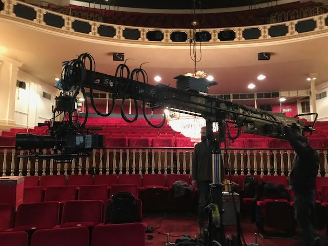
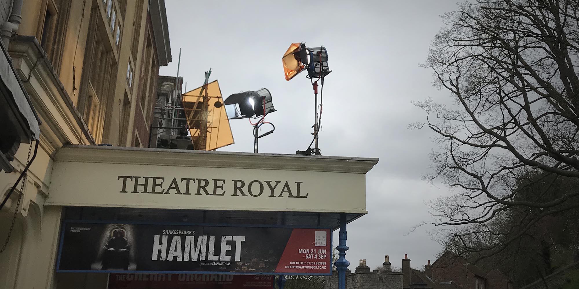
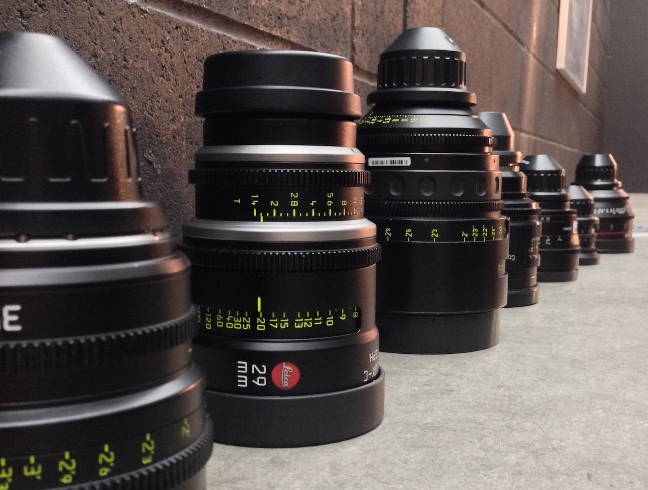
A bitty day, starting with our only day exteriors. Call time was 7am and it was a bank holiday, so that pedestrians and traffic were at a minimum on the street outside the theatre. We got through the shots pretty quickly as they were all handheld, mostly on the same lens and had no dialogue. To give the prologue a slightly different feel to the rest of the film, I’m trying to shoot it stopped down a little, generally T4 outside (though going as far as T11 when the sun came out and our combined .9 and .6 NDs weren’t enough), and using no haze inside. Max operated the camcorder to get a couple of POV shots from the oval office and the roof, and then switched to the second XT to capture a shot of Ben on the roof holding the camcorder.
Gaffer Ben and his team had all booked social events for today (as we had meant to wrap on Saturday) so we had a new gaffer for the day, Tristan Hutchinson, assisted by a spark daily called Nathan. They were faced with unfamiliar material and the kit being scattered all over the theatre, but they delivered the goods.
At the stage door we used a Fomex and a dodgy Litemat 2L to push extra daylight through the windows, having killed all the practicals. In Jonathan’s dressing room we used two Fomexes, one of them pushing through a 4×4 frame of half diffusion to simulate a window source.
Matching a scene on the stage to day 7 involved a Rifa and some theatrical lighting, while the reverse brought the kaleiodscope glasses into play for the first time in weeks, once again refracting the chandelier to beautiful effect. After a corridor shot we did a pick-up in Hamlet’s dressing room, matching the wide from the start of day 23 but now shooting away from the window. Tristan had the nice idea to bring in two floppy flags either side of camera to vignette the flat daylight and give the image some shape.
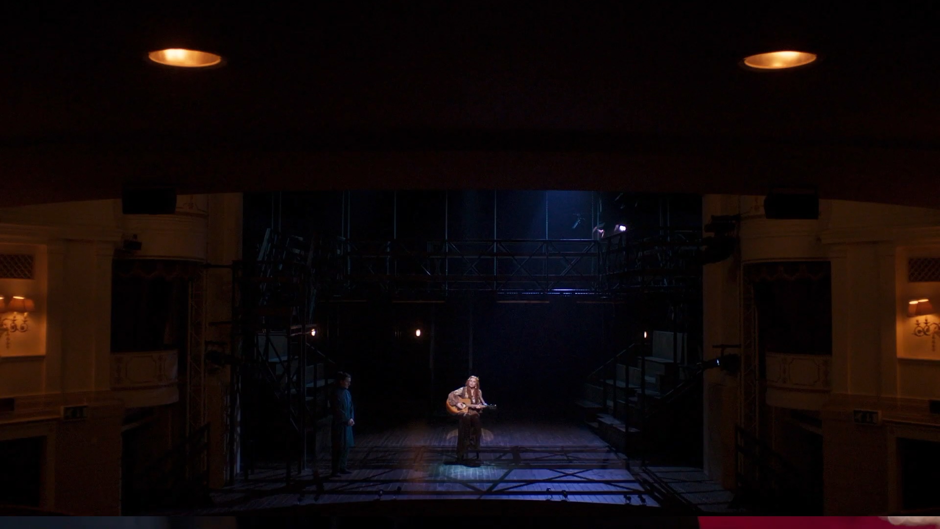
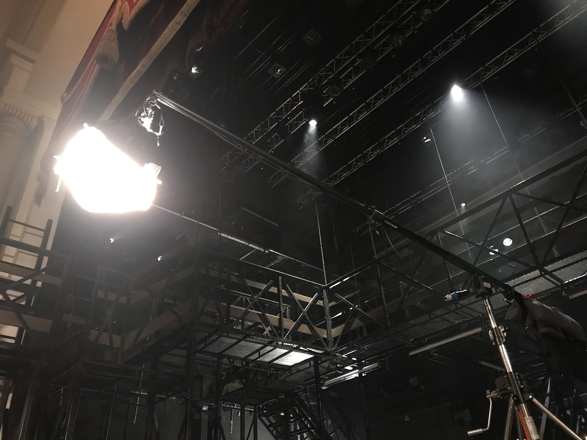
Finally we shot a dialogue scene in the goods lift. For this, as planned with Ben, we simply skirted the existing practical in the ceiling to keep it off the walls and give us a moody top-light. A small poly on the floor to give a hint of something in the eyes was the only thing keeping it from full-on Godfatherness. The scene dock – a small part of which was visible when the lift doors opened – was lit with a dimmed, bounced 5K and a 650W which was intended to rake the outside of the doors. However, we ran out of time and weren’t able to shoot the outside of the doors or any singles, wrapping with just the master shot in the can.
Day 25 – 4/5/21
“To be or not to be”
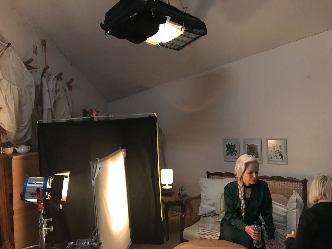
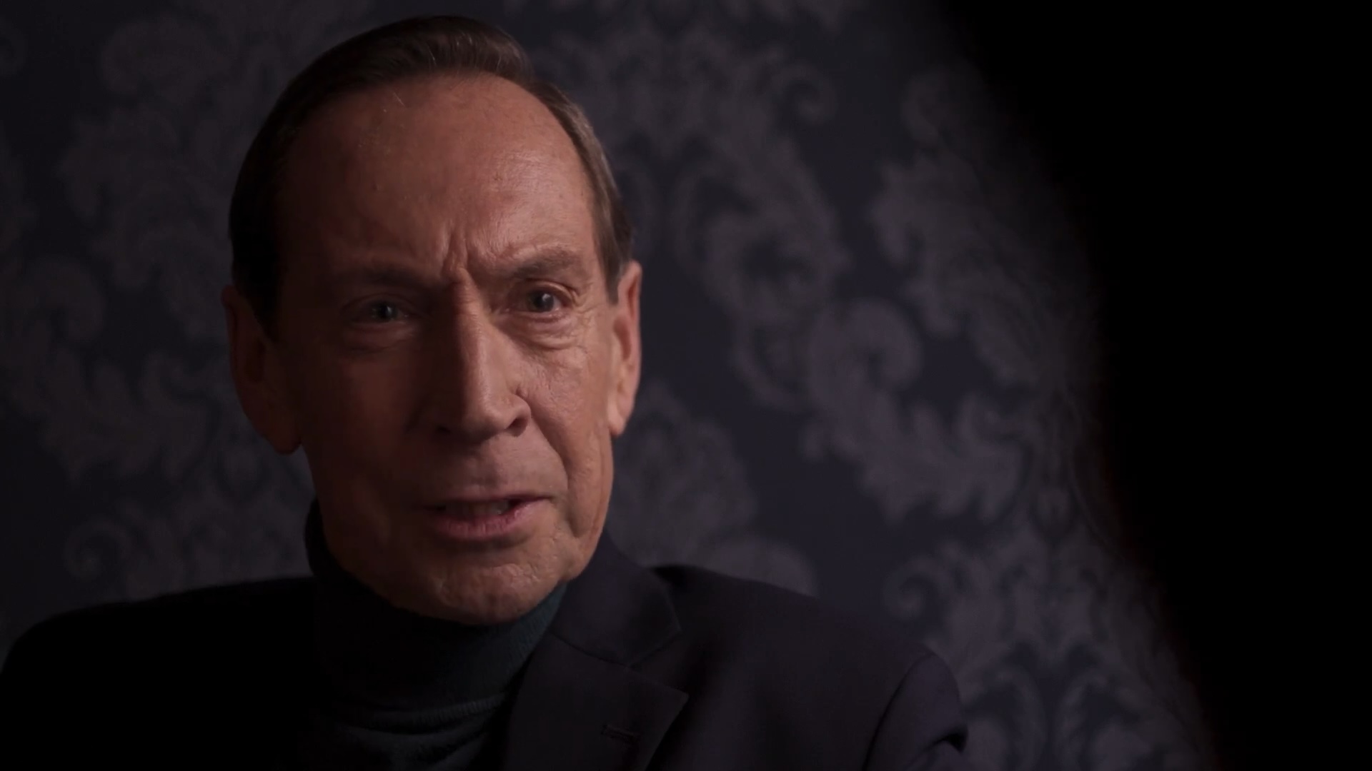
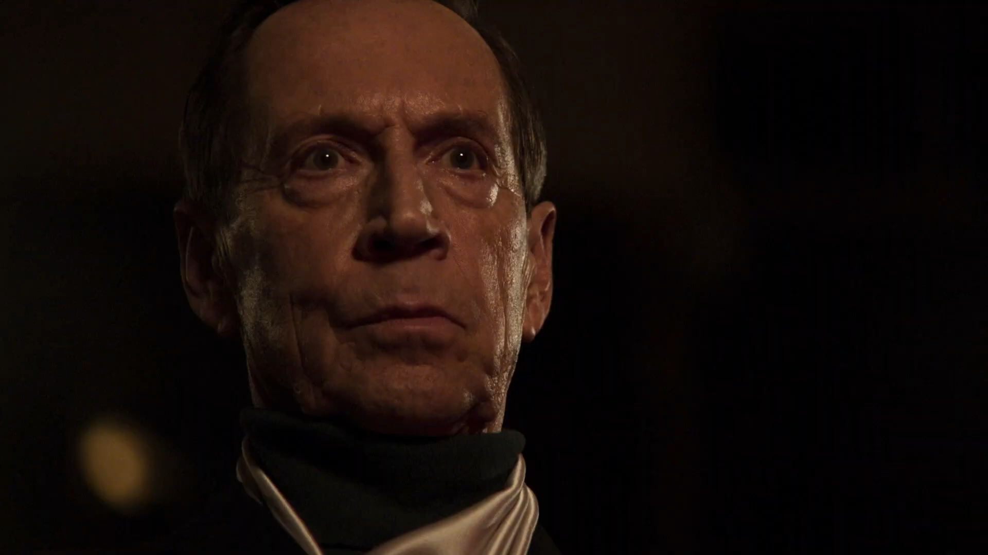
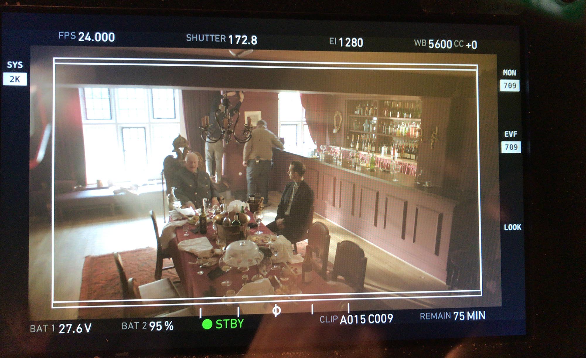
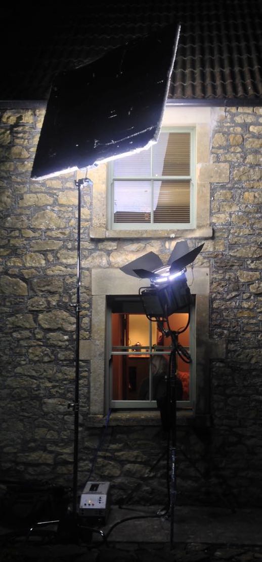
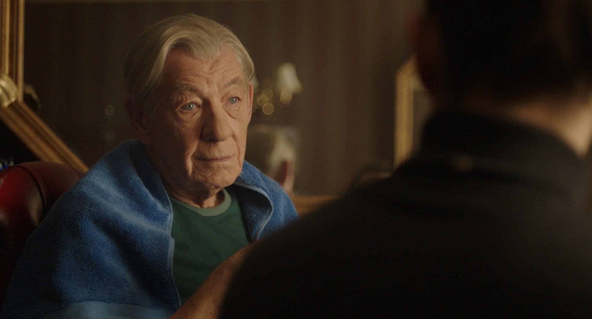
The morning’s work was a major scene in Claudius’s dressing room. It was set at night, so Ben and co tented the area outside the window, which was already partly enclosed by an external staircase. Poor Ian had an uncomfortable time sprawled on a crash mat outside the dressing room window as Hamlet spies on the king and considers murdering him. We first shot from outside, using another bulkhead to motivate the lighting, but in reality Ian’s key was a Fomex with unbleached muslin on it. Inside we had another Fomex above Claudius’s head in addition to two dim table lamps and two candles. When the camera came inside we added an Astera on the floor to give a little separation between Claudius and the background window where Hamlet is dimly visible. It was a very windy day and it was impossible to stop some daylight from creeping in around the black-out, but we got away with this as moonlight which played nicely on the diffused panes of the window. For Claudius’s single we got the most out of his dressing table’s triple mirror, surrounding him with his own reflections (and those of the candles) without getting the camera in!

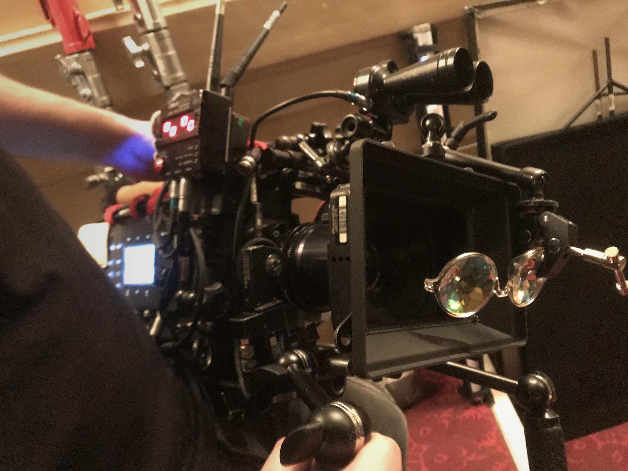
Next we moved to an even smaller dressing room which is Ian McKellen’s in the prologue, before he transforms into Hamlet. With the help of the art department and I think some of the theatre crew too, Ben’s team had built a surround for the mirror containing about 12 tungsten bulbs, all hooked individually to dimmer racks under the table, which Ben and Bruce were then able to control via DMX from the next room. As Ian looks into the mirror, the lights flash in random patterns, faster and faster until they all come on in one dazzling climax. We shot a wide on the 25mm, then switched to the 100mm and the kaleidoscope glasses (as I knew from the waltz scene that this focal length worked well with the glasses). We also shot a clean pass, and one with the prism too. Both the prism and kaleidoscope were handheld. Since we had some significant scenes to shoot after lunch, I didn’t feel like I could take as long with this scene as I wanted. I would love to have tried other focal lengths, and worked harder to find angles of the prism and kaleidoscope that created multiple images of Ian, which is what the script really called for.
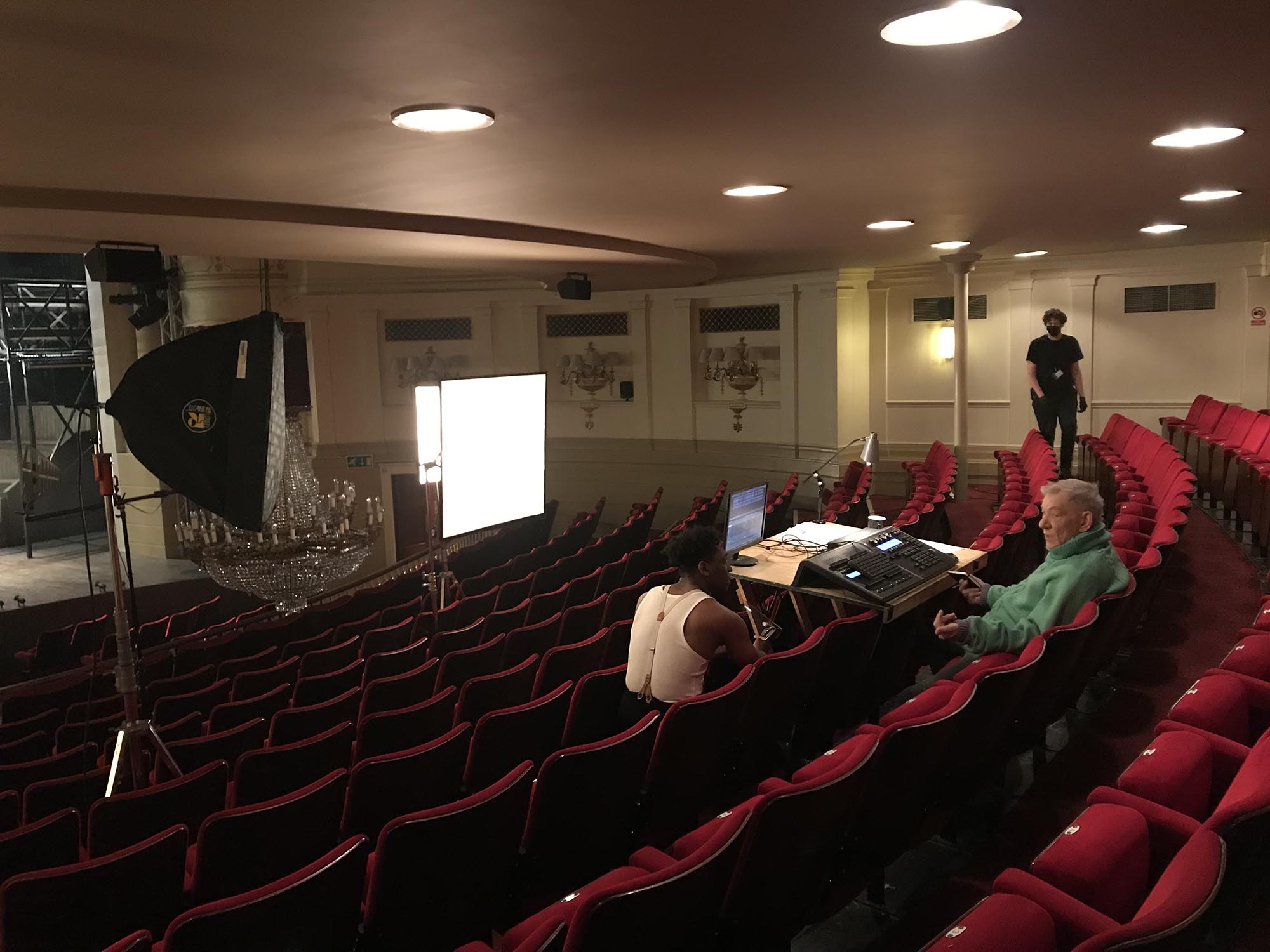
After lunch we shot the play’s most famous scene, something about swings and marrows I think? Ian and Sean had long decided that they wanted it to play like a conversation, not a soliloquy, with Hamlet pouring out his thoughts to Horatio before the latter shaves the former’s head. I decided in rehearsals to shoot it extremely simply, as two handheld over-the-shoulder shots. “Where’s the light?” asked Ian as we were about to shoot, looking around the empty room. Ben and co had once again set up the ultra-bounce outside the window, using the 2.5K HMI this time as the 6K had proven overkill last time. For Horatio’s reverse we added a matt silver bounce to wrap the window light slightly, but still left him mainly backlit.
Finally we shot the other side of Ian’s transition into Hamlet. Sean had come up with quite a different concept to what I had imagined, where Hamlet’s face isn’t properly seen, and instead of zooming out from his image in the mirror to reveal the room, we follow handheld behind him as he moves around the space. This gave us some fun and games with reflections in the room’s other mirrors, but after a few takes we got it in the can successfully. The sparks flickered the practicals for a couple of seconds at the top of the shot to provide a little bridge from the start of the transition. Other than that it was the same window light as the previous scene.
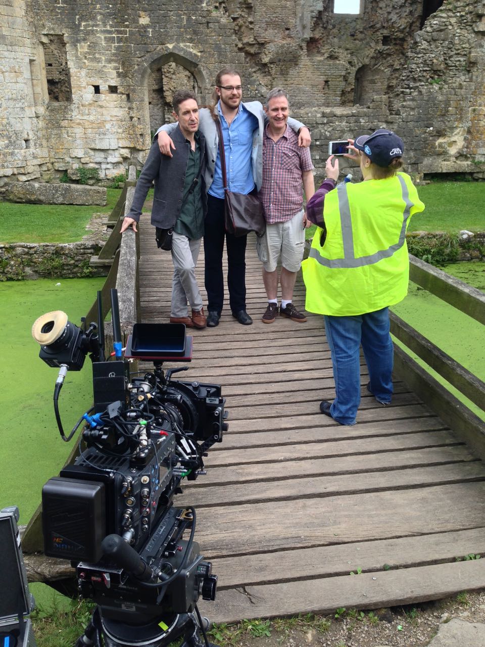
And then we were wrapped. Officially that is. In reality we have a couple of scenes and some odd pick-up shots still to shoot, which I believe we will do in June when the play has opened. I had a great time on this shoot. It was certainly stressful, and I struggled to sleep most nights worrying about the next day’s call sheet, but the cast and crew are the loveliest I’ve ever worked with on a paid gig. I learnt a lot and I made some fantastic memories.
And I confidently predict that no-one will be looking at the cheeseboard.
Day 26 – 21/9/21
“Arm you, I pray you, to this speedy voyage.”
Over four months later and I was back in Windsor to shoot pick-ups. How strange it was to return to this town that was my home for several weeks, return to the theatre that I grew to know like the back of my hand, this time just for a flying visit. Lockdown was far behind us (until the next one); the theatre was a living building now. The play had been performed on stage 78 times, and they would perform it again that night when the pick-ups were wrapped and I could take my seat like any other punter.
But before then there were 12 set-ups to shoot, consisting of a short scene in Claudius’s dressing room that we ran out of time to do before, several extra close-ups for the King’s speech (originally shot on day 7), one extra close-up for another auditorium scene and a shot of Hamlet climbing the stairs to Gertrude’s closet.
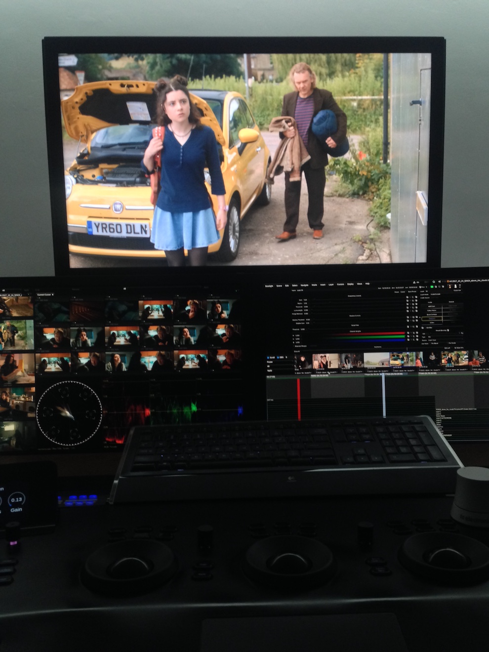
It was largely a technical exercise, with my laptop and the principal photography footage never far away, and the camera logs on hand too. We had prepared well and all went smoothly.
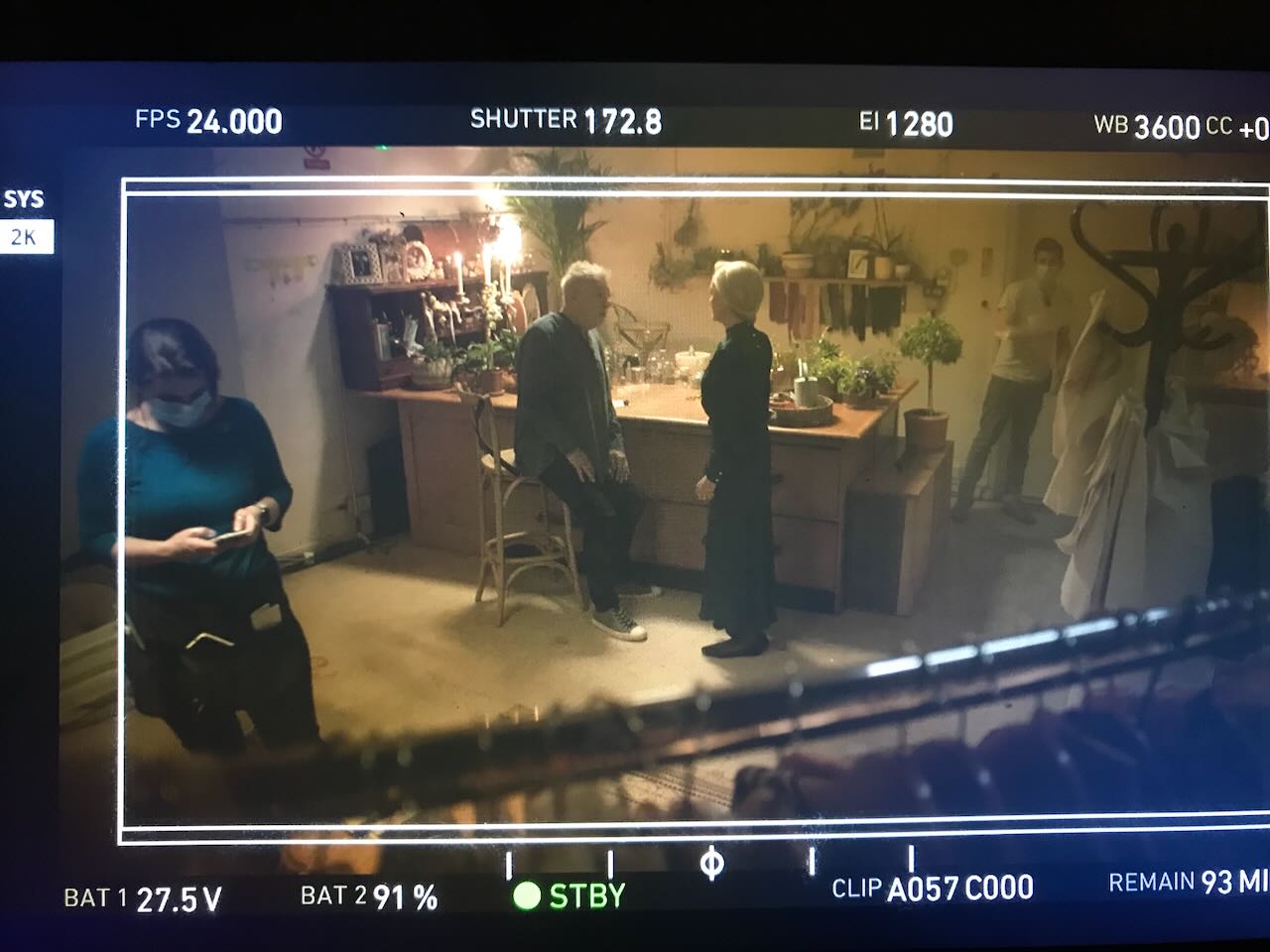
I got to see most of the cast again, but so very briefly. There was barely enough time to ask them how the play was going before it was time to move onto another actor and another set-up. Both Ian McKellen and Jonathan Hyde told me how much better they knew the story and the characters than they did back in the spring. This led to a change of blocking in the dressing room scene. Gone was a shot-reverse with Rosencrantz and Guildenstern sitting comfortably on the sofa, as we had rehearsed it in March. Jonathan felt strongly that R&G needed to stand, so I composed a shot over him to his triple-paned mirror in which both he and R&G were reflected.
There had been some debate over which staircase to use for the final shot, but in the end we stuck to the one that’s genuinely outside the costume workshop, which has a slightly grungy, seedy feel to it. Ben rigged a skirted toplight overhead and little spill coming from around the corner, and a few takes later we were wrapped. Such an anticlimax!
And how was the play? Electrifying, utterly electrifying. If the film turns out half as well then we will have something very special on our hands.
DAY 27 – 11/4/22
A year after principal photography, I was surprised to get a call from Sean asking me to return to Windsor one more time for some more pick-ups, and of course I was very happy to oblige.
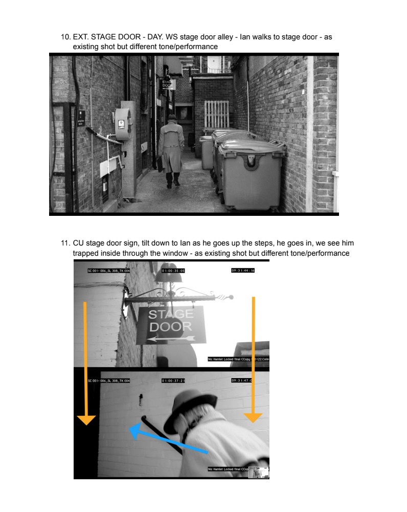
The edit is almost locked, but the tone of the prelude was wrong. So at 6 o’clock this morning we were on the street outside the Theatre Royal Windsor to shoot Ian’s arrival at the theatre again, this time with a much gloomier performance, and a new beat in which he peers into Hamlet’s dressing room and sees his alter-ego (using footage from principal photography). By the third set-up the streets were getting busy and we were shooting lots of takes in order to make sure we had every moment clean of unwanted background artists. There were a couple of camcorder shots to do from the roof and upper windows of the theatre, which involved contending with much chaos on the streets as people tried to walk or drive through frame or grab Ian’s autograph!
Sean and his editor, Nic, had completely desaturated the prologue, so I re-shot it with this in mind, going for a more sculpted and less naturalistic look than before. The weather was sunnier too, which will help give us the contrast that works so well in black and white.
When we moved the camera into the dressing room to shoot Ian looking in, Ben and spark Bruce bounced a 2.5K HMI into poly and then through a trace frame to produce a fill light that was soft enough to look natural against the bright daylight outside, but still had enough shape to look interesting. We shot a few variations including some with the prism gaffer-taped to the matte-box to add to the moment of magic.
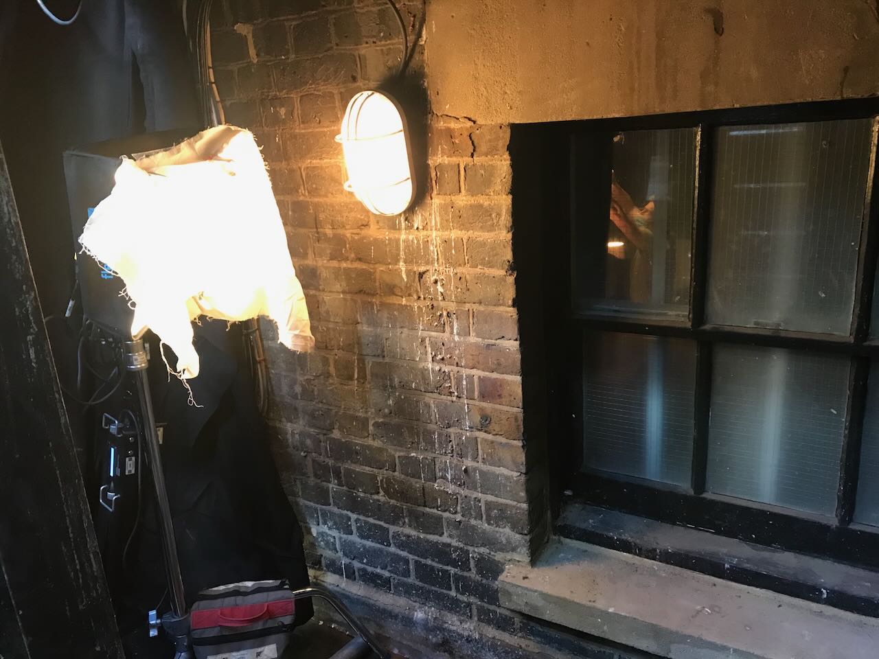
The scene just outside and inside the stage door we recreated with exactly the same set-ups as day 24. This time Ben bounced the 2.5K into Celotex in the alleyway to push more light through the little windows of the stage door, as well as rigging a Fomex from the ceiling to give just enough top-light to lift the shadows when the door closed.
We dreamed up a couple of extra shots since we were ahead of schedule, including one of Ian peering through the letterbox in the theatre’s front door. Then, after a quick lunch break, we moved to Prompt Corner on the stage, the production that was rehearsing there having broken for their own lunch. We had to shoot a VFX plate of the monitor to drop the camcorder shots into (a lack of the correct cable preventing us from piping it in for real). I put a couple of tracking crosses on it, and we lit it with practicals and a bit of fill from the Fomex bounced into the black walls. Even more of an anticlimax than the previous pick-ups wrap!