 Recently work began on colour grading Above the Clouds, a comedy road movie I shot for director Leon Chambers. I’ve covered every day of shooting here on my blog, but the story wouldn’t be complete without an account of this crucial stage of postproduction.
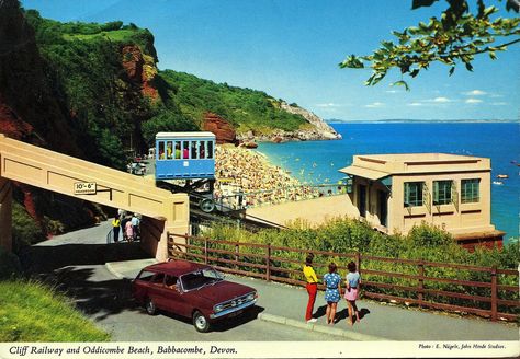
I must confess I didn’t give much thought to the grade during the shoot, monitoring in Rec.709 and not envisaging any particular “look”. So when Leon asked if I had any thoughts or references to pass on to colourist Duncan Russell, I had to put my thinking cap on. I came up with a few different ideas and met with Leon to discuss them. The one that clicked with his own thoughts was a super-saturated vintage postcard (above). He also liked how, in a frame grab I’d been playing about with, I had warmed up the yellow of the car – an important character in the movie!
Leon was keen to position Above the Clouds‘ visual tone somewhere between the grim reality of a typical British drama and the high-key gloss of Hollywood comedies. Finding exactly the right spot on that wide spectrum was the challenge!
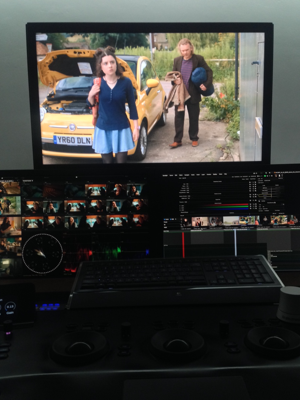
“Real but beautiful” was Duncan’s mantra when Leon and I sat down with him last week for a session in Freefolk’s Baselight One suite. He pointed to the John Lewis “Tiny Dancer” ad as a good touchstone for this approach.
 We spent the day looking at the film’s key sequences. There was a shot of Charlie, Oz and the Yellow Peril (the car) outside the garage from week one which Duncan used to establish a look for the three characters. It’s commonplace nowadays to track faces and apply individual grades to them, making it possible to fine-tune skin-tones with digital precision. I’m pleased that Duncan embraced the existing contrast between Charlie’s pale, freckled innocence and Oz’s dirty, craggy world-weariness.
Above the Clouds was mainly shot on an Alexa Mini, in Log C ProRes 4444, so there was plenty of detail captured beyond the Rec.709 image that I was (mostly) monitoring. A simple example of this coming in useful is the torchlight charity shop scene, shot at the end of week two. At one point Leo reaches for something on a shelf and his arm moves right in front of his torch. Power-windowing Leo’s arm, Duncan was able to bring back the highlight detail, because it had all been captured in the Log C.
But just because all the detail is there, it doesn’t mean you can always use it. Take the gallery scenes, also shot in week two, at the Turner Contemporary in Margate. The location has large sea-view windows and white walls. Many of the key shots featured Oz and Charlie with their backs towards the windows. This is a classic contrasty situation, but I knew from checking the false colours in log mode that all the detail was being captured.

Duncan initially tried to retain all the exterior detail in the grade, by separating the highlights from the mid-tones and treating them differently. He succeeded, but it didn’t look real. It looked like Oz and Charlie were green-screened over a separate background. Our subconscious minds know that a daylight exterior cannot be only slightly brighter than an interior, so it appeared artificial. It was necessary to back off on the sky detail to keep it feeling real. (Had we been grading in HDR [High Dynamic Range], which may one day be the norm, we could theoretically have retained all the detail while still keeping it realistic. However, if what I’ve heard of HDR is correct, it may have been unpleasant for audiences to look at Charlie and Oz against the bright light of the window beyond.)
There were other technical challenges to deal with in the film as well. One was the infra-red problem we encountered with our ND filters during last autumn’s pick-ups, which meant that Duncan had to key out Oz’s apparently pink jacket and restore it to blue. Another was the mix of formats employed for the various pick-ups: in addition to the Alexa Mini, there was footage from an Arri Amira, a Blackmagic Micro Cinema Camera (BMMCC) and even a Canon 5D Mk III. Although the latter had an intentionally different look, the other three had to match as closely as possible.
A twilight scene set in a rural village contains perhaps the most disparate elements. Many shots were done day-for-dusk on the Alexa Mini in Scotland, at the end of week four. Additional angles were captured on the BMMCC in Kent a few months later, both day-for-dusk and dusk-for-dusk. This outdoor material continues directly into indoor scenes, shot on a set this February on the Amira. Having said all that, they didn’t match too badly at all, but some juggling was required to find a level of darkness that worked for the whole sequence while retaining consistency.
In other sequences, like the ones in Margate near the start of the film, a big continuity issue is the clouds. Given the film’s title, I always tried to frame in plenty of sky and retain detail in it, using graduated ND filters where necessary. Duncan was able to bring out, suppress or manipulate detail as needed, to maintain continuity with adjacent shots.
Consistency is important in a big-picture sense too. One of the last scenes we looked at was the interior of Leo’s house, from weeks two and three, for which Duncan hit upon a nice, painterly grade with a bit of mystery to it. The question is, does that jar with the rest of the movie, which is fairly light overall, and does it give the audience the right clues about the tone of the scene which will unfold? We may not know the answers until we watch the whole film through.
Duncan has plenty more work to do on Above the Clouds, but I’m confident it’s in very good hands. I will probably attend another session when it’s close to completion, so watch this space for that.
See all my Above the Clouds posts here, or visit the official website.