“Annabel Lee”: Lighting the Arrival

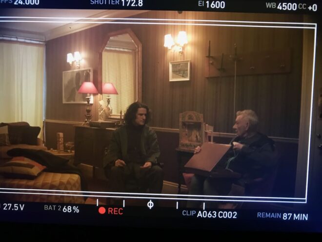
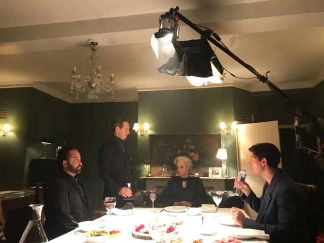
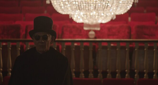
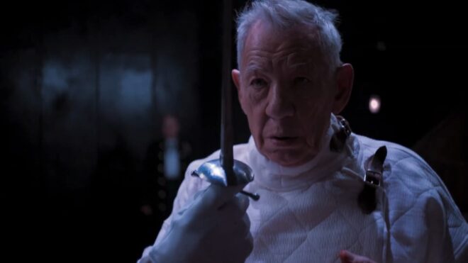
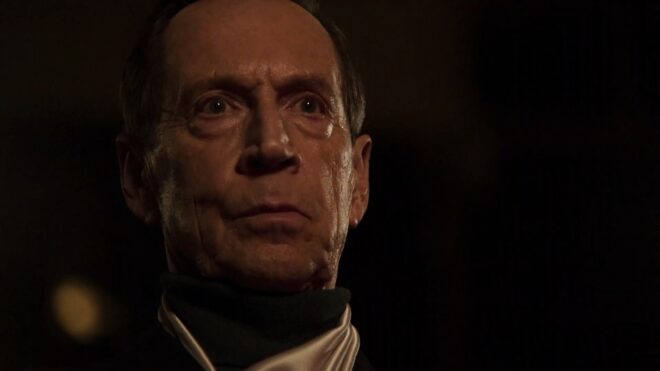
Last week, Annabel Lee – a short I photographed at the end of 2018 – won its sixth and seventh cinematography awards, its festival run having been somewhat delayed by Covid. I’ve previously written a couple of posts around shooting specific parts of Annabel Lee – here’s one about a Steadicam shot with a raven, and another about the church scene – and today I want to dissect the clip above. The sequence sees our two young refugees, Annabel and E, arriving at the Devonshire cottage where they’ll await passage to France.

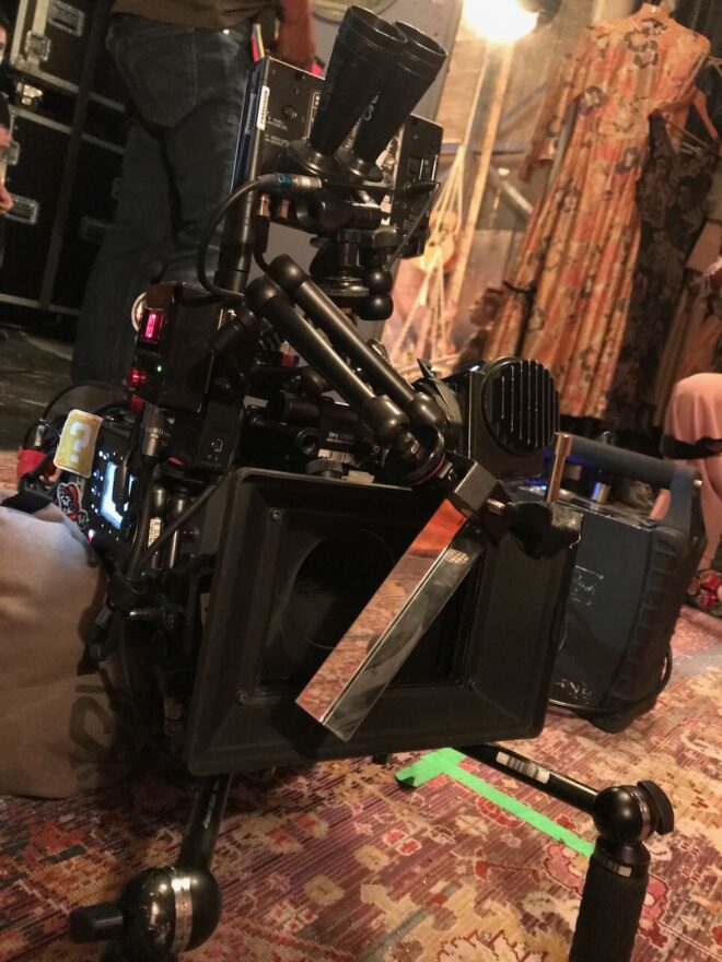
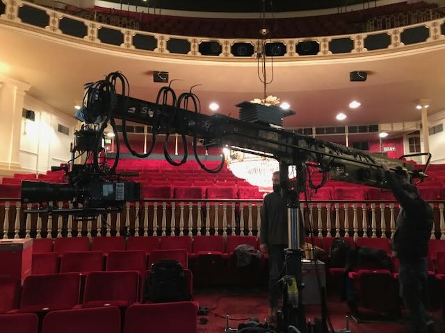
I was a last-minute replacement for another DP who had to pull out, so the crew, kit list and locations were all in place when I joined. Director Amy Coop had chosen to shoot on an Alexa Mini with Cooke anamorphic glass, and gaffer Bertil Mulvad and the previous DP had put together a package including a nine-light Maxi Brute, a couple of 2.5K HMIs and some LiteMats.

The Brute is serving as the moon in the exteriors, backlighting the (special effects) rain at least when we’re looking towards the driver. (If you’re not familiar with Maxi Brutes, they’re banks of 1K tungsten pars. Ours was gelled blue and rigged on a cherry-picker.) The topography of the location made it impossible to cheat the backlight around when we shot towards Annabel and E; rain doesn’t show up well unless it’s backlit, so this was quite frustrating.

We didn’t have any other sources going on except the period car’s tungsten headlights. It was very tricky to get the cast to hit the exact spots where the headlights would catch them while not shadowing themselves as they held out their hands with umbrellas or brooches.

Inside the cottage it’s a story point that the electricity doesn’t work, so until E lights the oil lamp we could only simulate moonlight and the headlights streaming in through the window. These latter were indeed a simulation, as we didn’t have the picture car at the time we shot inside. There was a whole sequence of bad luck that night when the camera van got stuck on the single-lane dirt track to the cottage, stranding certain crucial vehicles outside and sealing us all inside for three hours after wrap, until the RAC arrived and towed the camera van. So the “headlights” were a couple of tungsten fresnels, probably 650s, which were panned off and dimmed when the car supposedly departs. We also tried to dim them invisibly so that we could get more light on E as he comes in the door and avoid the Close Encounters look when the window comes into shot, but after a few takes of failing to make it undetectable we had to abandon the idea.

We also didn’t have the rain machine for the interiors, so as E opens the door you might briefly glimpse water being poured from an upstairs window by the art department, backlit by an LED panel. We put one of the HMIs outside a window that’s always off camera left to give us some “moonlight” in the room, create colour contrast with the tungsten headlights and the flame of the oil lamp, and ensure that we weren’t left in complete darkness when the “car” departs. Annabel looks right into it as she hugs E.

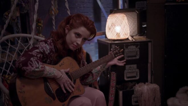
When the action moves upstairs, an HMI shines in through the window again. I remember it gave us real camera-shadow problems at the end of the scene, because Steadicam operator Rupert Peddle had to end with his back to that window and the talent in front of him (though the clip above cuts off before we get to that bit). The practical oil lamp does a lot of the work making this scene look great. I was sad that I had to put a little fill in the foreground to make E’s bruises at least a tiny bit visible; this was a LiteMat panel set to a very low intensity and bounced off the wall right of camera.

It’s worth mentioning the aspect ratio. My recollection is that I framed for 2.39:1, which is normal for anamorphic shooting. With the Alexa Mini in 4:3 mode, 2x anamorphic lenses produce an 8:3 or 2.66:1 image, which you would typically crop at the sides to 2.39 in post. When I arrived at the grade Annabel Lee was all in 2.66:1 and Amy wanted to keep it that way. I’m not generally a fan of changing aspect ratios in post because it ruins all the composition I worked hard to get right on set, but there’s no denying that this film looks beautiful in the super-wide ratio.

Finally, let me say a huge thank you to all the people who helped make the cinematography the award-winning success it has become, crucially drone operators Mighty Sky, underwater DP Ian Creed and colourist Caroline Morin. I’m sure the judges for these awards were swayed more by the beautiful aerial and aquatic work than the stuff I actually did!

“Annabel Lee”: Lighting the Arrival

Newton Thomas Sigel on the Cinematography of “Bohemian Rhapsody”

The following article originally appeared on RedShark News in 2018.

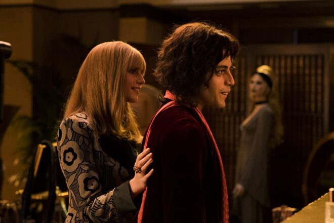
Directed by Bryan Singer, of X-Men and The Usual Suspects fame, Bohemian Rhapsody charts the story of Queen from their formation in 1970 to their triumphant Live Aid set in 1985, with plenty of their classic rock hits along the way. Rami Malek (from Amazon’s Mr. Robot) turns in an Oscar-winning performance as larger-than-life frontman Freddie Mercury.

In his tenth collaboration with Singer was director of photography Newton Thomas Sigel, ASC. I spoke to Sigel about how he approached evoking an era, recreating the concerts, and lensing a legend.

“Every day was this wonderful trip back in time,” enthuses Sigel, who saw the movie as a chance to relive his own youth. “I love shooting music. There is this wonderful transition from the end of the counter-culture, through glam-rock into the hedonism of the eighties.”

Shooting digitally, Sigel employed both the Alexa SXT and Alexa 65. “I decided the movie needed to have a visual arc that best represented the band’s transition from idealists to rock stars, and all the issues that creates. To that effect, I did the first act with old Cooke Speed Panchro lenses on the Alexa SXT. As Queen is discovered, and begins to be known on the international stage, we transition to the Alexa 65.” Sigel later fine-tuned this arc during grading.

The cinematographer paired the large-format Alexa 65 with Prime DNA and Prime 65-S glass, testing all the lenses to find the ones with the most gentle fall-off in focus. “Each lens had its own personality, and was never really ‘perfect’. Our 28mm had a particularly crazy quality that, when used sparingly, had great effect.”

One thing that struck me immediately about the cinematography is the distinctly un-British, warm and glowing look, with lots of sun streaming through windows. This was all part of Sigel’s plan, which develops as the film progresses. “What begins as warm and golden, with its own special LUT, grows ever sharper and cooler, even desaturated,” he explains. “The beginning is all handheld and grainy, the rest much cleaner, with the camera on Steadicam and crane.”

Sigel took a down-to-earth approach to photographing Malek’s Mercury. “I always wanted Freddie to feel very real,” he states. “It is important that you sense his vulnerability at the same time as he is projecting the bravado of the consummate showman. Like so many great performers, Freddie exuded confidence and brashness on stage, and yet, had a terribly shy insecurity in ‘real’ life.”

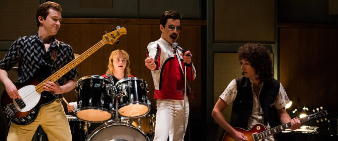
The highlights of Bohemian Rhapsody are undoubtedly the concert scenes. To tackle these, Sigel began by watching every single piece of Queen footage he could lay his hands on, noting the development of the stage lighting over the years. “I wanted to be as faithful to that as I could, while still having it service our story,” he says. That meant eschewing the easily-coloured RGB LED fixtures so common in movies and concerts today, and going back to the traditional method of laboriously changing gels on tungsten units. “We stuck to period lights,” Sigel confirms, “predominantly par cans and follow spots.”

The sheer number of concert scenes was a challenge for the filmmakers, who at one point had to shoot four gigs in just two days. “We had so many concerts to shoot and so little time, I needed to develop a system to quickly change from one venue to the next,” Sigel recalls. “Because Queen’s lighting was based on large racks of par cans, we were able to construct a very modular system that would allow us to raise or lower different sections very quickly. By pre-programming lighting sequences, we could also create sequence patterns with different configurations of light pods to make it look like a different venue.”

The types of units change as the story progresses through the band’s career. “By the late 70s, Queen was among the first bands to adopt the Vari-Lite, which was championed by the band Genesis,” Sigel explains. “That opened up many more possibilities in the theatrical lighting, which also reflected the band’s ascendancy to the upper echelons of the rock world.”

Sigel notes that he embraced all opportunities to capture lens flares from the concert lighting. “There is a great moment during Live Aid where Freddie makes this sweeping gesture through a circular flare, and it almost seems as if he is drawing on the lens.”

The historic Live Aid concert forms the jubilant climax of the film. Queen’s entire 20-minute set was recreated over seven days of shooting. “We photographed it in every type of weather Great Britain has ever seen: rain, sun, overcast, front-light, backlight – you name it. We couldn’t afford to silk the area as I would have liked,” Sigel adds, referring to large sheets of diffusion hung from cranes to maintain a soft, consistent daylight. “So it was a constant battle and the DI [digital intermediate] certainly helped.”

Filming for Bohemian Rhapsody began in autumn 2017, but by December trouble was brewing. Twentieth Century Fox halted production for a while, with the Hollywood Reporter citing the “unexpected unavailability of director Bryan Singer” as the reason. Dexter Fletcher, who had been attached to direct the nascent film back in 2013, ultimately replaced Singer for the last leg of photography.

“A change like that is never ideal,” admits Sigel, “but Dexter was very impressed with what we had done so far. With only a couple weeks to go, he was happy to carry on in the direction we had begun. Obviously he brought some of his own personal touches, but what I noticed the most was the ease he had in communicating with the actors.”

Reflecting on his long history of collaboration with Singer, Sigel is very positive. “When you have done that many movies together, there is a shorthand that develops and makes much of the work easier because you know your parameters from the beginning. Bohemian Rhapsody was truly the ‘labour of love’ cliché for so many people involved; it was quite remarkable.”

Asked to sum up the appeal of Bohemian Rhapsody, the cinematographer declares, “The film has everything – a deep emotional core at the centre of what is otherwise an exuberant celebration of Queen’s music. I also think Freddie’s story of an immigrant outsider just trying to fit in has a resonance today that is very profound.”

Newton Thomas Sigel on the Cinematography of “Bohemian Rhapsody”

6 Things to Beware of with Vintage Lenses

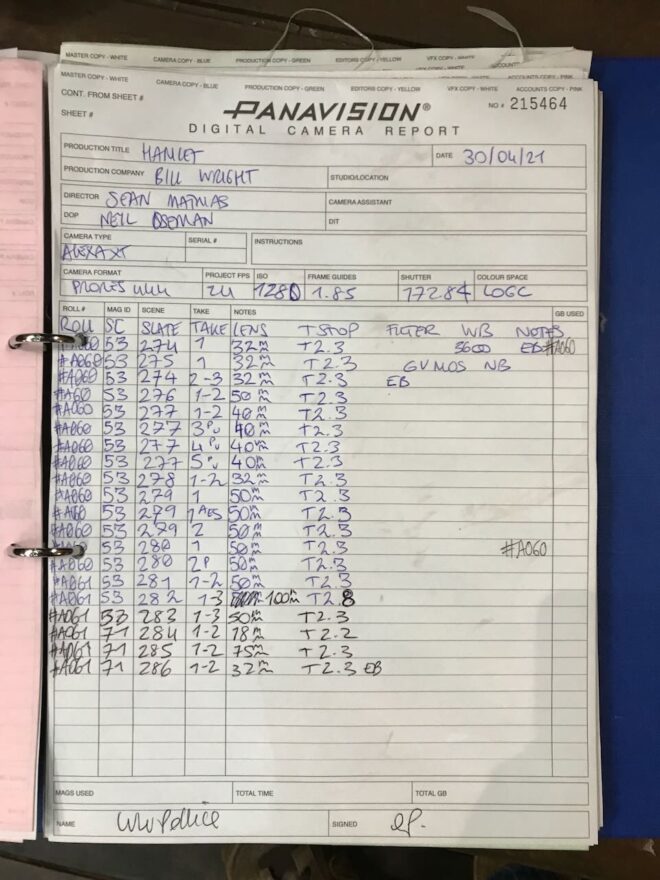
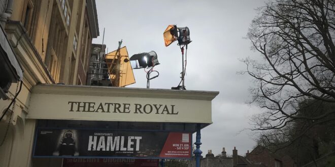
Ever since digital cinematography became the norm, DPs have sought to counter the format’s perfection with characterful vintage lenses. Having just completed a feature film shoot, Hamlet, on Cooke Panchros and a Cooke 10:1 Varotal, I’m over the moon with the beautiful, creamy, organic look they brought to the production. However, I can’t deny that they have some disadvantages over modern glass which you should take into consideration before choosing the vintage approach.


1. Softness

Vintage lenses simply aren’t as sharp as their modern counterparts, particularly at the edges of frame and particularly when the iris is wide open. On Hamlet I deliberately shot with the Panchros wide open to soften the image, rather than adding a diffusion filter like I’ve often done in the past, but that look is not for everyone, and it does make things a little harder for your focus puller. Be sure to test the sharpness and view the results on a large screen before committing.


2. BreathING

Breathe is the phenomenon whereby a lens appears to zoom slightly in or out when the focus is pulled. The Cooke Varotal is especially prone to this. As a result, my focus puller Aristide Russo had to be very gentle with his pulls otherwise the breathing was distracting.


3. Veiling

Many DPs love lens flares, and beautiful, natural flares were one of the reasons I picked the vintage Cooke glass. But look out for veiling flare – a milkiness and lift in the shadows affecting the whole frame. I noticed this a lot when shooting under the practical fluorescents in Hamlet‘s stage set, especially with handheld shots where the veiling would appear and disappear depending on the camera’s angle to the lights. I decided to embrace it and make it part of the film’s look, but if maintaining high contrast at all times is important to you, lenses without modern coatings may not be the right choice.


4. Vignetting

Check for dark patches in the corners of your image. The Varotal I used vignetted at certain parts of the zoom range and not at others, so the dark corners would appear and disappear during a zoom. Although not ideal, it isn’t noticeable most of the time. Besides, I figured that most colourists add vignettes to most shots anyway, so I was simply saving them a little time!


5. Mechanics

Older lenses are, quite naturally, less reliable. Even if they have been rehoused, like our Cooke “Century” Panchros had been in 2000, you may find that the iris and/or focus sticks sometimes. Our 25mm started to play up halfway through our shoot, forcing Aris to use the rosettes to support the matte box, otherwise the motor wasn’t powerful enough to turn the focus ring. This possibility was flagged for me during testing when we had a similar issue with the 50mm. Even if all your lenses seem to be fine during prep, know that a vintage lens could start misbehaving at any time, and your rental house may not have another on the shelf to replace it with.


6. Uniformity

Don’t expect a set of vintage primes to all have the same maximum aperture or the same external configuration. The iris ring might be buried in the matte box, the matte box might not fit on at all, or it may be impossible to engage both iris and focus motors at the same time.


All this sounds quite negative, but the flares, softness, breathing and vignettes can be absolutely beautiful. Be aware of the downsides of using vintage glass, absolutely, but if they suit your story then embrace the flaws and get ready to be blown away by your dailies.

In case you missed them the first time, I’ll leave you with some highlights from my Hamlet lens tests.

6 Things to Beware of with Vintage Lenses

Undisclosed Project: Experimentation

The main event of last week’s prep was a test at Panavision of the Arri Alexa XT, Red Gemini and Sony F55, along with Cooke Panchro, Cooke Varotal, Zeiss Superspeed and Angenieux glass. More on that below, along with footage.

The week started with Zoom meetings with the costume designer, the make-up artist, potential fight choeographers and a theatrical lighting designer. The latter is handling a number of scenes which take place on a stage, which is a new and exciting collaboration for me. I met with her at the location the next day, along with the gaffer and best boy. After discussing the stage scenes and what extra sources we might need – even as some of them were starting to be rigged – I left the lighting designer to it. The rest of us then toured the various rooms of the location, with the best boy making notes and lighting plans on his tablet as the gaffer and I discussed them. They also took measurements and worked out what distro they would need, delivering a lighting kit list to production the next day.

Meanwhile, at the request of the producer, I began a shot list, beginning with two logistically complex scenes. Despite all the recces so far, I’ve not thought about shots as much as you might think, except where they are specified in the script or where they jumped out at me when viewing the location. I expect that much of the shot planning will be done during the rehearsals, using Artemis Pro. That’s much better and easier than sitting at home trying to imagine things, but it’s useful for other departments to be able to see a shot list as early as possible.

So, the camera tests. I knew all along that I wanted to test multiple cameras and lenses to find the right ones for this project, a practice that is common on features but which, for one reason and another, I’ve never had a proper chance to do before. So I was very excited to spend Wednesday at Panavision, not far from my old stomping ground in Perivale, playing around with expensive equipment.

Specifically we had: an Arri Alexa – a camera I’m very familiar with, and my gut instinct for shooting this project on; a Sony F55 – which I was curious to test because it was used to shoot the beautiful Outlander series; and a Red Gemini – because I haven’t used a Red in years and I wanted to check I wasn’t missing out on something awesome.

For lenses we had: a set of Cooke Panchros – again a gut instinct (I’ve never used them, but from what I’ve read they seemed to fit); a set of Zeiss Superspeeds – selected after reviewing my 2017 test footage from Arri Rental; a couple of Cooke Varotal zooms, and the equivalents by the ever-reliable Angenieux. Other than the Angenieux we used on the B-camera for The Little Mermaid (which I don’t think we ever zoomed during a take), I’ve not used cinema zooms before, but I want the old-fashioned look for this project.

Here are the edited highlights from the tests…

You’ll notice that the Sony F55 disappears from the video quite early on. This is because, although I quite liked the camera on the day, as soon as I looked at the images side by side I could see that the Sony was significantly softer than the other two.

So it was down to the Alexa vs. the Gemini, and the Cookes vs. the Superspeeds. I spent most of Thursday and all of Friday morning playing with the footage in DaVinci Resolve, trying to decide between these two pairs of very close contenders. I tried various LUTs, did some rough grading (very badly, because I’m not a colourist), tested how far I could brighten the footage before it broke down, and examined flares and bokeh obsessively.

Ultimately I chose the Cooke Panchros because (a) they have a beautiful and very natural-looking flare pattern, (b) the bokeh has a slight glow to it which I like, (c) the bokeh remains a nice shape when stopped down, unlike the Superspeeds’, which goes a bit geometric, (d) they seem sharper than the Superspeeds at the edges of frame when wide open, and (e) more lengths are available.

As for the zoom lenses (not included in the video), the Cooke and the Angenieux were very similar indeed. I chose the former because it focuses a little closer and the bokeh again has that nice glow.

I came very close to picking the Gemini as my camera. I think you’d have to say, objectively, it produces a better image than the Alexa, heretical as that may sound. The colours seem more realistic (although we didn’t shoot a colour chart, which was a major oversight) and it grades extremely well. But…

I’m not making a documentary. I want a cinematic look, and while the Gemini is by no means un-cinematic, the Alexa was clearly engineered by people who loved the look of film and strove to recreate it. When comparing the footage with the Godfather and Fanny and Alexander screen-grabs that are the touchstone of the look I want to create, the Alexa was just a little bit closer. My familiarity and comfort level with the Alexa was a factor too, and the ACs felt the same way.

I’m very glad to have tested the Gemini though, and next time I’m called upon to shoot something great and deliver in 4K (not a requirement on this project) I will know exactly where to turn. A couple of interesting things I learnt about it are: (1) whichever resolution (and concomitant crop factor) you select, you can record a down-scaled 2K ProRes file, and this goes for the Helium too; (2) 4K gives the Super-35 field of view, whereas 5K shows more, resulting in some lenses vignetting at this resolution.

Undisclosed Project: Experimentation

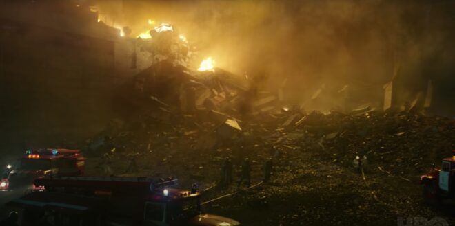
The Cinematography of “Chernobyl”

Like many of us, I’ve watched a lot of streaming shows this year. One of the best was Chernobyl, the HBO/Sky Atlantic mini-series about the nuclear power plant disaster of 1986, which I cheekily binged during a free trial of Now TV.

In July, Chernobyl deservedly scooped multiple honours at the Virgin Media British Academy Television (Craft) Awards. In addition to it claiming the Bafta for best mini-series, lead actor Jared Harris, director Johan Renck, director of photography Jakob Ihre, production designers Luke Hull and Claire Levinson-Gendler, costume designer Odile Dicks-Mireaux, editors Simon Smith and Jinx Godfrey, composer Hildur Gudnadóttir, and the sound team all took home the awards in their respective fiction categories.

I use the phrase “took home” figuratively, since no-one had left home in the first place. The craft awards ceremony was a surreal, socially-distanced affair, full of self-filmed, green-screened celebrities. Comedian Rachel Parris impersonated writer/actor Jessica Knappett, and the two mock-argued to present the award for Photography & Lighting: Fiction. Chernobyl’s DP Jakob Ihre, FSF gave his acceptance speech in black tie, despite being filmed on a phone in his living room. In it he thanked his second unit DP Jani-Petteri Passi as well as creator/writer Craig Mazin, one of the few principal players not to receive an award.

Mazin crafted a tense and utterly engrossing story across five hour-long instalments, a story all the more horrifying for its reality. Beginning with the suicide of Harris’ Valery Legasov on the second anniversary of the disaster, the series shifts back to 1986 and straight into the explosion of the No. 4 reactor at the Chernobyl Nuclear Power Plant in the Soviet Ukraine. Legasov, along with Brosi Shcherbina (Stellan Skarsgård) and the fictional, composite character Ulana Khomyuk (Emily Watson) struggle to contain the meltdown while simultaneously investigating its cause. Legions of men are sacrificed to the radiation, wading through coolant water in dark, labyrinthine tunnels to shut off valves, running across what remains of the plant’s rooftop to collect chunks of lethal graphite, and mining in sweltering temperatures beneath the core to install heat exchangers that will prevent another catastrophic explosion.

For Swedish-born NFTS (National Film and Television School) graduate Jakob Ihre, Chernobyl was a first foray into TV. His initial concept for the show’s cinematography was to reflect the machinery of the Soviet Union. He envisaged a heavy camera package representing the apparatus of the state, comprised of an Alexa Studio, with its mechanical shutter, plus anamorphic lenses. “After another two or three months of preproduction,” he told the Arri Channel, “we realised maybe that’s the wrong way to go, and we should actually focus on the characters, on the human beings, the real people who this series is about.”

Sensitivity and respect for the people and their terrible circumstances ultimately became the touchstone for both Ihre and his director. The pair conducted a blind test of ten different lens sets, and both independently selected Cooke Panchros. “We did a U-turn and of course we went for spherical lenses, which in some way are less obtrusive and more subtle,” said Ihre. For the same reason, he chose the Alexa Mini over its big brother. A smaller camera package like this is often selected when filmmakers wish to distract and overwhelm their cast as little as possible, and is believed by many to result in more authentic performances.

When it came to lighting, “We were inspired by the old Soviet murals, where you see the atom, which is often symbolised as a sun with its rays, and you see the workers standing next to that and working hand in hand with the so-called ‘friendly’ atom.” Accordingly, Ihre used light to represent gamma radiation, with characters growing brighter and over-exposed as they approach more dangerous areas.

Ihre thought of the disaster as damaging the fabric of the world, distorting reality. He strove to visualise this through dynamic lighting, with units on dimmers or fitted with remote-controlled shutters. He also allowed the level of atmos (smoke) in a scene to vary – normally a big no-no for continuity. The result is a series in which nothing feels safe or stable.

The DP shot through windows and glass partitions wherever possible, to further suggest a distorted world. Working with Hull and Levinson-Gendler, he tested numerous transparent plastics to find the right one for the curtains in the hospital scenes. In our current reality, filled with perspex partitions (and awards ceremonies shot on phones), such imagery of isolation is eerily prescient.

The subject of an invisible, society-changing killer may have become accidentally topical, but the series’ main theme was more deliberately so. “What is the cost of lies?” asks Legasov. “It’s not that we’ll mistake them for the truth. The real danger is that if we hear enough lies, then we no longer recognise the truth at all.” In our post-truth world, the disinformation, denial and delayed responses surrounding the Chernobyl disaster are uncomfortably familiar.

This article first appeared on RedShark News.

The Cinematography of “Chernobyl”

“The Little Mermaid”: Sun, Sea and Cinematography

(Spoiler alert!) The denouement of The Little Mermaid takes place in the waves on a picturesque beach, where Cam (William Moseley) has carried Elizabeth (Poppy Drayton). In true fairytale style, our hero and heroine finally share their first kiss, parting to reveal the flaring orange sun behind them, just above the horizon. By the time we got to this sequence, we had already shot some water scenes, but those were in controlled, studio-like conditions. Working with natural light and real waves was going to be a whole different ball-game.

Here are some extracts from my diary, revealing how this magical moment was ultimately captured.


Day 22

Scenes at the beach today, with actors in the ocean. We’ve been worried about this sequence since the earliest stages of preproduction. Will the cast get too cold? Will it be too dangerous with waves and jellyfish and razor-sharp oyster beds? Will we get the magical dawn lighting the script requires? Building a partial beach set against green-screen was considered for a long time, but eventually shooting on a real beach, and this one particular beach, turned out to be our only option. (We’re back on Tybee Island, the same island we did the Shirley Shoot on so very long ago, and Baywatch seems to have all the other beaches tied up.)

The weather is good, with a cloudless sky. We’re cheating sunset for sunrise, and I know exactly where the sun will go down, thanks to the Helios and Sun Tracker apps.

We get ready to go into the water shortly after 6pm. The ACs put the camera in the splash bag and we bring it into the ocean. It starts to leak. Which is pretty much the last thing you want to happen. We pull it out before the camera gets damaged, but now we’re wondering how to shoot the scene. Someone suggests I just put the camera on my shoulder (I’m only going in up to my waist) and a couple of the crew spot me to make sure I don’t drop it. Sounds risky, doesn’t it? But it works. Meanwhile Captain Dan joins us in his waders to hand-bash a polyboard bounce, and the ‘B’ camera team are on a pontoon trying to get alternate angles.

Perhaps the most important thing I do today is ask Will to pick Poppy up the other way around. You see, when we’re about to turn over, Will picks up Poppy with her head to his right and her tail to his left. But I can see that if they play the scene with Poppy this way around, I will end up framing the two-shot with my back to the sun, losing that magical image of the low sun in the background, and probably casting camera shadows on them to boot. So I ask Will to pick Poppy up the other way around.

As the sun races towards the horizon, we get two magical takes. I’m constantly reframing to keep the setting sun in the background, and as the hero and heroine kiss, it flares out perfectly between them. Everyone is ecstatic.


Day 23

‘B’ cam 1st AC Geran Daniels on the pontoon with the Alexa XR Studio and the hefty Angenieux 19.5-94mm Optimo

It’s another beautiful day, and the first task is to go out on the pontoon and shoot Poppy’s double swimming about in the mermaid tail. I use the Angenieux zoom for only the second time (it normally lives on the ‘B’ camera), and for the first time on my shoulder. Damn, that thing’s heavy. But my shoulder has worse to come today.

As sunset approaches, we must shoot pick-ups for Saturday’s water scene with the principal cast. Today the tide is much lower at sunset, and getting out to a deep enough spot (up to around waist or chest level) means walking over very squelchy mud which you sometimes sink in up to your knees, and sharp oyster beds. So instead we get into the water via the pontoon. This boat has a limited capacity, so I’m dropped off on the first trip, before it returns to the dock twice more to get the rest of the cast and crew who are needed. It’s extremely pleasant to swim about in the ocean (more of an estuary really) while we wait.

In the water with 2nd AC Kane Pearson and some expensive electronics. The white patch on the splash bag is the $5 of tape!

Line producer Fabio has proudly repaired the leaky splash bag with a $2 bicycle inner tube patch. 2nd AC Kane, a big spender, added $5 of tape, and we successfully tested it before we set sail.

Because the splash-bag doesn’t fit our Alexa’s viewfinder, Kane has to hand-bash a 5.6” monitor in a ziplock bag (along with a Teradek receiver and battery) so that I can see what I’m shooting. This works pretty well though. The hardest thing is the mud; it’s impossible to find a firm spot, so during the takes I’m always sinking and trying to keep my balance and follow the action at the same time. Kane has to prop me up on a couple of occasions.

For all the material in the ocean I stick to a (Cooke S4i) 32mm lens; the zoom won’t fit in the splash housing, and lens changes take too long. (The cast can only be in the water for 30 minutes at a time, according to Screen Actors Guild rules.) Although we mostly shoot at water level, where the splash bag floats and is easy to control, one set-up requires me to put it on my shoulder. The weight is quite something, but with help I get the shot.

With the water scenes wrapped, and the tide now higher, we swim back to shore. We’ve been in the water at least three hours, and it was exhausting but a lot of fun too.

That concludes my blog series on The Little Mermaid. If you missed any of the earlier instalments, here are the links:

Don’t forget, if you’re in the UK, the film is currently available from all good high-street DVD retailers and on Amazon as a DVD or download.

SaveSave

SaveSave

SaveSave

“The Little Mermaid”: Sun, Sea and Cinematography

Anamorphic Lens Tests

Anamorphic cinematography, first dabbled with in the 1920s, was popularised by Twentieth Century Fox in the fifties as CinemaScope. Television was growing in popularity and the studios were inventing gimmicks left, right and centre to encourage audiences back into cinemas. Fox’s idea was to immerse viewers in an image far wider than they were used to, but with minimal modifications to existing 4-perf 35mm projectors. They developed a system of anamorphic lenses containing elements which compressed the image horizontally by a factor of two. By placing a corresponding anamorphosing lens onto existing projectors, the image was unsqueezed into an aspect ratio of 2.55:1, or later 2.39:1.

Since those early days of CinemaScope, anamorphic cinematography has become associated with the biggest Hollywood blockbusters. Its optical features – streak flares, oval bokeh and curved horizontal lines – have been seared into our collective consciousness, indelibly associated with high production values.

I’ve not yet been fortunate enough to shoot anamorphic, but I was able to test a few lenses at Arri Rental recently, with the help of Rupert Peddle and Bex Clives. Last week I wrote about the spherical lenses which we tested; our anamorphic tests followed the same methodology.

Again we were shooting on an Alexa XT Plus in log C ProRes 4444 XQ, this time in 4:3 mode, a resolution of 2048×1536. Since all of the lenses had a standard 2:1 anamorphosing ratio, the images unsqueezed to a super-wide 2.66:1 ratio. (This is because the lenses were designed to be used on 35mm film with space left to one side for the optical soundtrack.) You can see the full width of this ratio in the first split-screen image in the video, at 2:08, and in the second image below, but otherwise I have horizontally cropped the footage to the standard 2.39:1 ratio.

We tested the following glass:

Series Length Speed CF* Weight
Hawk V 35mm T2.2 30″ 5.6kg
Cooke Xtal 30mm T2.8 ? 3kg
Kowa Mirrorscope 40mm T2.2 36″ 1.15kg
Kowa Mirrorscope 30mm T2.3 ? ?

* CF = close focus

For consistency with the spherical lenses, we used lengths around 32mm, but in the anamorphic format this is a pretty wide lens, not a mid-range lens. We shot at T2.8, again for consistency, but I hear that many anamorphics don’t perform well wider than T4.

We were only able to test what Arri Rental happened to have on the shelves that day. The biggest and presumably most expensive was the Hawk V-series. Next  in size and weight was the Cooke Xtal – pronounced “crystal” – a 1970s lens based on the much-loved Speed Panchros. The smallest and lightest, was the Kowa Mirrorscope, with a list price of £1,200 per week for a set of four. (Sorry, I couldn’t find any pricing info for the others online.) Note that there isn’t really a 30mm Mirrorscope; to get this length you put a wide angle adapter on the 40mm. As this extra element decreases the optical performance, we tested it with and without, hence the two lengths.

Here’s the video…


Skin tones

Click on the image to see it at full quality.

To my eye, the Hawk has a fairly rich, warm skin tone, while the Cooke – as with the spherical S4 tested last week – seems a little grey and flat. The Kowa is inexplicably brighter than the other two lenses, which makes it hard to compare, but perhaps it’s a little cooler in tone?


Sharpness

Focus is more critical with anamorphic lenses than spherical ones. From a forum posting by Max Jacoby:

Anamorphic lenses have what is known as a “curved field of focus” that works similarly to the curved movie screens in some large Cinerama theatres. This is one reason that one needs to expose these lenses at a deeper stop. If one doesn’t, the curved field will not be covered by depth of field and either the edges or centre of the frame will be soft.

One day I’d like to re-test these lenses at a lower stop, T4 or T5.6, where they will all undoubtedly perform much better. But in this T2.8 test, on Bex’s face in the centre of frame, the Hawk V and the Kowa Mirrorscope 40mm – both almost a full stop from their maximum apertures – are clearly the sharpest of the bunch. The Cooke Xtal, which is wide open, is unsurprisingly softer. The 30mm adapter on the Mirrorscope completely destroys the image, not only making it very soft but also introducing colour aberration.

Now let’s look at the checkerboard at the side of frame and see if we can spot any differences in sharpness there…

It seems to me that the Kowa, both with and without the adapter, has a greater difference in sharpness between the centre and edges of frame than the the Hawk and Cooke. With the latter two lenses, the checkerboard is reasonably sharp, at least on the lefthand side, with some ghosting/blur visible towards the righthand side. The same thing can be observed on the chart in the flare tests at the end of the video.


Breathing & Bokeh

All of these lenses have a noticeable degree of breathe, which I suppose is to be expected from anamorphics. The Hawk V has roughly oval bokeh, the Cooke’s is more circular, while the Mirrorscope has interesting D-shaped bokeh.


Flare

The Hawk V doesn’t flare much at all, which is apparently due to the anamorphic element being in the middle of the lens, rather than at the front. The Kowa has a nice streak and glow around the light source, with a funky purple artefact on the opposite side of frame. But it’s the Cooke Xtal which provides the most classic lens flare, with a horizontal line across most of the frame and a partial star pattern around the source, despite the lens being wide open.

At the end of the video you can see how the flares develop on each lens as the light source moves horizontally across frame.


Distortion

A bulging effect is very obvious on all of these lenses, due to the focal lengths being quite wide for anamorphic. Notice how at 40mm on the Kowa Mirrorscope this curvature of the image is significantly reduced.

It’s hard to compare the levels of distortion because none of the focal lengths are exactly the same, except for the Cooke Xtal and the Kowa Mirrorscope with the 30mm adapter on. The Cooke’s top right and bottom left corners appear to be stretched away from the centre relative to the other two corners. I suppose that strange and funky stuff like this is exactly why you choose vintage glass.

Interestingly, the Cooke’s image appears a little tighter than the Kowa’s, which combined with my inability to find any evidence online of the existence of a 30mm Xtal, leads me to suspect we may have been given a mislabelled 32mm.


Conclusions

When we got to the end of our spherical tests and started putting the anamorphics on, I was shocked by the drop in sharpness. But as noted earlier, this is because anamorphics really need to be used with a smaller aperture than the T2.8 I often shoot at. If I learnt nothing else from this test, I learnt that anamorphic needs more light!

I would love to put the Cooke Xtal’s lovely flares and general vintage look to good use on a period movie one day. The Hawk V would be a good choice if I wanted the anamorphic look with warm, dynamic skin tones. The Kowa system seemed a little cheap and cobbled-together, but could well be a good solution for anamorphic on a budget, as long as I stayed away from the 30mm adapter!

I hope you’ve found these tests useful. Thanks again to 1st AC Rupert Peddle, 2nd AC Bex Clives and Arri Rental UK for making them possible.

Anamorphic Lens Tests

Spherical Lens Tests

The other week I spent a day at Arri Rental in Uxbridge, in the Bafta Room no less, conducting various camera and lens tests. I’ve done a number a productions now where I wanted to test but there wasn’t the time or money, so for a while I’ve been meaning to go into Arri on my own time and do some general tests for my education and edification. An upcoming short provided the catalyst for me to get around to it at last.

Aided by 1st AC Rupert Peddle and 2nd AC Bex Clives, I tested a dozen lenses, some spherical, some anamorphic. Today I will cover the spherical lenses; next time I’ll look at the anamorphics.


Method

We shot on an Alexa XT Plus in log C ProRes 4444 XQ at 3.2K. In the video the image has been downscaled to 1080P and a standard Rec.709 LUT has been added.

I set the Alexa to ISO 800 and lit Bex to a T2.8 using a 650W tungsten fresnel bounced off poly. For fill I caught a little of the spill from the fresnel with a matte silver bounce board on the opposite side of camera. I placed fairy lights in the background to observe the bokeh (out of focus areas) and turned on a 100W globe during each take to see what the flare did.

We shot all the lenses at 2.8 – the stop I most commonly use – and also wide open (compensating with the shutter angle), but the direct 2.8 comparison proved most useful, so that’s mainly what you’ll see in the video. We tested a single length: 35mm or the closest available to it.

What we didn’t do was shoot grey-scale or colour charts, or do any testing of vignettes or distortion. (The day after doing these tests, Shane Hurlbut, ASC published an Inner Circle post about how to tests lenses, so I immediately learnt what my omissions were!)

We tested the following lenses:

Series Length Speed CF* Weight Price
Leica Summilux-C 29mm T1.4 18″ 1.7kg £27K
Arri/Zeiss Master Prime 35mm T1.3 14″ 2.2kg £16K
Cooke S4 32mm T2 6″ 1.85kg £14K
Leica Summicron-C 35mm T2 14″ 1.3kg £13K
Zeiss High Speed
(a.k.a. Superspeed Mk III)
35mm T1.3 14″ 0.79kg £12K
(refurb)
Arri/Zeiss Ultra Prime 32mm T1.9 15″ 1.1kg £10K
Zeiss T2.1 32mm T2.1 24″ 0.45kg £4K
(used)
Canon 35mm T1.5 12″ 1.1kg £3K

* CF = close focus

Here’s the video…


Skin tones

Click the image to see it at best quality.

The Arri/Zeiss Master Prime and the two Leicas seem to have the most vibrant skin tones. To my eye, the Leicas have a slight creaminess that’s very pleasing. The Canon looks just a little cooler and less dynamic. I was surprised to find that the Cooke S4, the lens I’ve used most, appears to have a grey, flat skin tone compared with the Master Prime, Leicas and Canon. I would rank the Ultra Prime and Superspeed next, on a par except that the Ultra Prime has a noticeable magenta cast. My least favourite skin tones are on the Zeiss T2.1, which comparatively makes poor Bex look a little bit ill!

Some of the nuances will be lost in the YouTube and Jpeg compression, but this is a very subjective assessment anyway, so feel free to completely disagree with all of the above. Any of the differences noted above could be corrected by grading, to some extent . But remember that the lens is at the very start of the light’s journey from set to screen, and any wavelengths that don’t get through it are lost forever. It’s like fluorescent lamps with colours missing from the spectrum; you can’t put those back in in post.


Sharpness

I have to say, I’m unable to detect any difference in sharpness between the Master Prime, Cooke S4, Canon and Leicas. The Ultra Prime and Superspeed both look a hair softer, while the T2.1 is very soft.


Breathing

Breathing is the slight zooming effect that you get with some lenses when you pull focus. Looking at 4:44 in the video you can clearly see the differences in breathing between the eight lenses. Because this part of the video is showing a crop of the bottom left corner of the image, the breathing manifests as a shift to the left (zoom in) as the lens is racked closer (goes soft) and a shift to the right (zoom out) as it’s racked deeper (goes sharp).

All the Zeiss lenses except the Master Prime have a significant amount of breath when seen in isolation like this, but not enough to be noticeable to an audience in most real-world situations. The Cooke S4 has a little bit of breathe, and the Canon a hair less. The Master Prime and the Leicas are rock solid.


Bokeh

Small points of light, when thrown out of focus, most clearly demonstrate the bokeh pattern of a lens. The shape of the bokeh is determined by the number of iris blades and the shape of those blades. Generally a circle is preferred, because it’s a natural shape, but for certain stories a more unusual shape might be appropriate. The shape of the iris changes with the T-stop, hence the T2.8 and wide open images above.

Immediately noticeable is the difference in the Cooke S4’s bokeh between wide open (circular) and T2.8 (octagonal). All of the other lenses have round bokeh at T2.8, apart from the Superspeed, which has heptagonal (seven-sided) bokeh.

It’s entirely subjective which bokeh you prefer. The only other thing I’ll point out is that the Canon’s bokeh wide open is very fuzzy, with noticeable colour aberration, though this may be due to the bright highlight rather than the defocusing.


Flare

Flare patterns also vary with aperture. The smaller the aperture, the more of a star effect you will get, as the light interacts with the corners in the iris blades. The Summilux shows this most clearly, with a pronounced star at T2.8 (two stops down from its maximum aperture) and almost none when wide open. The Cooke S4 also has a nice star pattern at T2.8. With the other lenses it’s much more subtle, and the Canon has almost none.


Conclusions

The real revelations in these tests, for me, were the Leicas. The Summilux in particular is a beautiful lens, with rich, dynamic skin tones, nice bokeh, no breathing, plus the bonus of nice star flares. I will definitely be looking to work with this glass in the future, although given the price tag that may be optimistic!

The Summicron also performed incredibly well, matching the more expensive Summilux and Master Prime in every respect except speed. I can see this becoming my new go-to lens.

The Master Prime of course produced a beautiful, sharp, clean image, but it lacks character. It might work nicely for science fiction, a drama requiring a neutral look, or something where filtration was being used to give the image character.

The Canon impressed me too – no mean feat given that it’s the cheapest lens we tested. With nice skin tones and attractive flares, I could see this working well for a romantic movie.

The Zeiss T2.1 did not appeal to me, with poor sharpness and cold, washed-out skin tones, so I would avoid it.

The Superspeed is a decent lens, but in most cases I’d plump for an Ultra Prime instead. Ultra Primes are certainly easier to work with for the 1st AC, and have proven to be a good workhorse lens for drama. (I shot Above the Clouds on them.)

The Cooke S4 has been my go-to glass up to now, and while it will probably remain my first choice for period pieces, due to its gentle focus fall-off, I’m excited to try some of the other glass in this test on other productions.

I’ll say it one last time: this is all subjective. Our visual preferences are what make every director of photography unique.

Tune in next week when I’ll look at the anamorphic lenses: Hawk-V, Cooke Xtal and Kowa Mirrorscope.

Spherical Lens Tests

8 Ways “Barry Lyndon” Emulates Paintings

Stanley Kubrick’s 1975 period epic Barry Lyndon, although indifferently received upon its original release, is considered a masterpiece by many today. This is largely due to its painterly photography with strong, precisely composed frames that leave the viewer feeling more like they’ve wandered through an art gallery than watched a movie. Today I’m going to look at eight methods that Kubrick and his team used to create this feel. It’s an excellent example of how a director with a strong vision can use the many aspects of filmmaking to realise that vision.


1. Storytelling

The American Cinematographer article on Barry Lyndon notes that “Kubrick has taken a basically talky novel and magically transformed it into an intensely visual film.” You have only to look at a series of frame-grabs from the movie to see just how much of the story is contained in the images. Just like a painter, Kubrick reveals a wealth of narrative within a single frame. The shot above, for example, while recalling the landscapes of artists like Constable in its background and composition, also clearly tells the story of a courtship threatened by a third party with violent designs.


2. Design

Kubrick was keen for Lyndon to feature the type of rich fabrics which are often seen in 18th century art. He referred costume designer Milena Canonero to various painters of the period. “Stanley wanted beautiful materials,” she recalls in the documentary Stanley Kubrick: A Life in Pictures, “because as he quite rightly said, that’s why in those paintings they gave that wonderful light.”


3. Aspect ratio

There was much confusion and controversy surrounding Kubrick’s intended ratio for Lyndon. The negative was apparently hard-masked to 1.6:1, with the result that VHS and DVDs used this ratio, while the images were vertically cropped to 1.78:1 for the later Blu-ray release. However, the discovery in 2011 of a letter from Kubrick to cinema projectionists finally proved that 1.66:1 was the ratio he wanted audiences to see the film in.

1.66:1 was a standard ratio in parts of Europe, but unusual in the UK and USA. It’s not far off the golden ratio (1.6180:1) – a mathematically significant ratio which some artists believe to be aesthetically pleasing. There is evidence that Kubrick was not a fan of wide aspect ratios in general, perhaps because of his background as a photographer, but it can be no coincidence that Lyndon distances itself from the cinematic ratios of 1.85 and 2.39, and instead takes a shape closer to that of a typical painting.

(Most of the images in this post come from Evan Richards’ Cinematographers Index, and he in turn grabbed them from the 1.78:1 Blu-ray. The image above is in 1.66:1 but shows the 1.78:1 crop-lines.)


4. Composition

“The actual compositions of our setups were very authentic to the drawings of the period,” says DP John Alcott, BSC in his interview with American Cinematographer. Perhaps the film’s most obvious compositional nod to classical art is the large amount of headroom seen in the wide shots. As this article by Art Adams explains, the concept of placing the subject’s head at the top of the frame is fairly new in the history of image creation. Plenty of traditional art includes lots of headroom, and Lyndon does the same.


5. Camera movement

There is little camera movement in Barry Lyndon, but there are 36 zoom shots. Unlike a physical dolly move, in which the parallax effect causes different planes of the image to shrink or enlarge at differing rates, a zoom merely magnifies or reduces the whole image as a single element. This of course only serves to enhance the impression of a two-dimensional piece of art. In fact, the zooms resemble nothing so much as the rostrum camera moves a documentary filmmaker might make across a painting – what today we’d call a Ken Burns effect.

It’s interesting to note that, although Barry Lyndon is famous for its fast lenses – the f/0.7 Zeiss Planar primes – the movie also used a very slow lens, a custom-built T9 24-480mm zoom. From various accounts, other zooms used seem to include a Cooke T3.1 20-100mm and possibly a 25-250mm of some description. Of course, none of the zoom lenses were anywhere near fast enough for the candlelit scenes, so in those instances the filmmakers were forced to use a Planar and pull back physically on a dolly.


6. Lighting

“In preparation for Barry Lyndon we studied the lighting effects achieved in the paintings of the Dutch masters,” Alcott says. “In most instances we were trying to create the feeling of natural light within the houses, mostly stately homes, that we used as shooting locations.”  The DP closely observed how natural light would come in through the windows and emulate that using diffused mini-brutes outside. This made it possible to shoot long days during the British winter when natural light was in short supply. Last week I covered in detail the technical innovations which allowed Alcott and Kubrick to shoot night scenes with just genuine candlelight, as 18th century painters would have seen and depicted them.


7. Contrast

Film stock in the seventies was quite contrasty, so Alcott employed a few methods to adjust his images to a tonal range more in keeping with 18th century paintings. He used a Tiffen No. 3 Low Contrast Filter at all times, with an additional brown net for the wedding scene “where I wanted to control the highlights on the faces a bit more,” he explains. He also used graduated ND filters (as in the above frame) both outdoors and indoors, if one side of the room was too bright. Most interestingly, he even went so far as to cover white fireplaces and doorways with fine black nets – not on the lens but on the objects themselves.


8. Blocking

The blocking in Barry Lyndon is often static. While this is certainly a creative decision by Kubrick, again recalling painted canvases and their frozen figures, it was also technically necessary in the candlelit scenes. Whenever the f/0.7 lenses were in use, the cast were apparently instructed to move as little as possible, to prevent them going out of focus. As one YouTube commenter points out, the stillness imposed by these lenses mirrors the stillness required of a painter’s model.

8 Ways “Barry Lyndon” Emulates Paintings