Having lately shot my first roll of black-and-white film in a decade, I thought now would be a good time to delve into the story of monochrome image-making and the various reasons artists have eschewed colour.
I found the recent National Gallery exhibition, Monochrome: Painting in Black and White, a great primer on the history of the unhued image. Beginning with examples from medieval religious art, the exhibition took in grisaille works of the Renaissance before demonstrating the battle between painting and early photography, and finishing with monochrome modern art.
Several of the pictures on display were studies or sketches which were generated in preparation for colour paintings. Ignoring hue allowed the artists to focus on form and composition, and this is still one of black-and-white’s great strengths today: stripping away chroma to heighten other pictorial effects.

What fascinated me most in the exhibition were the medieval religious paintings in the first room. Here, old testament scenes in black-and-white were painted around a larger, colour scene from the new testament; as in the modern TV trope, the flashbacks were in black-and-white. In other pictures, a colour scene was framed by a monochrome rendering of stonework – often incredibly realistic – designed to fool the viewer into thinking they were seeing a painting in an architectural nook.
During cinema’s long transition from black-and-white to colour, filmmakers also used the two modes to define different layers of reality. When colour processes were still in their infancy and very expensive, filmmakers selected particular scenes to pick out in rainbow hues, while the surrounding material remained in black-and-white like the borders of the medieval paintings. By 1939 the borders were shrinking, as The Wizard of Oz portrayed Kansas, the ordinary world, in black-and-white, while rendering Oz – the bulk of the running time – in colour.
Michael Powell, Emeric Pressburger and legendary Technicolor cinematographer Jack Cardiff, OBE, BSC subverted expectations with their 1946 fantasy-romance A Matter of Life and Death, set partly on Earth and partly in heaven. Says Cardiff in his autobiography:
Quite early on I had said casually to Michael Powell, “Of course heaven will be in colour, won’t it?” And Michael replied, “No. Heaven will be in black and white.” He could see I was startled, and grinned: “Because everyone will expect heaven to be in colour, I’m doing it in black-and-white.”
Ironically Cardiff had never shot in black-and-white before, and he ultimately captured the heavenly scenes on three-strip Technicolor, but didn’t have the colour fully developed, resulting in a pearlescent monochrome.
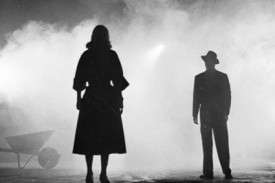
Meanwhile, DPs like John Alton, ASC were pushing greyscale cinematography to its apogee with a genre that would come to be known as film noir. Oppressed Jews like Alton fled the rising Nazism of Europe for the US, bringing German Expressionism with them. The result was a trend of hardboiled thrillers lit with oppressive contrast, harsh shadows, concealing silhouettes and dramatic angles, all of which were heightened by the lack of distracting colour.

Alton himself had a paradoxical relationship with chroma, famously stating that “black and white are colours”. While he is best known today for his noir, his only Oscar win was for his work on the Technicolor musical An American in Paris, the designers of which hated Alton for the brightly-coloured light he tried to splash over their sets and costumes.
It wasn’t just Alton that was moving to colour. Soon the economics were clear: chromatic cinema was more marketable and no longer prohibitively expensive. The writing was on the wall for black-and-white movies, and by the end of the sixties they were all but gone.
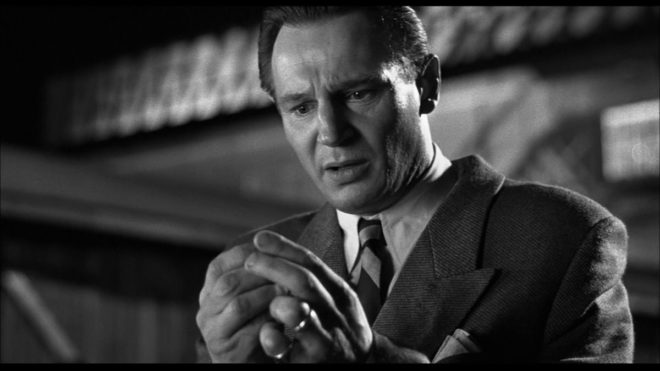
I was brought up in a world of default colour, and the first time I can remember becoming aware of black-and-white was when Schindler’s List was released in 1993. I can clearly recall a friend’s mother refusing to see the film because she felt she wouldn’t be getting her money’s worth if there was no colour. She’s not alone in this view, and that’s why producers are never keen to green-light monochrome movies. Spielberg only got away with it because his name was proven box office gold.

A few years later, Jonathan Frakes and his DP Matthew F. Leonetti, ASC wanted to shoot the holodeck sequence of Star Trek: First Contact in black-and-white, but the studio deemed test footage “too experimental”. For the most part, the same attitude prevails today. Despite being marketed as a “visionary” director ever since Pan’s Labyrinth, Guillermo del Toro’s vision of The Shape of Water as a black-and-white film was rejected by financiers. He only got the multi-Oscar-winning fairytale off the ground by reluctantly agreeing to shoot in colour.
Yet there is reason to be hopeful about black-and-white remaining an option for filmmakers. In 2007 MGM denied Frank Darabont the chance to make The Mist in black-and-white, but they permitted a desaturated version on the DVD. Darabont had this to say:
No, it doesn’t look real. Film itself [is a] heightened recreation of reality. To me, black-and-white takes that one step further. It gives you a view of the world that doesn’t really exist in reality and the only place you can see that representation of the world is in a black-and-white movie.

In 2016, a “black and chrome” version of Mad Max: Fury Road was released on DVD and Blu-Ray, with director George Miller saying:
The best version of “Road Warrior” [“Mad Max 2”] was what we called a “slash dupe,” a cheap, black-and-white version of the movie for the composer. Something about it seemed more authentic and elemental. So I asked Eric Whipp, the [“Fury Road”] colourist, “Can I see some scenes in black-and-white with quite a bit of contrast?” They looked great. So I said to the guys at Warners, “Can we put a black-and-white version on the DVD?”

The following year, Logan director James Mangold’s black-and-white on-set photos proved so popular with the public that he decided to create a monochrome version of the movie. “The western and noir vibes of the film seemed to shine in the form, and there was not a trace of the modern comic hero movie sheen,” he said. Most significantly, the studio approved a limited theatrical release for Logan Noir, presumably seeing the extra dollar-signs of a second release, rather than the reduced dollar-signs of a greyscale picture.
Perhaps the medium of black-and-white imaging has come full circle. During the Renaissance, greyscale images were preparatory sketches, stepping stones to finished products in colour. Today, the work-in-progress slash dupe of Road Warrior and James Mangold’s photographic studies of Logan were also stepping stones to colour products, while at the same time closing the loop by inspiring black-and-white products too.
With the era of budget- and technology-mandated monochrome outside the living memory of many viewers today, I think there is a new willingness to accept black-and-white as an artistic choice. The acclaimed sci-fi anthology series Black Mirror released an episode in greyscale this year, and where Netflix goes, others are bound to follow.