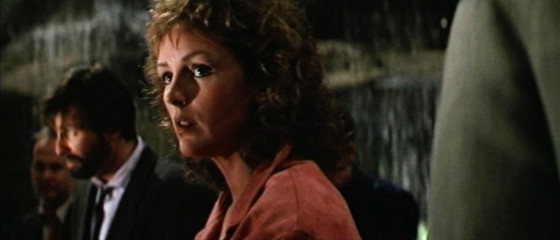
In the days of 4:3 cameras, many filmmakers chose to mask off their viewfinders and shoot in 16:9 widescreen. Now that 16:9 is ubiquitous, those of us wanting something more cinematic turn to the glorious 2.39:1, a.k.a. Scope. Choose your aspect ratio carefully though, not just because it “looks cooler”. 2.39 works well if you have lots of landscapes, lots of extras or a wide set. It’s not so great if one of your main sets is a tall, narrow booth, as I found out the hard way on Stop/Eject.
I love composing for the 2.39 ratio. You have so much flexibility on where to put your subject in the frame. The rule of thirds is obsolete here. You can put someone almost anywhere in the 2.39 frame and have it look good. They can be short-sided (placed on the “wrong” side of frame) but still have looking space. They can be just off centre, or they can be squeezed right to the edge. And if it’s a two-shot or a dirty single, you can illustrate the closeness of the characters’ relationship by choosing the distance between them in the frame – anywhere from overlapping (a couple madly in love?) to facing each other across the full width of the widescreen frame (enemies with no common ground?).
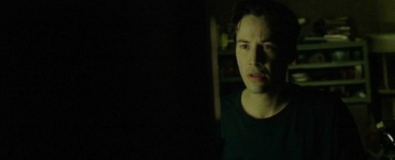
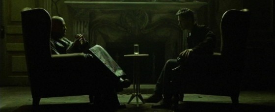
Here are some of my favourite examples of 2.39 composition. First up, The Matrix, lensed by Bill Bope. Look at how he uses black space to create a stark minimalism. One of the most powerful things you can do with all that horizontal space is to not use half of it!

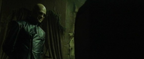
In this close-up (below), Morpheus starts off conventionally framed on the left, but leans forward at a key point, crossing the width of the frame to become short-sided, as pictured. It really makes it feel like he’s getting in your face.

Symmetrical shots become more powerful in 2.39. These ones really help reinforce the rigid, computer-generated nature of the matrix.

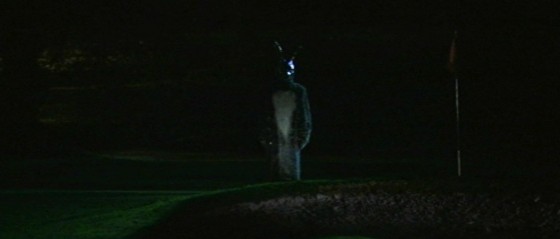
In Donnie Darko (DP: Steven Poster), formal composition (framing characters centrally) is used as a stylistic device in the dream sequences. Again, a powerful symmetry in this wide format.
I love the composition of this shot from Armaggedon (DP: John Schwartzman). He’s on the “wrong” side of frame and he’s barely off centre, but somehow it works beautifully. It almost looks like he’s surging forwards with the flag, rather than seeming dominated by it, like he would if he was on the right of frame.

Jan de Bont’s cinematography in Die Hard is a masterclass in 2.39 composition. Check out the depth in these raking shots.
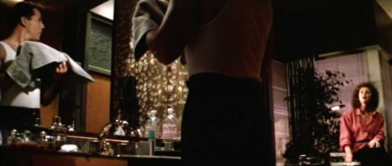
Below, De Bont uses the doorway as a symmetrical frame for the composition, which gives Willis license to be anywhere within it.
Here’s an interesting lesson in shooting over-the-shoulders in 2.39. Put the foreground actor on the edge of frame and you’ll find it very hard to keep a sense of depth if you put the background actor over on the other side of frame. You need them nearer so the perspective can continue off into the other side of frame, perhaps with other characters (or a statue, in this case) in the deep background or just the set.
Here’s a nice bit of short-siding, balanced out by the car.
And finally, I utterly adore this shot/reverse from Alien (DP: Derek Vanlint). If ever a director tells you that shot/reverses have to match, show them this scene. Every rule in the book is broken. He’s shot from a low angle, she’s shot from head height. He’s in a mid, she’s in an MCU. His single is dirty, hers is clean. He’s on the left of frame, and so’s she! But isn’t it gorgeous? Both characters are given power through composition, but in different ways. His power comes from the low angle of the camera. Hers comes from her being placed towards the closer end of the horizontal lines in the set. If she’d been placed on the tapering end, on the right of frame, she would have no power in this scene at all, compositionally. I can’t say whether it’s intentional, but the fact that this compositional power – equal but different – matches the power the characters have in the dialogue and performance, is just exquisite.
What are your favourite 2.39 movies, and how do they use the frame to help tell the story?

