The Script and the Cinematographer

cover pageWhen I read a script that I’m going to shoot, there are a number of things I’m looking out for. I want to identify the themes and the character arcs, so that I can come up with ways of reflecting these in the cinematography (see my previous blog post for examples). And on a more mundane practical level, I’m figuring out what equipment is required, and which scenes or sequences might be difficult photographically.

To demonstrate my thought process in planning a project, I thought I would share with you today the things I highlighted in a particular script and why. The script in question is The Gong Fu Connection, written by Ted Duran, and we start shooting it this Friday. It’s an action-comedy drama in which a young Chinese businessman learns a life lesson via his connection with an Englishman who has introduced Kung Fu in a farm community in Sussex. You can help us make the film by going to www.indiegogo.com/projects/the-gong-fu-connection and contributing, or by spreading the word on your social media networks.

Throughout the script I’ve highlighted the time of day in the slug lines. One of the first things I need to know as a DP is, “Are there are night scenes?” because that will have a big effect on the lighting equipment needed. Ted’s script is nice and specific, not just DAY or NIGHT, but DAWN, MORNING, AFTERNOON, EVENING and DUSK. This is a really helpful starting point in considering the light. In general I see that there are a lot of daylight exteriors, so bounce and negative fill are going to be my two chief weapons.

The very first slug line is:

1. INT. VICTORIA STATION – MORNING
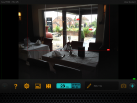
Day or night?
Day or night?

Immediately I’m wondering, “Is this going to be a guerilla shoot or are we going to have permission?” Clearly we will never be allowed large lighting set-ups and we will always be working around the general public. Battery-powered LED panels will come in handy here.

A little lower down the page is:

3. INT. RESTAURANT – DAY

Straight away I’m thinking, “Should it be night instead?” Even though in summer you may go to a restaurant in daylight, somehow it feels like it wouldn’t look right on camera. I make a note to discuss this with Ted on the recce, and indeed we end up deciding to shoot it after dark.

The next scene features a phone conversation. I make a note to ask if the person on the other end of the line will be seen.

Another station scene contains the direction:

He gets on the train… The train whizzes past an urban landscape…

I highlight this, to remind myself that this is a hidden extra scene – on board the train, as opposed to at the station. Again I’m wondering what the extent of permissions will be and what restrictions there may be on equipment. I also highlight other hidden extra scenes later on – an interior bedroom scene in which a character sees another character outside through the window, and a montage set in a variety of different places and times.

I highlight the following in a café scene:

Time passes, we see the clock tick past… Half an hour and two coffees later…

Maybe there are jump cuts here to show the passing of time? I’ll want to adjust the keylight outside the window to simulate the progress of the sun.

A violent flashback takes place in an apartment. Although the script specifies DAY, the content makes me imagine the look a little differently. I write the following notes: “Dingy look? TV light? Maybe night. Rough, handheld fight. No finesse or control.” Ultimately Ted and I do decide to set the scene at night. The flickering TV set will be a key light source. The handheld look will contrast with the more slick steadicam and tripod work which will characterise the Kung Fu fights later on in the film.

A more pastoral scene features two characters walking and talking beside a lake. I write: “Watery reflections? Bounce M18 off surface of water?” I’m thinking to enhance the beauty of the setting by using the rippling water surface to bounce an ArriMax M18 onto the characters’ faces.

A direction later on reads, “He is lost in his own world.” I write “push in?” beside this as a shot suggestion. Then I read:

Startled, he turns around to see a man towering over him in his dressing gown with a long plaited beard, who looks at him with a frown on his face.

This character, Mandragor, clearly has a special signficance, a mystical presence. I write “special lighting for Mandragor?” next to this passage. This will probably be stronger backlight or perhaps an unusual eyelight of some kind. I highlight his other appearances in the film too.
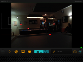
A dark room in a grungy pub

A dawn scene specifies that “the sun has just risen”, which I highlight. If it’s a cloudy day, or we’re unable to shoot at dawn, I may need to fake this with an orange-gelled HMI.

Later on, a direction reads:

RICKY smiles, then looks at AERONA dreamily.

I highlight this and write “classic beauty shot” above. I won’t go as far as a soft-focus filter, but the lighting needs to be particularly flattering here to represent Ricky’s enamoured POV.

A flashback in a pub has a nice clear description which is a great springboard for the cinematography:

… Playing pool in a dark room in a grungy pub…

I’m immediately thinking smoke, shadows, pools of light from the over-table fixtures. I also highlight the word “laptop” since the screen will be a light source which I may want to use or beef up with a hidden LED panel perhaps.

Scenes in moving cars are always tricky

Later on I’ve highlighted a dialogue scene in a moving car. I need to talk to Ted about how he wants to shoot it, and to think about how the camera can be rigged to get those shots.

The only time a specific shot is mentioned in the script is here:

Ricky is running as fast as he can. We see a close up on his face as he thinks.

I highlight this, knowing that it will be tricky to accomplish and hoping that Colin Smith, our steadicam operator, will be up to the challenge!

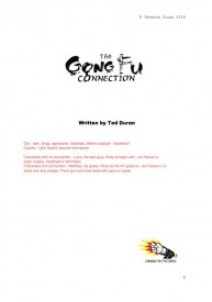
Having read the script a couple of times, I go back and make some notes on the cover page about the general photographic approach:

City – dark, dingy, oppressive, handheld, little/no eyelight – handheld?

Country – light, backlit, bounce-from-below

Characters with no connection – Lucia, the bad guys, Ricky to begin with – are framed in clean singles. Handheld or stiff tripod.

Characters with connection – Matthew, his posse, Ricky as the film goes on – are framed in 2- shots and dirty singles. There are more fluid shots with pans or tracks.

And that’s all. Some of these notes are just for me to think about, while others raised questions I needed to ask the director and producer about. Preparation is key in filmmaking, and in the heat and stress of the shoot I’ll be glad I gave some consideration to these issues in advance.

The Script and the Cinematographer

Camerawork and Character

Character isn't something that's only revealed in front of the lens
Character isn’t something that’s only revealed in front of the lens

Actors, costume designers, make-up artists and set dressers all work hard to enhance character through their work. Often cinematography is not considered part of this process, but there’s no reason it shouldn’t be.

Here are some examples of how I’ve used cinematography to enhance character:

  • In Soul Searcher, protagonist Joe has an unrequited love for waitress Heather. Whenever they talk to each other, her CUs are shot on sticks, while his CUs are shot handheld, reflecting his nervousness.
  • There is a similar situation in Someone Else’s Shoes, written and directed by Nick Fogg. We decided to use wide lenses for the man’s CUs, putting the audience right there with him, and long lenses for the woman’s CUs, suggesting she is being observed and loved from afar. You can watch Someone Else’s Shoes below.
  • I won’t reveal the name of this film, because it’s still in post and I don’t want to spoil the plot, but a project I worked on last year featured certain characters who were real and others who were imaginary or supernatural. I decided to give the unreal characters perfect haloes of backlight wherever they went, and make their faces flawless by surrounding them with reflectors.
  • In Ted Duran’s The Gong Fu Connection, which we start shooting next week, the theme of connecting with people is very important. Characters who have this connection will be shot in two-shots and dirty singles, while characters who don’t will be shot in clean singles or isolated in frame.
  • For Coffin Grabber, director Claire Alberie devised a visual grammer whereby the film’s young protagonist would be shot at his eye level with an engaing handheld camera, while adults would be shot in locked-off, isolating wides.

How could you use cinematography to reveal and enhance character in your films?

Camerawork and Character

Sun Paths

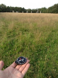
Checking my compass at the stone circle

I’ve spent the last three days in Sussex, scouting locations for a short film called The Gong Fu Connection. Written and directed by Ted Duran, the film follows a young man as he learns Kung Fu, not just the fighting but the whole lifestyle. Themes of sustainability and connection to nature are woven throughout.

The script is predominantly daylight exterior, with many picturesque rural settings including a number of farms. As director of photography, my main concern during the recce was to make the best use of the natural light. That meant checking the orientation of each location to the sun path.

Apps like Helios exist to show you the sun path on your iPhone or iPad wherever you are, but I find that for most locations such precision is unnecessary. A simple compass and a bit of guesswork based on the time of year can tell you what you need to know.

The best direction to shoot is usually towards the sun. This gives everything a lovely halo of backlight, while illuminating it softly from the front with “north light”. If north light isn’t enough, you can choose your reflectors at will – soft or hard, white or silver or gold – to mould the frontlight. For more on this, see my blog entry on moulding natural light. (One exception to this rule of thumb is establishing shots of buildings, which look best in crosslight.)

The shooting schedule is still in flux, so I was able to give the Gong Fu Connection’s production team my recommendations about when scenes should be shot for the best light.

An Artemis screengrab showing various focal lengths and the compass bearing at the lower centre

One app I did use extensively on the recce was Artemis, the virtual director’s viewfinder. Although Ted and I didn’t use it for picking lenses at this stage, it was useful to take screengrabs so I could get a sense of how the location would look with different focal lengths. Artemis also handily displays the compass bearing at the bottom of the screen – something I only noticed after I’d spent the whole three days photographing my pocket compass!

Of course there are plenty of other things to look out for on a location recce – check out my post on Ten Questions to Ask on a Recce. And if you’re scouting locations without your DP, read my earlier post about what you can look out for on their behalf.

Support The Gong Fu Connection and get access to exclusive rewards on Indiegogo.

Sun Paths

‘Painting with Light’ by John Alton

61kMuhKWfjLPainting with Light is a book I first heard about when Hollywood DP Shane Hurlbut recommended it on his excellent blog. Browsing the shop at the BFI Southbank recently I came across a copy, liked what I saw… and went home and ordered it on line. Them’s the breaks.

John Alton was something of a rebel. In an era when most DPs used complex lighting set-ups hung from the studio grid, Alton lit from the floor, using fewer sources, and was consequently faster. This made him unpopular with his peers. A strained, in-out relationship with the American Society of Cinematographers didn’t help. He sometimes clashed with other heads of department too, notably designers, who didn’t like the way his lighting made their work look. But directors and producers loved him because he worked quickly.

When Painting with Light was published in 1949, Alton was emerging as a key cinematographer of the film noir genre. Today he is remembered as one of the masters of noir. His utterly black shadows, backlit fog and slatted keylights defined the visuals of films like The T-Men (1947, dur. Anthony Mann) and The Big Combo (1955, dir. Joseph H. Lewis).

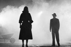
A classic bit of Alton's noir lighting from The Big Combo
A classic bit of Alton’s noir lighting from The Big Combo

However, noir lighting – or “Mystery Lighting” as Alton terms it – occupies only one chapter of Painting with Light. Two preceding chapters cover the basics of Hollywood filmmaking and introduce lighting equipment, most of which is now obsolete. Subsequent chapters cover “Special Illumination” – predominantly weather effects and vehicle interiors, “The Hollywood Close-up” – looking at key angles and introducing a clock system not dissimilar to the one I once blogged about – and “Outdoor Photography”.

The book then diverges from filmmaking, offering advice to novice photographers taking holiday snaps or equipping a portrait studio. Chapter nine, “Visual Music”, explores lighting and composition in terms of a musical allegory, each shot contributing to the symphony of the movie. Chapter twelve is the strangest, urging women to be aware of how their faces are lit as they go about their lives so that they can ensure they are always seen to their best advantage. All cinematographers know that beauty is as much about lighting as it is about bone structure and make-up, but I can’t see that idea ever catching on outside of the industry. Brief chapters on film processing, suggested improvements to cinemas, and the human eye as a camera, round out this mixed bag. A foreword, a lengthy but interesting biography and a filmography introduce the current edition.

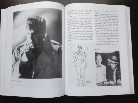
Demonstrating the use of a clothes light

While many of the ideas and principles put forward by Alton are still relevant today, some of it serves more as a historical record of cinematography in the mid-twentieth century. Curiously propounding the system he apparently rebelled against (I wonder how different the book might have been had he written it at the end of his noir period), Alton paints a picture of a time in which cinematography was much more complex and artificial. Whereas today we talk of the three-point lighting system of key, fill and backlight, Alton speaks of an eight light system, adding:

  • eyelight – to give a sparkle in the eye
  • kicker – a three-quarter backlight to define the jaw
  • clotheslight – a cross-light to bring out the texture of the costumes
  • filler – not to be confused with fill, the filler is purely to cure vertical shadows from a high keylight
  • background light

While the modern cinematographer is aware of all of the above and tries to incorporate them, he or she tries to make lamps pull double- or triple-duty and would almost never use eight lamps to light a single close-up. Alton also advocates abandoning all of your wide-shot lighting and starting again from scratch for the close-up, to beautify your star; today’s audiences would not accept the mis-match of such radically re-lit close-ups. He talks of flag and grip equipment which could never work with today’s dynamic blocking and camera movement, like a “chin scrim” designed to cast a very specific shadow on the collar of a white dinner jacket to stop it blowing out.

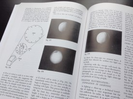
Alton explains his clock system and its effect on an orange

But some sections still have undeniable value today. Alton looks at different types of faces and how to light each to their best advantage, how to light a dinner table or a campfire scene, and how to light for different times of day. He maintains that movie lighting should always mimic what natural light does in real life – hard to believe, but this was quite a radical concept in 1949. Examples and diagrams are used throughout to illustrate his techniques.

For me the most interesting part was his insight into depth in cinematography. Many DPs, myself included, feel that a shot looks best when the foreground is dark, the midground is correctly exposed and the background is bright. Alton offers the following explanation of this phenomenon:

At night when we look into an illuminated room from the dark outside, we can see inside but cannot be seen ourselves. A similar situation exists in the motion picture theatre during a performance. We sit in the dark looking at a light screen; this gives a definite feeling of depth. In order to continue this depth on the screen, the progression from dark to light must be followed up. The spot which should appear to be the most distant should be the lightest, and vice versa…

I have no doubt that there are more useful tomes on the market for a student of contemporary cinematography, but if you like a bit of history along with useful tips you’ll find Painting with Light a good read. Like a time capsule, reading Alton’s book today reveals which bits of the past were transient fads and which were timeless universal truths. The importance of depth, the tricks of lighting for different faces, the textural power of cross-lighting, the drama of back-lighting… There are plenty of timeless truths here, and in learning them from Alton you’ll be following in the footsteps of many great cinematographers.

Unsurprisingly from the master of noir, Alton's chapter on mystery lighting emphasises the importance of shadows.
As you would expect from the master of noir, Alton’s chapter on mystery lighting emphasizes the importance of shadows.
‘Painting with Light’ by John Alton

Directing the Edit of Amelia’s Letter

Georgia Winters as Amelia
Georgia Winters as Amelia. Photo: Sophie Black

Working with editor Miguel Ferros on Stop/Eject in 2012/13 was a big eye-opener for me, demonstrating how much better my films could be if I didn’t edit them myself. It also helped me realise how little I like the isolated job of editing compared with the fun, stress and teamwork of being on set. Since then I’ve been gradually letting go of my editing work, both corporate and creative. My business card used to say ‘Director, Editor, DP’. Now it just says ‘Director, DP’.

Editing can be a thankless task, particularly in the corporate world. Once upon a time, when I had a cut I was happy with, I invited the client along to the edit suite, played it for them, then we discussed how it might be improved. But since broadband happened, clients wanted me to Dropbox the edit to them and then, rather than a creative discussion, I was typically emailed a list of instructions for changes. This is the point at which I would shut off my brain, carry out the instructions, often feeling that I was making the film worse, take the money and run.

So there’s much to be said for being in the same room as your editor. Not all the time, of course, but enough so that revisions can be made – or least discussed – collaboratively rather than imposed authoritatively.

Which is all pre-amble to saying that I travelled up to Nottingham yesterday to spend the day working with Tristan Ofield on the edit of Amelia’s Letter. He set up his Mac Mini in a darkened room in the Broadway and, after I popped out to be interviewed for the EPK, we got to work knocking the film into shape.

The letter. Photo: Amy Nicholson

I hadn’t realised until then how difficult a film it must have been for Tristan to assemble: multiple time periods; intercutting scenes that were numbered separately on the page but shot together as one; a cheated geography of the cottage relative to the lake. The one advantage of editing your own film is that you know where everything is supposed to go, but Tristan had to figure it out the hard way. He’s put a lot of work into wrangling and shaping the material over the last few months.

It was a very productive day. We started at the beginning of the film and went steadily through, nipping, tucking and often completely rebuilding scenes. The film we had when we finished at 5pm was streets ahead of the one we had at 9am. We got the running time down from 15’30 to a much more festival-friendly 12 minutes, trimming most in the first few scenes to get the story going sooner. The emotional core of the film was already shining through in Tristan’s cut, but now the creepy and tense moments work nicely as well.

The next stage will be to screen the film for a test audience. This is an essential step I’ve taken with all my films since The Beacon in 2001, to make sure that the story is clear, the pacing is right and the desired emotions are coming across. For more on why test screenings are important, read my blogs about test-screening Stop/Eject and some of the problems that it highlighted.

Update: You can read Tristan’s thoughts on editing over at belowthelinefilm.blogspot.co.uk

Amelia’s Letter is written by Steven Deery and produced by Sophia Ramcharan of Stella Vision Productions. Visit the Amelia’s Letter Facebook page.

Directing the Edit of Amelia’s Letter