This blog post is the third of our public rewards in the Stop/Eject crowdfunding campaign. If you’re reading this, it means we’ve raised at least £300 so far. If you don’t know what the hell I’m talking about, go to stopejectmovie.com to watch the trailer for my new short film and find out about the public and individual rewards we’re offering to anyone who sponsors the project.
In this post I’m going to break down the lighting set-ups for some of Stop/Eject’s key scenes in the shop, looking at what I was trying to achieve and how I went about it. I had intended to cover all of the film’s key scenes, but after writing out the shop stuff and realising how long it is, I’ve decided to save the rest for another time.
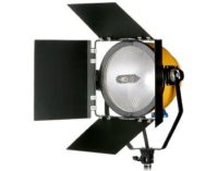
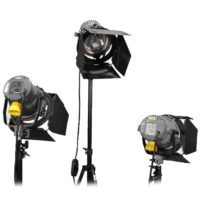
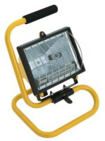
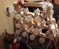
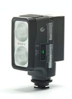
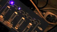
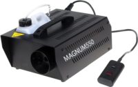
First of all, here’s the lighting equipment we had available to us on the shoot:
Plus stands, gels, sandbags and lots of splitters and extension leads. However many extension leads you think you need, triple it and you might just about have enough.
Int. Shop – Day
Here’s my lighting plan for the daylight interiors at Magpie, the shop location:
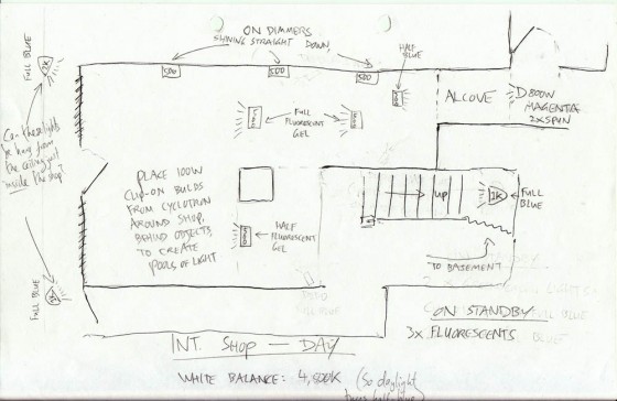
My aim with the lighting here was to create a transition from the cool realism of daylight at the front of the shop, through the warm shop floor, with patches of other colours adding depth and delineating different areas, to the alcove and the magenta light of the sconce which illuminates the tape recorder. In a nutshell: a magical journey.
Since it was a real location, there was genuine daylight flooding in through the windows, over which I had no control. This would determine my white balance and exposure, and everything I introduced would have to work with that. I knew that the windows would be blown out, but this was necessary anyway to hide certain things that were meant to be happening out on the street but weren’t.
We lensed the shop interiors at f1.8 on ISO 100 or 200. As you can see on the lighting plan, we set the white balance to 4,500K – dialling it in using Magic Lantern, which I’ll discuss in a future post. 4,500K is halfway between daylight and tungsten. This meant the daylight would appear slightly blue on camera, while any ungelled tungsten lamps would appear slightly orange, so my magical journey was already creating itself to some extent.
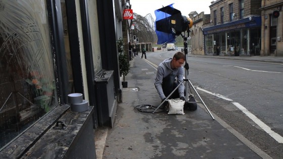
Although my plan shows two 1K Arrilites outside the windows, on the day I chose to use the blonde instead. This was to enhance the backlight on characters near the windows. When we flipped around to shoot towards the back of the shop, we often turned off this blonde because the natural light was doing enough by itself.
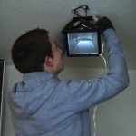
I also forgot how many work-lights Col had when I drew the plan. There weren’t enough to have the three shining down the side wall. But I did have him rig the other four in the plan. The owner of Magpie was totally laid back about us screwing things into his ceiling, which made rigging these lamps fairly straightforward.
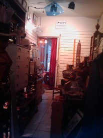
The two 500W work-lights drawn either side of the legend “full fluorescent gel” were initially not gelled at all. I decided it was best to keep them warm to facilitate the transition I described earlier. But ultimately we gelled them with half CTB (Colour Temperature Blue, i.e. daylight correction) because they were looking a bit too warm. These two lamps served to drop splashes of orange light on Kate (Georgina Sherrington) as she approached the alcove when shooting towards the front of the shop, and to backlight her and the other characters when shooting towards the back.
The 300W work-light trained on the alcove was left ungelled, which really made the red of the curtain pop.
The lone 500W work-light shown to the left of the staircase in the plan was gelled with half-green fluorescent correction, as planned, for no particular reason other than to separate this area of the shop a bit from others.
A 1K Arrilite was placed at the top of the stairs pointing down to give background depth to wide shots, and also to give some highlights to Dan (Oliver Park) and Alice (Therese Collins) when they’re looking at the records. The 1K was gelled blue (full CTB) to represent daylight. A second one, not in the plan, was placed in a doorway off to the side of the staircase to throw some side-light both on the stairs and on a patch of the shop floor next to the clothes rack.
An 800W Arrilite was positioned at the back of the alcove, with a couple of layers of tough-spun diffuser and one of magenta gel. Sophie had chosen to paint the sconce in the alcove with magenta paint, and I felt I should reinforce this in my lighting. It completes the magical journey nicely by representing the reddest end of the lighting spectrum I’d created.
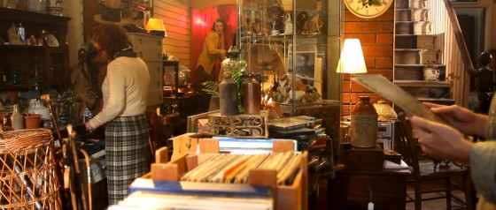
The final touch was clip-lights. We bought twelve of these £2.50 fixtures earlier in the year from B&M for the Cyclotron. Somehow the Cyclotron itself never got used, but the clip-lights were cannibalised and used extensively.
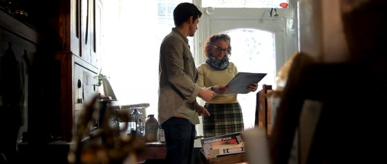
It’s all very well having a great location filled with interesting set dressing, but as DP if you don’t create depth with your lighting, then all that work is wasted. The clip-lights seemed like a great way to add little pools of warm light that would separate the layers of clutter from each other and provide contrast.
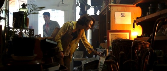
I loved this moment in the wide shot when Kate leant into one, picking her out from the background and reinforcing her leaving Dan behind on her magical journey. (Tell you what, just down your drink every time I write “magical journey”, okay?)
I found myself in need of a little extra “daylight” near the door – to keep Kate in the “real world” a little longer – and so I had one of the fluorescent studio lamps set up on top of a cabinet. That’s what’s hitting Dan on the left of his face in the above image. If I had to justify this light source, I’d say it’s daylight reflecting off a glass cabinet front. You’d buy that, right?
A second fluorescent lamp was employed when the time came to shoot a crucial Glidecam shot leading Kate as she advances into the shop. It was great that she moved in and out of the tungsten lights on her journey, but I was losing her eyes too much. And if you can’t see into your actors’ eyes, you might as well pack up and go home because you don’t have a film.
So while Col operated the Glidecam on this shot, I walked behind him, shining the fluorescent lamp over his head and straight into Georgie’s face. This constant, soft frontlight was at just the right level not to kill the dynamics created by the other lamps, while still putting a sparkle in her eyes and filling in any unflattering shadows.
Check out the shot in the trailer about 8 seconds in:
I also love the shadow from the clothes rack that crosses her face during this shot. This is cast by the 1K Arrilite in the doorway by the stairs, on the other side of the rack. Ostensibly it’s daylight from an unseen window.
This turned out to be one of my favourite shots in the film from a cinematography perspective. Georgie looks absolutely stunning, because of course she is, but Debs’ lovely make-up and the lighting here really bring out her features.
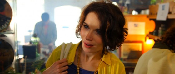
Col pumped in smoke for all the shop interiors. This is another great way of adding depth, not to mention enhancing the dusty, mysterious feel of the shop.
Int. Shop – Night
When it came to the night scenes in the shop, the lack of natural light made quite a big difference without me having to do anything. I changed the white balance to tungsten (3,000K) and experimented with turning off different lamps until I arrived at the mood I wanted. The blue-gelled Arrilites now appeared even bluer, passing as moonlight.
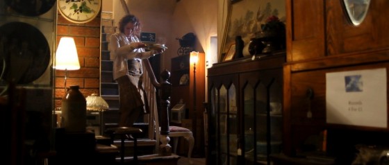
The most striking effect in the night scenes is the police lights. These were integral to the storyline, so I’d discussed them with Colin way in advance.
If you look at the opening scene of Soul Searcher (above – particularly noticeable from about 3’03 onwards), you’ll see that we made use of the flashing amber light on the street-cleaning vehicle. The actual light on the vehicle wasn’t powerful enough, so I asked Col to build a reflector that could be spun in front of an amber-gelled redhead to create the effect.
Eight years later, Col rebuilt this low-tech device for Stop/Eject’s police lights, gelling one side of the reflector red and the other blue. If you scroll back up to the Stop/Eject trailer and scrub to 2’00 you’ll see a behind-the-scenes glimpse of this in action.
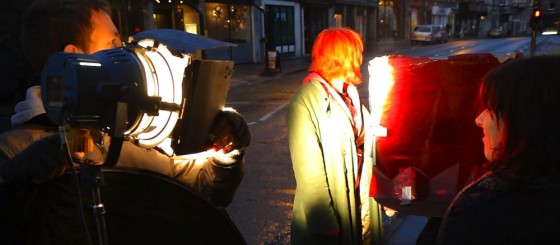
As it turned out, the reflected light from the catchily-named “Spinning Disc Mark II” was not bright enough for wide shots. Instead it fell to Sophie, if I remember rightly, to hold a flag in front of two lights, one gelled blue, the other gelled red, and move this flag back and forth during takes. At other times we simply switched the lights on and off in rapid succession.
During the shooting of all the shop scenes, I felt like I wasn’t quite achieving the look I wanted. Obviously my mind was on many other things, and we were very pushed for time, but somehow it wasn’t looking quite as moody and cave-like as I thought it should. But having played with colour-correcting a bit of the footage now, I’m more than happy that with a little grading it will look great.
If you have any questions about anything I’ve covered here, please comment or post on the Facebook page and I’ll be happy to answer.
That’s all for now, but I will be covering other scenes very soon. Thanks for getting our funding campaign to the £300 mark, and please keep giving and sharing the link so we can finish this epic little short to the best possible standard.
