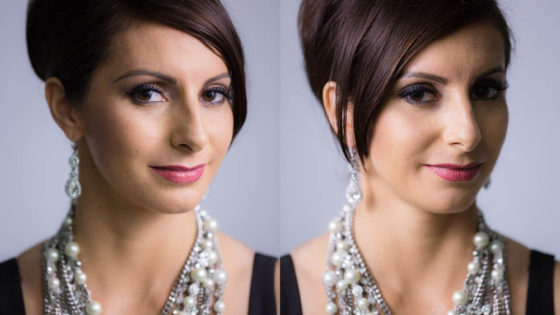
Earlier this year I blogged about a visit to the National Portrait Gallery, studying the lighting in traditional portraits. I noted that, contrary to the current cinematographic trend for short key lighting, almost all of those paintings used broad key. And while watching the high-end Netflix series The Crown this week, I noticed the same thing. Why might this be?

First of all, a reminder: a short key is a key light on the side of the face away from camera, while a broad key hits the side of the face towards camera. Short key is generally preferred amongst cinematographers because it gives better “modelling” – i.e. a better sense of the shape of the face – and focuses the viewer ON the face, rather than the ear and the side of the head. A broad key, meanwhile, presents less shadow to the camera, and arguably shows the hairstyle and the shape of the head better – which may be reasons for the preponderance of broad key in classical portraiture, which were more concerned with overall appearance than with emotion/performance.

But I don’t believe these direct pros and cons were the primary motivation in cinematographer Ole Bratt Birkeland’s decision to use broad key lighting in a crucial scene from The Crown.
The central themes of the series, which dramatises the early life of the Queen, are tradition and duty. Queen Mary often reminds her granddaughter Queen Elizabeth II of the long and noble lineage of the English royal family, a weight of history and responsibility which Elizabeth keenly feels. “The crown must always win,” Mary intones in the trailer.
In episode 4 the young Queen seeks advice, desperate to ensure she does not tarnish the monarchy’s centuries-old reputation. To symbolise this burden, Birkeland evokes the imagery of traditional portraiture – the subjects of which were always high-born individuals, often royals. Consider this frame grab from the scene, beneath an official portrait.

See how the light models the face the same way in both images? Note also the absence of backlight in the frame grab, another feature common to traditional paintings, which typically relied on a single window light source. Elizabeth’s dark hair blends into parts of the dark background.
Combined with the timeless regal production design, this lighting subtly places the Queen within the frame of an official portrait, trapping her within the overwhelming tradition of the monarchy. Can I say for certain that Birkeland did this deliberately? No, but I’d be very surprised if he hadn’t looked at royal portraits while prepping the show, and I’d be equally surprised if they hadn’t at least influenced him unconsciously.
Either way, this is a first-rate example of the power of cinematography to enhance theme and narrative by guiding the viewer to make subconscious associations. If you haven’t seen The Crown, I can highly recommend it; it’s not just the cinematography that’s top notch.
