I’m DOPing Stop/Eject as well as directing it, which means I have to be well prepared. I’m not going to have time to stand around on location figuring out how I want to light it. I need to do that in advance.
Last year I drew up some lighting plans, and thanks to the postponement of the shoot I have more time to work on these and get them just right. And recently I had a previsualisation idea: to take recce shots of the location and photoshop them to show the lighting I want to achieve.
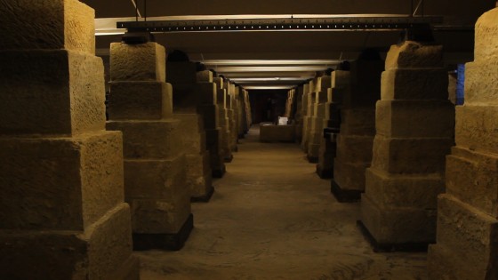
So here’s the image I decided to work with, from the basement at Strutt’s North Mill in Belper:


So, how do I want to light the basement? How does a DOP decide how to light anything? For me it always starts with three questions:
- Realistically, where would light be coming from?
- Creatively, where do I want to put the lightst?
- Practically, where can I put the lights?
Let’s try to answer these for the basement scene…
- The basement is only partially underground, so it does have some windows, but I don’t ever have to show them if I don’t want to (an advantage of being director too). A room like this would have regularly spaced ceiling lights, probably fluorescent. Perhaps the characters would have a torch or lamp of some kind too.
-

Soul Searcher’s car park scene, lit almost entirely by the existing overhead fluorescents I’m going to choose to include the daylight, to provide some contrast with the ceiling lights. This is our most impressive location and perhaps the scene where the film’s fantasy side is most apparent, so I want it to look magical and cinematic. More on the creative side later.
- We would have access to the areas outside the windows, so I could light through them if I wanted. (In practice I’ll probably never show the windows, and the lamps representing the daylight will actually be inside the building, just out of frame.) Our time at this location is likely to be extremely limited, so although the ceiling is suitable for hanging lamps from, I’ll probably just have to go with the existing fluorescents. I’ve done this before – the multi-storey car park in Soul Searcher – and it looked good.
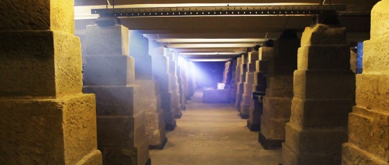
So with all that in mind, here’s what I came up with in Photoshop:

In my next post I’ll explain what I’ve done and why, particularly with reference to creating depth, and show you some alternate versions of the above image which will demonstrate some of the basics of colour theory. Sounds intriguing, huh? Better not miss it.