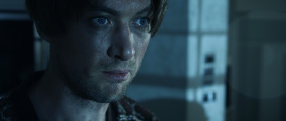
I wrote the bulk of this post over two years ago, when I wrapped photography on Sophie Black’s short drama Night Owls. As usual for no-budget shorts, there followed a long postproduction and then a festival run (it premiered at London Short Film Festival this January) which prevented us releasing any footage online.
But this week a number of great things have happened for the film. Firstly, Night Owls has been released online – you can see it here – and every view counts towards Promofest’s “Short of the Year” competition, so have a watch and help us win! Secondly, the film won an Honourable Mention and Best Actor (Jonny McPherson) at the LA Film Awards. Thirdly, my work on the film won me Best Cinematography at the Festigious International Film Festival.
So this is the perfect time to finally publish this look at the decisions and techniques I used in lighting and lensing the film. Night Owls was one of the first projects I shot on my Blackmagic Production Camera, and you can read what I thought of the camera in action in this post from May 2014.
Sophie wanted a soft, warm and cozy look to the short, which is set over a single night, mostly in one room, and tells how a teenage girl and an older man become unlikely friends. At the same time, the dialogue-driven script had moments which hinted at darkness and suffering in the past of both characters. And a cozy look suggests practicals like table lamps, which by their nature cast pools of light and leave other areas in darkness.
On a practical level – if you’ll excuse the pun – I knew that the need to hide lights that would boost the apparent output of the practicals would limit my options in the wide shots, and therefore also in the close-ups which would of course have to match. When shooting a day interior, you can easily stick a huge light outside the window and then shoot pretty much anywhere in the room, crabbing the light to one side or the other if it threatens to come into shot or cast a shadow of the camera. In a night scene with practicals, it’s not so simple.
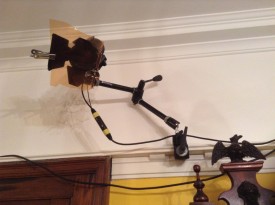
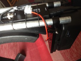
We knew in advance that we could not screw anything into the location’s ceiling, so I was relieved to find that the room had a nice, chunky picture rail all the way around. This soon became a dedo rail, as I used magic arms and k-clamps to rig two of the little spotlights in a classic cross-lighting formation. What I mean by this is that each light was positioned so as to provide backlight on one character and frontlight on the other. This is almost always my starting point when lighting a scene with two characters, and it really came into its own on this project. (See my post on cross-backlighting for more info.)
We had to shoot most of the scenes during the day, so the windows were blacked out. The one that appears on camera was tented around so that we could shine in a blue-gelled redhead, to suggest moonlight, without allowing any daylight in. Another blue-gelled redhead was set in the hall outside the door, creating depth and colour contrast. Our 1.2K HMI was placed in the next room, right at the far end. In front of it we rigged a sort of faux stained glass panel, that had conveniently broken out of another door in the house just the previous week, in order to cast a window-like shadow and give the impression of moonlight coming through a window in the next room.
The reason we rigged so many cool sources was that the first scene in the living room featured only Kent (played by Jonny McPherson), and Sophie had requested that the images only become warmer when Mari (played by Holly Rushbrooke) enters the film. We turned on fewer of the practicals for this first scene, but it was still necessary for their light (represented by the dedos) to be warm in colour to establish that for the later scenes. To counteract this and bring everything back into the blues a bit more, I set up a third dedo, gelled blue, to produce a cool lens flare.
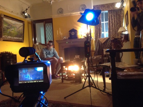
Sophie and I had talked about various ways of softening the image. We considered hiring a black promist filter, but after rewatching Christopher Ecclestone’s season of Doctor Who, which appears to be have been entirely shot using a black promist, I decided the look was far too cheesy. In the end we went for a set of Zeiss lenses which had had their anti-flare coating ground off. We felt that lens flares would give some sparkle and magic to the images, as well as giving us the opportunity to soften the contrast in the image when necessary. The flares were usually created by an additional lamp, often a dedo or a battery-powered pag light held by Col, aimed directly at the lens.
When Mari enters, Kent has lit the fire, so Col and I set up our usual cluster of 100W tungsten bulbs covered with an orange gel and rigged to a dimmer board. With hindsight we could have gone much more orange with the gel and much more flickery with the dimmer board action, but since the fire at the location was a wood burning stove with only a very small window, it’s probably good that the source of the light remains ambiguous. For the close-ups, the cluster of four bulbs was rearranged into a straight line, which gave a lovely, soft underlight to the character’s faces.
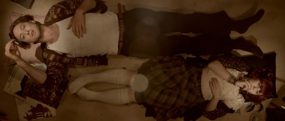
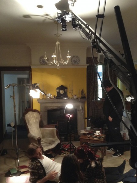
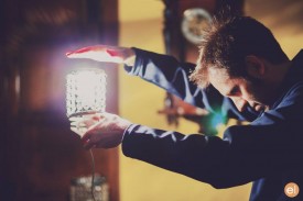
A major scene later on sees the two characters lying top-and-tail on the floor, and was shot from a jib kindly provided by All Doors Lead Somewhere Productions. Overhead shots of people lying down can look very flat, but rather than trying to combat that with cross-lighting, I decided to embrace it and light entirely from above. Sophie and Anya Kordecki, the production designer, had found these great practical lights surrounded by strings of crystals, which cast lovely shadows. Knowing that two of these lights were supposed to be just out of shot on either side of frame, I took some license and rigged them one directly over each character’s face, replacing the 40W bulbs with 100W ones. This created a nice pattern of light and shadow radiating out from the faces. To add further contrast, I spotted two dedos up on the actors as well, one for each, gelled with half CTB, so that the centre of each radial pattern had a cooler, brighter circle of light. I decided to shoot on a white balance of 4,500K so that these centre spots would appear white and the radiating pattern would appear slightly orange.
When the characters sit up later in the scene, the two practical lights were almost perfectly positioned to provide cross-backlight. Again I used the dedos to produce the light that is supposedly coming from the practicals. I cheated Mari’s key light around quite a bit; it should really have lit the camera-right side of her face given where the practical was positioned, but we lost too much of her expression that way when she looked at Kent, not to mention that it didn’t look as aesthetically pleasing.
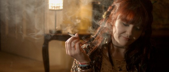
I hadn’t been intending to use so much hardlight. I’d actually purchased a sheet of unbleached muslin prior to the shoot with the aim of rigging some kind of book light, and I almost did it for these sitting-up close-ups. But Sophie had asked for Mari’s close-up to have a film noir look, highlighting the smoke from her spliff, besides which the weed was bringing out some home truths for the characters, so it made sense to go with stark lighting. The dedos were perfect for this, with their intense, focused light showing up the smoke brilliantly when shone from behind, and spotlighting the actors when shone in from the side. The dark sides of the characters’ faces were lit by a tiny amount of light that’s genuinely coming from the practicals.
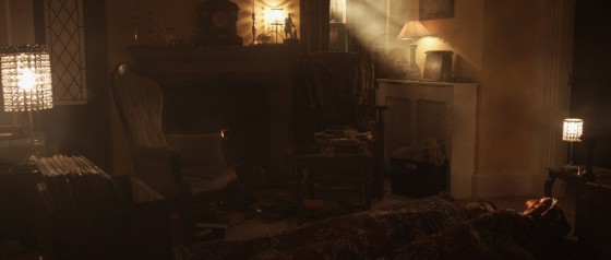
Near the end of the film, the sun rises, throwing a shaft of light into the room. This was supplied by the 1.2K HMI. With hindsight, cranking up a wind-up stand would have been the best way to create the rising effect, but we didn’t have one, so instead the lamp remained static and Col lowered a sheet of card to give the impression of the sun rising over the horizon. Copious smoke was used so that the beam of “sunlight” would show up on camera.
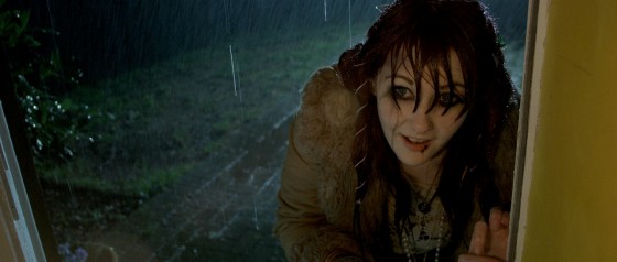
Night Owls is book-ended by doorstep scenes, the first set at night during a rainstorm, the other on a sunny morning. For both scenes I used the HMI as backlight. This was particularly neccesary for the night scene in order for the rain – actually created by a hosepipe – to show up. (For more on faking rain, check out this post.) At night I set my white balance to 3,200K so that the HMI would appear blue, suggesting moonlight, and in the morning I gelled the HMI with Light Straw and shot on a 5,600K white balance. Fill light was provided at night by the electric candelabra Kent was holding, and in the morning by a makeshift bounce card (a square piece of mountboard covered in silver wrapping paper) hidden from camera by Kent’s body, plus a blue-gelled redhead off to the side of the hall. When we turned round to shoot outdoors looking in, it was necessary to diffuse or dim the HMI, and to break up its light (which now looked very flat due to the lamp being so close to the camera) using tree branches.
That’s about it! Though I think I would do some things differently if I was shooting it now (more soft light, definitely), I’m still really proud of the film and the work I did on it. It’s very satisfying that Night Owls is now gaining the recognition it deserves. Don’t forget to check the film out here. And if you want to know more about the lighting set-ups described above, subscribe to my Instagram feed to see some lighting diagrams and behind-the-scenes photos over the next few days.
Images from Night Owls courtesy of Triskelle Pictures, Stella Vision and Team Chameleon. Produced by Sophia Ramcharan and Lauren Parker. Starring Jonny McPherson and Holly Rushbrooke.
