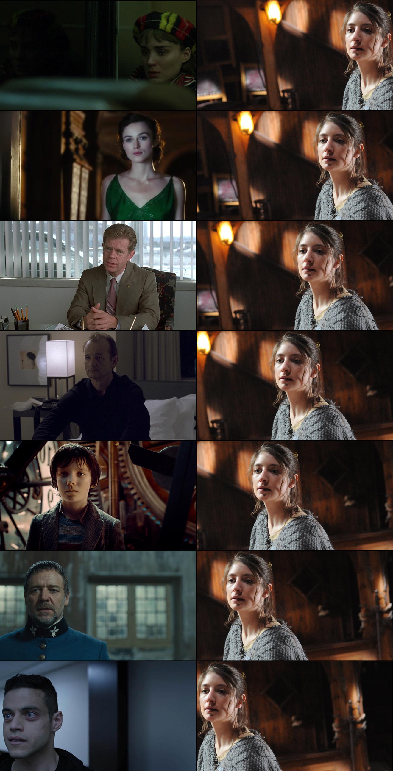
Like headroom, last week’s topic, lead room is one of the first concepts we are introduced to when we begin learning camera operation. And like headroom, it’s a rule that’s made to be broken. If a character is looking screen-left, certainly it’s most common to place them on the right of frame – giving them lead room (a.k.a. nose room or looking space) on the left, but that is not the only option. In certain situations it’s more appropriate, or simply more aesthetically pleasing, to place them on the left, or in the centre. And although The Rule of Thirds suggests how far to the left or right they will commonly be placed (a third, or two-thirds of the way across the frame) it is, again, far from the only option.
Below I’ve compiled a spectrum of lead room: a series of examples showing the whole range of horizontal positions within a frame where a subject could be placed. (Note: I’ve flopped some of the images to maintain the screen direction.) All of these examples are from 1.78:1 or 1.85:1 productions, but of course with the 2.39:1 Cinemascope format there is an even greater range of options. On the righthand side, to aid comparison, I’ve placed different crops of the same photo (by Richard Unger).

No composition is fixed in motion picture production. Actors move around, miss their marks; it’s difficult for a DP to be precise about where the subject appears in the shot, so reading a particular intention into an individual frame is dangerous. But if, within a film, there is a trend of characters, or a specific character, being placed in one particular part of the frame, then it’s fair to assume that the filmmakers were deliberately trying to create a particular effect.
With that in mind, the thoughts below are not intended to analyse why that specific shot in that specific production was composed the way it was, but rather to consider in general terms what meanings and emotions that kind of composition might convey.

This is the maximum lead room you can give an actor in 1.85:1 without cutting off part of their head (which you may want to do in certain extreme circumstances, but that’s a subject for another post). This is someone backed into a corner, isolated. They have full cognisance of their situation – they can see it all in front of them. What you choose to place on the other side of frame is very important with an extreme composition like this. Negative space, as in the above example, creates an unbalanced frame, suggesting someone in a precarious situation, whereas another person or object would appear to dominate the subject.

This is widely considered to be the ideal framing, with the subject placed according to The Rule of Thirds. Assuming that Keira is looking at another actor here, and that that actor’s single is framed with him in the left half of frame, the brain can comfortably merge the two shots into one, creating – subconsciously – a split-screen like a phone conversation in an old sitcom. The shot-reverse will be pleasingly balanced, and no tension will be created – at least not by the lead room.

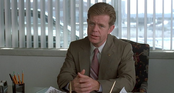
On more than one occasion I’ve tried to frame a shot like this, only to be told by the director that the subject is “too close to the centre”, it’s “wrong” and the subject must be placed on a third. What I should have done is shown them this frame, said, “If it’s good enough for Roger Deakins….” and then coughed in a way that sounded suspiciously like “thirteen Oscar nominations”. What’s interesting about this composition is the visual tension it creates when edited with the reverse. If the other actor is similarly close to the centre, their images start to overlap, almost like they’re duking it out, and if the other actor is placed further from the centre, they will seem trapped by their interlocutor. Or maybe composing the shot this way sometimes just allows for the best range of movement from the actor and the most pleasing frame.

Placing someone in the centre of frame can be very powerful. It suggests someone in control, balanced, dominant. Now of course, that is not at all an accurate description of Bill Murray’s character in Lost in Translation. But notice that big, bright practical light so close to his head; it completely unbalances the composition. This just goes to show that the subject’s position relative to background elements can be of equal or greater importance to their position within the frame. I aim to do a whole post about centre-framing in the near future.

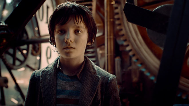
Although short-sided, the boy still has some lead room, in fact an amount of lead room that would be perfectly normal in a 4:3 composition. Personally, I would be comfortable with this composition for purely aesthetic reasons, but it could also be used to create some visual tension, suggesting things unknown behind the subject, waiting to creep up on them figuratively or literally. It could also suggest the character is weak, particularly if intercut with another character who is more traditionally framed.

Now we are into territory that many will find uncomfortable. A character short-sided like this may seem unbalanced, lost, trapped, wrong-footed or isolated. Or they might simply be deep in thought; you can easily imagine another character entering in the background of the above frame, breaking Crowe’s reverie, restoring the compositional balance and turning it into a deep two-shot.

Imagine someone walking into a room and standing right up against the wall, facing it. You would think them strange, disturbed. You might wonder if they were looking at something imaginary. This is the effect created by extreme short-siding. It also serves to make the subject look completely alone, even though they might be speaking to someone just inches in front of them. Mr. Robot is the only place I’ve ever seen composition this unusual, though I’m sure there are other examples out there.
Next time you watch a film or a TV show, pay attention to the lead room. You may be surprised to find that non-standard compositions are employed more often than you thought.
Thanks again to evanrichards.com, where I found most of the frame grabs.