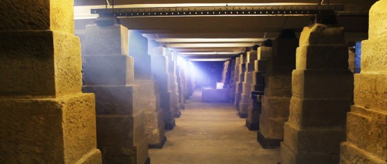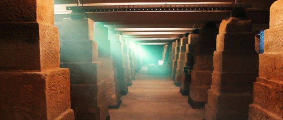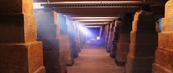
Following on from my last post, here’s what I was going for when I created the above lighting previz image for the basement scene in Stop/Eject.
As DoP Eve Hazelton lucidly explains in this video blog, one of the keys to great cinematography is creating depth, even (and especially) when you’re shooting in 2D. The basement location already has great depth with all those pillars tapering into the distance, but how can that be maximised on camera?
- I’ve added smoke. Smoke creates depth because there will be more of it between the camera and a distant subject than between the camera and a close subject.
- The light illuminating the smoke gets bluer as it gets further from camera. (This will be achieved by layering increasing numbers of blue gels on the lights.) This simulates the effect you can see when you look at the view from the top of a hill, whereby other hills in the distance seem bluer due to atmospheric haze.
- I’ve thrown alternating pillars into shadow. This makes each “layer” of pillars contrast with the ones behind and in front of it, highlighting the depth. (We can achieve this on the day by simply turning off or removing the tubes in every other fluorescent light.)

As the characters walk through this shot towards us, they will go in and out of smoke and shadow, and become clearer through the smoke. That gives us dynamics, which are also important in good cinematography.
Now let’s look at the issue of colour contrast, something which I must admit I’ve only got to grips with quite recently. To cut a long story short, images look more interesting if they contain contrasting colours. Typically this means choosing two colours on opposite sides of the colour wheel, like blue and yellow as in the above previz. Or I could have gone with orange/red and green…

… though green daylight is hard to justify! It does fit nicely with the colour palette we’ve already established for the costume and production design though.
I also tried orange daylight and green fluorescent light, but since the scene doesn’t take place at sunrise or sunset that’s hard to justify too.
Finally I tried orange and blue. One is a warm colour and the other is a cool colour – another classic way of creating colour contrast.

The jury’s still out on this one. A lot will depend on what colour I’m able to make the fluorescent light appear through white balancing, since we’re unlikely to have time to gel all of them to my desired hue, and also what colour costumes Katie puts the characters in for that scene.
Okay, that’s all for today. Once the film’s in the can, there will be lots more about how the scenes were lit. In the meantime, perhaps I’ll share some of my lighting plans in a future post.