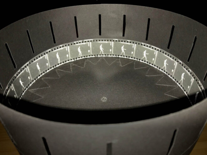
During Lockdown 1.0 I made a zoetrope and shot a number of time-lapses and animations with my 35mm SLR to go in it. Below is an update on this project, but first here are the links to the earlier posts about it, in case you missed them:
- Shooting a Time-lapse for a Zoetrope
- How to Make a Zoetrope for 35mm Contact Prints
- Making a 35mm Zoetrope: the Results
Although the zoetrope itself turned out very nicely – all the more surprising because I’m terrible at DIY – the content did not. I concluded that any future efforts needed to be very simple, bold and high-contrast.
Recently I got around to shooting a couple of new animations. This time, instead of detailed, complex or subtle efforts like sunlight moving across rotting apples or Lego minifigs passing each other in the street, I went back to basics. Inspired by typical animations supplied with zoetropes in the Victorian era, I created loops of a figure walking and running.
First of all I drew out the 18 frames of each cycle using online reference material. I wanted to shoot in natural light so I rigged a black backdrop outside on the patio. Dressed in my lightest-toned clothes, I adopted the 18 positions of the walk cycle one by one as my flatmate clicked my Pentax P30t’s shutter. Then I went through the run cycle in the same way to complete the roll of 36 exposures. We used Ilford Delta 3200 film, one second of exposure time and a pinhole (purely so I could say I had made and exhibited a motion picture without ever using a lens). By the time we finished, the light had fallen off a stop or two.
When I got the material into the darkroom I under-exposed the contact prints (making them lighter) because I had learnt that a spinning zoetrope darkens the image considerably. After all, you are only viewing it through tiny slots; what you’re mostly looking at is the opaque outside of the drum. I always print on multigrade paper which means that the contrast can be adjusted using a special set of colour filters. In this case I used the 4½ filter (on a scale where 0 produces the softest contrast and 5 the hardest) to get the boldest possible look. The resulting prints still looked very milky, especially the running one which I’d had to brighten more to compensate for the light falling off, but that was what I knew I needed.
When I got home and tried them in the zoetrope, the running animation just didn’t have enough contrast in it to work. The walking animation works better but still isn’t as good as I’d hoped. I think that what’s really required is strong studio lighting absolutely blasting the subject, a completely white outfit, and a backdrop with all light flagged off it.
The learning process continues!
The results look better in this video than they actually are, because the phone I shot it on conducted its own process of reducing the motion into discrete frames for your device and brain to reassemble.

