
I once had an argument with a director about the composition of a wide shot. I wanted to put the horizon nearer the top of the frame than the bottom, and he felt that this was the wrong way around. In reality there is no right and wrong in composition, only a myriad of possibilities that are all valid and can all make your viewers feel different ways. In this article I will take a metaphorical ramble through these possibilities, and ponder their effects.
You would think that the most natural position for the horizon would be in the vertical centre of the frame. After all, in our day-to-day life, when we look straight ahead, this is where it appears to be.
In practice, a central horizon is not a popular choice. This article by Art Wolfe, for example, argues that it robs the image of dynamism, sending the eye straight to the horizon rather than letting it wander around the frame. The technique is also at odds with the Rule of Thirds, though as I’ve written before, that’s not a rule I place much stock in.
The talented photographer and vlogger Arian Vila, however, describes the merits of a central horizon when composing for a square aspect ratio. And this is an excellent reminder that the horizon does not exist in a vacuum; like anything else, it must be judged in the context of the aspect ratio and the other compositional elements of the frame.
For Leon Chambers’ Above the Clouds (out now on Amazon Prime and other platforms!), I placed the horizon centrally several times:


This was a deliberate echo of the painting “Above the Clouds” which appears in the film and provides the thematic backbone. 
A year or two after shooting Clouds, I came across Photograms of the Year: 1949 in a charity shop. Amongst its pages I found another diptych, one created by the book designer rather than the two entirely separate photographers:

These two images, perfectly paired, demonstrate contrasting horizon placement. At Grey Dawn emphasises the sky by placing the horizon low in the frame, creating a sense of space. Meanwhile, Homeward Bound positions its horizon somewhere beyond the trees near the top of frame, drawing attention to the sand and the wheel ruts and indeed to the figures of the caravan itself, rather than to the destination or surroundings.
Horizon placement is closely tied to two other creative choices: headroom, which I dedicated a whole article to, and lens height, i.e. is this a low or a high angle? Even a GCSE media student can tell you that a low angle imbues power while a high angle implies vulnerability, but these are terms most applicable to closer shots. When we think of horizon placement we are probably concerned with big wides, where creating a mood for the scene or setting is more important than visualising a character’s power or lack thereof.
Breaking Bad is an example of a series that predominantly chooses low horizons to show off the big skies of its New Mexico locations. “[Showrunner] Vince [Gilligan] is a student of cinema and knows movies like the back of his hand,” says DP Michael Slovis, ASC. “It was always in his mind that this was a Western in the style of Sergio Leone and the Italian Neo-realists.”
Incidentally, there’s an amazing desert scene in the episode “Crawl Space” where a sunlit close-up cuts to a big wide. The wide holds as clouds roll over the sun. The action continues and the shot still holds, the line between sunlight and shade visible as it rolls away across the desert, until finally a new line slides under the camera and sun breaks over the actors once more. Only then are we permitted to see the scene up close again.


This creative choice, to set the character’s small concerns against the vast immutability of nature, comes from the same place as the choice to put the horizon low in frame.
Returning to Photograms of the Year: 1949, my eyes light upon another pair of contrasting images:
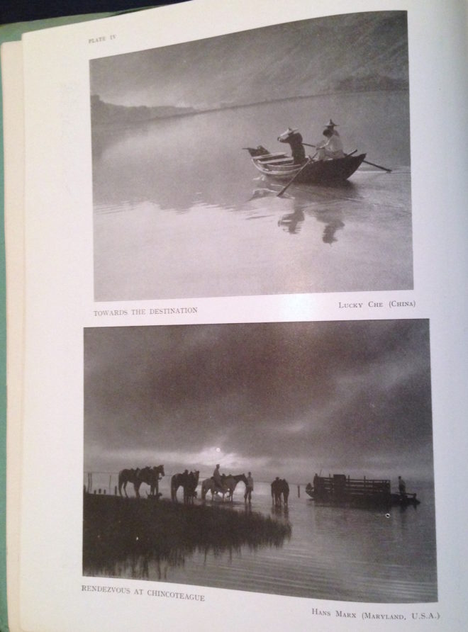 Despite its title, Towards the Destination shows us little of where the sailors are heading, by placing the horizon high in the frame and focusing on the water and the reflections therein. Rendezvous at Chincoteague, by placing its horizon low in the frame, radiates a feeling of isolation that is in contrast to the meeting of the title.
As we consider the figures in these photographs I am forced to concede that the argument I alluded to in the introduction may have been less about the position of the horizon and more about the position of the actor. I think the director felt that it was unnatural for an person to appear in the top half of the frame rather than the bottom half.
I can see his point. The vision of our naked eyes is definitely framed along the bottom by the ground, while the top remains open and unlimited – outdoors, at least. So if a person is standing on the ground, we naturally expect them to appear low down in an image.
But this – like nose room, the Rule of Thirds, the 180° Rule, short-key lighting, so many things in cinematography – is merely a guideline. There are times when it just isn’t helpful, when it can lead to wasted opportunities.
Here is a shot of mine from The Gong Fu Connection (dir. Ted Duran) where the horizon and the cast are placed in the upper half of frame:

Would it really have been better to frame them lower, losing out on the reflections and the foreround rushes, and gaining just empty sky? I think not. This composition was especially important to me, because the film’s titular connection is all about man and the natural world. By showing the water and greenery, we root the characters in it. A composition with more sky might have made them seem dwarfed by nature, lost in it.
This article has been something of a stream of consciousness, but the point I’m trying to make is this: always consider the content and meaning of your shot; reflecting those in your composition is infinitely more important than adhering to any guidelines.
If you enjoyed this, you may be interested in some of my other articles on composition: