Working with White Walls

White walls are the bane of a DP’s existence. They bounce light around everywhere, killing the mood, and they look cheap and boring in the background of your shot. Nonetheless, with so many contemporary buildings decorated this way, it’s a challenge we all have to face. Today I’m going to look back on two short films I’ve photographed, and explain the different approaches I took to get the white-walled locations looking nice.

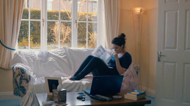
Finding Hope is a moving drama about a couple grieving for the baby they have lost. It was shot largely at the home of the producer, Jean Maye, on a Sony FS7 with Sigma and Pentax stills glass.

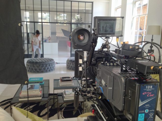
Exit Eve is a non-linear narrative about the dehumanisation of an au pair by her wealthy employers. With a fairly respectable budget for a short, this production shot in a luxurious Battersea townhouse on an Arri Alexa Classic with Ultra Primes.


“Crown”-inspired colour contrast

Cheap 300W dimmers like these are great for practicals.

It was January 2017 when we made Finding Hope, and I’d recently been watching a lot of The Crown. I liked how that series punctuated its daylight interior frames with pools of orange light from practicals. We couldn’t afford much of a lighting package, and I thought that pairing existing pracs with dimmers and tungsten bulbs would be a cheap and easy way to break up the white walls and bring some warmth – perhaps a visual representation of the titular hope – into the heavy story.

I shot all the daylight interiors at 5600K to get that warmth out of the pracs. Meanwhile I shaped the natural light as far as possible with the existing curtains, and beefed it up with a 1.2K HMI where I could. I used no haze or lens diffusion on the film because I felt it needed the unforgiving edges.

For close-ups, I often cheated the pracs a little closer and tweaked the angle, but I chose not to supplement them with movie lamps. The FS7’s native ISO of 2500 helped a lot, especially in a nighttime scene where the grieving parents finally let each other in. Director Krysten Resnick had decided that there would be tea-lights on the kitchen counter, and I asked art director Justine Arbuthnot to increase the number as much as she dared. They became the key-light, and again I tweaked them around for the close-ups.

My favourite scene in Finding Hope is another nighttime one, in which Crystal Leaity sits at a piano while Kevin Leslie watches from the doorway. I continued the theme of warm practicals, bouncing a bare 100W globe off the wall as Crystal’s key, and shaping the existing hall light with some black wrap, but I alternated that with layers of contrasting blue light: the HMI’s “moonlight” coming in through the window, and the flicker of a TV in the deep background. This latter was a blue-gelled 800W tungsten lamp bounced off a wobbling reflector.

When I saw the finished film, I was very pleased that the colourist had leant into the warm/cool contrast throughout the piece, even teasing it out of the daylight exteriors.


Trapped in a stark white townhouse

I took a different approach to colour in Exit Eve. Director Charlie Parham already knew that he wanted strong red lighting in party scenes, and I felt that this would be most effective if I kept colour out of the lighting elsewhere. As the film approaches its climax, I did start to bring in the orange of outside streetlamps, and glimpses of the party’s red, but otherwise I kept the light stark and white.

Converted from a Victorian schoolhouse, the location had high ceilings, huge windows and multiple floors, so I knew that I would mostly have to live with whatever natural light did or didn’t shine in. We were shooting during the heatwave of 2018, with many long handheld takes following lead actor Thalissa Teixeria from room to room and floor to floor, so even the Alexa’s dynamic range struggled to cope with the variations in light level.

For a night scene in the top floor bedroom, I found that the existing practicals were perfectly placed to provide shape and backlight. I white-balanced to 3600K to keep most of the colour out of them, and rigged black solids behind the camera to prevent the white walls from filling in the shadows.

(Incidentally, the night portions of this sequence were shot as one continuous take, despite comprising two different scenes set months apart. The actors did a quick-change and the bed was redressed by the art department while it was out frame, but sadly this tour de force was chopped up in the final cut.)

I had most control over the lighting when it came to the denouement in the ground floor living area. Here I was inspired by the work of Bradford Young, ASC to backlight the closed blinds (with tungsten units gelled to represent streetlights) and allow the actors inside to go a bit dim and murky. For a key moment we put a red gel on one of the existing spotlights in the living room and let the cast step into it.

So there we have it, two different approaches to lighting in a while-walled location: creating colour contrast with dimmed practicals, or embracing the starkness and saving the colour for dramatic moments. How will you tackle your next magnolia-hued background?

For another example of how I’ve tackled white-walled locations, see my Forever Alone blog.

Working with White Walls

The 4:3 Aspect Ratio is Not Dead

This summer I shot Exit Eve, a short film from director Charlie Parham dealing with the exhausting and demeaning life of an au pair. We took the unusual decision to shoot it in 4:3, a ratio all but obsolete, but one which felt right for this particular story. Before I look at some of the ratio’s strengths and challenges, let’s remind ourselves of the history behind it.


History

William Kennedy Dickson

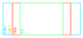
The 4:3 motion picture aspect ratio, a.k.a. 1.33:1, was created about 120 years ago by William Kennedy Dickson. This Thomas Edison employee was developing a forerunner to the movie projector, and decided that an image height of four perforations on 35mm film gave the ideal shape. In 1909 the ratio was declared the official standard for all US films by the Motion Picture Patent Company.

When the talkies arrived two decades later, room needed to be made on the film prints for the optical soundtrack. The Academy of Motion Pictures Arts and Sciences responded by determining a new, very slightly wider ratio of 1.37:1, known fittingly enough as the Academy Ratio. It’s so similar to 4:3 that I’m going to lump them together from hereon in.

When television was invented it naturally adopted the same 4:3 ratio as the big screen. The popularity of TV led to falling cinema attendance in the 1950s, to which the Hollywood studios responded with a range of enticing gimmicks including widescreen aspect ratios. Widescreen stuck, and for the next generation 1.85:1 and 2.39:1 were the ratios of cinema, while the narrower 4:3 was the ratio of TV.

By the time I entered the industry in the late 1990s, 4:3 was much maligned by filmmakers. It seemed boxy and restrictive compared with widescreen, and reminded those of us in the guerrilla world that we didn’t have the budgets and equipment of the Hollywood studios. Meanwhile, the wide compositions of big movies were butchered by pan-and-scan, the practice of cropping during the telecine process to fit the image onto a 4:3 TV without letterboxing. 4:3 was ruining our favourite movies, we felt.

Then, in the 21st century, 16:9 television became the norm, and the 4:3 aspect ratio quietly disappeared, unmourned…. Or did it?


Contemporary Cinema

Although they are firmly in a minority, a number of filmmakers have experimented with 4:3 or Academy Ratio in recent years. Some, like Andrea Arnold and the late Éric Rohmer, rarely shot anything else.

Arnold wanted a combination of intimacy and claustrophobia for her Bafta-winning 2009 drama Fish Tank. She carried the ratio over to her next film, an adaptation of Wuthering Heights, despite the prevalence of big landscapes which would have prompted most directors to choose 2.39:1. The Academy Ratio focuses the viewer’s attention much more on the characters and their inner worlds.

“Fish Tank” – DP: Robbie Ryan, BSC

Mark Kermode has this to say about the 1.37:1 work of Arnold and her DP Robbie Ryan: “What’s wonderful about it is the way [Ryan] uses that squarer format not to make the picture seem compressed but to make it seem taller, to make it seem larger, to make it seem oddly more expansive.”

Meek’s Cutoff (2010), a modern western by Kelly Reichardt, recalls the early Academy classics of the genre. As with Wuthering Heights, characters are placed in the landscape without being dominated by it, while the height of the frame produces bigger skies and an airier feel.

“Meek’s Cutoff” – DP: Chris Blauvelt

Pawel Pawlikowski’s 2013 Oscar-winner Ida deliberately goes against the grain, shooting not only in 4:3 but in black and white as well. It’s the perfect format to convey the timeless, spartan existence of the titular Ida and her fellow nuns. The tall frame allows for copious headroom, inspiring thoughts of Heaven and God, beneath which the mortal characters seem small.

The 2017 animated feature Loving Vincent, meanwhile, adopted 4:3 because it was closer to the shape of Van Gogh’s paintings.

David Lowery, director of last year’s A Ghost Story, wanted to trap his deceased title character in the boxy ratio. “It gave me a good opportunity to really hammer home the circumstances this ghost finds himself trapped in, and to dig into and break down the claustrophobia of his life within these four walls… And it was also a way to tap into some degree of nostalgia, because it feels old-fashioned when you see a movie in a square aspect ratio.”

4:3’s nostalgia factor has allowed it to be used very effectively for flashbacks, such as those in the recent Channel 4/Netflix series The End of the F***ing World. Wes Anderson delineated the three time periods of The Grand Budapest Hotel (2014) with different aspect ratios, using 1.37:1 for scenes set in 1932, the very same year in which that ratio was standardised by the Academy.


“Exit Eve”

Nostalgia, intimacy, claustrophobia, isolation – these are just some of the feelings which cinema’s original aspect ratio can evoke. For Charlie and I on Exit Eve, it was the sense of being trapped which made the ratio really fit our story. 

I’m also a great believer in choosing a ratio that fits the shape of your primary location, and the converted schoolhouse which we were shooting in had very high ceilings. 4:3 allowed us to show the oppressive scale of these rooms, while giving the eponymous Eve little horizontal freedom to move around it. One additional practical consideration was that, when lensing a party scene, the narrower ratio made it easier to fill the frame with supporting artists!

It wasn’t hard to get used to framing in 4:3 again. A lot of Exit Eve was handheld, making for fluid compositions. There were a couple of tripod set-ups where I couldn’t help thinking that the extra width of 1.85:1 would be useful, but for the most part 4:3 worked well. 

We were shooting on an Alexa Plus with a 16:9 sensor, meaning we were cropping the image at the sides, whereas ideally we would have hired a 4:3 model to use the full width of the sensor and a larger proportion of our lenses’ image circles. This would have allowed us to get slightly wider frames in some of the location’s smaller rooms.

Our sound department had to adapt a little. The boom op was used to being able to get in just above the actors’ heads, but with the generous headroom I was often giving, she had to re-learn her instincts.

Classic 4:3 overs in “Star Trek: The Next Generation”

I had forgotten how well dialogue scenes are suited to 4:3. With wider ratios, over-the-shoulder shots can sometimes be tricky; you can end up with a lot of space between the foreground shoulder and the other actor, and the eye-line ends up way off camera. 4:3 perfectly fits a face, along with that ideal L-shape of the foreground shoulder and side of head, while keeping the eye-line tight to camera.

Not every project is right for 4:3, far from it. But I believe that the ratio has served its sentence in the wilderness for its pan-and-scan crimes against cinema, and should now be returned to the fold as a valid and expressive option for filmmakers.

See also:

The 4:3 Aspect Ratio is Not Dead