White walls are the bane of a DP’s existence. They bounce light around everywhere, killing the mood, and they look cheap and boring in the background of your shot. Nonetheless, with so many contemporary buildings decorated this way, it’s a challenge we all have to face. Today I’m going to look back on two short films I’ve photographed, and explain the different approaches I took to get the white-walled locations looking nice.
Finding Hope is a moving drama about a couple grieving for the baby they have lost. It was shot largely at the home of the producer, Jean Maye, on a Sony FS7 with Sigma and Pentax stills glass.
Exit Eve is a non-linear narrative about the dehumanisation of an au pair by her wealthy employers. With a fairly respectable budget for a short, this production shot in a luxurious Battersea townhouse on an Arri Alexa Classic with Ultra Primes.
“Crown”-inspired colour contrast

It was January 2017 when we made Finding Hope, and I’d recently been watching a lot of The Crown. I liked how that series punctuated its daylight interior frames with pools of orange light from practicals. We couldn’t afford much of a lighting package, and I thought that pairing existing pracs with dimmers and tungsten bulbs would be a cheap and easy way to break up the white walls and bring some warmth – perhaps a visual representation of the titular hope – into the heavy story.
I shot all the daylight interiors at 5600K to get that warmth out of the pracs. Meanwhile I shaped the natural light as far as possible with the existing curtains, and beefed it up with a 1.2K HMI where I could. I used no haze or lens diffusion on the film because I felt it needed the unforgiving edges.

For close-ups, I often cheated the pracs a little closer and tweaked the angle, but I chose not to supplement them with movie lamps. The FS7’s native ISO of 2500 helped a lot, especially in a nighttime scene where the grieving parents finally let each other in. Director Krysten Resnick had decided that there would be tea-lights on the kitchen counter, and I asked art director Justine Arbuthnot to increase the number as much as she dared. They became the key-light, and again I tweaked them around for the close-ups.

My favourite scene in Finding Hope is another nighttime one, in which Crystal Leaity sits at a piano while Kevin Leslie watches from the doorway. I continued the theme of warm practicals, bouncing a bare 100W globe off the wall as Crystal’s key, and shaping the existing hall light with some black wrap, but I alternated that with layers of contrasting blue light: the HMI’s “moonlight” coming in through the window, and the flicker of a TV in the deep background. This latter was a blue-gelled 800W tungsten lamp bounced off a wobbling reflector.
When I saw the finished film, I was very pleased that the colourist had leant into the warm/cool contrast throughout the piece, even teasing it out of the daylight exteriors.
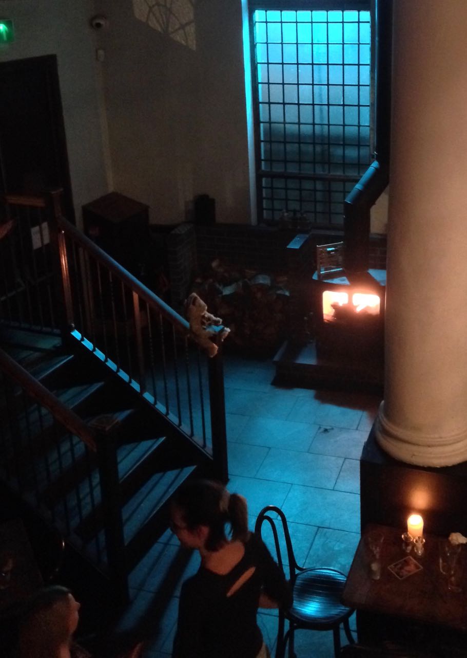
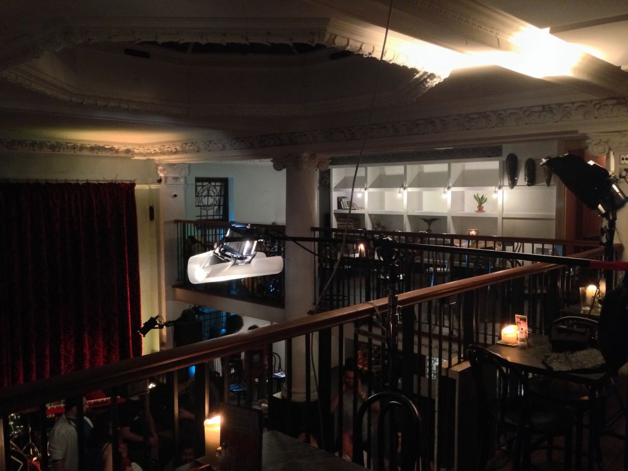
Trapped in a stark white townhouse
I took a different approach to colour in Exit Eve. Director Charlie Parham already knew that he wanted strong red lighting in party scenes, and I felt that this would be most effective if I kept colour out of the lighting elsewhere. As the film approaches its climax, I did start to bring in the orange of outside streetlamps, and glimpses of the party’s red, but otherwise I kept the light stark and white.

Converted from a Victorian schoolhouse, the location had high ceilings, huge windows and multiple floors, so I knew that I would mostly have to live with whatever natural light did or didn’t shine in. We were shooting during the heatwave of 2018, with many long handheld takes following lead actor Thalissa Teixeria from room to room and floor to floor, so even the Alexa’s dynamic range struggled to cope with the variations in light level.
For a night scene in the top floor bedroom, I found that the existing practicals were perfectly placed to provide shape and backlight. I white-balanced to 3600K to keep most of the colour out of them, and rigged black solids behind the camera to prevent the white walls from filling in the shadows.
(Incidentally, the night portions of this sequence were shot as one continuous take, despite comprising two different scenes set months apart. The actors did a quick-change and the bed was redressed by the art department while it was out frame, but sadly this tour de force was chopped up in the final cut.)
I had most control over the lighting when it came to the denouement in the ground floor living area. Here I was inspired by the work of Bradford Young, ASC to backlight the closed blinds (with tungsten units gelled to represent streetlights) and allow the actors inside to go a bit dim and murky. For a key moment we put a red gel on one of the existing spotlights in the living room and let the cast step into it.

So there we have it, two different approaches to lighting in a while-walled location: creating colour contrast with dimmed practicals, or embracing the starkness and saving the colour for dramatic moments. How will you tackle your next magnolia-hued background?
For another example of how I’ve tackled white-walled locations, see my Forever Alone blog.