Stop/Eject: Script to Screen

Following my personal observations on the shot planning process the other day, here’s a look at that process in action and a record of some of the thoughts that go through my head as a director when I’m choosing camera angles.

Everything begins with the script, and here is the extract for the Stop/Eject sequence I’m going to break down:

14. INT. ALCOVE/EXT. RIVER GARDENS – DAY – INTERCUT
KATE stands behind the alcove’s curtain with an armful of tapes.
She pushes one into the recorder – “JULY 16th 2007, 5-6:30pm” - 
and hits PLAY. Warm summer sunshine steals in through the crack
in the curtain. She pulls it back to reveal the river, sunlight
dancing and sparkling in the water of the weir.
COPY-KATE cycles through the gardens on a creaky old bicycle
with a custom paint job and various doodads hanging off,
oblivious to her other self and the alcove stood in the middle
of a Victorian bandstand.
Copy-Kate spots a strange figure on the riverbank, wearing
closed-back headphones and waving a big, fluffy microphone at
the running water.  She looks ahead – she’s about to run over
TWO YOUNG GIRLS.  She grips the brakes tightly and the bike
screeches to a stop with a noise like a small army of warring
cats.  She catches her breath as the older girl scowls and drags
her sister away.

Sophie drew the following storyboards for this sequence, based on my rough sketches:

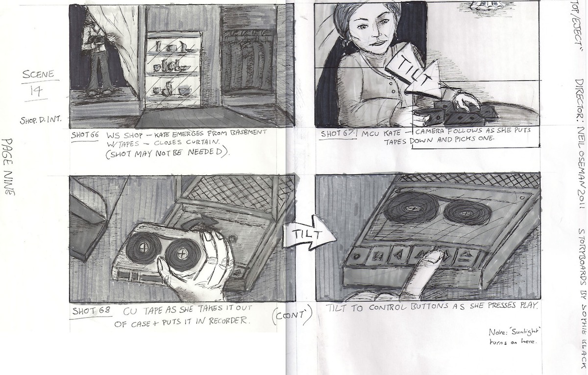
I don’t like starting scenes with establishing shots; I prefer to reveal them gradually. So when I conceived the first shot (top left) – setting up Kate in the alcove in the shop – I suspected I would probably end up cutting it, and sure enough I never even filmed it. The audience would know by now where the tape recorder alcove was, I figured.

The next shot (top right) follows Kate as she puts down the stack of tapes. This is fairly basic visual storytelling. The audience already knows that the tapes contain recordings of Kate’s life. When we see her come in with an armful of cassettes, we anticipate her nostalgia trip.

As this was the first time Kate was to travel back in time more than a few hours, I felt it important to show the action of the tape going into the recorder in close-up (bottom), to ensure the audience understood the connection between the tapes, the machine and the time travelling.

storyboards_scan10

We then return (top left) to the previous angle, following Kate as she stands back up and opens the curtain. One of my regrets with Stop/Eject was that I never shot over Kate’s shoulder as she looked out of the alcove. I can only think this is because I was trying to avoid doing “the obvious thing”. In this scene I chose instead to tease what she’s seeing, revealing first the sunlight on her face, and then (top right) an abstract close-up of a spinning bike wheel, part of the visual theme of circles I had smart-arsedly developed for the film. My thinking was that time travel was a big and unbelievable concept for Kate to take in, so it needed to be broken to her (and therefore us) gradually.

Finally the scene is revealed (bottom left) in a high wide shot to establish the geography, which then cranes down to draw us into the action. On the day, there was a bush in the foreground, which began to obscure the action as we craned down, so we decided to crane up instead, rising up over the bush to reveal the action.

Next it was necessary to show the place of Kate and the alcove in the geography. I wanted to echo the formality and symmetry of the bandstand’s architecture by framing it flat-on, dead centre (bottom right).

storyboards_scan11
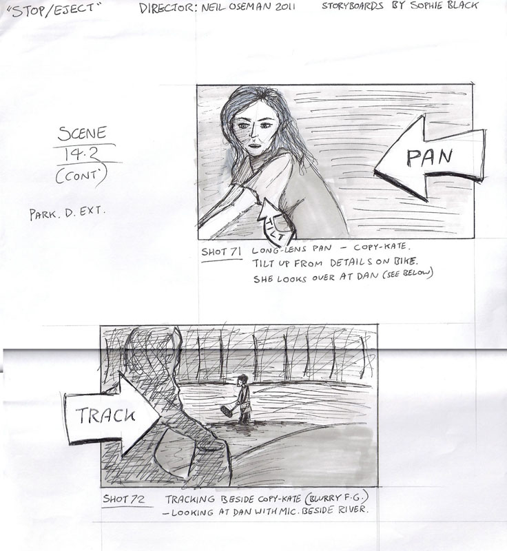
Then Copy-Kate sees Dan, her future husband, for the very first time. I wanted to show an immediate connection using an over-the-shoulder shot-reverse. Since Copy-Kate was on a moving bike, this meant panning with her for her angle (top) and then tracking with her for Dan’s angle (bottom) in order to keep her shoulder in frame. I left Dan’s shoulder out of Kate’s shot since he hasn’t seen her yet and so hasn’t made a connection.

The editing podcast below from summer 2012 explains the various iterations I went through with this sequence. (I later brought Miguel Ferros on board to re-edit the film, and his final version is far superior to all of my attempts.) You can see in the podcast some of the problems that my linear shot planning approach caused, notably my failure to cover the whole scene in the crane shot, and the restrictions which that placed on me in the edit.

Despite these minor quibbles, I’m very proud of Stop/Eject and its visual storytelling. It’s recently received a couple of glowing reviews on Unsung Films and The London Film Review, the latter praising its visuals, and both quite rightly lauding Georgina Sherrington’s brilliant lead performance.


Stop/Eject: Script to Screen

Writing a Shot List

Some of my rough storyboards for Stop/Eject

How does a filmmaker decide what angles to shoot from? Speaking for myself, it’s a hard process to analyse, as many of the decisions are made without much conscious thought. Often I just sit down and imagine the scene playing out in my head. Since childhood I’ve been pretending to be a camera – closing one eye and moving my head to mimick a crane shot, for example, as I pushed my Lego car along – so in imagining the scene I automatically create shots and edits in my head. Then it’s just a case of writing them down, or sketching them as storyboards. I suspect that some of the time – perhaps a lot of the time – I’m subconciously recalling similar scenes in other films I’ve seen and copying their shots.

Sometimes it does require more thought to choose between a number of options. It’s about picking the angle, the lens, the movement that has the right feel for that moment of the story. “If I push in on a short lens, it will feel more dramatic and intimate, but maybe a cool, detached look would be better, using a long lens and remaining static… What do I want the audience to feel?”

Throughout my career, I’ve always shot-listed or storyboarded in a linear fashion – “I’ll be on this shot, then I’ll cut to this one, then this one, then back to the first one, then to the second one which has now dollied in closer, etc….” It made perfect sense to me, because that’s how the film would ultimately appear to the viewer. Knowing the order in which angles would be seen, I could choose to transition between two angles with a camera move, rather than a cut. I could be sure that I wasn’t wasting time on set shooting extraneous material.

But of course, this linear approach to shot planning lacked flexibility. If the action changed on set when blocking it with the actors, I often struggled to integrate this into my plans. And if I needed to change the sequence in the edit, it was often challenging to make the shots work in a different order, because I hadn’t covered the whole scene from a particular angle, or I’d built in a camera move which was now redundant.

Storyboards by Luis Gayol for The Dark Side of the Earh

Other directors plan their shots more in terms of coverage. They might do this via a floorplan showing the camera positions. They’re making sure that, across the sum total of their camera angles, all of the action can be seen clearly and with the appropriate tightness or wideness of framing. They’ve not decided where each angle will be used, only that these are angles they will probably need somewhere in the edit. They’re giving themselves options.

I used to think of giving yourself options as a weakness in a director. Surely you should know now what you want, rather than figuring it out in post? But as I’ve come to realise, particularly in my experience of working with a separate editor for the first time on Stop/Eject, until you’re away from the baggage of the shoot and you’re actually putting the stuff together, you simply can’t know for sure what the best way to edit it is going to be. You can’t predict every nuance of a performance in preproduction, you can’t predict exactly where the pace may flag and need tightening, and you can’t predict which shots or pieces of action will be unsuccessful due to problems on the day with the execution.

So in writing the shot list for A Cautionary Tale last week, I’ve tried to lean much more towards the coverage style of planning. Inevitably the result is a halfway house, or more optimistically perhaps a hybrid, between the linear and coverage styles. I look forward to seeing what impact this has on the editing process.

Continuing this theme, in my next blog post I’ll break down how I chose the shots for a sequence in Stop/Eject, and look at how those decisions ramified in production and post.

Writing a Shot List

How to Soften Harsh Sunlight with Tinfoil and a Bedsheet

On a pick-up shoot a couple of months back I found myself in the position of needing to mould the natural light without any equipment whatsoever. The sun was shining brightly with no clouds in sight, and we needed to shoot a close-up that would match an existing overcast wide shot. Fortunately there was a B&M just around the corner. Unfortunately no-one took any pictures of the ridiculous set-up that ensued, hence the comedy illustration.

Here’s how to do it:

  1. Get yourself round to B&M. (Other depressing discount stores are available.)
  2. Purchase a white bedsheet (£3.99) and a roll of foil (79p).
  3. The sheet is going to be your “silk”. First of all, cut the elastic corners to make it easier to wrangle.
  4. Assign Unfortunate Crewmember #1 to hold up the sheet so that it casts a shadow on the talent. It will soften the direct sunlight falling on the them, but there will probably still be darker shadows on their face than you want, so…
  5. Unroll a couple of feet of the foil. This is going to be your bounce card.
  6. Assign Unfortunate Crewmember #2 to stand on the shade side of the talent and use the foil to reflect some direct sunlight into that side their face.
  7. Hope that this is not the day the photographer from the local paper visits the set.

Even if you’re not matching to overcast shots, this softening of harsh sunlight is usually desirable to some degree when shooting CUs. Click here for more on moulding natural light.

How to Soften Harsh Sunlight with Tinfoil and a Bedsheet

Handheld Thoughts

In the new year I’ll be teaming up with Sophie Black once again to photograph her new short film, Night Owls, a tale of unexpected friendship with echoes of Juno and Lost in Translation. It’s early days yet, but we’ve already discussed a fluid, handheld feel as being the dominant look.

Conveniently I came across this video recently, thanks to nofilmschool.com, in which DP Sean Bobbitt delivers a masterclass in handheld camera operation. He covers it from all angles, from wearing the right clothes and stretching beforehand, to developing a rapport with the actors you’re dancing around.

There are many variations of handheld cinematography. Bobbitt talks about trying to keep the camera as stable as possible, to reduce the shake to the absolute minimum the human body can transmit to an object it’s holding. But, as he also mentions, sometimes directors ask for more energy in the camerawork – they want a lot of sway and “fidgeting”.

Halo Haynes and Mark Drake, the cast of Night Owls

A director may want you the operator to stay rooted to one spot, like a tripod with a bit of wobble, or they may want you to execute a carefully planned move – like a dolly or a steadicam with wobble. Or they might give you freedom to move around the action, framing one actor or another as you see fit. Crash zooms might be part of the agreed look, or they might be banned.

All this needs to be discussed in advance.

And if you’re going to do improvised movements, what does that mean for the lighting? It makes it more difficult. For an interior scene, which most of Night Owls is, it means relying heavily on practicals – light sources that are visible on camers, e.g. table lamps – and throwing light into the room from outside doors and windows. (Incidentally, I was lucky enough to attend a masterclass by DP Chris Menges last week and he spoke of his belief that lights should always be kept outside the room so as not to clutter up the actors’ space and eyelines with equipment.)

So these are some of the things that are swirling around in my head right now as I contemplate the Night Owls shoot on the horizon.

Now for the catch. That shoot can only happen if our crowd-funding campaign reaches its £2,000 total by January 2nd. Please check out Night Owls’ Kickstarter page and put a little bit of money in the pot if you can, or if you can’t, spread the word.

Thank you and merry Christmas!

Handheld Thoughts

The DP’s Dilemma

So, you’re in the middle of shooting a scene. You’ve shot everything in one direction and now it’s time to turn around and shoot the reverses. The director of photography must make a decision: do I go for realistic or matching reverses?

Imagine you have a simple scene in which character A stands facing character B and they exchange dialogue. It’s night exterior so you’ve given A a blue backlight and a white frontlight. Realistically then, since B is facing in the opposite direction, he should have a white backlight and a blue frontlight. But do you really want one person’s face to be blue and the other’s to be white? Wouldn’t it be better for B to have a blue backlight and a white frontlight, to match nicely with A? That’s the dilemma.

A matching shot-reverse from Soul Searcher. Both characters have blue backlight, but somehow neither of them have blue frontlight.
A realistic shot-reverse from Stop/Eject. The magenta light strikes Alice (left) from the front but Kate (right) from behind.

TV shows seem to plump mostly for matching reverses, whereas movies tend to be a little more realistic, but this is a very rough generalisation. When deciding which style to go for, here are some things you might consider:

  • Is the overall look of the piece stylised or realistic?
  • Does lighting the characters differently help to underscore the power dynamics in their relationship, or enhance their characters in some way?
  • Will the audience have clearly seen a window or other prominent light source in the scene to show that more light would be coming from one direction than another?
  • Will the light that looks so great as a backlight on character A look unpleasantly harsh as a frontlight on character B? (The answer here is usually yes. That is the whole reason cinematographers have to relight when they do the reverses.)

There is of course middle ground between matching and realistic reverses – tweaking the lighting so that an audience can still buy the continuity of it but it looks good on character B. Usually that is the middle ground we tread, but you will have to decide which style to lean towards.

Incidentally, I believe that a cinematographer should always try to differentiate the status of the characters in a shot-reverse in some way, even if you go for a matching lighting scheme. For example, in the Soul Searcher shots above, Joe’s nervousness is reflected by his close-up being handheld, while Heather’s is locked off. Another example would be a higher angle for one character and lower angle for the other. Best to keep it subtle though!

The DP’s Dilemma

Lighting Droplets

The tarsier puppet in Droplets

Lighting in the controlled environment of a studio should theoretically be much easier than lighting a location, but I found recently that it doesn’t come without its challenges.

Last month I had the pleasure of working on a music promo for Droplets by Lewis Watson and Gabrielle Aplin. Directed by Tom Walsh and designed by First Musketeer veteran Amy Nicholson, this magical, handmade puppet fest was only the second or third studio-bound production of my career. Tom had secured the use of Giltbrook Studios, an impressively equipped 1,300 sq ft soundstage in Nottingham, complete with manager Andy Swain as gaffer.

Apart from the exclusion of pesky natural light, the biggest advantage offered by a stage over a location is the lighting grid; no more wondering if that polecat or K-clamp will take the paint off the wall, and no more compromising your backlight position to keep the stand out of frame. The downside of the grid is the time it takes to rig or adjust a light, particularly if the grid, like Giltbrook’s, has no catwalks, and every adjustment must be made by bringing in and scaling a huge ladder. In fact it may be impossible to rig or adjust lights once there is a finished set underneath. All of which means you’re going to need a pre-rig day.

Some of the ill-fated space lights can be seen here, as well as the cucoloris rigged beneath the 650W fresnel key light. At the top left is the 2K fresnel backlight.

In the case of Droplets, the pre-rig day was also used to assemble the set, a tree on top of a cave, which must have measured about fifteen feet in height. As soon as it had been erected we realised that the six space lights Andy had spent all morning rigging were going to be in frame, as the top of the tree reached above the bottoms of these lights. (A space light is a circular arrangement of six tungsten tubes inside a cylinder of white diffusion cloth. They’re typically used in large numbers to simulate daylight in a studio.)

Some of the par cans that supplied the colour wash on the backdrop.

In fact my options on where I could put lights were very narrow, because of the lack of space around the set, both vertically and horizontally. We shot against the studio’s white infinity cove, and Tom wanted colour washes over this to suggest various times of day. Andy achieved this with gelled par cans off to either side of the set, but then it was crucial that no other light spilled onto the backdrop or it would ruin the effect.

We rigged a 2K tungsten fresnel immediately behind and above the set, for backlight, but it was hard to put anything in from the sides or the front without contaminating the backdrop. The 650W key light had to be rigged almost directly above the set, and even then its shadow can be seen on the floor in the wide shots if you look carefully. We hung a cucoloris (sheet of wood with random shapes cut in it) below the 650 to created the dappled effect of woodland light, taking care that a patch of light fell on the tarsier puppet’s main position.

For fill I used an LED panel off to the right of the set, dimming it to find a balance between its light being barely visible on the backdrop while still lifting the set and the puppets enough. I placed a smaller LED panel inside the cave, with a turquoise gel to suggest phosphorescence.

The final day/sunset look. From each side an orange-gelled and a pink-gelled par can light the backdrop. A 2K tungsten fresnel provides backlight, while a 650W fresnel with a cucoloris provides dappled light on the tree and tarsier. An LED panel off right supplies fill, and a second panel is inside the cave with a turquoise gel.
For closer shots, a reflector below frame and/or a Dedolight behind camera were used to fill in unwanted shadows.

Another advantage of a studio is that you can easily run all the lamps into a dimmer board. This was very handy for Droplets because in addition to the day/sunset look, we had nighttime scenes and a storm to light for, and some on-screen transitions between the states. We were able to set these all up in advance and switch between them pretty much by just pushing a few sliders up and a few others down.

The night state involved a yellow-gelled redhead on the floor behind the cave, pointed straight at the backdrop. With its barn doors removed, this created a circle of light which reminded me strongly of the huge yellow moon in the posters for The Nightmare Before Christmas. I hadn’t been intending to create such a defined circle, but when I saw it I immediately loved its stylised look.

A second 650W fresnel was rigged, close to the first, and with ulcered black wrap in front of it to again created a dappled look, but with a purple gel on it. This took us away from the more traditional blue of nighttime scenes, adding to the stylised look again, and contrasting nicely in colour with the yellow “moon”.

The 2K backlight remained on for the night scenes, but the sunset colour wash on the backdrop was switched off, as was the fill.

Nighttime in puppet land: the 2K backlight remains on, a yellow-gelled redhead lights the backdrop from behind the set, and a purple-gelled 650W fresnel in the grid pushes through a cucoloris to highlight the tarsier.

For the storm scene we experimented with strobes, but they caused unpleasant rolling shutter artefacts. Instead I used the flash button on the 2K’s dimmer box to create lightning. Both 650W fresnels were turned off for this state, but the fill was turned back on. While the pink colour wash remained off, we brought up the orange wash just a little bit to suggest an angry sky in the background.

Stormy weather. The orange colour wash coming from the par cans, originally set up for the sunset look, is used here much more dimly to suggest an angry sky. The LED panel off right supplies fill while the 2K backlight is flashed periodically.

Copious smoke was used throughout (another advantage of studios – your smoke stays put!) to generate god rays as the backlight streamed through the tree. It also helped soften the backdrop and render the colour washes more convincing as a sky.

Watch the video here. Shot on a Red Epic operated by Chris Wetton. Big thanks to Andy and Giltbrook Studios for all their help. Visit www.polymathematics.co.uk to find out more about the amazing work of Tom Walsh and Amy Nicholson.

Lighting Droplets

Where to Put Your Key Light

What angle the key light hits a character at is a KEY (groan) decision for a director of photography. The lighting featurette in my last post looked at some of the options, but today I’d like to expand on those with some more up-to-date examples.

Imagine a clock face. You’re looking down on the scene and your talent is at the centre with their eyeline to twelve o’clock.

The key light clock
The key light clock

With that in mind, consider the following shots. The camera is at between twelve and one o’clock in each case.

Rewind
Key light at almost twelve o’clock
Half past eleven
Half past eleven
Eleven o'clock
Eleven o’clock
Quarter to eleven
Quarter to eleven
Half past nine (Aimee Denaro in See Saw)
Half past nine (view the See Saw trailer)

Clearly the level of fill makes a big difference, but you can already see that a key light at noon gives a flawless, evenly lit look which is great for a leading lady, while a half-past-nine casts half of the face into darkness for a threatening or mysterious feel. There is a sweet spot I love at about quarter to eleven where, on one side of the face, only the eye and a triangle on the cheek are lit. But generally between half past ten and half past eleven models the face nicely.

In all of the above examples, with the camera at one-ish, the key was between nine and twelve, i.e. the key was on the opposite side of the eyeline to the camera. This is known as lighting the “downside” – the side away from camera. Most cinematographers, myself included, consider this the most pleasing side to light from, as it shows the shape of the face and gives a nice shadow area on the camera side into which you can dial your preferred amount of fill.

Here is an example of lighting the upside:

Key light at eleven o'clock, camera at eleven thirty (click here to link through to this interview with renowned designer Dick Powell, by Astute Graphics)
Key light at eleven o’clock, camera at eleven thirty (Click here to link through to this interview with renowned designer Dick Powell, by Astute Graphics)

In many scenes, the position of the keylight will be dictated by the layout of the set or location, so a DP should consider this in pre-production discussions with the production designer, on location scouts or when the director is blocking the actors.

Where to Put Your Key Light

Soul Searcher: 10 Minute Lighting Masterclass

Continuing the tenth anniversary releases of the Soul Searcher DVD extras, this week we have the 10 Minute Lighting Masterclass. It’s a quick guide to some of the basic set-ups and techniques used to give the film its cinematic, moody look. Since making this featurette digital cameras have improved vastly and so has my lighting, so these days I would light more subtly with fill and soft sources, but the basic building blocks in this video are still valid. Later in the week I’ll expand on some of those building blocks here on the blog.

Soul Searcher: 10 Minute Lighting Masterclass

Understanding Shutter Angles

A revised and updated version of this article is available.

How many of us see that 1/50 or 1/48 in the bottom of our viewfinders and aren’t really sure what it means? Shutter angles or shutter intervals are part of the cinematographer’s toolkit, but to use them most effectively an understanding of what’s going on under the hood is useful. And that begins with celluloid.

This animation from Wikipedia shows how the shutter's rotation works in tandem with the claw moving the film through the gate.
This animation from Wikipedia shows how the shutter’s rotation works in tandem with the claw moving the film through the gate. The shutter angle here is 180 degrees.

Let’s imagine we’re shooting on film at 24fps, the most common frame rate. Clearly the film can’t move continuously through the gate (the opening behind the lens where the focused light strikes the film) or we would end up with just a long vertical streak. The film must remain stationary long enough to expose an image, before being moved on four perforations (the standard height of a 35mm film frame) so the next frame can be exposed. And crucially light must not hit the film while it is being moved or vertical streaking will occur.

This is where the shutter comes in. The shutter is a portion of a disc that spins in front of the gate. The standard shutter angle is 180°, meaning that the shutter is a semi-circle. A 270° shutter would be a quarter of a circle; we always talk about shutter angles in terms of the portion of the disc which is absent.

The shutter spins continuously at the same speed as the frame rate – so at 24fps the shutter makes 24 revolutions per second. So with a 180° shutter, each 24th of a second is divided into two halves, or 48ths of a second:

  • During one 48th of a second, the missing part of the shutter is over the gate, allowing the stationary film to be exposed.
  • During the other 48th of a second, the shutter blocks the gate to prevent light hitting the film as it is advanced. The shutter has a mirrored surface so that light from the lens is reflected up the viewfinder, allowing the camera operator to see what they’re shooting.

Frame rate * (360/shutter angle) = shutter interval denominator

24 * (360/180) = 48

So we can see that a film running at 24fps, shot with a 180° shutter, shows us only a 48th of a second’s worth of light on each frame. And this has been the standard frame rate and shutter angle in cinema since the introduction of sound in the late 1920s. The amount of motion blur captured in a 48th of a second is the amount that we as an audience have been trained to expect from motion pictures all our lives.

Saving Private Ryan's Normandy beach sequence uses a decreased shutter interval
Saving Private Ryan’s Normandy beach sequence uses a decreased shutter interval

A greater (larger shutter angle, longer shutter interval) or lesser (smaller shutter angle, shorter shutter interval) amount of motion blur looks unusual to us and thus can be used to creative effect. Saving Private Ryan features perhaps the best-known example of a small shutter angle in its D-day landing sequence, where the lack of motion blur creates a crisp, hyper-real effect that draws you into the horror of the battle. Many action movies since have copied the effect in their fight scenes.

Large shutter angles are less common, but the extra motion blur can imply a drugged, fatigued or dream-like state.

In today’s digital environment, only the top-end cameras like the Arri Alexa have a physical shutter. In other models the effect is replicated electronically (with some nasty side effects like the rolling shutter “jello” effect) but the same principles apply. The camera will allow you to select a shutter interval of your choice, and on some models like the Canon C300 you can adjust the preferences so that it’s displayed in your viewfinder as a shutter angle rather than interval.

I advise always keeping your shutter angle at 180° unless you have a solid creative reason to do otherwise. Don’t shorten your shutter interval to prevent over-exposure on a sunny day; instead use the iris, ISO/gain or better still ND filters to cut out some light. And if you shoot slow motion, maintain that 180° angle for the best-looking motion blur – e.g. at 96fps set your shutter interval to 1/192.

Understanding Shutter Angles

Period Cinematography

White "daylight" (a 2.5K HMI outside the window and a Kinolfo Barfly behind the actor) and warm "candlelight" (a Dedolight off camera right)
White “daylight” (a 2.5K HMI outside the window and a Kinolfo Barfly behind the actor) and warm “candlelight” (a Dedolight off camera right)

The First Musketeer was my first period production as DP. It’s a genre that brings its own set of challenges and opportunities, most obviously for sets and costumes, and also sound (we spent a lot of time waiting for cars and planes to pass by), but for cinematography too. The first thing that hit me was the restrictiveness of it. Back in the day there were only three sources of light: the sun, the moon and fire. And maybe, at a pinch, starlight.

Blue "moonlight" and orange "firelight" - in this case both created by gelled Dedolights
Paul McMaster as Ghislain. Blue “moonlight” and orange “firelight” – in this case both created by gelled Dedolights

I kept colour temperatures simple by deciding that daylight would always appear white, moonlight would be +2,400K (blue) and firelight would be -2,400K (orange). In practice this meant that daylight scenes were white-balanced at 5,600K using natural light, HMIs and kinoflos, with ungelled redheads or dedos for candlelight, while night scenes were typically white-balanced at 3,200K which turned HMIs and kinos blue for moonlight/starlight, with redheads or dedos gelled with full CTO to turn them orange on camera.

This night exterior shot of Lazare (Tony Sams) and Athos (Edward Mitchell) was shot with a white balance of 3,200K, turning the HMI backlight blue, while the warm light around the taven entrance was provided by CTO-gelled Dedos and redheads.
This night exterior shot of Lazare (Tony Sams) and Athos (Edward Mitchell) was shot with a white balance of 3,200K, turning the HMI backlight blue, while the warm light around the tavern entrance was provided by CTO-gelled dedos and redheads.

Occasionally I used straw gels to give “firelight” more of a yellow hue than an orange one, and in one scene involving a church I introduced strongly yellow light and some pink backlight, the theory being that stained glass windows could be held accountable.

A 2.5K provides the frontal keylight here, while a redhead sporting Minus Green gel provides the pink backlight. A second redhead double-gelled with Light Straw uplights the figure of Christ on the back wall, and finally a 1.2K HMI at the rear of the building illuminates the stained glass window.

I think it’s very important to soften the images when shooting a period piece digitally. Initially we hoped to do this by using Cooke lenses, but they proved unobtainable on our budget. It was too late to look into filters by this point, so instead I relied on smoke in most scenes to diffuse and age the image.

Like everyone, I continue to learn with every project that I do. Reviewing the rushes towards the end of the shoot, I realised (a little too late) that texture was the key to making the period convincing. There was bags of it in front of me – in the stone walls of the locations, in the beautifully-aged costumes, in the detailed set dressing. It was an era before smooth surfaces. I can now see that my cinematography was most successful when the lighting brought the textures out.

A 1.2K HMI outside the door cross-lights the stonework, while smoke volumizes this light, resulting in a very satisfying depth and texture. The only other light sources are two kinoflo Barflies hanging from polecats above the bench at the back of shot. This backlight is reflected back at the foreground characters by a sheet of silver foamcore beneath the camera.
A 1.2K HMI outside the door cross-lights the stonework, while smoke volumizes this light, resulting in a very satisfying depth and texture. The only other light sources are two Kinoflo Barflies hanging from polecats above the bench at the back of shot. This backlight is reflected back at the foreground characters by a sheet of silver foamcore beneath the camera.

Contrast the shot above with the one below. This location had equally nice stonework, but because I didn’t cross-light it it looks flat and artificial, like a cheap panto set.

A 2.5K HMI supplies the backlight here, while a blue-gelled redhead out of the top right of frame is aimed down the steps to pick out the characters as they descend. An orange-gelled Dedo creates a pool of light around the candle, and everything else is natural bounce off the surrounding stonework. A second blue-gelled redhead at the foot of the stairs firing across the stonework would have made all the difference to the believability of the environment, but hindsight is 20/20.
A 2.5K HMI supplies the backlight here, while a blue-gelled redhead out of the top right of frame is aimed down the steps to pick out the characters as they descend. An orange-gelled Dedo creates a pool of light around the candle, and everything else is natural bounce off the surrounding walls. A second blue-gelled redhead at the foot of the stairs firing across the stonework would have made all the difference to the believability of the environment, but hindsight is 20/20.

So that’s an important lesson I’ve learnt to take forward to the next season. Next time around I also want to play more with different colours of daylight, using more straw, amber and pink gels to stretch out the colour palette and suggest different times of day.

And then there’s the whole candlelight thing – but I’ll save that for my next post.

All images copyright 2013 The First Musketeer. Find out more about the series at www.firstmusketeer.com

Period Cinematography