Top Tips from Day Two of the Big League Cine Summit 2015

blcs-blue-on-whiteLast week I published the best tips I culled from day one of the 2015 Big League Cine Summit. To complete the set, here are the top tips from day two, starting with that legendary teacher of cinematography, Shane Hurlbut, ASC. Since Shane is so good at sharing his knowledge on the Hurlblog, I’ve only listed a few tips from him; I strongly recommend you check out his site for many, many more gems.

Shane Hurlbut – “Delivering Storytelling Impact with Light, Lens and Camera”

  • On the visual grammar of Crazy/Beautiful: controlled camera moves represent Jay’s controlling mother.
  • Shane likes to use the work of stills photographers as inspiration.
  • He added extra 400W sodium vapour fixtures to the existing 100W sodium vapour streetlights for night exteriors in Crazy/Beautiful.
  • He used a “damaged key” in Crazy/Beautiful to represent Kirsten Dunst’s flustered state. It’s messy, doesn’t quite reach both eyes.

David Vollrath – “Motivated Lighting”

  • “I don’t want to light their faces and bodies specifically. I like to light the space.” – Harris Savides
  • Stand where your subject will be to see what reflective objects are affecting your lighting.
  • Tabletops can be great bounce-boards for toplight. Maybe put muslim or paper on the table to enhance it.
  • Look for things to motivate light: windows, practicals, overhead fixtures, sconces, etc.
  • Once you’ve lit the space, it will become clearer how to light the faces.
  • Work with the art department in preproduction to make sure you get the practicals you need.
  • Flag your other sources off your practical so that excess light isn’t falling on them and washing them out.
  • You can use the reflection of a softbox to create a nice shine on a dark surface or even on a face.
  • A roll of duvetyne armed off a C-stand makes a fair stand-in for a 4×4 floppy flag.
  • “Beadboard” is just another name for polyboard. (I genuinely didn’t know that!)
  • Other bounceboards include foamcore and showcard.
  • Use Source 4 Leikos to fire into your bounce, because they’re easily cut and focused. They’re cheap to rent too.
  • It’s easier to rig a bounce card overhead than a softbox or a kinoflo.
  • Plus Green and Minus Green gels – to match or correct fluorescents – are useful in subtle 1/8th flavours.
  • “Lighting is in the gripping.” Taking away light can be more effective than adding it.
  • A “cocktail” is a layering of multiple gels.
  • A simple black card over a shiny piece of furniture can cut bounce and bring back contrast.
  • Hazers add great atmosphere, but they raise the fill level. To see shafts of light, use a dark background.

Caleb Pike – “Everything You Need to Know About Lenses”

  • A good set of primes will last you decades.
  • Lens choice affects: 1. Field of view, 2. Depth of field, 3. Compression (amount of perspective).
  • Use compression to isolate a subject, or to crop out equipment.
  • Use wide lenses to open up a space, exaggerate expressions or get the most out of camera moves.
  • Longer lenses are more flattering for close-ups. Short lenses can distort the face unpleasantly.
  • Don’t always shoot with your aperture wide open. Choose an appropriate depth of field for your story.
  • Generally it’s best to keep your aperture the same throughout a scene.
  • Avoid non-constant aperture zoom lenses for video work.
  • Primes (fixed focal length lenses) are generally faster, cheaper, lighter and sharper than zooms.
  • Cine lenses are heavier than stills lenses, do not breathe (zoom slightly when focusing), and have fixed filter rings.
  • Cine lenses have hard stops on the focus rings, so you can set focus marks on the lens.
  • Cine lenses have longer throws on the focus rings, so that follow focusing can be more precise.
  • Wide cine lenses have less distortion than their stills counterparts.
  • Passive lens adapters are cheap and simple; smart adapters maintain the electronic connection for autofocus etc.
  • Lens boosters can solve cropping problems caused by using a lens with a sensor size it’s not designed for.
  • Throttle adapters are passive adapters with neutral density fader filters built in.
  • Caleb’s budget lens recommendations:
    1. Nikon 35-70mm f3.5 macro
    2. Olympus 50mm zuiko f1.4 and 1.8 versions – sharp, with long focus throw – around $30
    3. Canon 40mm f2.8 pancake prime
    4. Nikon 100mm F2.8 E series – around $99
    5. Canon 28-80mm F2.8-4.0 L series – well built, very sharp – around $500

Matt Workman – “Camera Moves That Matter”

  • A camera “hand off” is a move that starts focused on one thing and then transitions to focus on another.
  • A classic establisher might start on a mysterious insert then pull back – “hand off” – to reveal the scene.
  • Spielberg, Scorsese, Luhrmann, Singer and Bay all use camera hand-offs frequently.
  • Camera moves increase production value and can cover multiple story beats in one shot.
  • Doing the same thing in cuts reduces your audience’s understanding of the scene’s geography.
  • Crane-ups give you a privileged view, a sense of power.
  • Write down the beats of the scene, then storyboard or previz. All departments can benefit from the previz.
  • Beware of boring bits in the middle of camera moves. Is it better to do it in cuts so you can speed it up?
  • Use Autodesk Maya for previz. Build a library of accurate grip equipment models.
  • Check out Matt’s other site which uses previz tools to illustrate other DPs’ set-ups.
Top Tips from Day Two of the Big League Cine Summit 2015

1,000th Blog Post

1000

Little did I think, on March 4th 2001, when I typed the words “The Story So Far” on www.the-beacon.com, that I was starting a fourteen-year journal/rant/ramble that would continue to the crazy Doc-Brownian future of 2015 and encompass a thousand entries. Today I’m going to tell the story of my blogs as they leapt from project to project, highlighting some of the best posts along the way.

Lorna-Jane Hamer in The Beacon

For the first decade of my online odyssey, I saw blogging as a kind of “bonus content” to accompany my film projects. I remember planning the website for the original short version of Soul Searcher before I even had internet access. Both that project and its immediate successor, Cow Trek, had retrospective production diaries on their websites.

But when I embarked on my first professional(ish) feature, The Beacon, I launched a website for it at the very start of preproduction. A simple splash page, a brief About page and a “Journal”. The project was so huge, I think I felt that breaking it down into bite-sized blog posts as I went along would make it more manageable for me, and help me feel that I was making progress.

paper-scanMy early blogs were really production diaries, reporting what had happened since the last post. I was young and cocky, and I often tried to be humourous. Much of the humour was obscure and probably put off some readers, with hindsight, but at the time I didn’t feel like many people were reading it anyway. I was wrong.

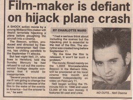
In September 2001, the World Trade Centre attacks spookily echoed a scene I had shot a month earlier in which a plane full of terrorists crashed into a cinema. On September 26th I wrote: “A couple of people have asked me if I’m going to make any changes to The Beacon or delay its release in the wake of the events in America. The answer is no.” I regretted being so blunt when this quote made it into local papers under the headline: “Film-maker is defiant on hijack plane crash”.

The Beacon’s blog ran for sixteen months, the most entertaining posts being those that displayed my lack of concern for safety, or our efforts to avoid the Malvern Hills Conservators, who threatened to shut down the shoot. August 9th 2001’s entry, on the second day of shooting the car chase, had drama from both of these angles.

The Soul Searcher website

On March 27th 2002, a few months before The Beacon’s blog fizzled out, the website and production journal for my next feature were launched. Soul Searcher‘s journal followed the reporting style of The Beacon’s, with the same surreal humour, though this time with increasingly frequent Back to the Future quotes, for no good reason. Often I was deliberately playing to the audience of cast and crew who I knew were avid readers.

This journal ran for four years, ending on the day Soul Searcher was released on DVD in the UK. Along the way, every up and down of the production was documented. And believe me, there were many downs. I saw no reason to conceal the problems we faced; I realised that the struggles were entertaining. I still bump into people today who enjoyed and were inspired by my Soul Searcher blog back in the mid-noughties.

Some of the best Soul Searcher posts were:

My next blog covered my attempts to develop and finance another feature, The Dark Side of the Earth. “What the hell is the matter with me? I’m back for more punishment,” is how I began my first entry, on October 14th 2005.

Benedict Cumberbatch as Max
Benedict Cumberbatch as Max in The Dark Side of the Earth’s pilot

(Shortly afterwards, concurrently, I began publishing the paper-and-ink journal I’d kept for the original, amateur version of The Dark Side of the Earth, each entry being posted exactly a decade after it had been written. Yes, I had a blogging impulse before I even knew what blogging or the internet were. Read this teenage journal and my contemporary annotations here.)

By this time my blogging style was maturing, and I was learning to hold back some of the bad news in case potential producers or investors were reading. This perhaps led to a wider appeal, evidenced by Film & Festivals Magazine publishing an abridged version of my Dark Side journal in September 2009.

Although I shot a 35mm pilot starring Benedict Cumberbatch – read my posts about the stressful shoot here and here – it slowly became clear that The Dark Side of the Earth was going nowhere, and by 2011 my posts were rarely about the project.

What’s more, times had changed. Back in 2001 a lot of people had never even heard the term “blog”. A decade later, blogging had exploded, and it had evolved into more of a magazine format. No longer could you get away with simply reporting your progress on a project. Now readers demanded tips, interviews, videos, image galleries, tutorials. I realised it was time to start a new site, one that would be about me sharing my filmmaking knowledge and experiences.

NeilOseman.com launched on August 5th 2011, and quickly became a much richer and diverse blog than any of my previous ones. Tying in with my gradual retreat from self-originated and self-directed projects, cinematography became the main focus of the site, though other aspects of filmmaking continue to be covered. Here are some of my favourite posts from the last four years:

Here’s to the next thousand posts! And for those of you looking to learn more about the art of waffling on a website, I’ll be posting my top blogging tips in the next few weeks.

1,000th Blog Post

Top Tips from Day One of the Big League Cine Summit 2015

blcs-blue-on-whiteThis week the third annual Big League Cine Summit is taking place: two days of online masterclasses with top commercial, TV and feature film cinematographers. If you missed this educational and inspirational free event, here are the best tips I culled from day one’s sessions:

Frankie DeMarco – “Composition and Camera Operating for the Big Screen”

  • The advantage for a DP of working with a separate camera op is that you have a second opinion.
  • Try to think like an editor. What specific shots do you need to tell the story? Can you do it in a “oner”?
  • Lots of angles/coverage can kill performances and make the audience overly aware of the camera.
  • If you need to shift position for comfort, do it during a part of the take that the editor is unlikely to use.
  • You can sometimes get away with crossing the line if your singles are dirty.
  • Use clean singles to show that characters are not connecting with each other.
  • Single point perspective, a.k.a. formal composition (framing the subject centrally) can be very powerful.
  • Lighting for silhouette can make a simple moment highly evocative.
  • The best composition reflects character relationships, perhaps using layers and depth.
  • Good composition should draw the eye to the right part of the screen and not distract the audience.
  • Good cinematography should tap into the emotion of the scene and the character whose eyes we’re seeing it through.
  • When watching the blocking, think about the emotions. Let the scene tell you how it should be shot.
  • Let the lens talk to you. Try watching the blocking through different lenses and see what feels right.
  • A great static frame that the actor can move around in trumps panning around with the actor.
  • Use a dolly-in for an emotional moment, but a zoom-in to show a character having a thought or idea.
  • Check out Stanley Kubrick and William Friedkin films to see excellent use of zooms.
  • Use a long lens to disconnect your subject from their surroundings.
  • Play the first take safe, and then you can try tagging hand-props or pulling focus to background characters on later takes.
  • “When in doubt, turn it out.” i.e. beware of over-lighting!
  • Don’t be afraid of changing f-stops from angle to angle to maintain a consistent softness of background when your background is different distances away from different subjects.
  • Don’t worry about continuity too much. “The set is made of rubber.”
  • Try unusual compositions. Be willing to fail.

Kevin Shahinian – “Story Telling Techniques: Adding Massive Production Value”

  • In high-end events shooting, try to get the organisers to pick rooms that will work for sun orientation.
  • Use a long lens to create a potentially unsettling sense of voyeurism.
  • To build tension and unsettle the audience, short-side your subject and show lots of empty background.
  • In an over-the-shoulder shot, add power to the foreground character by having them dominate the frame.
  • With non-actors, shoot candid footage; you may capture genuinely great moments. Use action verbs to direct them, rather than talking in terms of emotions.

Rasmus Heise – “Extraordinary Cinematography with Minimal Lighting”

  • Design lighting that works from all directions, to minimise set-up times.
  • Use more than one colour to add depth.
  • Dot practicals around where possible, to give you sources that will work for different angles.
  • Focus on one key light source in a scene. Everything else is just a bonus.
  • Fluorescent tubes and sodium vapour lamps can be great low budget, low wattage solutions.
  • Philips makes fluorescent tubes with high CRI.
  • Wet down your exterior sets to add contrast and nice reflections.
  • Silhouette shots are quick, cheap and look great.

Matthew Santo – “Commercial Lighting: How to Light Fashion vs. Action”

  • Photographing commercials is all about heightened reality, perfect sunsets, perfect skin, etc.
  • It requires a lot of passive lighting: bounce cards, negative fill, contrast control.
  • On beauty and fashion commercials:
    • Your background can set a darker mood even if the talent has to be lit flatly for beauty.
    • Know your talent’s face in advance – e.g. do they have soft or hard features? Deep-set eyes?
    • What side is the talent’s hair parted on? This could affect your decision on which side to key from.
    • Try to make sure the make-up room’s lighting matches the colour of your lighting on set, so the MUA doesn’t get any nasty surprises on set.
    • Use Briese lights for beauty. They have hard- and softlight qualities.
    • Chimeras may be better for talent with less defined features.
    • Reduce skin texture by pushing fill through large frames or bounce, e.g. 12×12 frames.
    • Hard backlight looks great but beware of fly-away hair.
    • Combine hard and soft sources for backlight that has punch but wraps and doesn’t create shadow issues.
    • There’s a range of Cosmetic lighting gels that add a little warmth and diffusion.
    • Use a low overall light level for talent comfort and less squinting!
  • On sport and action commercials:
    • It’s about movement and body definition. Backlight and sidelight are most important.
    • Edgelight defines the talent’s body shape. Toplight adds muscle definition.
    • Lens flares add dynamism but reduce contrast, so light high-key.
    • Use higher light levels for highspeed shooting and to maintain focus as people move.

Stefan V. Borbely – “Deconstructing High End Car Commercials”

  • Rather than lighting the car, light the environment and the car will reflect that environment.
  • For exteriors, wait for dramatic skies because the car will reflect these.
  • Silver cars are the easiest to light.
  • Use long fluorescent tubes or long reflectors to make seamless long highlights on the bodywork.
  • Use Cinema 4D to test your lighting set-ups for reflections.
  • For night exteriors, take stills on the recce and note your exposure settings.
  • Bagolights are great for creating streaks of light on cars.
  • Fisherlights are a good substitute for the sky.
  • If you can’t afford Fisherlights overhead, put lamps on the floor and shoot them up into big polyboards.
  • Schedule your exterior shots for sunrise and sunset, and shoot inside the car in the middle of the day.

There is still time to get free access to the summit at bigleaguecinesummit.com Stay tuned to neiloseman.com for top tips from day two.


Top Tips from Day One of the Big League Cine Summit 2015

Women On Film: Characters or Glorified Props?

The cast of Your Highness
Last year I was offered the chance to direct pick-ups and reshoots for a low-budget feature. I watched the existing rough cut and it was utterly, unsalvageably awful. One of the key investors, however, had a list of suggestions to “improve” it. Amongst them – prefaced with the line, “Sex sells. Always has. Always will.” – was an entreaty for some gratuitous female nudity.

He would not have been the first person to try to save a bad movie with T&A.

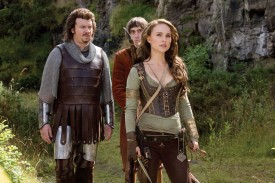
Take the puerile 2011 “comedy” Your Highness. Already steeped in misogyny – the villain plans to rape Zooey Deschanel so that she’ll conceive some kind of demon, a plan which the script treats as more comedic than abhorrent – the film reduces Natalie Portman’s warrior to eye candy with a needless thong scene. Inevitably this scene figures prominently in the trailer.

Kate Beckinsale in Whiteout

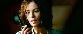
Or 2009’s Whiteout, starring Kate Beckinsale as a US Marshall stationed at a research base in Antarctica. How is her character introduced? Setting up her deductive powers as she solves a case? Establishing her authority as she defuses a tense situation? Demonstrating her physical prowess as she chases down a suspect? No. She strips off and takes a shower, and the camera gets a close-up of her bum. For no reason whatsoever. Whiteout is immediately ruined because the audience has been told that the lead character is only there to be ogled. Presumably director Dominic Sena misguidedly thought that a little skin would improve the appeal of a film that’s uniformly inept, from the production design – a British character decorating his room with a huge Union Jack, seriously? – to the script, revealing its tedious backstory through clumsy flashbacks. (Even more depressingly, I’ve just read on Wikipedia that the graphic novel the film is based on had two female leads, but one was changed to a man for the film because the studio thought that would increase the audience.)

There are of course many, many more examples both in cinema – like the inexplicable Alice Eve underwear shot in Star Trek Into Darkness – and in the wider media, as evidenced by this brief but telling montage.

There will be some men reading who think gratuitous female nudity is harmless, even a good thing, but here are just a few reasons why it’s not:

  1. It’s a signpost that your film is bad, and you know it is.
  2. It undermines your female characters, weakening your story and the level of emotional engagement an audience will give to it.
  3. Your actress is a human being. How does she feel about it? What about the countless websites that will inevitably take the scene out of context and present it for male gratification?
  4. It perpetuates the objectification of women and misogyny in general, both huge problems in our culture today.
  5. It contributes, I strongly suspect, to the dearth of women behind the camera, by portraying them as glorified props rather than valuable contributors to the filmmaking process.

If writers spent more time on crafting good characters, particularly good female characters, they wouldn’t need gratuitous T&A or any other spurious fixes. Stronger female characters are starting to appear in cinemas, but often they’re far from ideal. This article from Dissolve questions the quality of some of the superficially strong female characters in recent blockbusters. Putting a woman in an action role just so she can wear a skin-tight costume and demonstrate her physical flexibility is not equality. There’s a long way to go yet.

Joss Whedon, creator of Buffy the Vampire Slayer and director of the Avengers movies, has some excellent and impassioned stuff to say on this subject. I’ll leave him with the closing words.

Women On Film: Characters or Glorified Props?

2015: The Future on Film

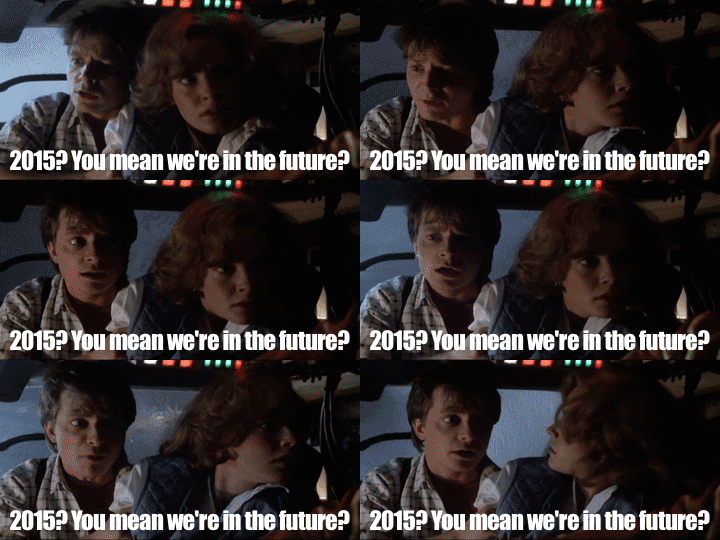
BTTF2-2015We’ve finally caught up with Doc Brown and his flying DeLorean, and arrived in 2015. (Alright, technically we haven’t caught up with him until October 21st, but go with me here.) Inevitably this has led to a number of articles comparing the 2015 of Back to the Future Part II with the reality of today’s world. While this is fun, it misses the point.

It’s not the job of sci-fi filmmakers to predict the future, just as it’s not the job of period filmmakers to present the past with slavish accuracy. It’s the filmmaker’s job to present an environment that is believable within the context of the story, and, crucially, that is thematically appropriate for the story.

The low-tech FX behind those self-lacing Nikes

The Back to the Future films are comedies first and foremost, so they made the future fun. Writer-producer Bob Gale realised that he would fail if he genuinely tried to predict the future. “We decided that the only way to deal with it was to make it optimistic, and have a good time with it,” he says in the official behind-the-scenes book of the trilogy.

Production designer Rick Carter notes how the optimistic 2015 mirrors the rose-tinted 1955 portrayed in the first film. “In Part I the 1955 square had a beautiful, grassy park. In the ’80s it was paved over for a parking lot, and in 2015, once again, we have this serene park and pond – with 75 shops underneath.”

"Don't talk to anyone, don't touch anything, don't do anything, don't interact with anyone and try not to look at anything."
“Don’t talk to anyone, don’t touch anything, don’t do anything, don’t interact with anyone and try not to look at anything.”

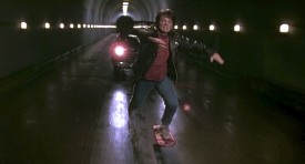
Flying cars and hoverboards don’t exist in the real 2015, but if they hadn’t in BTTF’s fictional 2015 then we would have been denied the brilliant tunnel sequence at the climax of Part II. (“Manure, I hate manure.”) It was important to the story that the future was different from 1985, that skateboards and cars had leapt forward so that sequences from Part I could be revisited with a futuristic twist, rather than simply being repeated with ground-based skateboards and cars.

Back the Future Tunnel2
That car won’t be so shiny in a minute.

“We just modified ordinary, everyday conveniences,” Gale continues. Kids watched too much TV in the ’80s, so he envisaged a future in which this was taken to a ridiculous extreme, with kids wearing their TVs as glasses. Microwave meals had begun to compete with home cooking, so Gale invented another leap forward with the pizza-inflating food hydrator. As is inevitable and right, yesterday’s vision of tomorrow tells us more about yesterday than tomorrow.

In the end, it’s not 2015 that looks ridiculous to the modern BTTF viewer, it’s the ’80s. 1985 is portrayed bleakly throughout the trilogy, with its rundown Hill Valley square, its Libyan terrorists, its graffitied high school, the materialistic fawning over shiny black Toyotas, and the decadence and corruption of the “Biff-horrific” 1985 seen in Part II. Explaining why he built the time machine, Doc Brown soliloquizes: “The intent here is to gain a clear perception of humanity, where we’ve been, where we’re going, the pitfalls, the possibilities, the perils and the promise.” The filmmakers clearly believed that the ’80s were a pitfall, but the future had promise. And that optimism is still as appealing today as it was in 1989.

Plus flying DeLoreans are cool.

"Flying DeLorean? Haven't seen one of those in… 30 years."
“Flying DeLorean? Haven’t seen one of those in… 30 years.”
2015: The Future on Film

Ten Productive Ways to Fill a Lean January

Don't just sit around waiting for the giant, forced perspective phone to ring.
Don’t just sit around waiting for the giant, forced perspective phone to ring.

January is often a lean time for film freelancers. The powers that be have not recovered from Christmas sufficiently to commission any new work, the budget for the financial year is almost spent, and the weather and short hours of daylight make shooting difficult and unpleasant.

So when you’ve had enough of eating the Christmas leftovers, and watching TV box-sets, how can you gainfully fill your time? Here are some suggestions.

  1. Do your taxes. Really, you can’t put them off any longer.
  2. Update your showreel. Chase up producers for clips and get editing, so you can show your latest and greatest to the world and line up some sweet work for 2015. Don’t forget to add your latest credits to your CV as well, and update your website.
  3. Go through the job sites – Shooting People, Mandy, Talent Circle etc. – and  write some applications. Even if there’s nothing quite up your street, why not stretch yourself and apply for something a little different? If nothing else, it’s good practice.
  4. Attend events, workshops and talks to broaden your knowledge and network. Did you know, for example, that there’s a free cinematography masterclass on in Birmingham on the 31st?
  5. Learn more about your craft by reading books on the subject. (I recently posted a list of my favourite “making of” movie books.)
  6. Go to galleries and see relevant work – a cinematographer might want to look at the use of light in classic paintings; a costume designer might want to check out an exhibition of period fashions, and so on.
  7. Go to the cinema! There are several great films out at the moment, including The Imitation Game, The Theory of Everything and Birdman.
  8. Perform essential maintenance on your equipment. Fix those niggly things that you’ve put up with for the last few months while you’ve been busy, top up your consumables, and order those cheap accessories from Hong Kong now while you can afford to wait weeks for them to arrive.
  9. Do a personal project: make a micro-short, write a script, take some photos. It’ll help keep your skills sharp and could help you get work.
  10. Do something entirely unrelated to filmmaking. Such things exist. Apparently.
Ten Productive Ways to Fill a Lean January