5 Principles of Cinematography We Can Learn from Turner

Yesterday I took a trip to The Tate Britain to see what I could learn about light and composition from the world of traditional art. My background is more technical than fine art, so this world is quite new to me. Within quarter of an hour of arriving, I had fallen in love with the work of JMW Turner. The way this man captured the natural moods of light and weather is breathtaking.

Here are five of Turner’s techniques for creating beautiful images which we can apply to cinematography.


1. Negative space

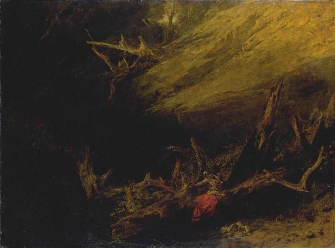
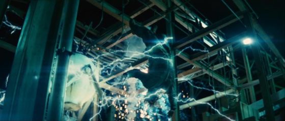
One of the most powerful things you can do with an area of the frame is to let it go black. A great example is Bill Pope’s work on The Matrix. But 200 years before that, Turner was embracing the darkness, emphasising those areas in the light, and allowing the viewer’s imagination to fill in the gaps.

“Jason” (1802) – That dragon is lurking in the shadows like a dodgy monster costume in a B-movie.
“Sketch of a Bank, with Gipsies” (1809) – The titular gypsies are barely visible in the black shadows, betrayed only by the smoke from their fire.


2. Layering

Any artist creating a 2D image strives to give the impression of depth and dimensionality. There are a number of techniques that can be used to achieve this, but one which Turner uses repeatedly is layering. See how the paintings below delineate foreground (light), midground (dark) and background (light again). The midgrounds sink into shadow, becoming negative space, reinforcing the link and relationship between the foregrounds and backgrounds. At the same time, the foreground figures stand out clearly and eye-catchingly against the shade behind them.

“The Tenth Plague of Egypt” (1802)
“The Goddess of Discord Choosing the Apple of Contention in the Garden of the Hesperides” (1806) – This painting contains five layers: light-dark-light-dark-light, highlighting the two groups of people and the monster in the distance.


3. Framing

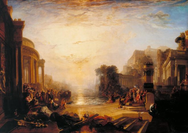
Although most images we see are framed, be it by a gilt picture frame or by the black edges of a phone screen, there is something aesthetically pleasing about adding a second frame within the image itself. An extreme example would be shooting through a window, framing the image on all four sides, but more commonly we frame two or three sides of the image. Turner frequently does this using trees, buildings and shadowy ground.

“The Decline of the Carthaginian Empire” (1817) – A backwards-‘J’-shaped frame is created by the dark foreground: the wall on the left, the shadowed floor across the bottom, and the dark space in the lower right. To balance the shorter part of the ‘J’ on the righthand side, the sun and its reflection (the focal point of the image) are placed left of centre.
“England: Richmond Hill, on the Prince Regent’s Birthday” (1819) – The dark ground and dark tree to the right create a backwards-L-shaped frame which appears to cradle the rest of the image like a waiter cradling plates in the crook of his elbow.


4. Dynamic Composition

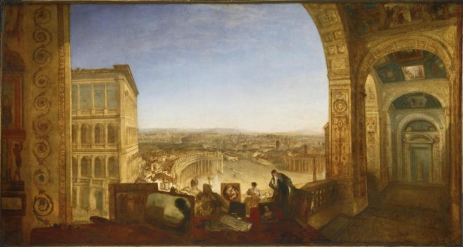
The composition of the two paintings below fascinates me. Both seem to be two images in one: a deep view of a settlement on the left, and a tapering tunnel perspective on the right. As I studied them, I found my eyes “panning” from one side to the other. As cinematographers, we can use actual camera movement to create a dynamic shot, but we should not forget Turner’s lesson here, that there can also be dynamism in static frames.

“Rome, from the Vatican. Raffaelle, Accompanied by La Fornarina, Preparing his Pictures for the Decoration of the Loggia” (1820)
“Palestrina – Composition” (1828)


5. Colour Contrast

Apart from stunningly demonstrating Turner’s power to create mood and atmosphere (a core skill for any DP), the two paintings below are great examples of warm/cool colour contrast. The yellows, oranges and reds of fire and sunset are juxtaposed with the blues of the sky. The result is pictures that really “pop”, arresting the viewer’s attention. A modern cinematographer can readily achieve a similar effect by playing natural daylight, and daylight sources like HMIs and Kinos, against practicals and other tungsten sources.

“Peace – Burial at Sea” (1842) – Contrast in both hue and luminance make this a powerfully evocative painting.
“War. The Exile and the Rock Limpet” (1842) – Note how Napoleon’s blue uniform causes him to stand out against the oranges of the sky, whilst the unimportant, red-garbed soldier behind him is allowed to blend into the background.

 
See also: my trip to the National Portrait Gallery.

5 Principles of Cinematography We Can Learn from Turner

9 Fun Photic Facts from a 70-year-old Book

Shortly before Christmas, while browsing the secondhand books in the corner of an obscure Herefordshire garden centre, I came across a small blue hardback called The Tricks of Light and Colour by Herbert McKay. Published in 1947, the book covered almost every aspect of light you could think of, from the inverse square law to camouflage and optical illusions. What self-respecting bibliophile cinematographer could pass that up?

Here are some quite-interesting things about light which the book describes…


1. SPHERES ARE THE KEY to understandING the inverse square law.

Any cinematographer worth their salt will know that doubling a subject’s distance from a lamp will quarter their brightness; tripling their distance will cut their brightness to a ninth; and so on.  This, of course, is the inverse square law. If you struggle to visualise this law and why it works the way it does, The Tricks of Light and Colour offers a good explanation.

[Think] of light being radiated from… a mere point. Light and heat are radiated in straight lines and in all directions [from this point]. At a distance of one foot from the glowing centre the whole quantity of light and heat is spread out over the surface of a sphere with a radius of one foot. At a distance of two feet from the centre it is spread over the surface of a sphere of radius two feet. Now to find an area we multiply two lengths; in the case of a sphere both lengths are the radius of the sphere. As both lengths are doubled the area is four times as great… We have the same amounts of light and heat spread over a sphere four times as great, and so the illumination and heating effect are reduced to a quarter as great.


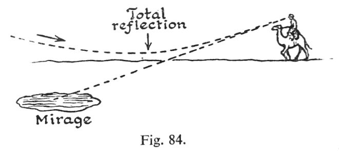
2. MIRAGES ARE DUE TO Total internal reflection.

This is one of the things I dimly remember being taught in school, which this book has considerably refreshed me on. When light travels from one transparent substance to another, less dense, transparent substance, it bends towards the surface. This is called refraction, and it’s the reason that, for example, streams look shallower than they really are, when viewed from the bank. If the first substance is very dense, or the light ray is approaching the surface at a glancing angle, the ray might not escape at all, instead bouncing back down. This is called total internal reflection, and it’s the science behind mirages.

The heated sand heats the air above it, and so we get an inversion of the density gradient: low density along the heated surface, higher density in the cooler air above. Light rays are turned down, and then up, so that the scorched and weary traveller sees an image of the sky, and the images looks like a pool of cool water on the face of the desert.
 

3. Pinhole images pop up in unexpected places.

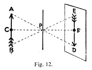
Most of us have made a pinhole camera at some point in our childhood, creating an upside-down image on a tissue paper screen by admitting light rays through a tiny opening. Make the opening bigger and the image becomes a blur, unless you have a lens to focus the light, as in a “proper” camera or indeed our eyes. But the pinhole imaging effect can occur naturally too. I’ve sometimes lain in bed in the morning, watching images of passing traffic or flapping laundry on a line projected onto my bedroom ceiling through the little gap where the curtains meet at the top. McKay describes another example:

One of the prettiest examples of the effect may be seen under trees when the sun shines brightly. The ground beneath a tree may be dappled with circles of light, some of them quite bright… When we look up through the leaves towards the sun we may see the origin of the circles of light. We can see points of light where the sun shines through small gaps between the leaves. Each of these gaps acts in the same way as a pinhole: it lets through rays from the sun which produce an image of the sun on the ground below.
 

4. The sun isn’t a point source.

“Shadows are exciting,” McKay enthuses as he opens chapter VI. They certainly are to a cinematographer. And this cinematographer was excited to learn something about the sun and its shadow which is really quite obvious, but I had never considered before.

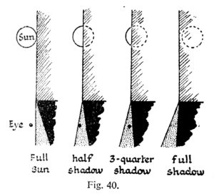
Look at the shadow of a wall. Near the base, where the shadow begins, the edge of the shadow is straight and sharp… Farther out, the edge of the shadow gets more and more fuzzy… The reason lies of course in the great sun itself. The sun is not a mere point of light, but a globe of considerable angular width.

The accompanying illustration shows how you would see all, part or none of the sun if you stood in a slightly different position relative to the hypothetical wall. The area where none of the sun is visible is of course in full shadow (umbra), and the area where the sun is partially visible is the fuzzy penumbra (the “almost shadow”).
  

5. Gravity bends LIGHT.

Einstein hypothesised that gravity could bend light rays, and observations during solar eclipses proved him right. Stars near to the eclipsed sun were seen to be slightly out of place, due to the huge gravitational attraction of the sun.

The effect is very small; it is too small to be observed when the rays pass a comparatively small body like the moon. We need a body like the sun, at whose surface gravity is 160 or 170 times as great as at the surface of the moon, to give an observable deviation…. The amount of shift depends on the apparent nearness of a star to the sun, that is, the closeness with which the rays of light from the star graze the sun. The effect of gravity fades out rapidly, according to the inverse square law, so that it is only near the sun that the effects can be observed.


6. Light helped us discover helium.

Sodium street-lamps are not the most pleasant of sources, because hot sodium vapour emits light in only two wave-lengths, rather than a continuous spectrum. Interestingly, cooler sodium vapour absorbs the same two wave-lengths. The same is true of other elements: they  emit certain wave-lengths when very hot, and absorb the same wave-lengths when less hot. This little bit of science led to a major discovery.

The sun is an extremely hot body surrounded by an atmosphere of less highly heated vapours. White light from the sun’s surfaces passes through these heated vapours before it reaches us; many wave-lengths are absorbed by the sun’s atmosphere, and there is a dark line in the spectrum for each wave-length that has been absorbed. The thrilling thing is that these dark lines tell us which elements are present in the sun’s atmosphere. It turned out that the lines in the sun’s spectrum represented elements already known on the earth, except for one small group of lines which were ascribed to a hitherto undetected element. This element was called helium (from helios, the sun).


7. Moonlight is slightly too dim for colours.

Our retinas are populated by two different types of photoreceptors: rods and cones. Rods are much more sensitive than cones, and enable us to see in very dim light once they’ve had some time to adjust. But rods cannot see colours. This is why our vision is almost monochrome in dark conditions, even under the light of a full moon… though only just…

The light of the full moon is just about the threshold, as we say, of colour vision; a little lighter and we should see colours.


8. MAGIC HOUR can be longer than an hour.

We cinematographers often think of magic “hour” as being much shorter than an hour. When prepping for a dusk-for-night scene on The Little Mermaid, I used my light meter to measure the length of shootable twilight. The result was 20 minutes; after that, the light was too dim for our Alexas at 800 ISO and our Cooke S4 glass at T2. But how long after sunset is it until there is literally no light left from the sun, regardless of how sensitive your camera is? McKay has this to say…

Twilight is partly explained as an effect of diffusion. When the sun is below the horizon it still illuminates particles of dust and moisture in the air. Some of the scattered light is thrown down to the earth’s surface… Twilight ends when the sun is 17° or 18° below the horizon. At the equator [for example] the sun sinks vertically at the equinoxes, 15° per hour; so it sinks 17° in 1 hour 8 minutes.


9. Why isn’t Green a primary colour in paint?

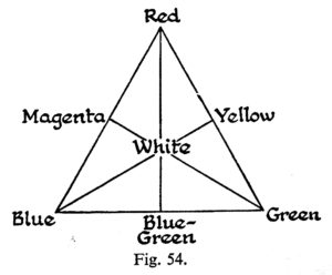
And finally, the answer to something that bugged me during my childhood. When I was a small child, daubing crude paintings of stick figures under cheerful suns, I was taught that the primary colours are red, blue and yellow. Later I learnt that the true primary colours, the additive colours of light, are red, blue and green. So why is it that green, a colour that cannot be created by mixing two other colours of light, can be created by mixing blue and yellow paints?

When white light falls on a blue pigment, the pigment absorbs reds and yellows; it reflects blue and also some green. A yellow pigment absorbs blue and violet; it reflects yellow, and also some red and green which are the colours nearest to it in the spectrum. When the two pigments are mixed it may be seen that all the colours are absorbed by one or other of the components except green.
 

If you’re interested in picking up a copy of The Tricks of Light and Colour yourself, there is one on Amazon at the time of writing, but it will set you back £35. Note that Herbert McKay is not to be confused with Herbert C. McKay, an American author who was writing books about stereoscopic photography at around the same time.

9 Fun Photic Facts from a 70-year-old Book

7 Female DPs You Didn’t Know You’ve Been Watching

We’ve all heard the shocking statistics about the tiny proportion of DPs who are women. So when you watch film and TV, sadly, you might assume that you’re always watching the cinematography of a man. Today’s post encourages you to think again.

To mark International Women’s Day, I’m highlighting the work of seven female DPs who are lensing mainstream productions, and whose cinematography you’ve probably seen. All of these women are great role models for aspiring DPs.


Sharon Calahan, ASC


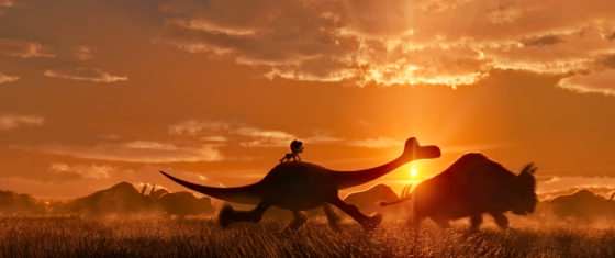
Raised in the USA’s Pacific Northwest, Calahan studied advertising art, illustration, and graphic design. Her first job was at a TV station, where she worked as an art director but also got involved in lighting sets. She joined Pixar just as the company was starting out, becoming the lighting supervisor on Toy Story, before graduating to director of photography for A Bug’s Life, Toy Story 2 and Finding Nemo. In 2014, Calahan became the first DP working purely in CGI to be admitted into the American Society of Cinematographers. By this time, her extensive experience of studying and mimicking natural light had led her to take up landscape painting, and for Pixar’s next release, The Good Dinosaur, director Peter Sohn used Calahan’s landscapes as the visual template for the entire look.


Anna Foerster, ASC


A German cinematographer and director, Foerster is perhaps best known for her collaborations with her fellow countryman Roland Emmerich. After working as an FX unit DP for him on Independence Day and Godzilla (1998), then second unit DP and director on Tomorrow and 10,000 BC, she graduated to first unit DP on Anonymous and White House Down. Anonymous is an independent historical thriller suggesting Shakespeare’s plays were actually written by Lord Oxford, while White House Down is of course an all-out action thriller. On the latter, Foerster came up with a number of clever tricks to hide the lighting units from the wide lenses she favoured. She also worked hard to sell the sound-stages that most of the movie was shot on as real day-lit interior and exterior locations. Foerster’s directing credits include Underworld: Blood Wars, and episodes of Outlander and Criminal Minds.


Sue Gibson, BSC

Derbyshire-born Gibson developed an interest in photography at the age of fourteen. She studied at Newport College of Art, then at the National Film and Television School (NFTS), graduating in 1981. After starting out in commercials, she shot her first feature, Hear My Song, in 1989, which won The Evening Standard Award for Technical Achievement. Her other feature credits include Mrs Dalloway and – in a very different genre – second unit on Alien vs. Predator. She worked extensively in British TV, particularly murder mystery, lensing episodes of Poirot, Marple, LewisSpooks and The Forsyte Saga. In 1992 Gibson became the first female member of the British Society of Cinematographers, and later served as its president between 2008-2010. She passed away last summer, and was posthumously awarded The Philips Vari-Lite Award for Drama at The Knight of Illuminations Awards for two of her Death in Paradise episodes, her final work.


Ellen Kuras, ASC

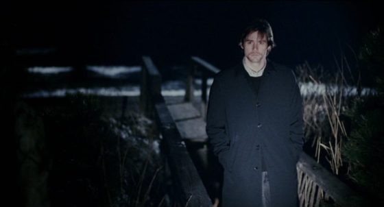
Born in New Jersey, Kuras studied photography and 8mm filmmaking after university, with a view to becoming a documentary filmmaker. After lensing the award-winning short doc Samsara: Death and Rebirth in Cambodia, her career diversified to eventually include such big-budget features as Blow and Analyze That. Kuras has also collaborated twice with French director Michel Gondry. In Eternal Sunshine of the Spotless Mind, she used her documentary background to put the realism into Gondry’s magical realism, with handheld cameras and naturalistic lighting. But she brought the magic too; for example, using a camera-mounted spotlight for a tunnel vision effect during the sequence in which Jim Carey and Kate Winslet try to hide within Carey’s memory. Although more classically composed, 2008’s Be Kind Rewind was similarly creative, featuring low-fi VHS recreations of big movies, and a memorable montage captured in a single developing shot. Kuras’ many awards include an unprecedented hat-trick of Best Dramatic Cinematography gongs at Sundance, and an Oscar nomination for The Betrayal – Nerakhoon, a documentary feature she directed.


Suzie Lavelle, ISC

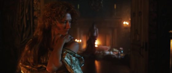
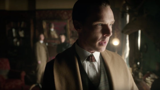
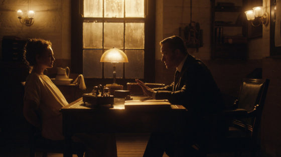
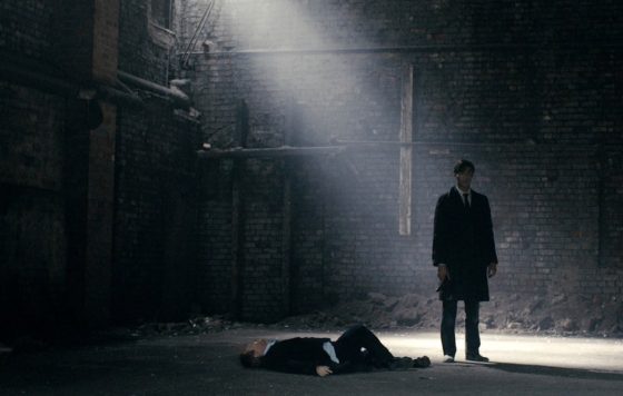
Lavelle is an Irish DP who studied at NFTS before entering the TV industry as an AC. Her sumptuous, colourful and contrasty lighting has featured in some of the BBC’s most high-profile TV dramas. “The Abominable Bride”, her Sherlock outing, was nominated for a Primetime Emmy in 2016. “Cold War”, her contribution to Doctor Who‘s 2013 season, is one of the best-looking and most atmospheric episodes the venerable series has ever produced.  And, along with James Mather, she swept away the dull photography of Ripper Street‘s first two seasons and established the much moodier style for season three that would continue for the rest of the show’s run. Lavelle’s other TV credits include VikingsThe Living and the Dead, Endeavour and Jekyll & Hyde, and she photographed the award-winning features One Hundred Mornings and The Other Side of Sleep.


Urszula Pontikos, BSC

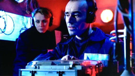
Hailing from Gdynia in Poland, Pontikos has photographed a number of indie features, including Weekend, Second Coming and Lilting. The latter won her the Cinematography Award for World Cinema (Dramatic) at Sundance 2014, but she’s also shot some of the most interesting British TV shows of recent years. Despite a self-confessed nervousness about the scale of the show’s night exteriors, Pontikos delivered confident, slick and atmospheric cinematography for BBC 1’s Cold War spy thriller The Game in 2014. The following year she photographed the first two episodes of Humans, setting the style for this hugely popular C4 sci-fi drama. She employed unusual eye-lights, symmetrical composition and linear camera moves for scenes featuring the robotic “synths”. Her other TV credits include the crime dramas Glue for E4 and Marcella for ITV.


Mandy Walker, ACS, ASC

Born and raised in Melbourne, Walker got her first industry contacts from a short film course she took after graduation. Persistently calling these contacts yielded some unpaid work and her first feature at the age of just 25. More Aussie features followed, until a Chanel Nº 5 commercial with Baz Luhrmann and Nicole Kidman propelled Walker into the big-time with an epic drama, entitled – of course – Australia. Since then, Walker has lensed the likes of Natalie Portman (Jane Got a Gun) and Robert Redford (Truth). Her latest release is Hidden Figures, an inspiring and important drama about African-American women who worked on Nasa’s space programme. Walker used subtle techniques to enhance the themes of racism and sexism, like placing the camera below the heroine’s eye-lines so that they were always looking up at the white men. Hidden Figures is in cinemas across the UK right now, and I highly recommend it.


That’s all for now, but some other great DPs to check out are Charlotte Bruus Christensen (The Girl on the Train), Uta Briesewitz, ASC (The Wire) and Cynthia Pusheck, ASC (Magnolia).

7 Female DPs You Didn’t Know You’ve Been Watching