Last week I discussed the technical and creative decisions that went into the camerawork of The Knowledge, a fake game show for an art installation conceived by Ian Wolter and directed by Jonnie Howard. This week I’ll break down the choices and challenges involved in lighting the film.
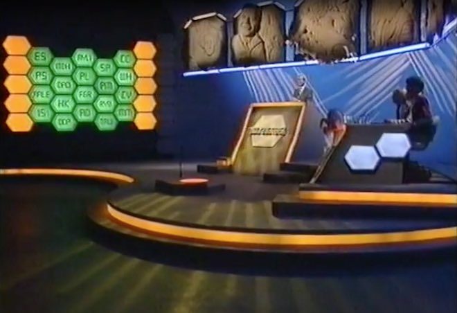
The eighties quiz shows which I looked at during prep were all lit with the dullest, flattest light imaginable. It was only when I moved forward to the nineties shows which Jonnie and I grew up on, like Blockbusters and The Generation Game, that I started to see some creativity in the lighting design: strip-lights and glowing panels in the sets, spotlights and gobos on the backgrounds, and moodier lighting states for quick-fire rounds.
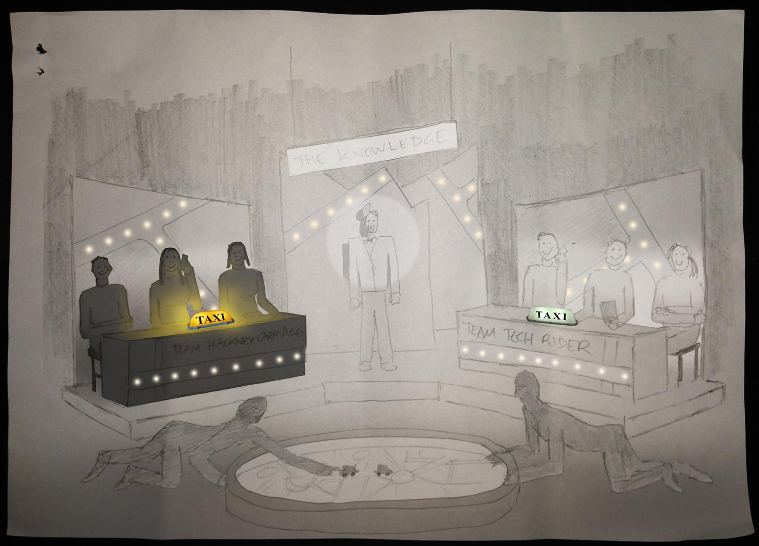
Jonnie and I both wanted TheKnowledge‘s lightingto be closer to this nineties look. He was keen to give each team a glowing taxi sign on their desks, which would be the only source of illumination on the contestants at certain moments. Designer Amanda Stekly and I came up with plans for additional practicals – ultimately LED string-lights – that would follow the map-like lines in the set’s back walls.
Once the set design had been finalised, I did my own dodgy pencil sketch and Photoshopped it to create two different lighting previsualisations for Jonnie.
He felt that these were a little too sophisticated, so after some discussion I produced a revised previz…
…and a secondary version showing a lighting state with one team in shadow.
These were approved, so now it was a case of turning those images into reality.
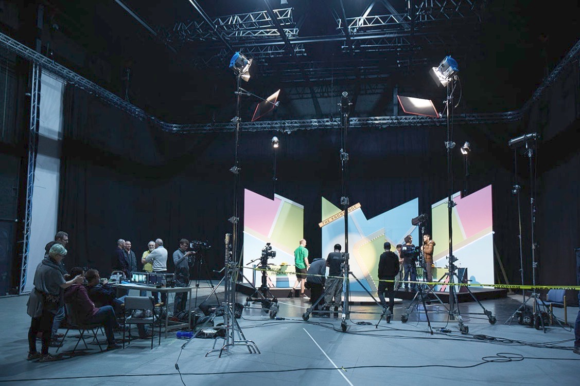
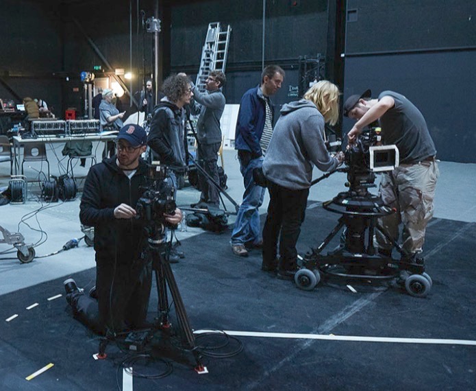
We were shooting on a soundstage, but for budget reasons we opted not to use the lighting grid. I must admit that this worried me for a little while. The key-light needed to come from the front, contrary to normal principles of good cinematography, but very much in keeping with how TV game shows are lit. I was concerned that the light stands and the cameras would get in each others’ way, but my gaffer Ben Millar assured me it could be done, and of course he was right.
Ben ordered several five-section Strato Safe stands (or Fuck-offs as they’re charmingly known). These were so high that, even when placed far enough back to leave room for the cameras, we could get the 45° key angle which we needed in order to avoid seeing the contestants’ shadows on the back walls. (A steep key like this is sometimes known as a butterfly key, for the shape of the shadow which the subject’s nose casts on their upper lip.) Using the barn doors, and double nets on friction arms in front of the lamp-heads, Ben feathered the key-light to hit as little as possible of the back walls and the fronts of the desks. As well as giving the light some shape, this prevented the practical LEDs from getting washed out.
Note the nets mounted below the key-lights (the tallest ones). Photo: Laura Radford
Once those key-lights were established (a 5K fresnel for each team), we set a 2K backlight for each team as well. These were immediately behind the set, their stands wrapped in duvetyne, and the necks well and truly broken to give a very toppy backlight. A third 2K was placed between the staggered central panels of the set, spilling a streak of light out through the gap from which host Robert Jezek would emerge.
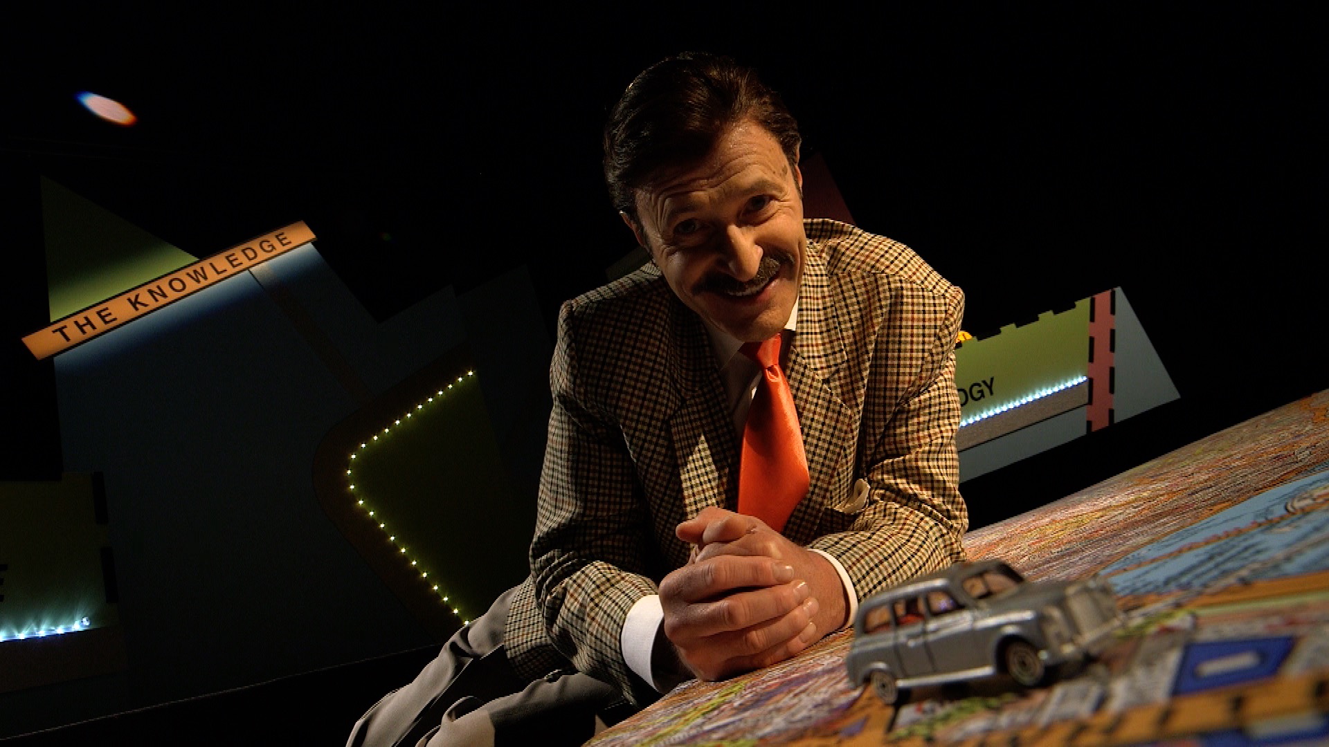
A trio of Source Fours with 15-30mm zoom lenses were used for targeted illumination of certain areas. One was aimed at The Knowledge sign, its cutters adjusted to form a rectangle of light around it. Another was focused on the oval map on the floor, which would come into play during the latter part of the show. The last Source Four was used as a follow-spot on Robert. We had to dim it considerably to keep the exposure in range, which conveniently made him look like he had a fake tan! Ben hooked everything, in fact, up to a dimmer board, so that various lighting cues could be accomplished in camera.
The bulk of the film was recorded in a single day, following a day’s set assembly and a day of pre-rigging. A skeleton crew returned the next day to shoot pick-ups and promos, a couple of which you can see on Vimeo here.
I’ll leave you with some frame grabs from the finished film. Find out more about Ian Wolter’s work at ianwolter.com.
Robert Jezek as gameshow host Robert O’Reilly. Photo: Laura Radford
Last week saw the UK premier of The Knowledge, an art installation film, at the FLUX Exhibition hosted by Chelsea College of Arts. Conceived by award-winning, multi-disciplinary artist Ian Wolter,The Knowledge comments on the topical issue of artificial intelligence threatening jobs. It takes the form of a fake game show, pitting a team of traditional London cabbies (schooled in the titular Knowledge) against a team of smart-phoning minicab drivers. Although shot entirely on stage, the film’s central conceit is that the teams are each guiding a driver across London, to see whether technology or human experience will bring its car to the finish line first.
You can see a couple of brief promos on Vimeo here. It’s a unique project, and one that I knew would be an interesting challenge as soon as I heard of it from my friend Amanda Stekly, producer and production designer. This week and next I’ll describe the creative and technical decisions that went into photographing the piece, beginning this week with the camera side of things.
Photo: Laura Radford
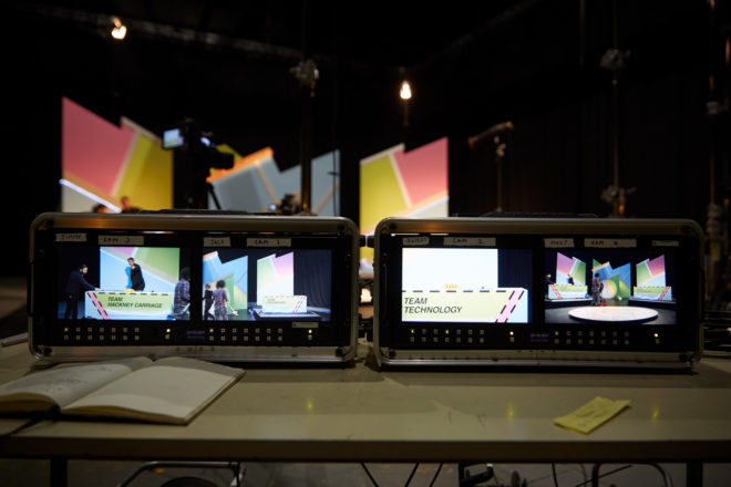
I had never shot a multi-camera studio production like this before, so my first move was to sit down with my regular 1st AC and steadicam operator Rupert Peddle, and his friend Jackie D’Souza-Toulson. Jackie has extensive experience operating as part of a multi-camera team for live TV and events. This conversation answered such basic questions as, could the operators each pull their own focus? (yes) and allowed me to form the beginnings of a plan for crew and kit.
At the monitors with Jonnie. Photo: Laura Howard
Ian and Amanda wanted the film to have a dated look, and referenced such eighties quiz shows as 3-2-1 and Blankety Blank. Director Jonnie Howard and I knew that we had to supply the finished film in HD, which ruled out shooting on vintage analogue video cameras. Interlaced recording was rejected for similar reasons, though if memory serves, I did end up shooting at a shutter angle of 360 degrees to produce a more fluid motion suggestive of interlaced material.
I was very keen that the images should NOT look cinematic. Jonnie was able to supply two Canon C100s – which I’ve always thought have a sharp, “video-ish” look – and L-series glass. I set these to 1600 ISO to give us the biggest possible depth of field. For the remaining two cameras, I chose ENG models, a Canon XF-300 (owned by Rupert) and XF-305. In an ideal world, all four cameras would have been ENG models, to ensure huge depth of field and an overall TV look, but some compromise was necessary for budget reasons, and at least they all used Canon sensors. We hired a rack of four matching 9″ monitors so we could ensure a consistent look on set.
Photo: Laura Radford
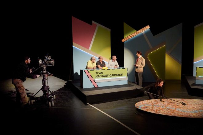
One Canon C100, with an L-series zoom, was mounted on a pedestal and outfitted with Rupert’s follow focus system, allowing Jackie to pull focus from the panning handle. The other C100 would shoot a locked-off wide, and was the first camera to be set up. A 14mm Samyang lens made the set look huge, and I placed it low down to emphasise the map in the foreground, and to make it easy for the other cameras to shoot over it. Once that frame was set, we taped a large V shape on the floor to indicate the edges of the wide shot. As long as the lights and other cameras stayed out of that area, they would be safe.
Jackie operates the pedestal-mounted C100. Photo: Laura Radford
Generally Jackie’s pedestal-mounted C100 followed the host, Robert Jezek, or captured the interesting moving shots, while Rupert and the third operator, Jimmy Buchanan, cross-shot the two teams on the XF-100 and XF-105. No filtration was used, except for a four-point star filter on one camera when glitter canons are fired at the end of the game. This cheesiness was inspired by the 3-2-1 clips I watched for research, in which star filters were used for the tacky sequences showing the prizes on offer.
Next week I’ll discuss lighting the show. Meanwhile, find out more about Ian’s work at ianwolter.com.
Last week I looked at the science of colour: what it is, how our eyes see it, and how cameras see and process it. Now I’m going to look at colour theory – that is, schemes of mixing colours to produce aesthetically pleasing results.
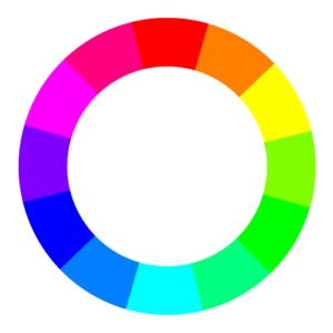
The Colour wheel
The first colour wheel was drawn by Sir Isaac Newton in 1704, and it’s a precursor of the CIE diagram we met last week. It’s a method of arranging hues so that useful relationships between them – like primaries and secondaries, and the schemes we’ll cover below – can be understood. As we know from last week, colour is in reality a linear spectrum which we humans perceive by deducing it from the amounts of light triggering our red, green and blue cones, but certain quirks of our visual system make a wheel in many ways a more useful arrangement of the colours than a linear spectrum.
One of these quirks is that our long (red) cones, although having peak sensitivity to red light, have a smaller peak in sensitivity at the opposite (violet) end of the spectrum. This may be what causes our perception of colour to “wrap around”.
Another quirk is in the way that colour information is encoded in the retina before being piped along the optic nerve to the brain. Rather than producing red, green and blue signals, the retina compares the levels of red to green, and of blue to yellow (the sum of red and green cones), and sends these colour opponency channels along with a luminance channel to the brain.
You can test these opposites yourself by staring at a solid block of one of the colours for around 30 seconds and then looking at something white. The white will initially take on the opposing colour, so if you stared at red then you will see green.
Hering’s colour wheels
19th century physiologist Ewald Hering was the first to theorise about this colour opponency, and he designed his own colour wheel to match it, having red/green on the vertical axis and blue/yellow on the horizontal.
RGB colour wheel
Today we are more familiar with the RGB colour wheel, which spaces red, green and blue equally around the circle. But both wheels – the first dealing with colour perception in the eye-brain system, and the second dealing with colour representation on an RGB screen – are relevant to cinematography.
On both wheels, colours directly opposite each other are considered to cancel each other out. (In RGB they make white when combined.) These pairs are known as complementary colours.
Complementary
A complementary scheme provides maximum colour contrast, each of the two hues making the other more vibrant. Take “The Snail” by modernist French artist Henri Matisse, which you can currently see at the Tate Modern; Matisse placed complementary colours next to each other to make them all pop.
“The Snail” by Henri Matisse (1953)
In cinematography, a single pair of complementary colours is often used, for example the yellows and blues of Aliens‘ power loader scene:
“Aliens” DP: Adrian Biddle, BSC
Or this scene from Life on Mars which I covered on my YouTube show Lighting I Like:
I frequently use a blue/orange colour scheme, because it’s the natural result of mixing tungsten with cool daylight or “moonlight”.
“The First Musketeer”, DP: Neil Oseman
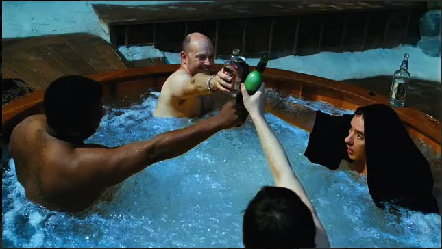
And then of course there’s the orange-and-teal grading so common in Hollywood:
“Hot Tub Time Machine” DP: Jack N. Green, ASC
Amélie uses a less common complementary pairing of red and green:
“Amélie” DP: Bruno Belbonnel, AFC, ASC
Analogous
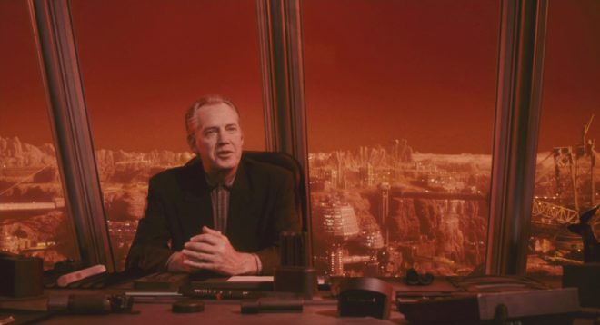
An analogous colour scheme uses hues adjacent to each other on the wheel. It lacks the punch and vibrancy of a complementary scheme, instead having a harmonious, unifying effect. In the examples below it seems to enhance the single-mindedness of the characters. Sometimes filmmakers push analogous colours to the extreme of using literally just one hue, at which point it is technically monochrome.
“The Matrix” DP: Bill Pope, ASC“Terminator 2: Judgment Day” DP: Adam Greenberg, ASC“The Double” DP: Erik Alexander Wilson“Total Recall” (1990) DP: Jost Vacano, ASC, BVK
There are other colour schemes, such as triadic, but complementary and analogous colours are by far the most common in cinematography. In a future post I’ll look at the psychological effects of individual colours and how they can be used to enhance the themes and emotions of a film.
Colour is a powerful thing. It can identify a brand, imply eco-friendliness, gender a toy, raise our blood pressure, calm us down. But what exactly is colour? How and why do we see it? And how do cameras record it? Let’s find out.
The Meaning of “Light”
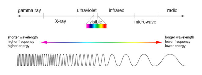
One of the many weird and wonderful phenomena of our universe is the electromagnetic wave, an electric and magnetic oscillation which travels at 186,000 miles per second. Like all waves, EM radiation has the inversely-proportional properties of wavelength and frequency, and we humans have devised different names for it based on these properties.
The electromagnetic spectrum
EM waves with a low frequency and therefore a long wavelength are known as radio waves or, slightly higher in frequency, microwaves; we used them to broadcast information and heat ready-meals. EM waves with a high frequency and a short wavelength are known as x-rays and gamma rays; we use them to see inside people and treat cancer.
In the middle of the electromagnetic spectrum, sandwiched between infrared and ultraviolet, is a range of frequencies between 430 and 750 terahertz (wavelengths 400-700 nanometres). We call these frequencies “light”, and they are the frequencies which the receptors in our eyes can detect.
If your retinae were instead sensitive to electromagnetic radiation of between 88 and 91 megahertz, you would be able to see BBC Radio 2. I’m not talking about magically seeing into Ken Bruce’s studio, but perceiving the FM radio waves which are encoded with his silky-smooth Scottish brogue. Since radio waves can pass through solid objects though, perceiving them would not help you to understand your environment much, whereas light waves are absorbed or reflected by most solid objects, and pass through most non-solid objects, making them perfect for building a picture of the world around you.
Within the range of human vision, we have subdivided and named smaller ranges of frequencies. For example, we describe light of about 590-620nm as “orange”, and below about 450nm as “violet”. This is all colour really is: a small range of wavelengths (or frequencies) of electromagnetic radiation, or a combination of them.
In the eye of the beholder
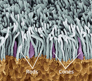
Scanning electron micrograph of a retina
The inside rear surfaces of your eyeballs are coated with light-sensitive cells called rods and cones, named for their shapes.
The human eye has about five or six million cones. They come in three types: short, medium and long, referring to the wavelengths to which they are sensitive. Short cones have peak sensitivity at about 420nm, medium at 530nm and long at 560nm, roughly what we call blue, green and red respectively. The ratios of the three cone types vary from person to person, but short (blue) ones are always in the minority.
Rods are far more numerous – about 90 million per eye – and around a hundred times more sensitive than cones. (You can think of your eyes as having dual native ISOs like a Panasonic Varicam, with your rods having an ISO six or seven stops faster than your cones.) The trade-off is that they are less temporally and spatially accurate than cones, making it harder to see detail and fast movement with rods. However, rods only really come into play in dark conditions. Because there is just one type of rod, we cannot distinguish colours in low light, and because rods are most sensitive to wavelengths of 500nm, cyan shades appear brightest. That’s why cinematographers have been painting night scenes with everything from steel grey to candy blue light since the advent of colour film.
The spectral sensitivity of short (blue), medium (green) and long (red) cones
The three types of cone are what allow us – in well-lit conditions – to havecolour vision. This trichromatic vision is not universal, however. Many animals have tetrachromatic (four channel) vision, and research has discovered some rare humans with it too. On the other hand, some animals, and “colour-blind” humans, are dichromats, having only two types of cone in their retinae. But in most people, perceptions of colour result from combinations of red, green and blue. A combination of red and blue light, for example, appears as magenta. All three of the primaries together make white.
Compared with the hair cells in the cochlea of your ears, which are capable of sensing a continuous spectrum of audio frequencies, trichromacy is quite a crude system, and it can be fooled. If your red and green cones are triggered equally, for example, you have no way of telling whether you are seeing a combination of red and green light, or pure yellow light, which falls between red and green in the spectrum. Both will appear yellow to you, but only one really is. That’s like being unable to hear the difference between, say, the note D and a combination of the notes C and E. (For more info on these colour metamers and how they can cause problems with certain types of lighting, check out Phil Rhode’s excellent article on Red Shark News.)
Artificial eye
A Bayer filter
Mimicking your eyes, video sensors also use a trichromatic system. This is convenient because it means that although a camera and TV can’t record or display yellow, for example, they can produce a mix of red and green which, as we’ve just established, is indistinguishable from yellow to the human eye.
Rather than using three different types of receptor, each sensitive to different frequencies of light, electronic sensors all rely on separating different wavelengths of light before they hit the receptors. The most common method is a colour filter array (CFA) placed immediately over the photosites, and the most common type of CFA is the Bayer filter, patented in 1976 by an Eastman Kodak employee named Dr Bryce Bayer.
The Bayer filter is a colour mosaic which allows only green light through to 50% of the photosites, only red light through to 25%, and only blue to the remaining 25%. The logic is that green is the colour your eyes are most sensitive to overall, and that your vision is much more dependent on luminance than chrominance.
A RAW, non-debayered image
The resulting image must be debayered (or more generally, demosaiced) by an algorithm to produce a viewable image. If you’re recording log or linear then this happens in-camera, whereas if you’re shooting RAW it must be done in post.
This system has implications for resolution. Let’s say your sensor is 2880×1620. You might think that’s the number of pixels, but strictly speaking it isn’t. It’s the number of photosites, and due to the Bayer filter no single one of those photosites has more than a third of the necessary colour information to form a pixel of the final image. Calculating that final image – by debayering the RAW data – reduces the real resolution of the image by 20-33%. That’s why cameras like the Arri Alexa or the Blackmagic Cinema Camera shoot at 2.8K or 2.5K, because once it’s debayered you’re left with an image of 2K (cinema standard) resolution.
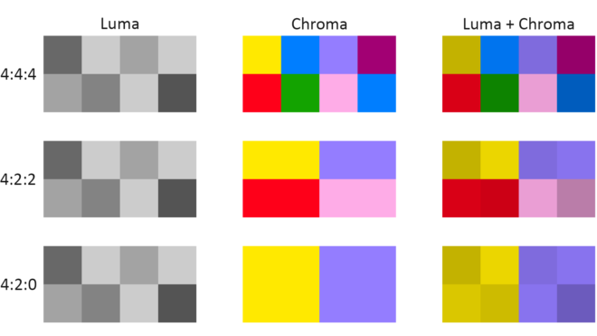
colour Compression
Your optic nerve can only transmit about one percent of the information captured by the retina, so a huge amount of data compression is carried out within the eye. Similarly, video data from an electronic sensor is usually compressed, be it within the camera or afterwards. Luminance information is often prioritised over chrominance during compression.
Examples of chroma subsampling ratios
You have probably come across chroma subsampling expressed as, for example, 444 or 422, as in ProRes 4444 (the final 4 being transparency information, only relevant to files generated in postproduction) and ProRes 422. The three digits describe the ratios of colour and luminance information: a file with 444 chroma subsampling has no colour compression; a 422 file retains colour information only in every second pixel; a 420 file, such as those on a DVD or BluRay, contains one pixel of blue info and one of red info (the green being derived from those two and the luminance) to every four pixels of luma.
Whether every pixel, or only a fraction of them, has colour information, the precision of that colour info can vary. This is known as bit depth or colour depth. The more bits allocated to describing the colour of each pixel (or group of pixels), the more precise the colours of the image will be. DSLRs typically record video in 24-bit colour, more commonly described as 8bpc or 8 bits per (colour) channel. Images of this bit depth fall apart pretty quickly when you try to grade them. Professional cinema cameras record 10 or 12 bits per channel, which is much more flexible in postproduction.
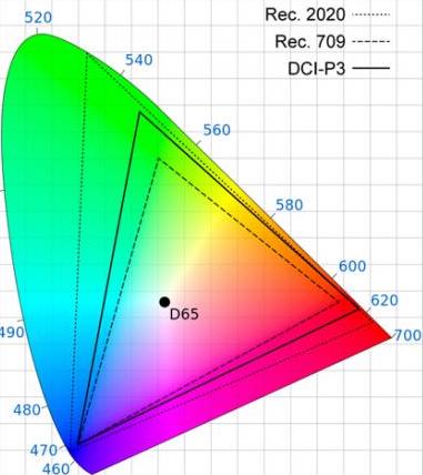
CIE diagram showing the gamuts of three video standards. D65 is the standard for white.
The third attribute of recorded colour is gamut, the breadth of the spectrum of colours. You may have seen a CIE (Commission Internationale de l’Eclairage) diagram, which depicts the range of colours perceptible by human vision. Triangles are often superimposed on this diagram to illustrate the gamut (range of colours) that can be described by various colour spaces. The three colour spaces you are most likely to come across are, in ascending order of gamut size: Rec.709, an old standard that is still used by many monitors; P3, used by digital cinema projectors; and Rec.2020. The latter is the standard for ultra-HD, and Netflix are already requiring that some of their shows are delivered in it, even though monitors capable of displaying Rec.2020 do not yet exist. Most cinema cameras today can record images in Rec.709 (known as “video” mode on Blackmagic cameras) or a proprietary wide gamut (“film” mode on a Blackmagic, or “log” on others) which allows more flexibility in the grading suite. Note that the two modes also alter the recording of luminance and dynamic range.
To summarise as simply as possible: chroma subsampling is the proportion of pixels which have colour information, bit depth is the accuracy of that information and gamut is the limits of that info.
That’s all for today. In future posts I will look at how some of the above science leads to colour theory and how cinematographers can make practical use of it.


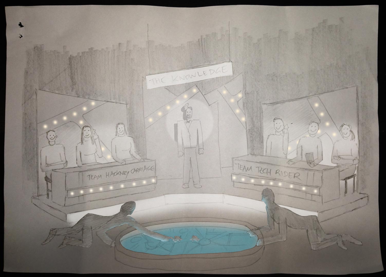 He felt that these were a little too sophisticated, so after some discussion I produced a revised previz…


 The first colour wheel was drawn by Sir Isaac Newton in 1704, and it’s a precursor of the CIE diagram we met last week. It’s a method of arranging hues so that useful relationships between them – like primaries and secondaries, and the schemes we’ll cover below – can be understood. As we know from last week, colour is in reality a linear spectrum which we humans perceive by deducing it from the amounts of light triggering our red, green and blue cones, but certain quirks of our visual system make a wheel in many ways a more useful arrangement of the colours than a linear spectrum.