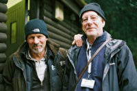
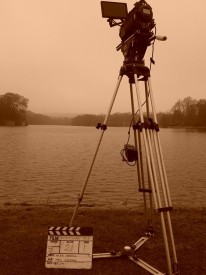
Directing Amelia’s Letter

Georgia Winters as Amelia. Photo: Colin Smith

Amelia’s Letter premiered last week at the Cincinnati Film Festival. It’s the first official selection in what we hope will be a long festival run for this moving little ghost story written by Steve Deery and produced by Sophia Ramcharan. Here’s the synopsis:

Amelia receives a letter from her publisher. Over one hundred years later its legacy still haunts writers who visit her Lodge. Gordon discovers the letter and thinks there is a story to be told. It would be better for him if he didn’t try and tell it.

I want to say a bit about my directing process on the film, but beware – this post contains spoilers!

In a preproduction blog entry I talked about writing backstories for the characters, and touched on the films I’d been watching as research. Today I’ll pick up where I left off and carry on through to production.

The backstories, by the way, were really useful to me throughout the process. They provided a filter through which I could view the script, focusing in on what the characters wanted and where they were coming from. And they made it easy to answer many of the questions the actors had about their characters.
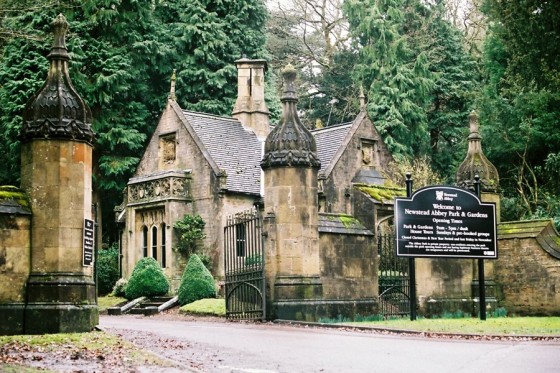
The gatehouse of Newstead Abbey, the film's location. Photo: Colin Smith
The gatehouse of Newstead Abbey, the film’s location. Photo: Colin Smith

I decided early on to give the film overtones of gothic horror. This can be seen most clearly in the location and costume design. I watched several horror films, gothic and otherwise, as well as ghost stories, during preproduction. The Awakening (2011, dir. Nick Murphy) and The Woman in Black (2012, dir. James Watkins) proved to me the importance of building a strong emotional spine before bringing in the scares, and the latter film along with The Innocents (1961, dir. Jack Clayton) showed how effective a slow, subtle reveal of a ghost in a corner of the frame can be.

However, as the shoot got closer, I realised I had been too fixated on the genre, and had neglected the very emotional spine I’d admired in the above films. At its core, Amelia’s Letter is about a woman committing suicide. I therefore set out to watch some films that dealt with this topic. First up was Seven Pounds (2008, dir. Gabriele Muccino) – for a Hollywood film starring Will Smith, it’s quite dark and thought-provoking – followed by Wristcutters: A Love Story (2006, dir. Goran Dukic) – an inventive and darkly humourous American indie set in a suicides’ afterlife which is just like the real world, only everything’s a bit more rubbish – and finally Veronika Decides to Die (2009, dir. Emily Young) – in which Sarah Michelle Gellar gives a surprisingly good portrayal of a failed suicide learning to love life again.

I can’t point to any specific tips I gleaned from those films, but they certainly made me think more about the issue. Indeed, during Veronika Decides to Die, I had a breakthrough regarding Amelia. I recalled a Richard Herring podcast I’d listened to in which Stephen Fry, Herring’s interviewee, had talked very openly about his bipolar disorder and a recent suicide attempt he had made. I realised that Amelia should be bipolar. Sufferers are often highly creative people, like Amelia, and sadly have a much higher rate of suicide. Actress Georgia Winters embraced the idea, and although it’s not at all explicit from watching the film that Amelia is bipolar, the highs and lows she goes through while reading the letter are a result of this behind-the-scenes decision.

Tina Harris as Barbara. Photo: Colin Smith

Another thing that was a big influence on my interpretation of the script was a tome which a relative bought me one Christmas during my early teens. The Giant Book of Mysteries (edited by Colin, Rowan and Damon Wilson) features a memorable chapter in which several ghost-hunters theorise that spooks are actually something akin to tape recordings. When a tragic event happens, the theory goes, the emotions of the people involved – emitted as electromagnetic waves from the brain – can be  “recorded” by the electrical field of any water nearby, in the same way that sounds can be recorded on the iron oxide of a cassette tape.

I seized this idea as a way of explaining, to the actors if not to the audience, how the supernatural events in Amelia’s Letter function. Once the various authors in the film glimpse Amelia’s ghost and are drawn out of the cottage, it would have been easy to say that these authors are in a trance, but this seemed too easy. Instead I decided that the emotions which Amelia felt when she jumped into the lake were recorded by the water and radiate out from it. The closer they get to the lake, the more their own emotions are taken over by hers until eventually they’re feeling exactly what she did, with the inevitable consequence that they kill themselves too.

Carrying this theory throughout the film, it meant that the glimpses which the authors see of Amelia from the cottage window are simply “recordings” of moments in her life – perhaps a surge of creativity, or depression. By coincidence, the art department had painted fake mould into the corners of the study, which tied in beautifully with the water recording theory and helped explain the supernatural events that occur at the cottage.

Frank Simms as Gordon, with Amelia. Photo: Colin Smith
Frank Simms as Gordon, by the lake with Amelia. Photo: Colin Smith

Although much of the above will not be directly apparent to the viewer, I hope that it gave extra depth and veracity to the performances and so makes the film more effective overall.

Amelia’s Letter is a Stella Vision production in association with Pondweed Productions. Find out more at facebook.com/ameliasletter

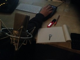
Directing Amelia’s Letter

Mixing Amelia’s Letter

IMG_1841
Nico Metten works on the mix of Amelia’s Letter

Yesterday I attended the final sound mix for Amelia’s Letter, the short supernatural drama I directed last year for writer Steve Deery and producer Sophia Ramcharan. This is always one of my favourite parts of the filmmaking process; all the hard work of generating the material is done, and it’s just about arranging those materials in the right proportions to create a whole larger than the sum of its parts.

Mixing is harder the more tracks of sound you have. It took Neil Douek and I forever to wrangle the layers and layers of audio I’d laid into a decent mix for Soul Searcher (listen to a breakdown here), and The Dark Side of the Earth‘s pilot was a delicate balancing act with swordfight SFX, dialogue and a big orchestral score all going on at the same time (watch an interview with the mixer here). Stop/Eject, being quieter and less complex, was a breeze to mix (read the blog post here).

Amelia’s Letter was a little more complex than Stop/Eject, but not much. It was my third collaboration with gifted sound designer Henning Knoepfel, and my fourth with the equally gifted composer Scott Benzie, who both gave us excellent material to work with. In the pilot’s seat for the mix was Nico Metten of Picture Sound. Although I hadn’t worked with him before, he was very much in tune with what I wanted from the mix. In a nutshell, the brief was: make it scary.

If Amelia’s Letter succeeds, and I think it does, it should be by turns unnervingly scary and heart-breakingly sad. I did research the horror genre when I embarked on the project, but for the latter stages of preproduction and during the shoot (basically, whenever I was dealing with the actors) the important thing was that the characters worked and were empathetic; the sadness would naturally follow. I tried to avoid thinking of the film in horror terms at all during that stage.

Recording one last sound effect...
Recording one last sound effect…

But once we got to post, it was time to start thinking about creeping out the audience, and downright scaring them. As the last stage in the audio chain, the mix needed to play a big part in this. Nico agreed, and had already added some extra creepy sounds by the time I arrived. As we went through, we added in more impacts to the jumpy moments, not forgetting to keep things quiet in the run-up to those moments to make them seem even louder by comparison.

Just as, during the picture edit, Tristan and I had been reminded of the power of NOT cutting, during the sound mix I was reminded of the power of subtracting sound, rather than always adding it. In a couple of key places we discovered that muting the first few bars of a music cue to let the SFX do the job made for much more impact when the music did come in.

But the mix wasn’t just about making it scary. The film climaxes with a sequence of flashbacks and revelations that was tricky to edit and still wasn’t quite doing what I wanted. It was only at the scoring and mixing stage that I was finally able to realise that a clear transition was needed halfway through the sequence; as I said to Nico, “At this point it needs to stop being scary and become sad.” In practice this meant dropping out the dissonant sounds and the ominous rumbling, even dropping out the ambience, and letting Scott’s beautifully sad music carry the rest of the scene.

It never ceases to amaze me how the story shines through in the end. You hack away at this lump of stone all through production and post, and at the end you’ve revealed a sculpture that – though in detail it may be different – follows all the important lines of the writer’s original blueprint.
Now begins the process of entering Amelia’s Letter into festivals…

Amelia’s Letter is a Stella Vision production in association with Pondweed Productions. Find out more at facebook.com/ameliasletter

Mixing Amelia’s Letter

Amelia’s Letter: The Edit Continues

Tristan, Steve and insufficient chairs.

A week after the test screening, I sat down with editor Tristan Ofield in a corner of Steve Deery’s book depot to take a final pass at Amelia’s Letter. Steve balanced on a pile of boxes beside us. Who says exec producers get all the luxury?

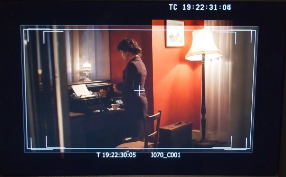
The main aim of the day was to make the film clearer. This became a fascinating exercise with notes from the test screening like, “I didn’t get that Barbara was a writer,” although she spends most of her screen-time sitting at a typewriter. How could we configure these images to more effectively tell the audience that Barbara is a writer, without the benefit of dialogue or ridiculous captions? And without showing her actually writing, because the whole crux of the film is that she’s suffering from writer’s block – and that needs to come across too. How? By really getting into the nuts and bolts of how motion picture editing tells a story, that’s how.

The previous evening I’d been watching 2 Reel Guys, a YouTube series about the creative filmmaking process. It’s incredibly cheesy, and a little bit soporific, but it does make some excellent points. Like how just two different shots can be edited together in three different ways for very different effects.

So how did we make it clearer that Barbara was a writer suffering from block? First, Tristan altered the scene to open on a shot of Barbara standing thoughtfully over the typewriter, with the machine dominant in frame. He held the shot for quite a while to let the audience take it all in. “A reminder of the power of not cutting,” he pointed out.

The Letter of Undue Importance

The second step was for us to really consider when to cut to the keyboard, or to the blank paper. The scene’s previous iteration had started on the blank paper, but I think that image failed to sink in for viewers, who were too busy trying to work out where they were and what was going on. Moving it later in the scene made it much more powerful.

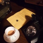
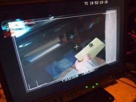
It was also important not to cut to something else at the wrong time. There was a cutaway of a letter that had to be included somewhere for plot reasons, but I was convinced that if we showed that immediately before the typewriter CU then we would be telling the audience that Barbara was trying to compose a reply to the letter. Context is everything in editing. Put a different shot before or after a certain shot and you can completely change the meaning of that shot. By cutting to the letter as Barbara puts a teacup down next to it, Tristan was able to avoid it gaining undue importance.

Tristan's got one of those proper, colour-coded editing keyboards. Cool.
Tristan’s got one of those proper, colour-coded editing keyboards. Cool.

Another big lesson/reminder of the day was: less is more. I had been feeling for a while that Amelia’s Letter had one too many layers of supernatural mystery. Would the film be clearer if one was removed?
Steve was sceptical, and understandably so. No writer loves having chunks of their material hacked out. But to his credit, he let Tristan and I try it. After watching this revised version through, all three of us were convinced it was the right decision. Everything else in the film had become stronger because this one thread had been removed. Minor characters gained more importance because they weren’t competing with the removed element, and major characters’ challenges and emotions shone through more clearly. And the audience would have a much better chance of solving the film’s two remaining mysteries without scatching their heads over the third one too.

At the end of the day, we left greatly satisfied with what we had accomplished. Soon Amelia’s Letter will enter the next phase of postproduction: sound design, music composition, grading and visual effects. Stay tuned.

Amelia’s Letter is written by Steven Deery, directed by me and produced by Sophia Ramcharan of Stella Vision Productions. Visit the Amelia’s Letter Facebook page.

Amelia’s Letter: The Edit Continues

Amelia’s Letter: Test Screening

Test-screening2

On Saturday morning, Broadway in Nottingham kindly gave us the use of their lounge to screen the present edit of Amelia’s Letter to a select audience. As is normal for a test screening, the film is still in a very rough state, but the aim was to identify the weak points, primarily in terms of pace and clarity.

The audience was attentive and gave very useful feedback, though there wasn’t so much of a consensus as there has been at my previous test screenings. I think this might be par for the course for a film based on mystery. Some people like not knowing what’s going on, and some people don’t.

Personally, I like clarity. When I used to make amateur films as a teenager with my friend Dave, I remember how much it galled me when he reported that his mum had watched our latest cinematic effort and couldn’t follow the storyline. So I think we will do what we can, with the footage we have, to make Amelia’s Letter a little clearer.

Some people wanted the film to be longer, to reveal more about the minor characters, while others felt it could be shorter. Since we can’t make it longer, we’ll try to nibble some more out of the first few minutes to get it moving more quickly.

Test screenings usually throw up some surprises too, and this one was no exception. Some people briefly thought that a middle-aged character was supposed to be a future version of a younger character. (This is why, like Chris Jones says in The Guerilla Filmmakers’ Handbook, you should avoid casting actors that physically resemble each other.) And more than one person failed to realise that some minor characters were supposed to be writers, despite these characters spending much of their screen-time sat at typewriters. Who would have seen that one coming?

There was plenty of positive feedback. Amongst the words and phrases people could tick to describe the film, almost everyone ticked “well acted”, with “emotional”, “involving” and “I want to see it again” coming in joint second.

All in all, a useful exercise. Hopefully it won’t be long now before we can get the edit locked and move onto music, grading and sound design.

Amelia’s Letter: Test Screening

Directing the Edit of Amelia’s Letter

Georgia Winters as Amelia
Georgia Winters as Amelia. Photo: Sophie Black

Working with editor Miguel Ferros on Stop/Eject in 2012/13 was a big eye-opener for me, demonstrating how much better my films could be if I didn’t edit them myself. It also helped me realise how little I like the isolated job of editing compared with the fun, stress and teamwork of being on set. Since then I’ve been gradually letting go of my editing work, both corporate and creative. My business card used to say ‘Director, Editor, DP’. Now it just says ‘Director, DP’.

Editing can be a thankless task, particularly in the corporate world. Once upon a time, when I had a cut I was happy with, I invited the client along to the edit suite, played it for them, then we discussed how it might be improved. But since broadband happened, clients wanted me to Dropbox the edit to them and then, rather than a creative discussion, I was typically emailed a list of instructions for changes. This is the point at which I would shut off my brain, carry out the instructions, often feeling that I was making the film worse, take the money and run.

So there’s much to be said for being in the same room as your editor. Not all the time, of course, but enough so that revisions can be made – or least discussed – collaboratively rather than imposed authoritatively.

Which is all pre-amble to saying that I travelled up to Nottingham yesterday to spend the day working with Tristan Ofield on the edit of Amelia’s Letter. He set up his Mac Mini in a darkened room in the Broadway and, after I popped out to be interviewed for the EPK, we got to work knocking the film into shape.

The letter. Photo: Amy Nicholson

I hadn’t realised until then how difficult a film it must have been for Tristan to assemble: multiple time periods; intercutting scenes that were numbered separately on the page but shot together as one; a cheated geography of the cottage relative to the lake. The one advantage of editing your own film is that you know where everything is supposed to go, but Tristan had to figure it out the hard way. He’s put a lot of work into wrangling and shaping the material over the last few months.

It was a very productive day. We started at the beginning of the film and went steadily through, nipping, tucking and often completely rebuilding scenes. The film we had when we finished at 5pm was streets ahead of the one we had at 9am. We got the running time down from 15’30 to a much more festival-friendly 12 minutes, trimming most in the first few scenes to get the story going sooner. The emotional core of the film was already shining through in Tristan’s cut, but now the creepy and tense moments work nicely as well.

The next stage will be to screen the film for a test audience. This is an essential step I’ve taken with all my films since The Beacon in 2001, to make sure that the story is clear, the pacing is right and the desired emotions are coming across. For more on why test screenings are important, read my blogs about test-screening Stop/Eject and some of the problems that it highlighted.

Update: You can read Tristan’s thoughts on editing over at belowthelinefilm.blogspot.co.uk

Amelia’s Letter is written by Steven Deery and produced by Sophia Ramcharan of Stella Vision Productions. Visit the Amelia’s Letter Facebook page.

Directing the Edit of Amelia’s Letter

Designing Amelia’s Letter

Amy Nicholson
Amy Nicholson. Photo: Colin Smith

Production designer Amy Nicholson is no stranger to period settings and low budgets. I spent all of last September in France lighting her impressive work, so when I came to crew up Amelia’s Letter, she was the only person I considered to create the script’s four distinct periods. I’ve asked her to share her experiences of the design process on this demanding short film. 

I met Neil as a DOP on The First Musketeer, a rather intense but wonderful project. He instantly won my respect and acclaim with consistently superb lighting, a real appreciation for prop details and generally being a nice guy to work with. [Neil quietly slips Amy a tenner.] So when he approached me about designing Amelia’s Letter which he would be directing, I couldn’t help but say yes, despite a recent promise to myself not to take on any more freebies.    

Amelia (Georgia Winters) in 1903
The eponymous Amelia (Georgia Winters) and her equally eponymous letter, in 1903

The script filled me with a mix of excitement and dread. On the one hand it was my dream job with four different time periods (including my favourite, 1930s) and a gothic style, but on the other hand the level of art required to do this project was massive.

The original budget set by the production wouldn’t cover the acquisition of the named props let alone any effective dressing. Luckily for me they listened to my cause and agreed to increase the figure to a point my most optimistic budget might stretch to. This was fantastic but of course still set me up on my biggest challenge ever! 

Barbara (Tina Harris) in 1939

I was part of early conversations and visits to locations, and with Neil agreed what could work best.  This collaboration between a director and production designer is fantastic and really builds the strength and vision of a piece. The chosen location was a little semi derelict cottage at Newstead Abbey. The architecture was stunning and although the worn state and small size of the building would present big challenges, the opportunity to do whatever we wanted and really transform the main room for each time period was incredible. 

Charles (Francis Adams) in 1969

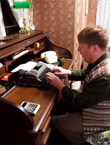
The main focus of the design and plot revolved around a period desk. Therefore it was important to get this piece right and plan all other design factors around this key item. I spent days searching for the right one, regularly sending images back and forth to Neil for an opinion. I wouldn’t normally bug a director in this way but the desk really had to support the action and shots effectively, so was crucial. I was pleased to learn that Neil was of the opinion that in this case the look of something was more important than the true accuracy of period, so this gave me a little flexibility. I eventually found the perfect piece, a 1909 roll top desk. The age and style was ever so slightly too modern but the detail and quality of wood far outweighed the five years of inaccuracy. Unfortunately the desk was 150 miles away and featured quite a bit of damage. So a road trip to collect the desk and some renovations by my dad ensued. Dad also constructed a bespoke locking drawer needed for the action. This proved a great deal of effort but worth it to get the right piece. 

There were a few other items I had to buy, including a 1930s radio, but on the whole I was able to source everything else from my personal prop store and generally doing a bit of beg, steal and borrow from friends, family and the crew. I also befriended a local antique shop and was able to hire many dressing items really cheaply. Having many sources in this way really makes a budget stretch but always involves a lot of time spent collecting, sorting and returning.

Choosing paint colours should have been quite easy but the best colours are always the most expensive and with four colours required in just three days it took careful consideration. Neil and I agreed a pallet of colours which would look good on camera and distinguish each period. He requested that the colours get bolder throughout to suit the narrative, but on a practical front this also ensured only a single coat was needed on the walls, saving time and money. I bought patterned rollers to achieve an easy wallpaper effect for both 1903 and 1969. This was a new toy for me and proved a fantastic effect that I will certainly be using again. 

Some of the present day set dressing

On set I had a superb team to support with all the redressing. It was like 60-minute makeover each time we transformed to a new period and I was so impressed and grateful that all the crew got involved at some point to help us out. Once each transformation was complete the cast and crew consistently let out a genuine ‘wow’ making the art team feel very proud. 

I was truly pleased with each of the sets and it was really special seeing them combined with some effective costume design by Sophie Black, impressive lighting by Alex Nevill and intense actor performances. I can’t wait to see the finished film, as I’m confident it will be something of beauty!

Visit Amy’s website at www.amynicholson.net.

For the latest updates on Amelia’s Letter, like the Facebook page. The film is produced by Sophia Ramcharan of Stella Vision Productions.

Designing Amelia’s Letter

Film Faces by Colin Smith

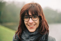
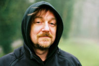
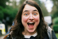
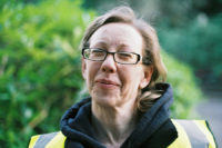
As well as being an excellent gaffer and camera assistant, not to mention the most loyal crew member I’ve ever come across, with over a decade of suffering on Neil Oseman shoots under his belt now, Colin Smith is a talented portrait photographer. He keeps it quiet, but the evidence can be seen below in the form of these stunningly natural cast and crew portraits from the set of Amelia’s Letter (working title: A Cautionary Tale). Just by looking at the faces in these pictures you can see that they have been taken by one of the most friendly and popular people on set.

But don’t ask him to see the picture after he’s taken it. You’ll get a laugh with the response, “Certainly, in about two weeks,” because these are “film faces” in more ways than one; Colin is keeping the flame of celluloid alive by shooting on good old 35mm. These images are proof, if any is needed, that film can capture the human face with an authenticity and a beauty that no digital format will ever match. Nice one Col, and here’s to many more shoots together.

Film Faces by Colin Smith

Directing: A Collaborative Tale

Photo: Frank Simms
Photo: Frank Simms

Directing A Cautionary Tale last week was a very satisfying experience. There are a number of reasons for this – one is that, unlike when Stop/Eject wrapped, we are not now faced with the task of creating visual effects, shooting pick-ups and doing ADR. I’m pretty sure we got everything we needed in the can in that whirlwind three day shoot.

But the main reason is that it’s been one of the most collaborative directing experiences of my career. I’ve written before about the process of surrendering filmmaking roles to collaborators, and the joy of receiving contributions from those collaborators which far outstrip what you could have done yourself. With A Cautionary Tale I’ve finally reached a point where I am directing and ONLY directing. (We will gloss over the bit of focus-pulling I had to do on a few shots.)

It was great to leave the job of lighting and photographing the film completely to Alex Nevill, who did a beautiful job, and it’s nice to sit back and wait for editor Tristan Ofield’s first cut. It was also really, really good not to have to worry about the logistical side of things.

But the biggest relevation and the biggest benefit was in the improved relationship I was able to have with the actors. Freed from the invisible cord which tethers a DP to their camera, and without the concerns of a producer littering my mind, I was able (I hope) to give the cast far more attention. It is not often in my career that I have been able to sit in a trailer (okay… it was a caravan) and discuss the upcoming scene with the actors, but I got to do it on A Cautionary Tale.

Despite the late casting of Frank Simms as Gordon, I had been able to meet both Frank and lead actress Georgia Winters prior to the shoot and do some good groundwork on their characters. Here too I found the process more collaborative than I have done in the past, for the simple reason that I had not written the script. A writer-director is very close to his or her story and tends to have a very strong idea of how everything should be played. A non-hyphenate director, however, has no greater insight into the script than the actors. The result is that I found I was usually asking the actors questions, to invite discussion, rather than issuing them with instructions. I suppose some might see this as a lack of vision on my part, but I’m pretty sure it will lead to a richer end product.

Throughout the shoot I tried to maintain my philosophy of keeping the number of takes to a minimum, as discussed in a 2011 blog entry. At points it made me unpopular with Alex, but long and bitter experience has taught me that it is not worth doing another take just because of minor camera wobbles. Yes, your operator might get the camerawork perfect on the next take, but something else will go wrong – a loud motorbike going by, for example – and before you know it, it’s twenty minutes later, you’ve done four more takes to get everything technically perfect, and now the performances are no longer fresh, so you use take one in the edit anyway! Don’t go chasing the take where everything’s perfect, because it will never happen. Just make sure the performance is perfect and the audience will forgive everything else – hell, they probably won’t even notice that camera wobble once it’s cut smoothly with the surrounding shots and the sound is nicely mixed.

Reading Stanislavski definitely paid off. He underlined the importance of a fresh performance built on unique creative inspiration, chiming in with my point above. And I was even able to use a “magic if” when directing the closing shot of the film. I strongly recommend reading An Actor Prepares if you want to better understand how to engage with actors.

Stay tuned for more on A Cautionary Tale as we progress through post.

Photo: Terry Jefford
Directing: A Collaborative Tale

Shooting A Cautionary Tale

On Saturday, production wrapped on A Cautionary Tale after three days of shooting at Newstead Abbey Historic House and Park in Nottinghamshire. I had vaguely hoped to make a video diary of the whole thing, but in practice I only managed to grab a few bits on the first day:

Focus puller John Tween, director of photography Alex Nevill and actor Frank Simms in a present day cottage scene

The second day saw us filming in the bone-chilling wind blowing over the lake all morning, while 1939 was re-dressed to 1969 inside the cottage. After filming 1969 through the afternoon, we wrapped when the light fell, postponing a few cottage exterior shots until the next day.

After picking up those shots on Saturday, we moved inside for the present day interiors and the meatiest scenes in the film. As anticipated, we found ourselves faking daylight through the windows as shooting continued after dark, though we wrapped only half an hour later than planned.

I’d like to thank all of the cast and crew once again for their hard work, plus everyone who supplied equipment and props, and the lovely staff at Newstead Abbey.

A project like this leaves me with very mixed feelings about unpaid filmmaking. On the one hand I hate the stress of trying to find last-minute replacements for drop-outs, I hate how much I have to ask of people, and I hate that I cannot acknowledge people’s hard work with the renumeration it richly deserves. But I also come away with a strong feeling that this is it, this is what matters, this is all that matters – making truly creative work and having fun doing it – and despite fifteen of years of plugging away, I still have no idea how to do that while paying people. Should I therefore stop? I really don’t know.

Shooting A Cautionary Tale

Last Week of Preproduction on A Cautionary Tale

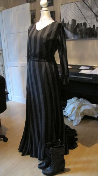
Amelia's dress, designed and made by Sophie Black
Amelia’s dress, designed and made by Sophie Black

We’re less than one week out from shooting A Cautionary Tale, with many aspects of the production coming together nicely, but others proving more challenging.

Regular readers may recall that after Stop/Eject, a project where the last few weeks of preproduction were marred by both lead actors and many crew pulling out, I vowed never again to make a film where people weren’t paid. (Puppet films excepted.) When I took on A Cautionary Tale, I figured this rule didn’t apply. After all, it wasn’t “my” film; I didn’t originate it, and I wasn’t producing it, so it wasn’t my call whether people were paid or not.

I was disappointed, but not surprised, when our lead actor pulled out about ten days ago, after being offered a lucrative alternative. Just like on Stop/Eject, it has proven very hard to find a suitable replacement, someone willing to travel way outside of London, for no money, for “just another” short film. And the search continues.

Another hiccup has been the cinematography. By mutual agreement, the DP who I originally selected left the project about a week ago. The lesson learned here is that, just like an actor, a DP must be right for the project. If you are working with limited resources, you need someone who relishes the challenge, rather than feeling restricted by it. Alex Nevill has stepped up to the plate, and I’m sure he’ll do a terrific job.

The knock-on effect has been that only today have we been able to start confirming equipment hires. For a while it looked like we might have to shoot on a DSLR, but Alex has been able to get us a great deal on a Red One MX.

Tomorrow our loyal band of runners and production assistants begins cleaning out the cottage at Newstead Abbey. On Tuesday, the art department led by Amy Nicholson will descend on the location and begin the huge task of painting and dressing it to become a writer’s study from 1903. Then, over the course of our three-day shoot, Amy’s team will have to redress it three times to bring it through the twentieth century to the present day.

Despite all the drama, I’m looking forward to the shoot. Many of the crew have worked with me before, including gaffer Colin Smith, costumer Sophie Black, sound mixer David Bekkevold, and of course Amy, and I know they’ll do me proud. And I’m sure there will be new great working relationships forged in the white heat (or more literally, freezing cold) of A Cautionary Tale’s shoot too. Stay tuned.

Last Week of Preproduction on A Cautionary Tale