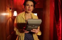
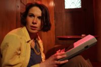
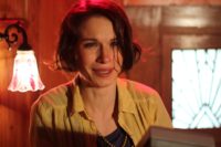
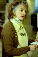
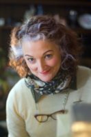
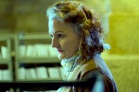
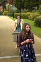
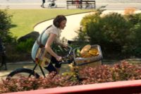
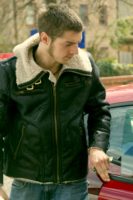
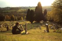
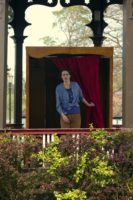
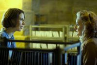
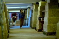
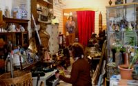
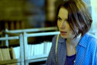
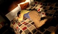
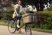
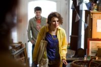
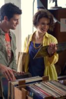
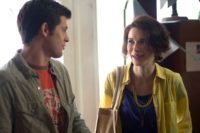
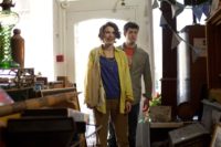
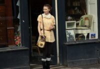
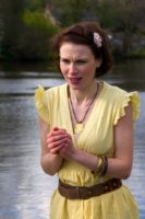
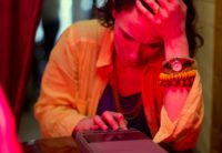
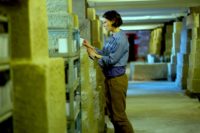
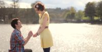
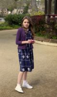
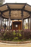
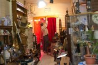
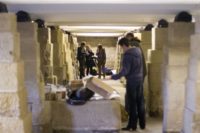
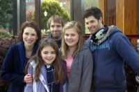
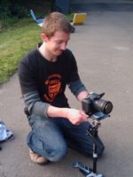
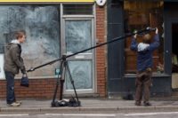
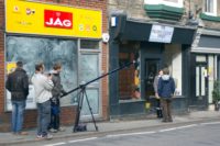
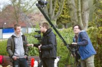
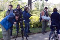
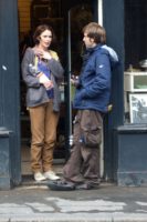
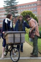
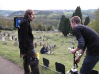
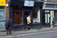
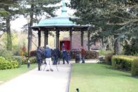
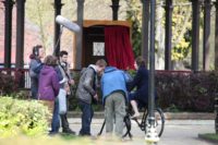
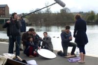
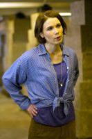
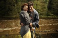
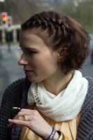
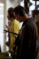
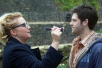
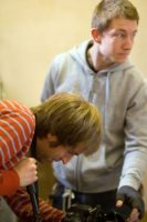
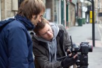
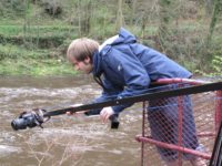
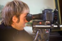
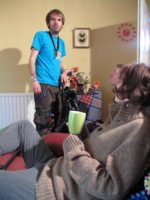
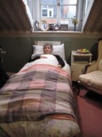
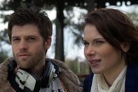
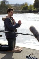
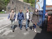
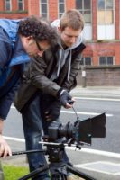
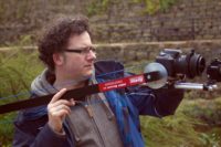
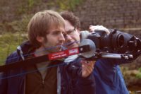
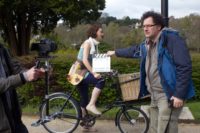
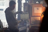
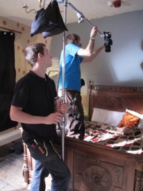
Here’s a look at the first day of shooting on my short film Stop/Eject, featuring the debut of the alcove set.
3. Short production
The Value of a Full Crew

Col constantly ribs me about the lack of a first assistant director on Stop/Eject, and the consequent lack of adherence to the schedule. But as I edit the film, I’m appreciating more and more the other duties of a first AD and the consequences of those duties going undischarged.
Because part of the first’s job is to literally assist the director – to help them keep track of things which can easily get forgotten amidst the chaos of filming. Things like crossing the line, getting enough coverage and not missing out bits of the script. (Two other crew members that a big budget production will have who will also be looking out for those things are the script supervisor and the editor – because the editor will be cutting the material the day after you shoot it, and may be able to tell you before you leave a location that you need an extra shot.)
So here are some examples of the moronic cock-ups I made, which might well have been avoided if I’d had a first and/or a script supervisor looking out for me:
- Tommy Draper wrote a great stage direction in one scene: “She opens the fridge. It’s as empty as her life.” Unfortunately I chose to shoot it in a way that made it impossible to tell the fridge was empty, because I didn’t pay close enough attention to the script during filming.
- In another scene, I wrote that the cellophane is torn off an object before it is used. I included that detail in the script because, as a writer, I knew that otherwise the audience would not necessarily understand the important point that the object was brand new and unused. Somehow this got dropped from the scene during rehearsals, and it wasn’t until I saw the film edited together that I realised how crucial the cellophane was.
- In scene seven, the most complex of the film, we decided during rehearsals to alter the timing of an incident. One side effect of this – which again I didn’t notice until I saw the edit – was that the shots I had storyboarded (and thus the shots that I filmed) no longer established satisfactorily the whereabouts of one of the characters at a critical moment.
- In scene 24 I crossed the line. You can see this at the very end of the trailer.
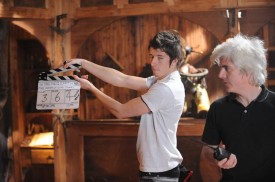
The omission of things in the script are particularly annoying (a) because I co-wrote the bloody thing and should have noticed, and (b) because any good writer takes care to be economical with words and only put in things which are important.
Some of these things can be fixed with pick-ups. For example, I filmed a close-up of my wife’s hands unwrapping the cellophane in our flat recently. But others have no solution beyond a major reshoot, which would be very hard to justify. So what you end up with is a subtle erosion of the quality of the film, and this is one of the reasons that a more expensive film looks more expensive. A bigger crew does mean more attention to detail and thus higher production values in every respect.
I share these thoughts with you not because I’m any less proud of Stop/Eject or feel like I need to make excuses for it, but simply to pass on a lesson the project has taught me. It’s very easy to think of a first assistant director as merely a time-keeper, but if you work without one you should appreciate that there are other strings to their bow, and your project may suffer more lasting effects than just a tired cast and crew.
Microwave Shot
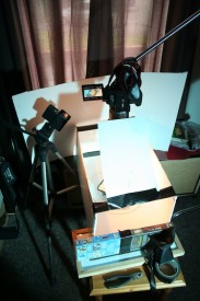
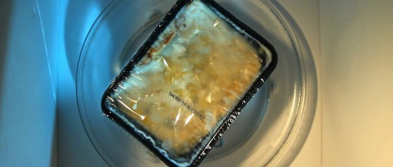
Shot 104 on my Stop/Eject storyboards has been loitering for a long time. Originally slated for the last day of principal photography, it got dropped and has been bothering the back of my mind ever since. It’s a bird’s eye view of a ready meal turning slowly in a microwave… if the hypothetical bird flew into the microwave before Kate shut it, and survived long enough to look down on anything. (The shot is part of the circles theme that runs throughout the film, which I blogged about earlier in the year.)
Back in the autumn we bought an old microwave, my intention being to rip the top off for the shot. Even though I was clearly not planning to turn the thing on after dismembering it so, safety concerns were voiced and thoughts turned to mocking up a microwave interior.
I finally filmed the shot this morning, and I don’t think anyone – including me – expected it to be achieved in the incredibly low-tech fashion it was. I folded up a piece of old foam board and punched a hole in the middle of it, and gaffer-taped an allen key to the bottom of the circular plate so I could rotate it through the hole from underneath.
So that’s another shot ticked off the list.
If you’re in Hereford, come along to the test screening tomorrow (Wednesday June 20th) at 3pm. It’s in the downstairs lecture theatre at Hereford College of Art’s Media Centre on Bath Street. Non-students are welcome; just sign is as visiting Christabel Gingell. I need all the feedback I can get to finesse the edit.
Things That Slowed Us Down
Several weeks ago I evaluated Stop/Eject’s shooting schedule. As noted in that post, we got behind schedule more than once during production. Today I want to look at the reasons why, so I can remind myself next time I draw up a schedule, and so that you lovely readers can perhaps pre-empt similar problems on your own projects.
-

Self shooter. Photo: Paul Bednall Lack of a First Assistant Director. The key role of this crew member is to keep things running to schedule, and we didn’t have one. Two people were lined up and then dropped out due to paying work, and no other applicants were forthcoming. Difficult to see what could have been done to avoid this, other than raising more money to pay everyone.
- Lack of a separate Director of Photography and Camera Operator. I chose to act as my own DP on Stop/Eject and, when operator Rick Goldsmith was only able to do half of the shoot, chose not to find a replacement for the remainder and fill that role myself as well. This is something I’ve done on many of my previous productions, so I knew full well that it wasn’t a good idea; it slows things down and it reduces the time I can spend working with the actors. But I did it anyway because I figured any DP worth their salt would balk at the pathetic equipment we had available.
-

Steve Giller assembles the alcove. Photo: Paul Bednall Lack of other skilled crew. There were only two people on the crew who were really handy with power tools, Col and Steve Giller, and Steve was only around for a couple of days. So when we arrived at a new location and had to assemble the alcove set and rig lights from the ceiling, there were only one or two people doing these two most time-consuming tasks. Solution: ask around in pre-production for DIYers who fancy helping out on a film.
- Large number of costume changes. With eleven story days and a lead actress playing two different versions of her character, there was a lot of costume swapping, each one accompanied by a hair and make-up change too. I’d advise you to always try to minimise the number of story days in your script, and to carefully schedule your shoot to reduce the number of switches.
-

Hair and make-up changes take time. Photo: Katie Lake Large number of locations. Even though we found several locations in one building, there was still a lot of moving around, which wastes huge amounts of time. Ideally you should shoot in only one location each day.
- Fatigue. As mentioned in my earlier post, scheduling long days and/or wrapping late gets you into a destructive cycle because your cast and crew work slower the next day due to lack of sleep.
- Composition issues. This is an odd one which nobody foresaw. We shot in the Cinemascope aspect ratio, 2:35:1, which is a very wide frame, but we had many scenes set in the alcove, which was a tall, narrow set. Think about how wide a 2.35:1 shot has to be to see the head of a standing actress and a tape recorder on a two foot high table at the same time, and how much will be revealed at the sides of frame. Combine this with the fact that some alcove scenes were shot in a corridor at the back of the shop location that was only half the width the alcove was meant to be, so one wall always had to be out of frame. And then factor in that you can’t compress the vertical space by going for a high angle shot because then you won’t see the face of the actress as she looks down at the recorder, and you can’t compress it with a low angle shot because you’ll reveal the lights hanging from the ceiling. Yes, it was a nightmare shooting in that little alcove. There was a lot of time wasted in scratching my head over how to cover the scenes effectively while framing out the wall and the lights. This might seem like a very esoteric problem, but I can derive three points of good general advice from it:
-
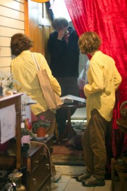
Alcove headaches. Photo: Paul Bednall Think carefully when choosing the aspect ratio for your film. Consider the shape and size of your key locations and props. When making The Dark Side of the Earth‘s pilot, DP Oliver Downey pointed out that the tall, spindly Swordsman puppet and the tall training room set were not well suited to the 2.35:1 anamorphic ratio we were shooting.
- Think twice before rigging lights to the ceiling. This is very much a double-edged sword. Although it takes a long time to hang lamps from the ceiling, once they’re up there you will find it relatively quick to light each of your set-ups. But if you then realise that the ceiling’s going to be in shot, taking those lamps down or altering your composition to frame them out could be a big time-waster.
- Small locations will slow you down. Working in a confined space with lots of lamps, grip and mics is slow, hot and unpleasant. Avoid it wherever possible. More space means lights can be quickly set up on stands further away, rather than having to be rigged time-consumingly to walls or furniture.
-
So those are the main things that slowed down Stop/Eject, and of course there are many, many other things that can hold you up when shooting. And although many of these are impossible to foresee or prevent, a little thinking time in pre-production can identify a lot of these issues and help you plan accordingly.
Stop/Eject Lighting Breakdown #4: Basement
As regular readers will know, I spent some time in pre-production planning the lighting of Stop/Eject‘s basement scenes – filmed at Strutt’s North Mill in Belper – even going so far as to mock up some previz images in Photoshop. Click here to read the post and see those images.
However, the best-laid plans of mice and men gang aft agley, and they ganged a bit agley in this case.
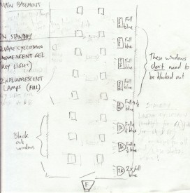
My lighting plan followed the concept I outlined in that pre-production blog post, which was to put lamps in between all the pillars on one side of the basement, representing daylight from unseen windows. Col and the runners duly set these up on the day, gelling them successively bluer along the length of the room, to enhance the feeling of depth.
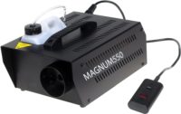
However, none of the staff at the location were able to disable the fire alarm, which sadly meant we couldn’t use the smoke machine. So no cinematic shafts of light, and a blow to my second method of showcasing the fantastic depth of the location. (Possibly if we had warned them in advance about the smoke they could have found out how to disable the alarm. Oh well, lesson learnt.)
The third way I wanted to create depth was by turning off alternating fluorescent tubes on the ceiling, so that every other pillar would be in darkness. In the final analysis it seemed pointless to do this, as many of the tubes were on the blink anyway and so there were already plenty of shadows. One of the tubes kept flickering, which was a nice little touch.
I went with a tungsten white balance, which gave the greenest look to the fluorescent tubes. (On a side note, I find my 20mm Sigma registers this green spike much more than my other lenses.) Since the “daylight” was blue, I had created a colour scheme that had no contrast at all, being all cool. This despite all my previz and planning. Yes, I am an idiot.
Looking at the rushes again now, I see that despite using the Sigma lens, the fluorescent light has come out quite yellow, so there is a bit of colour contrast after all. Dumb luck: 1, Neil’s skill: 0.
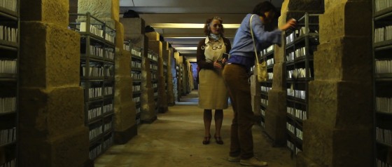
It will be fine when it’s graded, but it could have been so much better if only we could have used smoke.
Next up was a tracking-two shot over the shelves. I chose to shoot this from the opposite side of the basement to the “daylight” lamps, so that they would backlight the talent rather than giving us flat, boring front-light. We cheated the positions of two of these lamps massively so that they would both hit Kate (Georgina Sherrington) and Alice (Therese Collins) without being in shot.
Some front-light was required, because the overhead tubes weren’t lighting the ladies sufficiently or giving a very flattering look. So we rigged a fluorescent studio light over the camera. This isn’t generally a good place to put a lamp, but when you’ve got some good backlight going on you can get away with some flatness elsewhere. Ironically, this fluroescent lamp – which had a daylight-balanced bulb – needed fluorescent gel on it to get the green look I wanted, to suggest the light was coming from the overhead tubes.
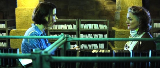
The basement was one of the few scenes in Stop/Eject in which moody close-ups with dark, unfilled shadows were justified.
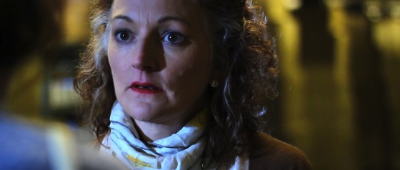
One of the blue-gelled 800W Arrilites which had served as backlight in the two-shot now acted as Alice’s key. The edge-light on her hair comes from one of the overhead tubes.
Another of those backlights became a key for Kate’s close-up. The yellowish fill is from the overhead tubes, while backlight is from another blue-gelled Arrilite positioned in a way that bore no resemblance to any previous lighting. (When you’re pushed for time as a DP, you often have to chose between making it look good or maintaining lighting continuity.)
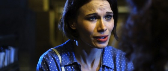
Incidentally, the trio of shots we’ve just covered – the two-shot and the corresponding singles – conform roughly to a lighting template I call “cross-backlighting”. This model consists of two backlights in the two-shot, one out of each side of frame, one of which immediately becomes a key for each close-up. There’s more info on cross-backlighting in The Ten Minute Lighting Masterclass, one of the bonus features you get when you rent the deluxe package of Going to Hell: The Making of Soul Searcher.
That brings the Stop/Eject lighting breakdown to a close. I hope you’ve found it useful. I’m more than happy to answer any lighting questions here in the comments or on the Stop/Eject Facebook page.
The next public reward is Sophie’s great little podcast about the first day of the shoot, which will go online when we reach £400, so be sure to visit stopejectmovie.com and help us get there. Thanks everyone!
Stop/Eject Lighting Breakdown #3: Bedroom
Today I’m taking a look at Stop/Eject‘s three brief scenes in Kate’s bedroom. Each consisted of one shot only, but each required a different look. Here’s my lighting plan:
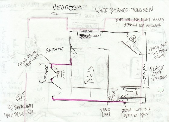
Much of the room, including the window, would never be seen. This allowed me to black it out and place my own fake window exactly where I wanted it.
If you imagine your subject (viewed from above) is at the centre of a clockface and they’re looking towards 12 o’clock, your key light should usually be at around 1:30 or 10:30. That’s enough of an angle to give their face some dimension and shadow, but not so much that you can’t get light into both eyes. That’s a rough rule of thumb, and of course it can vary according to the mood you want to create.
Knowing that Kate (Georgina Sherrington) was going to be facing more or less towards camera, I accordingly chose the corner of the room in the top right of the plan for the key. You can see I’ve drawn in a “cardboard window frame” gobo, but as it turned out there were some fold-up chairs kicking about, one of which threw a very window-like shadow when clamped to a C-stand in front of the 1K.
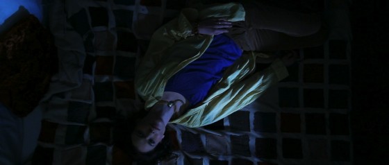
The first of the three scenes was set at night. Since Kate was exhausted, it was reasonable she would not bother turning on lights or closing the curtains, so the 1K – with blue gel for a moonlight effect – became the one and only light source for the scene.
To get a bird’s eye view of the bed, the camera was clamped to the cantilevered arm of a well-sandbagged C-stand.
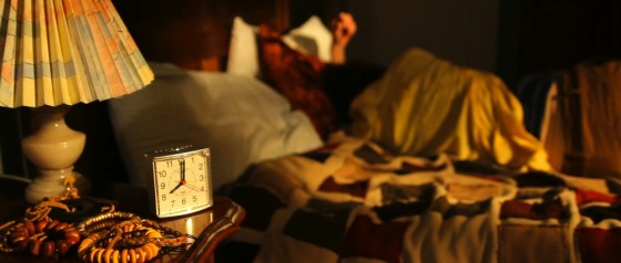
The next scene was the following morning. This was a piece of cake; I just swapped the blue gel on the 1K for orange for that sunrise look.
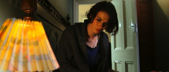
The third and final scene was night again, but this time with other light sources besides the window. Kate’s key was a practical table lamp, reinforced by a 100W clip-light just out of frame.
Col rigged a 300W backlight, or “hair light”, on top of the wardrobe, representing a ceiling light. As it turned out, once the door was opened it flagged this light off Kate. I didn’t mind because her dark hair stood out well against the light background anyway, and the 300W lamp still put a streak of light in the top right corner of the shot, which was a bit of added interest and helped frame the composition.
An Arrilite was set up in the corridor to create depth, and was gelled green to contrast chromatically with Kate’s orange skin tone.
So although brief, one-shot scenes like these might seem restrictive for a director of photography, they’re actually some of the most creative because you can experiment and create a variety of different looks relatively quickly.
If you’ve found this blog useful, please visit stopejectmovie.com and make a contribution, or if you’re not able to do that then share the link with as many people as possible and help spread the word.
And stay tuned for the fourth and final part of this breakdown, in which I’ll look at my least favourite scene (lighting-wise): the basement.
Stop/Eject Lighting Breakdown #2: Living Room
In this second part of my Stop/Eject lighting breakdown, looking at the how, why and what-with of lighting a short film, I’ll focus on the scenes in Kate and Dan’s living room. If you missed part one, check it out first to see what equipment we had with us. You can also read production designer Sophie Black’s blog about decorating and dressing the living room over on her website.
Int. Living Room – Day
Here’s my lighting plan for the main scene in the living room:
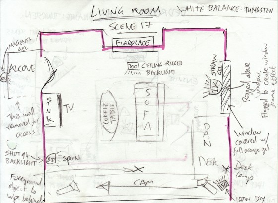
Along the bottom I’ve drawn in the tracks and camera for the master shot. I’m treating the location like a three-walled set, so this bottom wall will never be seen. (The pink highlight was to show Sophie which walls needed painting.)
The wide tracking shot had the potential to be difficult from a lighting stand-point, since it would show almost 270 degrees of the room. Putting the lights behind camera is never a good idea creatively; you end up with a depth-less image that looks like a photo taken with flash. But fortunately the location had a high ceiling, so Col was able to rig lamps overhead.
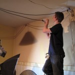
When you can’t afford to hire HMIs – which emit a 5,600K light, the same colour as sunlight – you have to make a difficult decision on your daytime interiors. You could put blue CTB “daylight” gels on your tungsten lights, but that immediately cuts out half their illumination, and they’re not very bright to start with. Or you could white-balance somewhere in between daylight and tungsten, letting one go slightly blue and the other slightly orange on camera, like I did in the shop.
Or you can cover the windows in CTO gel, tinting the incoming daylight orange to match your tungsten lamps. Typically this is only practical for rooms with small windows – and luckily our living room location was such a room. So once the window was gelled, I knew I could set my camera’s white balance to the tungsten preset (3,200K) and all the light would look white.
As daylight is liable to change – the sun moves across the sky, goes behind clouds – you’ll always want to reinforce it with an artificial light source for consistency. Besides which, I wanted it to look like the sun was out and shining straight in the window, which I clearly couldn’t rely on nature to do for me. Hence the 1KW Arrilite in the lighting plan (labelled simply “1K”), rigged above the window.
In discussions with Sophie and Katie, the costume designer, we had decided to make yellow the colour of happiness in Stop/Eject. So, since this scene is before Dan’s death, I chose to put straw gel on this 1K. In retrospect, this was a bit over the top, given that the walls were already painted yellow.
A 300W work-light was rigged from the ceiling just in front of the fireplace, to provide some backlight.
As in the shop, an 800W Arrilite with magenta gel was placed behind the alcove to represent the wall sconce.
A table lamp was placed on Dan’s desk to brighten up what could otherwise be quite a dark corner.
The other two lamps shown in the plan were ditched as unnecessary for the wide shot.
Finally, a little smoke was added to volumize the “sunlight” and generally diffuse the image.
Here are some frames from the rushes of the wide shot:
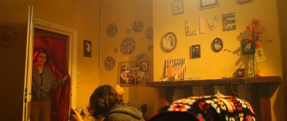
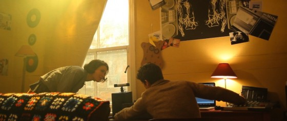
Let’s look at a couple of other camera angles in this scene, and how the lighting set-up had to be tweaked for them.
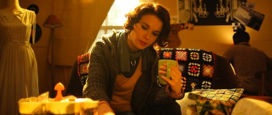
This mid-shot of Kate (Georgina Sherrington) was straightforward. The 1K “sun” provided lovely backlight, while the 300W work-light above the fireplace wraps this around the right side of her face a little. The only addition needed was a reflector next to camera for fill.
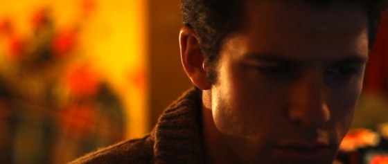
This angle starts as a single on Dan (Oliver Park). Kate is occasionally revealed in the background, and she was already well lit by the 1K “sun” and the 300W work-light.
I wanted some edge light on Dan to highlight his ear, because he’s listening closely to the audio he’s editing. This was a 100W clip-light off camera left at about the right height to suggest an unseen table lamp. As an added bonus, this light also supplied some fill on Kate as she crept up on Dan later in the shot:
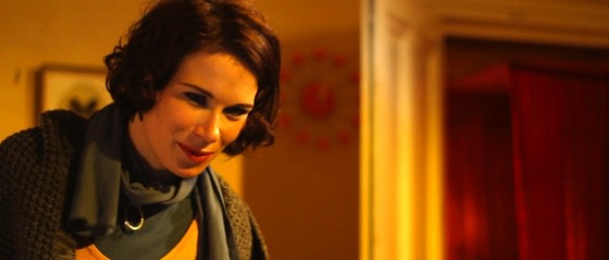
Once Kate is sat on Dan’s lap you can see the key light in action:
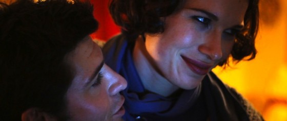
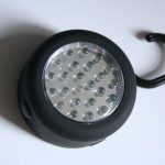
What was the key lamp? Having established the desk lamp in the wide, I could have used that – or something representing it – as the key. Instead I decided to add some colour contrast by using the blue light from the computer screen. The screen wasn’t bright enough to light him in reality, so this is where a £2 LED camping light came in handy – I simply hooked it over the top of the screen. (For more info on colour contrast, see this earlier post.)
For a later daylight scene in the living room, I totally cheated the lights. It’s easier to get away with cheating your lighting angles when a scene only has one shot and the audience can’t see too much of the geography.
I had Col rig a second straw-gelled 1K Arrilite close to the first, but pointed at right-angles so as to directly backlight Kate. Naturally reflected light was not giving Kate’s face the definition I wanted, so I put the 800W Arrilite out of the right of frame with several layers of tough spun diffuser on.
Here’s the result:
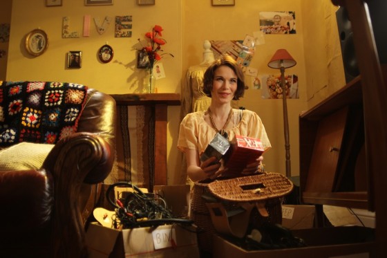
The light sources don’t stand up to much scrutiny, but it’s a brief scene so I think I’ll get away with it. Except that I just told everybody. D’oh.
Int. Living Room – Night
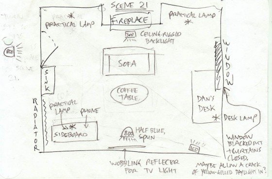
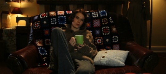
The single nighttime scene in this location was filmed in the early afternoon, so the crew blacked out the window. The 1K “sun” lamp was of course turned off, but the 300W work-light was left as a backlight for Kate on the sofa. A fluorescent-gelled 800W Arrilite was placed in the corridor to represent illumination from a strip light in the kitchen.
I wanted to trap Kate within a formal, symmetrical frame. Two practical lamps in the background, on either side of the wide shot, contributed to this effect.
Finally, she was meant to be watching TV, although the set would never be seen. Over the years I’ve tried several techniques for simulating TV illumination. I haven’t found a definitive one yet, but currently my favourite method is to bounce a day-light balanced lamp (in this case one of the fluorescent studio lamps, not an 800W Arri as the plan indicates) off a reflector that’s being wobbled by a crew member.
That’s your lot for today. Next time we’ll look at the bedroom scenes (minds out of the gutter, please).
Stop/Eject Lighting Breakdown #1: Charity Shop
This blog post is the third of our public rewards in the Stop/Eject crowdfunding campaign. If you’re reading this, it means we’ve raised at least £300 so far. If you don’t know what the hell I’m talking about, go to stopejectmovie.com to watch the trailer for my new short film and find out about the public and individual rewards we’re offering to anyone who sponsors the project.
In this post I’m going to break down the lighting set-ups for some of Stop/Eject’s key scenes in the shop, looking at what I was trying to achieve and how I went about it. I had intended to cover all of the film’s key scenes, but after writing out the shop stuff and realising how long it is, I’ve decided to save the rest for another time.
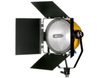
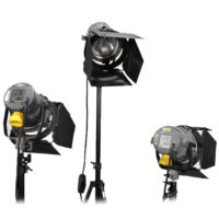
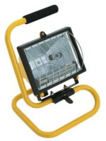
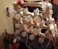
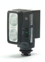
First of all, here’s the lighting equipment we had available to us on the shoot:
Plus stands, gels, sandbags and lots of splitters and extension leads. However many extension leads you think you need, triple it and you might just about have enough.
Int. Shop – Day
Here’s my lighting plan for the daylight interiors at Magpie, the shop location:
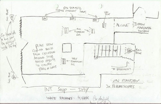
My aim with the lighting here was to create a transition from the cool realism of daylight at the front of the shop, through the warm shop floor, with patches of other colours adding depth and delineating different areas, to the alcove and the magenta light of the sconce which illuminates the tape recorder. In a nutshell: a magical journey.
Since it was a real location, there was genuine daylight flooding in through the windows, over which I had no control. This would determine my white balance and exposure, and everything I introduced would have to work with that. I knew that the windows would be blown out, but this was necessary anyway to hide certain things that were meant to be happening out on the street but weren’t.
We lensed the shop interiors at f1.8 on ISO 100 or 200. As you can see on the lighting plan, we set the white balance to 4,500K – dialling it in using Magic Lantern, which I’ll discuss in a future post. 4,500K is halfway between daylight and tungsten. This meant the daylight would appear slightly blue on camera, while any ungelled tungsten lamps would appear slightly orange, so my magical journey was already creating itself to some extent.
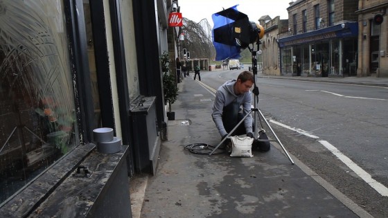
Although my plan shows two 1K Arrilites outside the windows, on the day I chose to use the blonde instead. This was to enhance the backlight on characters near the windows. When we flipped around to shoot towards the back of the shop, we often turned off this blonde because the natural light was doing enough by itself.
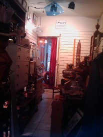
I also forgot how many work-lights Col had when I drew the plan. There weren’t enough to have the three shining down the side wall. But I did have him rig the other four in the plan. The owner of Magpie was totally laid back about us screwing things into his ceiling, which made rigging these lamps fairly straightforward.
The two 500W work-lights drawn either side of the legend “full fluorescent gel” were initially not gelled at all. I decided it was best to keep them warm to facilitate the transition I described earlier. But ultimately we gelled them with half CTB (Colour Temperature Blue, i.e. daylight correction) because they were looking a bit too warm. These two lamps served to drop splashes of orange light on Kate (Georgina Sherrington) as she approached the alcove when shooting towards the front of the shop, and to backlight her and the other characters when shooting towards the back.
The 300W work-light trained on the alcove was left ungelled, which really made the red of the curtain pop.
The lone 500W work-light shown to the left of the staircase in the plan was gelled with half-green fluorescent correction, as planned, for no particular reason other than to separate this area of the shop a bit from others.
A 1K Arrilite was placed at the top of the stairs pointing down to give background depth to wide shots, and also to give some highlights to Dan (Oliver Park) and Alice (Therese Collins) when they’re looking at the records. The 1K was gelled blue (full CTB) to represent daylight. A second one, not in the plan, was placed in a doorway off to the side of the staircase to throw some side-light both on the stairs and on a patch of the shop floor next to the clothes rack.
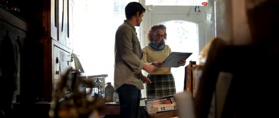
An 800W Arrilite was positioned at the back of the alcove, with a couple of layers of tough-spun diffuser and one of magenta gel. Sophie had chosen to paint the sconce in the alcove with magenta paint, and I felt I should reinforce this in my lighting. It completes the magical journey nicely by representing the reddest end of the lighting spectrum I’d created.
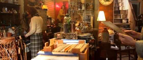
The final touch was clip-lights. We bought twelve of these £2.50 fixtures earlier in the year from B&M for the Cyclotron. Somehow the Cyclotron itself never got used, but the clip-lights were cannibalised and used extensively.
It’s all very well having a great location filled with interesting set dressing, but as DP if you don’t create depth with your lighting, then all that work is wasted. The clip-lights seemed like a great way to add little pools of warm light that would separate the layers of clutter from each other and provide contrast.
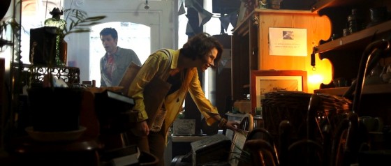
I loved this moment in the wide shot when Kate leant into one, picking her out from the background and reinforcing her leaving Dan behind on her magical journey. (Tell you what, just down your drink every time I write “magical journey”, okay?)
I found myself in need of a little extra “daylight” near the door – to keep Kate in the “real world” a little longer – and so I had one of the fluorescent studio lamps set up on top of a cabinet. That’s what’s hitting Dan on the left of his face in the above image. If I had to justify this light source, I’d say it’s daylight reflecting off a glass cabinet front. You’d buy that, right?
A second fluorescent lamp was employed when the time came to shoot a crucial Glidecam shot leading Kate as she advances into the shop. It was great that she moved in and out of the tungsten lights on her journey, but I was losing her eyes too much. And if you can’t see into your actors’ eyes, you might as well pack up and go home because you don’t have a film.
So while Col operated the Glidecam on this shot, I walked behind him, shining the fluorescent lamp over his head and straight into Georgie’s face. This constant, soft frontlight was at just the right level not to kill the dynamics created by the other lamps, while still putting a sparkle in her eyes and filling in any unflattering shadows.
Check out the shot in the trailer about 8 seconds in:
I also love the shadow from the clothes rack that crosses her face during this shot. This is cast by the 1K Arrilite in the doorway by the stairs, on the other side of the rack. Ostensibly it’s daylight from an unseen window.
This turned out to be one of my favourite shots in the film from a cinematography perspective. Georgie looks absolutely stunning, because of course she is, but Debs’ lovely make-up and the lighting here really bring out her features.
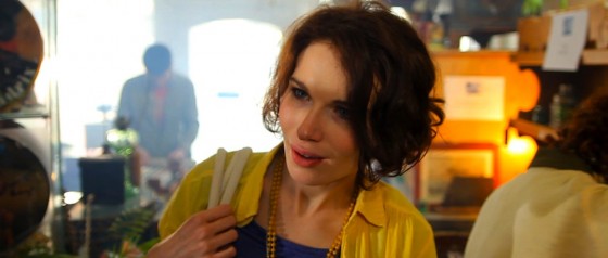
Col pumped in smoke for all the shop interiors. This is another great way of adding depth, not to mention enhancing the dusty, mysterious feel of the shop.
Int. Shop – Night
When it came to the night scenes in the shop, the lack of natural light made quite a big difference without me having to do anything. I changed the white balance to tungsten (3,000K) and experimented with turning off different lamps until I arrived at the mood I wanted. The blue-gelled Arrilites now appeared even bluer, passing as moonlight.
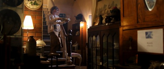
The most striking effect in the night scenes is the police lights. These were integral to the storyline, so I’d discussed them with Colin way in advance.
If you look at the opening scene of Soul Searcher (above – particularly noticeable from about 3’03 onwards), you’ll see that we made use of the flashing amber light on the street-cleaning vehicle. The actual light on the vehicle wasn’t powerful enough, so I asked Col to build a reflector that could be spun in front of an amber-gelled redhead to create the effect.
Eight years later, Col rebuilt this low-tech device for Stop/Eject’s police lights, gelling one side of the reflector red and the other blue. If you scroll back up to the Stop/Eject trailer and scrub to 2’00 you’ll see a behind-the-scenes glimpse of this in action.
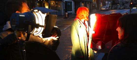
As it turned out, the reflected light from the catchily-named “Spinning Disc Mark II” was not bright enough for wide shots. Instead it fell to Sophie, if I remember rightly, to hold a flag in front of two lights, one gelled blue, the other gelled red, and move this flag back and forth during takes. At other times we simply switched the lights on and off in rapid succession.
During the shooting of all the shop scenes, I felt like I wasn’t quite achieving the look I wanted. Obviously my mind was on many other things, and we were very pushed for time, but somehow it wasn’t looking quite as moody and cave-like as I thought it should. But having played with colour-correcting a bit of the footage now, I’m more than happy that with a little grading it will look great.
If you have any questions about anything I’ve covered here, please comment or post on the Facebook page and I’ll be happy to answer.
That’s all for now, but I will be covering other scenes very soon. Thanks for getting our funding campaign to the £300 mark, and please keep giving and sharing the link so we can finish this epic little short to the best possible standard.
Stop/Eject in Pictures
Production stills by Paul Bednall Photography, except where otherwise indicated.
Behind-the-scenes stills by Paul Bednall, Sophie Black, Philip Briggs, Tommy Draper, Steve Giller and Katie Lake.
Stop/Eject: Shoot Day 6 Podcast
A look at the unscheduled sixth day of principal photography on Stop/Eject…
For Stop/Eject’s post-production crowd-funding campaign, we’ve introduced a new idea. As well as individual rewards for everyone who sponsors – anything from a ticket to the premiere to a voice role in the film, depending on how much you contribute – there are public rewards too. The way these work is that every time the total raised passes one of the hundred pound marks, we release a little treat online – like podcasts or special blog posts.
When the campaign was launched yesterday, we received an amazing £240 in just a few hours, smashing through the first two public reward targets.
Accordingly, Sophie has published a special, detailed blog breaking down the design and creation of the living room set, and a video podcast about the final day of shooting. Why the final day? Well, because the podcasts about the other days aren’t ready yet; we weren’t expecting the total to get past £200 so quickly!
And you can watch the podcast above.
You can make your contribution to Stop/Eject at stopejectmovie.com and help us reach the next target, £300, for an in-depth breakdown of how I lit the shop scenes, what with and why.
