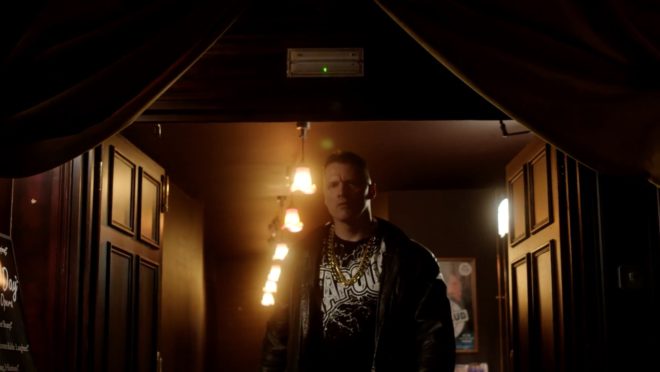
This year I’ve shot a couple of productions on the Sony FS7, a camera I’ve been very impressed by. Its most interesting feature is its high native ISO of 2000, which makes quite an impact on how you go about lighting. The light shed by practicals is often enough to illuminate a scene, or a large part of it, and sometimes you need to take existing practicals away in order to maintain contrast and shape, similar to how you take ambient light away (negative fill) when shooting exteriors.
It’s a strange thing about being a DP that, yes, sometimes you’re required to plan a mammoth lighting set-up using tens of kilowatts of power, but other times it’s just a case of saying, “Take the bulb out of that sconce.” You’re working to exactly the same principles, using your creative eye just as much in both scenarios.
Let’s look at some examples from a promotional film I shot with director Oliver Park for Closer Each Day, an improvised stage soap.
Our location was a pub, which had a large number of existing practicals: mainly wall sconces, but some overheads above the bar and in the corridors too. The film had to be shot in a single night, entirely on Steadicam, with some shots revealing almost the whole room, and to further complicate matters I was a last-minute hire due to another DP having to step down. Keeping the lighting simple, and avoiding putting any “film lights” on the floor where the roving camera might see them, was clearly the way to go.
I identified the darker areas of the room and added a few extra sources: two blue-gelled 800s outside the windows, an orange-gelled 1×1′ LED panel in the wood-burner, an LED reporter light in one key corner, and a small tungsten fresnel toplight onto a key table, firing down from the mezzanine so it would never be in shot. Other than those, and a low level of fill bounced off the ceiling, we relied exclusively on the existing practicals. (They were mainly fluorescent, and ideally we would have reglobed these all with tungsten, but it wasn’t possible.)

So, that’s the “positive” lighting. Here are three examples of “negative” lighting in the film…
When Big Dick Johnson (yep, that’s the character’s name) first enters the pub, I put a piece of tape over a little halogen spotlight just above his point of entry. This was partly because it was very bright and I didn’t want him to blow out as he walked under it, but it also made for a much better sense of depth in the overall shot. As I’ve often mentioned on this blog, the best depth in an image is usually achieved by having the foreground dark, the mid-ground at key and the background bright. Killing the halogen spotlight helped create this progression of brightness and therefore depth. It’s also just nice in a shot like this to come out of darkness into the light, enhancing the reveal of the new space to the viewers.
When Billy De Burgh scrambles to buy a ticket at the box office, there are two practicals just above his head. Depending on which way we were shooting, I de-globed one of the fixtures – always the one closest to camera. This ensured that Billy always had backlight, and never had a really hot, toppy front-light shining harshly down on him.
On a side note, the blue light inside the box office was existing – I guess they were using cool white LED bulbs in there – and I really like the way it differentiates the spaces on camera. It puts the bored ticket-seller in a cold, detached world very separate to Billy’s warmer, more urgent world.
This doorway where Big Dick ends the film had sconces on both sides. It’s never very interesting to have an actor evenly lit on both sides of their face, and especially as Dick is such a tough, unpleasant character, I felt that more contrast was required. I chose to remove the globe from the righthand sconce, so that when he turns camera left to look at the sign he turns into the remaining sconce, his key-light. We filled in the other side of his face a tiny touch with a reflector.
I would love to have been able to exercise the same control over the street-lamps in the opening scene of the film – some of them are quite flat and frontal – but unfortunately time, budget and permissions made that impossible. We would have needed huge flags, or a council-approved electrician to switch the lamps off.
That’s all for today. Next time you’re in Bristol, check out Closer Each Day. I didn’t get chance to see it, but I hear it’s brilliant.


