Composing a Shot-Reverse

Ah, the shot-reverse, that staple of film and television, that standard for dialogue scenes everywhere. Sooner or later, two characters are going to stand three feet apart, facing each other, and have a chat. (You know, like real people do all the time.) And the required coverage will be a wide or two-shot, followed by a pair of singles known as a shot-reverse.

The singles can be dirty (including the other character’s shoulder or back of head in the frame) or clean (not showing the other character). Except for tight close-ups, dirty singles – often called over-the-shoulder shots for obvious reasons – are most common, and it’s these that I’ll focus on in this post.


The Unwritten rules. Which I shall now write.

Conventional wisdom on shot-reverses says that the two shots should

  • be the same size,
  • use the same lens,
  • match the height of the respective eye-lines,
  • allow “looking space”, and
  • frame the two characters on opposite sides of the screen.

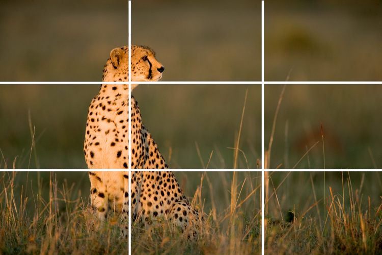
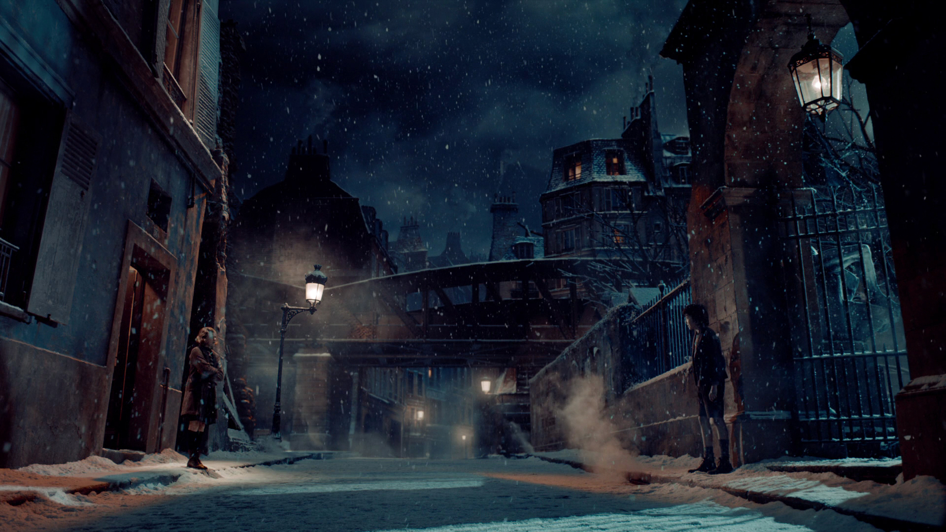
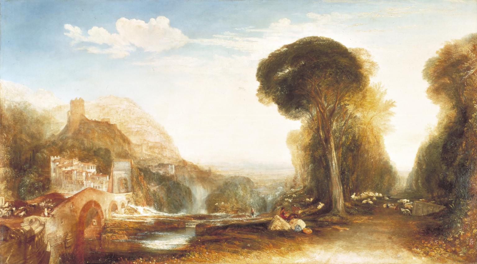
Here is a shot-reverse from Hugo (DP: Robert Richardson) which obeys all of these rules…

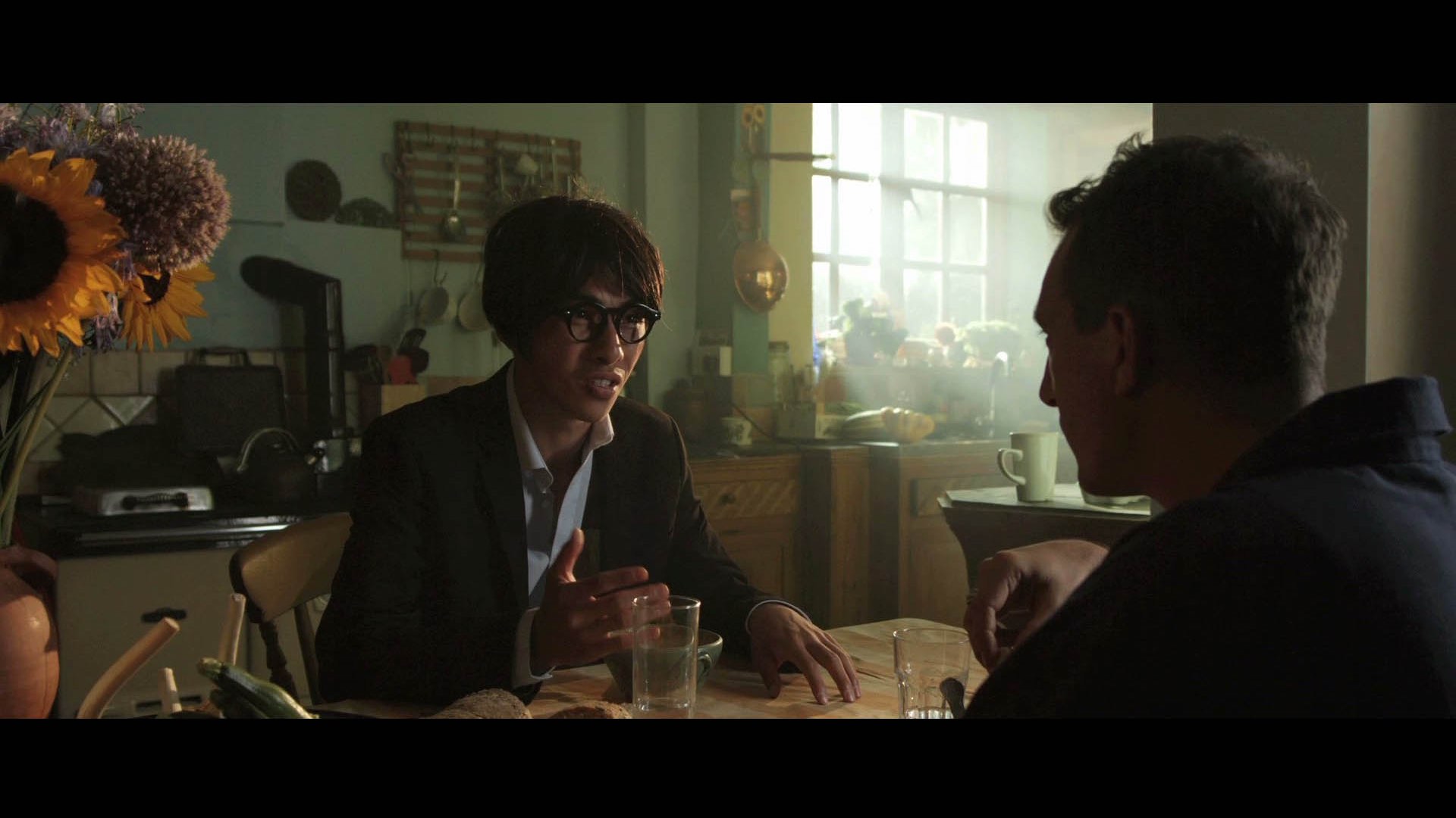
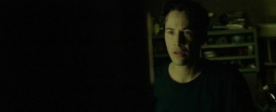
And here is a shot-reverse from Alien (DP: Derek Vanlint) which obeys none of them…

Ultimately, like all framing decisions, it’s subjective. Directors often have strong ideas about what they do and don’t like in shot-reverses. And no two DPs will agree exactly on the subject. And of course the actors will move around at least slightly during the scene, messing with any strict composition you’ve established.


Using the width of the frame

Traditional television, driven as it was by dialogue scenes usually covered in over-the-shoulder shots, was perfectly suited to the old 4:3 ratio. The subject and foreground characters neatly filled the frame.

But with today’s wider aspect ratios – particularly 2.39:1- we have a choice to make about how to use the extra horizontal space. If we want to place the characters on either side of the frame, we have to shift the camera out, away from the eyeline…

This has the disadvantage of showing some of the foreground character’s face, and starting to look a little like a two-shot. But it may be very effective symbolically if the characters have a strained or distant relationship in the story.

If you don’t like all that space between the characters, you can return the camera closer to the eyeline, keeping the subject on the “correct” side of frame, the side that gives them the most looking space

However, the foreground character cuts off the looking space, and the composition can end up looking unbalanced. It may feel like the subject is trapped, squashed into the side of frame by the foreground character. But again, this may be the effect you want to create.

You can frame the characters more centrally, or you can go to the other extreme, placing the foreground character enclosing the side of frame, cradling the rest of the composition…

This creates a nice sense of depth, making the screen resemble a window. The foreground character on the edge of frame continues the perspective of the physical frame itself (be it the plastic surround of a TV set, the curtains of a cinema or whatever) into the frame.

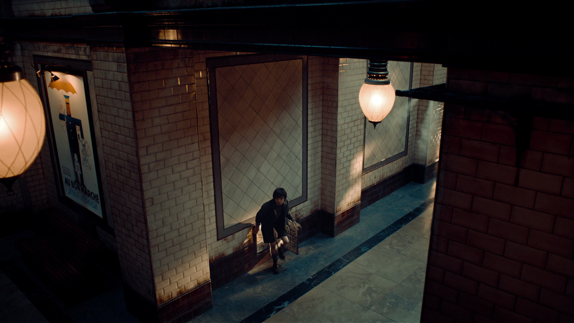
(I can’t understand why the cinema’s empty. This looks like an awesome movie.)

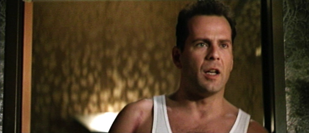
Here’s a similar composition from Die Hard (DP: Jan de Bont), where the perspective is continued even further into the image, to a statue in the deep background…


Oscar-winning shot-reverses

Looking through Evan Richards’ Cinematography Index at recent movies to bag the Best Cinematography Oscar, I saw a wide variety of styles in the shot-reverses. Here are just a few that stood out to me as interesting.

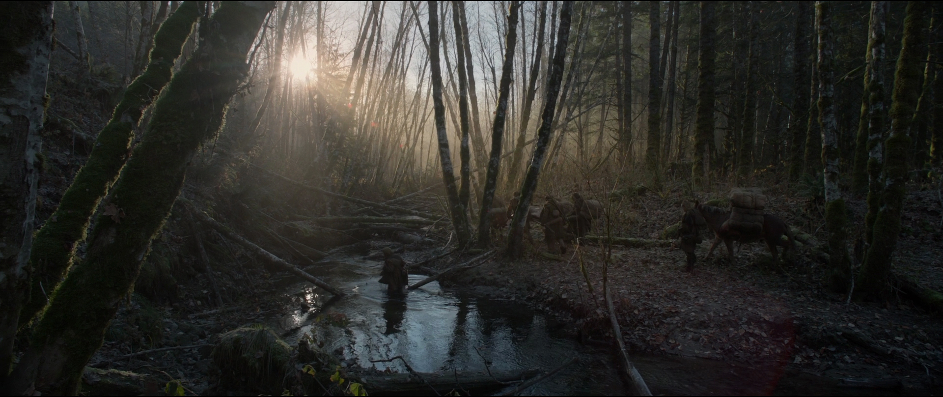
Here’s an example from The Revenant (DP: Emmanuel Lubezki) which uses the foreground character as a framing element on the right…

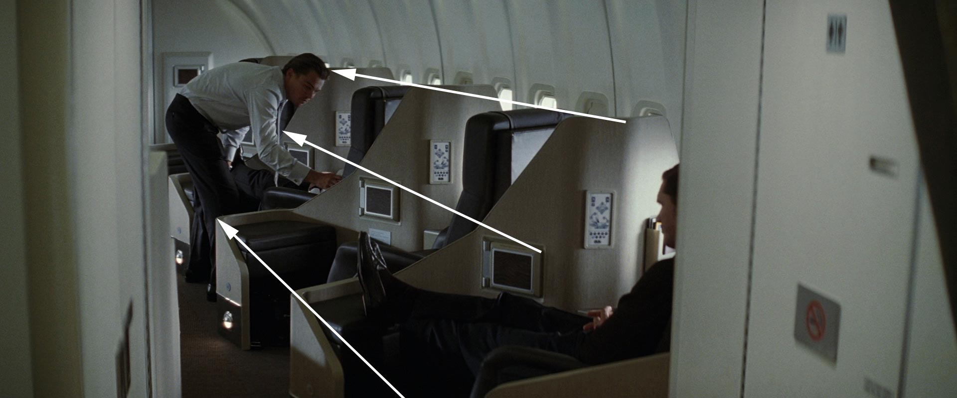
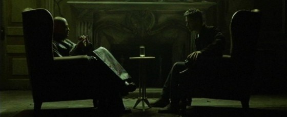
This next example from Inception (DP: Wally Pfister) has great perspective, helped by the line of the table, and the wineglass on the left which almost feels like a vanishing point for the eye-line…

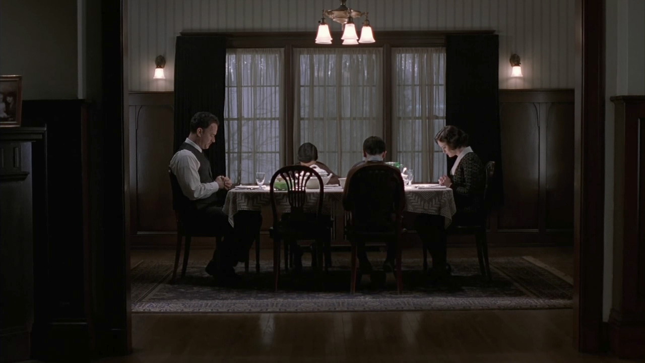
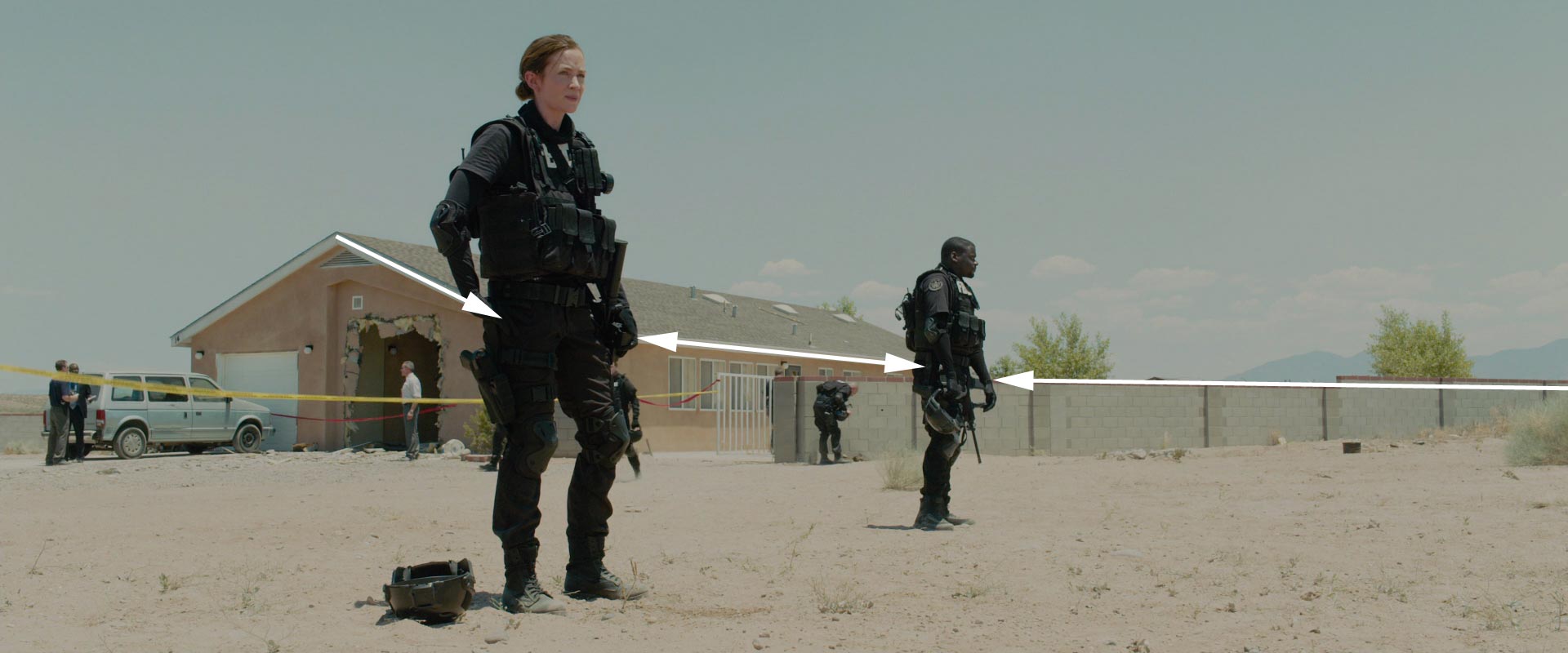
This clean shot-reverse from Sicario (DP: Roger Deakins) is interesting because the camera height is not on the eye-line….

The men at the table are shot from just below their head height, giving them more power and permitting the inclusion of the great perspective lines of ceiling lights in the background. The characters are framed quite centrally, which is also true of this final example, from Memoirs of a Geisha (DP: Dion Beebe)…

In the first shot, the distant window on frame right anchors and balances the composition, while the lantern on frame left serves the same function in the second shot.


And now the conclusion

If there’s one single piece of advice to take from this somewhat disjointed post, it’s that it’s more important to frame a shot-reverse in a way that feels right aesthetically, for the characters, and for the story, than to follow any rules, because…

See also: Composing a Wide Shot and 2.39:1 Composition

Composing a Shot-Reverse

Composing a Wide Shot

I have wanted to write a blog post about composition for ages, but I’ve procrastinated. Framing is such an instinctive and subjective thing; could I ever articulate how to do it? I’m still not sure, but at last I’m taking a deep breath and giving it a go. To help me, I’m using frame grabs from Best Cinematography Oscar-winning films of the last ten years or so, taken from the brilliant and handy website Cinematographer’s Index. Check it out and donate a few bucks if you can.


the rule of thirds

The Rule of Thirds is well known to most filmmakers. It suggests that you imagine the frame divided vertically and horizontally into thirds, then place the subject on one of the intersections of these lines.

However, composing images using The Rule of Thirds is like riding a bike using stabilisers. It’s something that you use before you’ve developed your own eye for composition.

Here are just a few examples of cinematography which completely ignore the rule, yet won Oscars. Guillermo Navarro puts his subject bang in the centre, in this scene from Pan’s Labyrinth

While Dion Beebe goes for an extreme off-set in Memoirs of a Geisha

In this scene from Life of Pi, Claudio Miranda places the two least important elements in the frame – the lifeboat and the sun – roughly on the thirds, but puts Pi himself right in the centre, and the distant ship off to the right…


ENclosing one SIDE

So, if we’re not using The Rule of Thirds, where do we start? I like to start with the edges of the frame, rather than some arbitrary points within in. I look for something to give me a reason to put the edge of the frame in a particular place.

As I touched on in my previous post, about Turner, it’s aesthetically pleasing to create a frame within a frame, but unless you’re shooting through a window you can’t always enclose the image on all four sides. Often the ground/horizon gives you a free framing along the bottom edge. So if you can frame just one more side, you’ve got an L-shaped frame (though the ‘L’ may be backwards) and you’re doing pretty well.

This is probably the most common compositional technique you’ll see in wide shots: a tree, wall or other vertical element enclosing the frame on one side. Pan’s Labyrinth again…

Here’s one from The Revenant (DP: Emmanuel Lubezki)…

It’s great when these enclosing elements are in the foreground, because they also serve to add depth to the image. But they can be in the background too, like the righthand skyscraper in this frame from Slumdog Millionaire (DP: Anthony Dod Mantle)…

Or in this one from Pan’s Labyrinth, where the mill wheel defines the height of the image as well as framing it on the left…

Sometimes, with flatter compositions, you can find an element on the same plane as the subject with which to frame the shot on one side, like the streetlamp on the left of this shot from Life of Pi. Note that the edge of the pond also provides strong framing along the bottom of the image…


ENCLOSING TWO SIDES

Placing enclosing elements on both sides of the frame, as well as being even more aesthetically pleasing than enclosing a single side, can suggest a situation from which the characters cannot escape. Consider these frames from, respectively, Inception (DP: Wally Pfister) and Road to Perdition (DP: Conrad Hall)…


Other frames within frames

In this shot from Hugo (DP: Robert Richardson), the architecture frames the image along the top and righthand side, while leaving it open in the bottom left, the direction towards which the subject is moving…

This shot from Life of Pi contains an interesting choice. The obvious – and far more dominant place – to put the subject would have been leaning against the foreground pillar on the right. Instead, Miranda makes the audience search for him in the frame…

Here, in Road to Perdition, the foreground character, the desk, the phone and the doorway all cradle and enclose the subject…


Pinning a corner

Sometimes it is impossible to enclose the image on any of its sides. In these cases I will at least try to pin a corner – to find an element that I can place just within a corner of the frame to anchor the composition. This frame from Hugo uses the lamp in the top right for this purpose…

Mantle uses the foreground tyre here in Slumdog Millionaire…

Navarro uses a chair in the bottom left of this Pan’s Labyrinth shot. Notice how the subject is placed on the imaginary line connecting the chair to the circular window in the background, which balances it out…

In this scene from Road to Perdition, Hall pins the top lefthand corner with the light fixture, then balances it beautifully with the shadows in the bottom right…

Indeed, the corner-pinning technique seems most effective when the diagonally opposite corner is opposite in other ways too – dark vs. light, close vs. far, warm vs. cold, etc.


Vanishing points

Vanishing points are a concept familiar to artists and technical drafters. You extend the image’s straight lines in perspective to the point where they vanish into the distance. Placing the subject of your image on a vanishing point will lead the viewer’s eyes right to them. Check out these examples from, respectively, Memoirs of a Geisha and Road to Perdition…

This shot from Slumdog Millionaire is a little more subtle, but follow the lines of the table and chair and you’ll end up right at the children…

And just to prove that rules are meant to be broken, here’s a Slumdog shot where the subjects are nowhere the vanishing point…


LEADING LINES

It’s not just vanishing points that provide satisfying spots to place your subject. Leading lines of any kind can draw the eye. In this shot from Inception, the vanishing point (the tip of the plane’s nose) would be somewhere in the extreme top-left corner of frame. Di Caprio isn’t on that vanishing point, but the rows of seats still lead our eyes to him…

In this shot from Sicario, Roger Deakins places both subjects over the corners of the house, where the buildings’ lines lead us to…

In The Revenant, this frame places the subjects at the point of the V formed by the sloping mounds…


Symmetry

I’ve touched on the concept of balance throughout this post, and I’ll probably need to write a whole other post to really get into it, but for now, here are some beautiful examples of the simplest way of giving a composition balance: symmetry…


So those are a few basic ways of approaching the composition of a wide shot. More composition posts to come, but meanwhile, you might like to check out my existing post on 2.39:1 composition.

Composing a Wide Shot

5 Principles of Cinematography We Can Learn from Turner

Yesterday I took a trip to The Tate Britain to see what I could learn about light and composition from the world of traditional art. My background is more technical than fine art, so this world is quite new to me. Within quarter of an hour of arriving, I had fallen in love with the work of JMW Turner. The way this man captured the natural moods of light and weather is breathtaking.

Here are five of Turner’s techniques for creating beautiful images which we can apply to cinematography.


1. Negative space

One of the most powerful things you can do with an area of the frame is to let it go black. A great example is Bill Pope’s work on The Matrix. But 200 years before that, Turner was embracing the darkness, emphasising those areas in the light, and allowing the viewer’s imagination to fill in the gaps.

“Jason” (1802) – That dragon is lurking in the shadows like a dodgy monster costume in a B-movie.
“Sketch of a Bank, with Gipsies” (1809) – The titular gypsies are barely visible in the black shadows, betrayed only by the smoke from their fire.


2. Layering

Any artist creating a 2D image strives to give the impression of depth and dimensionality. There are a number of techniques that can be used to achieve this, but one which Turner uses repeatedly is layering. See how the paintings below delineate foreground (light), midground (dark) and background (light again). The midgrounds sink into shadow, becoming negative space, reinforcing the link and relationship between the foregrounds and backgrounds. At the same time, the foreground figures stand out clearly and eye-catchingly against the shade behind them.

“The Tenth Plague of Egypt” (1802)
“The Goddess of Discord Choosing the Apple of Contention in the Garden of the Hesperides” (1806) – This painting contains five layers: light-dark-light-dark-light, highlighting the two groups of people and the monster in the distance.


3. Framing

Although most images we see are framed, be it by a gilt picture frame or by the black edges of a phone screen, there is something aesthetically pleasing about adding a second frame within the image itself. An extreme example would be shooting through a window, framing the image on all four sides, but more commonly we frame two or three sides of the image. Turner frequently does this using trees, buildings and shadowy ground.

“The Decline of the Carthaginian Empire” (1817) – A backwards-‘J’-shaped frame is created by the dark foreground: the wall on the left, the shadowed floor across the bottom, and the dark space in the lower right. To balance the shorter part of the ‘J’ on the righthand side, the sun and its reflection (the focal point of the image) are placed left of centre.
“England: Richmond Hill, on the Prince Regent’s Birthday” (1819) – The dark ground and dark tree to the right create a backwards-L-shaped frame which appears to cradle the rest of the image like a waiter cradling plates in the crook of his elbow.


4. Dynamic Composition

The composition of the two paintings below fascinates me. Both seem to be two images in one: a deep view of a settlement on the left, and a tapering tunnel perspective on the right. As I studied them, I found my eyes “panning” from one side to the other. As cinematographers, we can use actual camera movement to create a dynamic shot, but we should not forget Turner’s lesson here, that there can also be dynamism in static frames.

“Rome, from the Vatican. Raffaelle, Accompanied by La Fornarina, Preparing his Pictures for the Decoration of the Loggia” (1820)
“Palestrina – Composition” (1828)


5. Colour Contrast

Apart from stunningly demonstrating Turner’s power to create mood and atmosphere (a core skill for any DP), the two paintings below are great examples of warm/cool colour contrast. The yellows, oranges and reds of fire and sunset are juxtaposed with the blues of the sky. The result is pictures that really “pop”, arresting the viewer’s attention. A modern cinematographer can readily achieve a similar effect by playing natural daylight, and daylight sources like HMIs and Kinos, against practicals and other tungsten sources.

“Peace – Burial at Sea” (1842) – Contrast in both hue and luminance make this a powerfully evocative painting.
“War. The Exile and the Rock Limpet” (1842) – Note how Napoleon’s blue uniform causes him to stand out against the oranges of the sky, whilst the unimportant, red-garbed soldier behind him is allowed to blend into the background.

 
See also: my trip to the National Portrait Gallery.

5 Principles of Cinematography We Can Learn from Turner

Aspect Ratio

Aspect ratio is a large and potentially confusing subject, but the good news is that there are only a few things you need to know to get by 99% of the time. Today I’ll go over those things, and show you where to look if you want to cover that last 1%.

Put simply, aspect ratio is the ratio of an image’s width to its height. For example, a 1.85:1 image is 1.85 times as wide as it is high.

Caption: the three main aspect ratios, plus 4:3 for reference. 4:3 is, more or less, the ratio most movies were shot in until the 1950s and all TV was shot in until the late 1990s.

The diagram above shows four aspect ratios. 4:3 is, more or less, the ratio most movies were shot in until the 1950s and all TV was shot in until the late 1990s, but today it’s virtually obsolete. So let’s look at the other three…

  • 16:9 – This is the standard ratio for TV, DVD (sort of), Blu-ray, YouTube and other video sharing and VOD platforms. It is sometimes written as 1.77:1 or 1.78:1. Almost all digital cameras shoot natively in this ratio. In the TV industry, this ratio was often called widescreen to distinguish it from 4:3.
  • 1.85:1 – One of two standard ratios for digital cinema projection. It is very similar to 16:9, but slightly wider. In practice, 1.85:1 movies may be shot and framed for 16:9, and delivered in 16:9 for TV, DVD and so on, but cropped very slightly at the top and bottom to achieve the 1.85:1 ratio for cinema projection.
  • 2.39:1 – A.k.a. Cinemascope (“Scope” for short) or widescreen (in the film industry), this is the other standard ratio for cinema projection. It is achieved either by cropping a 16:9 frame or by using anamorphic lenses to squeeze the image horizontally. Note that many cameras offer 2.35:1 framing guides rather than 2.39:1, but the difference is negligible, and these two designations are used pretty much interchangeably, as well as 2.40:1. On TV, VOD and so on, 2.39:1 movies are generally letterboxed to fit the ratio onto the 16:9 screen.
A 2.39:1 image letterboxed to 16:9, from The Gong Fu Connection (dir. Ted Duran)
A 2.39:1 image letterboxed to 16:9, from an action-comedy feature I shot called The Gong Fu Connection (dir. Ted Duran)


This graph by Stephen Follows shows how 2.39:1 movies have become more common in recent years, with around 70% of the 100 top grossing Hollywood films produced in this ratio.
This graph by Stephen Follows shows how Scope movies have become more common in the last two decades, with around 70% of the 100 top grossing Hollywood films produced in the 2.35:1 / 2.39:1  ratio. I suspect that a survey of lower grossing films would show a higher proportion of 1.85:1 material.

There is a temptation to choose 2.39:1 because it looks more “cinematic“, but it’s important to think carefully before selecting your aspect ratio. Here are some reasons to consider:

Some advantages of 2.39:1

  • Better for landscapes
  • More composition options with group shots and over-the-shoulder shots in terms of horizontal placement and separation of the two characters
  • Better for wide sets, or sets lacking height

(See also my article on 2:39:1 composition.)

Ren: The Girl with the Mark (2.35:1)
The 2.39:1 aspect ratio helps me to frame out the unfinished roofs of the buildings behind the title character in Ren: The Girl with the Mark (dir. Kate Madison).

Some advantages of 1.85:1 or 16:9

  • Shows more body language in singles
  • Better for shots containing characters of very different heights – e.g. two-shot of an adult and a child
  • Better for tall or narrow sets, and car interiors
The 16:9 aspect ratio allows me to show the nice, oak beam ceiling and the raised stage in this shot from The First Musketeer (dir. Harriet Sams).

Although your project will almost certainly be delivered in one of the three ratios listed above, it is of course possible to frame and mask your footage to any aspect ratio you can imagine. This should always be cleared with the producer though, because sales agents may reject films not presented in a standard ratio.

Some recent films using non-standard ratios are:

  • The Hateful Eight – 2.76:1 – Tarantino’s latest was lensed in Ultra Panavision 70, an obsolete, super-wide 70mm celluloid format. But unless you were lucky enough to catch one of the much-publicised roadshow screenings, or you own the Blu-ray, you probably saw it cropped to 2.39:1.
  • Jurassic World – 2:1 – The filmmakers felt that 1.85:1 was too TV, but 2.39:1 lacked enough height for the dinosaurs, so they used a halfway house. In practice, the movie was delivered to cinemas in 1.85:1 with letterboxing at the top and bottom to achieve the 2:1 ratio. I have a whole post about 2:1 here.
  • Ida – 4:3 – Set in a convent, this film symbolises its nuns’ and novices’ thoughts of God and heaven above by using this tall aspect ratio and framing with lots of head room. I have a whole post about 4:3 here.
aspect_ratios
The Grand Budapest Hotel

A surprising number of films use multiple aspect ratios, which we often don’t even notice on a conscious level. Here are just a few examples:

  • The Grand Budapest Hotel – Wes Anderson differentiated the three time periods featured in the story by giving each a different aspect ratio: 1.375:1 (“Academy” ratio, similar to 4:3) for the 1930s, 2.35:1 for the 1960s and 1.85:1 for the more contemporary bookends.
  • The Dark Knight – Parts of this film, such as the opening bank robbery and aerial city footage, were shot in Imax at 1.44:1, while the rest is in 2.35:1.
  • Scott Pilgrim vs. the World – To recall the comic book format of this film’s source material, the aspect ratio changes on a shot-by-shot basis during the fight scenes.

The aspect ratio of a film is agreed by the director, the DP and sometimes the producer, in preproduction. However, it is very easy for a director, producer, editor or colourist to alter the aspect ratio in postproduction. This is far from ideal, and since it changes the composition of every image in the movie, the DP should always be consulted and should ideally work with the post team to ensure that he or she retains authorship of the frame. After all, his or her name is on the film as director of photography.

Regrettably, this doesn’t always happen. I did a short last year which I agreed with the director and producer we would shoot in 4:3, but to my dismay when I saw the finished film it had been reformatted to 2.39:1, a drastically different ratio. To minimise the chances of this happening to you, make sure in preproduction that your director and producer fully understand the consequences of the selected ratio, and make your best effort to attend the grading so you can at least see if any re-framing has occurred before it’s too late.

If you want to know more about aspect ratio, here are a couple of videos you might find useful. The first is a guide I made a few years ago to shooting on celluloid, and it covers (at timecode 2:00) the aspect ratios native to the various gauges of film.

The second is a comprehensive history of aspect ratios in film and TV from Filmmaker IQ.

Aspect Ratio

Shooting ‘Self Control’

On location in a cafe-bar in north London

Recently I photographed Self Control, a short film by writer-director Stanislava “Stacey” Buevich. Joanna Kate Rodgers plays Lily, a woman who struggles to control her violent urges when she’s befriended by an extremely annoying colleague.

A read of Stacey’s shotlist revealed a clear Wes Anderson influence, which was great for me because I immediately knew the parameters: flat angles, formal composition, deliberate 90 degree pans and lateral tracks. Stacey also referenced Ida, which led to several wide shots with lots of headroom, like this one…

Chair scene graded copy

Creating interesting shadows by using a partition window at the location.

Lighting wise, it was a limited kit (two tungsten 2Ks and a Dedo kit with only two functioning lamps). Bin bags and some sheets of thin white packing foam were used to eliminate or reduce natural light coming through offscreen windows, to give shape and contrast to the images. For a scene in the office kitchen, I fired one of the 2Ks through a high partition window to create some shadows.

I knew that I wanted to do something with lighting to clue the audience into Lily’s true identity (she’s the devil in human form). By the end of the first morning I’d settled on lighting her from below whenever possible. In this CU from an office scene, a blue-gelled tungsten 2K was fired down onto a white desktop in front of Lily…

A 2K fires down onto a white desktop to uplight Lily (frame grab below).

Lily office CU graded copy

For a yoga/relaxation scene on the second day, production designer Devon Barber conveniently dressed in a row of tealights on the floor in front of Lily, giving me a great excuse for satanic, fiery bottom-light. We set up a Dedo either side of camera, firing down into strips of kitchen foil so that the light would bounce back up onto Lily’s face. The Dedo dimmers were ridden by my ACs during takes to create a flickering effect.

Strips of tinfoil placed on the floor around the dolly track reflect two Dedolites (just out of frame either side) back up onto Lily's face. A 2K hidden behind the wall on the right provides backlight.
Strips of tinfoil placed on the floor around the dolly track reflect two Dedolites (just out of frame either side) back up onto Lily’s face. A 2K hidden behind the wall on the right provides backlight.

Yoga1 graded copy

To find out more about the work of Stacey and her producing partner Lara Myles, visit www.clockpunkfilms.com

Shooting ‘Self Control’

Top Tips from Day One of the Big League Cine Summit 2015

blcs-blue-on-whiteThis week the third annual Big League Cine Summit is taking place: two days of online masterclasses with top commercial, TV and feature film cinematographers. If you missed this educational and inspirational free event, here are the best tips I culled from day one’s sessions:

Frankie DeMarco – “Composition and Camera Operating for the Big Screen”

  • The advantage for a DP of working with a separate camera op is that you have a second opinion.
  • Try to think like an editor. What specific shots do you need to tell the story? Can you do it in a “oner”?
  • Lots of angles/coverage can kill performances and make the audience overly aware of the camera.
  • If you need to shift position for comfort, do it during a part of the take that the editor is unlikely to use.
  • You can sometimes get away with crossing the line if your singles are dirty.
  • Use clean singles to show that characters are not connecting with each other.
  • Single point perspective, a.k.a. formal composition (framing the subject centrally) can be very powerful.
  • Lighting for silhouette can make a simple moment highly evocative.
  • The best composition reflects character relationships, perhaps using layers and depth.
  • Good composition should draw the eye to the right part of the screen and not distract the audience.
  • Good cinematography should tap into the emotion of the scene and the character whose eyes we’re seeing it through.
  • When watching the blocking, think about the emotions. Let the scene tell you how it should be shot.
  • Let the lens talk to you. Try watching the blocking through different lenses and see what feels right.
  • A great static frame that the actor can move around in trumps panning around with the actor.
  • Use a dolly-in for an emotional moment, but a zoom-in to show a character having a thought or idea.
  • Check out Stanley Kubrick and William Friedkin films to see excellent use of zooms.
  • Use a long lens to disconnect your subject from their surroundings.
  • Play the first take safe, and then you can try tagging hand-props or pulling focus to background characters on later takes.
  • “When in doubt, turn it out.” i.e. beware of over-lighting!
  • Don’t be afraid of changing f-stops from angle to angle to maintain a consistent softness of background when your background is different distances away from different subjects.
  • Don’t worry about continuity too much. “The set is made of rubber.”
  • Try unusual compositions. Be willing to fail.

Kevin Shahinian – “Story Telling Techniques: Adding Massive Production Value”

  • In high-end events shooting, try to get the organisers to pick rooms that will work for sun orientation.
  • Use a long lens to create a potentially unsettling sense of voyeurism.
  • To build tension and unsettle the audience, short-side your subject and show lots of empty background.
  • In an over-the-shoulder shot, add power to the foreground character by having them dominate the frame.
  • With non-actors, shoot candid footage; you may capture genuinely great moments. Use action verbs to direct them, rather than talking in terms of emotions.

Rasmus Heise – “Extraordinary Cinematography with Minimal Lighting”

  • Design lighting that works from all directions, to minimise set-up times.
  • Use more than one colour to add depth.
  • Dot practicals around where possible, to give you sources that will work for different angles.
  • Focus on one key light source in a scene. Everything else is just a bonus.
  • Fluorescent tubes and sodium vapour lamps can be great low budget, low wattage solutions.
  • Philips makes fluorescent tubes with high CRI.
  • Wet down your exterior sets to add contrast and nice reflections.
  • Silhouette shots are quick, cheap and look great.

Matthew Santo – “Commercial Lighting: How to Light Fashion vs. Action”

  • Photographing commercials is all about heightened reality, perfect sunsets, perfect skin, etc.
  • It requires a lot of passive lighting: bounce cards, negative fill, contrast control.
  • On beauty and fashion commercials:
    • Your background can set a darker mood even if the talent has to be lit flatly for beauty.
    • Know your talent’s face in advance – e.g. do they have soft or hard features? Deep-set eyes?
    • What side is the talent’s hair parted on? This could affect your decision on which side to key from.
    • Try to make sure the make-up room’s lighting matches the colour of your lighting on set, so the MUA doesn’t get any nasty surprises on set.
    • Use Briese lights for beauty. They have hard- and softlight qualities.
    • Chimeras may be better for talent with less defined features.
    • Reduce skin texture by pushing fill through large frames or bounce, e.g. 12×12 frames.
    • Hard backlight looks great but beware of fly-away hair.
    • Combine hard and soft sources for backlight that has punch but wraps and doesn’t create shadow issues.
    • There’s a range of Cosmetic lighting gels that add a little warmth and diffusion.
    • Use a low overall light level for talent comfort and less squinting!
  • On sport and action commercials:
    • It’s about movement and body definition. Backlight and sidelight are most important.
    • Edgelight defines the talent’s body shape. Toplight adds muscle definition.
    • Lens flares add dynamism but reduce contrast, so light high-key.
    • Use higher light levels for highspeed shooting and to maintain focus as people move.

Stefan V. Borbely – “Deconstructing High End Car Commercials”

  • Rather than lighting the car, light the environment and the car will reflect that environment.
  • For exteriors, wait for dramatic skies because the car will reflect these.
  • Silver cars are the easiest to light.
  • Use long fluorescent tubes or long reflectors to make seamless long highlights on the bodywork.
  • Use Cinema 4D to test your lighting set-ups for reflections.
  • For night exteriors, take stills on the recce and note your exposure settings.
  • Bagolights are great for creating streaks of light on cars.
  • Fisherlights are a good substitute for the sky.
  • If you can’t afford Fisherlights overhead, put lamps on the floor and shoot them up into big polyboards.
  • Schedule your exterior shots for sunrise and sunset, and shoot inside the car in the middle of the day.

There is still time to get free access to the summit at bigleaguecinesummit.com Stay tuned to neiloseman.com for top tips from day two.


Top Tips from Day One of the Big League Cine Summit 2015

2.39:1 Composition

In the days of 4:3 cameras, many filmmakers chose to mask off their viewfinders and shoot in 16:9 widescreen. Now that 16:9 is ubiquitous, those of us wanting something more cinematic turn to the glorious 2.39:1, a.k.a. Scope. Choose your aspect ratio carefully though, not just because it “looks cooler”. 2.39 works well if you have lots of landscapes, lots of extras or a wide set. It’s not so great if one of your main sets is a tall, narrow booth, as I found out the hard way on Stop/Eject.

I love composing for the 2.39 ratio. You have so much flexibility on where to put your subject in the frame. The rule of thirds is obsolete here. You can put someone almost anywhere in the 2.39 frame and have it look good. They can be short-sided (placed on the “wrong” side of frame) but still have looking space. They can be just off centre, or they can be squeezed right to the edge. And if it’s a two-shot or a dirty single, you can illustrate the closeness of the characters’ relationship by choosing the distance between them in the frame – anywhere from overlapping (a couple madly in love?) to facing each other across the full width of the widescreen frame (enemies with no common ground?).

Here are some of my favourite examples of 2.39 composition. First up, The Matrix, lensed by Bill Bope. Look at how he uses black space to create a stark minimalism. One of the most powerful things you can do with all that horizontal space is to not use half of it!

Matrix-black1

Matrix-door

Matrix-Morpheus

In this close-up (below), Morpheus starts off conventionally framed on the left, but leans forward at a key point, crossing the width of the frame to become short-sided, as pictured. It really makes it feel like he’s getting in your face.

Matrix-Morpheus-shortside

Symmetrical shots become more powerful in 2.39. These ones really help reinforce the rigid, computer-generated nature of the matrix.

Matrix-chairs-symmetry

Matrix-agents-symmetry

In Donnie Darko (DP: Steven Poster), formal composition (framing characters centrally) is used as a stylistic device in the dream sequences. Again, a powerful symmetry in this wide format.

Donnie1 Donnie2

I love the composition of this shot from Armaggedon (DP: John Schwartzman). He’s on the “wrong” side of frame and he’s barely off centre, but somehow it works beautifully. It almost looks like he’s surging forwards with the flag, rather than seeming dominated by it, like he would if he was on the right of frame.

Armageddon

Jan de Bont’s cinematography in Die Hard is a masterclass in 2.39 composition. Check out the depth in these raking shots.

DieHard-Bonnie

DieHard-mirror

Below, De Bont uses the doorway as a symmetrical frame for the composition, which gives Willis license to be anywhere within it.

DieHard-CU-shortside

Here’s an interesting lesson in shooting over-the-shoulders in 2.39. Put the foreground actor on the edge of frame and you’ll find it very hard to keep a sense of depth if you put the background actor over on the other side of frame. You need them nearer so the perspective can continue off into the other side of frame, perhaps with other characters (or a statue, in this case) in the deep background or just the set.

DieHard-overshoulder

Here’s a nice bit of short-siding, balanced out by the car.

DieHard-shortside-ext

And finally, I utterly adore this shot/reverse from Alien (DP: Derek Vanlint). If ever a director tells you that shot/reverses have to match, show them this scene. Every rule in the book is broken. He’s shot from a low angle, she’s shot from head height. He’s in a mid, she’s in an MCU. His single is dirty, hers is clean. He’s on the left of frame, and so’s she! But isn’t it gorgeous? Both characters are given power through composition, but in different ways. His power comes from the low angle of the camera. Hers comes from her being placed towards the closer end of the horizontal lines in the set. If she’d been placed on the tapering end, on the right of frame, she would have no power in this scene at all, compositionally. I can’t say whether it’s intentional, but the fact that this compositional power – equal but different – matches the power the characters have in the dialogue and performance, is just exquisite.

Alien-HurtAlien-Weaver

What are your favourite 2.39 movies, and how do they use the frame to help tell the story?

2.39:1 Composition