A few weeks ago, I came very close to investing in an Ilford/Paterson Starter Kit so that I could process film at home. I have four exposed rolls of 35mm HP5+ sitting on my shelf, and I thought that developing them at home might be a nice way to kill a bit of lockdown time. However, I still wouldn’t be able to print them, due to the difficulties of creating a darkroom in my flat. And with lockdown now easing, it probably won’t be long until I can get to Holborn Studios and hire their darkroom as usual.
So in this article I’ll talk through the process of developing a roll of black-and-white 35mm, as I would do it in the Holborn darkoom. If you haven’t already, you might want to read my post about how film works first.
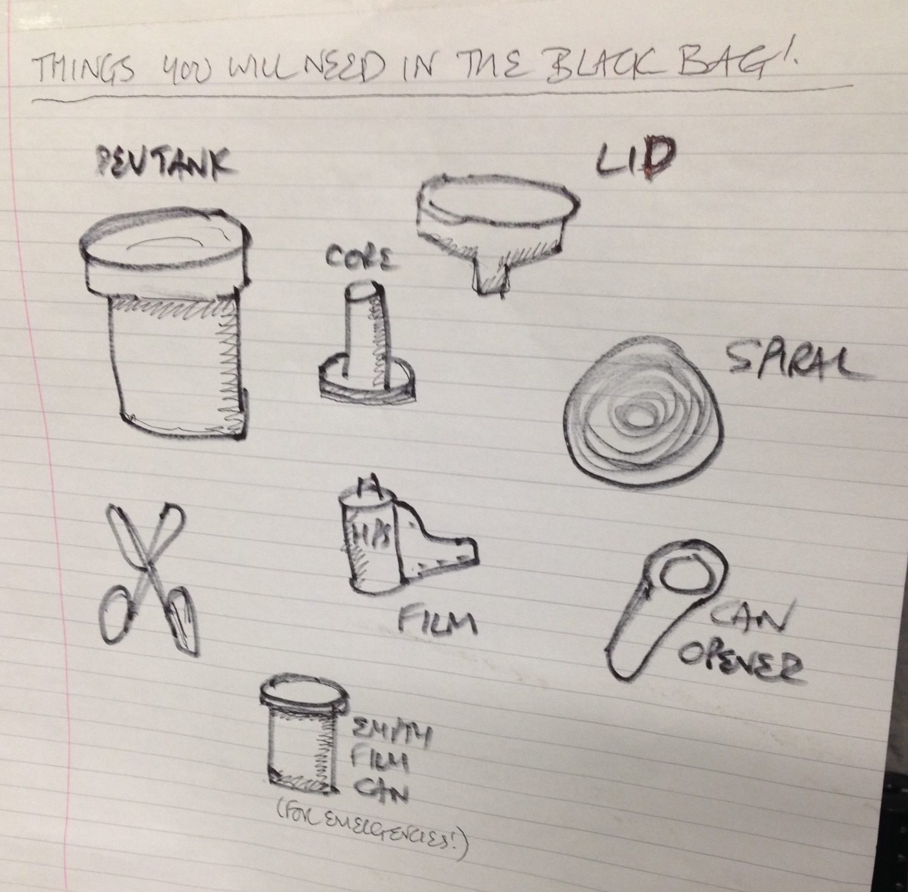
You will need
- Exposed roll of 35mm, with the tail of the film still sticking out of the cassette
- Changing bag, or a room that you can completely eliminate ALL light from
- Paterson tank, or similar developing tank
- Scissors
- Measuring cylinders
- Thermometer
- Drying hooks
- Squeegee
- Developer, e.g. Kodak HC-110
- Fixer
- Washing-up liquid
- Negative storage sheet
- Easy access to running water
- Somewhere dust-free to dry the negatives
Loading the developing tank
The first step is to transfer the exposed film from its cassette – which is of course light-proof – into the Paterson tank, which is designed to admit the developing chemicals but not light. This transfer must take place in complete darkness, to avoid fogging the film. I’ve always done this using a changing bag, which is a black bag with a double seal and elasticated arm-holes.
Start by putting the following items into the bag: the film cassette, scissors and the various components of the Paterson tank, including the spiral. It’s wise to put in an empty film canister too, in case something goes wrong, and if the tail of your film isn’t sticking out of the cassette then you’ll need a can opener as well.
Seal the bag, put your arms in, and pull all the film out of the cassette. It’s important NOT to remove your arms from the bag now, until the film is safely inside the closed tank, otherwise light can get in through the arm-holes and fog the film.
Use the scissors to cut the end of the film from the cassette, and to trim the tongue (narrower part) off the head of the film.

Now we come to the most difficult part, the part which always has me sweating and swearing and regretting all my life choices: loading the film onto the spiral. I have practised this with dead film many times, but when I’m fumbling around in the dark of the changing bag it’s a hundred times harder.
It’s hard to describe loading the spiral verbally, but this blog post by Chris Waller is very clear and even includes pictures. (Chris recommends cutting a slight chamfer onto the leading corners of the film, which I shall certainly try next time, as well as using your thumbs to keep the film flat on its approach to the reel.)
If you’re working with 120 film, the loading process is very slightly different, and this video describes it well.
Once the spiral is loaded, you can thread it onto the core, place the core inside the tank, and then put the lid on. It is now safe to open the bag.
Developing

Holborn Studios’ darkroom is stocked with a working solution of Kodak HC-110 developer, but if you don’t have this luxury, or you’re not using the Ilford Simplicity packs, then you’ll need to make up a working solution yourself by diluting the developer according to the manufacturer’s instructions. For HC-110 dilution B, which is what Holborn uses, it’s 1+31, i.e.one part concentrated developer to 31 parts water. The working solution has a limited shelf life, so again consult the manufacturer’s instructions.
Further dilution is required at the point of development, at a ratio of 1+7 in this case, but once more this may vary depending on the chemicals you choose. For one roll of 35mm, you need 37.5ml of the HC-110 dilution B, and 262.5ml of water for a total of 300ml.
The developing time depends on the type of film stock, the speed you rated it at, the type of developer and its dilution, and the temperature of the chemicals. Digital Truth has all the figures you need to find the right development time.

I was taught to ensure my water is always at 20°C before mixing it with the developer, to keep the timing calculations a little simpler. At this temperature, a roll of Ilford HP5+ rated at its box speed of ISO 400 needs five minutes to develop in HC-110 dilution B. Ilford Delta, on the other hand, needs a whopping 14.5 minutes to process at its box speed of 3200.
Once your diluted developer is ready, pour it into the Paterson tank and put on the cap. It is now necessary to agitate the chemicals in order to distribute them evenly around the film. My technique is inversion, i.e. turning the tank upside-down and back again. Do this continuously for the first 30 seconds, then for 10 seconds every minute after that.
Inside the tank, your latent image is being transformed into an image proper, wherein every exposed silver halide crystal is now black metallic silver.
Fixing
Once the developing time is up, remove the cap from the tank, and pour away the developer immediately. At this point some people will say you need to use a stop bath to put a firm halt to the developing process, but I was taught simply to rinse the tank out with tap water and then proceed straight to fixing. This method has always worked fine for me.
After rinsing the tank, pour in enough fix solution (again prepared to the manufacturer’s instructions) to fill it completely. Put the cap back on, agitate it for 30 seconds, then leave it for ten minutes.
During this time, the fixer renders the film’s unexposed crystals inactive and water soluble. When the ten minutes is up, pour the fixer back into its container (it’s reuseable) and leave the tank under running water for a further ten minutes. This washes away the unused silver halide crystals, leaving only the exposed black silver corresponding with light areas of the scene, and just the transparent plastic base corresponding with the dark areas.
Squirt a little diluted washing-up liquid into the tank to prevent drying rings, then drain it. You can now open the tank and see your negative for the first time.

Drying
Remove the film from the developing spiral, taking care to only touch the ends and the edges. Squeegee the top part of the film, dry your hands, then squeegee the rest. This removes droplets which can otherwise mark the negative.
Now attach two hooks to the film, a light one at the top to hang it from, and a heavy one at the bottom to stop the film curling as it dries. Holborn Studios is equipped with a heated drying cabinet, but with patience you can hang a film to dry in any dust-free area.
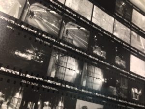
When your film is dry, you can cut it into strips of six frames and insert them into a negative storage sheet.
You can now scan your negatives, or better still print them photo-chemically, as I’ll describe in a future post.