“Red Dwarf VI”: Making a Sci-fi Sitcom in 1993

I have been a huge fan of the British sci-fi sitcom Red Dwarf since the age of 12 or 13. The show has undergone many changes over the years, and every fan has their own view about which era is the best, but for me seasons V and VI will always be my favourites. I discovered the show during season V and I remember the huge anticipation for the next season. During this time the show’s production values were very high but it was still extremely funny, with the main characters all well established and well rounded.

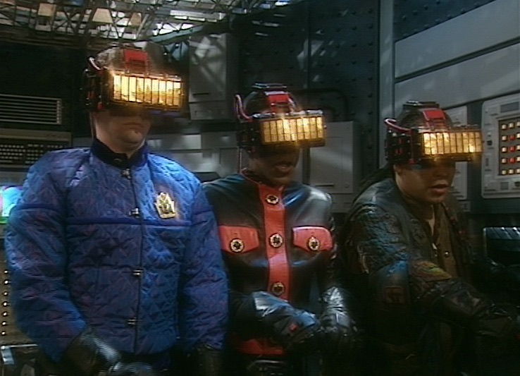
So I was delighted to come across Joe Nazzaro’s book The Making of Red Dwarf in a charity shop recently. It focuses on the production of the series’ most lauded episode, the International Emmy-winning “Gunmen of the Apocalypse” from 1993. The episode sees mechanoid Kryten deliberately contract a computer virus in order to save the Red Dwarf posse, and their efforts to help him battle the infection within the framework of a Wild West VR game representing his consciousness.

What I find fascinating is that the series, at that time at least, was made in such a different way to modern high-end TV or film, following instead the multi-camera sitcom pattern of rehearsing all week and recording in the evening on Saturday.

The cycle began on a Sunday, with production designer Mel Bibby removing the previous episode’s sets from Stage G at Shepperton and installing the new ones.

On Monday the director, writers and cast rehearsed on the set while certain crew members travelled to location – the Laredo Western Club in Kent – to pre-rig. A British sitcom at this time had no director of photography; instead the camera angles were chosen purely by the director and technically executed under the purview of the camera supervisor, while illumination was provided by the lighting director, in this case John Pomphrey. His work at Laredo included putting warm lights inside the buildings to match the look of the interiors which he planned for the studio.

Pomphrey lit a lot of rock and pop shows, and was inspired by concert lighting for such bands as Iron Maiden:

“If you look at them they’re into the same colours I am: oranges, deep blues; powerful colours. I don’t believe in understating something, because you’re generally watching it on a small screen in a well-lit room, so you’ve got to overstate the colours. In the cinema, you can get away with subtle tones, but I don’t think you can on this show… I’m a frustrated cinematographer: I want to make ‘Aliens’.”

Tuesday was the location shoot, conducted with multiple cameras (though not for every set-up) as director Andy DeEmmony worked through his storyboards. At this time all UK TV was 4:3 standard definition. While a high-end drama would have used 16mm film, most shows, including Red Dwarf, were captured on a tape format like Betacam SP. “Gunmen of the Apocalypse” saw the series make rare use of a crane, and behind-the-scenes photos also show at least one HMI shining through a diffusion frame. It was common practice at this time to use large HMIs to fill in shadows on sunny day exteriors.

On Wednesday rehearsals continued on stage, culminating in a tech run during which camera supervisor Rocket previewed shots using the classic hand-framing method. In the evening the production team convened to discuss the next episode, “Polymorph II: Emohawk”.

Thursday was known as the Pre-VT day: the day when all scenes too complex to shoot in front of the live audience must be recorded. With “Gunmen” this meant scenes inside the Last Chance Saloon which required such camera tricks as pulling knives out of antagonist Jimmy’s jacket on nylon wires so that in reverse it looked like the knives were pinning him to the wall, Rimmer’s bar fight with four cowboys, and a scene aboard the Simulant ship which is the source of Kryten’s infection.

Pomphrey would communicate by radio with Dai Thomas, who spent studio days in a darkened cabin operating a lighting desk while watching the action on two monitors.

Friday saw more rehearsals, while Tuesday and Thursday’s footage was edited to show to the live audience tomorrow.

Saturday began with blocking and camera rehearsals, before the doors opened to the public at 7pm and recording commenced at 7:30.

It seems that Shepperton Stage G was not equipped with a gallery like a dedicated TV studio; instead, vision mixing was done from the scanner – an outside broadcast truck. For those who don’t know, vision mixing is live editing, cutting from one camera to another in real time as a production assistant calls the shots from the director’s camera script. Elsewhere in the scanner, an engineer monitored the images, doing something akin to the job of a modern DIT, adjusting colours, sharpness and even remotely controlling the cameras’ irises. (Zoom and focus were controlled by the camera operators.)

It’s a testament to all concerned that the show looked so cinematic despite being made this way. Later seasons became even more cinematic, doing away with the live audience for a little while, then bringing it back and later kick-starting Ed Moore BSC’s career when he shot seasons XI and XII beautifully. By this time the show was produced by Dave (a channel named, appropriately enough, after Red Dwarf‘s slobbish hero Dave Lister). It was now captured in HD, on Red cameras of some flavour if I remember rightly, with a focus puller for each one and a more film-like crew structure .

It’s unclear at present if any more seasons will follow 2020’s “The Promised Land”, but if they do I’m sure the series will continue to evolve and embrace new technologies and working practices. Which is a very dull way to end a post about a very funny show, so instead I’ll leave you with one of my favourite jokes from the series, which will make no sense whatsoever unless you remember the set-up.

Kryten, no kitchen appliance should give a human being a double polaroid.

“Red Dwarf VI”: Making a Sci-fi Sitcom in 1993

Mechanical TV: A Forgotten Format

Cathode ray tube televisions, those bulky, curve-screened devices we all used to have before the rise of LCD flat-screens, already seem like a distant memory. But did you know that they were not the first form of television, that John Logie Baird and his contemporaries first invented a mechanical TV system more akin to Victorian optical toys than the electronic screens that held sway for the greater part of the 20th century?

Mechanical television took several forms, but the most common type revolved, quite literally, around a German invention of 1884 called the Nipkow disc. This had a number of small holes around it, evenly spaced in a spiral pattern. In the Baird standard, developed by the Scottish inventor in the late 1920s, there were 30 holes corresponding to 30 lines of resolution in the resulting image, and the disc would revolve 12.5 times per second, which was the frame rate.

In a darkened studio, an arc light would be shone through the top portion of a spinning Nipkow disc onto the subject. The disc would create a flying spot – a spot of light that travelled horizontally across the scene (as one of the holes passed in front of the arc lamp) and then travelled horizontally across it again but now slightly lower down (as the next hole in the spiral pattern passed the lamp) and so on. For each revolution of the 30-hole disc, 30 horizontal lines of light would be scanned across the subject, one below the other.

A number of photocells would be positioned around the subject, continually converting the overall brightness of the light to a voltage. As the flying spot passed over light-coloured surfaces, more light would reflect off them and into the photocells, so a greater voltage would be produced. As the spot passed over darker objects, less light would reflect into the photocells and a smaller voltage would result. The voltage of the photocells, after amplification, would modulate a radio signal for transmission.

This picture from “Science and Invention”, November 1928, shows the radio receiver on the left and the Nipkow disc with its conical viewing shade on the right.

A viewer’s mechanical television set would consist of a radio receiver, a neon lamp and an upright Nipkow disc of a foot or two in diameter. The lamp – positioned behind the spinning disc – would fluctuate in brightness according to the radio signal.

The viewer would look through a rectangular mask fitted over the top portion of the disc. Each hole that passed in front of the neon lamp would draw a streak of horizontal (albeit slightly arcing) light across the frame, a streak varying in brightness along its length according to the continually varying brightness of the lamp. The next hole would draw a similar line just beneath it, and so on. Thanks to persistence of vision, all the lines would appear at once to the viewer, and it would be followed by 11.5 more sets of lines each second: a moving image.

A number of people were experimenting with this crude but magical technology at the same time, with Baird, the American Charles Francis Jenkins and the Japanese Kenjiro Takayanagi all giving historic public demonstrations in 1925.

The image quality was not great. For comparison, standard definition electronic TV has 576 lines and 25 frames per second in the UK, twice the temporal resolution and almost 20 times the spatial resolution of the Baird mechanical standard. The image was very dim, it was only an inch or two across, and it could only be viewed by a single person through a hood or shade extending from the rectangular mask.

The BBC began transmitting a regular mechanical TV service in 1929, by which time several stations were up and running in the USA. An early viewer, Ohio-based Murry Mercier Jr., who like many radio enthusiasts built his own mechanical TV from a kit, described one of the programmes he watched as “about 15 minutes long, consisting of block letters, from the upper left to the lower right of the screen. This was followed by a man’s head turning from left to right.” Hardly Breaking Bad.

John Logie Baird working on a mechanical TV set

Higher resolutions and larger images required larger Nipkow discs. A brighter image necessitated lenses in each of the disc’s holes to magnify the light. Baird once experimented with a disc of a staggering 8ft in diameter, fitted with lenses the size of bowling balls. One of the lenses came loose, unbalancing the whole disc and sending pieces flying across the workshop at lethal speeds.

Other methods of reproducing the image were developed, including the mirror screw, consisting of a stack of thin mirrors arranged like a spiral staircase, one “step” for each line of the image. The mirror screw produced much larger, brighter images than the Nipkow disc, but the writing was already on the wall for mechanical television.

By 1935, cathode ray tubes – still scanning their images line by line, but by magnetically deflecting an electron beam rather than with moving parts – had surpassed their mechanical counterparts in picture quality. The BBC shut down its mechanical service, pioneers like Baird focused their efforts on electronic imaging, and mechanical TV quietly disappeared.

Mechanical TV: A Forgotten Format

Secondary Grades are Nothing New

Last week I posted an article I wrote a while back (originally for RedShark News), entitled “Why You Can’t Relight Footage in Post”. You may detect that this article comes from a slightly anti-colourist place. I have been, for most of my career, afraid of grading – afraid of colourists ruining my images, indignant that my amazing material should even need grading. Arrogance? Ego? Delusion? Perhaps, but I suspect all DPs have felt this way from time to time.

I think I have finally started to let go of this fear and to understand the symbiotic relationship betwixt DP and colourist. As I mentioned a couple of weeks ago, one of the things I’ve been doing to keep myself occupied during the Covid-19 lockdown is learning to grade. This is so that I can grade the dramatic scenes in my upcoming lighting course, but also an attempt to understand a colourist’s job better. The course I’m taking is this one by Matthew Falconer on Udemy. At 31 hours, it takes some serious commitment to complete, commitment I fear I lack. But I’ve got through enough to have learnt the ins and outs of Davinci Resolve, where to start when correcting an image, the techniques of primary and secondary grades, and how to use the scopes and waveforms. I would certainly recommend the course if you want to learn the craft.

As I worked my way through grading the supplied demo footage, I was struck by two similarities. Firstly, as I tracked an actor’s face and brightened it up, I felt like I was in the darkroom dodging a print. (Dodging involves blocking some of the light reaching a certain part of the image when making an enlargement from a film negative, resulting in a brighter patch.) Subtly lifting the brightness and contrast of your subject’s face can really help draw the viewer’s eye to the right part of the image, but digital colourists were hardly the first people to recognise this. Photographers have been dodging – and the opposite, burning – prints pretty much since the invention of the negative process almost 200 years ago.

The second similarity struck me when I was drawing a power curve around an actor’s shirt in order to adjust its colour separately from the rest of the image. I was reminded of this image from Painting with Light, John Alton’s seminal 1949 work on cinematography…


The chin scrim is a U-shaped scrim… used to cut the light off hot white collars worn with black dinner jackets.

It’s hard for a modern cinematographer to imagine blocking static enough for such a scrim to be useful, or indeed a schedule generous enough to permit the setting-up of such an esoteric tool. But this was how you did a power window in 1949: in camera.

Sometimes I’ve thought that modern grading, particularly secondaries (which target only specific areas of the image) are unnecessary; after all, we got through a century of cinema just fine without them. But in a world where DPs don’t have the time to set up chin scrims, and can’t possibly expect a spark to follow an actor around with one, adding one in post is a great solution. Our cameras might have more dynamic range than 1940s film stock, meaning that that white collar probably won’t blow out, but we certainly don’t want it distracting the eye in the final grade.

Like I said in my previous post, what digital grading does so well are adjustments of emphasis. This is not to belittle the process at all. Those adjustments of emphasis make a huge difference. And while the laws of physics mean that a scene can’t feasibly be relit in post, they also mean that a chin scrim can’t feasibly follow an actor around a set, and you can’t realistically brighten an actor’s face with a follow spot.

What I’m trying to say is, do what’s possible on set, and do what’s impossible in post. This is how lighting and grading work in harmony.

Secondary Grades are Nothing New

The 4:3 Aspect Ratio is Not Dead

This summer I shot Exit Eve, a short film from director Charlie Parham dealing with the exhausting and demeaning life of an au pair. We took the unusual decision to shoot it in 4:3, a ratio all but obsolete, but one which felt right for this particular story. Before I look at some of the ratio’s strengths and challenges, let’s remind ourselves of the history behind it.


History

William Kennedy Dickson

The 4:3 motion picture aspect ratio, a.k.a. 1.33:1, was created about 120 years ago by William Kennedy Dickson. This Thomas Edison employee was developing a forerunner to the movie projector, and decided that an image height of four perforations on 35mm film gave the ideal shape. In 1909 the ratio was declared the official standard for all US films by the Motion Picture Patent Company.

When the talkies arrived two decades later, room needed to be made on the film prints for the optical soundtrack. The Academy of Motion Pictures Arts and Sciences responded by determining a new, very slightly wider ratio of 1.37:1, known fittingly enough as the Academy Ratio. It’s so similar to 4:3 that I’m going to lump them together from hereon in.

When television was invented it naturally adopted the same 4:3 ratio as the big screen. The popularity of TV led to falling cinema attendance in the 1950s, to which the Hollywood studios responded with a range of enticing gimmicks including widescreen aspect ratios. Widescreen stuck, and for the next generation 1.85:1 and 2.39:1 were the ratios of cinema, while the narrower 4:3 was the ratio of TV.

By the time I entered the industry in the late 1990s, 4:3 was much maligned by filmmakers. It seemed boxy and restrictive compared with widescreen, and reminded those of us in the guerrilla world that we didn’t have the budgets and equipment of the Hollywood studios. Meanwhile, the wide compositions of big movies were butchered by pan-and-scan, the practice of cropping during the telecine process to fit the image onto a 4:3 TV without letterboxing. 4:3 was ruining our favourite movies, we felt.

Then, in the 21st century, 16:9 television became the norm, and the 4:3 aspect ratio quietly disappeared, unmourned…. Or did it?


Contemporary Cinema

Although they are firmly in a minority, a number of filmmakers have experimented with 4:3 or Academy Ratio in recent years. Some, like Andrea Arnold and the late Éric Rohmer, rarely shot anything else.

Arnold wanted a combination of intimacy and claustrophobia for her Bafta-winning 2009 drama Fish Tank. She carried the ratio over to her next film, an adaptation of Wuthering Heights, despite the prevalence of big landscapes which would have prompted most directors to choose 2.39:1. The Academy Ratio focuses the viewer’s attention much more on the characters and their inner worlds.

“Fish Tank” – DP: Robbie Ryan, BSC

Mark Kermode has this to say about the 1.37:1 work of Arnold and her DP Robbie Ryan: “What’s wonderful about it is the way [Ryan] uses that squarer format not to make the picture seem compressed but to make it seem taller, to make it seem larger, to make it seem oddly more expansive.”

Meek’s Cutoff (2010), a modern western by Kelly Reichardt, recalls the early Academy classics of the genre. As with Wuthering Heights, characters are placed in the landscape without being dominated by it, while the height of the frame produces bigger skies and an airier feel.

“Meek’s Cutoff” – DP: Chris Blauvelt

Pawel Pawlikowski’s 2013 Oscar-winner Ida deliberately goes against the grain, shooting not only in 4:3 but in black and white as well. It’s the perfect format to convey the timeless, spartan existence of the titular Ida and her fellow nuns. The tall frame allows for copious headroom, inspiring thoughts of Heaven and God, beneath which the mortal characters seem small.

The 2017 animated feature Loving Vincent, meanwhile, adopted 4:3 because it was closer to the shape of Van Gogh’s paintings.

David Lowery, director of last year’s A Ghost Story, wanted to trap his deceased title character in the boxy ratio. “It gave me a good opportunity to really hammer home the circumstances this ghost finds himself trapped in, and to dig into and break down the claustrophobia of his life within these four walls… And it was also a way to tap into some degree of nostalgia, because it feels old-fashioned when you see a movie in a square aspect ratio.”

4:3’s nostalgia factor has allowed it to be used very effectively for flashbacks, such as those in the recent Channel 4/Netflix series The End of the F***ing World. Wes Anderson delineated the three time periods of The Grand Budapest Hotel (2014) with different aspect ratios, using 1.37:1 for scenes set in 1932, the very same year in which that ratio was standardised by the Academy.


“Exit Eve”

Nostalgia, intimacy, claustrophobia, isolation – these are just some of the feelings which cinema’s original aspect ratio can evoke. For Charlie and I on Exit Eve, it was the sense of being trapped which made the ratio really fit our story. 

I’m also a great believer in choosing a ratio that fits the shape of your primary location, and the converted schoolhouse which we were shooting in had very high ceilings. 4:3 allowed us to show the oppressive scale of these rooms, while giving the eponymous Eve little horizontal freedom to move around it. One additional practical consideration was that, when lensing a party scene, the narrower ratio made it easier to fill the frame with supporting artists!

It wasn’t hard to get used to framing in 4:3 again. A lot of Exit Eve was handheld, making for fluid compositions. There were a couple of tripod set-ups where I couldn’t help thinking that the extra width of 1.85:1 would be useful, but for the most part 4:3 worked well. 

We were shooting on an Alexa Plus with a 16:9 sensor, meaning we were cropping the image at the sides, whereas ideally we would have hired a 4:3 model to use the full width of the sensor and a larger proportion of our lenses’ image circles. This would have allowed us to get slightly wider frames in some of the location’s smaller rooms.

Our sound department had to adapt a little. The boom op was used to being able to get in just above the actors’ heads, but with the generous headroom I was often giving, she had to re-learn her instincts.

Classic 4:3 overs in “Star Trek: The Next Generation”

I had forgotten how well dialogue scenes are suited to 4:3. With wider ratios, over-the-shoulder shots can sometimes be tricky; you can end up with a lot of space between the foreground shoulder and the other actor, and the eye-line ends up way off camera. 4:3 perfectly fits a face, along with that ideal L-shape of the foreground shoulder and side of head, while keeping the eye-line tight to camera.

Not every project is right for 4:3, far from it. But I believe that the ratio has served its sentence in the wilderness for its pan-and-scan crimes against cinema, and should now be returned to the fold as a valid and expressive option for filmmakers.

See also:

The 4:3 Aspect Ratio is Not Dead

Book Review: “Motion Studies” by Rebecca Solnit

A modern animation created from photographs from Muybridge’s “Animal Locomotion”, 1887

This is a book that caught my eye following my recent photography project, Stasis. In that project I made some limited explorations of the relationship between time, space and light, so Motion Studies: Time, Space and Eadweard Muybridge, to give it its full title, seemed like it would be on my current wavelength.

Like me a few weeks ago, you might be vaguely aware of Muybridge as the man who first photographed a trotting horse sharply enough to prove that all four of its legs left the ground simultaneously. You may have heard him called “The Father of Cinema”, because he was the first person to shoot a rapid sequence of images of a moving body, and the first person to reanimate those images on a screen.

Born in Kingston-on-Thames in 1830, Muybridge emigrated to San Francisco in the 1850s where, following a stint as a book seller and a near-fatal accident in a runaway carriage, he took up landscape photography. He shot spectacular views of Yosemite National Park and huge panoramas of his adopted city. In 1872 he was commissioned by the railroad tycoon Leland Stanford to photograph his racehorse Occident in motion. This developed into a vast project for Muybridge over the next decade or so, ultimately encompassing over 100,000 photos of humans and other animals in motion.

Muybridge’s set-up for his early motion studies, 1881. The cameras are in the shed on the left.

Much of his early work was accomplished on mammoth wet plates, 2ft wide, that had to be coated with emulsion just before exposure and developed quickly afterwards, necessitating a travelling darkroom tent. To achieve the quick exposures he needed to show the limbs of a   trotting horse without motion blur, he had to develop new chemistry and – with John Isaacs – a new electromagnetic shutter. The results were so different to anything that had been photographed before, that they were initially met with disbelief in some quarters, particularly amongst painters, who were eventually forced to recognise that they had been incorrectly portraying horse’s legs. Artists still use Muybridge’s motion studies today as references for dynamic anatomy.

“Boys Playing Leapfrog”, 1887

To “track” with the animals in motion, Muybridge used a battery of regularly-spaced cameras, each triggered by the feet of the subject pulling on a wire or thread as they passed. Sometimes he would surround a subject with cameras and trigger them all simultaneously, to get multiple angles on the same moment in time. Does that sound familiar? Yes, Muybridge invented Bullet Time over a century before The Matrix.

Muybridge was not the first person to project images in rapid succession to create the illusion of movement, but he was the first person to display photographed (rather than drawn) images in a such a way, to deconstruct motion and reassemble it elsewhere like a Star Trek transporter. In 1888 Muybridge met with Thomas Edison and discussed collaborating on a system to combine motion pictures with wax cylinder audio recordings, but nothing came of this idea which was decades ahead of its time. The same year, French inventor Louis Le Prince shot Roundhay Garden Scene, the oldest known film. A few years later, Edison patented his movie camera, and the Lumière brothers screened their world-changing Workers Leaving the Lumière Factory. The age of cinema had begun.

From “Animal Locomotion”, 1887

Although Muybridge is the centre of Solnit’s book, there is a huge amount of context. The author’s thesis is that Muybridge represents a turning point, a divider between the world he was born into – a world in which people and information could only travel as fast as they or a horse could walk or run, a world where every town kept its own time, where communities were close-knit and relatively isolated – and the world which innovations like his helped to create – the world of speed, of illusions, of instantaneous global communication, where physical distance is no barrier. Solnit draws a direct line from Muybridge’s dissection of time and Stanford’s dissection of space to the global multimedia village we live in today. Because of all this context, the book feels a little slow to get going, but as the story continues and the threads draw together, the value of it becomes clear, elucidating the meaning and significance of Muybridge’s work.

“Muybridge and Athlete”, circa 1887

I can’t claim to have ever been especially interested in history, but I found the book a fascinating lesson on the American West of the late nineteenth century, as well as a thoughtful analysis of the impact photography and cinematography have had on human culture and society. As usual, I’m reviewing this book a little late (it was first published in 2003!), but I heartily recommend checking it out if you’re at all interested in experimental photography or the origins of cinema.

Book Review: “Motion Studies” by Rebecca Solnit