On a pick-up shoot a couple of months back I found myself in the position of needing to mould the natural light without any equipment whatsoever. The sun was shining brightly with no clouds in sight, and we needed to shoot a close-up that would match an existing overcast wide shot. Fortunately there was a B&M just around the corner. Unfortunately no-one took any pictures of the ridiculous set-up that ensued, hence the comedy illustration.
Here’s how to do it:
Get yourself round to B&M. (Other depressing discount stores are available.)
The sheet is going to be your “silk”. First of all, cut the elastic corners to make it easier to wrangle.
Assign Unfortunate Crewmember #1 to hold up the sheet so that it casts a shadow on the talent. It will soften the direct sunlight falling on the them, but there will probably still be darker shadows on their face than you want, so…
Unroll a couple of feet of the foil. This is going to be your bounce card.
Assign Unfortunate Crewmember #2 to stand on the shade side of the talent and use the foil to reflect some direct sunlight into that side their face.
Hope that this is not the day the photographer from the local paper visits the set.
So, you’re in the middle of shooting a scene. You’ve shot everything in one direction and now it’s time to turn around and shoot the reverses. The director of photography must make a decision: do I go for realistic or matching reverses?
Imagine you have a simple scene in which character A stands facing character B and they exchange dialogue. It’s night exterior so you’ve given A a blue backlight and a white frontlight. Realistically then, since B is facing in the opposite direction, he should have a white backlight and a blue frontlight. But do you really want one person’s face to be blue and the other’s to be white? Wouldn’t it be better for B to have a blue backlight and a white frontlight, to match nicely with A? That’s the dilemma.
A matching shot-reverse from Soul Searcher. Both characters have blue backlight, but somehow neither of them have blue frontlight.A realistic shot-reverse from Stop/Eject. The magenta light strikes Alice (left) from the front but Kate (right) from behind.
TV shows seem to plump mostly for matching reverses, whereas movies tend to be a little more realistic, but this is a very rough generalisation. When deciding which style to go for, here are some things you might consider:
Is the overall look of the piece stylised or realistic?
Does lighting the characters differently help to underscore the power dynamics in their relationship, or enhance their characters in some way?
Will the audience have clearly seen a window or other prominent light source in the scene to show that more light would be coming from one direction than another?
Will the light that looks so great as a backlight on character A look unpleasantly harsh as a frontlight on character B? (The answer here is usually yes. That is the whole reason cinematographers have to relight when they do the reverses.)
There is of course middle ground between matching and realistic reverses – tweaking the lighting so that an audience can still buy the continuity of it but it looks good on character B. Usually that is the middle ground we tread, but you will have to decide which style to lean towards.
Incidentally, I believe that a cinematographer should always try to differentiate the status of the characters in a shot-reverse in some way, even if you go for a matching lighting scheme. For example, in the Soul Searcher shots above, Joe’s nervousness is reflected by his close-up being handheld, while Heather’s is locked off. Another example would be a higher angle for one character and lower angle for the other. Best to keep it subtle though!
What angle the key light hits a character at is a KEY (groan) decision for a director of photography. The lighting featurette in my last post looked at some of the options, but today I’d like to expand on those with some more up-to-date examples.
Imagine a clock face. You’re looking down on the scene and your talent is at the centre with their eyeline to twelve o’clock.
The key light clock
With that in mind, consider the following shots. The camera is at between twelve and one o’clock in each case.
Key light at almost twelve o’clockHalf past elevenEleven o’clockQuarter to elevenHalf past nine (view the See Saw trailer)
Clearly the level of fill makes a big difference, but you can already see that a key light at noon gives a flawless, evenly lit look which is great for a leading lady, while a half-past-nine casts half of the face into darkness for a threatening or mysterious feel. There is a sweet spot I love at about quarter to eleven where, on one side of the face, only the eye and a triangle on the cheek are lit. But generally between half past ten and half past eleven models the face nicely.
In all of the above examples, with the camera at one-ish, the key was between nine and twelve, i.e. the key was on the opposite side of the eyeline to the camera. This is known as lighting the “downside” – the side away from camera. Most cinematographers, myself included, consider this the most pleasing side to light from, as it shows the shape of the face and gives a nice shadow area on the camera side into which you can dial your preferred amount of fill.
In many scenes, the position of the keylight will be dictated by the layout of the set or location, so a DP should consider this in pre-production discussions with the production designer, on location scouts or when the director is blocking the actors.
Continuing the tenth anniversary releases of the Soul Searcher DVD extras, this week we have the 10 Minute Lighting Masterclass. It’s a quick guide to some of the basic set-ups and techniques used to give the film its cinematic, moody look. Since making this featurette digital cameras have improved vastly and so has my lighting, so these days I would light more subtly with fill and soft sources, but the basic building blocks in this video are still valid. Later in the week I’ll expand on some of those building blocks here on the blog.
White “daylight” (a 2.5K HMI outside the window and a Kinolfo Barfly behind the actor) and warm “candlelight” (a Dedolight off camera right)
The First Musketeer was my first period production as DP. It’s a genre that brings its own set of challenges and opportunities, most obviously for sets and costumes, and also sound (we spent a lot of time waiting for cars and planes to pass by), but for cinematography too. The first thing that hit me was the restrictiveness of it. Back in the day there were only three sources of light: the sun, the moon and fire. And maybe, at a pinch, starlight.
Paul McMaster as Ghislain. Blue “moonlight” and orange “firelight” – in this case both created by gelled Dedolights
I kept colour temperatures simple by deciding that daylight would always appear white, moonlight would be +2,400K (blue) and firelight would be -2,400K (orange). In practice this meant that daylight scenes were white-balanced at 5,600K using natural light, HMIs and kinoflos, with ungelled redheads or dedos for candlelight, while night scenes were typically white-balanced at 3,200K which turned HMIs and kinos blue for moonlight/starlight, with redheads or dedos gelled with full CTO to turn them orange on camera.
This night exterior shot of Lazare (Tony Sams) and Athos (Edward Mitchell) was shot with a white balance of 3,200K, turning the HMI backlight blue, while the warm light around the tavern entrance was provided by CTO-gelled dedos and redheads.
Occasionally I used straw gels to give “firelight” more of a yellow hue than an orange one, and in one scene involving a church I introduced strongly yellow light and some pink backlight, the theory being that stained glass windows could be held accountable.
A 2.5K provides the frontal keylight here, while a redhead sporting Minus Green gel provides the pink backlight. A second redhead double-gelled with Light Straw uplights the figure of Christ on the back wall, and finally a 1.2K HMI at the rear of the building illuminates the stained glass window.
I think it’s very important to soften the images when shooting a period piece digitally. Initially we hoped to do this by using Cooke lenses, but they proved unobtainable on our budget. It was too late to look into filters by this point, so instead I relied on smoke in most scenes to diffuse and age the image.
Like everyone, I continue to learn with every project that I do. Reviewing the rushes towards the end of the shoot, I realised (a little too late) that texture was the key to making the period convincing. There was bags of it in front of me – in the stone walls of the locations, in the beautifully-aged costumes, in the detailed set dressing. It was an era before smooth surfaces. I can now see that my cinematography was most successful when the lighting brought the textures out.
A 1.2K HMI outside the door cross-lights the stonework, while smoke volumizes this light, resulting in a very satisfying depth and texture. The only other light sources are two Kinoflo Barflies hanging from polecats above the bench at the back of shot. This backlight is reflected back at the foreground characters by a sheet of silver foamcore beneath the camera.
Contrast the shot above with the one below. This location had equally nice stonework, but because I didn’t cross-light it it looks flat and artificial, like a cheap panto set.
A 2.5K HMI supplies the backlight here, while a blue-gelled redhead out of the top right of frame is aimed down the steps to pick out the characters as they descend. An orange-gelled Dedo creates a pool of light around the candle, and everything else is natural bounce off the surrounding walls. A second blue-gelled redhead at the foot of the stairs firing across the stonework would have made all the difference to the believability of the environment, but hindsight is 20/20.
So that’s an important lesson I’ve learnt to take forward to the next season. Next time around I also want to play more with different colours of daylight, using more straw, amber and pink gels to stretch out the colour palette and suggest different times of day.
And then there’s the whole candlelight thing – but I’ll save that for my next post.
All images copyright 2013 The First Musketeer. Find out more about the series at www.firstmusketeer.com
One of the most important jobs of a director of photography is to help the viewer’s brain decode the image. Just as a sound mixer must get the cleanest possible dialogue and ensure that ambience, music and effects don’t distract from it or drown it out, so a cinematographer must ensure the eye is drawn to the character and not distracted by the surroundings.
Depth is a key part of creating this clarity. Christopher Nolan once said: “95 percent of our depth cues come from occlusion, resolution, color and so forth, so the idea of calling a 2-D movie a ’2-D movie’ is a little misleading.”
This week, on The Deaths of John Smith, I photographed a shot that used every trick in the book to create depth. Why? Because it was a one-shot scene, a flashback taken out of context, and the audience needed to “get it” quickly.
When I first set the camera up and we stood John (played by Roy Donoghue) in position, his dark suit melted into the dark wood panelling behind him, so there was clearly some work to do. Once lit, as you can see from these frame grabs, he stands out sharply.
Kirsty Minchella-Storer (Sarah) and Roy Donoghue (John) in The Deaths of John Smith, directed by Roger Harding, copyright 2013 Two Hats Films
Let’s look at the depth cues going on here.
DEPTH OF FIELD. Although I’m shooting at f1.8, on a 20mm lens nothing is massively out of focus, so that isn’t helping much.
SMOKE. There is more smoke between the camera and a distant object than between the camera and a close object, and therefore smoke aids depth perception.
CONTRAST. The foreground is darker than the background, helping the eye to distinguish between the various layers. In particular, the smoke picks up the light from the windows at the back of the room, creating a blue-white haze against which John’s dark suit stands out clearly, as does Sarah’s silhouette.
COLOUR CONTRAST. The foreground is lit with warm orange, while the background is a cool blue, again enhancing the separation between the layers. (Imagine you’re standing on a hill and looking at another hill in the distance. That distant hill looks much bluer than the one you’re standing on, due to atmospheric haze. The smoke and colour contrast mimic this effect.) For most of this film I kept all the light sources within about 1,500K of each other, but in this scene I deliberately allowed more like 3,000K of difference between warm and cool sources to give the flashback a more stylised look.
BACKLIGHT. John has a little edge-light on his righthand side, ostensibly from the wall sconces, but in reality from a hidden Dedo. This helps to cut him out from the background.
FRAMING. The doorway frames the image, adding an extra layer of depth.
PARALLAX. This is the optical phenomenon whereby, when you move your head (or a camera) things closer to you appear to move more than things further away. By dollying slightly into the room behind Sarah we create a dramatic parallax effect as the doorway grows on camera much more than John and the room behind him.
I’ll leave you with my (retrospective) lighting plan for this scene. Be sure to check out the film’s official website at www.thedeathsofjohnsmith.com
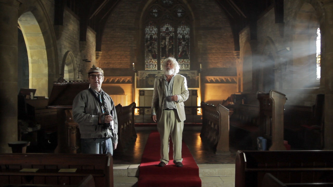
Roger Harding (left) and Jeremy Heynes in The Deaths of John Smith. A 1.2K HMI punches through the window on the right, while a fluorescent softbox illuiminates the arches on the left. Background light comes from two 500W halogen work-lights rigged to a dimmer, while fill (given that it was getting dark outside at this point) comes from a blue-gelled 1K Arrilite behind and to the left of camera.
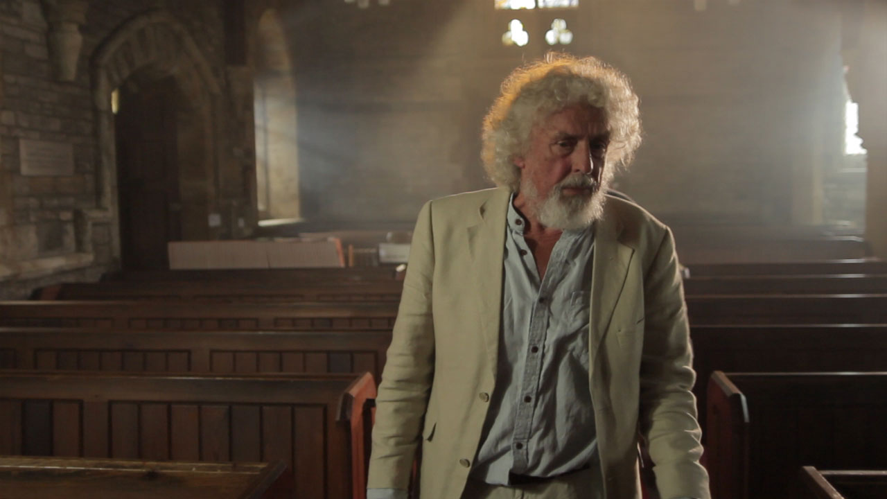
This weekend shooting began on Roger Harding and Darren Scott’s feature-length comedy The Deaths of John Smith. As director of photography I was called on to light a beautiful rural church on a limited budget. Here are some tips for ecclesial cinematography:
Hire HMIs – powerful, daylight-balanced lamps. Without at least one you will never have enough light to illuminate anything but the tiniest of churches. As a backlight on a mezzanine level, a 2.5K HMI will illuminate most churches. Better still, put them outside the windows and create artificial sunbeams. (A blue-gelled blonde or redhead outside a stained glass window is pretty much useless; those windows cut out so much light.)
Use smoke. A £50 disco smoke machine is perfectly sufficient – use it to volumize the light and emphasise the depth and scale of the building. If you’re struggling to expose a bright enough image, smoke helps there too – because it catches the backlight and lightens up the shadows.
Candlelight is a good way to introduce colour contrast into your scene. Dedos are the best lamps to fake candelight with, as they can produce a small circular pool of light. Failing that, any tungsten source will do, ideally rigged to a dimmer board for a bit of flickering.
Assuming you’ve got your HMIs punching directly in through all the windows on one side of your church (that’s the side the “sun” is on), you now need soft light coming in through the opposite windows. Ideally these would be larger HMIs playing off bounce boards, but you might get away with soft boxes or bounced tungsten sources (gelled blue, of course) hidden behind pillars inside the building.
Sellotape together some old bits of coloured gel and rig them in front of a fresnel to simulate daylight through a stained glass window. Note that this doesn’t really work with unfocused lamps like redheads.
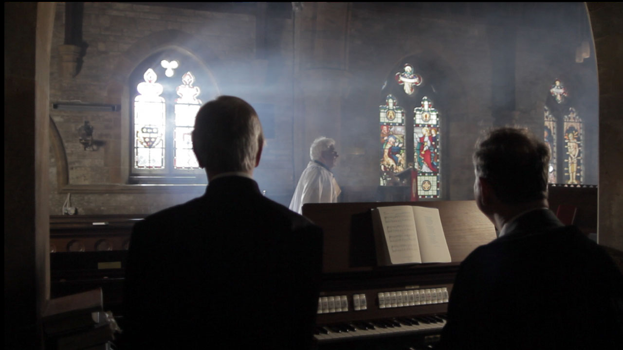
Left to right: David Draper, Bryan Ferriman and Adrian Moore. Our single HMI shines through the lefthand window, suitably volumized with smoke, leaving natural light to deal with the other two. A blue-gelled 1K Arrilite off to the right of frame creates the edge-light on the righthand side of each character. An existing halogen spotlight over the organ was gelled with half CTB to cool it down a little. I chose to leave the nearside of the characters dark to contrast the foreground with the brighter background.
On The Deaths of John Smith I only had access to one HMI, so for every shot I needed to carefully choose which window to put it outside of for the maximum impact. I relied on natural light as well as blue-gelled redheads and fluorescent softboxes just out of frame for fill light. Nonetheless, I’m very pleased with the results. Next weekend we have to repeat the performance with a large congregation….
Here the “sun” (HMI) is outside of the lefthand background window, but I couldn’t resist cheating a little and pushing a 1K Arrilite through a nice yellow stained glass window in the top centre background. Additional backlight comes from a blue-gelled Arrilite off frame right, while a softbox behind and to the left of camera illuminates the actor’s face.
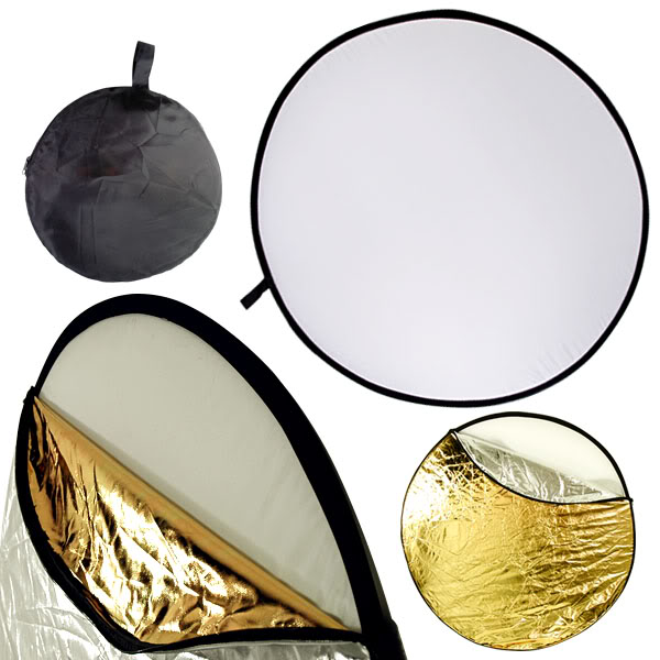
Reflectors are incredibly useful tools, whether you’re a one-man crew or a DP on a big set. And with a 5-in-1 reflector costing only around £10 on Amazon there’s really no excuse not to own one. Here are some of the things you can do with one of these:
On a cloudy day, use the SILVER side to bounce light into the shadows on your subject’s face.
On a sunny day, use the WHITE side for the same purpose (the silver side would be bright enough to make the subject squint) and to put a nice white reflection in the subject’s eyes.
To simulate firelight, bounce a lamp off the GOLD side of the reflector and wobble it gently.
Use the BLACK side for negative fill, useful when shooting in a room with white walls to get some shape and definition back into your subject’s face.
Strip the reflector down to the TRANSLUCENT WHITE centre and rig it on a C-stand above the subject’s head to reduce and diffuse harsh sunlight.
Two reflectors, one below and one above frame, perform functions 2 and 5 respectively. (Georgina Sherrington as Kate in Stop/Eject)
Earlier this year I was hired to DP some promotional spots for Onstage in London. Onstage produces content for the web, hotel TV channels and the growing number of TVs in London taxi cabs, on the subject of West End theatre. The brief was to shoot interviews with actors and creatives against a white backdrop, to be intercut with EPK (Electronic Press Kit) footage of the shows or edited into montages like this one:
I’ve always been a bit wary of shooting against white screens. The danger can be that you have to pump in so much light to make the screen blow out on camera (meaning it turns to complete, uniform white) that the whole image becomes flat and you’re left with no shape to your talent’s face.
Further complicating matters was that, on the first day of shooting, we were travelling to the talent, rather than vice versa, so we were often setting up the backdrop, lights and camera in cramped dressing rooms.
Here is the set-up I came up with:
Set-up 1
Yes, just one light. That one light does four things:
Its direct light blows out the white backdrop.
Its direct light through the diffuser serves as the talent’s key.
Its bounce light creates a little edging on the talent. (I initially set up a dedicated backlight, but found that this bounce was doing a better job. Besides, if you put in too much backlight the talent starts to blend into the white screen.)
The level of ambient light it created in the room served as fill. Sometimes there was too much fill, in which case I would have Colin hold up a black card near the talent’s down side (i.e. the side not lit by the key) to block some of the ambience and restore some shape and contrast to the image.
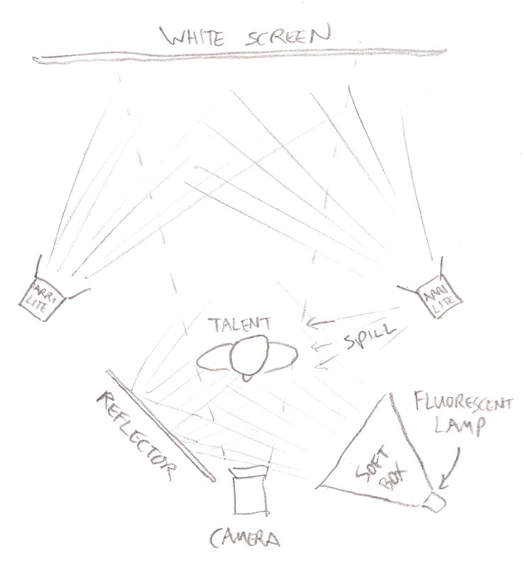
The next time we shot for this project we were in just one room, with significantly more space than we’d had before, so I plumped for a different set-up:
Set-up 2
This time there was enough room to place the talent well away from the backdrop and light them separately. Two Arrilites blow out the backdrop while the fluorescent lamp serves as the talent’s key. Fill is provided by a reflector and a touch of edge light is serendipitously provided by spill from the cooling vents on the side of one Arrilite.
Has anyone else out there shot against a white screen recently? I’m interested to hear what your approach to lighting it was.
The WidthScribe promotional video I recently completed for Astute Graphics involved the actress driving a car – except we ended up casting an actress who can’t drive. We got around this in a few different ways, including the obvious substitution of a qualified driver in the wide shots, complete with appropriate wig.
Perhaps the most interesting technique we used, and one which I might well have used even if she could drive, was Poor Man’s Process. Nowadays, most fake driving shots in films and TV shows are achieved by shooting against a greenscreen and replacing that screen in post with a moving background plate. A more traditional technique is to film against a rear projection screen – a screen onto which previously-shot footage of a moving background is projected in real time behind the actors. This was known as Process Photography.
Poor Man’s Process leaves out the screen altogether, shooting against a plain, ambiguous background that doesn’t reveal the lack of movement – typically empty sky. Careful use of camera movement and dynamic lighting create the illusion of movement.
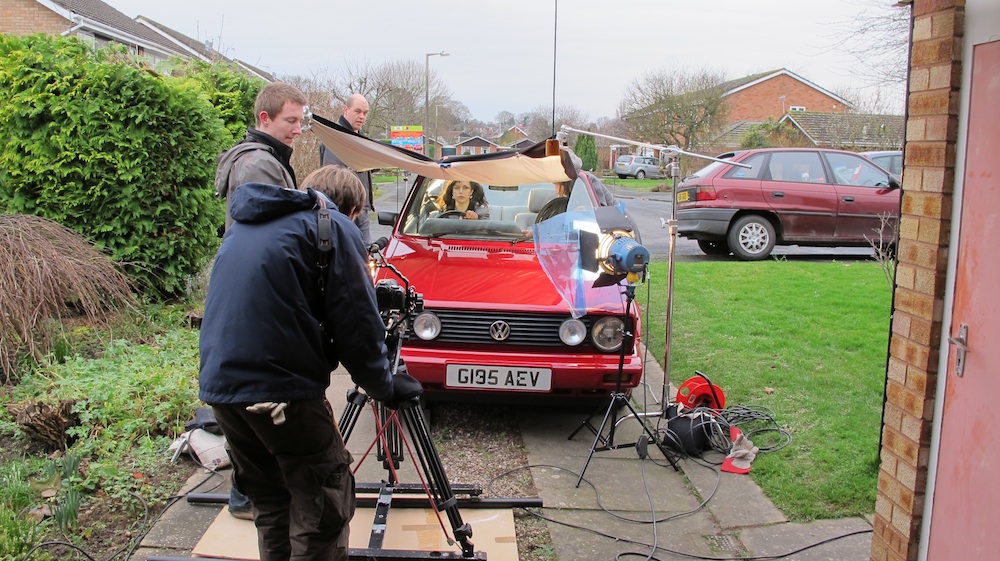
Here is the set-up we used on the WidthScribe promo.
Making the magic
The car is parked on Nick’s drive, which is conveniently sloped so that – from the camera’s point of view – only sky and a bit of a distant tree are visible in the background.
A light behind the car represents the sun, and Nick chops a piece of cardboard up and down in front of it to represent the shadows of passing trees.
Low budget wind machine
Sophie operates a hairdryer to blow Laura’s hair around.
Col shines a reporter light into the lens, moving it around to create the impression of the sun changing position relative to the camera.
And I dolly the camera side-to-side while vibrating it ever so slightly.
When intercut with wide shots of Nick’s wife driving the car for real, you’d never know the close-ups were cheated. (An additional trick we employed was to sit Laura in the passenger seat of the moving car then flop the image in post, for the over-the-shoulder shot of the pylon passing by.)
The drapes are to cut out the reflections in the windscreen.
Poor Man’s Process works best at night, but with the shallow depth of field provided by DSLRs it’s now possible to get away with it in daylight too, so long as the shot is kept fairly tight and the road you’re meant to be driving on is fairly open.
You’ll want to vary the lighting effects you use according to the surroundings the car is supposed to be in. You can use spinning mirrors to sweep “headlights” or “streetlights” over your actors, or move a keylight representing the sun or moon slowly side-to-side, or even place two out-of-focus bulbs in the background of your shot to represent another car behind.
I’ll leave you with an example of Poor Man’s Process in use on a big-budget Hollywood film, Michael Bay’s 1997 Alcatraz actioner, The Rock. All the close-ups in the cars were shot static in a car park.