Front-light

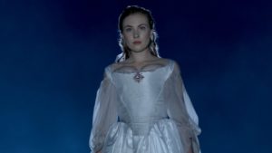
A front-lit shot of mine from “The First Musketeer” (2015, dir. Harriet Sams)

Front-light is a bit of a dirty word in cinematography. DPs will commonly be heard rhapsodising about beautiful backlight or moody sidelight, but rarely does the humble front-light get any love. But there is no right or wrong in cinematography. Just because front-light is less popular, doesn’t mean it can’t make a great shot.

Why do we avoid front-light so often? Because it usually flattens things out, reducing or eliminating any sense of depth in the image, and giving no shape to faces or objects. Sometimes this might be the perfect look: for a character who is shallow, or who feels like their life is dull and uneventful, perhaps; a live-action scene to be intercut with two-dimensional animation; or a stylised flashback like the image above. And sometimes, of course, front-light is unavoidable for logical reasons – if a character is looking out of a window, say. The trouble is, it can make for un-engaging or un-cinematic images, and that’s when you may want to pull some other tricks out of the box.

Here are six ways to bring some interest back into a frontally-lit frame.


1. Cut the light.
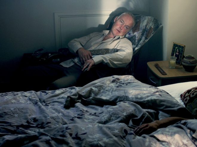
A shot of mine from “Crossing Paths” (2015, dir. Ben Bloore)

If you can flag some of the front-light, reducing the area of the frame it’s hitting, and leave the rest to the fill light or to fall into shadow, you’ll get some contrast back into your image.


2. Use a gobo.
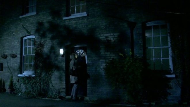
Another shot of mine, this one from “Lebensraum” way back in 2007.

If it doesn’t make sense to cut the light, try breaking it up with a gobo. You can make a gobo from almost anything. Commonly on night exteriors I send a spark off to liberate a branch from a nearby tree and rig that in front of the key-light. If I need to create a window-frame effect I’ve been known to clamp a chair or stool to a C-stand to get a suitable pattern of perpendicular lines.


3. Add dynamics.

Front-light is often more interesting if it’s not there all the time. If you can find an excuse to have it flicker or move somehow, you’ll get a lot more mood and shape in your shot. Firelight, TVs, rippling water, panning searchlights or the headlights of a passing car can all safely come from the front and remain dramatic. Create a moving gobo and you’ve got something really interesting. The tree branch example from earlier – if that blows around in the wind then it will add a lot of tension to the visuals. Here’s a firelight example from Ren: The Girl with the Mark

(Check out my Instagram feed for more lighting breakdowns like this.)


4. Darken the background.
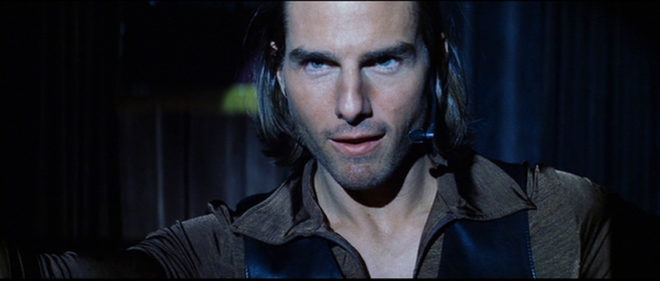
“Magnolia” (DP: Robert Elswit, ASC)

You can combat the lack of depth by keeping the background dark, so that the front-lit subject stands out against it. This will happen automatically due to the Inverse-square Law (a post on that is coming soon) if the subject is close to the source, e.g. standing right by a window. Due to the nature of front-light, you probably can’t flag the background without flagging the subject too, so bringing your source closer to the subject or redressing the background may be your only options.


5. Make a virtue of the subject’s shadow.
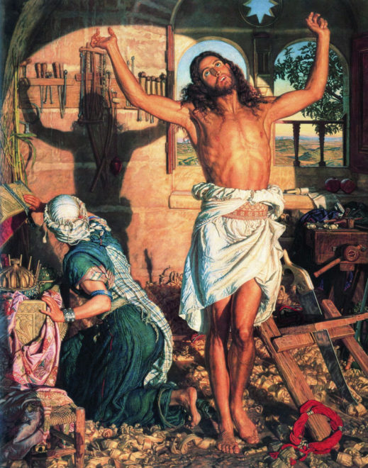
“The Shadow of Death” by William Holman Hunt, 1873

One reason to avoid front-light is the distracting shadow which the subject will cast on the background. But sometimes this can be a great benefit to the shot, almost becoming another character, or adding subtext as in this painting.


6. Use a strong backlight.
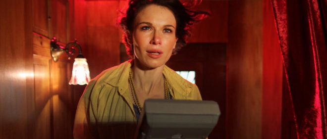
A still of mine from “Stop/Eject”. The red backlight and the kicker from the practical help mitigate the flat front-light.

If there’s nothing you can do to modify the front-light, then pumping up the backlight might well save the day. The most flatly-illuminated shots suddenly become deep and appealing when the subject has a halo of over-exposed light. Indeed, this is what commonly happens with day exteriors: you shoot into the sun to get the nice backlight, and ambient light flatly fills in the faces.

So next time you’re faced with front-light, remember, it’s not the end of the world!

Front-light

Lighting Micro-sets

From time to time I help out my friend Kate Madison shooting show reels for actors. The fun and the challenge is in creating and lighting little micro-sets to capture angles that look like they might be lifted out of a scene from a much larger production, all with limited equipment.

lawyer-grade-moresat
Here’s an interesting shot from a recent showreel for Dana Hajaj. This was intended to resemble a Good Wife style legal drama, though actually the first reference that the lawyer’s office setting brought to my mind was Ally McBeal. I remember how they often had hot sunlight coming in through their office windows which would hit the talent from the chest down, while softer, indirect daylight would illuminate the faces.

Clearly this technique wasn’t exactly going to work for an MCU, but it did get me thinking about windows as two-in-one sources: a hard source which adds interest and ‘sheen’ to the image but is too harsh to hit faces with, and a soft sources for faces. Often cinematographers will use two different lights through the same window to achieve these two distinct effects. (I sometimes employ what I call a “Window Wrap” to this end.)

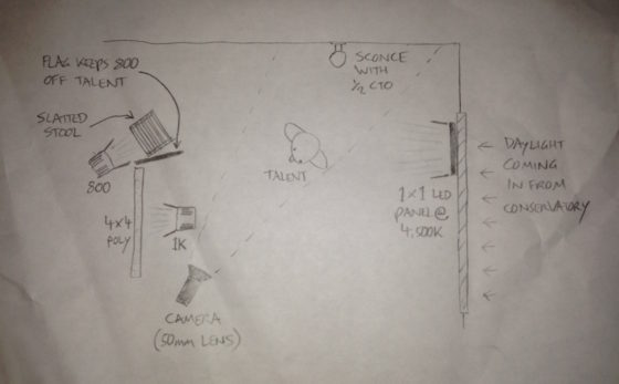
Now, the set for this showreel shot was just a red wall and sconce. (We tried a plant in the corner but couldn’t get it to work.) I wanted to suggest what the rest of the set might be, beyond the borders of this MCU, and simulating a window seemed like a natural choice. Furthermore, a window with Venetian blinds would help sell what was really a living room as a place of business. But this was not film noir; I didn’t want stripes of light on Dana’s face. Instead I used them to add interest to the wall.

Kate had a slatted-top stool in the hall which threw convincing “blinds” shadows when clamped to a C-stand in front of an 800W Arrilite. Ideally the shadows would have been sharper, but without a Dedo or a par this was the best I could do.

To get the maximum richness from the practical, I put a topper (black wrap clipped to the stool!) on the 800 to keep it off the sconce, and placed CTO inside the lampshade to warm up the fluorescent bulb.

To key Dana, I fired a 1K Arrilite into a 4’x4′ polyboard which was positioned next to the stool. Tungsten bounced off poly gives a beautiful soft, matt quality of light, and is a great way to key talent.

The backlight comes from a 1’x1′ LED panel set to about 4500K. What is the motivation for this source? North light coming from another window maybe? The great thing about micro-sets is there’s no wide shot so I don’t have to worry about that if I don’t want to! The motivation is that cold backlight looks good on black hair, and that’s that.

img_1344

As we prepared to roll, I wondered if I should increase the contrast more. I could have done this by (a) flagging the poly bounce to prevent it filling in the “blinds” shadows on the wall and (b) bringing in negative fill on the talent’s camera right side to kill the ambience. But I decided that more contrast was not appropriate for this kind of piece.

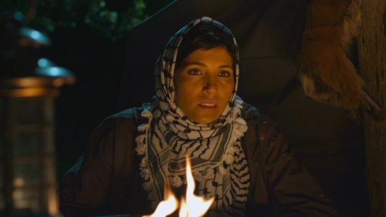
For another scene for Dana’s reel, we mocked up a remote Arabian campsite on Kate’s patio! Kate used a piece of fabric hung from a post and two light stands to represent the tent.

campsite-grade-moresat

I wanted to give the impression that if we cut to a wide shot – which of course we never do, but if we did – that it would show a vast landscape, perhaps a desert, all backlit by moonlight. On this hypothetical production, I would generate that moonlight with 18Ks on condor cranes, gelled with Steel Blue.

But on this tight shot I was able to achieve the same effect with two far smaller sources, both gelled with Steel Blue. (This is a blue with more green in it than CTB. It’s prettier and has connotations of many 80s and 90s thrillers and action movies that seemed to use copious amounts of this gel.) In the deep background is an LED panel, 3/4 backlighting a couple of blurry apple trees that could maybe play as vegetation around an oasis. Immediately behind the “tent” is a 40″ C-stand, top floor, with a 1K Arrilite on it. So close to the talent, the 1K comes down at a steep enough angle to imply moonlight, or an 18K on a condor, depending on how you want to look at it.

The flames from the fire pit weren’t doing much to light Dana, so I bounced another 1K off a gold reflector on the floor next to the fire. During takes I wiggled the reflector to add dynamics to the light.

To add a final touch of production value, I suggested a foreground practical. Kate found a candle lantern which we hung from a flag arm just in front of camera. Every frame of a Blockbuster movie is packed with details, so things like this help a lot to sell the scale.

img_1308
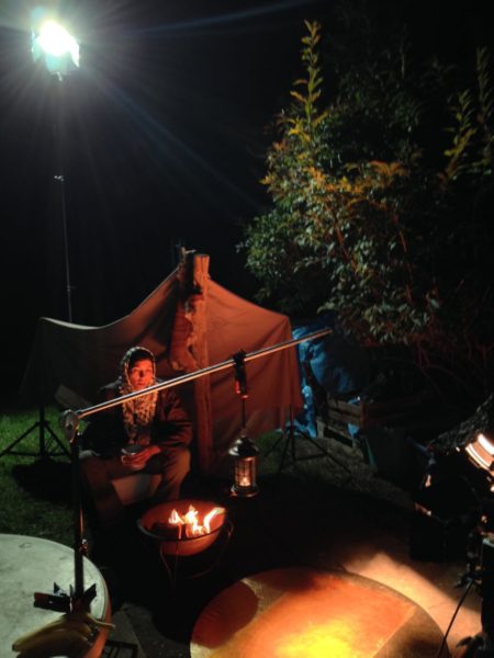
The 1K “moon” backlight is at top left. The gold reflector for the fire source is in the bottom centre, with the 1K bouncing into it visible two-thirds of the way down the right-hand edge of this image. The camera is just out of the bottom right corner of this frame. Not pictured is the LED background light, way back off left of this frame.

For more on shooting micro-sets, check out my blog from Above the Clouds, a feature that had several of them. Visit actorsatworkproductions.co.uk for showreel info.

Lighting Micro-sets