“Jurassic Park” Retrospective

With the temporary closure of Cineworlds around the UK, the future of theatrical exhibition once more hangs in the balance. But just a couple of months ago cinemas were reopening and people were positive that the industry would recover. One of the classic blockbusters that was re-released to plug the gaps in the release schedule ahead of Christopher Nolan’s Tenet was a certain quite popular film about dinosaurs. I described my trip to see it recently, but let’s put that hideous experience behind us and concentrate on the film itself.

Thanks in no small part to the excellent “making of” book by Don Shay and Jody Duncan, Jurassic Park was a formative experience for the 13-year-old Neil Oseman, setting me irrevocably on the path to filmmaking as a career. So let me take you back in time and behind the scenes of an iconic piece of popcorn fodder.


Man creates dinosaurs

Even before author Michael Crichton delivered the manuscript of his new novel in May 1990, Steven Spielberg had expressed an interest in adapting it. A brief bidding war between studios saw Joe Dante (Gremlins), Tim Burton (Batman) and Richard Donner (Superman) in the frame to direct, but Spielberg and Universal Pictures were the victors.

Storyboards by David Lowery. Lots of the film’s storyboards are reproduced in “The Making of Jurassic Park” by Don Shay and Jody Duncan.

The screenplay went through several drafts, first by Crichton himself, then by Malio Scotch Marmo and finally by David Koepp, who would go on to script Mission: Impossible, Spider-Man and Panic Room. Pre-production began long before Koepp finished writing, with Spielberg generating storyboards based directly on scenes from the book so that his team could figure out how they were going to bring the dinosaurs to life.

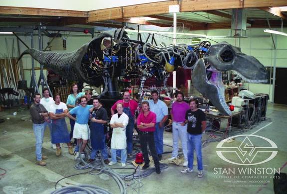
Inspired by a life-size theme park animatronic of King Kong, Spielberg initially wanted all the dinsoaurs to be full-scale physical creatures throughout. This was quickly recognised as impractical, and instead Stan Winston Studio, creators of the Terminator endoskeleton, the Predator make-up and the fifteen-foot-tall Alien queen, focused on building full-scale hydraulically-actuated dinosaurs that would serve primarily for close-ups and mids.

Stan Winston’s crew with their hydraulic behemoth

Meanwhile, to accomplish the wider shots, Spielberg hired veteran stop-motion animator Phil Tippett, whose prior work included ED-209 in RoboCop, the tauntaun and AT-AT walkers in The Empire Strikes Back, and perhaps most relevantly, the titular creature from Dragonslayer. After producing some beautiful animatics – to give the crew a clearer previsualisation of the action than storyboards could provide – Tippett shot test footage of the “go-motion” process he intended to employ for the real scenes. Whilst this footage greatly improved on traditional stop-motion by incorporating motion blur, it failed to convince Spielberg.

At this point, Dennis Muren of Industrial Light and Magic stepped in. Muren was the visual effects supervisor behind the most significant milestones in computer-generated imagery up to that point: the stained-glass knight in Young Sherlock Holmes (1986), the water tendril in The Abyss (1989) and the liquid metal T-1000 in Terminator 2: Judgment Day (1991). When Spielberg saw his test footage – initially just skeletons running in a black void – the fluidity of the movement immediately grabbed the director’s attention. Further tests, culminating in a fully-skinned tyrannosaur stalking a herd of gallimimuses, had Spielberg completely convinced. On seeing the tests himself, Tippett famously quipped: “I think I’m extinct.”

The first CGI test

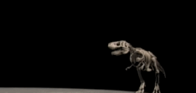
Tippett continued to work on Jurassic Park, however, ultimately earning a credit as dinosaur supervisor. Manipulating a custom-built armature named the Dinosaur Input Device, Tippett and his team were able to have their hands-on techniques recorded by computer and used to drive the CG models.

Building on his experiences working with the E.T. puppet, Spielberg pushed for realistic animal behaviours, visible breathing, and bird-like movements reflecting the latest paleontological theories, all of which would lend credibility to the dinosaurs. Effects co-supervisor Mark Dippe stated: “We used to go outdoors and run around and pretend we were gallimisuses or T-Rexes hunting each other, and shoot [reference] film.”


Dinosaurs eat man

Stan Winston’s triceratops was the first dinosaur to go before the cameras, and the only one to be filmed on location.

Production began in August 1992 with three weeks on the Hawaiian island of Kauai. Filming progressed smoothly until the final day on location, which had to be scrubbed due to Hurrican Iniki (although shots of the storm made it into the finished film). After a brief stint in the Mojave Desert, the crew settled into the stages at Universal Studios and Warner Brothers to record the bulk of the picture.

The most challenging sequence to film would also prove to be the movie’s most memorable: the T-Rex attack on the jeeps containing Sam Neill’s Dr. Grant, Jeff Goldblum’s Ian Malcolm, lawyer Gennaro and the children, Lex and Tim. It was the ultimate test for Stan Winston’s full-scale dinosaurs.

The T-Rex mounted on its motion simulator base on Stage 16 at Warner Brothers

The main T-Rex puppet weighed over six tonnes and was mounted on a flight simulator-style platform that had to be anchored into the bedrock under the soundstage. Although its actions were occasionally pre-programmed, the animal was mostly puppeteered live using something similar to the Dinosaur Input Device.

But the torrential rain in which the scene takes place was anathema to the finely tuned mechanics and electronics of the tyrannosaur. “As [the T-Rex] would get rained on,” Winston explained, “his skin would soak up water, his weight would change, and in the middle of the day he would start having the shakes and we would have to dry him down.”

Although hints of this shaking can be detected by an eagle-eyed viewer, the thrilling impact of the overall sequence was clear to Spielberg, who recognised that the T-Rex was the star of his picture. He hastily rewrote the ending to bring the mighty creature back, relying entirely on CGI for the new climax in which it battles raptors in the visitor centre’s rotunda.

The CGI T-Rex in the rewritten finale


Woman inherits the earth

After wrapping 12 days ahead of schedule, Jurassic Park hit US cinemas on June 11th, 1993. It became the highest-grossing film of all time, a title which it would hold until Titanic’s release four years later. 1994’s Oscar ceremony saw the prehistoric blockbuster awarded not only Best Visual Effects but also Best Sound Editing and Best Sound Mixing. Indeed, Gary Rydstrom’s contribution to the film – using everything from a dolphin/walrus combination for the raptors’ calls, to the sound of his own dog playing with a rope toy for the T-Rex – cannot be overstated.

Jurassic Park has spawned four sequels to date (with a fifth on the way), and its impact on visual effects was enormous. For many years afterwards, blockbusters were filled with CGI that was unable to equal, let alone surpass, the quality of Jurassic Park’s. Watching it today, the CGI is still impressive if a little plasticky in texture, but I believe that the full-size animatronics which form the lion’s share of the dinosaurs’ screen time are what truly give the creatures their memorable verisimilitude. The film may be 27 years old, but it’s still every bit as entertaining as it was in 1993.

This article first appeared on RedShark News.

Director of photography Dean Cundey, ASC with the brachiosaur head puppet
“Jurassic Park” Retrospective

“The Knowledge”: Lighting a Multi-camera Game Show

Metering the key-light. Photo: Laura Radford

Last week I discussed the technical and creative decisions that went into the camerawork of The Knowledge, a fake game show for an art installation conceived by Ian Wolter and directed by Jonnie Howard. This week I’ll break down the choices and challenges involved in lighting the film.

The eighties quiz shows which I looked at during prep were all lit with the dullest, flattest light imaginable. It was only when I moved forward to the nineties shows which Jonnie and I grew up on, like Blockbusters and The Generation Game, that I started to see some creativity in the lighting design: strip-lights and glowing panels in the sets, spotlights and gobos on the backgrounds, and moodier lighting states for quick-fire rounds.

Jonnie and I both wanted The Knowledge‘s lighting to be closer to this nineties look. He was keen to give each team a glowing taxi sign on their desks, which would be the only source of illumination on the contestants at certain moments. Designer Amanda Stekly and I came up with plans for additional practicals – ultimately LED string-lights – that would follow the map-like lines in the set’s back walls.

Once the set design had been finalised, I did my own dodgy pencil sketch and Photoshopped it to create two different lighting previsualisations for Jonnie.

He felt that these were a little too sophisticated, so after some discussion I produced a revised previz…

…and a secondary version showing a lighting state with one team in shadow.

These were approved, so now it was a case of turning those images into reality.

We were shooting on a soundstage, but for budget reasons we opted not to use the lighting grid. I must admit that this worried me for a little while. The key-light needed to come from the front, contrary to normal principles of good cinematography, but very much in keeping with how TV game shows are lit. I was concerned that the light stands and the cameras would get in each others’ way, but my gaffer Ben Millar assured me it could be done, and of course he was right.

Ben ordered several five-section Strato Safe stands (or Fuck-offs as they’re charmingly known). These were so high that, even when placed far enough back to leave room for the cameras, we could get the 45° key angle which we needed in order to avoid seeing the contestants’ shadows on the back walls. (A steep key like this is sometimes known as a butterfly key, for the shape of the shadow which the subject’s nose casts on their upper lip.)  Using the barn doors, and double nets on friction arms in front of the lamp-heads, Ben feathered the key-light to hit as little as possible of the back walls and the fronts of the desks. As well as giving the light some shape, this prevented the practical LEDs from getting washed out.

Note the nets mounted below the key-lights (the tallest ones). Photo: Laura Radford

Once those key-lights were established (a 5K fresnel for each team), we set a 2K backlight for each team as well. These were immediately behind the set, their stands wrapped in duvetyne, and the necks well and truly broken to give a very toppy backlight. A third 2K was placed between the staggered central panels of the set, spilling a streak of light out through the gap from which host Robert Jezek would emerge.

A trio of Source Fours with 15-30mm zoom lenses were used for targeted illumination of certain areas. One was aimed at The Knowledge sign, its cutters adjusted to form a rectangle of light around it. Another was focused on the oval map on the floor, which would come into play during the latter part of the show. The last Source Four was used as a follow-spot on Robert. We had to dim it considerably to keep the exposure in range, which conveniently made him look like he had a fake tan! Ben hooked everything, in fact, up to a dimmer board, so that various lighting cues could be accomplished in camera.

The bulk of the film was recorded in a single day, following a day’s set assembly and a day of pre-rigging. A skeleton crew returned the next day to shoot pick-ups and promos, a couple of which you can see on Vimeo here.

I’ll leave you with some frame grabs from the finished film. Find out more about Ian Wolter’s work at ianwolter.com.

SaveSave

SaveSave

SaveSave

“The Knowledge”: Lighting a Multi-camera Game Show

Prepping A Cautionary Tale

The Turn of the Screw, one of my references for A Cautionary Tale

In the new year I’ll be directing a short film called A Cautionary Tale, written by Steve Deery and produced by Sophia Ramcharan. This will be my first time directing without (co-)writing or (co-)producing too. (Steve got in touch with me after seeing the Stop/Eject trailer at a FiveLamps Film Night in Derby.) As usual, I’ll be documenting the filmmaking process on this blog.

A Cautionary Tale is a drama with a supernatural twist, featuring various authors who visit a cottage retreat to write, in several time periods from 1903 to the present.

It’s interesting in this prep stage how things I did unconsciously or which were inextricably entangled with the writing on other projects, require much more conscious thought and are much more clearly delineated when solely directing.

Other than providing notes on the various drafts of Steve’s screenplay, my first job was provide character breakdowns so Sophia could issue a casting call. First of all I went through the script and picked out all the clues Steve had provided about the characters. Then I sat down to compose backstories for them. There was an easy way into these, because two questions immediately arose for each of the authors: what kind of novel were they writing, and why had their publishers felt it necessary to pack them off to this retreat?

Another image from the moodboard

In the case of the 1903 authoress, I was highly influenced by a compendium of Frankenstein-related stories I was reading at the time; I decided to make her a gothic horror writer, with Mary Shelley her heroine. This fit neatly with the supernatural elements of the story, and led me to a key decision on the tone of the film: that I would give the whole thing a gothic edge.

I immediately began researching the genre, watching The Others, Sleepy Hollow, and The Elephant Man at a convenient BFI Gothic Season screening. I noted how framing and pacing were used to create atmosphere and sense of dread, and arrived at a keyword for my vision of A Cautionary Tale: trapped. Soon I had a page of notes on how this would come across in the camerawork, to go with my two pages of backstories for the characters and the house.

I’ve also started a moodboard on Pinterest. It’s weird to think that a year ago, before doing FilmWorks – on which, incidentally, Sophia was a fellow participant – I’d never even heard of a moodboard. Now I can’t imagine going into a project without one of these scrapbooks (virtual or otherwise) of visual references. The images in this post are from the board.

That’s all for now. Stay tuned for all the latest news on the making of A Cautionary Tale.

Prepping A Cautionary Tale

Presenting Your Vision

Working on my Stop/Eject mood reel for FilmWorks last week got me thinking about the various methods with which a director can convey his vision for a film during the development process. Here are the ways I’ve used over the years, and the pros and cons of each.

The first ones are all static images, so they can be printed out and thus viewed without the need for any technology (no worries about whether the recipient will be able to open this particular file format) but are also small enough to be emailed. They’ll never grab someone’s attention as much as a moving image, but take less time to absorb and can produce an instant reaction.

If you have the skills or know someone who does, high quality CONCEPT ART can dazzle and excite. Choose dramatic moments and give the artist guidance on the colour palette and lighting you’re after.

The Dark Side of the Earth concept art by Ian Tomlinson
Storyboards for The Dark Side of the Earth by David Ayling

You wouldn’t get STORYBOARDS out at an initial pitch, but they’ll impress at a second or third meeting. They show you’ve thought carefully about the script and how you’re going to put it on screen. This is particularly valuable if you have complex action or FX sequences. Beware that if the person you’re pitching to thinks the script needs more work, they’ll see storyboards as jumping the gun. Get the script right first.

A MOOD BOARD is a scrapbook or montage of images from films and/or other artforms that represent the tone and style of your piece. Less skill is required to make one of these than concept art or storyboards, and although as a creative person you may balk at the implication that your film is unoriginal, execs will find it very useful to compare your project to previous ones. If you use images from a film that did poor box office, again expect tough questions about why your movie won’t fail too.

The Dark Side of the Leaflet, designed and executed by Ian Tomlinson

A variation on this is a BOOKLET which might contain some of the above, plus photos and biogs of attached or wish-list actors, a synopsis, a director’s statement and maybe even an outline budget. Ian Tomlinson, The Dark Side of the Earth’s incredibly talented production designer, came up with the period-style leaflets pictured at left to promote the project. In one of my Cannes video blogs you can see a bit of these leaflets. (Sadly they’re now all gone and they got quite time-consuming and expensive to produce.)

Now we’ll look at moving images. Nowadays these aren’t prohibitively expensive to produce, and can be distributed for next-to-nothing via the internet – but beware of techy problems on the other end. Even YouTube doesn’t always work. If the person you’re sending it to can’t open it, they’ll probably give up and move onto something else, perhaps without even telling you why. Frankly I reckon you’re always safer with a DVD. Playing it off a laptop, tablet computer or iPhone in a meeting is a bad idea. Execs are narrow-minded and will see your project as a cheap YouTube video rather than a big, cinematic venture. Plus the sound will be awful. In another of my Cannes vlogs I discussed the dilemma of whether it’s better to show your pilot with poor picture and sound or not at all.

A MOOD REEL or RIP REEL is a moving version of the mood board or scrapbook. Ripping all those DVDs and YouTube clips can be a technical nightmare, but if done well it can be very useful. Here’s one for a very different vision of The Hunger Games by director Kevin Tancharoen. The accompanying interview on Slashfilm.com is also well worth a read.

Beware that many of the above materials will start giving the recipient thoughts about the budget. If your materials make it look like your vision will be expensive, be prepared to answer tough questions about that.

TEASER TRAILERS can be very useful for raising crowd-funding, but my feeling is that they’re not great for attracting conventional financing. Unless you’re going to chuck a hell of a lot of money at it and get an experienced trailer editor to cut it, the danger that a teaser trailer will look amateur and backfire is significant. You’d be better off with a rip reel.

PILOTS can also backfire. You can’t shoot it on a DSLR with a few hundred quid, then screen it at your pitch meeting and say, “The film will look like this, only better.” You have to shoot it with the production values you want the full film to have. That’s why my pilot for The Dark Side of the Earth was shot on 35mm anamorphic, and why we insist that anyone wanting to view it attends a screening of the print, rather than watching a crappy little quicktime or even a DVD. When you’re in that darkened screening room with the 5.1 track rumbling away and the image looking jaw-droppingly beautiful, only then are you doing your film-to-be justice.

Consider making a stand-alone SHORT FILM instead. My greatest regret with the Dark Side pilot is that we didn’t do this; we just took a couple of scenes from the middle of the screenplay and added an introductory voiceover and concept art montage to explain the story so far. It’s far and away my best work, but no-one’s seen it! If only I could have entered it into film festivals. Even if that hadn’t helped get the feature funded, it would have been great exposure for me and perhaps could have led to another of my projects getting made.

Another thing I tried for Dark Side before making the pilot was PREVIZ. These are filmed or animated storyboards, normally created once a project is greenlit to help plan and budget for FX, but they may also have value as part of a pitch, particularly if you want to prove you’re on top of how the FX will be achieved. The Dark Sides previz was shot with action figures and cardboard models and I’d certainly never screen them in a pitch meeting; I did them mainly for my own benefit. If they’re for a pitch, get a good CG animator on the case.

Check out The Dark Side of the Earth: Previsualisation playlist on YouTube for more of these.

Finally, I once read about a filmmaker who created an AUDIO PITCH consisting of her own voice narrating the synopsis, mixed with music and sound effects. Whatever technology and skills you can access to best get your vision across, that’s what you’ve got to do. But remember, it has to be top quality or you’re just shooting yourself in the foot.

What methods have you used to get your vision across?

Presenting Your Vision

FilmWorks: Mood Reel

A few days ago I re-read the FilmWorks homework instructions and noticed the hitherto-unnoticed word “edit” lurking after the phrase “mood reel“. Cue mad dash around the DVD shops of Hereford, frantic googling for software that will rip region 1 discs and even filming YouTube videos off my computer screen. I fear the technical aspect of the exercise may have overshadowed the creative one, but anyway here it is:

It’s probably the most random thing I’ve ever edited, but I can already see its value. Mashing up the romantic drama genre with sci-fi is not easy, and the Venn Diagram of audience demographics for those two genres has little overlap. I see the audience for Stop/Eject being males 25-45 and a wider female audience of 14-45.

Despite the difficulties, some films have straddled the genre gap successfully, The Adjustment Bureau being the best example to my mind. Sci-fi is at its best when using fantastic devices and situations to explore the human condition, and if I can pull off a moving personal drama against a fantasy backdrop it should be quite powerful. I think this is nicely encapsulated by Stop/Eject’s tagline: “What would you rewind?” – a classic “what if?” type question.

FilmWorks: Mood Reel

Soul Searcher Previz

Back in 2003 when I was developing Soul Searcher, I tried my hand at making a videomatic for the first time. A videomatic is a kind of previsualisation, like a moving storyboard that shows not only the camera angles but the pacing as well, and often gives an idea of how the music and sound effects will work with the scene and what the VFX requirements will be.

Jurassic Park animatic

Nowadays previz is usually CGI, but back in the day it was not uncommon to build crude miniatures of the props and people in a scene and film the previz in the form of a videomatic using a camcorder or lipstick camera. Pat McClung and co, when prepping James Cameron’s Aliens, made Drop Ships and APCs out of cardboard boxes and pulled them on strings through landscapes formed from rumpled paper and blankets. A decade later, when planning his deep dives to the Titanic wreck, Cameron had his team build a model of the ship and like-scaled models of the submersibles, so he could previz the shots they needed to get on the ocean floor. Phil Tippett went to the trouble of animating Jurassic Park’s previz in beautiful stop motion, demonstrating not only the angles and movement Spielberg wanted for the real scenes, but the lighting as well. Even Peter Jackson’s cutting edge Lord of the Rings trilogy employed cardboard mock-ups and a video camera to previz the flooding of Isengard.

In that fine tradition I attempted this videomatic for Soul Searcher:

Shooting a videomatic for The Dark Side of the Earth. Photo: Ian Tomlinson

Looking back on it now, it was quite a lazy attempt and suffered greatly from the poorly drawn storyboards, which are very hard to interpret, especially when bits of them are cut out and pasted onto the live action footage. Although I found making this videomatic very useful for my own process as director, and many of the Lego train shots were cut into the film during post-production until the final miniature shots were ready, it wasn’t much use for showing other crew members what work needed to be done. In fact, when I brought the model-makers on board in 2004, I decided to draw a new set of nice, neat storyboards rather than show them the videomatic.

My videomatic skills improved, however, and by 2006 I was shooting a series of them for my new feature project, The Dark Side of the Earth. You can view some of them here.

Soul Searcher Previz

Taking Decisions Lightly: Part 2

Lighting concept #1 for the basement

Following on from my last post, here’s what I was going for when I created the above lighting previz image for the basement scene in Stop/Eject.

As DoP Eve Hazelton lucidly explains in this video blog, one of the keys to great cinematography is creating depth, even (and especially) when you’re shooting in 2D. The basement location already has great depth with all those pillars tapering into the distance, but how can that be maximised on camera?

  • I’ve added smoke. Smoke creates depth because there will be more of it between the camera and a distant subject than between the camera and a close subject.
  • The light illuminating the smoke gets bluer as it gets further from camera. (This will be achieved by layering increasing numbers of blue gels on the lights.) This simulates the effect you can see when you look at the view from the top of a hill, whereby other hills in the distance seem bluer due to atmospheric haze.
  • I’ve thrown alternating pillars into shadow. This makes each “layer” of pillars contrast with the ones behind and in front of it, highlighting the depth. (We can achieve this on the day by simply turning off or removing the tubes in every other fluorescent light.)
Colour wheel
Colour wheel

As the characters walk through this shot towards us, they will go in and out of smoke and shadow, and become clearer through the smoke. That gives us dynamics, which are also important in good cinematography.

Now let’s look at the issue of colour contrast, something which I must admit I’ve only got to grips with quite recently. To cut a long story short, images look more interesting if they contain contrasting colours. Typically this means choosing two colours on opposite sides of the colour wheel, like blue and yellow as in the above previz. Or I could have gone with orange/red and green…

Lighting concept #2
Lighting concept #2

… though green daylight is hard to justify! It does fit nicely with the colour palette we’ve already established for the costume and production design though.

I also tried orange daylight and green fluorescent light, but since the scene doesn’t take place at sunrise or sunset that’s hard to justify too.

Finally I tried orange and blue. One is a warm colour and the other is a cool colour – another classic way of creating colour contrast.

Lighting concept #3
Lighting concept #3

The jury’s still out on this one. A lot will depend on what colour I’m able to make the fluorescent light appear through white balancing, since we’re unlikely to have time to gel all of them to my desired hue, and also what colour costumes Katie puts the characters in for that scene.

Okay, that’s all for today. Once the film’s in the can, there will be lots more about how the scenes were lit. In the meantime, perhaps I’ll share some of my lighting plans in a future post.

Taking Decisions Lightly: Part 2

Taking Decisions Lightly

I’m DOPing Stop/Eject as well as directing it, which means I have to be well prepared. I’m not going to have time to stand around on location figuring out how I want to light it. I need to do that in advance.

Last year I drew up some lighting plans, and thanks to the postponement of the shoot I have more time to work on these and get them just right. And recently I had a previsualisation idea: to take recce shots of the location and photoshop them to show the lighting I want to achieve.

So here’s the image I decided to work with, from the basement at Strutt’s North Mill in Belper:

Raw frame grab from the basement recce
Ceiling fluorescents

So, how do I want to light the basement? How does a DOP decide how to light anything? For me it always starts with three questions:

  1. Realistically, where would light be coming from?
  2. Creatively, where do I want to put the lightst?
  3. Practically, where can I put the lights?

Let’s try to answer these for the basement scene…

  1. The basement is only partially underground, so it does have some windows, but I don’t ever have to show them if I don’t want to (an advantage of being director too). A room like this would have regularly spaced ceiling lights, probably fluorescent. Perhaps the characters would have a torch or lamp of some kind too.
  2. Soul Searcher's car park scene, lit almost entirely by the existing overhead fluorescents
    Soul Searcher’s car park scene, lit almost entirely by the existing overhead fluorescents

    I’m going to choose to include the daylight, to provide some contrast with the ceiling lights. This is our most impressive location and perhaps the scene where the film’s fantasy side is most apparent, so I want it to look magical and cinematic. More on the creative side later.

  3. We would have access to the areas outside the windows, so I could light through them if I wanted. (In practice I’ll probably never show the windows, and the lamps representing the daylight will actually be inside the building, just out of frame.) Our time at this location is likely to be extremely limited, so although the ceiling is suitable for hanging lamps from, I’ll probably just have to go with the existing fluorescents. I’ve done this before – the multi-storey car park in Soul Searcher – and it looked good.

So with all that in mind, here’s what I came up with in Photoshop:

Lighting concept #1 for the basement

In my next post I’ll explain what I’ve done and why, particularly with reference to creating depth, and show you some alternate versions of the above image which will demonstrate some of the basics of colour theory. Sounds intriguing, huh? Better not miss it.

Taking Decisions Lightly