Lighting Micro-sets

From time to time I help out my friend Kate Madison shooting show reels for actors. The fun and the challenge is in creating and lighting little micro-sets to capture angles that look like they might be lifted out of a scene from a much larger production, all with limited equipment.

lawyer-grade-moresat
Here’s an interesting shot from a recent showreel for Dana Hajaj. This was intended to resemble a Good Wife style legal drama, though actually the first reference that the lawyer’s office setting brought to my mind was Ally McBeal. I remember how they often had hot sunlight coming in through their office windows which would hit the talent from the chest down, while softer, indirect daylight would illuminate the faces.

Clearly this technique wasn’t exactly going to work for an MCU, but it did get me thinking about windows as two-in-one sources: a hard source which adds interest and ‘sheen’ to the image but is too harsh to hit faces with, and a soft sources for faces. Often cinematographers will use two different lights through the same window to achieve these two distinct effects. (I sometimes employ what I call a “Window Wrap” to this end.)

Now, the set for this showreel shot was just a red wall and sconce. (We tried a plant in the corner but couldn’t get it to work.) I wanted to suggest what the rest of the set might be, beyond the borders of this MCU, and simulating a window seemed like a natural choice. Furthermore, a window with Venetian blinds would help sell what was really a living room as a place of business. But this was not film noir; I didn’t want stripes of light on Dana’s face. Instead I used them to add interest to the wall.

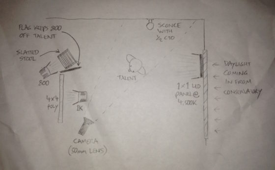
Kate had a slatted-top stool in the hall which threw convincing “blinds” shadows when clamped to a C-stand in front of an 800W Arrilite. Ideally the shadows would have been sharper, but without a Dedo or a par this was the best I could do.

To get the maximum richness from the practical, I put a topper (black wrap clipped to the stool!) on the 800 to keep it off the sconce, and placed CTO inside the lampshade to warm up the fluorescent bulb.

To key Dana, I fired a 1K Arrilite into a 4’x4′ polyboard which was positioned next to the stool. Tungsten bounced off poly gives a beautiful soft, matt quality of light, and is a great way to key talent.

The backlight comes from a 1’x1′ LED panel set to about 4500K. What is the motivation for this source? North light coming from another window maybe? The great thing about micro-sets is there’s no wide shot so I don’t have to worry about that if I don’t want to! The motivation is that cold backlight looks good on black hair, and that’s that.

img_1344

As we prepared to roll, I wondered if I should increase the contrast more. I could have done this by (a) flagging the poly bounce to prevent it filling in the “blinds” shadows on the wall and (b) bringing in negative fill on the talent’s camera right side to kill the ambience. But I decided that more contrast was not appropriate for this kind of piece.

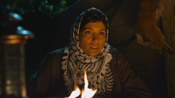
For another scene for Dana’s reel, we mocked up a remote Arabian campsite on Kate’s patio! Kate used a piece of fabric hung from a post and two light stands to represent the tent.

campsite-grade-moresat

I wanted to give the impression that if we cut to a wide shot – which of course we never do, but if we did – that it would show a vast landscape, perhaps a desert, all backlit by moonlight. On this hypothetical production, I would generate that moonlight with 18Ks on condor cranes, gelled with Steel Blue.

But on this tight shot I was able to achieve the same effect with two far smaller sources, both gelled with Steel Blue. (This is a blue with more green in it than CTB. It’s prettier and has connotations of many 80s and 90s thrillers and action movies that seemed to use copious amounts of this gel.) In the deep background is an LED panel, 3/4 backlighting a couple of blurry apple trees that could maybe play as vegetation around an oasis. Immediately behind the “tent” is a 40″ C-stand, top floor, with a 1K Arrilite on it. So close to the talent, the 1K comes down at a steep enough angle to imply moonlight, or an 18K on a condor, depending on how you want to look at it.

The flames from the fire pit weren’t doing much to light Dana, so I bounced another 1K off a gold reflector on the floor next to the fire. During takes I wiggled the reflector to add dynamics to the light.

To add a final touch of production value, I suggested a foreground practical. Kate found a candle lantern which we hung from a flag arm just in front of camera. Every frame of a Blockbuster movie is packed with details, so things like this help a lot to sell the scale.
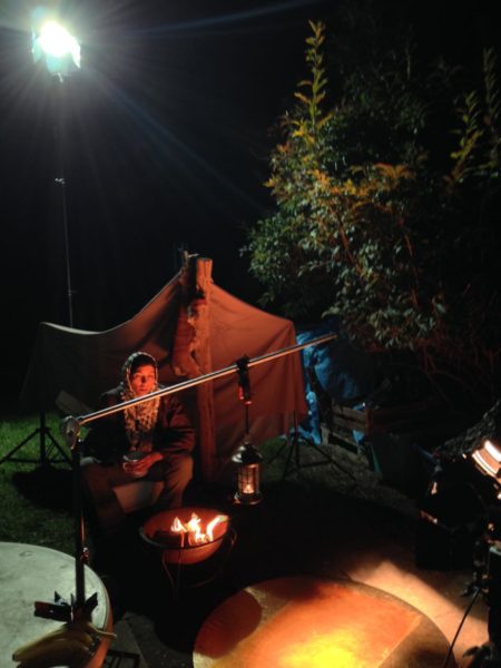
img_1308
The 1K “moon” backlight is at top left. The gold reflector for the fire source is in the bottom centre, with the 1K bouncing into it visible two-thirds of the way down the right-hand edge of this image. The camera is just out of the bottom right corner of this frame. Not pictured is the LED background light, way back off left of this frame.

For more on shooting micro-sets, check out my blog from Above the Clouds, a feature that had several of them. Visit actorsatworkproductions.co.uk for showreel info.
Lighting Micro-sets

“Above the Clouds”: October Pick-ups

Day 21 / Friday

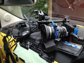
My wallet plays a vital part in adjusting the tilt of the camera.

Two and a half months on, and most of the team are back for three days of pick-ups on this comedy road movie. (Read my blog from principal photography here.) Director Leon Chambers showed me some of the rough cut last night, and it’s shaping up to be a really warm, charming film.

Principal was photographed on an Alexa Mini in Pro Res 4444, with Zeiss Ultra Primes and a half Soft FX to take off the digital edge. Since the pick-ups consist largely of scenes in a moving hatchback – the film’s signature Fiat 500 “Yellow Peril” – Leon has invested in a Blackmagic Micro Cinema Camera. Designed for remote applications like drone use, the BMMCC is less than 9cm (3.5″) square, meaning it can capture dashboard angles which no other camera can, except a Go Pro. Unlike a Go Pro, the BMMCC can record Cinema DNG raw files with a claimed 13 stops of dynamic range.

Leon has fitted the camera with a Metabones Speed Booster, converting the BMMCC’s Super 16 sensor to almost a Super 35 equivalent and increasing image brightness by one and two-thirds stops. The Speed Booster also allows us to mount Nikon-fit Zeiss stills lenses – a 50mm Planar, and 25mm and 35mm Distagons – to which I add a half Soft FX filter again. A disadvantage of the Speed Booster is the looseness it introduces between lens and camera; when the focus ring is turned, the whole lens shifts slightly.

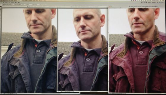
Filtration causes the first pick-ups hiccup when we realise that leading man Andy’s blue jacket is reading pink on camera.  This turns out to be an effect of infra-red pollution coming through our .6 and 1.2 ND filters. Yes, whoops, we forgot to order IR NDs. Fortunately we also have a variable ND filter, which doesn’t suffer from IR issues, so we switch to that.

img_1282
Left to right: variable ND, .6 ND, 1.2 ND. As you can see, there is a pronounced magenta shift on the non-variable filters.

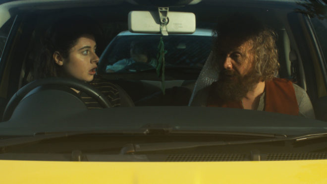
Lighting follows a similar pattern to principal, with a little bounce and negative fill outside the car, and Rosco 12″x3″ LitePads on the dashboard for eye light inside. On the move, Rupert and I monitor and pull focus wirelessly from a chase car. Referring to the false colours on an Atomos Ninja, I radio Leon to tweak the variable ND between takes when necessary. I miss the generous dynamic range of the Alexa Mini, which so rarely clipped the sky – and I do not buy the manufacturer claims that the BMMCC has only one stop less, but it still does an amazing job for its size and price.


Day 22 / Saturday

I start the day by reviewing some of yesterday’s footage side-by-side with Alexa Mini material from principal. They are very comparable indeed. The only differences I can detect are a slightly sharper, more “video” look from the BMMCC, and a nasty sort of blooming effect in the stills lenses’ focus roll-off, which reminds me of the cheap Canon f1.8/50mm “Nifty Fifty” I used to own.

A couple of quick shots at Leon’s, then we move to his friend Penny’s house, where a donkey and a horse look on as we set up around the Peril in Penny’s paddock. There are some inserts to do which must cut in with scenes where the car is moving, but since we don’t see any windows in these inserts, the car remains parked. Two people stand, one on either side of the car, each sweeping a 4’x4′ polyboard repeatedly over the windscreen and sunroof. With heavy cloud cover softening the shadows of these boards, the result is an effective illusion that the car is moving.

img_1300

After lunch we have to capture additional angles for the traffic jam scene originally staged on day 14. By an amazing stroke of luck, the sun comes out, shining from almost exactly the same direction (relative to the car) as Colin bounced it in from with Celotex during principal. To begin with we are shooting through the windscreen, with a filter cocktail of half Soft FX, .6 ND and circular polariser. Since Andy is no longer wearing the blue jacket, I decided to risk the .6 ND rather than stacking multiple polarisers (the variable ND consists of two polarising filters). The next shot requires the camera to be rigged outside the driver’s window as the car drives away (pictured right).

Then we set up for night scenes to cut with day 11, which, like the inserts earlier today, we achieve using Poor Man’s Process. Instead of polyboards, Gary sweeps a 1’x1′ LED panel gelled with Urban Sodium over the passenger side of the car to represent streetlights. Rueben walks past the driver’s side with another 1’x1′ panel, representing the headlights of a passing car. I’ve clamped a pair of Dedos to Rupert’s Magliner, and Andrew dollies this side-to-side behind the Peril, representing the headlights of a car behind; these develop and flare very nicely during the scene. For fill, the usual two 12″x3″ LitePads are taped to the dashboard and dimmed to 10%.

For a later stretch of road with no streetlamps or passing cars, I use a low level of static backlight, and a static sidelight with a branch being swept in front of it to suggest moonlight through trees.


Day 23 / Sunday

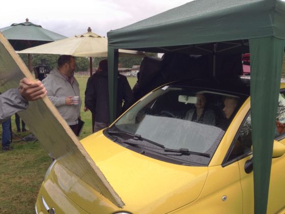
After a brief scene against a tiny little micro set, we have more scenes to shoot around the parked Peril – and it’s supposed to be parked this time, no movement to fake. Unfortunately it’s raining, which doesn’t work for continuity. Although I’m worried it will block too much light, the crew erect a gazebo over the car to keep the rain off, and in fact it really helps to shape the light. I even add a black drape to increase the effect. Basically, when shooting through the driver’s window, it looks best if most of the light is coming through the windscreen and the passenger’s window, and when we shoot through the windscreen it looks best if most of the light is coming through the side and rear windows; it’s the usual cinematographic principle of not lighting from the front.

img_1304
Shooting through the driver’s window

After another driving scene using car rigs, we move to our final location, a designer bungalow near Seven Oaks. Here we are shooting day-for-dusk, though it’s more like dusk-for-dusk by the time the camera rolls. I set the white balance to 3,200K to add to the dusky feel, increasing it to 4,500K as the daylight gets bluer for real. The extra one and two-thirds stops which the Speed Booster provides are very useful, allowing us to capture all four steadicam shots before the light fades completely.

And with that we are wrapped for the second, but not final, time. Crucial scenes involving a yet-to-be-cast character remain for some future shoot.

Keep up to date with Above the Clouds on the official Facebook page or Instagram account.

“Above the Clouds”: October Pick-ups

Aspect Ratio

Aspect ratio is a large and potentially confusing subject, but the good news is that there are only a few things you need to know to get by 99% of the time. Today I’ll go over those things, and show you where to look if you want to cover that last 1%.

Put simply, aspect ratio is the ratio of an image’s width to its height. For example, a 1.85:1 image is 1.85 times as wide as it is high.

Caption: the three main aspect ratios, plus 4:3 for reference. 4:3 is, more or less, the ratio most movies were shot in until the 1950s and all TV was shot in until the late 1990s.

The diagram above shows four aspect ratios. 4:3 is, more or less, the ratio most movies were shot in until the 1950s and all TV was shot in until the late 1990s, but today it’s virtually obsolete. So let’s look at the other three…

  • 16:9 – This is the standard ratio for TV, DVD (sort of), Blu-ray, YouTube and other video sharing and VOD platforms. It is sometimes written as 1.77:1 or 1.78:1. Almost all digital cameras shoot natively in this ratio. In the TV industry, this ratio was often called widescreen to distinguish it from 4:3.
  • 1.85:1 – One of two standard ratios for digital cinema projection. It is very similar to 16:9, but slightly wider. In practice, 1.85:1 movies may be shot and framed for 16:9, and delivered in 16:9 for TV, DVD and so on, but cropped very slightly at the top and bottom to achieve the 1.85:1 ratio for cinema projection.
  • 2.39:1 – A.k.a. Cinemascope (“Scope” for short) or widescreen (in the film industry), this is the other standard ratio for cinema projection. It is achieved either by cropping a 16:9 frame or by using anamorphic lenses to squeeze the image horizontally. Note that many cameras offer 2.35:1 framing guides rather than 2.39:1, but the difference is negligible, and these two designations are used pretty much interchangeably, as well as 2.40:1. On TV, VOD and so on, 2.39:1 movies are generally letterboxed to fit the ratio onto the 16:9 screen.
A 2.39:1 image letterboxed to 16:9, from The Gong Fu Connection (dir. Ted Duran)
A 2.39:1 image letterboxed to 16:9, from an action-comedy feature I shot called The Gong Fu Connection (dir. Ted Duran)


This graph by Stephen Follows shows how 2.39:1 movies have become more common in recent years, with around 70% of the 100 top grossing Hollywood films produced in this ratio.
This graph by Stephen Follows shows how Scope movies have become more common in the last two decades, with around 70% of the 100 top grossing Hollywood films produced in the 2.35:1 / 2.39:1  ratio. I suspect that a survey of lower grossing films would show a higher proportion of 1.85:1 material.

There is a temptation to choose 2.39:1 because it looks more “cinematic“, but it’s important to think carefully before selecting your aspect ratio. Here are some reasons to consider:

Some advantages of 2.39:1

  • Better for landscapes
  • More composition options with group shots and over-the-shoulder shots in terms of horizontal placement and separation of the two characters
  • Better for wide sets, or sets lacking height

(See also my article on 2:39:1 composition.)

Ren: The Girl with the Mark (2.35:1)
The 2.39:1 aspect ratio helps me to frame out the unfinished roofs of the buildings behind the title character in Ren: The Girl with the Mark (dir. Kate Madison).

Some advantages of 1.85:1 or 16:9

  • Shows more body language in singles
  • Better for shots containing characters of very different heights – e.g. two-shot of an adult and a child
  • Better for tall or narrow sets, and car interiors
The 16:9 aspect ratio allows me to show the nice, oak beam ceiling and the raised stage in this shot from The First Musketeer (dir. Harriet Sams).

Although your project will almost certainly be delivered in one of the three ratios listed above, it is of course possible to frame and mask your footage to any aspect ratio you can imagine. This should always be cleared with the producer though, because sales agents may reject films not presented in a standard ratio.

Some recent films using non-standard ratios are:

  • The Hateful Eight – 2.76:1 – Tarantino’s latest was lensed in Ultra Panavision 70, an obsolete, super-wide 70mm celluloid format. But unless you were lucky enough to catch one of the much-publicised roadshow screenings, or you own the Blu-ray, you probably saw it cropped to 2.39:1.
  • Jurassic World – 2:1 – The filmmakers felt that 1.85:1 was too TV, but 2.39:1 lacked enough height for the dinosaurs, so they used a halfway house. In practice, the movie was delivered to cinemas in 1.85:1 with letterboxing at the top and bottom to achieve the 2:1 ratio. I have a whole post about 2:1 here.
  • Ida – 4:3 – Set in a convent, this film symbolises its nuns’ and novices’ thoughts of God and heaven above by using this tall aspect ratio and framing with lots of head room. I have a whole post about 4:3 here.
aspect_ratios
The Grand Budapest Hotel

A surprising number of films use multiple aspect ratios, which we often don’t even notice on a conscious level. Here are just a few examples:

  • The Grand Budapest Hotel – Wes Anderson differentiated the three time periods featured in the story by giving each a different aspect ratio: 1.375:1 (“Academy” ratio, similar to 4:3) for the 1930s, 2.35:1 for the 1960s and 1.85:1 for the more contemporary bookends.
  • The Dark Knight – Parts of this film, such as the opening bank robbery and aerial city footage, were shot in Imax at 1.44:1, while the rest is in 2.35:1.
  • Scott Pilgrim vs. the World – To recall the comic book format of this film’s source material, the aspect ratio changes on a shot-by-shot basis during the fight scenes.

The aspect ratio of a film is agreed by the director, the DP and sometimes the producer, in preproduction. However, it is very easy for a director, producer, editor or colourist to alter the aspect ratio in postproduction. This is far from ideal, and since it changes the composition of every image in the movie, the DP should always be consulted and should ideally work with the post team to ensure that he or she retains authorship of the frame. After all, his or her name is on the film as director of photography.

Regrettably, this doesn’t always happen. I did a short last year which I agreed with the director and producer we would shoot in 4:3, but to my dismay when I saw the finished film it had been reformatted to 2.39:1, a drastically different ratio. To minimise the chances of this happening to you, make sure in preproduction that your director and producer fully understand the consequences of the selected ratio, and make your best effort to attend the grading so you can at least see if any re-framing has occurred before it’s too late.

If you want to know more about aspect ratio, here are a couple of videos you might find useful. The first is a guide I made a few years ago to shooting on celluloid, and it covers (at timecode 2:00) the aspect ratios native to the various gauges of film.

The second is a comprehensive history of aspect ratios in film and TV from Filmmaker IQ.

Aspect Ratio