The Inverse Square Law

If you’ve ever read or been taught about lighting, you’ve probably heard of the Inverse Square Law. It states that light fades in proportion to the square of the distance from the source. But lately I started to wonder if this really applies in all situations. Join me as I attempt to get to the bottom of this…


Knowing the law

The seed of this post was sown almost a year ago, when I read Herbert McKay’s 1947 book The Tricks of Light and Colour, which described the Inverse Square Law in terms of light spreading out. (Check out my post about The Tricks of Light and Colour here.)

But before we go into that, let’s get the Law straight in our minds. What, precisely, does it say? Another excellent book, Gerald Millerson’s Lighting for Television and Film, defines it thusly:

With increased distance, the light emitted from a given point source will fall rapidly, as it spreads over a progressively larger area. This fall-off in light level is inversely proportional to the distance square, i.e. 1/d². Thus, doubling the lamp distance would reduce the light to ¼.

The operative word, for our purposes, is “spreads”.

If you’d asked me a couple of years ago what causes the Inverse Square Law, I probably would have mumbled something about light naturally losing energy as it travels. But that is hogwash of the highest order. Assuming the light doesn’t strike any objects to absorb it, there is nothing to reduce its energy. (Air does scatter – and presumably absorb – a very small amount of light, hence atmospheric haze, but this amount will never be significant on the scale a cinematographer deals with.)

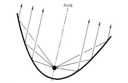
In fact, as the Millerson quote above makes clear, the Inverse Square Law is a result of how light spreads out from its source. It’s purely geometry. In this diagram you can see how fewer and fewer rays strike the ‘A’ square as it gets further and further away from the source ‘S’:

Illustration by Borb, CC BY-SA 3.0

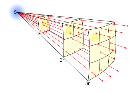
Each light ray (dodgy term, I know, but sufficient for our purposes) retains the same level of energy, and there are the same number of them overall, it’s just that there are fewer of them passing through any given area.

So far, so good.


Taking the Law into my own hands

During season two of my YouTube series Lighting I Like, I discussed Dedo’s Panibeam 70 HMI. This fixture produces collimated light, light of which all the waves are travelling in parallel. It occurred to me that this must prevent them spreading out, and therefore render the Inverse Square Law void.

This in turn got me thinking about more common fixtures – par cans, for example.


Par lamps are so named for the Parabolic Aluminised Reflectors they contain. These collect the light radiated from the rear and sides of the filament and reflect it as parallel rays. So to my mind, although light radiated from the very front of the filament must still spread and obey the Inverse Square Law, that which bounces off the reflector should theoretically never diminish. You can imagine that the ‘A’ square in our first diagram would have the same number of light rays passing through it every time if they are travelling in parallel.

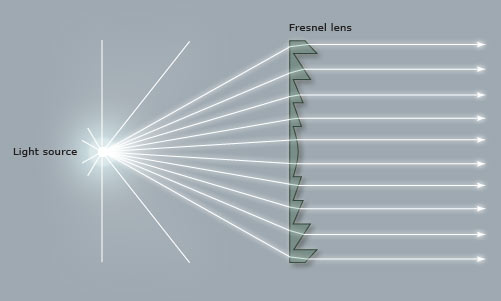
Similarly, fresnel lenses are designed to divert the spreading light waves into a parallel pattern:

Even simple open-face fixtures have a reflector which can be moved back and forth using the flood/spot control, affecting both the spread and the intensity of the light. Hopefully by now you can see why these two things are related. More spread = more divergence of light rays = more fall-off. Less spread = less divergence of light rays = more throw.

So, I wondered, am I right? Do these focused sources disobey the Inverse Square Law?


Breaking the law

To find the answer, I waded through a number of fora.

Firstly, and crucially, everyone agrees that the Law describes light radiated from a point source, so any source which isn’t infinitely small will technically not be governed by the Law. In practice, says the general consensus, the results predicted by the Law hold true for most sources, unless they are quite large or very close to the subject.

If you are using a softbox, a Kinoflo or a trace frame at short range though, the Inverse Square Law will not apply.

The above photometric data for a Filmgear LED Flo-box indeed shows a slower fall-off than the Law predicts. (Based on the 1m intensity, the Law predicts the 2m and 3m intensities as 970÷2²=243 lux and 970÷3²=108 lux respectively.)

A Flickr forum contributor called Severin Sadjina puts it like this:

In general, the light will fall off as 1/d² if the size of the light source is negligible compared to the distance d to the light source. If, on the other hand, the light source is significantly larger than the distance d to the light source, the light will fall off as 1/d – in other words: slower than the Inverse Square Law predicts.

Another contributor, Ftir, claims that a large source will start to follow the Law above distances equal to about five times the largest side of the source, so a 4ft Kinoflo would obey the Law very closely after about 20ft. This claim is confirmed by Wikipedia, citing A. Ryer’s The Light Measurement Handbook.

But what about those pesky parallel light beams from the pars and fresnels?

Every forum had a lot of disagreement on this. Most people agree that parallel light rays don’t really exist in real life. They will always diverge or converge, slightly, and therefore the Law applies. However, many claim that it doesn’t apply in quite the same way.

Diagram from a tutorial PDF on light-measurement.com showing a virtual point source behind the bulb of a torch.

A fresnel, according to John E. Clark on Cinematography.com, can still be treated as a point source, but that point source is actually located somewhere behind the lamp-head! It’s a virtual point source. (Light radiating from a distant point source has approximately parallel rays with consequently negligible fall-off, e.g. sunlight.) So if this virtual source is 10m behind the fixture, then moving the lamp from 1m from the subject to 2m is not doubling the distance (and therefore not quartering the intensity). In fact it is multiplying the distance by 1.09 (12÷11=1.09), so the light would only drop to 84% of its former intensity (1÷1.09²=0.84).

I tried to confirm this using the Arri Photometrics App, but the data it gives for Arri’s fresnel fixtures conforms perfectly with an ordinary point source under the Law, leaving me somewhat confused. However, I did find some data for LED fresnels that broke the Law, for example the Lumi Studio 300:

As you can see, at full flood (bottom graphic) the Law is obeyed as expected; the 8m intensity of 2,500 lux is a quarter of the 4m intensity of 10,000 lux. But when spotted (top graphic) it falls off more rapidly. Again, very confusing, as I was expecting it to fall off less rapidly if the rays are diverging but close to parallel.

A more rapid fall-off suggests a virtual point source somewhere in front of the lamp-head. This was mentioned in several places on the fora as well. The light is converging, so the intensity increases as you move further from the fixture, reaching a maximum at the focal point, then diverging again from that point as per the Inverse Square Law. In fact, reverse-engineering the above data using the Law tells me – if my maths is correct – that the focal point is 1.93m in front of the fixture. Or, to put it another way, spotting this fixture is equivalent to moving it almost 2m closer to the subject. However, this doesn’t seem to tally with the beam spread data in the above graphics. More confusion!

I decided to look up ETC’s Source Four photometrics, since these units contain an ellipsoidal reflector which should focus the light (and therefore create a virtual point source) in front of themselves. However, the data shows no deviation from the Law and no evidence of a virtual point source displaced from the actual source.


I fought the law and the law won

I fear this investigation has left me more confused than when I started! Clearly there are factors at work here beyond what I’ve considered.

However, I’ve learnt that the Inverse Square Law is a useful means of estimating light fall-off for most lighting fixtures – even those that really seem like they should act differently! If you double the distance from lamp to subject, you’re usually going to quarter the intensity, or near as damn it. And that rule of thumb is all we cinematographers need 99% of the time. If in doubt, refer to photometrics data like that linked above.

And if anyone out there can shed any light (haha) on the confusion, I’d be very happy to hear from you!

The Inverse Square Law

Front-light

A front-lit shot of mine from “The First Musketeer” (2015, dir. Harriet Sams)

Front-light is a bit of a dirty word in cinematography. DPs will commonly be heard rhapsodising about beautiful backlight or moody sidelight, but rarely does the humble front-light get any love. But there is no right or wrong in cinematography. Just because front-light is less popular, doesn’t mean it can’t make a great shot.

Why do we avoid front-light so often? Because it usually flattens things out, reducing or eliminating any sense of depth in the image, and giving no shape to faces or objects. Sometimes this might be the perfect look: for a character who is shallow, or who feels like their life is dull and uneventful, perhaps; a live-action scene to be intercut with two-dimensional animation; or a stylised flashback like the image above. And sometimes, of course, front-light is unavoidable for logical reasons – if a character is looking out of a window, say. The trouble is, it can make for un-engaging or un-cinematic images, and that’s when you may want to pull some other tricks out of the box.

Here are six ways to bring some interest back into a frontally-lit frame.


1. Cut the light.

A shot of mine from “Crossing Paths” (2015, dir. Ben Bloore)

If you can flag some of the front-light, reducing the area of the frame it’s hitting, and leave the rest to the fill light or to fall into shadow, you’ll get some contrast back into your image.


2. Use a gobo.

Another shot of mine, this one from “Lebensraum” way back in 2007.

If it doesn’t make sense to cut the light, try breaking it up with a gobo. You can make a gobo from almost anything. Commonly on night exteriors I send a spark off to liberate a branch from a nearby tree and rig that in front of the key-light. If I need to create a window-frame effect I’ve been known to clamp a chair or stool to a C-stand to get a suitable pattern of perpendicular lines.


3. Add dynamics.

Front-light is often more interesting if it’s not there all the time. If you can find an excuse to have it flicker or move somehow, you’ll get a lot more mood and shape in your shot. Firelight, TVs, rippling water, panning searchlights or the headlights of a passing car can all safely come from the front and remain dramatic. Create a moving gobo and you’ve got something really interesting. The tree branch example from earlier – if that blows around in the wind then it will add a lot of tension to the visuals. Here’s a firelight example from Ren: The Girl with the Mark

(Check out my Instagram feed for more lighting breakdowns like this.)


4. Darken the background.

“Magnolia” (DP: Robert Elswit, ASC)

You can combat the lack of depth by keeping the background dark, so that the front-lit subject stands out against it. This will happen automatically due to the Inverse-square Law (a post on that is coming soon) if the subject is close to the source, e.g. standing right by a window. Due to the nature of front-light, you probably can’t flag the background without flagging the subject too, so bringing your source closer to the subject or redressing the background may be your only options.


5. Make a virtue of the subject’s shadow.

“The Shadow of Death” by William Holman Hunt, 1873

One reason to avoid front-light is the distracting shadow which the subject will cast on the background. But sometimes this can be a great benefit to the shot, almost becoming another character, or adding subtext as in this painting.


6. Use a strong backlight.

A still of mine from “Stop/Eject”. The red backlight and the kicker from the practical help mitigate the flat front-light.

If there’s nothing you can do to modify the front-light, then pumping up the backlight might well save the day. The most flatly-illuminated shots suddenly become deep and appealing when the subject has a halo of over-exposed light. Indeed, this is what commonly happens with day exteriors: you shoot into the sun to get the nice backlight, and ambient light flatly fills in the faces.

So next time you’re faced with front-light, remember, it’s not the end of the world!

Front-light

#ShotOfTheWeek: 2017 Round-up

At the end of last summer I started a regular #ShotOfTheWeek on my Twitter feed. It’s very simple: each week I post a frame grab (or sometimes a GIF if I can find one) of a great shot from a film or series I’ve been watching. Sometimes these are new productions, just out, and sometimes they’re older pieces which I’m revisiting or viewing for the first time.

For those of you who aren’t among the Twitterati, here is a round-up of last year’s Shots of the Week. On the other hand, if you are a Twitterist, why not post your own inspirational frame grabs, using the hashtag #ShotOfTheWeek?


Powerful Close-ups

Cinema is arguably at its most potent  when showing us the tiny nuances of emotion that only a big close-up can provide.

“Anne with an E” DP: Bobby Shore

This example from the moving Netflix series Anne with an E makes the most of Anne’s freckled face and puts us right in her headspace… literally. Shots like this were captured with a 27mm Primo, as opposed to the vintage Panavision glass used for other coverage. For more on the cinematography of Anne with an E, check out the Varicam section in my report from Camerimage 2017.

“Black Narcissus” DP: Jack Cardiff

I love the shadows in this shot by legendary DP Jack Cardiff; they almost suggest a crucifix or prison bars. Either would be appropriate for this story of a nun sent to a remote Indian palace to establish a school and hospital. The low-angle eye-light adds to the unsettling feel.

“The Crown” DP: Stuart Howell

The key promotional art for The Crown is an edge-lit profile shot of the Queen, evoking the regal image on stamps and coins. Here DP Stuart Howell has paid homage to the artwork, channelling the same connotations of a figurehead carrying a country on her shoulders.

“American Gods” DP: Aaron Morton

What can I say? I’m a sucker for a good profile shot. The hellish colours here are perfect given what the erstwhile Lovejoy has just done. (I won’t give you any spoilers, but let’s just say it doesn’t involve cheeky antiques dealing.)


Symbolism

“The Handmaid’s Tale” DP: Colin Watkinson

This was the shot that inspired me to start #ShotOfTheWeek. The Handmaid’s Tale is set in a Christian fundamentalist society, so evoking classical religious paintings with the angel-wing-like headboard and the muted, brown colour scheme was a clever move.

“The Ipcress File” DP: Otto Heller

This classic spy thriller has a lot of unusual compositions with domineering foreground objects. Here the cross and circle shapes of the light-shade suggest the crosshairs of a gun, while the bulb tastefully obscures the actual bullet wound.

“Mr Robot” DP: Tod Campbell

This one is almost too on-the-nose to be called symbolism. Only a drama as quirky as Mr Robot could get away with this kind of (literal) signposting, but I love how bold it is. The rigid geometric lines and excessive headroom used throughout the series are also in evidence here, reflecting how we’re seeing everything from Elliot’s mentally ill point of view.


Negative Space

“Mission: Impossible – Rogue Nation” DP: Robert Elswit

A forgettable film, but a shot with much to admire. The dark back of the bench creates negative space in the composition, reducing the already-wide Scope frame to a ratio of about 4:1, echoing the short, wide shape of the House of Commons. On the lighting front, negative fill has been employed to render both that bench and the cast very dark, almost silhouettes, imparting a lot of depth to an otherwise flat image.

“Stranger Things” DP: Tim Ives

Again, negative space here creates a geometrical frame within a frame. What I particularly liked was the placement of the bulb above the sheriff’s head, rather than on the right of frame, which would have produced a more balanced but much less interesting shot.

“Better Call Saul” DP: Arthur Albert

Every time Better Call Saul returned to this location I scanned the background of each angle, trying to figure out what on earth could be motivating the bold slash of light on the right of this image. It remains a mystery! The show is full of uncompromisingly dark images with crisp, pure blacks, but perhaps none so overtly noirish as this one.


Intersecting Lines

“Metropolis” DPs: Karl Freund, Günther Rittau & Walter Ruttmann

All credit to Otto Hunte, the production designer on this 1920s sci-fi classic, as every line in this set leads us to the figure of Maria, fittingly for a character who has captured the imaginations of the dystopian underclass. The cinematographers have helped by framing her centrally and making her the brightest part of the image.

“Jardin d’hiver” DP: Darius Khondji

Jardin d’hiver was sponsored by CW Sonderoptic to promote their new large-format Leica Thalia glass (see my Camerimage post for more info). I have to admit that most of the film’s imagery did nothing for me, but this shot of bold, contrasty lines softened by the milkiness of the foreground window has a graphical quality I find very appealing.

“Little Miss Sunshine” DP: Tim Suhrstedt

This is a shot of two halves: the upper half busy, confused and oppressive, the lower half reassuringly simple with its one-point perspective. It was only after filming wrapped on Above the Clouds that I realised just how much this shot and others like it in Little Miss Sunshine had influenced my cinematography of Leon Chambers’ comedy road movie. (Check out the second still on the Above the Clouds page and you’ll see what I mean!)


Iconic Reveals

“The 39 Steps” (1935) DP: Bernard Knowles

Richard Hannay and the audience both discover the cause of Annabella’s distress simultaneously, in a reveal that’s shocking and also funny! The chiaroscuro of the lighting beautifully highlights the bright knife against the deep shadows of the background.

“Terminator 2: Judgment Day” DP: Adam Greenberg

These two gifs are both parts of the same shot, which cranes up from the shockingly unexpected crushing of the skull to reveal the endoskeleton puppet in mid-shot as a perfectly timed explosion goes off in the background. As well as being a remarkable technical achievement, the arts and sciences of cinematography, practical effects and animatronics all working in harmony, it’s a great piece of visual storytelling.


And finally…

“A Ghost Story” DP: Andrew Droz Palermo

A Ghost Story didn’t get a very wide release, and won’t be to everyone’s taste. A lyrical meditation on the nature of time, its slow pace becomes glacial during a grief-filled, ten-minute pie-eating scene containing only one cut. There is plenty of time to consider the composition, and I loved how casually the ghost is placed within the frame, with the top of his head even cut off. (I later discovered he was composited in, to reduce the chances of anything spoiling the ultra-long, ultra-emotional take.) The lines of the cupboards lead our eyes always back to Rooney Mara, the painterly splash of light on the wall (which I believe was natural) throwing her profile into relief. When she starts to cry, it takes a while to spot the tears, but somehow that makes it all the more powerful.

It’s interesting to note that no fewer than four aspect ratios are represented by all these Shots of the Week: from the traditional Academy ratio of 4:3, through the standard 16:9, to the Netflix-favoured 2:1 and of course 2.39:1 Cinemascope. It’s an exciting time to be working in cinematography, when we have so many choices open to us to create the most fitting images for any given story. Here’s to many more inspiring #ShotOfTheWeek images in 2018. Follow me on Twitter to see them first!

#ShotOfTheWeek: 2017 Round-up

A Cinematograper Prepares

One of the things which I believe separates a good director of photography from a bad one is preparation. On a big production you may have weeks of paid, full-time prep, but on a micro-budget movie you may be lucky to have a single meeting before the shoot. In the latter case you’ll have to use your initiative, put in the time for free, and use Skype a lot, but either way the quality of the prep can make or break the production.

Here are ten things a DP should do to set themselves up for success before the camera rolls. This is not intended to be an exhaustive list, rather it’s a run-down of the things which I have found to bear most fruit later on in the production.


1. Get inside the director’s head.

Some directors will come to you with a beautiful set of storyboards, concept art and reference images, but many won’t. Many will simply have an idea in their head of how they want it to look, and it’s your job to find out what that vision is. Often this will happen before full-time prep begins. It will consist of watching movies together, pouring over books of photos, sharing Pinterest boards or Dropboxes full of images, all the while discussing what they do and don’t like. The aim is to get such a clear idea of their vision that when you set up a shot you’ll deliver the mood they’re looking for first time.


2. Work with the art department.

Chatting over a set model helps identify potential lighting or lensing problems before construction begins.

The next person to get in sync with is the production designer. This is an incredibly important and symbiotic relationship; you have the power to completely destroy each others’ work, or to make each other look like geniuses! Two things you should talk about early on with the designer are the colour palette of the film (and any palettes specific to certain locations, plot threads or characters) and the aspect ratio: does the shape of the sets being designed fit the shape of the frame you’re planning to compose? Next you’ll want to discuss each set and the position of windows and practicals within it, to ensure that you’ll be able to get the lighting angles you need. For their part, the designer will want to quiz you on where the key camera positions will be, and the rough lens lengths you’ll be using, so they know where to put in the most detail and the important bits of dressing.


3. Get to know the needs of the other H.o.D.s.

Although the production designer is the most important head of department for a DP to work with, they are by no means the only one. The visual effects supervisor is increasingly a key collaborator; you should discuss the look you’re going for and how that will integrate with the VFX, and whether plates need to be shot at a higher resolution, in RAW, or any other technical requirements. You should familiarise yourself with the costume designs and discuss how those will integrate with the overall look. Similarly the make-up department will want to talk about about lens filtration, coloured lighting and anything else that may affect how their work looks. The line producer is a crucial person to get on the good side of. Sooner or later you’ll have to ask them for something expensive and unexpected, and they’re much more likely to say yes if you have tried to help them earlier on, by reducing your equipment list for example, or by hiring local camera assistants to save on accommodation costs.

Read my article on collaborating with other departments for more on this topic.


4. Check sun paths at locations.

Checking my compass at the stone circleWhen you start to scout the locations, you’ll want to pay careful attention to the direction of the sun. Which windows will it come through as it moves around over the course of the day? Are those trees or buildings likely to shadow that park bench where the characters will be sitting? With a bit of experience – and a compass, if it’s cloudy – you can estimate this, or use apps like Sun Tracker and Helios which are designed for exactly this purpose. For interiors, windows that never get direct sunlight are most convenient, allowing you to light them artificially, and thus constantly, without having to flag the real sun. For exteriors, shooting into the sun is generally most desirable, for the beauty of the backlight and the softness of the reflected fill. Of course, there will always be compromises with the other demands of the production.

See my article on sun paths for more on this.


5. Develop the shot list with the director.

Each director has a different process, but often they will draft a shot list on their own before passing it to you for feedback. There are many things for a DP to consider when going through this list. Do the shots reflect the style and visual grammar you both discussed earlier? (If not, has the director had a change of heart, or have they simply forgotten? Directors have a lot to think about!) Do the shots provide enough coverage for the editor? Are there too many shots to realistically accomplish on schedule? (Very often there are!) What grip equipment will the camera movements require? Are any special lenses or filters required, e.g. a macro lens for an extreme close-up of an eye?


6. Shoot tests.

Testing is a crucial part of the prep for both technical and creative reasons. Usually you will want to test a few different cameras and lens sets, to see which best serve the story. For example, a period film lit with a lot of genuine candlelight may work best on a sensitive camera like the Panasonic Varicam combined with soft fall-off lenses like Cooke S4s, while a sci-fi thriller might be suited to a Red or Alexa and a set of anamorphics for those classic flares. Until you’ve tested them and compared the images side by side though, you can’t be sure, and neither can the director and producers. Often costume and make-up tests will be requested, which may be combined with the camera tests to see how the different sensors render them, or maybe done separately once the camera kit is locked down. These tests are also a great opportunity for the DP to demonstrate for the director the type of lighting you plan to use to, and to make sure you really are on the same page. Ideally a DIT (digital imaging technician) will be available to grade the test footage, developing LUTs (look-up tables) if required, and providing proof of concept for the finished look of the movie.

Check out my tests of Alexa ISO settings, spherical lenses and anamorphic lenses.


7. Discuss the schedule.

Once the 1st AD has drafted the shooting schedule, they will show it to the DP for feedback. When determining how much can be done in a day, the 1st AD is thinking of the script page count, and they may not have seen a shot list at this point. Along with the director, the DP must bring any concerns they have about the schedule to the 1st AD in prep, or forever hold your peace! Is there enough time to get those tricky camera moves you’ve planned? Has the re-light time for the reverse been factored in? Have things been arranged in a logical order for lighting, or will things have to be torn down and put back up again later? Does the schedule permit things to be shot at the best time of day for light? Are the night scenes actually scheduled at night or will the windows have to be blacked out? Are there critical close-ups towards the end of the schedule, when the cast will be tired and no longer look their best?

For more detail on this, check out my article about things to look for in a schedule.


8. Get to know the faces of your cast.

Legendary DP John Alton, ASC tests lighting angles with Joan Bennett

However good-looking the talent may be, they will always look better under certain types of lighting than others. Often you will figure out what suits each actor after a week or so of shooting, but ideally you want to find out before principal photography begins. You can do this during testing, if the cast are available and you have enough time – trying out different key angles, fill levels, backlight and lenses to see what works best for their individual faces. Apart from anything else, this is a great way to establish trust with the cast right from the start, assuring them that they are in safe hands. If testing isn’t possible, watch some of their previous work, looking carefully at how they have been photographed.


9. Mark up your script.

There’s no point in having lots of great ideas in preproduction if you forget them when you’re on set. Everyone has a different system, but you may wish to mark up your script and/or shot list. This could include using coloured highlighters to differentiate day and night scenes at a glance, underlining any references to mood or camera angles in the stage directions, or indicating beats in the development of the story or characters which need to be reflected in how things are lit or shot.


10. Plan your lighting.

Shop lighting planEveryone likes to get rolling as soon as possible after call time, and a big factor in achieving this is how quickly you can light. Ideally you will have planned the broad strokes of the lighting in preproduction, and communicated that plan to the gaffer. Budget permitting, the lighting crew can even pre-rig the set so that only tweaking is required when the whole unit arrives. In this case you’ll need to have been very clear and specific about what you want set up and where, drawing diagrams or approving those which the gaffer has drawn up. Often you’ll need to know the rough blocking of the scene before you can plan the lighting, so you should make sure the director indicates their intentions for this during scouts.


Every film is different, but follow the steps above and you’ll be well on your way to an efficient and productive shoot in 2018. Happy new year!

A Cinematograper Prepares