Earlier this year I undertook a personal photography project called Stasis. I deliberately set out to do something different to my cinematography work, shooting in portrait, taking the paintings of Dutch seventeenth century masters as my inspiration, and eschewing traditional lighting fixtures in favour of practical sources. I was therefore a little disappointed when I began showing the images to people and they described them as “cinematic”.

This experience made me wonder just what people mean by that word, “cinematic”. It’s a term I’ve heard – and used myself – many times during my career. We all seem to have some vague idea of what it means, but few of us are able to define it.
Dictionaries are not much help either, with the Oxford English Dictionary defining it simply as “relating to the cinema” or “having qualities characteristic of films”. But what exactly are those qualities?
Shallow depth of field is certainly a quality that has been widely described as cinematic. Until the late noughties, shallow focus was the preserve of “proper” movies. The size of a 35mm frame (or of the digital cinema sensors which were then emerging) meant that backgrounds could be thrown way out of focus while the subject remained crisp and sharp. The formats which lower-budget productions had thereto been shot on – 2/3” CCDs and Super-16 film – could not achieve such an effect.
Then the DSLR revolution happened, putting sensors as big as – or bigger than – those of Hollywood movies into the hands of anyone with a few hundred pounds to spare. Suddenly everyone could get that “cinematic” depth of field.

Before long, of course, ultra-shallow depth of field became more indicative of a low-budget production trying desperately to look bigger than of something truly cinematic. Gradually young cinematographers started to realise that their idols chose depth of field for storytelling reasons, rather than simply using it because they could. Douglas Slocombe, OBE, BSC, ASC, cinematographer of the original Indiana Jones trilogy, was renowned for his deep depth of field, typically shooting at around T5.6, while Janusz Kaminski, ASC, when shooting Kingdom of the Crystal Skull, stopped down as far as T11.
There was also a time when progressive scan – the recording of discrete frames rather than alternately odd and even horizontal lines to make an interlaced image – was considered cinematic. Now it is standard in most types of production, although deviations from the norm of 24 or 25 frames per second, such as the high frame rate of The Hobbit, still make audiences think of reality TV or news, rejecting it as “uncinematic”.
Other distinctions in shooting style between TV/low-budget film and big-budget film have slipped away too. The grip equipment that enables “cinematic” camera movement – cranes, Steadicams and other stabilisers – is accessible now in some form to most productions. Meanwhile the multi-camera shooting which was once the preserve of TV, looked down upon by filmmakers, has spread into movie production.
A direct comparison may help us drill to the core of what is “cinematic”. Star Trek: Generations, the seventh instalment in the sci-fi film franchise, went into production in spring 1994, immediately after the final TV season of Star Trek: The Next Generation wrapped. The movie shot on the same sets, with the same cast and even the same acquisition format (35mm film) as the TV series. It was directed by David Carson, who had helmed several episodes of the TV series, and whose CV contained no features at that point.
Yet despite all these constants, Star Trek: Generations is more cinematic than the TV series which spawned it. The difference lies with the cinematographer, John A. Alonzo, ASC, one of the few major crew members who had not worked on the TV show, and whose experience was predominantly in features. I suspect he was hired specifically to ensure that Generations looked like a movie, not like TV.
The main thing that stands out to me when comparing the film and the series is the level of contrast in the images. The movie is clearly darker and moodier than the TV show. In fact I can remember my schoolfriend Chris remarking on this at the time – something along the lines of, “Now it’s a movie, they’re in space but they can only afford one 40W bulb to light the ship.”
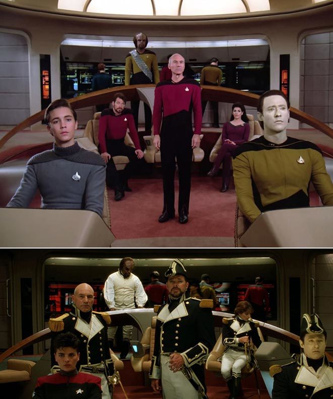
It was a distinction borne of technical limitations. Cathode ray tube TVs could only handle a dynamic range of a few stops, requiring lighting with low contrast ratios, while a projected 35mm print could reproduce much more subtlety.
Today, film and TV is shot on the same equipment, and both are viewed on a range of devices which are all good at dealing with contrast (at least compared with CRTs). The result is that, with contrast as with depth of field, camera movement and progressive scan, the distinction between the cinematic and the uncinematic has reduced.
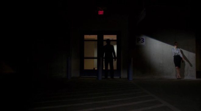
In fact, I’d argue that it’s flipped around. To my eye, many of today’s TV series – and admittedly I’m thinking of high-end ones like The Crown, Better Call Saul or The Man in the High Castle, not Eastenders – look more cinematic than modern movies.
As my friend Chris had realised, the flat, high-key look of Star Trek: The Next Generation was actually far more realistic than that of its cinema counterpart. And now movies seem to have moved towards realism in the lighting, which is less showy and not so much moody for the sake of being moody, while TV has become more daring and stylised.
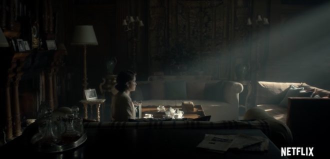
The Crown, for examples, blasts a 50KW Soft Sun through the window in almost every scene, bathing the monarchy in divine light to match its supposed divine right, while Better Call Saul paints huge swathes of rich, impenetrable black across the screen to represent the rotten soul of its antihero.
Film lighting today seems to strive for naturalism in the most part. Top DPs like recent Oscar-winner Roger Deakins, CBE, ASC, BSC, talk about relying heavily on practicals and using fewer movie fixtures, and fellow nominee Rachel Morrison, ASC, despite using a lot of movie fixtures, goes to great lengths to make the result look unlit. Could it be that film DPs feel they can be more subtle in the controlled darkness of a cinema, while TV DPs choose extremes to make their vision clear no matter what device it’s viewed on or how much ambient light contaminates it?

Whatever the reason, contrast does seem to be the key to a cinematic look. Even though that look may no longer be exclusive to movies released in cinemas, the perception of high contrast being linked to production value persists. The high contrast of the practically-lit scenes in my Stasis project is – as best I can tell – what makes people describe it as cinematic.
What does all of this mean for a filmmaker? Simply pumping up the contrast in the grade is not the answer. Contrast should be built into the lighting, and used to reveal and enhance form and depth. The importance of good production design, or at least good locations, should not be overlooked; shooting in a friend’s white-walled flat will kill your contrast and your cinematic look stone dead.
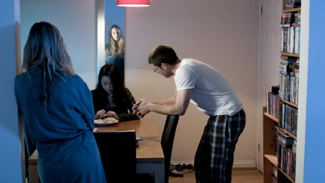
Above all, remember that story – and telling that story in the most visually appropriate way – is the essence of cinema. In the end, that is what makes a film truly cinematic.


