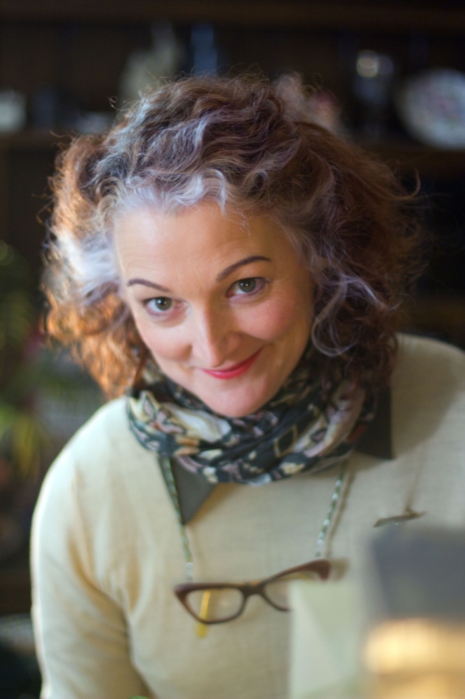
Another guest blog from Stop/Eject‘s producer Sophie Black today. She’s been hard at work creating the Electronic Press Kit, to promote the post-production crowd-funding campaign, and I asked her to share her thoughts on what makes a good EPK.
The Electronic Press Kit is an important part of post-production because we use it to send to regional news programmes and television shows, in the hope that they will do a feature on our film. There’s a lot of things which can be put into it – and in some cases it’s down to choice and what you think will best promote your film – but I got my checklist from Chris Gore’s Ultimate Film Festival Survival Guide, which I’ve been using as a guidebook. Actually it’s a corking book, and very useful, so I recommend that you get a copy. But, in the meantime, here is his checklist for EPK assemblage, and my notes on each:
- Two Trailers – one with music and one without. This is mainly in case they want to show the trailer but are fearful of copyright infringement with the music. We included just the one copy of the trailer, with music, because the sound track (not the score) is still in early days and it might feel seem somewhat exposed without the music. If you have the same concerns then you can do what we did and include a copy of the license agreement for your music, so that they feel safe to use it. If you haven’t got clearance for your music – what are you doing? Go and get some at once! And if you can’t, you lose all chance of having your trailer played anywhere that gets attention, and you’re wasting valuable promotional opportunities. Another reason to only include one trailer is that ours came with a swanky little pitch video, so there’s two videos included in the package already!
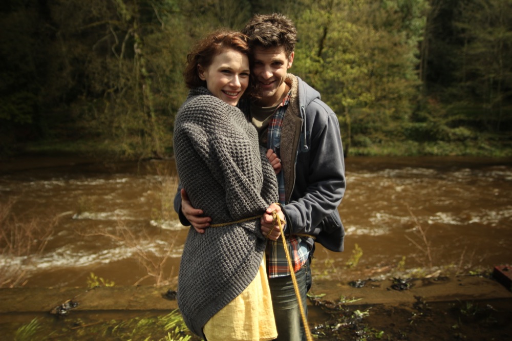
- Selected Scenes – basically this is an opportunity for you to put in the best scenes of the film to show how great your film is, or to show the general style and tone of your film (if your trailer hasn’t done this enough for you). But of course, you do run the risk of giving away too much too soon. We didn’t include any scenes in our EPK because ours is to promote the trailer and the final funding campaign, rather than a finished film (yes, this does mean there may be a second EPK at a later date).
-

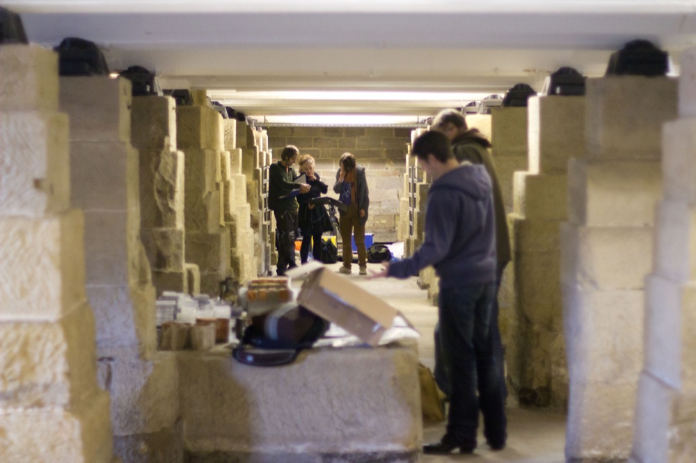
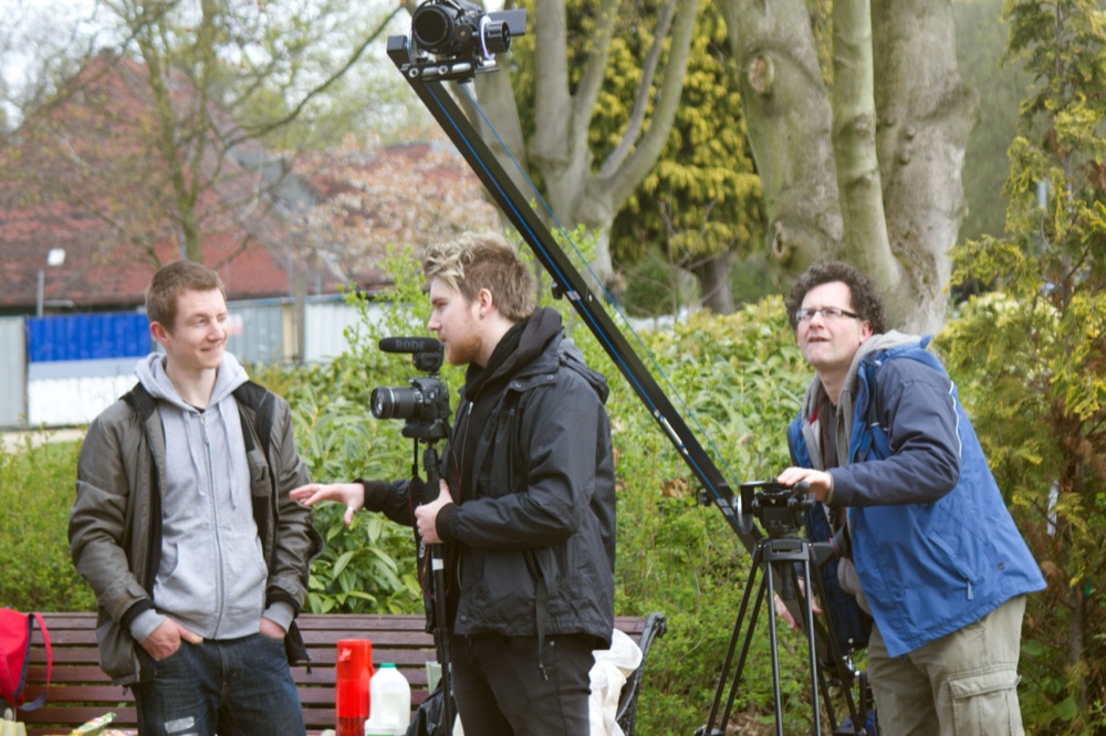
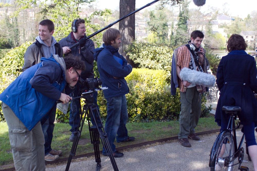
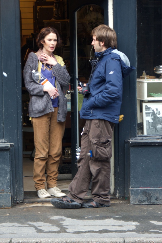
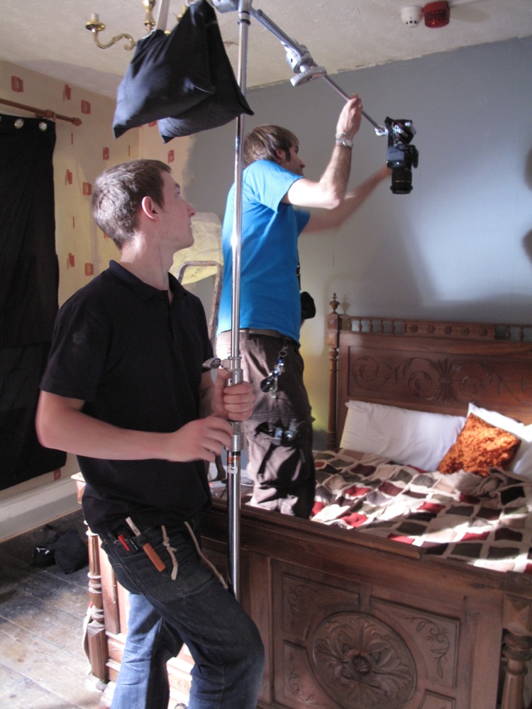
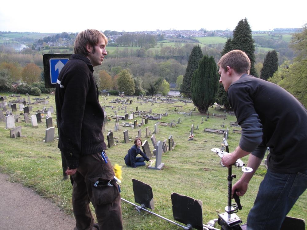
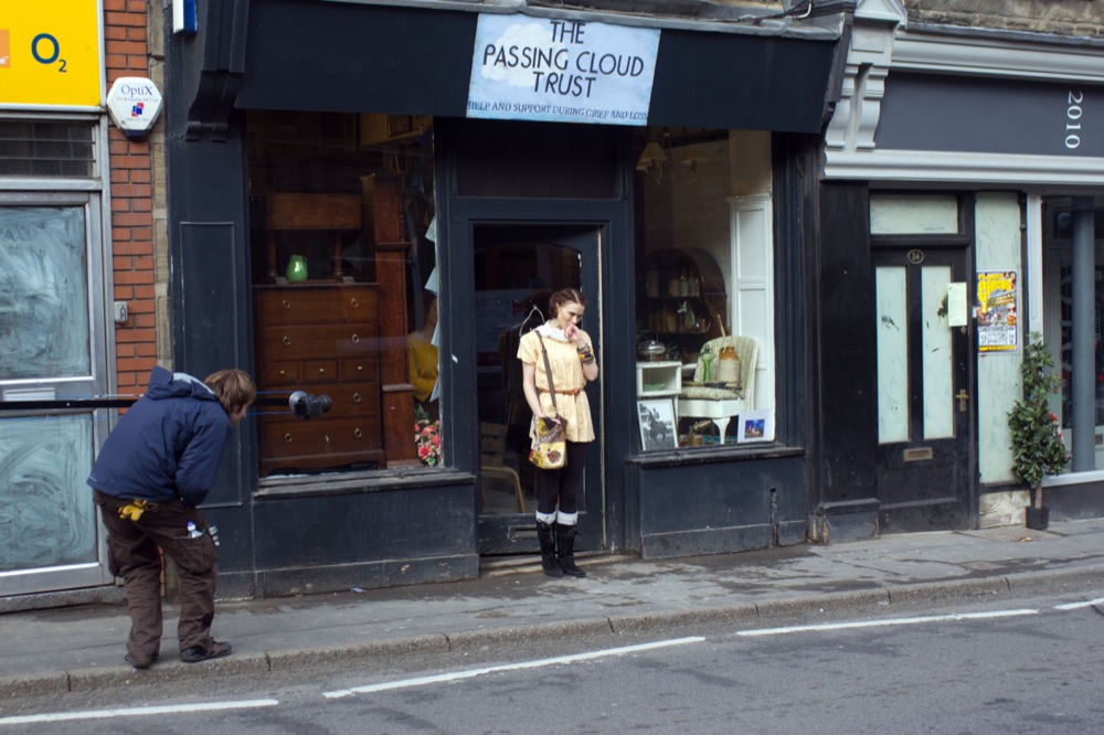
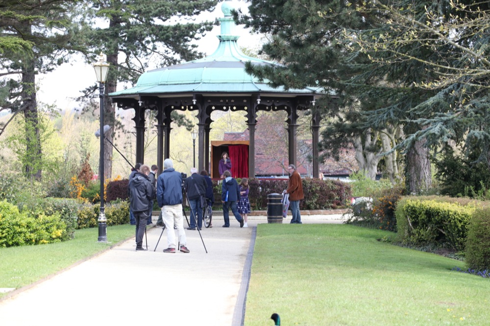
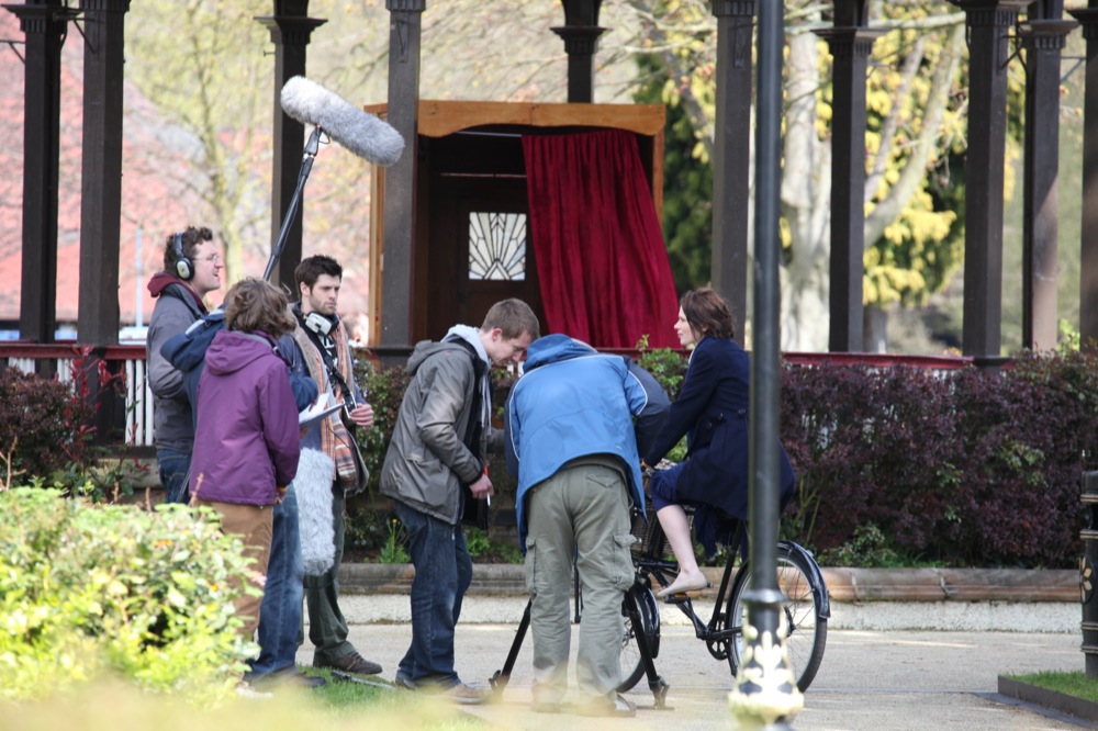
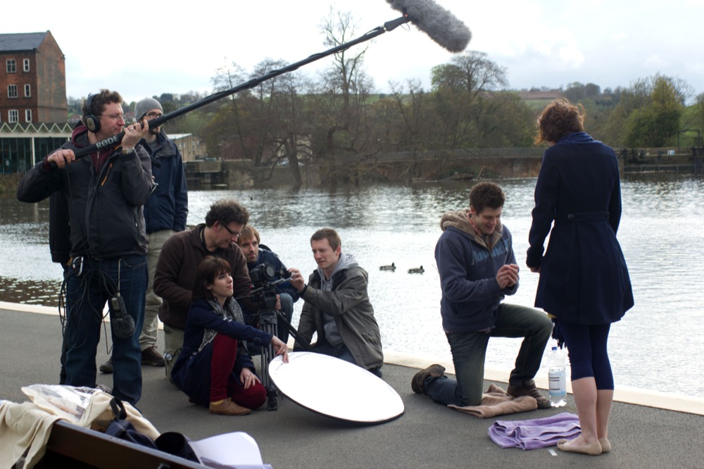
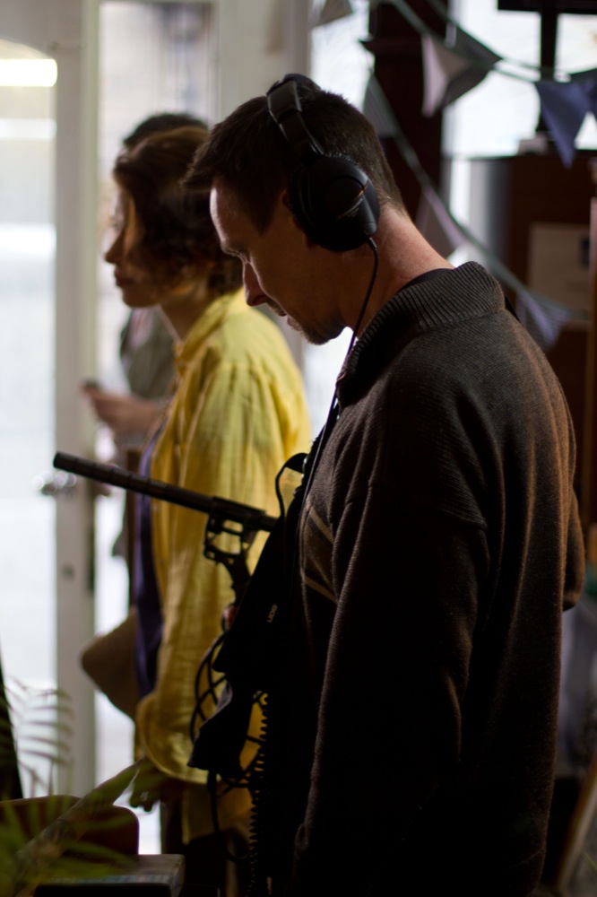
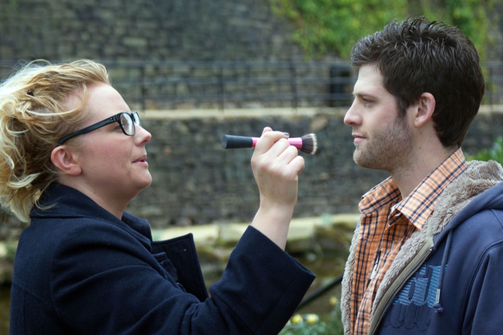
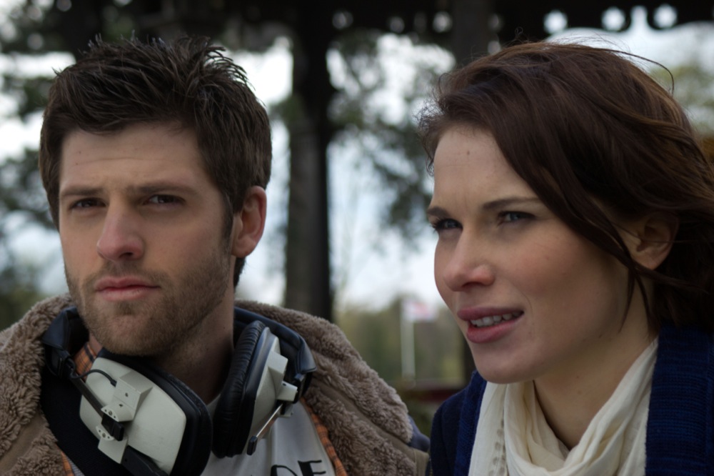
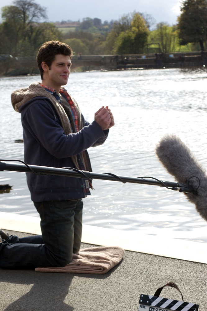
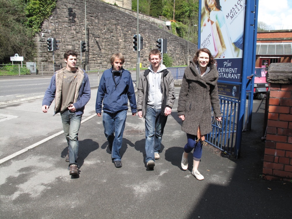
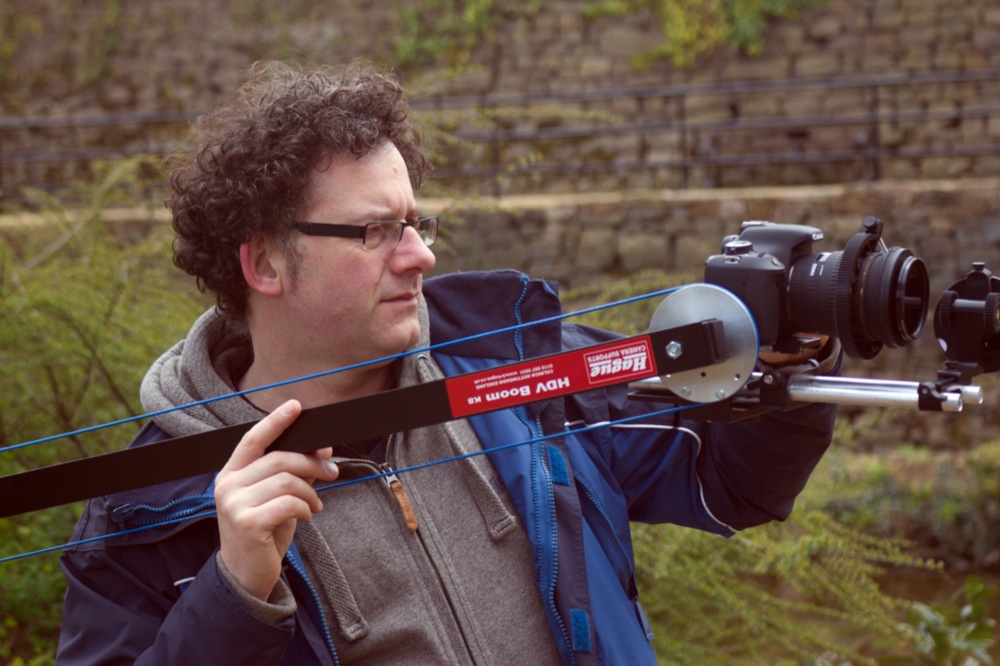
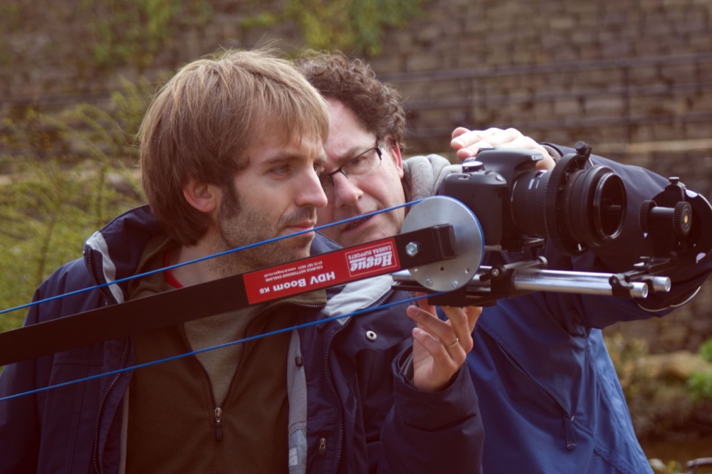
B-roll A Making-Of Featurette – Gore says that this is optional but I LOVE behind the scenes footage. No news room is going to want to show a full making-of in a small report, but including a snippet of one can entice them in (a person at a planning desk is still ‘your audience’, after all) and make them want to do their own piece on the film. Particularly when targeting local news, clips of their best scenery with film crews working on them – and looking all professional – will basically spell out the story for them. So we didn’t include a full Making-of, but I did include a happy little montage of the crew assembling the alcove and equipment in the Rivergardens, taken straight from the first podcast. Lovely Belper Scenery: check. Crew looking professional and hard at work: check.
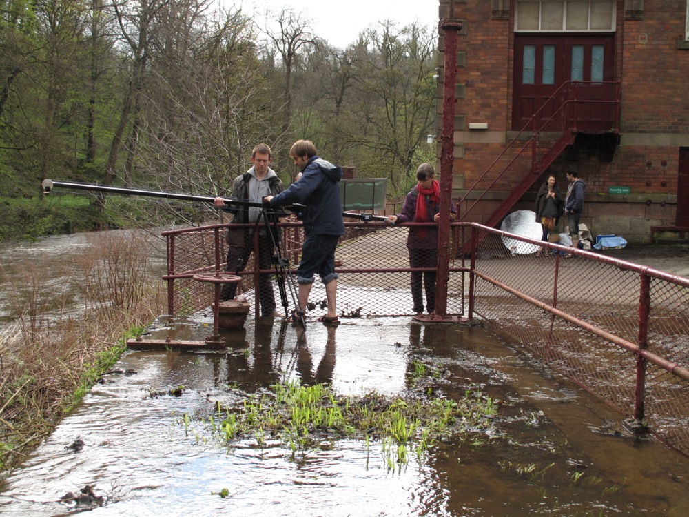
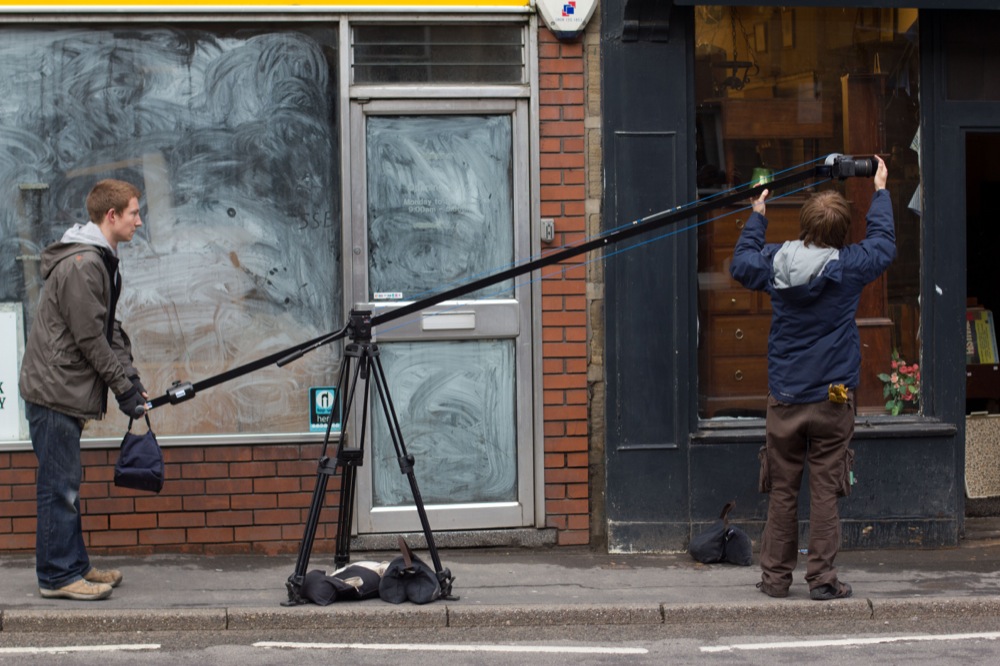
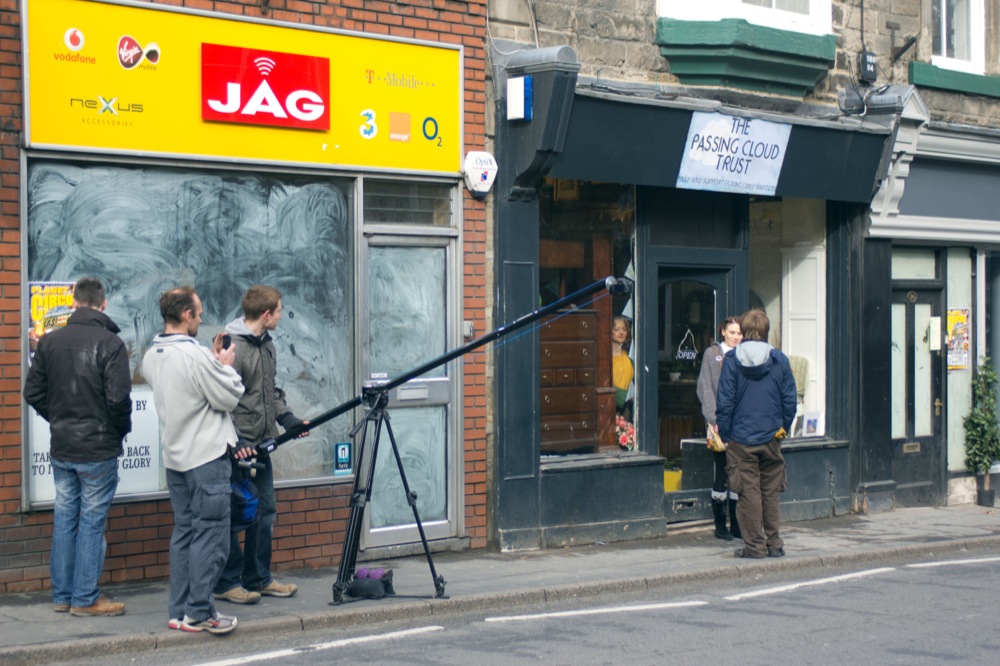
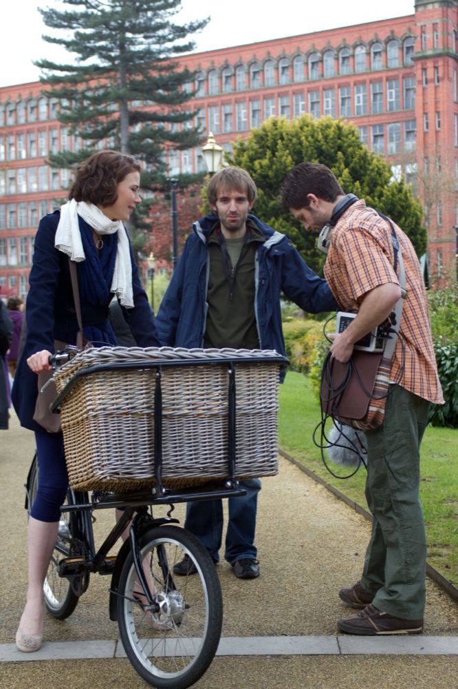
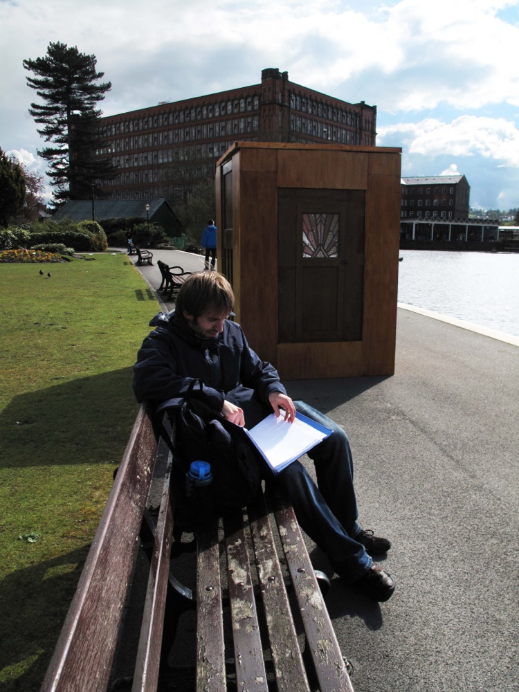
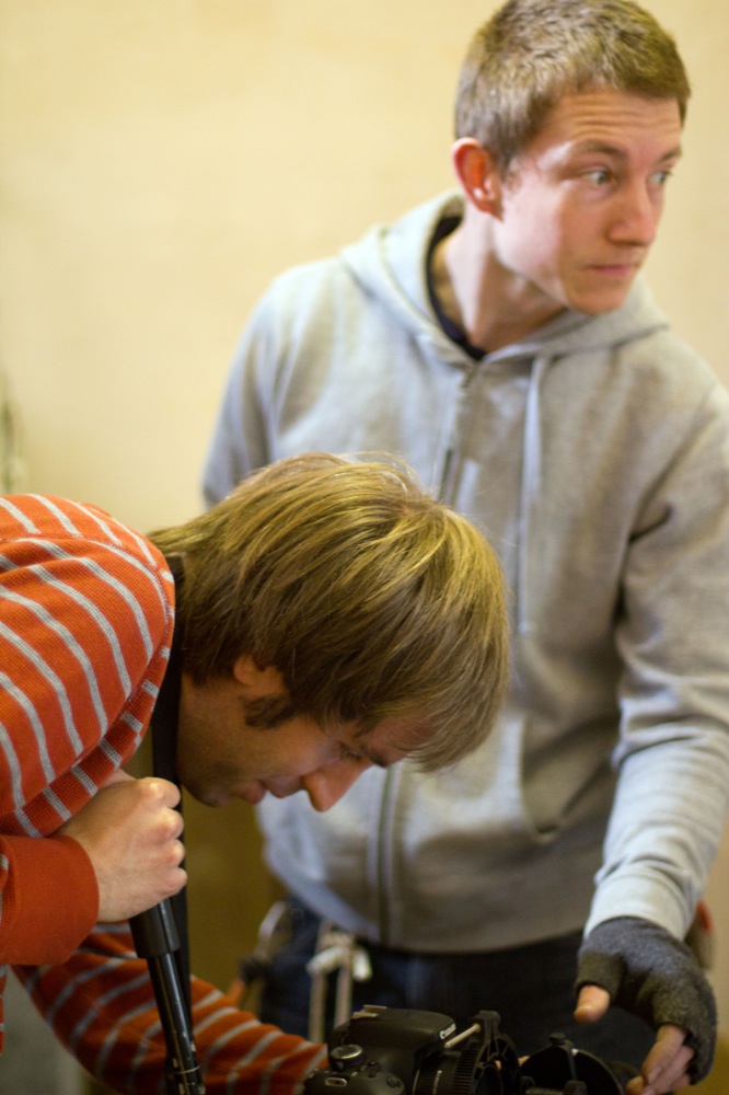
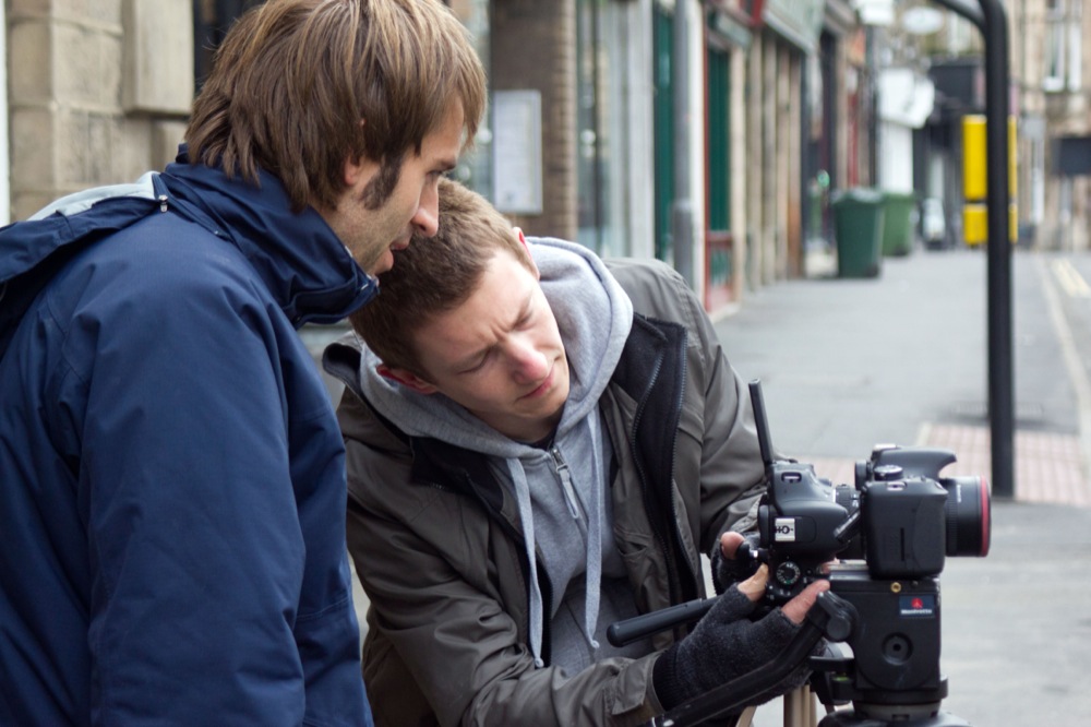
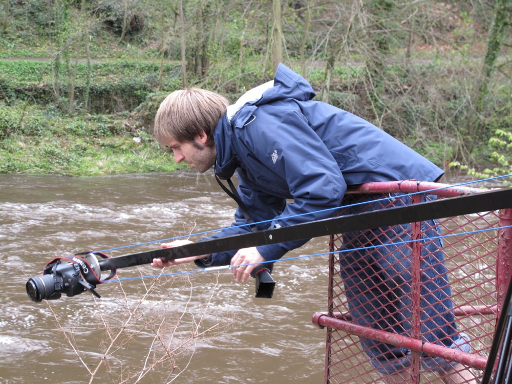
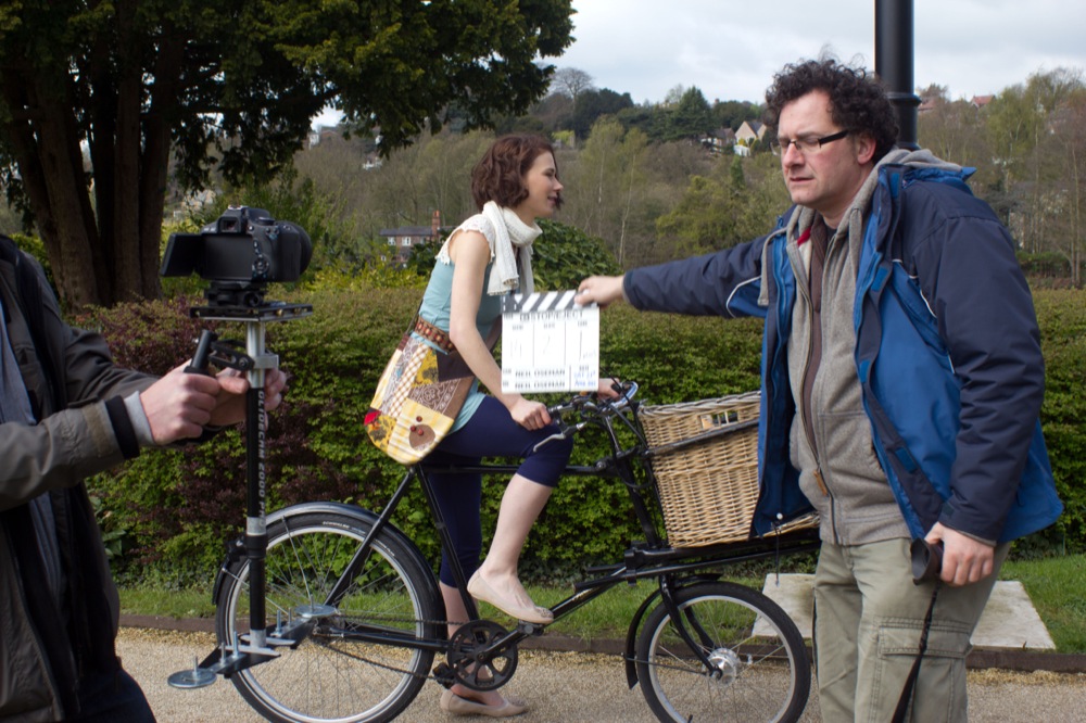
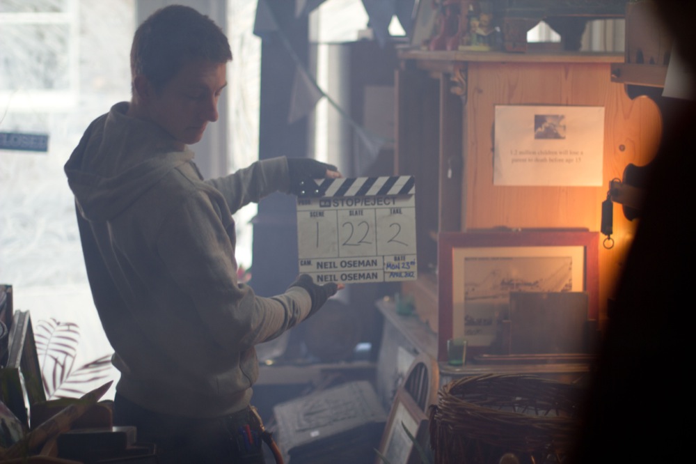
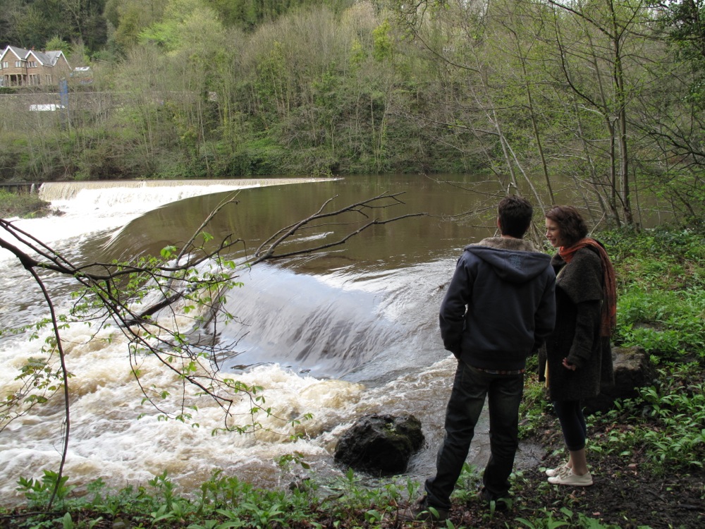
- B-roll Footage – again, optional, but I recommend it more than anything. If you weren’t lucky enough to have a news crew capturing your activity whilst you were still on set (and, let’s be honest, you’d have to have quite a name for yourself for that to happen, and in that case you probably wouldn’t want them there), then sending your own behind-the-scenes footage is the only way for that to be featured in the report. News stories about films being made, particularly by independent filmmakers in local areas, are often character-driven and at least half made-up by behind the scenes footage. In conclusion, don’t submit clips of the director looking thoughtful and saying ‘action’, or the actors rehearsing a scene in front of a nice camera, and you probably won’t get a story! Again, any clips you do send should be relevant to the people you’re sending it too, so the majority of ours showed the Belper/Matlock streets and landmarks being used.
-

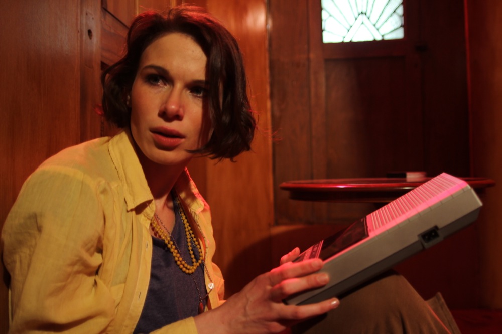
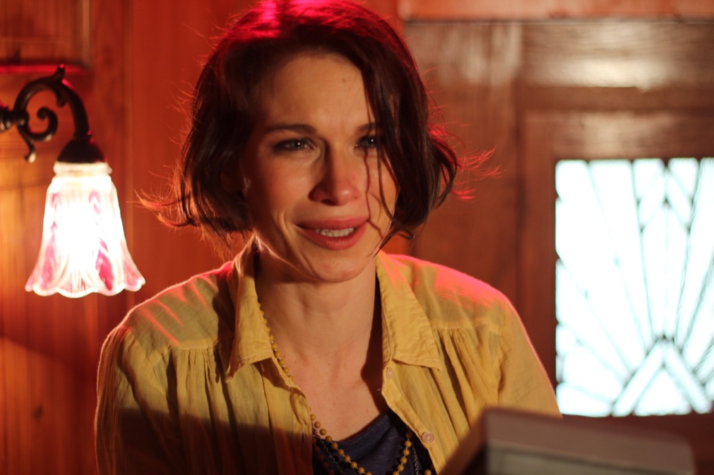
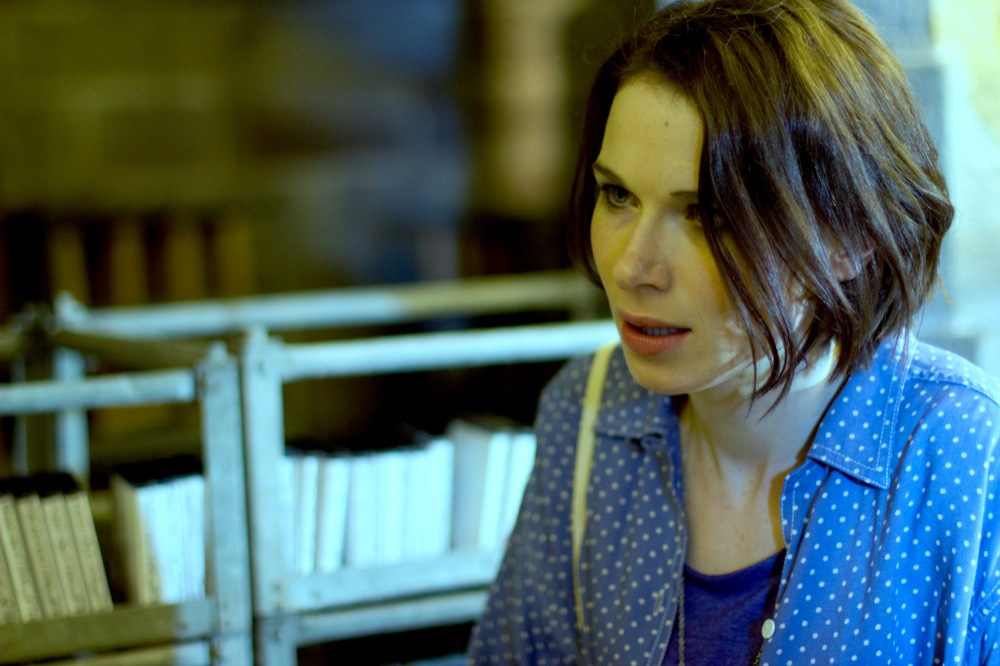
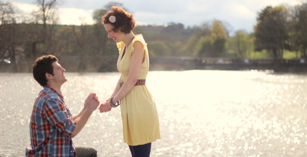
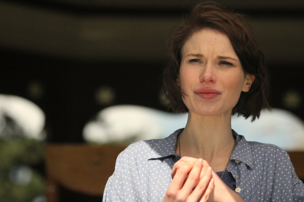
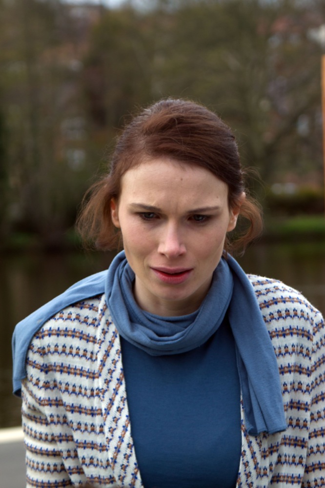
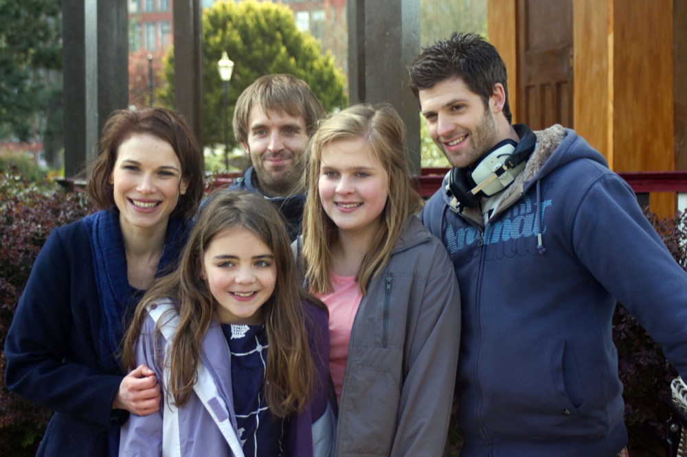
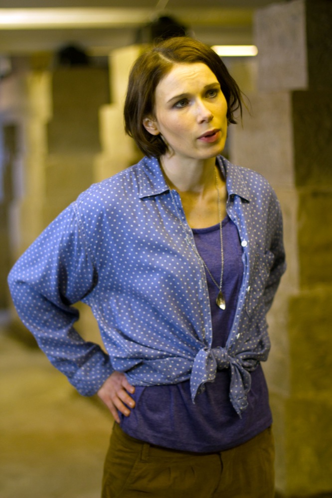
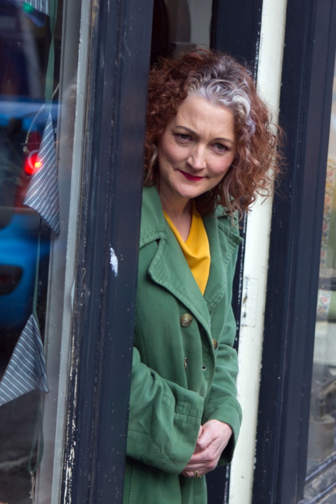
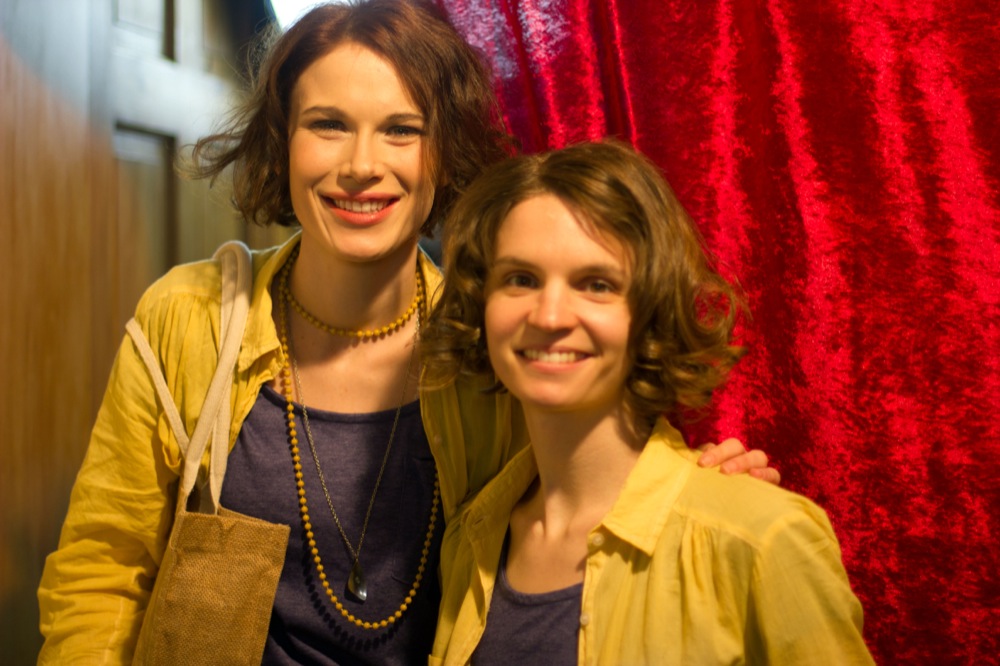
Interview footage Interviews – and here is where the second half of a character-driven news report comes from. Companies like the BBC will always shoot their own interviews, as a rule, but submitting your own interview clips will show them the type of thing the cast/crew would say in an interview, and suggests that they are in fact worth interviewing! Even better, get a clip of them saying something along the lines of “the local area is brilliant etc.” then it shows the crew will have relevant things to say for the local news channels, and that we might even make them look good – it gives them a sample sound bite and hopefully shows that the programme will get some good publicity in return. I put the interview clips in order of relevance to who I was sending to, assuming that the news crew will lose interest towards the end – that’s a good rule with anything like this, actually. Put your best stuff first – these people are very busy and might not even have chance to see all of it, even if they want to, so you have to snare them quick. So the clip of Neil talking about how lovely it was to film in the East Midlands went right towards the top. The majority of the interview snippets came from Neil and Georgina, being our main attractions, but I also included a clip of myself from an early podcast, purely because I was talking about the locations and showing how beautiful they looked.
- Promotional Images – just as with a regular press kit, it is important to include your poster, logo, website screenshot etc., only in this case in a digital format. If you’re lucky, your logo may even be used in the background when the newsreader headlines your story, so make sure it’s in a high resolution! I also included a scan of our Belper News feature – the way I see it, that showed that we were already ‘news worthy’ and hope that it encourages further publicity.


Yes, that is a big list, but put it all together and you’ll have yourself a bonafide, well-researched-looking EPK!
At the start of the DVD, you should also include your company logo, and a disclaimer which is well-worded to discourage people from spreading your material willy-nilly without putting them off promoting it at all.
Before EVERY clip on the EPK, make sure you include the title of the film, the director’s name, a brief description of what the clip is, and a total running time of said clip. This makes the whole thing look very corporate but is helpful for the people researching and compiling your story on the other side.
You also have to silence the creative editor inside you, which is the part I found hardest. The clips you submit should be snappy and interesting, cutting straight to the relevant shots of people working and the local scenery looking great, or a one-sentence answer (if possible) in your interview clips. There’s no room for elegant pacing here.

One area where you can be creative, however, is in the presentation of the package itself. Don’t just put the clips onto a basic disk with a note – here is an opportunity for you to show how professional and interesting your film is before they’ve even watched the disk, which will make them want to do so. I created the disks using Lightscribe, featuring the film’s logo, and the covering letter/DVD contents sheet were made using our original posters as backgrounds. This kept everything in our colour scheme and made it looks as though everything was designed specifically for the EPK. It’s also important to ring up the news companies in advance to make initial contact; you can get addresses and numbers on the internet but you have to track down the name of the person to send the EPK directly to, to avoid it going unsorted in a forgotten pile. Plus it gets your names into the reporters’ heads before the EPK arrives, and they will (hopefully) know to look out for it.
Cheers, Sophie. Let’s hope this gets us some local news coverage.


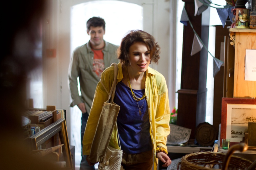
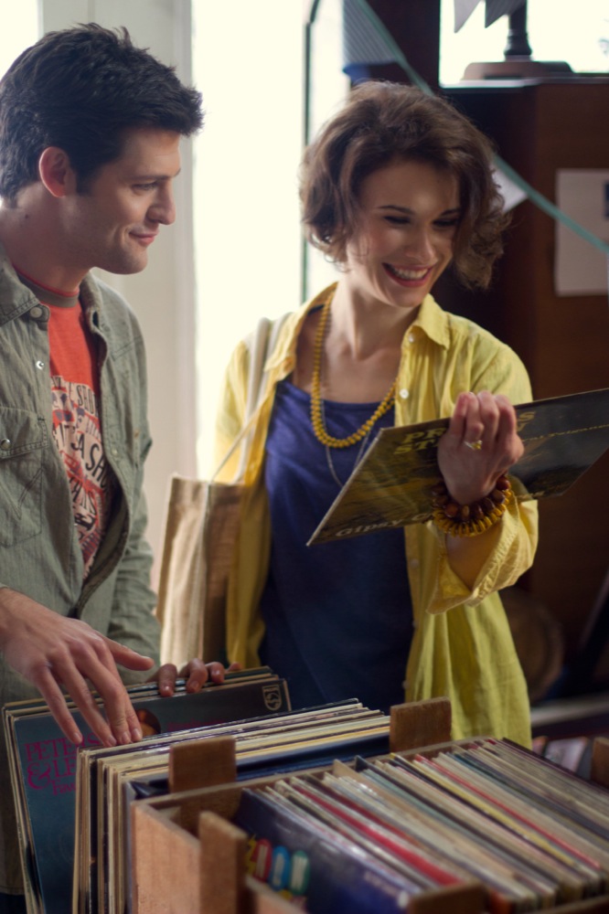
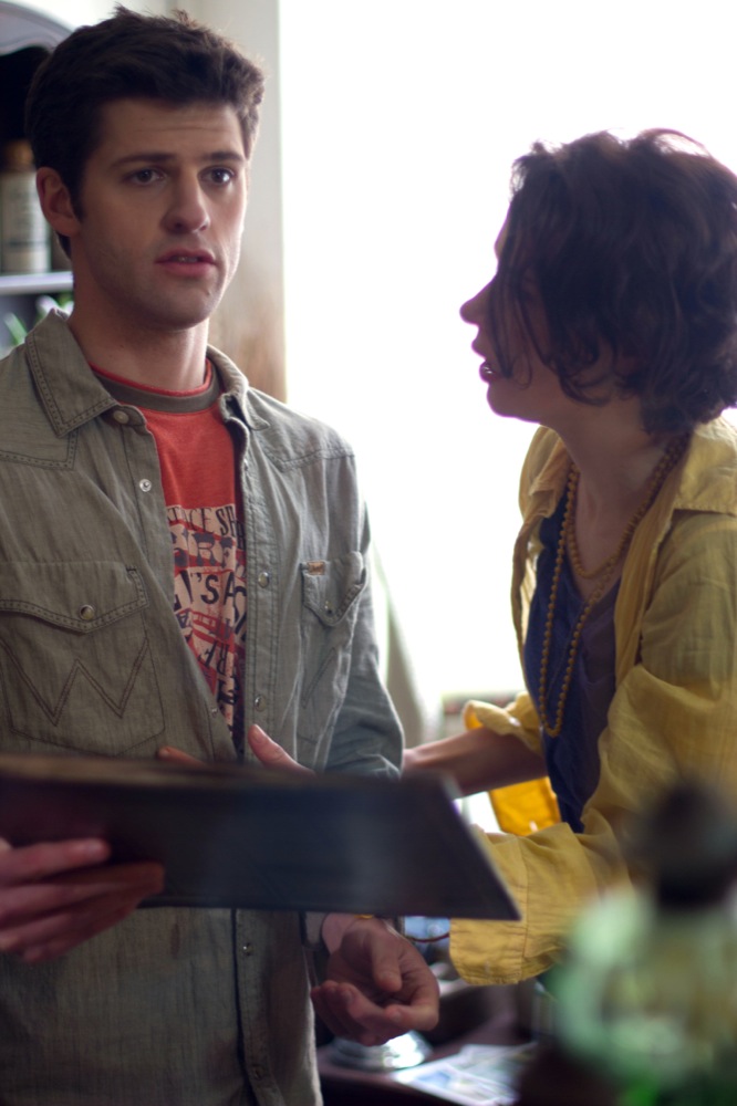
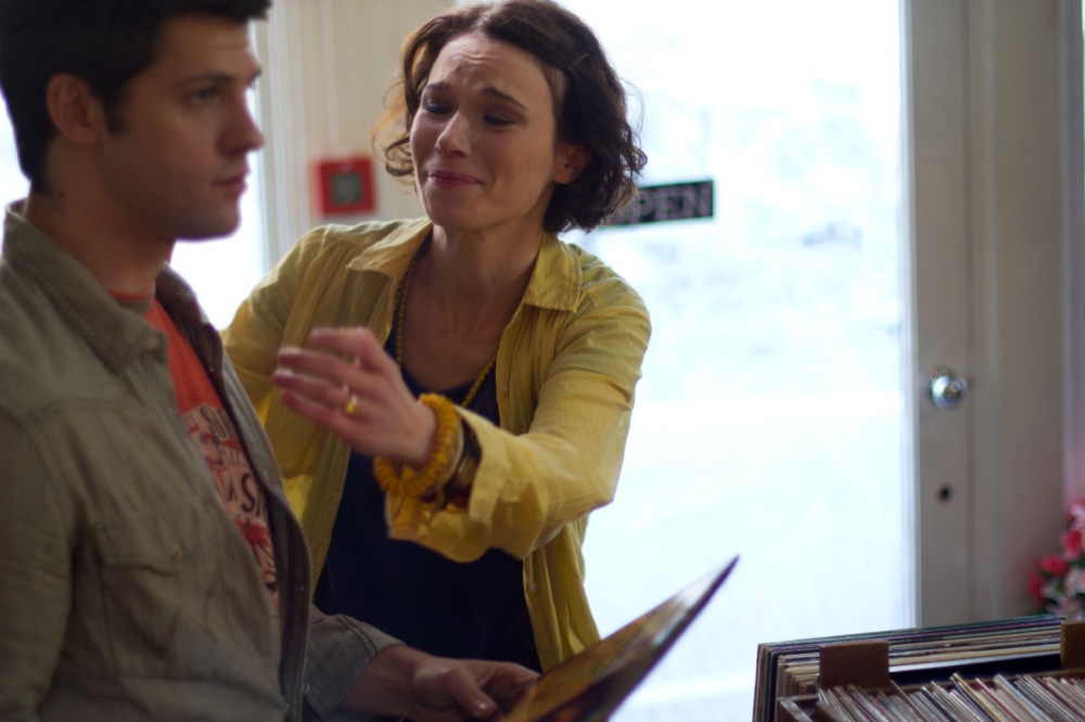
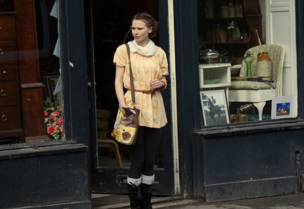
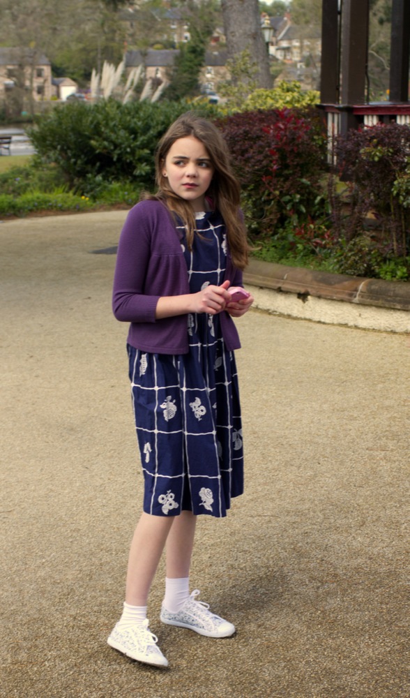
 and Alice (Therese Collins) from either side.")


")

")
")

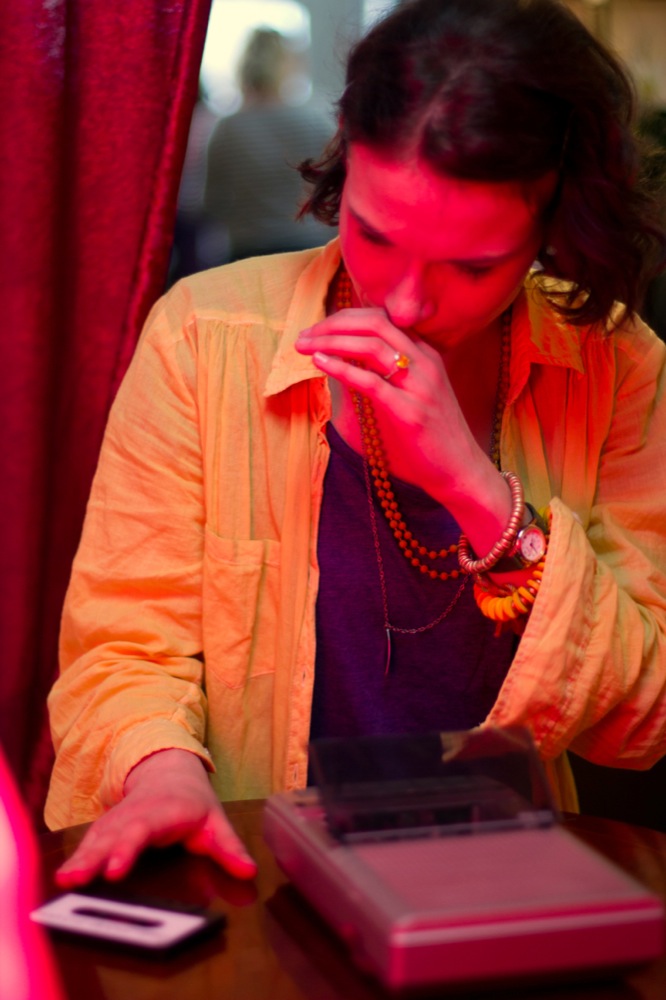
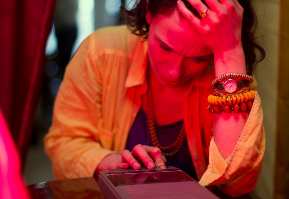
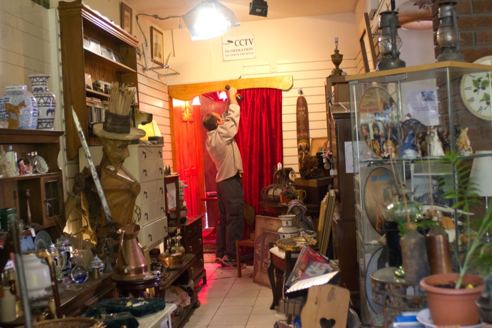
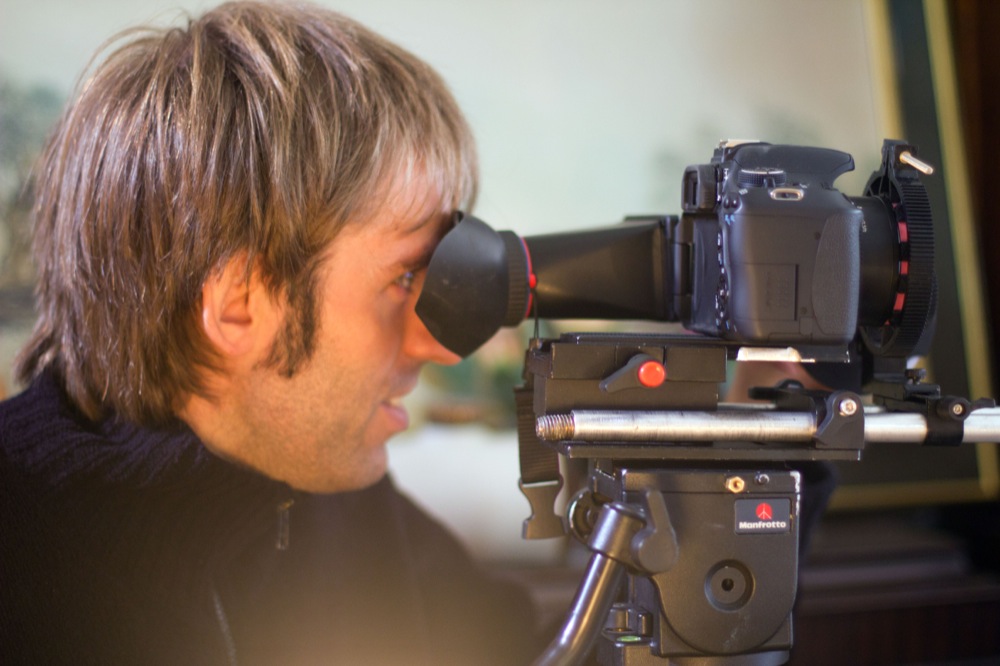
 editing audio on his laptop")


")