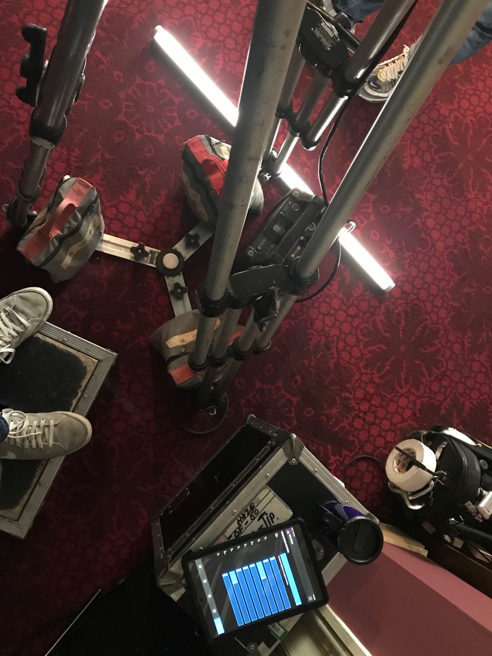
Astera Titan Tubes seem to be everywhere at the moment, every gaffer and DP’s favourite tool. Resembling fluorescent tubes, Asteras are wireless, flicker-free LED batons comprised of 16 pixels which can be individually coloured, flashed and programmed from an app to produce a range of effects.
Here are five ways in which I used Titan Tubes on my most recent feature, Hamlet. I’m not being sponsored by Astera to write this. I just know that loads of people out there are using them and I thought it would be interesting to share my own experiences.
1. Substitute fluorescents
We had a lot of scenes with pre-existing practical fluorescents in them. Sometimes we gelled these with ND or a colour to get the look we wanted, but other times it was easier to remove the fluorescent tube and cable-tie an Astera into the housing. As long as the camera didn’t get too close you were never going to see the ties, and the light could now be altered with the tap of an app.
On other occasions, when we moved in for close-ups, the real fluorescents weren’t in an ideal position, so we would supplement or replace them with an Astera on a stand and match the colour.
2. Hidden behind corners
Orientated vertically, Asteras are easy to hide behind pillars and doorways. One of the rooms we shot in had quite a dark doorway into a narrow corridor. There was just enough space to put in a vertical pole-cat with a tube on it which would light up characters standing in the doorway without it being seen by the camera.
3. Eye light
Ben Millar, Hamlet‘s gaffer, frequently lay an Astera on the floor to simulate a bit of floor bounce and put a sparkle in the talent’s eye. On other occasions when our key light was coming in at a very sidey angle, we would put an Astera in a more frontal position, to ping the eyes again and to wrap the side light very slightly.
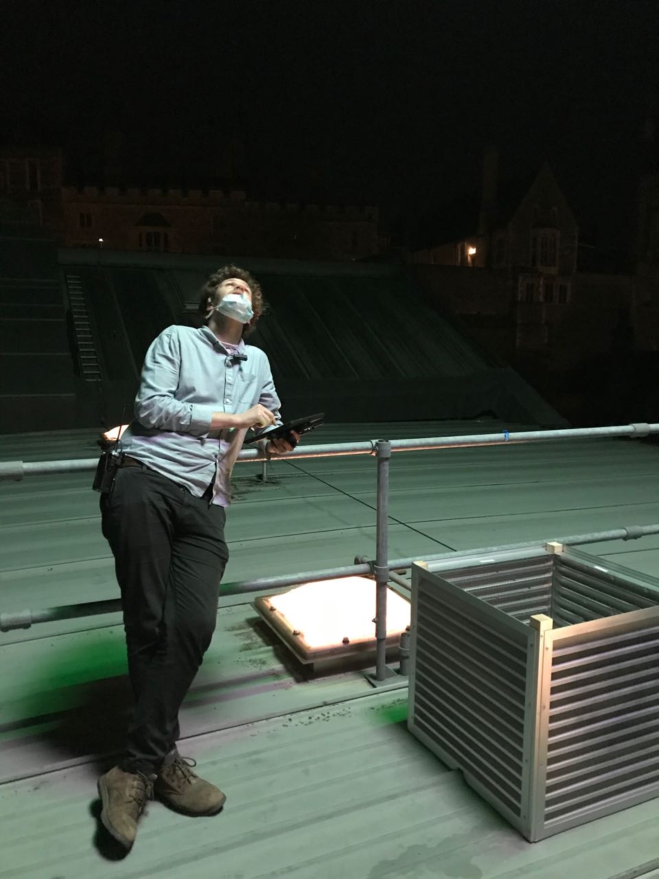
4. rigged to the ceiling
We had a scene in a bathroom that was all white tiles. It looked very flat with the extant overhead light on. Our solution was to put up a couple of pole-cats, at the tops of the two walls that the camera would be facing most, and hang Asteras horizontally from them. Being tubes they have a low profile so it wasn’t hard to keep them out of the top of frame. We put honeycombs on them and the result was that we always had soft, wrappy backlight with minimal illumination of the bright white tiles.
5. Special effects
One of the most powerful things about Titan Tubes is that you can programme them with your own special effects. When we needed a Northern Lights effect, best boy Connor Adams researched the phenomenon and programmed a pattern of shifting greens into two tubes rigged above the set.
On War of the Worlds in 2019 we used the Asteras’ emergency lights preset to pick up some close-ups which were meant to have a police car just out of shot.
“The Handmaid’s Tale: Offred” (2017, DP: Colin Watkinson, ASC, BSC)
When DSLR video exploded onto the indie filmmaking scene a decade ago, film festivals were soon awash with shorts with ultra-blurry backgrounds. Now that we have some distance from that first novelty of large-sensor cinematography we can think more intelligently about how depth of field – be it shallow or deep – is best used to help tell our stories.
First, let’s recap the basics. Depth of field is the distance between the nearest and farthest points from camera that are in focus. The smaller the depth of field, the less the subject has to move before they go out of focus, and the blurrier any background and foreground objects appear. On the other hand, a very large depth of field may make everything from the foreground to infinity acceptably sharp.
Everyone’s favourite time machine at f/5 (left) and f/1.8 (right)
Depth of field is affected by four things: sensor (or film) size, focal length (i.e. lens length), focal distance, and aperture. In the days of tiny Mini-DV sensors, I was often asked by a director to zoom in (increase the focal length) to decrease the depth of field, but sometimes that was counter-productive because it meant moving the camera physically further away, thus increasing the focal distance, thus increasing the depth of field.
It was the large 35mm sensors of DSLRs, compared with the smaller 1/3” or 2/3” chips of traditional video cameras, that made them so popular with filmmakers. Suddenly the shallow depth of field seen in a Super-35 movie could be achieved on a micro-budget. It is worth noting for the purists, however, that a larger sensor technically makes for a deeper depth of field. The shallower depth of field associated with larger sensors is actually a product of the longer lenses required to obtain the same field of view.
Once a camera is selected and filming is underway, aperture is the main tool that DPs tend to use to control depth of field. A small aperture (large f- or T-number) gives a large depth of field; a large aperture (small f- or T-number) gives a narrow depth of field. What all those early DSLR filmmakers, high on bokeh, failed to notice is that aperture is, and always has been, a creative choice. Plenty of directors and DPs throughout the history of cinema have chosen deep focus when they felt it was the best way of telling their particular story.
“Citizen Kane” (1941, DP: Gregg Toland, ASC)
One of the most famous deep-focus films is 1941’s Citizen Kane, frequently voted the greatest movie ever made. First-time director Orson Welles came from a theatre background, and instructed DP Gregg Toland to keep everything in focus so that the audience could choose what to look at just as they could in a theatre. “What if they don’t look at what they’re supposed to look at?” Welles was apparently asked. “If that happens, I would be a very bad director,” was his reply.
Stanley Kubrick was also fond of crisp backgrounds. The infamous f/0.7 NASA lenses used for the candlelight scenes in Barry Lyndon were a rare and extreme exception borne of low-light necessity. A typical Kubrick shot has a formal, symmetrical composition with a single-point perspective and everything in focus right into the distance. Take the barracks in Full Metal Jacket, for example, where the background soldiers are just as sharp as the foreground ones. Like Welles, Kubrick’s reasons may have lain in a desire to emulate traditional art-forms, in this case paintings, where nothing is ever blurry.
“Full Metal Jacket” (1987, DP: Douglas Milsome, ASC, BSC)
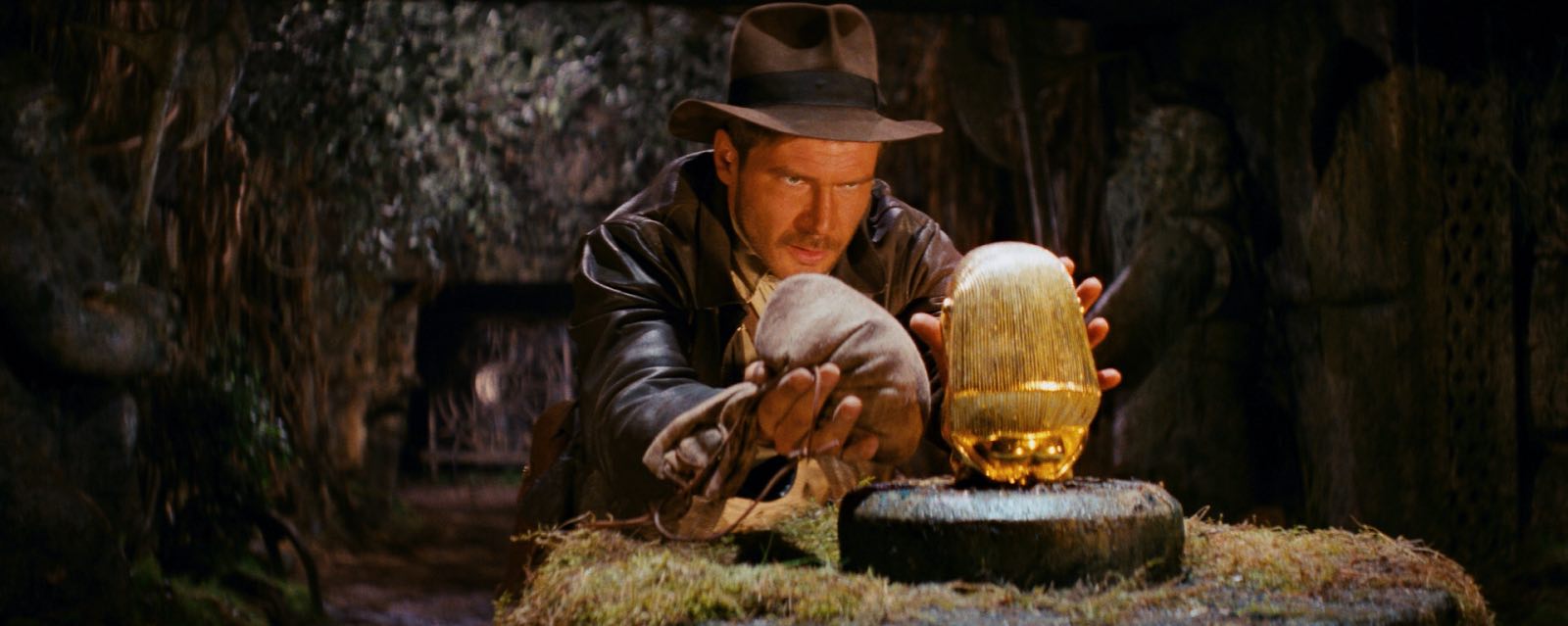
The Indiana Jones trilogy was shot at a surprisingly slow stop by the late, great Douglas Slocombe. “I prefer to work in the aperture range of T14-T14.5 when I am shooting an anamorphic film like Raiders,” he said at the time. “The feeling of depth contributed to the look.” Janusz Kamiński continued that deep-focus look, shooting at T8-T11 when he inherited the franchise for Kingdom of the Crystal Skull.
At the other end of the aperture scale, the current Hulu series The Handmaid’s Tale makes great creative use of a shallow depth of field, creating a private world for the oppressed protagonist which works in tandem with voiceovers to put the viewer inside her head, the only place where she is free.
A director called James Reynolds had a similar idea in mind when I shot his short film, Exile Incessant. He wanted to photograph closed-minded characters with shallow focus, and show the more tolerant characters in deep focus, symbolising their openness and connection with the world. (Unfortunately the tiny lighting budget made deep focus impossible, so we instead achieved the symbolism by varying the harshness of the lighting.)
“Ren: The Girl with the Mark” (2016, DP: Neil Oseman)
One production where I did vary the depth of field was Ren: The Girl with the Mark, where I chose f/4 as my standard working stop, but reduced it to as little as f/1.4 when the lead character was bonding with the mysterious spirit inside her. It was the same principle again of separating the subject from the world around her.
Depth of field is a fantastic creative tool, and one which we are lucky to have so much control over with today’s cameras. But it will always be most effective when it’s used expressively, not just aesthetically.
Raiders of the Lost Ark, the first instalment in the blockbusting Indiana Jones franchise, burst onto our screens a scarcely-believable 40 years ago. But of course, it’s not the years, it’s the mileage…
The origin story of this legendary character is itself the stuff of Hollywood legend. Fleeing LA to escape the dreaded box office results of Star Wars (spoiler: he needn’t have worried), George Lucas and his friend Steven Spielberg were building a sandcastle on a Hawaiian beach when Lucas first floated the idea.
Like Star Wars, the tale of adventuring archaeologist Indiana Smith was inspired by adventure serials of the 1950s. Although Spielberg liked the first name (which came from Lucas’s dog, a reference that the third film would twist back on itself), he wasn’t so keen on Smith, and so Indiana Jones was born.
Rather than auditions, actors under consideration were invited to join Spielberg in baking bread. Tom Selleck was famously the first choice for the lead, but his contract with the TV series Magnum, P.I. precluded his involvement, and Spielberg instead suggested to a reluctant Lucas that they cast his regular collaborator Harrison Ford.
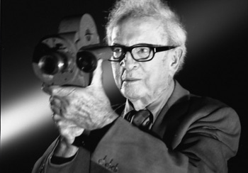
DP Douglas Slocombe, OBE, BSC, BSC
Raiders was shot at a breakneck pace, with Spielberg determined to reverse his reputation for going over schedule and over budget. Beginning in summer 1980, the animated red line of the film crew travelled across a map of the world from La Rochelle, France to England’s Elstree Studios (where Lucas had shot Star Wars) to Tunisia (ditto) to Hawaii, where it had all begun.
The film, and indeed the whole of the original trilogy, was photographed in glorious Panavision anamorphic by the late, great Douglas Slocombe, OBE, BSC, ASC. “Dougie is one of the few cinematographers I’ve worked with who lights with hard and soft light,” Spielberg commented. “Just the contrast between those styles within the framework of also using warm light and cool light and mixing the two can be exquisite.”
Location challenges included the removal of 350 TV aerials in the Tunisian town of Kairouan, so that views from Sallah’s balcony would look period-accurate, this being before the days of digital tinkering.
Digital tinkering was applied to the DVD release many years later, however, to remove a tell-tale reflection in a glass screen protecting Harrison Ford from a real cobra. Besides this featured reptile – which proved the value of the screen by spitting venom all over it – the production team initially sourced 2,000 snakes for the scene in which Indy and friends locate the Ark of the Covenant. But Spielberg found that “they hardly covered the set, so I couldn’t get wide shots.” 7,000 more snakes were shipped in to complete the sequence.
While the classic truck chase was largely captured by second unit director Michael Moore working to pre-agreed storyboards, Spielberg liked to improvise in the first unit. The fight on the Flying Wing, during which Ford tore a ligament after the plane’s wheel rolled over his leg, was made up as the filmmakers went along. When Indy uses the plane to gun down a troop of bad guys, the director requested a last-minute change from graphic blood sprays to more of a dusty look. Mechanical effects supervisor Kit West resorted to putting cayenne pepper in the squibs, which had the entire crew in sneezing fits.
“I would hear complaints,” said Kathleen Kennedy, who worked her way up the producer ranks during the trilogy, beginning as “associate to Mr. Spielberg”. “‘Well, Steven’s not shooting the sketches.’ But once you get into a scene and it’s suddenly right there in front of you, I only think that it can be better if changes are made then.”
Spielberg’s most famous improvisation, when a four-day sword-fight was thrown out and replaced with Indy simply shooting the swordsman dead, was prompted by the uncomfortable Tunisian heat and the waves of sickness that were sapping morale. “We couldn’t understand why the crew was getting ill, because we were all drinking bottled Evian water,” recalled Ford’s stunt double Vic Armstrong. “Until one day somebody followed the guy that collected the empties and saw him filling these Evian bottles straight out of the water truck.”
Production wrapped in early October, and effects house ILM, sound designer Ben Burtt and composer John Williams worked their world-class magic on the film. For the opening of the Ark, ILM shot ghost puppets underwater, while the demise of the Nazi Toht was accomplished with a likeness of actor Ronald Lacey sculpted out of dental alginate, which melted gorily when heated.
Amongst the sounds Burtt recorded were a free-wheeling Honda station wagon (the giant boulder), hands squelching in a cheese casserole (slithering snakes) and the cistern cover of his own toilet (the lid of the Ark). Williams initially composed two potential themes, both of which Spielberg loved, so one became the main theme and the other the bridge.
Although still great fun, and delivering a verisimilitude which only practical effects and real stunts can, some aspects of Raiders are problematic to the modern eye. The Welsh John Rhys Davies playing the Egyptian Sallah, and a female lead who is continually shoved around by both villains and heroes alike, make the film a little less of a harmless romp today than it was intended at the time.
Raiders was a box office hit, spawning two excellent sequels (and a third of which we shall not speak) plus a spin-off TV series, The Young Indiana Jones Chronicles, and even a shot-for-shot amateur remake filmed by a group of Mississippi teenagers over many years. It also won five Oscars in technical categories, and firmly established Steven Spielberg as the biggest filmmaker in Hollywood.
A fifth Indiana Jones film recently entered production, helmed by Logan director James Mangold with Spielberg producing. It is scheduled for release in July 2022.
What colour is moonlight? In cinema, the answer is often blue, but what is the reality? Where does the idea of blue moonlight come from? And how has the colour of cinematic moonlight evolved over the decades?
The science bit
According to universetoday.com the lunar surface “is mostly oxygen, silicon, magnesium, iron, calcium and aluminium”. These elements give the moon its colour: grey, as seen best in photographs from the Apollo missions and images taken from space.
When viewed from Earth, Rayleigh scattering by the atmosphere removes the bluer wavelengths of light. This is most noticeable when the moon is low in the sky, when the large amount of atmosphere that the light has to travel through turns the lunar disc quite red, just as with the sun, while at its zenith the moon merely looks yellow.
Yellow is literally the opposite (or complement) of blue, so where on (or off) Earth did this idea of blue cinematic moonlight come from?
One explanation is that, in low light, our vision comes from our rods, the most numerous type of receptor in the human retina (see my article “How Colour Works” for more on this). These cells are more sensitive to blue than any other colour. This doesn’t actually mean that things look blue in moonlight exactly, just that objects which reflect blue light are more visible than those that don’t.
In reality everything looks monochromatic under moonlight because there is only one type of rod, unlike the three types of cones (red, green and blue) which permit colour vision in brighter situations. I would personally describe moonlight as a fragile, silvery grey.
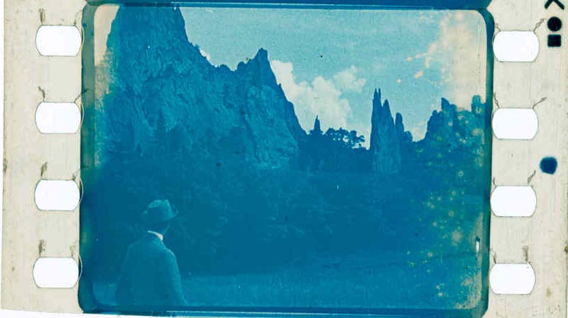
Blue moonlight on screen dates back to the early days of cinema, before colour cinematography was possible, but when enterprising producers were colour-tinting black-and-white films to get more bums on seats. The Complete Guide to Colour by Tom Fraser has this to say:
As an interesting example of the objectivity of colour, Western films were tinted blue to indicate nighttime, since our eyes detect mostly blue wavelengths in low light, but orange served the same function in films about the Far East, presumably in reference to the warm evening light there.
It’s entirely possible that that choice to tint night scenes blue has as much to do with our perception of blue as a cold colour as it does with the functioning of our rods. This perception in turn may come from the way our skin turns bluer when cold, due to reduced blood flow, and redder when hot. (We saw in my recent article on white balance that, when dealing with incandescence at least, bluer actually means hotter.)
Whatever the reason, by the time it became possible to shoot in colour, blue had lodged in the minds of filmmakers and moviegoers as a shorthand for night.
Examples
Early colour films often staged their night scenes during the day; DPs underexposed and fitted blue filters in their matte boxes to create the illusion. It is hard to say whether the blue filters were an honest effort to make the sunlight look like moonlight or simply a way of winking to the audience: “Remember those black-and-white films where blue tinting meant you were watching a night scene? Well, this is the same thing.”
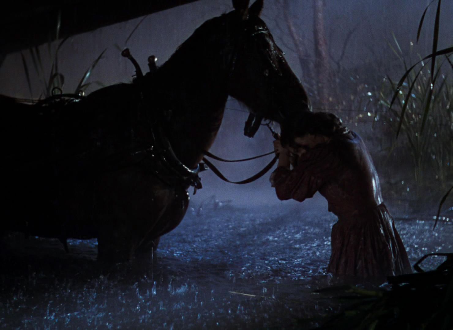
This scene from “Ben Hur” (1959, DP: Robert Surtees, ASC) appears to be a matte painting combined with a heavily blue-tinted day-for-night shot.A classic and convincing day-for-night scene from “Jaws” (1975, DP: Bill Butler, ASC)
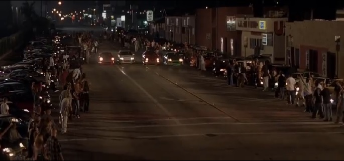
Day-for-night fell out of fashion probably for a number of reasons: 1. audiences grew more savvy and demanded more realism; 2. lighting technology for large night exteriors improved; 3. day-for-night scenes looked extremely unconvincing when brightened up for TV broadcast. Nonetheless, it remains the only practical way to show an expansive seascape or landscape, such as the desert in Mad Max: Fury Road.
Blue moonlight on stage for “Gone with the Wind” (1939, DP: Ernest Haller)Cold stage lighting matches the matte-painted mountains in “Black Narcissus” (1947, DP: Jack Cardiff, OBE)
One of the big technological changes for night shooting was the availability of HMI lighting, developed by Osram in the late 1960s. With these efficient, daylight-balanced fixtures large areas could be lit with less power, and it was easy to render the light blue without gels by photographing on tungsten film stock.
Cinematic moonlight reached a peak of blueness in the late 1980s and early ’90s, in keeping with the general fashion for saturated neon colours at that time. Filmmakers like Tony Scott, James Cameron and Jan de Bont went heavy on the candy-blue night scenes.
“Beverly Hills Cop II” (1987, DP: Jeffrey Kimball, ASC)“Flatliners” (1990, DP: Jan de Bont, ASC)“Terminator 2: Judgment Day” (1991, DP: Adam Greenberg, ASC) uses a lot of strong, blue light, partly to symbolise the cold inhumanity of the robots, and partly because it’s a hallmark of director James Cameron.
By the start of the 21st century bright blue moonlight was starting to feel a bit cheesy, and DPs were experimenting with other looks.
“The Fast and the Furious” (2001, DP: Ericson Core) has generally warm-coloured night scenes to reflect LA’s mild weather after dark, but often there is a cooler area of moonlight in the deep background.“War of the Worlds” (2005, DP: Janusz Kaminski, ASC)
Speaking of the above ferry scene in War of the Worlds, Janusz Kaminski, ASC said:
I didn’t use blue for that night lighting. I wanted the night to feel more neutral. The ferryboat was practically illuminated with warm light and I didn’t want to create a big contrast between that light and a blue night look.
The invention of the digital intermediate (DI) process, and later the all-digital cinematography workflow, greatly expanded the possibilities for moonlight. It can now be desaturated to produce something much closer to the silvery grey of reality. Conversely, it can be pushed towards cyan or even green in order to fit an orange-and-teal scheme of colour contrast.
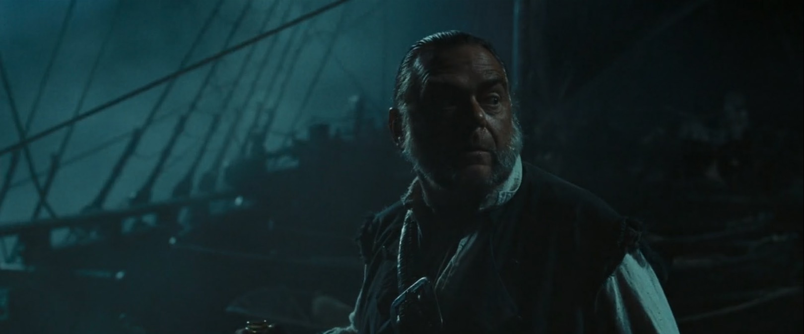
“Pirates of the Carribean: Dead Man’s Chest” (2006, DP: Darius Wolski, ASC)
Darius Wolksi, ASC made this remark to American Cinematographer in 2007 about HMI moonlight on the Pirates of the Caribbean movies:
The colour temperature difference between the HMIs and the firelight is huge. If this were printed without a DI, the night would be candy blue and the faces would be red. [With a digital intermediate] I can take the blue out and turn it into more of a grey-green, and I can take the red out of the firelight and make it more yellow.
Compare Shane Hurlbut, ASC’s moonlight here in “Terminator Salvation” (2009) to the “Terminator 2” shot earlier in the article.The BBC series “The Musketeers” (2014-2016, pilot DP: Stephan Pehrsson) employed very green moonlight, presumably to get the maximum colour contrast with orange candles and other fire sources.
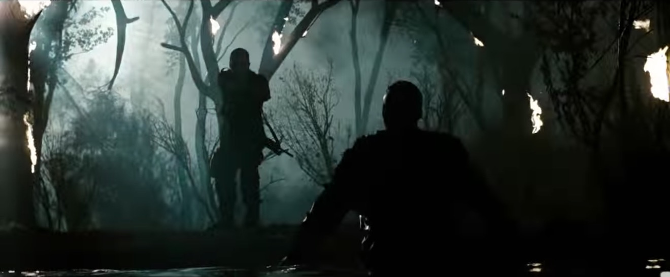
My favourite recent approach to moonlight was in the Amazon sci-fi series Tales from the Loop. Jeff Cronenweth, ASC decided to shoot all the show’s night scenes at blue hour, a decision motivated by the long dusks (up to 75 minutes) in Winnipeg, where the production was based, and the legal limits on how late the child actors could work.
The results are beautiful. Blue moonlight may be a cinematic myth, but Tales from the Loop is one of the few places where you can see real, naturally blue light in a night scene.
“Tales from the Loop” (2020, DP: Jeff Cronenweth, ASC)
If you would like to learn how to light and shoot night scenes, why not take my online course, Cinematic Lighting? 2,300 students have enrolled to date, awarding it an average of 4.5 stars out of 5. Visit Udemy to sign up now.
 Astera Titan Tubes seem to be everywhere at the moment, every gaffer and DP’s favourite tool. Resembling fluorescent tubes, Asteras are wireless, flicker-free LED batons comprised of 16 pixels which can be individually coloured, flashed and programmed from an app to produce a range of effects.