6 Ways to Judge Exposure

Exposing the image correctly is one of the most important parts of a cinematographer’s job. Choosing the T-stop can be a complex technical and creative decision, but fortunately there are many ways we can measure light to inform that decision.

First, let’s remind ourselves of the journey light makes: photons are emitted from a source, they strike a surface which absorbs some and reflects others – creating the impressions of colour and shade; then if the reflected light reaches an eye or camera lens it forms an image. We’ll look at the various ways of measuring light in the order the measurements occur along this light path, which is also roughly the order in which these measurements are typically used by a director of photography.


1. Photometrics data

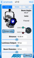
You can use data supplied by the lamp manufacturer to calculate the exposure it will provide, which is very useful in preproduction when deciding what size of lamps you need to hire. There are apps for this, such as the Arri Photometrics App, which allows you to choose one of their fixtures, specify its spot/flood setting and distance from the subject, and then tells you the resulting light level in lux or foot-candles. An exposure table or exposure calculation app will translate that number into a T-stop at any given ISO and shutter interval.


2. Incident meter

Some believe that light meters are unnecessary in today’s digital landscape, but I disagree. Most of the methods listed below require the camera, but the camera may not always be handy – on a location recce, for example. Or during production, it would be inconvenient to interrupt the ACs while they’re rigging the camera onto a crane or Steadicam. This is when having a light meter on your belt becomes very useful.

An incident meter is designed to measure the amount of light reaching the subject. It is recognisable by its white dome, which diffuses and averages the light striking its sensor. Typically it is used to measure the key, fill and backlight levels falling on the talent. Once you have input your ISO and shutter interval, you hold the incident meter next to the actor’s face (or ask them to step aside!) and point it at each source in turn, shading the dome from the other sources with your free hand. You can then decide if you’re happy with the contrast ratios between the sources, and set your lens to the T-stop indicated by the key-light reading, to ensure correct exposure of the subject’s face.


3. Spot meter (a.k.a. reflectance meter)

Now we move along the light path and consider light after it has been reflected off the subject. This is what a spot meter measures. It has a viewfinder with which you target the area you want to read, and it is capable of metering things that would be impractical or impossible to measure with an incident meter. If you had a bright hillside in the background of your shot, you would need to drive over to that hill and climb it to measure the incident light; with a spot meter you would simply stand at the camera position and point it in the right direction. A spot meter can also be used to measure light sources themselves: the sky, a practical lamp, a flame and so on.

But there are disadvantages too. If you spot meter a Caucasian face, you will get a stop that results in underexposure, because a Caucasian face reflects quite a lot of light. Conversely, if you spot meter an African face, you will get a stop that results in overexposure, because an African face reflects relatively little light. For this reason a spot meter is most commonly used to check whether areas of the frame other than the subject – a patch of sunlight in the background, for example – will blow out.

Your smartphone can be turned into a spot meter with a suitable app, such as Cine Meter II, though you will need to configure it using a traditional meter and a grey card. With the addition of a Luxiball attachment for your phone’s camera, it can also become an incident meter.

The remaining three methods of judging exposure which I will cover all use the camera’s sensor itself to measure the light. Therefore they take into account any filters you’re using as well transmission loss within the lens (which can be an issue when shooting on stills glass, where the marked f-stops don’t factor in transmission loss).


4. Monitors and viewfinders

The letter. Photo: Amy Nicholson

In the world of digital image capture, it can be argued that the simplest and best way to judge exposure is to just observe the picture on the monitor. The problem is, not all screens are equal. Cheap monitors can misrepresent the image in all kinds of ways, and even a high-end OLED can deceive you, displaying shadows blacker than any cinema or home entertainment system will ever match. There are only really two scenarios in which you can reliably judge exposure from the image itself: if you’ve owned a camera for a while and you’ve become very familiar with how the images in the viewfinder relate to the finished product; or if the monitor has been properly calibrated by a DIT (Digital Imaging Technician) and the screen is shielded from light.

Most cameras and monitors have built-in tools which graphically represent the luminance of the image in a much more accurate way, and we’ll look at those next. Beware that if you’re monitoring a log or RAW image in Rec.709, these tools will usually take their data from the Rec.709 image.


5. Waveforms and histograms

These are graphs which show the prevalence of different tones within the frame. Histograms are the simplest and most common. In a histogram, the horizontal axis represents luminance and the vertical axis shows the number of pixels which have that luminance. It makes it easy to see at a glance whether you’re capturing the greatest possible amount of detail, making best use of the dynamic range. A “properly” exposed image, with a full range of tones, should show an even distribution across the width of the graph, with nothing hitting the two sides, which would indicate clipped shadows and highlights. A night exterior would have a histogram crowded towards the left (darker) side, whereas a bright, low contrast scene would be crowded on the right.

A waveform plots luminance on the vertical axis, with the horizontal axis matching the horizontal position of those luminance values within the frame. The density of the plotting reveals the prevalence of the values. A waveform that was dense in the bottom left, for example, would indicate a lot of dark tones on the lefthand side of frame. Since the vertical (luminance) axis represents IRE (Institute of Radio Engineers) values, waveforms are ideal when you need to expose to a given IRE, for example when calibrating a system by shooting a grey card. Another common example would be a visual effects supervisor requesting that a green screen be lit to 50 IRE.


6. Zebras and false colours

Almost all cameras have zebras, a setting which superimposes diagonal stripes on parts of the image which are over a certain IRE, or within a certain range of IREs. By digging into the menus you can find and adjust what those IRE levels are. Typically zebras are used to flag up highlights which are clipping (theoretically 100 IRE), or close to clipping.

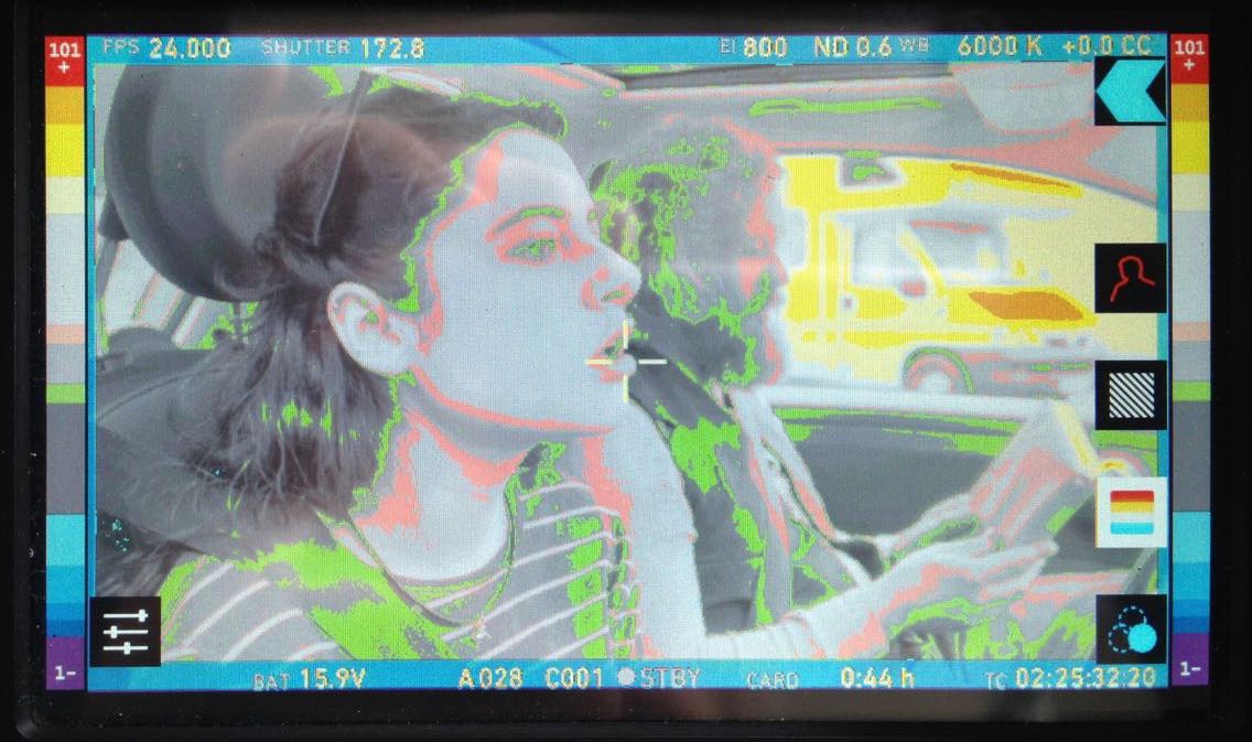
Exposing an image correctly is not just about controlling highlight clipping however, it’s about balancing the whole range of tones – which brings us to false colours. A false colour overlay looks a little like a weather forecaster’s temperature map, with a code of colours assigned to various luminance values. Clipped highlights are typically red, while bright areas still retaining detail (known as the “knee” or “shoulder”) are yellow. Middle grey is often represented by green, while pink indicates the ideal level for caucasian skin tones (usually around 55 IRE). At the bottom end of the scale, blue represents the “toe” – the darkest area that still has detail – while purple is underexposed. The advantage of zebras and false colours over waveforms and histograms is that the former two show you exactly where the problem areas are in the frame.

I hope this article has given you a useful overview of the tools available for judging exposure. Some DPs have a single tool they rely on at all times, but many will use all of these methods at one time or another to produce an image that balances maximising detail with creative intent. I’ll leave you with a quote from the late, great Douglas Slocombe, BSC who ultimately used none of the above six methods!

I used to use a light meter – I used one for years. Through the years I found that, as schedules got tighter and tighter, I had less and less time to light a set. I found myself not checking the meter until I had finished the set and decided on the proper stop. It would usually say exactly what I thought it should. If it didn’t, I wouldn’t believe it, or I would hold it in such a way as to make it say my stop. After a time I decided this was ridiculous and stopped using it entirely. The “Raiders” pictures were all shot without a meter. I just got used to using my eyes.

6 Ways to Judge Exposure

Book Review: “Motion Studies” by Rebecca Solnit

A modern animation created from photographs from Muybridge’s “Animal Locomotion”, 1887

This is a book that caught my eye following my recent photography project, Stasis. In that project I made some limited explorations of the relationship between time, space and light, so Motion Studies: Time, Space and Eadweard Muybridge, to give it its full title, seemed like it would be on my current wavelength.

Like me a few weeks ago, you might be vaguely aware of Muybridge as the man who first photographed a trotting horse sharply enough to prove that all four of its legs left the ground simultaneously. You may have heard him called “The Father of Cinema”, because he was the first person to shoot a rapid sequence of images of a moving body, and the first person to reanimate those images on a screen.

Born in Kingston-on-Thames in 1830, Muybridge emigrated to San Francisco in the 1850s where, following a stint as a book seller and a near-fatal accident in a runaway carriage, he took up landscape photography. He shot spectacular views of Yosemite National Park and huge panoramas of his adopted city. In 1872 he was commissioned by the railroad tycoon Leland Stanford to photograph his racehorse Occident in motion. This developed into a vast project for Muybridge over the next decade or so, ultimately encompassing over 100,000 photos of humans and other animals in motion.

Muybridge’s set-up for his early motion studies, 1881. The cameras are in the shed on the left.

Much of his early work was accomplished on mammoth wet plates, 2ft wide, that had to be coated with emulsion just before exposure and developed quickly afterwards, necessitating a travelling darkroom tent. To achieve the quick exposures he needed to show the limbs of a   trotting horse without motion blur, he had to develop new chemistry and – with John Isaacs – a new electromagnetic shutter. The results were so different to anything that had been photographed before, that they were initially met with disbelief in some quarters, particularly amongst painters, who were eventually forced to recognise that they had been incorrectly portraying horse’s legs. Artists still use Muybridge’s motion studies today as references for dynamic anatomy.

“Boys Playing Leapfrog”, 1887

To “track” with the animals in motion, Muybridge used a battery of regularly-spaced cameras, each triggered by the feet of the subject pulling on a wire or thread as they passed. Sometimes he would surround a subject with cameras and trigger them all simultaneously, to get multiple angles on the same moment in time. Does that sound familiar? Yes, Muybridge invented Bullet Time over a century before The Matrix.

Muybridge was not the first person to project images in rapid succession to create the illusion of movement, but he was the first person to display photographed (rather than drawn) images in a such a way, to deconstruct motion and reassemble it elsewhere like a Star Trek transporter. In 1888 Muybridge met with Thomas Edison and discussed collaborating on a system to combine motion pictures with wax cylinder audio recordings, but nothing came of this idea which was decades ahead of its time. The same year, French inventor Louis Le Prince shot Roundhay Garden Scene, the oldest known film. A few years later, Edison patented his movie camera, and the Lumière brothers screened their world-changing Workers Leaving the Lumière Factory. The age of cinema had begun.

From “Animal Locomotion”, 1887

Although Muybridge is the centre of Solnit’s book, there is a huge amount of context. The author’s thesis is that Muybridge represents a turning point, a divider between the world he was born into – a world in which people and information could only travel as fast as they or a horse could walk or run, a world where every town kept its own time, where communities were close-knit and relatively isolated – and the world which innovations like his helped to create – the world of speed, of illusions, of instantaneous global communication, where physical distance is no barrier. Solnit draws a direct line from Muybridge’s dissection of time and Stanford’s dissection of space to the global multimedia village we live in today. Because of all this context, the book feels a little slow to get going, but as the story continues and the threads draw together, the value of it becomes clear, elucidating the meaning and significance of Muybridge’s work.

“Muybridge and Athlete”, circa 1887

I can’t claim to have ever been especially interested in history, but I found the book a fascinating lesson on the American West of the late nineteenth century, as well as a thoughtful analysis of the impact photography and cinematography have had on human culture and society. As usual, I’m reviewing this book a little late (it was first published in 2003!), but I heartily recommend checking it out if you’re at all interested in experimental photography or the origins of cinema.

Book Review: “Motion Studies” by Rebecca Solnit

A History of Black and White

The contact sheet from my first roll of Ilford Delta 3200

Having lately shot my first roll of black-and-white film in a decade, I thought now would be a good time to delve into the story of monochrome image-making and the various reasons artists have eschewed colour.

I found the recent National Gallery exhibition, Monochrome: Painting in Black and White, a great primer on the history of the unhued image. Beginning with examples from medieval religious art, the exhibition took in grisaille works of the Renaissance before demonstrating the battle between painting and early photography, and finishing with monochrome modern art.

Several of the pictures on display were studies or sketches which were generated in preparation for colour paintings. Ignoring hue allowed the artists to focus on form and composition, and this is still one of black-and-white’s great strengths today: stripping away chroma to heighten other pictorial effects.

“Nativity” by Petrus Christus, c. 1455

What fascinated me most in the exhibition were the medieval religious paintings in the first room. Here, old testament scenes in black-and-white were painted around a larger, colour scene from the new testament; as in the modern TV trope, the flashbacks were in black-and-white. In other pictures, a colour scene was framed by a monochrome rendering of stonework – often incredibly realistic – designed to fool the viewer into thinking they were seeing a painting in an architectural nook.

During cinema’s long transition from black-and-white to colour, filmmakers also used the two modes to define different layers of reality. When colour processes were still in their infancy and very expensive, filmmakers selected particular scenes to pick out in rainbow hues, while the surrounding material remained in black-and-white like the borders of the medieval paintings. By 1939 the borders were shrinking, as The Wizard of Oz portrayed Kansas, the ordinary world, in black-and-white, while rendering Oz – the bulk of the running time – in colour.

Michael Powell, Emeric Pressburger and legendary Technicolor cinematographer Jack Cardiff, OBE, BSC subverted expectations with their 1946 fantasy-romance A Matter of Life and Death, set partly on Earth and partly in heaven. Says Cardiff in his autobiography:

Quite early on I had said casually to Michael Powell, “Of course heaven will be in colour, won’t it?” And Michael replied, “No. Heaven will be in black and white.” He could see I was startled, and grinned: “Because everyone will expect heaven to be in colour, I’m doing it in black-and-white.”

Ironically Cardiff had never shot in black-and-white before, and he ultimately captured the heavenly scenes on three-strip Technicolor, but didn’t have the colour fully developed, resulting in a pearlescent monochrome.

Meanwhile, DPs like John Alton, ASC were pushing greyscale cinematography to its apogee with a genre that would come to be known as film noir. Oppressed Jews like Alton fled the rising Nazism of Europe for the US, bringing German Expressionism with them. The result was a trend of hardboiled thrillers lit with oppressive contrast, harsh shadows, concealing silhouettes and dramatic angles, all of which were heightened by the lack of distracting colour.

A classic bit of Alton's noir lighting from The Big Combo
“The Big Combo” DP: John Alton, ASC

Alton himself had a paradoxical relationship with chroma, famously stating that “black and white are colours”. While he is best known today for his noir, his only Oscar win was for his work on the Technicolor musical An American in Paris, the designers of which hated Alton for the brightly-coloured light he tried to splash over their sets and costumes.

It wasn’t just Alton that was moving to colour. Soon the economics were clear: chromatic cinema was more marketable and no longer prohibitively expensive. The writing was on the wall for black-and-white movies, and by the end of the sixties they were all but gone.

I was brought up in a world of default colour, and the first time I can remember becoming aware of black-and-white was when Schindler’s List was released in 1993. I can clearly recall a friend’s mother refusing to see the film because she felt she wouldn’t be getting her money’s worth if there was no colour. She’s not alone in this view, and that’s why producers are never keen to green-light monochrome movies. Spielberg only got away with it because his name was proven box office gold.

“Schindler’s List” DP: Janusz Kamiński, ASC

A few years later, Jonathan Frakes and his DP Matthew F. Leonetti, ASC wanted to shoot the holodeck sequence of Star Trek: First Contact in black-and-white, but the studio deemed test footage “too experimental”. For the most part, the same attitude prevails today. Despite being marketed as a “visionary” director ever since Pan’s Labyrinth, Guillermo del Toro’s vision of The Shape of Water as a black-and-white film was rejected by financiers. He only got the multi-Oscar-winning fairytale off the ground by reluctantly agreeing to shoot in colour.

Yet there is reason to be hopeful about black-and-white remaining an option for filmmakers. In 2007 MGM denied Frank Darabont the chance to make The Mist in black-and-white, but they permitted a desaturated version on the DVD. Darabont had this to say:

No, it doesn’t look real. Film itself [is a] heightened recreation of reality. To me, black-and-white takes that one step further. It gives you a view of the world that doesn’t really exist in reality and the only place you can see that representation of the world is in a black-and-white movie.

“The Mist” DP: Rohn Schmidt

In 2016, a “black and chrome” version of Mad Max: Fury Road was released on DVD and Blu-Ray, with director George Miller saying:

The best version of “Road Warrior” [“Mad Max 2”]  was what we called a “slash dupe,” a cheap, black-and-white version of the movie for the composer. Something about it seemed more authentic and elemental. So I asked Eric Whipp, the [“Fury Road”] colourist, “Can I see some scenes in black-and-white with quite a bit of contrast?” They looked great. So I said to the guys at Warners, “Can we put a black-and-white version on the DVD?”

One of the James Mangold photos which inspired “Logan Noir”

The following year, Logan director James Mangold’s black-and-white on-set photos proved so popular with the public that he decided to create a monochrome version of the movie. “The western and noir vibes of the film seemed to shine in the form, and there was not a trace of the modern comic hero movie sheen,” he said. Most significantly, the studio approved a limited theatrical release for Logan Noir, presumably seeing the extra dollar-signs of a second release, rather than the reduced dollar-signs of a greyscale picture.

Perhaps the medium of black-and-white imaging has come full circle. During the Renaissance, greyscale images were preparatory sketches, stepping stones to finished products in colour. Today, the work-in-progress slash dupe of Road Warrior and James Mangold’s photographic studies of Logan were also stepping stones to colour products, while at the same time closing the loop by inspiring black-and-white products too.

With the era of budget- and technology-mandated monochrome outside the living memory of many viewers today, I think there is a new willingness to accept black-and-white as an artistic choice. The acclaimed sci-fi anthology series Black Mirror released an episode in greyscale this year, and where Netflix goes, others are bound to follow.

A History of Black and White

Roger Deakins’ Oscar-winning Cinematography of “Blade Runner 2049”

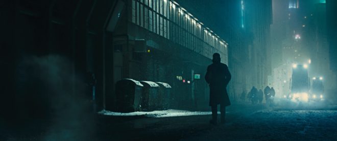
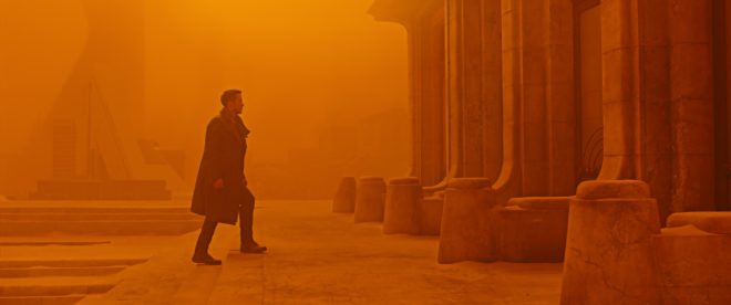
After fourteen nominations, celebrated cinematographer Roger Deakins, CBE, BSC, ASC finally won an Oscar last night, for his work on Denis Villeneuve’s Blade Runner 2049. Villeneuve’s sequel to Ridley Scott’s 1982 sci-fi noir is not a perfect film; its measured, thoughtful pace is not to everyone’s taste, and it has serious issues with women – all of the female characters being highly sexualised, callously slaughtered, or both – but the Best Cinematography Oscar was undoubtedly well deserved. Let’s take a look at the photographic style Deakins employed, and how it plays into the movie’s themes.

Blade Runner 2049 returns to the dystopian metropolis of Ridley Scott’s classic three decades later, introducing us to Ryan Gosling’s K. Like Harrison Ford’s Deckard before him, K is a titular Blade Runner, tasked with locating and “retiring” rogue replicants – artificial, bio-engineered people. He soon makes a discovery which could have huge implications both for himself and the already-strained relationship between humans and replicants. In his quest to uncover the truth, K must track down Deckard for some answers.

Villeneuve’s film meditates on deep questions of identity, creating a world in which you can never be sure who is or isn’t real – or even what truly constitutes being “real”. Deakins reinforces this existential uncertainty by reducing characters and locations to mere forms. Many scenes are shrouded in smog, mist, rain or snow, rendering humans and replicants alike as silhouettes.

K spends his first major scene seated in front of a window, the side-light bouncing off a nearby cabinet the only illumination on his face. Deakins’ greatest strength is his ability to adapt to whatever style each film requires, but if he has a recognisable signature it’s this courage to rely on a single source and let the rest of the frame go black.

Whereas Scott and his DP Jordan Cronenweth portrayed LA mainly at night, ablaze with pinpoints of light, Villeneuve and Deakins introduce it in daylight, but a daylight so dim and smog-ridden that it reveals even less than those night scenes from 1982.

All this is not to say that the film is frustratingly dark, or that audiences will struggle to make out what is going on. Shooting crisply on Arri Alexas with Arri/Zeiss Master Primes, Deakins is a master of ensuring that you see what you need to see.

A number of the film’s sequences are colour-coded, delineating them as separate worlds. The city is mainly fluorescent blues and greens, visually reinforcing the sickly state of society, with the police department – an attempt at justice in an insane world – a neutral white.

The Brutalist headquarters of Jared Leto’s blind entrepreneur Wallace are rendered in gold, as though the corporation attempted a friendly yellow but was corrupted by greed. These scenes also employ rippling reflections from pools of water. Whereas the watery light in the Tyrell HQ of Scott’s Blade Runner was a random last-minute idea by the director, concerned that his scene lacked enough interest and production value, here the light is clearly motivated by architectural water features. Yet it is used symbolically too, and very effectively so, as it underscores one of Blade Runner 2049’s most powerful scenes. At a point in the story where more than one character is calling their memories into question, the ripples playing across the walls are as intangible and illusory as those recollections. “I know what’s real,” Deckard asserts to Wallace, but both the photography and Ford’s performance bely his words.

The most striking use of colour is the sequence in which K first tracks Deckard down, hiding out in a Las Vegas that’s been abandoned since the detonation of a dirty bomb. Inspired by photos of the Australian dust storm of 2009, Deakins bathed this lengthy sequence in soft, orangey-red – almost Martian – light. This permeating warmth, contrasting with the cold artificial light of LA, underlines the personal nature of K’s journey and the theme of birth which is threaded throughout the film.

Deakins has stated in interviews that he made no attempt to emulate Cronenweth’s style of lighting, but nonetheless this sequel feels well-matched to the original in many respects. This has a lot to do with the traditional camerawork, with most scenes covered in beautifully composed static shots, and movement accomplished where necessary with track and dolly.

The visual effects, which bagged the film’s second Oscar, also drew on techniques of the past; the above featurette shows a Canon 1DC tracking through a miniature landscape at 2:29. “Denis and I wanted to do as much as possible in-camera,” Deakins told Variety, “and we insisted when we had the actors, at least, all the foreground and mid-ground would be in-camera.” Giant LED screens were used to get authentic interactive lighting from the advertising holograms on the city streets.

One way in which the lighting of the two Blade Runner movies is undeniably similar is the use of moving light sources to suggest an exciting world continuing off camera. (The infamous lens flares of J.J. Abrahms’ Star Trek served the same purpose, illustrating Blade Runner’s powerful influence on the science fiction genre.) But whereas, in the original film, the roving searchlights pierce the locations sporadically and intrusively, the dynamic lights of Blade Runner 2049 continually remodel the actors’ faces. One moment a character is in mysterious backlight, the next in sinister side-light, and the next in revealing front-light – inviting the audience to reassess who these characters are at every turn.

This obfuscation and transience of identity and motivation permeates the whole film, and is its core visual theme. The 1982 Blade Runner was a deliberate melding of sci-fi and film noir, but to me the sequel does not feel like noir at all. Here there is little hard illumination, no binary division of light and dark. Instead there is insidious soft light, caressing the edge of a face here, throwing a silhouette there, painting everyone on a continuous (and continuously shifting) spectrum between reality and artificiality.

Blade Runner 2049 is a much deeper and more subtle film than its predecessor, and Deakins’ cinematography beautifully reflects this.

Roger Deakins’ Oscar-winning Cinematography of “Blade Runner 2049”