Pinhole Results

In my last couple of posts I described making and shooting with a pinhole attachment for my 35mm Pentax P30t SLR. Well, the scans are now back from the lab and I’m very pleased with them. They were shot on Fujifilm Superia Xtra 400.

As suspected, the 0.7mm pinhole was far too big, and the results are super-blurry:

See how contemptuous Spike is of this image. Or maybe that’s just Resting Cat Face.

The 0.125mm hole produced much better results, as you can see below. My f/stop calculations (f/365) seem to have been pretty close to the mark, although, as is often the case with film, the occasions where I gave it an extra stop of exposure produced even richer images. Exposure times for these varied between 2 and 16 seconds. Click to see them at higher resolution.

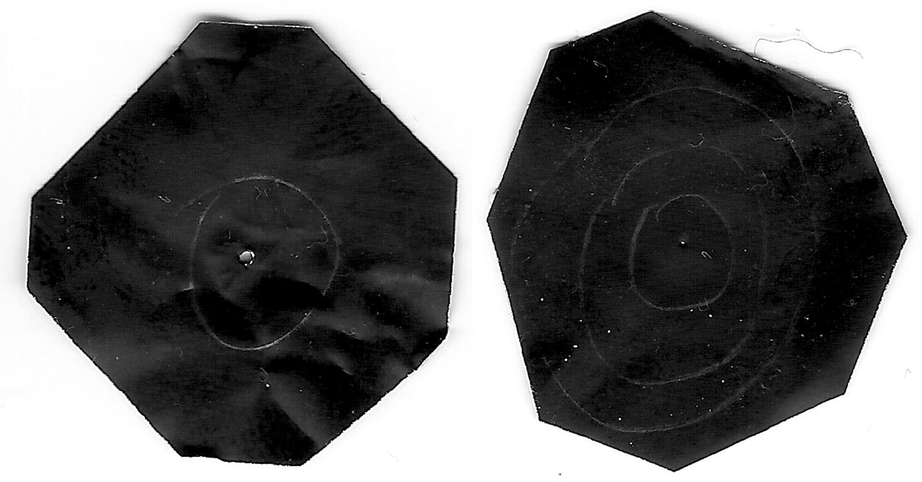
I love the ethereal, haunting quality of all these pictures, which recalls the fragility of Victorian photographs. It’s given me several ideas for new photography projects…

SaveSave

Pinhole Results

Adventures with a Pinhole

Last week I discussed making a pinhole for my Pentax 35mm SLR. Since then I’ve made a second pinhole and shot a roll of Fujifilm Superia X-tra 400 with them. Although I haven’t had the film processed yet, so the quality of the images is still a mystery, I’ve found shooting with a pinhole to be a really useful exercise.

My Pentax P30T fitted with a 0.125mm pinhole attachment


A Smaller Pinhole

Soon after my previous post, I went out into the back garden and took ten exposures of the pond and the neighbour’s cat with the 0.7mm pinhole. By that point I had decided that the hole was almost certainly too big. As I noted last week, Mr Pinhole gives an optimal diameter of 0.284mm for my camera. Besides that, the (incredibly dark) images in my viewfinder were very blurry, a sign that the hole needed to be smaller.

Scans of my two pinholes

So I peeled the piece of black wrap with the 0.7mm pinhole off my drilled body cap and replaced it with another hole measuring about 0.125mm. I had actually made this smaller hole first but rejected it because absolutely nothing was visible through the viewfinder, except for a bit of a blur in the centre. But now I came to accept that I would have to shoot blind if I wanted my images to be anything approaching sharp.

The 0.125mm(ish) pinhole magnified in Photoshop

I had made the 0.125mm hole by tapping the black wrap with only the very tip of the needle, rather than pushing it fully through. Prior to taping it into the body cap, I scanned it at high resolution and measured it using Photoshop. This revealed that it’s a very irregular shape, which probably means the images will still be pretty soft. Unfortunately I couldn’t see a way of getting it any more circular; sanding didn’t seem to help.

Again I found the f-stop of the pinhole by dividing the flange focal distance (45.65mm) by the hole diameter, the result being about f/365. My incident-light meter only goes up to f/90, so I needed to figure out how many stops away from f/365 that is. I’m used to working in the f/1.4-f/22 range, so I wasn’t familiar with how the stop series progresses above f/90. Turns out that you can just multiply by 1.4 to roughly find the next stop up, so after f/90 it’s 128, then 180, then 256, then 358, pretty close to my f/365 pinhole. So whatever reading my meter gave me for f/90, I knew that I would need to add 4 stops of exposure, i.e. multiply the shutter interval by 16. (Stops are a base 2 logarithmic scale. See my article on f-stops, T-stops and ND filters for more info.)


The Freedom of Pinhole Shooting

I’ve just spent a pleasant hour or so in the garden shooting the remaining 26 exposures on my roll with the new 0.125mm pinhole. Regardless of how the photos come out, I found it a fun and fascinating exercise.

Knowing that the images would be soft made me concentrate on colour and form far more than I normally would. Not being able to frame using the viewfinder forced me to visualise the composition mentally. And as someone who finds traditional SLRs very tricky to focus, it was incredibly freeing not to have to worry about that, not to have to squint through the viewfinder at all, but just plonk the camera down where it looked right and squeeze the shutter.

Of course, before squeezing the shutter I needed to take incident-light readings, because the TTL (through the lens) meter was doing nothing but flash “underexposed” at me. Being able to rely solely on an incident meter to judge exposure is a very useful skill for a DP, so this was great practice. I’ve been reading a lot about Ansel Adams and the Zone System lately, and although this requires a spot reflectance meter to be implemented properly, I tried to follow Adams’ philosophy, visualising how I wanted the subject’s tones to correspond to the eventual print tones. (Expect an article about the Zone System in the not-too-distant future!)


D.I.Y. pinhole Camera

On Tuesday night I went along to a meeting of Cambridge Darkroom, the local camera club. By coincidence, this month’s subject was pinhole cameras. Using online plans, Rich Etteridge had made up kits for us to construct our own complete pinhole cameras in groups. I teamed up with a philosophy student called Tim, and we glued a contraption together in the finest Blue Peter style. The actual pinholes were made in metal squares cut from Foster’s cans, which are apparently something Rich has in abundance.

DIY pinhole camera

I have to be honest though: I’m quite scared of trying to use it. Look at those dowels. Can I really see any outcome of attempting to load this camera other than a heap of fogged film on the floor? No. I think I’ll stick with my actual professionally-made camera body for now. If the pinhole photos I took with that come out alright, then maaaaaaybe I’ll consider lowering the tech level further and trying out my Blue Peter camera. Either way, big thanks to Rich for taking all that time to produce the kits and talk us through the construction.

Watch this space to find out how my pinhole images come out.

SaveSave

Adventures with a Pinhole

My 5 Favourite Cinematographer Commentaries

I won my first DVD player in a trailer competition on a sort of YouTube forerunner site in December 2000. Over the next decade I was entertained and educated by many extras-packed Digital Versatile Discs. Now, of course, physical media is a thing of the past, but many of the anecdotes I heard in DVD commentaries have stuck in my mind. Some have even helped me on set when facing a new situation.

So, if you’ve got these discs on your shelf and never given the commentary a listen, or if you’re passing a CEX or Cash Convertor with a shiny new pound coin burning a hole in your pocket, you could do worse than seek out these classic chat tracks.


5. Moulin Rouge

DP Don McAlpine is actually quite quiet on this track, leaving director Baz Luhrmann and production designer Catherine Martin to do much of the work. This latter pair explain how sets, miniatures and CGI were blended to create the world of Moulin Rouge. At one point Luhrmann notes that he resisted the temptation to digitally stabilise the crane shots in the Elephant Love Medley, preferring to recall the look of classic 20th century musicals which did not have access to such postproduction trickery. A few nuggets we get from McAlpine include his use of blue light on Satine (Nicole Kidman) to make the most of her pale skin, the anachronistic use of follow spots for the stage shows, and how he was briefed by Luhrmann in one scene to light Jim Broadbent like the devil – which he did with flickering orange firelight from a low angle.

Highlight: Performing in what proves to be her final show, Satine wears a diamond necklace which reflects dazzling light onto Richard Roxburgh’s lustful duke. McAlpine reveals that he created the shimmering reflections by shaking some canvas with pieces of broken mirror on it.


4. X-Men 2

Although the DVD menu lists it as a director’s commentary, Bryan Singer in fact pairs up with his DP Newton Thomas Sigel for this track. Sigel discusses the importance of building practicals into the sets to enhance realism and flexibility of shooting. He explains how he colour-coded certain scenes so that the audience would more readily understand where they were during the fast-paced action sequences; for example, the corridors of the Alkali Lake bunker were lit with a moss green.

Highlight: The brutal claw-fight between Wolverine and Lady Deathstrike features dynamic and unusual camerawork. Sigel and Singer reveal that they used a cable rig to swoop the camera towards the duelling mutants, knowing that the camera would bounce back when it reached the end of its cable, but embracing this for the extra energy it added to the sequence.


3. Garden State

DP Lawrence Sher shares (no pun intended) a commentary track with director Zach Braff and production designer Judy Becker. The trio give an insight into the way that the moods and emotions of the film were enhanced by the colours, design, framing and camera movement. Braff and Sher chose a static look with strong compositions, punctuated by occasional Technocrane moves and at least one quasi-crane move that was actually captured on a Steadicam. Various happy (and unhappy) accidents helped shape the look too, like the constant rain throughout the exterior shoots, the mist and flaring practicals in the pool party scene, and the square of light on the airport wall behind Braff and Natalie Portman in the final shot.

Highlight: Sher explains the use of different film stocks to delineate threads of the story. Scenes with Large’s father (Ian Holm) were rendered cold and clinical by shooting on a sharper, harder Kodak film, while Portman’s sequences were imbued with organic warmth by Fuji stock. The feel was further enhanced by lighting and the colour choices in the respective sets.


2. Alien 3

The departure of director David Fincher from Alien 3 – under a cloud of studio interference and re-edits – is an infamous part of movie lore. Less well known is that the director of photography changed a week into shooting, after original DP Jordan Cronenworth (of Blade Runner fame) fell ill. Alex Thompson stepped in, and his humble, soft-spoken observations are spliced with other crew and cast members to form the commentary track on the Alien Quadrilogy boxset version of this film. Throughout the track he explains how he created the cool, toppy look of the prison’s communal areas, the dark, shadowy environs of the basements, and the hot, hellish feel of the lead-works. There are some interesting remarks about practicals too, such as the deliberate use of mismatched, low-CRI fluorescent tubes to give the canteen a run-down look, and tips for creating convincing firelight flicker.

Highlight: To create the illusion of glowing molten metal in the colony’s lead-works set, Thompson placed a veritable arsenal of lamps – almost 1,000 amps’ worth – underneath sheets of trace. Despite their brilliance, the individual units were still visible on camera, rather than a continuous white glow. According to Thompson, it was Fincher who came to the rescue, wiping grease from the side of his nose onto the lens to diffuse the offending lamps. I hope he let the AC put an optical flat on first!


1. Armageddon

Whatever you think of this slice of outer-space Bayhem, there’s no denying that DP John Schwartzman’s commentary on the Criterion Collection edition (spliced in with two of the film’s scientific advisors) is a fascinating insight into photographing the biggest of big-budget blockbusters. Schwartzman reveals that seven miles of cable were laid by his electrical department in preparation for extreme wide shots of the Armadillo vehicle travelling across the asteroid – in reality the South Dakota Badlands at night. Elsewhere he discusses lighting through coloured windows, shooting under UV lights (pictured above), dealing with spacesuit helmet reflections, and how Spielberg’s lens-meister Janusz Kaminski stepped in to shoot pick-ups of meteorites wiping out Shanghai.

Highlight: Schwartzman and his team photographed two real shuttle launches for the movie. Nasa decreed that the 35mm cameras had to sit in position on the launchpad, threaded with film and ready to go, for two days before take-off. The camera dept undertook extensive testing to making this possible, dealing with such problems as the condensation that would form as the temperature changed over the 48 hours. When they returned to the cameras after the launch and examined the one which had been the closest to the shuttle’s rocket motors, they discovered that the lens was in pieces, the vibrations having undone every single screw!

My 5 Favourite Cinematographer Commentaries

5 Principles of Cinematography We Can Learn from Turner

Yesterday I took a trip to The Tate Britain to see what I could learn about light and composition from the world of traditional art. My background is more technical than fine art, so this world is quite new to me. Within quarter of an hour of arriving, I had fallen in love with the work of JMW Turner. The way this man captured the natural moods of light and weather is breathtaking.

Here are five of Turner’s techniques for creating beautiful images which we can apply to cinematography.


1. Negative space

One of the most powerful things you can do with an area of the frame is to let it go black. A great example is Bill Pope’s work on The Matrix. But 200 years before that, Turner was embracing the darkness, emphasising those areas in the light, and allowing the viewer’s imagination to fill in the gaps.

“Jason” (1802) – That dragon is lurking in the shadows like a dodgy monster costume in a B-movie.
“Sketch of a Bank, with Gipsies” (1809) – The titular gypsies are barely visible in the black shadows, betrayed only by the smoke from their fire.


2. Layering

Any artist creating a 2D image strives to give the impression of depth and dimensionality. There are a number of techniques that can be used to achieve this, but one which Turner uses repeatedly is layering. See how the paintings below delineate foreground (light), midground (dark) and background (light again). The midgrounds sink into shadow, becoming negative space, reinforcing the link and relationship between the foregrounds and backgrounds. At the same time, the foreground figures stand out clearly and eye-catchingly against the shade behind them.

“The Tenth Plague of Egypt” (1802)
“The Goddess of Discord Choosing the Apple of Contention in the Garden of the Hesperides” (1806) – This painting contains five layers: light-dark-light-dark-light, highlighting the two groups of people and the monster in the distance.


3. Framing

Although most images we see are framed, be it by a gilt picture frame or by the black edges of a phone screen, there is something aesthetically pleasing about adding a second frame within the image itself. An extreme example would be shooting through a window, framing the image on all four sides, but more commonly we frame two or three sides of the image. Turner frequently does this using trees, buildings and shadowy ground.

“The Decline of the Carthaginian Empire” (1817) – A backwards-‘J’-shaped frame is created by the dark foreground: the wall on the left, the shadowed floor across the bottom, and the dark space in the lower right. To balance the shorter part of the ‘J’ on the righthand side, the sun and its reflection (the focal point of the image) are placed left of centre.
“England: Richmond Hill, on the Prince Regent’s Birthday” (1819) – The dark ground and dark tree to the right create a backwards-L-shaped frame which appears to cradle the rest of the image like a waiter cradling plates in the crook of his elbow.


4. Dynamic Composition

The composition of the two paintings below fascinates me. Both seem to be two images in one: a deep view of a settlement on the left, and a tapering tunnel perspective on the right. As I studied them, I found my eyes “panning” from one side to the other. As cinematographers, we can use actual camera movement to create a dynamic shot, but we should not forget Turner’s lesson here, that there can also be dynamism in static frames.

“Rome, from the Vatican. Raffaelle, Accompanied by La Fornarina, Preparing his Pictures for the Decoration of the Loggia” (1820)
“Palestrina – Composition” (1828)


5. Colour Contrast

Apart from stunningly demonstrating Turner’s power to create mood and atmosphere (a core skill for any DP), the two paintings below are great examples of warm/cool colour contrast. The yellows, oranges and reds of fire and sunset are juxtaposed with the blues of the sky. The result is pictures that really “pop”, arresting the viewer’s attention. A modern cinematographer can readily achieve a similar effect by playing natural daylight, and daylight sources like HMIs and Kinos, against practicals and other tungsten sources.

“Peace – Burial at Sea” (1842) – Contrast in both hue and luminance make this a powerfully evocative painting.
“War. The Exile and the Rock Limpet” (1842) – Note how Napoleon’s blue uniform causes him to stand out against the oranges of the sky, whilst the unimportant, red-garbed soldier behind him is allowed to blend into the background.

 
See also: my trip to the National Portrait Gallery.

5 Principles of Cinematography We Can Learn from Turner

Lighting in Traditional Art

IMG_0879As I dig deeper into the craft of cinematography I feel the need to consume more references and inspiration than cinema itself can provide. To that end, I took a trip this week to the National Portrait Gallery in Trafalgar Square to see a little of  how light has been used in painting and photography over the last few centuries.

The light in many of the portraits is strikingly similar, with the subjects positioned near an unseen window in such a way as to light their up-side, the side of their face closest to the artist or viewer. This is known as a broad key, and in modern cinematography you don’t see it very often; a short key (‘lighting the down-side’) is almost universally favoured. The only convincing explanation I can offer for this is changing fashions.

The paintings that caught my eye were the ones that try something a little different with their lighting. I found it an interesting exercise to work out where the natural light was coming from and how I would recreate it with modern equipment. Here are three of my favourites…


Frederick, Duke of York and Albany by Sir David Wilkie (1823)

by Sir David Wilkie, oil on panel, 1822-1823, dated 1823

Rather than using the daylight to illuminate his subject’s face, Wilkie seats the duke with his back to the window, which cross-lights his sword nicely. The paper in his hand acts as a bounce board, throwing light back onto his face and shirt buttons. It’s great fun doing this in cinematography – firing a hot source in through a window and then seeing it bounce unpredictably off the set and costumes. If I was recreating this painting, the source might be a 6K HMI through a diffusion frame.


Thomas Henry Huxley by John Collier (1883)

NPG 3168; Thomas Henry Huxley by John Collier

I love how the top-light in this painting throws Huxley’s eye sockets into shadow, making him resemble the skull he’s holding. I’m guessing Collier didn’t pitch the portrait that way though! I might recreate this using a lightly diffused Joker Bug rigged to the ceiling, or a Source 4 Leiko fired up into an overhead bounce board.


The Mission of Mercy: Florence Nightingale Receiving the Wounded at Scutari by Jerry Barrett (1857)

NPG 6202; The Mission of Mercy: Florence Nightingale receiving the Wounded at Scutari by Jerry Barrett

The key light here is coming from the left – perhaps a 12K through a 12×12 full grid – but there’s a hotter shaft picking out Flo in the centre. For that I might use a 2.5K just out of frame, flagged to hit only her. At her feet there would have to be a silver reflector to kick that up-light onto the face of the kneeling woman. The characters on the right of frame are edged quite strongly by the light from the archway. (We know from looking at the shadows on the background buildings that it can’t be direct sunlight, so there must be a window or a very bright wall which that edge light is bouncing off.) I would use an 8×4 matte silver bounce board or maybe even a mirror board to recreate that.

That’s all for now, but look out for more art posts in the near future.

Lighting in Traditional Art