The Art and Science of White Balance

Mixed colour temperatures in “Annabel Lee”

Colour temperature starts with something mysterious called a “black body”, a theoretical object which absorbs all frequencies of electromagnetic radiation and emits it according to Planck’s Law. Put simply, Planck’s Law states that as the temperature of such a body increases, the light which it emits moves toward the blue end of the spectrum. (Remember from chemistry lessons how the tip of the blue flame was the hottest part of the Bunsen Burner?)

Colour temperature is measured in kelvins, a scale of temperature that begins at absolute zero (-273°C), the coldest temperature physically possible in the universe. To convert centigrade to kelvin, simply add 273.

Tungsten bulbs emit an orange light - dim them down and it gets even more orangey.
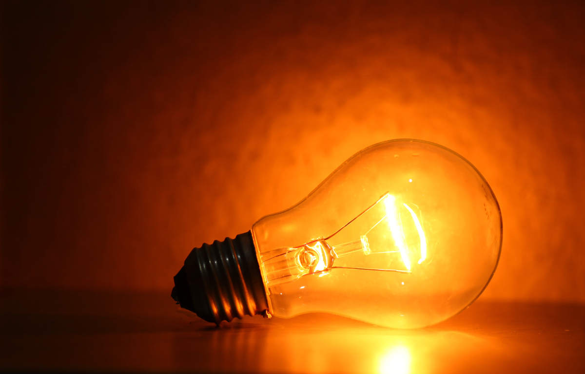
The surface of the sun has a temperature of 5,778K (5,505°C), so it emits a relatively blue light. The filament of a tungsten studio lamp reaches roughly 3,200K (2,927°C), providing more of an orange light. Connect that fixture to a dimmer and bring it down to 50% intensity and you might get a colour temperature of 2,950K, even more orange.

Incandescent lamps and the sun’s surface follow Planck’s Law fairly closely, but not all light sources rely on thermal radiation, and so their colour output is not dependent on temperature alone. This leads us to the concept of “correlated colour temperature”.

Colour temperature chart
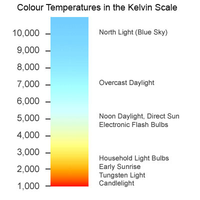
The correlated colour temperature of a source is the temperature which a black body would have to be at in order to emit the same colour of light as that source. For example, the earth’s atmosphere isn’t 7,100K hot, but the light from a clear sky is as blue as a Planckian body glowing at that temperature would be. Therefore a clear blue sky has a correlated colour temperature (CCT) of 7,100K.

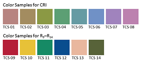
LED and fluorescent lights can have their colour cast at least partly defined by CCT, though since CCT is one-dimensional, measuring only the amount of blue versus red, it may give us an incomplete picture. The amounts of green and magenta which LEDs and fluorescents emit varies too, and some parts of the spectrum might be missing altogether, but that’s a whole other can of worms.

The human eye-brain system ignores most differences of colour temperature in daily life, accepting all but the most extreme examples as white light. In professional cinematography, we choose a white balance either to render colours as our eyes perceive them or for creative effect.

6000K HMI lighting photographed at 3200K to give a moonlight feel to “Heretiks”

Most cameras today have a number of white balance presets, such as tungsten, sunny day and cloudy day, and the options to dial in a numerical colour temperature directly or to tell the camera that what it’s currently looking at (typically a white sheet of paper) is indeed white. These work by applying or reducing gain to the red or blue channels of the electronic image.

Interestingly, this means that all cameras have a “native” white balance, a white balance setting at which the least total gain is applied to the colour channels. Arri quotes 5,600K for the Alexa, and indeed the silicon in all digital sensors is inherently less sensitive to blue light than red, making large amounts of blue gain necessary under tungsten lighting. In an extreme scenario – shooting dark, saturated blues in tungsten mode, for example – this might result in objectionable picture noise, but the vast majority of the time it isn’t an issue.

Left: daylight white balance preset (5,600K). Right: tungsten white balance preset (3,200K)

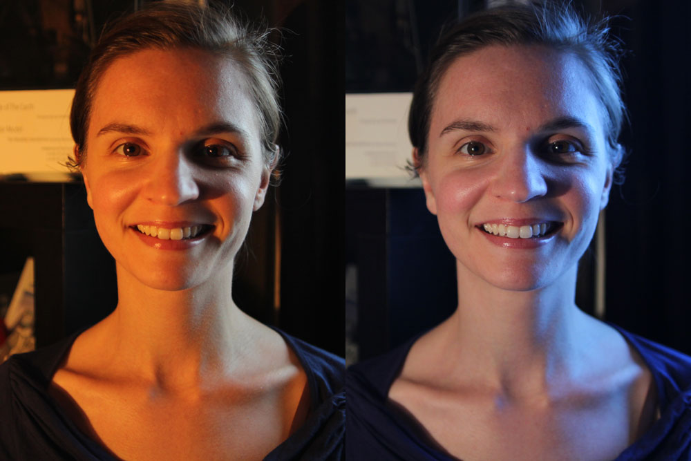
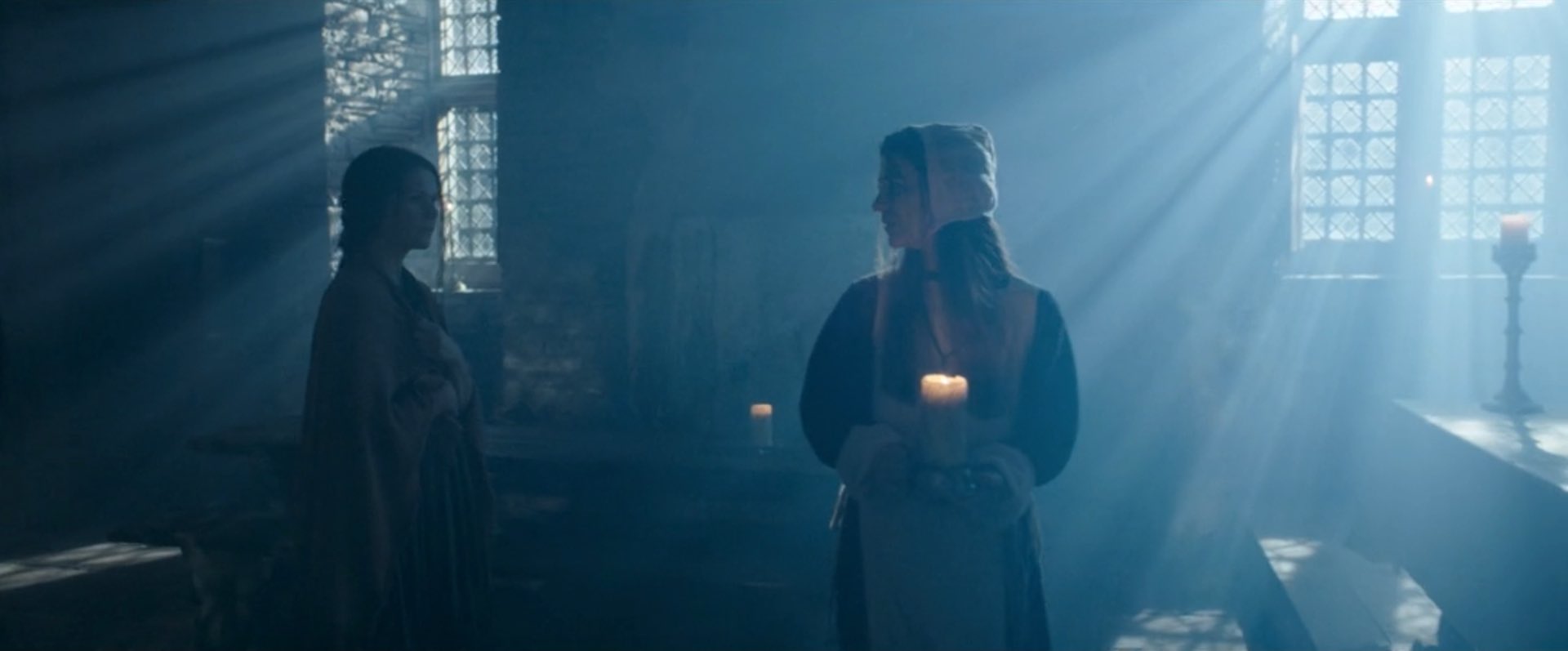
The difficulty with white balance is mixed lighting. A typical example is a person standing in a room with a window on one side of them and a tungsten lamp on the other. Set your camera’s white balance to daylight (perhaps 5,600K) and the window side of their face looks correct, but the other side looks orange. Change the white balance to tungsten (3,200K) and you will correct that side of the subject’s face, but the daylight side will now look blue.

Throughout much of the history of colour cinematography, this sort of thing was considered to be an error. To correct it, you would add CTB (colour temperature blue) gel to the tungsten lamp or perhaps even place CTO (colour temperature orange) gel over the window. Nowadays, of course, we have bi-colour and RGB LED fixtures whose colour temperature can be instantly changed, but more importantly there has been a shift in taste. We’re no longer tied to making all light look white.

A practical light of the “wrong” colour temperatures in “Finding Hope”

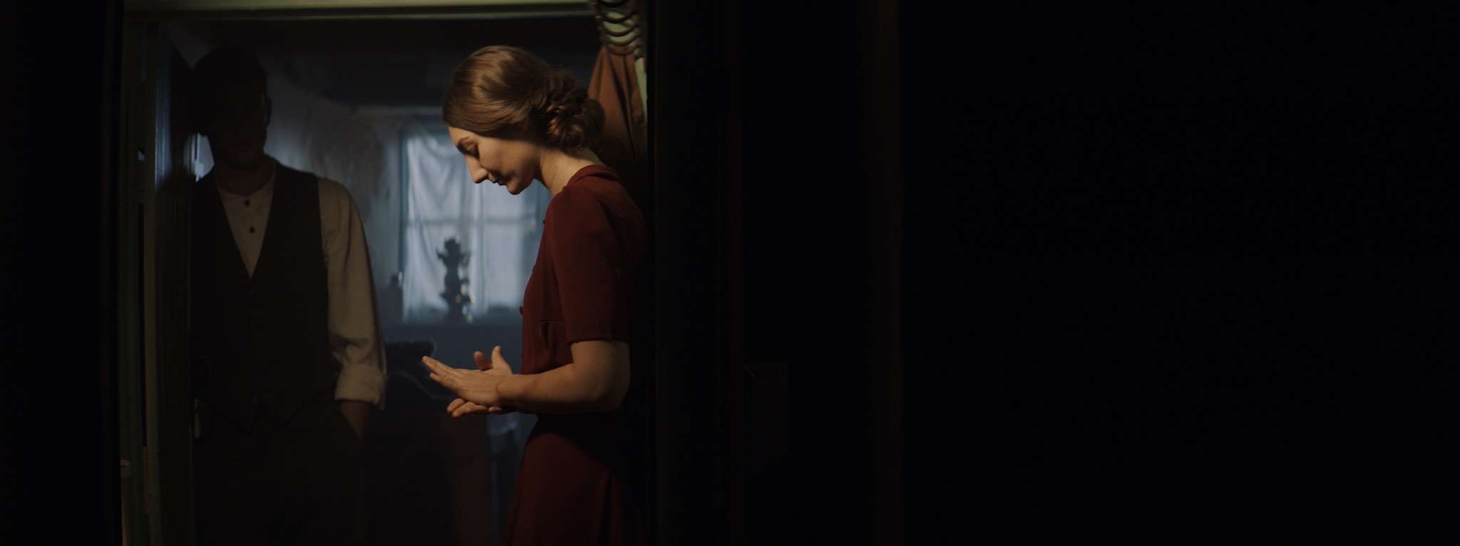
To give just one example, Suzie Lavelle, award-winning DP of Normal People, almost always shoots at 4,300K, halfway between typical tungsten and daylight temperatures. She allows her practical lamps to look warm and cozy, while daylight sources come out as a contrasting blue.

It is important to understand colour temperature as a DP, so that you can plan your lighting set-ups and know what colours will be obtained from different sources. However, the choice of white balance is ultimately a creative one, perhaps made at the monitor, dialling through the kelvins to see what you like, or even changed completely in post-production.

The Art and Science of White Balance

How Digital Sensors Work

Last week I delved into the science of how film captures an image. This time we’ll investigate the very different means by which electronic sensors achieve the same result.


CCD

In the twentieth century, the most common type of electronic imaging sensor was the charge-coupled device or CCD. A CCD is made up of metal-oxide-semiconductor (MOS) capacitors, invented by Bell Labs in the late fifties. Photons striking a MOS capacitor give it a charge proportional to the intensity of the light. The charges are passed down the line through adjacent capacitors to be read off by outputs at the edges of the sensor. This techniques limits the speed at which data can be output.

My first camcorder, an early nineties analogue 8mm video device by Sanyo, contained a single CCD. Professional cameras of that time had three: one sensor each for red, green and blue. Prisms and dichroic filters would split the image from the lens onto these three CCDs, resulting in high colour fidelity.

A CCD alternates between phases of capture and read-out, similar to how the film in a traditional movie camera pauses to record the image, then moves on through the gate while the shutter is closed. CCD sensors therefore have a global shutter, meaning that the whole of the image is recorded at the same time.

CCDs are still used today in scientific applications, but their slow data output, higher cost and greater power consumption have seen them fall by the wayside in entertainment imaging, in favour of CMOS.


CMOS

Complementary metal-oxide-semiconductor sensors (a.k.a. APS or active-pixel sensors) have been around just as long as their CCD cousins, but until the turn of the millennium they were not capable of the same imaging quality.

Each pixel of a typical CMOS sensors consists of a pinned photodiode, to detect the light, and a metal-oxide-semiconductor field-effect transistor. This MOSFET is an amplifier – putting the “active” into the name “active-pixel sensor” – which reduces noise and converts the photodiode’s charge to a voltage. Other image processing technology can be built into the sensor too.

The primary disadvantage of CMOS sensors is their rolling shutter. Because they capture an image row by row, top to bottom, rather than all at once, fast-moving subjects will appear distorted. Classic examples include vertical pillars bending as a camera pans quickly over them, or a photographer’s flash only lighting up half of the frame. (See the video below for another example, shot an iPhone.) The best CMOS sensors read the rows quickly, reducing this distortion but not eliminating it.

Today, all the major cinema cameras use CMOS sensors, from Blackmagics to Alexas. Medium format stills cameras clung on to CCD technology longest for that higher image quality, but even these are now CMOS.

CMOS sensors are cheaper, less power-hungry, and not suspectible to the highlight blooming or smearing of CCDs. They are also faster in terms of data output, and in recent years their low-light sensitivity has surpassed CCD technology too.


Beyond the Sensor

The analogue voltages from the sensor, be it CCD or CMOS, are next passed to an analogue-to-digital convertor (ADC) and thence to the digital signal processor (DSP). How much work the DSP does depends whether you’re recording in RAW or not, but it could include things like correcting the gamma and colour balance, and converting linear values to log. Debayering the image is a very important task for the DSP, and I’ve covered this in detail in my article on how colour works.

After the DSP, the signal is sent to the monitor outputs and the storage media, but that’s another story.

How Digital Sensors Work

Pinhole Results

In my last couple of posts I described making and shooting with a pinhole attachment for my 35mm Pentax P30t SLR. Well, the scans are now back from the lab and I’m very pleased with them. They were shot on Fujifilm Superia Xtra 400.

As suspected, the 0.7mm pinhole was far too big, and the results are super-blurry:

See how contemptuous Spike is of this image. Or maybe that’s just Resting Cat Face.

The 0.125mm hole produced much better results, as you can see below. My f/stop calculations (f/365) seem to have been pretty close to the mark, although, as is often the case with film, the occasions where I gave it an extra stop of exposure produced even richer images. Exposure times for these varied between 2 and 16 seconds. Click to see them at higher resolution.

I love the ethereal, haunting quality of all these pictures, which recalls the fragility of Victorian photographs. It’s given me several ideas for new photography projects…

SaveSave

Pinhole Results

Adventures with a Pinhole

Last week I discussed making a pinhole for my Pentax 35mm SLR. Since then I’ve made a second pinhole and shot a roll of Fujifilm Superia X-tra 400 with them. Although I haven’t had the film processed yet, so the quality of the images is still a mystery, I’ve found shooting with a pinhole to be a really useful exercise.

My Pentax P30T fitted with a 0.125mm pinhole attachment


A Smaller Pinhole

Soon after my previous post, I went out into the back garden and took ten exposures of the pond and the neighbour’s cat with the 0.7mm pinhole. By that point I had decided that the hole was almost certainly too big. As I noted last week, Mr Pinhole gives an optimal diameter of 0.284mm for my camera. Besides that, the (incredibly dark) images in my viewfinder were very blurry, a sign that the hole needed to be smaller.

Scans of my two pinholes

So I peeled the piece of black wrap with the 0.7mm pinhole off my drilled body cap and replaced it with another hole measuring about 0.125mm. I had actually made this smaller hole first but rejected it because absolutely nothing was visible through the viewfinder, except for a bit of a blur in the centre. But now I came to accept that I would have to shoot blind if I wanted my images to be anything approaching sharp.

The 0.125mm(ish) pinhole magnified in Photoshop

I had made the 0.125mm hole by tapping the black wrap with only the very tip of the needle, rather than pushing it fully through. Prior to taping it into the body cap, I scanned it at high resolution and measured it using Photoshop. This revealed that it’s a very irregular shape, which probably means the images will still be pretty soft. Unfortunately I couldn’t see a way of getting it any more circular; sanding didn’t seem to help.

Again I found the f-stop of the pinhole by dividing the flange focal distance (45.65mm) by the hole diameter, the result being about f/365. My incident-light meter only goes up to f/90, so I needed to figure out how many stops away from f/365 that is. I’m used to working in the f/1.4-f/22 range, so I wasn’t familiar with how the stop series progresses above f/90. Turns out that you can just multiply by 1.4 to roughly find the next stop up, so after f/90 it’s 128, then 180, then 256, then 358, pretty close to my f/365 pinhole. So whatever reading my meter gave me for f/90, I knew that I would need to add 4 stops of exposure, i.e. multiply the shutter interval by 16. (Stops are a base 2 logarithmic scale. See my article on f-stops, T-stops and ND filters for more info.)


The Freedom of Pinhole Shooting

I’ve just spent a pleasant hour or so in the garden shooting the remaining 26 exposures on my roll with the new 0.125mm pinhole. Regardless of how the photos come out, I found it a fun and fascinating exercise.

Knowing that the images would be soft made me concentrate on colour and form far more than I normally would. Not being able to frame using the viewfinder forced me to visualise the composition mentally. And as someone who finds traditional SLRs very tricky to focus, it was incredibly freeing not to have to worry about that, not to have to squint through the viewfinder at all, but just plonk the camera down where it looked right and squeeze the shutter.

Of course, before squeezing the shutter I needed to take incident-light readings, because the TTL (through the lens) meter was doing nothing but flash “underexposed” at me. Being able to rely solely on an incident meter to judge exposure is a very useful skill for a DP, so this was great practice. I’ve been reading a lot about Ansel Adams and the Zone System lately, and although this requires a spot reflectance meter to be implemented properly, I tried to follow Adams’ philosophy, visualising how I wanted the subject’s tones to correspond to the eventual print tones. (Expect an article about the Zone System in the not-too-distant future!)


D.I.Y. pinhole Camera

On Tuesday night I went along to a meeting of Cambridge Darkroom, the local camera club. By coincidence, this month’s subject was pinhole cameras. Using online plans, Rich Etteridge had made up kits for us to construct our own complete pinhole cameras in groups. I teamed up with a philosophy student called Tim, and we glued a contraption together in the finest Blue Peter style. The actual pinholes were made in metal squares cut from Foster’s cans, which are apparently something Rich has in abundance.

DIY pinhole camera

I have to be honest though: I’m quite scared of trying to use it. Look at those dowels. Can I really see any outcome of attempting to load this camera other than a heap of fogged film on the floor? No. I think I’ll stick with my actual professionally-made camera body for now. If the pinhole photos I took with that come out alright, then maaaaaaybe I’ll consider lowering the tech level further and trying out my Blue Peter camera. Either way, big thanks to Rich for taking all that time to produce the kits and talk us through the construction.

Watch this space to find out how my pinhole images come out.

SaveSave

Adventures with a Pinhole

Colour Rendering Index

Many light sources we come across today have a CRI rating. Most of us realise that the higher the number, the better the quality of light, but is it really that simple? What exactly is Colour Rendering Index, how is it measured and can we trust it as cinematographers? Let’s find out.


What is C.R.I.?

CRI was created in 1965 by the CIE – Commission Internationale de l’Eclairage – the same body responsible for the colour-space diagram we met in my post about How Colour Works. The CIE wanted to define a standard method of measuring and rating the colour-rendering properties of light sources, particularly those which don’t emit a full spectrum of light, like fluorescent tubes which were becoming popular in the sixties. The aim was to meet the needs of architects deciding what kind of lighting to install in factories, supermarkets and the like, with little or no thought given to cinematography.

As we saw in How Colour Works, colour is caused by the absorption of certain wavelengths of light by a surface, and the reflection of others. For this to work properly, the light shining on the surface in the first place needs to consist of all the visible wavelengths. The graphs below show that daylight indeed consists of a full spectrum, as does incandescent lighting (e.g. tungsten), although its skew to the red end means that white-balancing is necessary to restore the correct proportions of colours to a photographed image. (See my article on Understanding Colour Temperature.)

Fluorescent and LED sources, however, have huge peaks and troughs in their spectral output, with some wavelengths missing completely. If the wavelengths aren’t there to begin with, they can’t reflect off the subject, so the colour of the subject will look wrong.

Analysing the spectrum of a light source to produce graphs like this required expensive equipment, so the CIE devised a simpler method of determining CRI, based on how the source reflected off a set of eight colour patches. These patches were murky pastel shades taken from the Munsell colour wheel (see my Colour Schemes post for more on colour wheels). In 2004, six more-saturated patches were added.

The maths which is used to arrive at a CRI value goes right over my head, but the testing process boils down to this:

  1. Illuminate a patch with daylight (if the source being tested has a correlated colour temperature of 5,000K or above) or incandescent light (if below 5,000K).
  2. Compare the colour of the patch to a colour-space CIE diagram and note the coordinates of the corresponding colour on the diagram.
  3. Now illuminate the patch with the source being tested.
  4. Compare the new colour of the patch to the CIE diagram and note the coordinates of the corresponding colour.
  5. Calculate the distance between the two sets of coordinates, i.e. the difference in colour under the two light sources.
  6. Repeat with the remaining patches and calculate the average difference.

Here are a few CRI ratings gleaned from around the web:

Source CRI
Sodium streetlight -44
Standard fluorescent 50-75
Standard LED 83
LitePanels 1×1 LED 90
Arri HMI 90+
Kino Flo 95
Tungsten 100 (maximum)


Problems with C.R.I.

There have been many criticisms of the CRI system. One is that the use of mean averaging results in a lamp with mediocre performance across all the patches scoring the same CRI as a lamp that does terrible rendering of one colour but good rendering of all the others.

Demonstrating the non-continuous spectrum of a fluorescent lamp, versus the continuous spectrum of incandescent, using a prism.

Further criticisms relate to the colour patches themselves. The eight standard patches are low in saturation, making them easier to render accurately than bright colours. An unscrupulous manufacturer could design their lamp to render the test colours well without worrying about the rest of the spectrum.

In practice this all means that CRI ratings sometimes don’t correspond to the evidence of your own eyes. For example, I’d wager that an HMI with a quoted CRI in the low nineties is going to render more natural skin-tones than an LED panel with the same rating.

I prefer to assess the quality of a light source by eye rather than relying on any quoted CRI value. Holding my hand up in front of an LED fixture, I can quickly tell whether the skin tones looks right or not. Unfortunately even this system is flawed.

The fundamental issue is the trichromatic nature of our eyes and of cameras: both work out what colour things are based on sensory input of only red, green and blue. As an analogy, imagine a wall with a number of cracks in it. Imagine that you can only inspect it through an opaque barrier with three slits in it. Through those three slits, the wall may look completely unblemished. The cracks are there, but since they’re not aligned with the slits, you’re not aware of them. And the “slits” of the human eye are not in the same place as the slits of a camera’s sensor, i.e. the respective sensitivities of our long, medium and short cones do not quite match the red, green and blue dyes in the Bayer filters of cameras. Under continuous-spectrum lighting (“smooth wall”) this doesn’t matter, but with non-continuous-spectrum sources (“cracked wall”) it can lead to something looking right to the eye but not on camera, or vice-versa.


Conclusion

Given its age and its intended use, it’s not surprising that CRI is a pretty poor indicator of light quality for a modern DP or gaffer. Various alternative systems exist, including GAI (Gamut Area Index) and TLCI (Television Lighting Consistency Index), the latter similar to CRI but introducing a camera into the process rather than relying solely on human observation. The Academy of Motion Picture Arts and Sciences recently invented a system, Spectral Similarity Index (SSI), which involves measuring the source itself with a spectrometer, rather than reflected light. At the time of writing, however, we are still stuck with CRI as the dominant quantitative measure.

So what is the solution? Test, test, test. Take your chosen camera and lens system and shoot some footage with the fixtures in question. For the moment at least, that is the only way to really know what kind of light you’re getting.

SaveSave

SaveSaveSaveSave

SaveSave

SaveSave

SaveSave

SaveSave

SaveSave

SaveSave

SaveSave

SaveSave

Colour Rendering Index